
I'm a warm-palette kind of person. So retro bedroom design has always felt more personal to me than any other style. It's not about recreating the past. It's about keeping the best parts of it.
These 12 rooms feel collected. Not curated, not styled. Like someone actually chose every piece on purpose, over time.
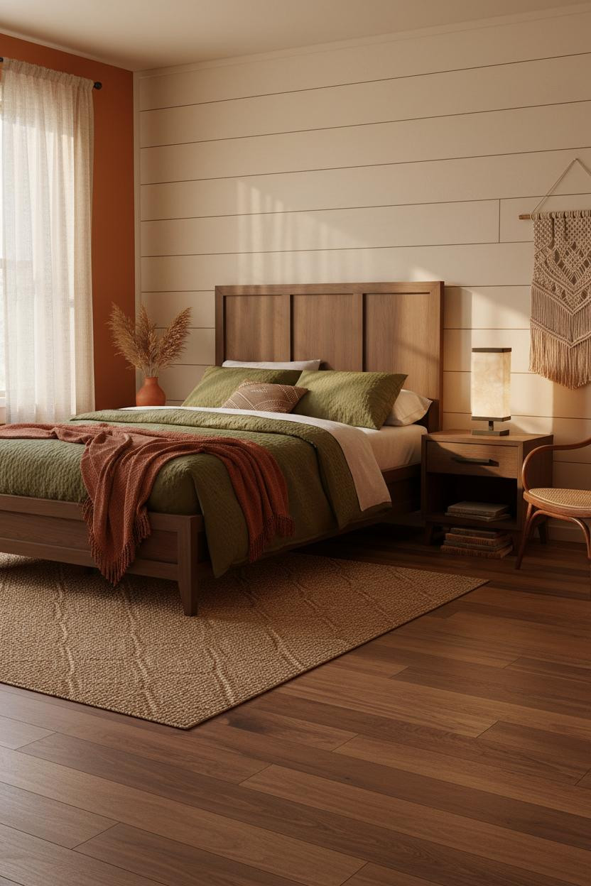
The Shiplap Room That Makes You Want to Stay Longer
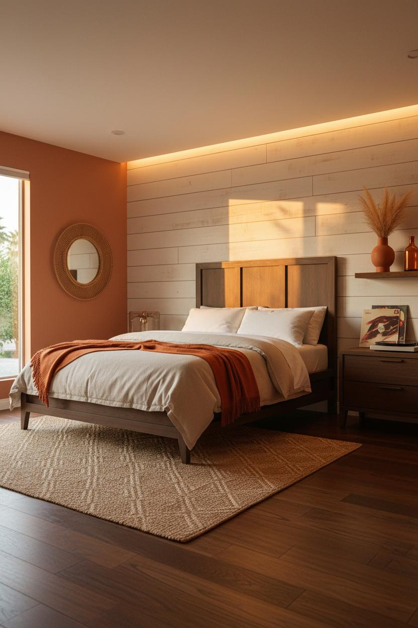


The room feels warm without being heavy, and I think the cream horizontal shiplap behind the bed is doing most of that work.
Why it holds together: Weathered plank grain catches raking afternoon light the way flat plaster never does, giving the wall genuine texture on a budget.
Steal this move: Pair the shiplap with terracotta walls on either side. The contrast keeps it from reading like a beach house.
Wood Wainscoting Proves Half the Wall Is Enough
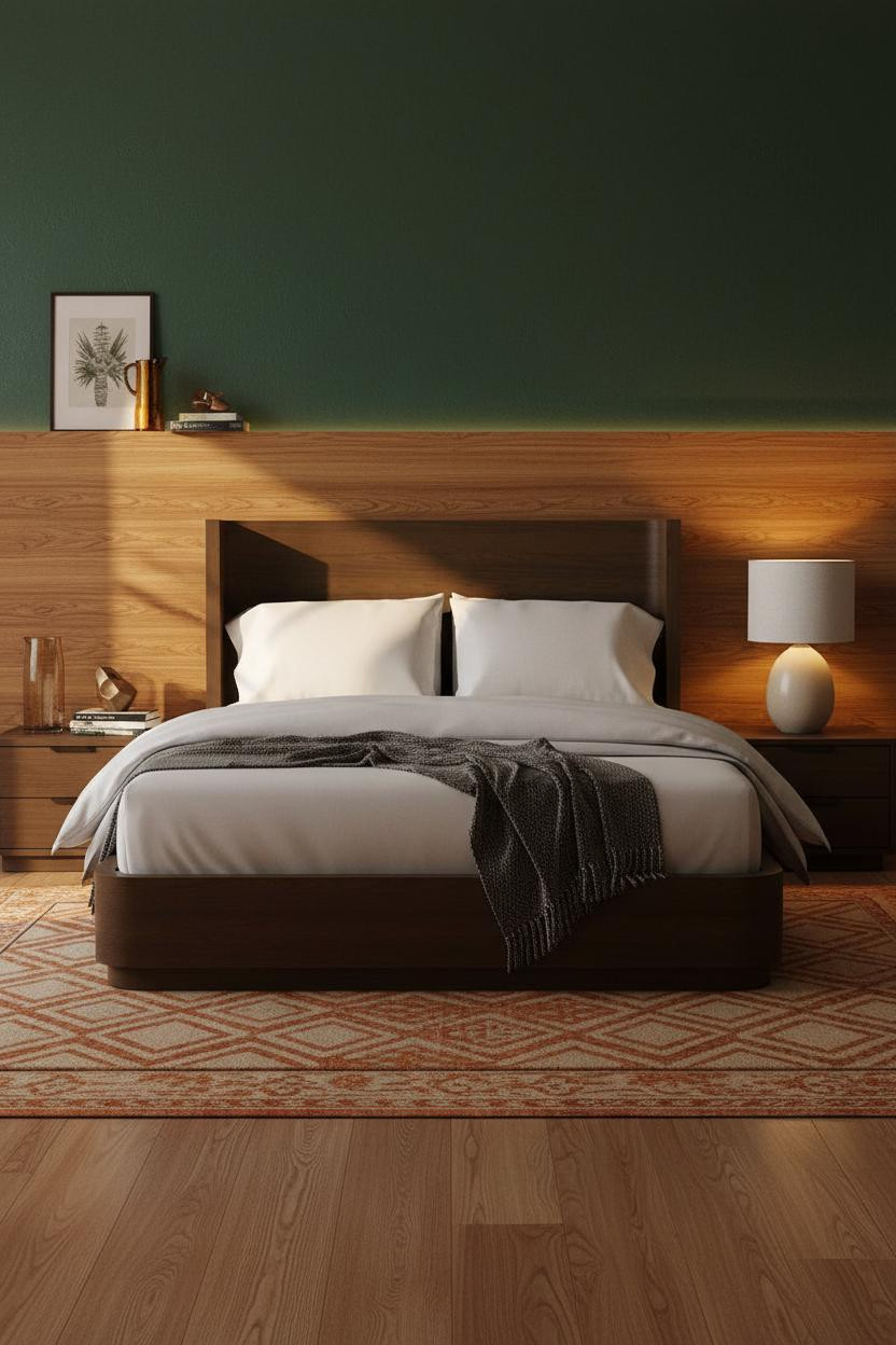

Divisive combo. Forest green above honey oak wainscoting is not subtle.
But it works because of scale. The wainscoting runs the full width and stops at exactly the right height, so the contrast feels architectural, not accidental.
What gives it depth: The honey oak horizontal grain collects lamplight in amber ribbons that the green wall above just can't compete with. That's the whole trick.
Why a Coffered Walnut Ceiling Changes Everything Below It
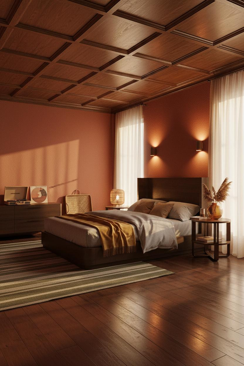

I keep coming back to this one. The ceiling is doing what most people try to do with a statement headboard.
Why it looks custom: Recessed walnut coffered panels throw geometric shadow grids downward across rust-red plaster walls, creating a layered depth that no paint color can fake.
The part to get right: The walls have to be warm. Cool plaster kills the wood's richness and makes the whole thing feel like a library, not a bedroom.
That Ochre Plaster Wall Only Looks Easy
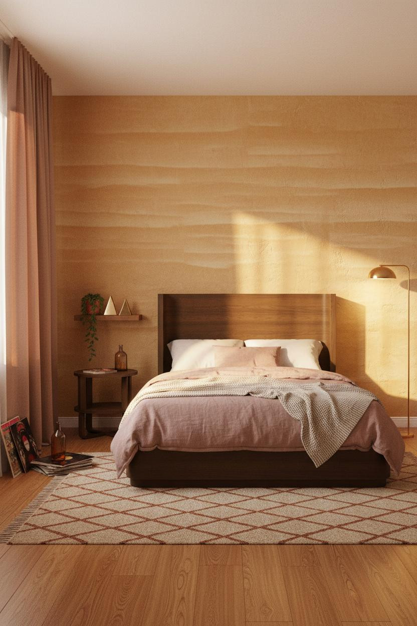
This is the kind of cozy colorful bedroom inspiration I look at and assume is harder to pull off than it is.
What makes this work: Hand-troweled ochre plaster catches raking afternoon light in organic bands, which makes a flat wall read like something that was actually built with care.
Where to start: Floor-to-ceiling rust linen curtains do half the job before you even pick a wall color. Pull those first.
Terracotta Brick and a Brass Lamp Walk Into a Bedroom
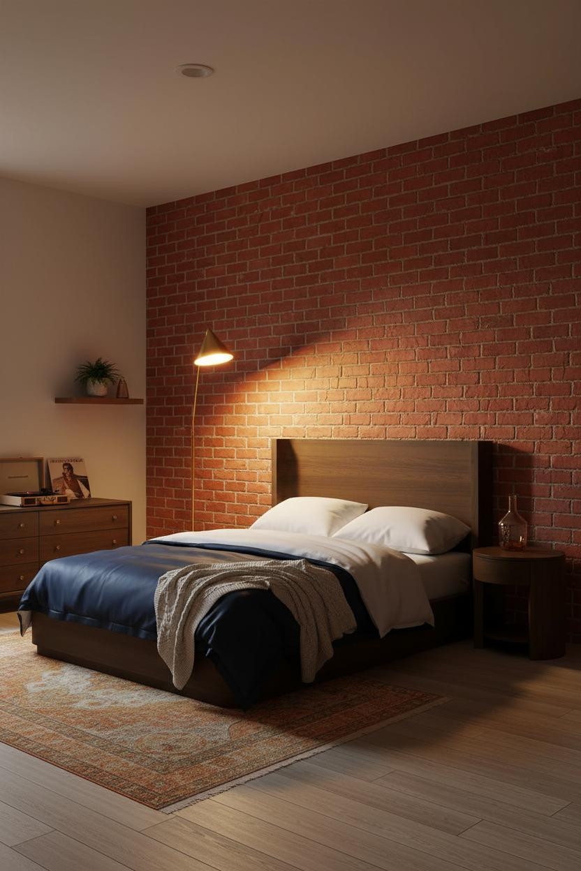

Fair warning. This is a lot of room to commit to. Exposed brick painted in terracotta-coral isn't reversible on a Tuesday afternoon.
Why it lands: Each brick edge catches warm lamp glow and throws tiny horizontal shadow lines across the rough surface, giving the wall a tactile quality that smooth plaster never gets close to.
A brass torchiere in the far corner creates that upward amber pool. It's a small lamp doing a big job.
The Curved Archway That Makes the Room Feel Found
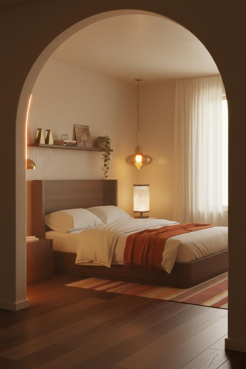
Honestly, a doorway view shouldn't be this good. But a curved plaster archway at the entry frames the whole room like a scene you're stepping into rather than a room you're walking past.
What creates the mood: The soft radius catches warm light on the upper curve and falls into cool shadow beneath, and that contrast makes the mushroom-toned walls behind it look richer than they actually are.
Pro move: Trace the archway curve with a hidden LED cove. The warm pool on the floor planks is what makes the room feel lived-in and intimate.
Dark Walls and a Rattan Mirror Are Not Playing Around
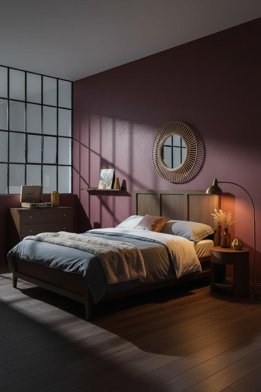
Deep burgundy matte plaster is a commitment. The room feels collected rather than decorated, which is exactly why it works.
The real strength: The Crittall-style steel window grid throws geometric shadow lines across the textured plaster, and the dark wall makes those lines look intentional, like someone drew them.
What to borrow: An oversized woven rattan mirror above the bed. In a dark room, the right lighting decisions plus a reflective round shape are the fastest way to keep things from feeling closed in.
A Gallery Wall That Actually Earns the Mustard
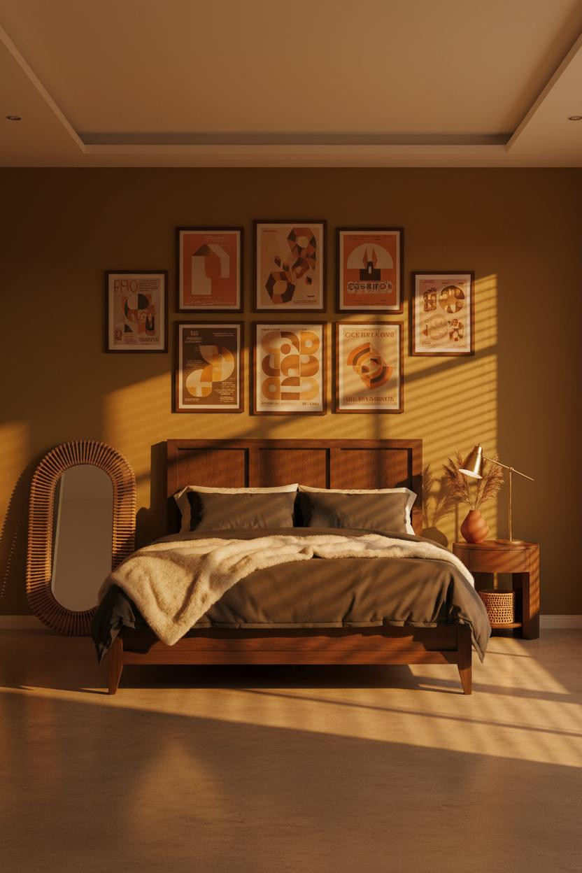
Most gallery walls look cluttered. This one looks like a record collection: personal, warm, nothing too precious.
The reason it reads as groovy instead of messy is the deep mustard matte plaster behind it. The wall color unifies every frame before you even look closely at what's in them. Why the palette works: Ochre and sienna tones in the prints echo the wall, so it all stays in the same warm family.
Avoid this mistake: Don't hang every frame level. One slightly tilted piece is what makes it feel personal rather than staged.
What Walnut Floating Shelves Do to a Plum Wall
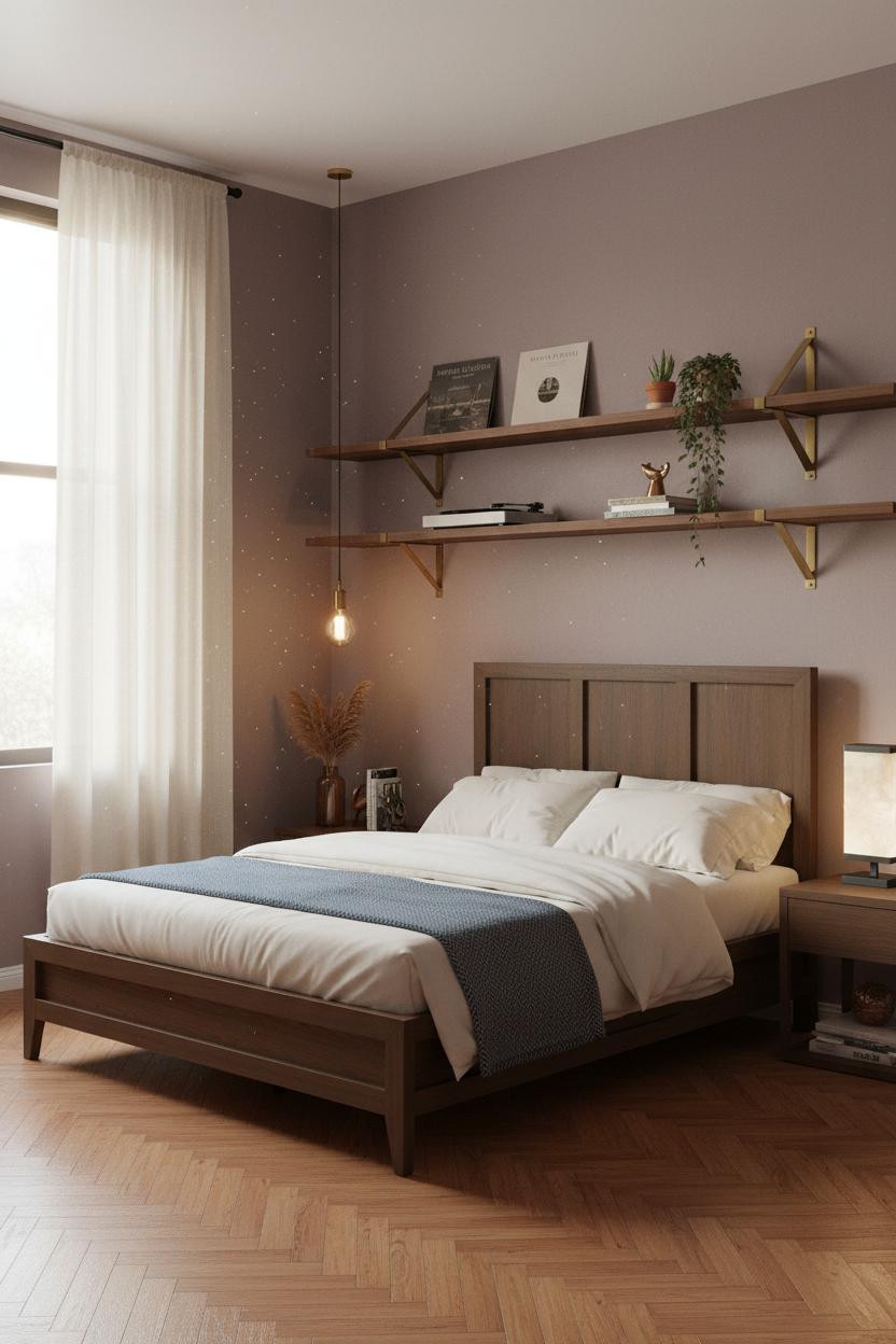
Dusty plum walls with walnut floating shelves above the bed. It shouldn't feel calm. But it does.
What carries the look: The honey-toned grain glowing under morning light pulls enough warmth into the plum to keep it from feeling cold, while the herringbone parquet floor below adds pattern without competing for attention.
The easy win: Style the shelf with a record player and one casual vinyl sleeve leaning forward. It reads as lived-in immediately. (Check out more nightstand styling ideas that tie the whole bed zone together.)
Avocado Green Walls With Walnut Beams Feel Oddly Perfect
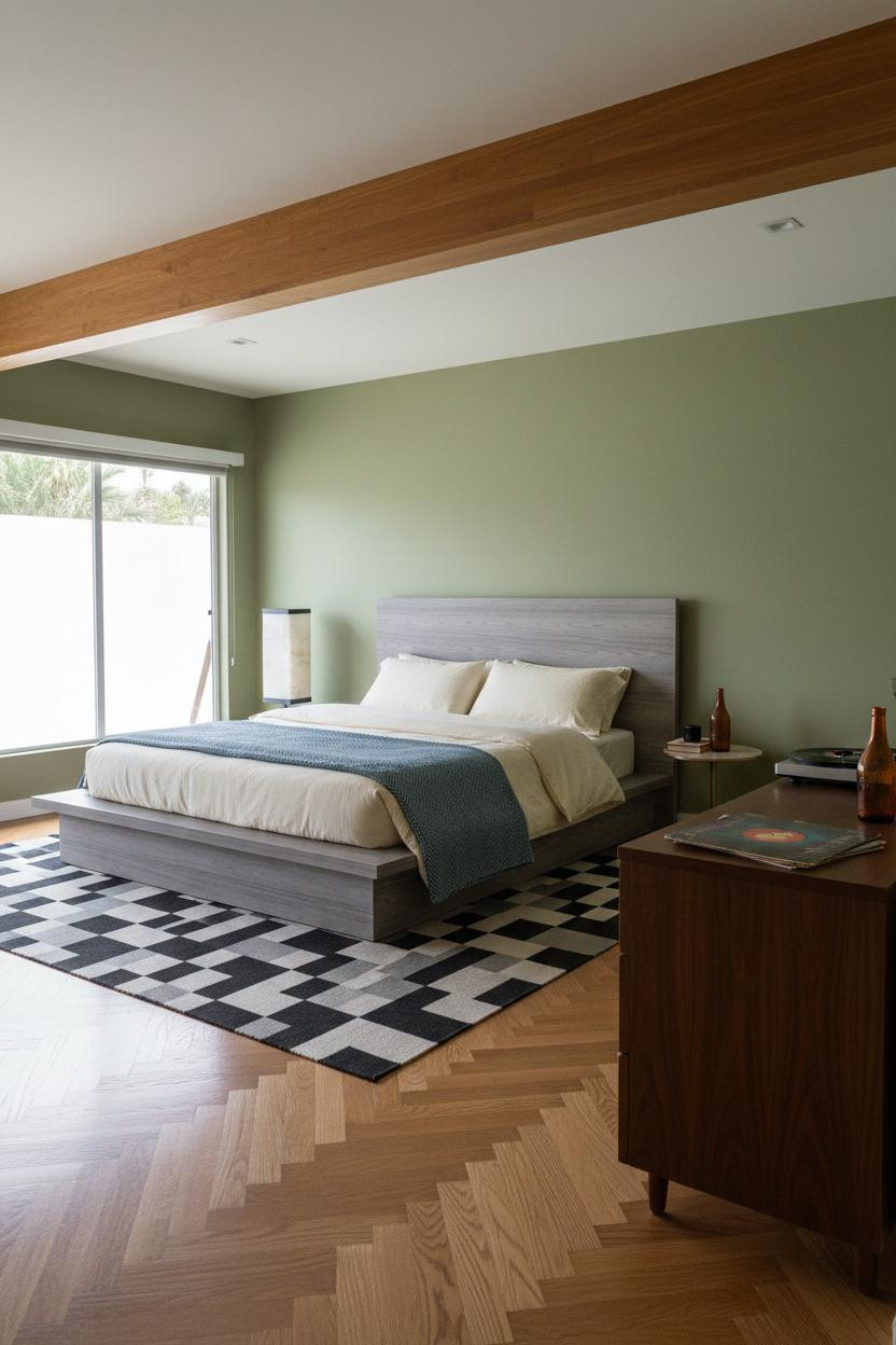

I almost dismissed this one. Avocado green is genuinely hard to use well, and most rooms I've seen try it end up feeling dated in the wrong way.
What changes the room: A recessed walnut beam soffit across the ceiling frames the space with actual geometry, so the green walls below read as a backdrop rather than the main event.
The smarter choice: Go bare on the floor. The amber oak herringbone parquet needs room to breathe, and a rug would bury the best detail in the room.
Floor-to-Ceiling Honey Oak Slats Are the Move Nobody Expects
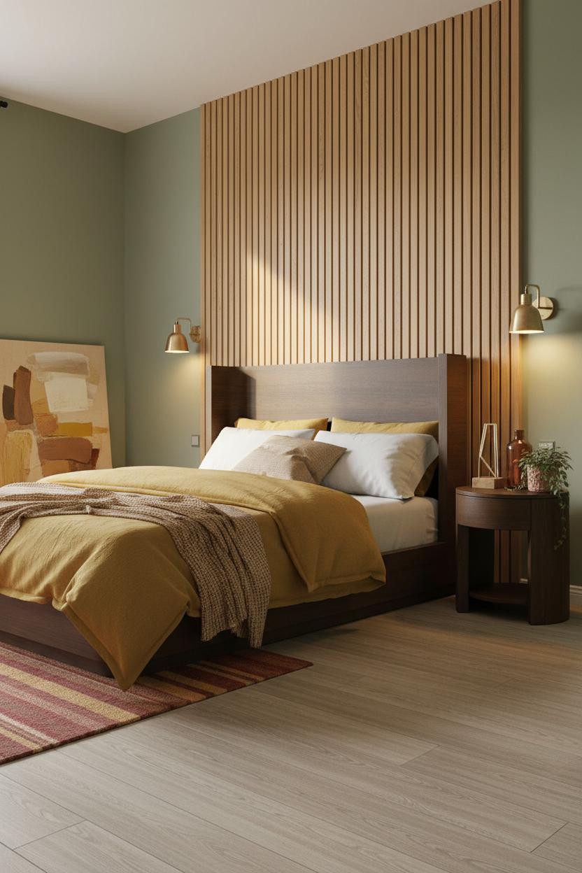
This is one of those unique bedroom designs where the wall treatment is so confident that everything else just falls into place around it.
Why the materials matter: Each vertical honey oak slat casts a thin shadow line, and when morning light rakes across it, the wall has rhythm flat paneling will never manage. The sage flanking walls keep the wood warm, not heavy.
Worth copying: A mustard linen duvet against all that wood grain. Just enough contrast to keep things interesting.
Burnt Orange Walls, Macramé, and a Jute Rug Land Every Time
Nothing fancy. That's the point.
What softens the room: The hand-woven jute rug underfoot and a macramé wall hanging above a cane chair keep the burnt orange walls from feeling aggressive, in a way that feels genuinely organic rather than styled. And the cream shiplap behind the bed holds the whole warm palette together without competing with any of it.

Our #1 Pick
Saatva Classic Mattress
America's best-selling online luxury innerspring. 365-night trial, lifetime warranty, free white glove delivery.
Shop Saatva Classic
The Foundation Of Every Beautiful Bedroom
Walls get repainted. Linen gets swapped out. But the bed design that ties the room together stays, and so does what's under you when you sleep. That part matters more than most people admit when they're deep into a retro bedroom mood board.
The Saatva Classic runs a dual-coil support system that holds up over years, not just months. The organic cotton cover doesn't trap heat, and the Euro pillow top is soft enough to feel genuinely luxurious while still giving you the support that keeps you sleeping well.
Good design ages well because it's made well.
