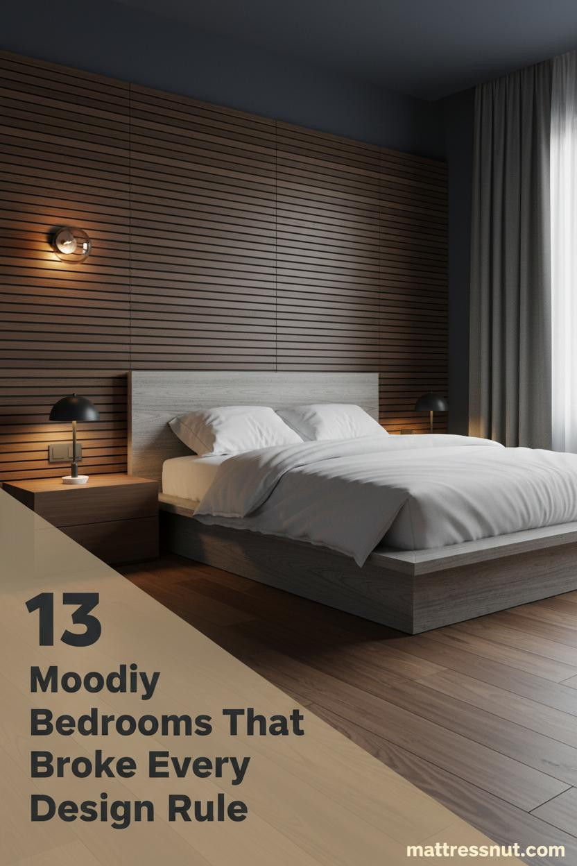
The first thing you notice in the best moody mid-century modern bedroom is that the darkness doesn't feel heavy. It feels deliberate. Like someone made a series of very confident choices and then stopped.
These thirteen rooms get that balance right. Dark walls, warm wood, amber light. Nothing accidental about any of it.
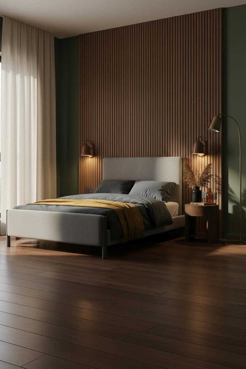
The Slatted Wall That Makes Darkness Feel Designed
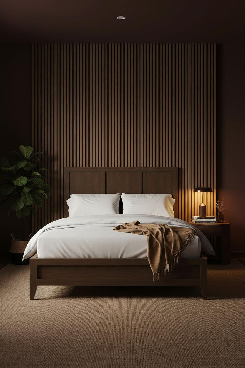


This is the kind of room that makes you want to close the door behind you and stay. The blackened walnut slatted headwall does something a painted wall never could.
Why it works: Each narrow flute catches amber lamp glow differently, so the wall reads as both texture and light source at once, while the deep burgundy flanking walls keep it from feeling cold.
Steal this move: Ground the whole scheme with sisal flooring in a warm oat tone. It absorbs echo and adds an organic layer that stops the dark palette from tipping into stark.
How Ribbed Plaster Earns Its Moody Reputation
Bold choice. Not for everyone. But the rooms that commit to charcoal ribbed plaster never look half-finished.
The texture is the whole point. Each ridge in the warm charcoal-grey ribbed plaster catches the amber bedside lamp differently, which creates a wall that actually changes throughout the day.
Don't ruin it with: Cool-toned bedding. A vintage Persian rug in faded burgundy and cream is the move that keeps the scheme feeling collected rather than decorated.
Exposed Brick Makes the MCM Warmth Feel Earned
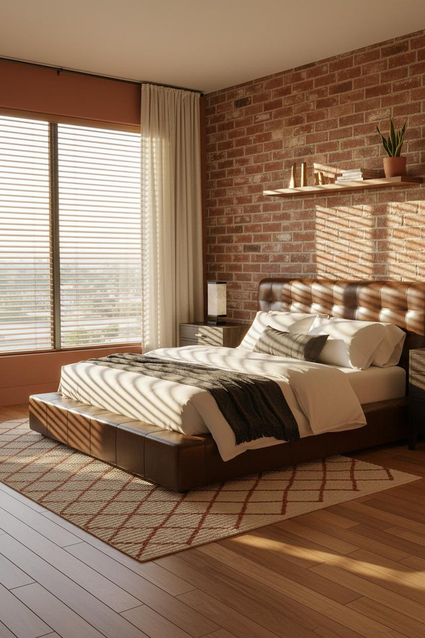


Somehow a lightly whitewashed brick wall in terracotta tones reads warmer than a freshly painted one. I think it's the age the texture implies.
What makes this one different: Whitewashing the terracotta brick softens its rawness just enough to read MCM rather than industrial, in a way that feels intentional without looking fussy.
The easy win: Pair it with warm maple floors and cream linen curtains. The morning light does the rest.
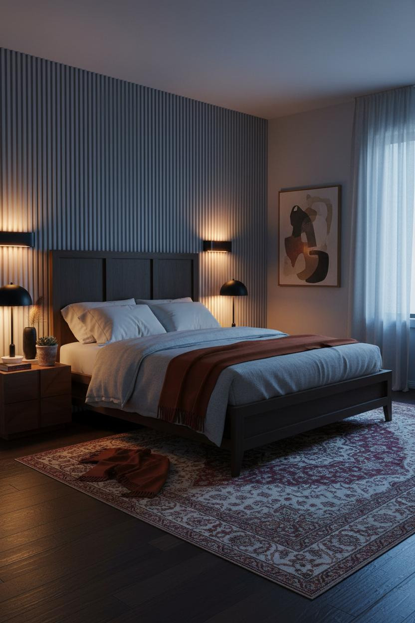
What Blackened Steel Windows Do for a Sage Green Room
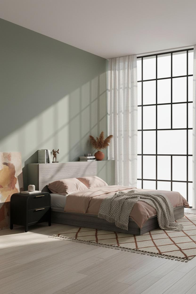


I almost scrolled past this one. Glad I didn't.
What creates the mood: The blackened steel Crittall window wall gives the sage green something architectural to push against, so the color reads sophisticated rather than sweet. The cool-warm tension between diffused daylight and the bedside lamp is what makes the room feel alive.
Pro move: Lean an oversized abstract canvas in muted ochre against the opposite wall. It gives the sage a foil without hanging anything.
Slate Blue Shiplap Is Quieter Than You'd Expect
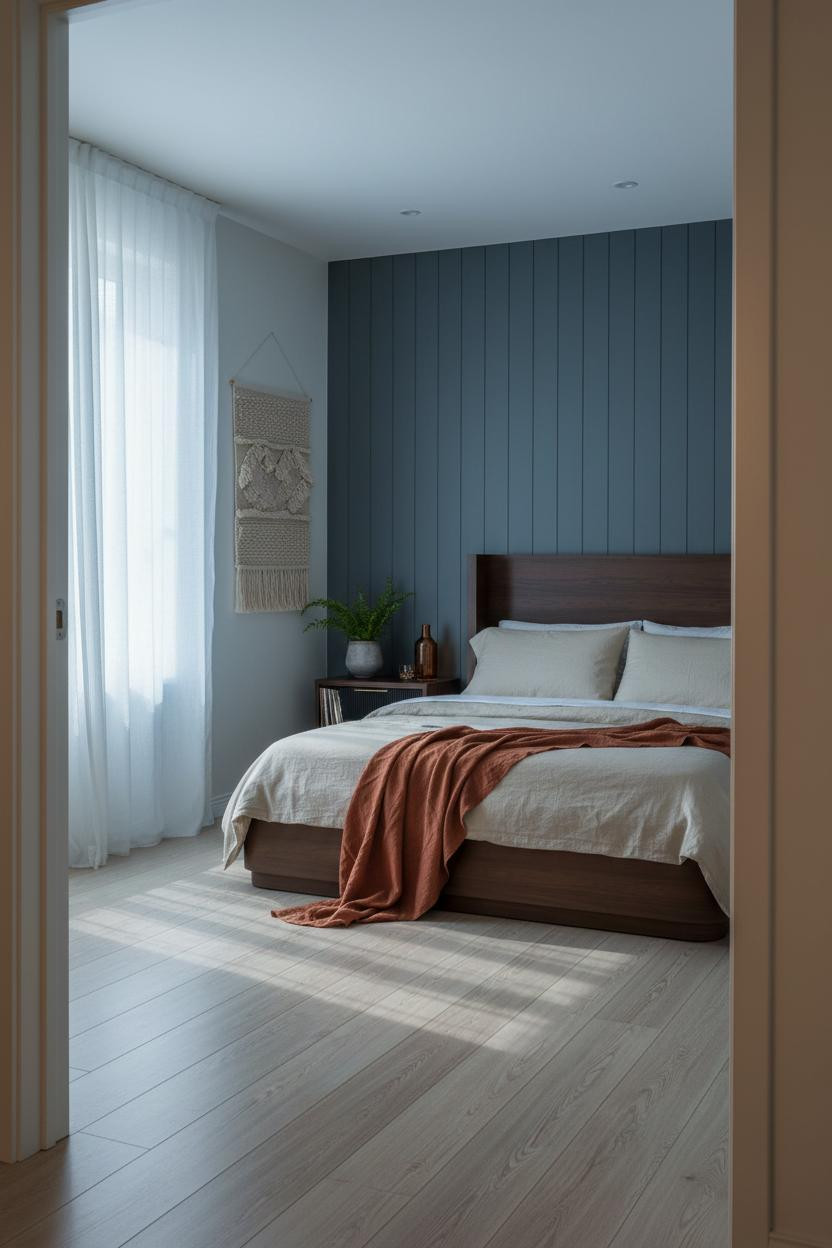

Nothing fancy. That's the point.
Why it feels balanced: Matte deep slate blue shiplap catches thin ridges of cool overcast light along each plank edge, which gives the wall graphic rhythm without demanding anything dramatic from the rest of the room.
A rust linen throw and a woven wall hanging in undyed natural fiber do the warming. The pale birch floor keeps it breathing. This is one of those small moody bedrooms that feel like a refuge without sacrificing light entirely.
Olive Slatted Walls and the Case for Dusty Blue Flanking
Admittedly, olive and dusty blue on the same palette sounds risky. But the room feels calm and cohesive because both colors share the same low saturation.
The real strength: Overcast light flattens the olive matte plaster flutes into a single graphic plane during the day, then the amber bedside lamp at night carves the shadow ridges back out, which means the wall reads differently every few hours.
What to borrow: A burnt orange mohair throw draped unevenly off the mattress corner. One color accent, that's all this palette needs.
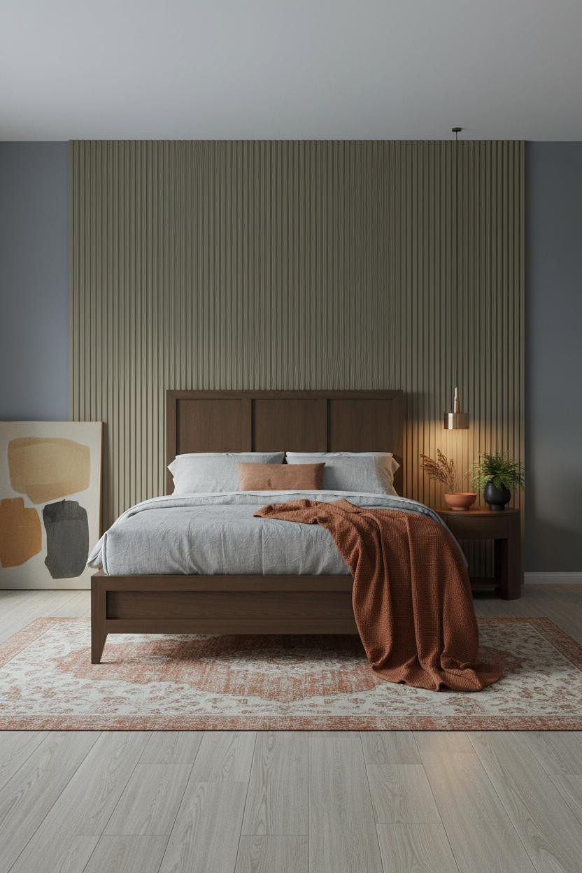
Warm Ochre Walls With Geometry Built In
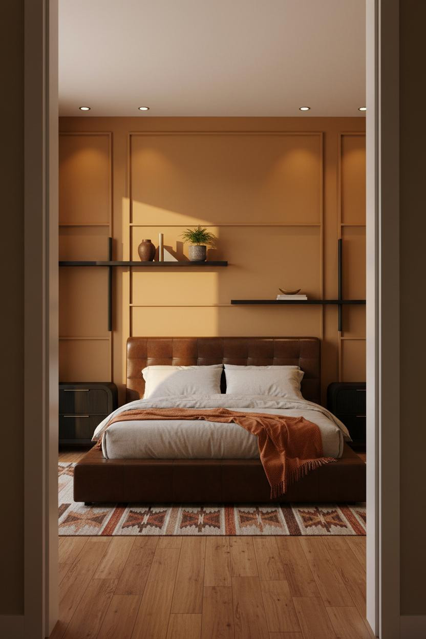
This one is divisive. Ochre is a color that either lands or doesn't, and I think it lands here because the recessed horizontal shelving breaks the wall into something structural rather than decorative.
The reason it feels MCM instead of rustic is the blackened steel and walnut veneer shelving cutting precise horizontal lines across the warm ochre surface, which gives the wall its geometry without any tile or paneling involved.
Worth copying: Style the shelf with a ceramic vessel in deep ochre beside a single brass bookend. Nothing too matchy. Just enough object weight to keep things interesting.
Taupe Board-and-Batten for the Skeptics

Fair warning. Board-and-batten gets dismissed as farmhouse, and honestly that's a fair complaint. But in warm taupe with MCM furniture it reads completely differently.
Why it holds together: The vertical batten ridges in matte warm taupe catch cove ceiling light along their edges, so the wall has shadow detail even in a room with no strong directional daylight. That's a lot of architectural work for one paint color.
The smarter choice: Dusty pink linen bedding over pale birch floors. The palette stays warm without needing any wood tones above the baseboard.
A Burgundy Arch That Earns Its Drama
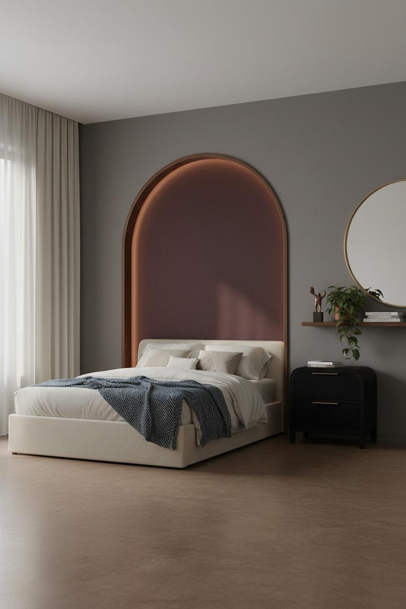

The arch shouldn't work in a bedroom this restrained. But it does, because the deep burgundy matte plaster inside the niche absorbs light rather than reflecting it, which makes the shape feel carved rather than applied.
What gives it presence: Walnut trim lining the arch interior adds the MCM geometry that keeps this from reading as purely Mediterranean. The mushroom grey flanking walls give the burgundy room to breathe.
An oversized round mirror leaning against the side wall completes it. Avoid this mistake: Don't hang it. Leaning keeps the room feeling lived-in and intimate rather than staged.
The Coffered Walnut Ceiling Nobody Talks About Enough
I keep coming back to this one. The decision to put the drama overhead instead of on a wall is genuinely interesting, and more achievable than it looks.
What carries the look: A coffered ceiling in dark-stained walnut creates a geometric grid with real depth. Each recessed square casts its own shallow shadow, and against charcoal grey walls the grain reads as warm pattern rather than weight. The room feels enclosed in the best way.
The practical move: Keep the floor completely bare in pale birch. The ceiling is doing the work. Let it.
Deep Indigo Walls and What the Floating Shelf Does
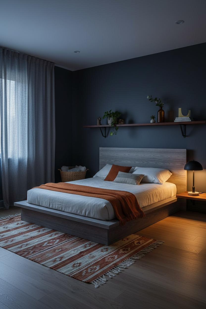
This is a dark cozy bedroom that doesn't feel small even though it probably is. The proportion logic is doing the heavy lifting here.
What changes the room: A full-width low-profile walnut veneer shelf on blackened steel brackets anchors the wall as a single horizontal band, which pulls the eye across rather than up and makes the deep indigo-charcoal walls feel wide instead of close.
Where to start: Charcoal linen curtains floor to ceiling on the window. That vertical run of fabric is what lets the shelf read as a deliberate break rather than a storage solution.
Clay Plaster at Its Most Textural and Its Most Useful
Clay plaster walls photograph well. That's their reputation. But what I think people miss is how differently they behave with raking side-light compared to diffused overcast. Two completely different rooms, one surface.
Why the materials matter: Strong east window light rakes across the warm clay plaster and throws shallow relief shadows that no paint sheen can replicate. The rough matte surface holds onto that light just long enough to feel tactile rather than flat.
The finishing layer: Honey oak herringbone parquet underfoot. The floor pattern echoes the wall texture's handmade quality, while still feeling polished. See how other dark earthy bedrooms use natural materials this well.
Dark Walnut Paneling With Forest Green and Late Light

This is the darkest room in the lineup and honestly the most committed. Forest green flanking walls against horizontal walnut slat paneling is not a combination that leaves room for second-guessing.
Where the luxury comes from: The matte walnut finish absorbs light at the slat valleys while the warm grain catches amber at the ridges, which gives the wall depth that painted paneling just won't have. And the wide-plank dark walnut floor extends that grain vocabulary all the way down.
One smart swap: A brass arc floor lamp in the far corner. It gives the deep palette its only bright metal and anchors the room without adding clutter. These kinds of moody bedroom details are what make the difference.

Our #1 Pick
Saatva Classic Mattress
America's best-selling online luxury innerspring. 365-night trial, lifetime warranty, free white glove delivery.
Shop Saatva Classic
The Foundation Of Every Beautiful Bedroom
Walls get repainted. Walnut slats get swapped out. But the mattress stays, and in a room this considered, it should be worth keeping. The Saatva Classic is what I'd put under all thirteen of these beds without hesitation.
Dual-coil support holds its shape over years, not just months. The organic cotton cover doesn't trap heat, which matters more in a dark, enclosed bedroom than people expect. And the Euro pillow top is soft without losing its structure halfway through the night.
The rooms people save are the ones where nothing looks accidental. Start with what you sleep on.

Good design ages well because it's made well. Pick the surfaces that hold up, the light that flatters, and the mattress that earns its place in a room you actually took time to build.