The first thing I notice in the best 60s bedroom ideas is what's missing. No clutter, no theme-park excess. Just warm wood, honest geometry, and the quiet confidence of a room that knows exactly what it is.
These eleven rooms sit somewhere between Palm Springs modernism and a well-edited thrift find. Collected, not costumed.
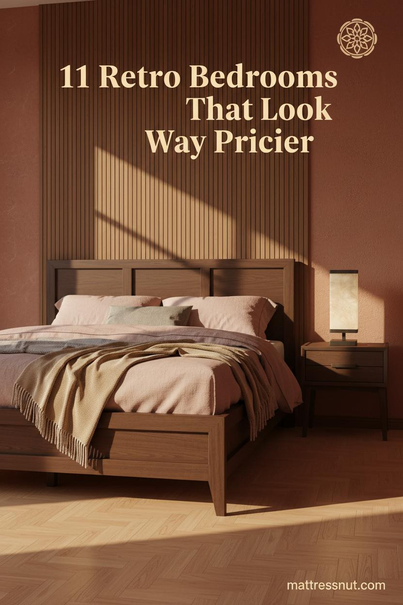
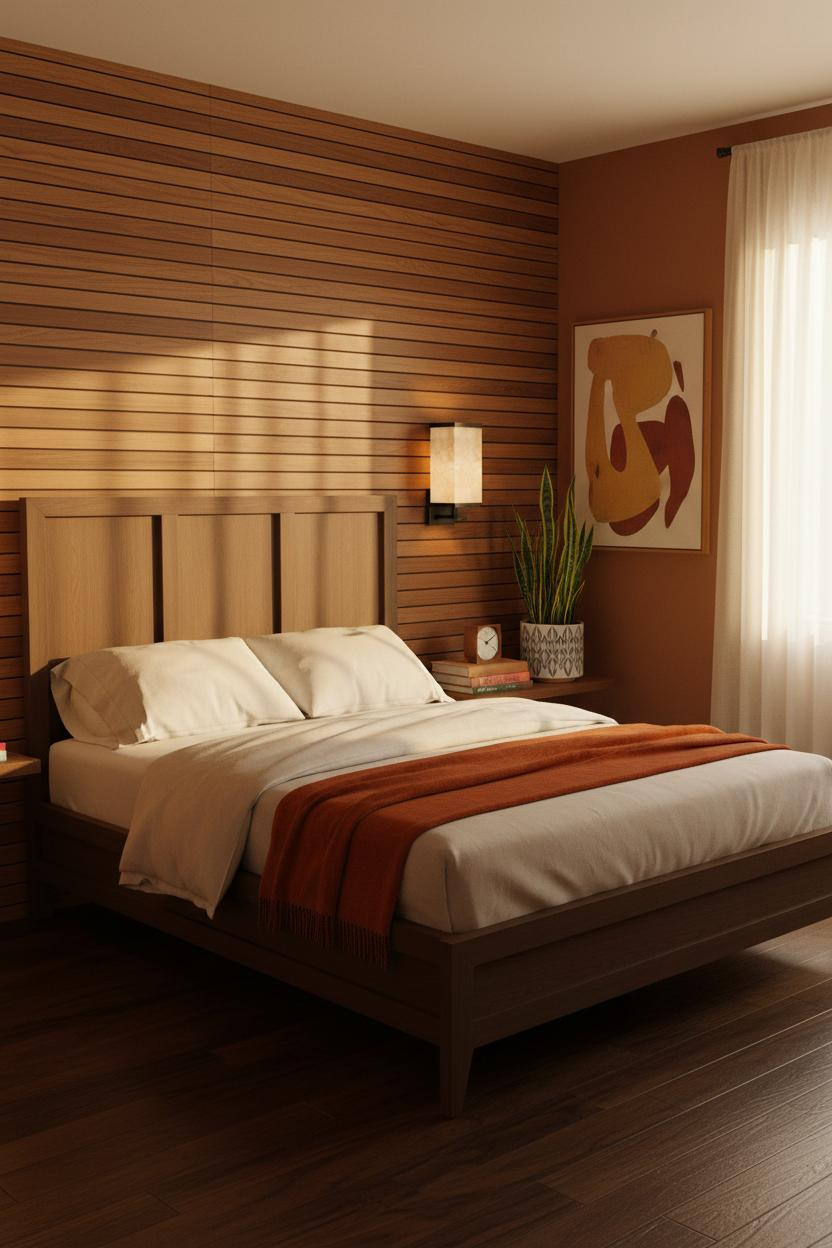
The Teak Slat Wall That Makes Everything Else Feel Calm


I keep coming back to this one. The geometry is simple, but it somehow makes the whole room feel settled.
Why it holds together: Full-height teak vertical slat paneling creates shadow rhythm across the headboard wall, giving the eye something to rest on without competing with the terracotta.
Steal this move: Pair warm-grain wood slats with a flat-weave wool rug in rust and cream. The textures speak the same language.
When Denim Blue Walls Actually Work in a Retro Room
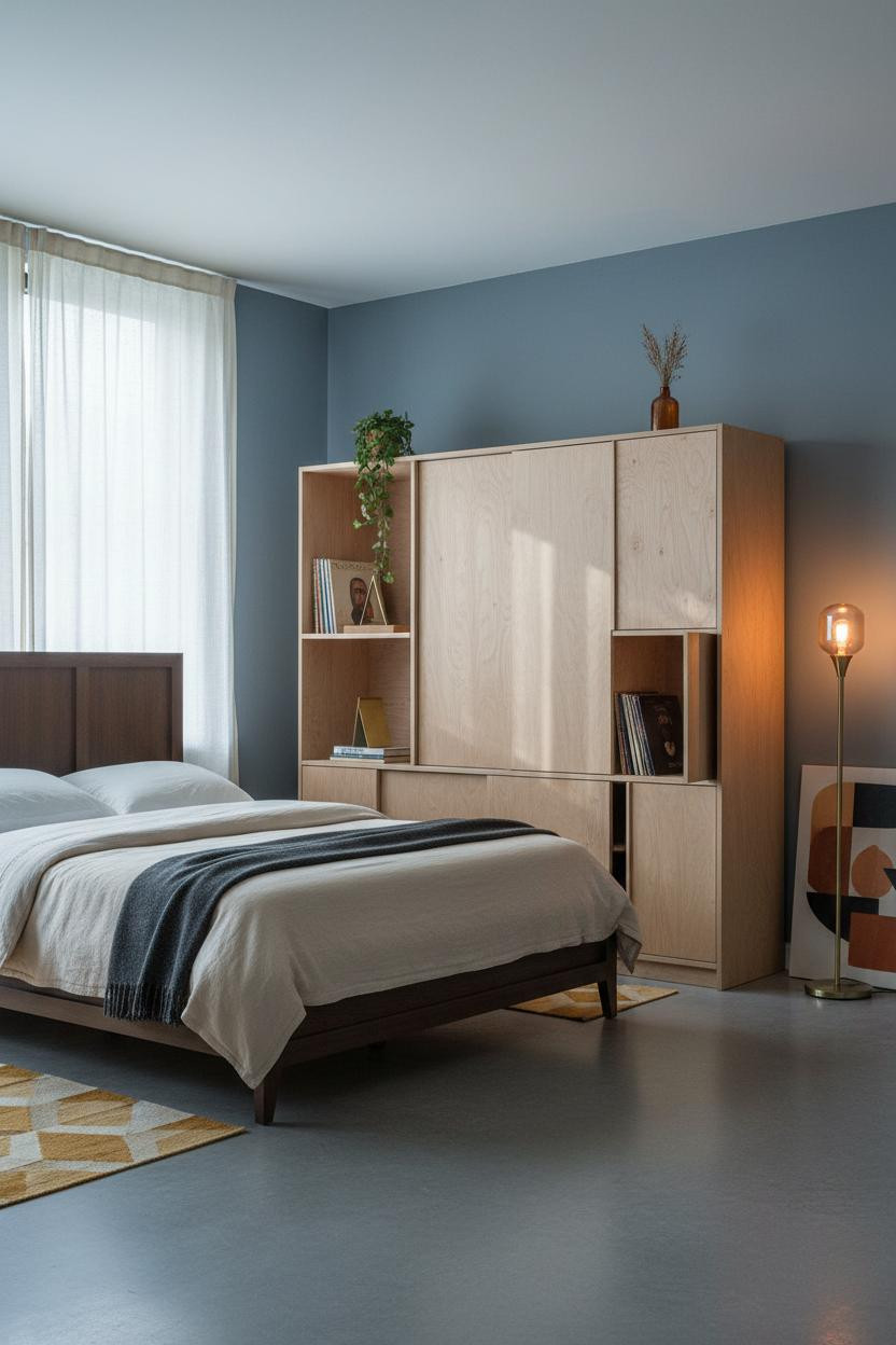
This one is divisive. But I'd argue the faded denim blue is exactly why it works.
The pale birch plywood credenza wall needs a cool backdrop to keep it from reading too rustic. Blue does that while still feeling period-correct.
The easy win: A stack of vinyl records beside a brass bookend costs nothing and lands the era without any costume risk. That's the difference between collected and decorated.
Dark Walnut Panels and the Plum Wall Nobody Talks About

Honestly, the plum-tinted cream walls are the secret. They're barely there, but they stop the walnut from feeling like a ski lodge.
What gives it depth: A herringbone parquet floor in warm maple pulls the dark walnut veneer panel down into the room so the whole thing feels grounded, not top-heavy.
Worth copying: An overdyed rust and tobacco vintage rug over herringbone parquet is one of those combinations that always looks better than it should on paper.
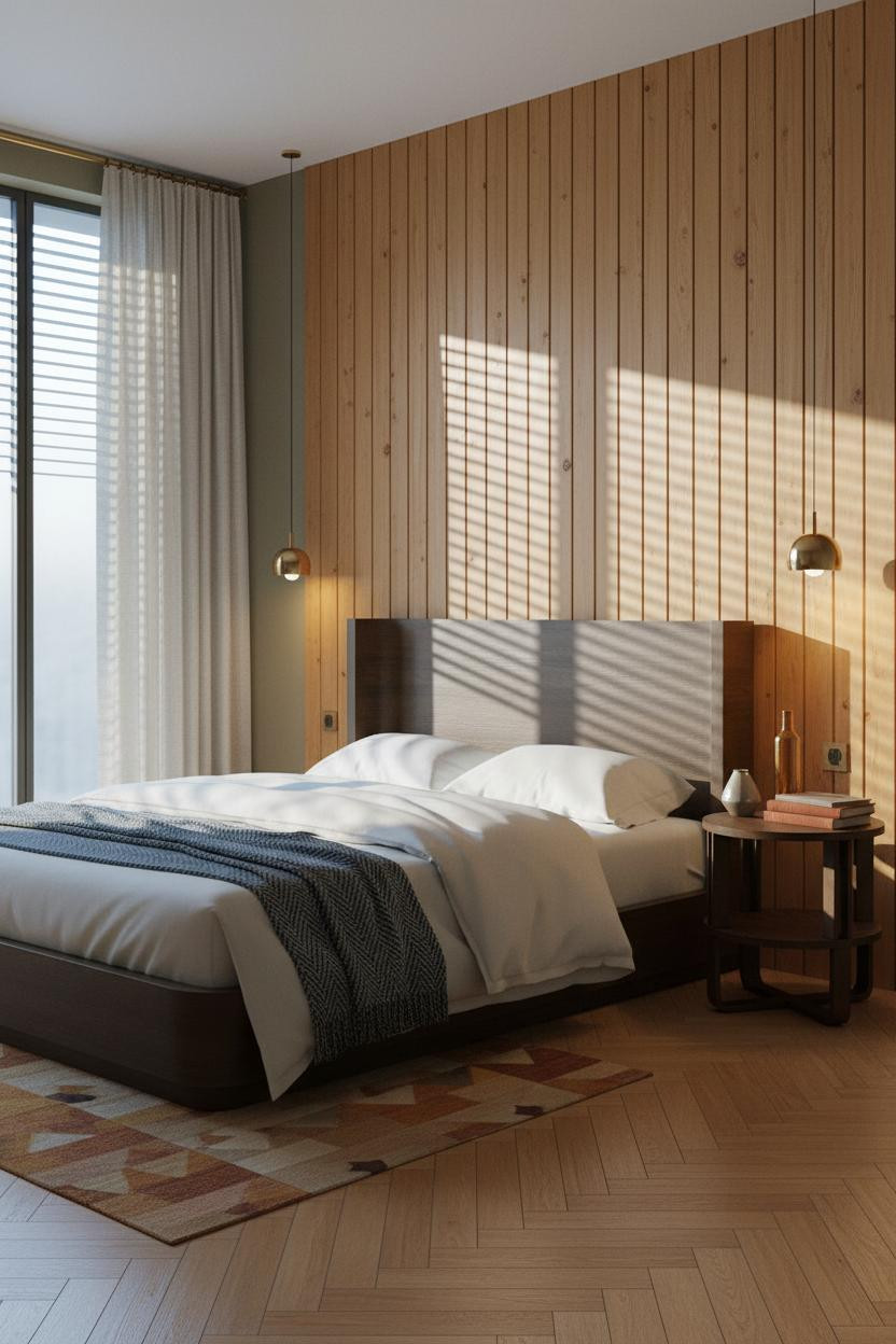
The Chevron Plywood Wall That Looks Expensive for Almost No Reason
Blonde plywood shouldn't feel this refined. But set it in a chevron pattern against charcoal grey walls and it shifts completely.
Why it looks custom: The chevron-pattern blonde plywood creates diagonal shadow play that flat wood paneling never achieves, especially when morning light rakes across it from the side.
Floor-to-ceiling ivory linen curtains on a brass rod are the move here. Avoid this mistake: Don't break the vertical line with a short panel. Let it pool at the floor.
Forest Green Walls and Why This Pairing Keeps Coming Back
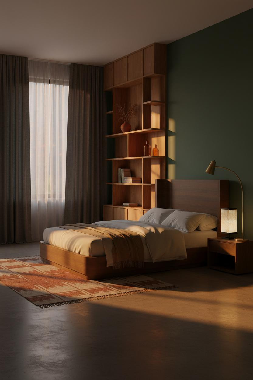
Deep forest green and warm walnut veneer is a combination that practically defines the 70s room aesthetic. And it still looks current.
What carries the look: The reason it feels rich rather than heavy is the sculptural walnut credenza wall, which draws the eye across the room while the green walls hold everything behind it.
Pro move: Charcoal linen curtains pooling at the floor add drama without fighting the green. Camel wool throw at the foot corner keeps the bedding from reading too cool.
Board-and-Batten in Honey Pine Is a Better Idea Than It Sounds

Fair warning. Board-and-batten reads rustic on a white wall. Against dusty olive, it reads retro-modern.
What makes this work: Vertical battens spaced at period-correct intervals catch raking light and throw narrow shadow lines that give the honey-toned pine wall graphic rhythm without any carving or stain required.
The smarter choice: A steel blue herringbone wool throw over cream percale breaks the warm palette just enough. Nothing too matchy. A solid wood nightstand keeps the bedside from getting fussy.
Mustard Yellow and the Geometric Headboard Worth Recreating
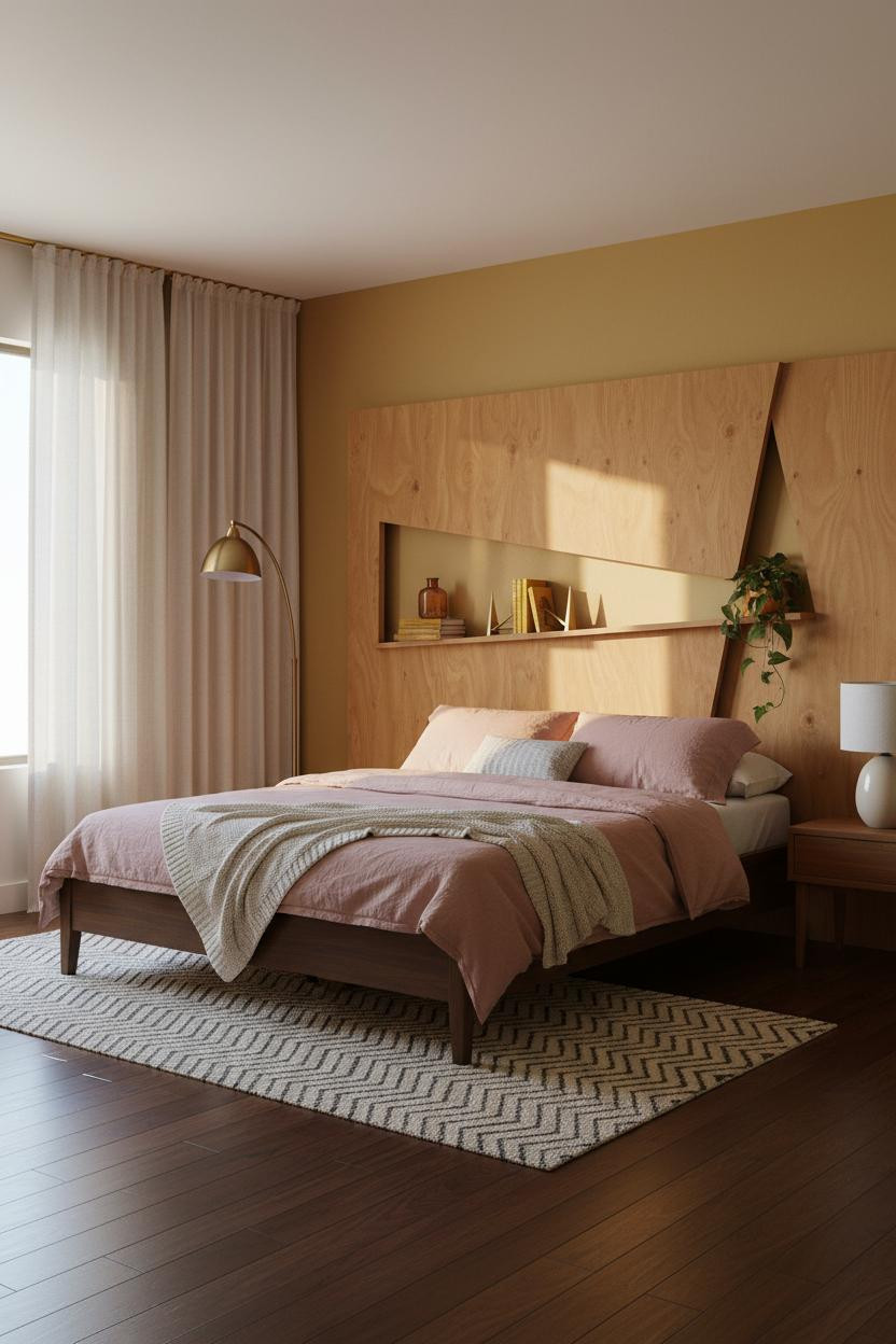
The mustard yellow feature wall is a commitment. I respect it.
But the honey-stained plywood geometric headboard is why it works. Angular cutout shelving casts diagonal shadows that echo the wall color's warmth without either one repeating the other.
What to borrow: Dusty pink linen bedding against mustard yellow is one of those period-correct combinations that feels warm and lived-in. The bed design is doing most of the heavy lifting here.
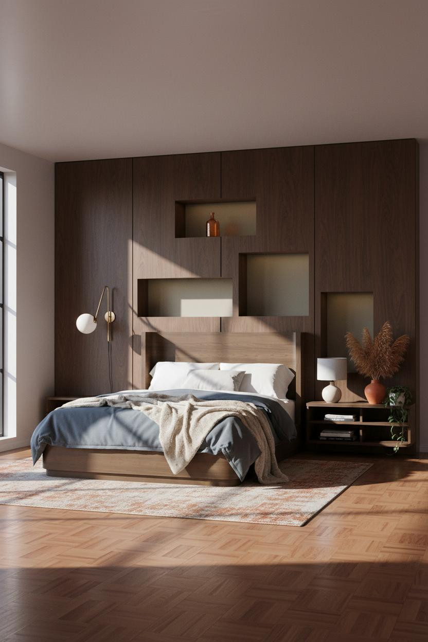
A Terracotta Plaster Alcove That Somehow Doesn't Feel Overdone
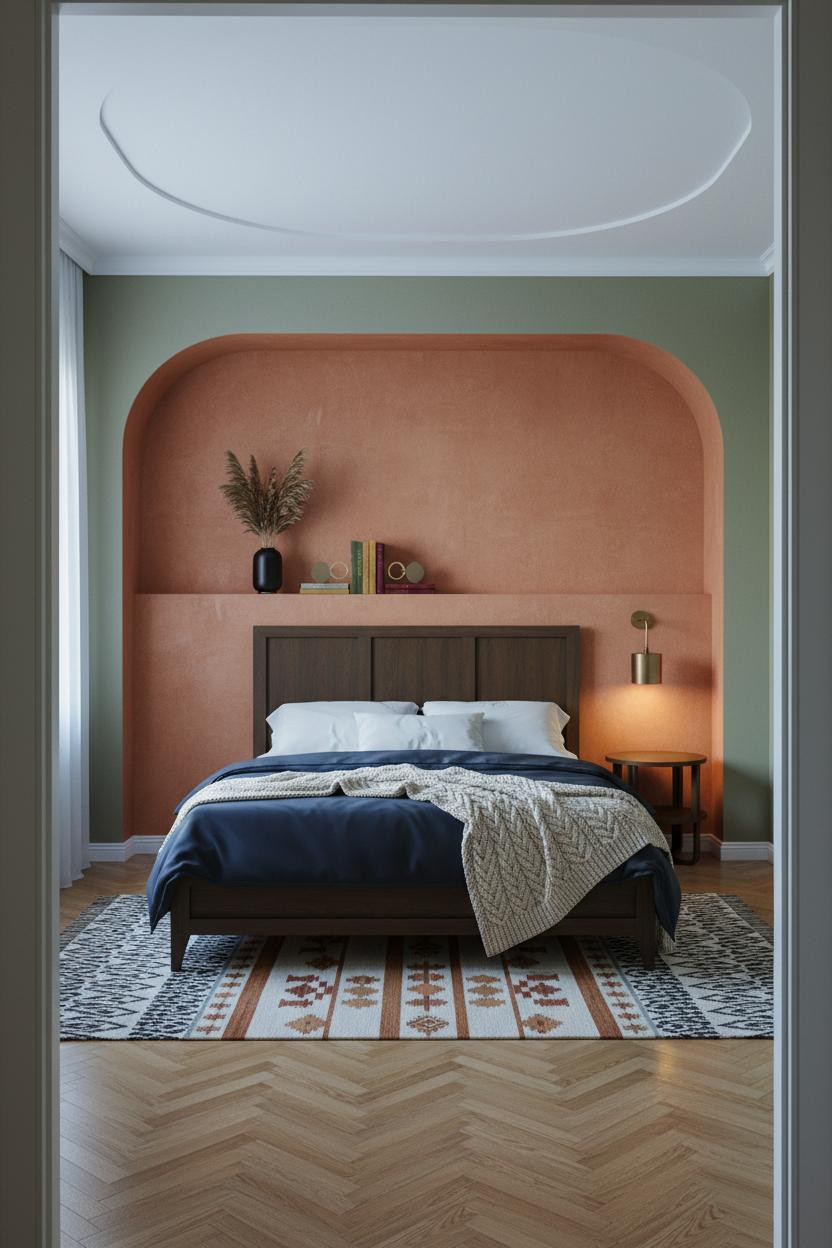
I almost scrolled past this. Glad I didn't.
The arched niche in warm terracotta plaster frames the whole bed like a stage, and the dusty olive flanking walls keep it from tipping into Mediterranean kitsch. The curved geometry casts a soft shadow arc that changes all day.
The detail to keep: Navy sateen duvet against terracotta is a color pairing that feels genuinely period-authentic for a 1960s bedroom. Don't swap it for white.
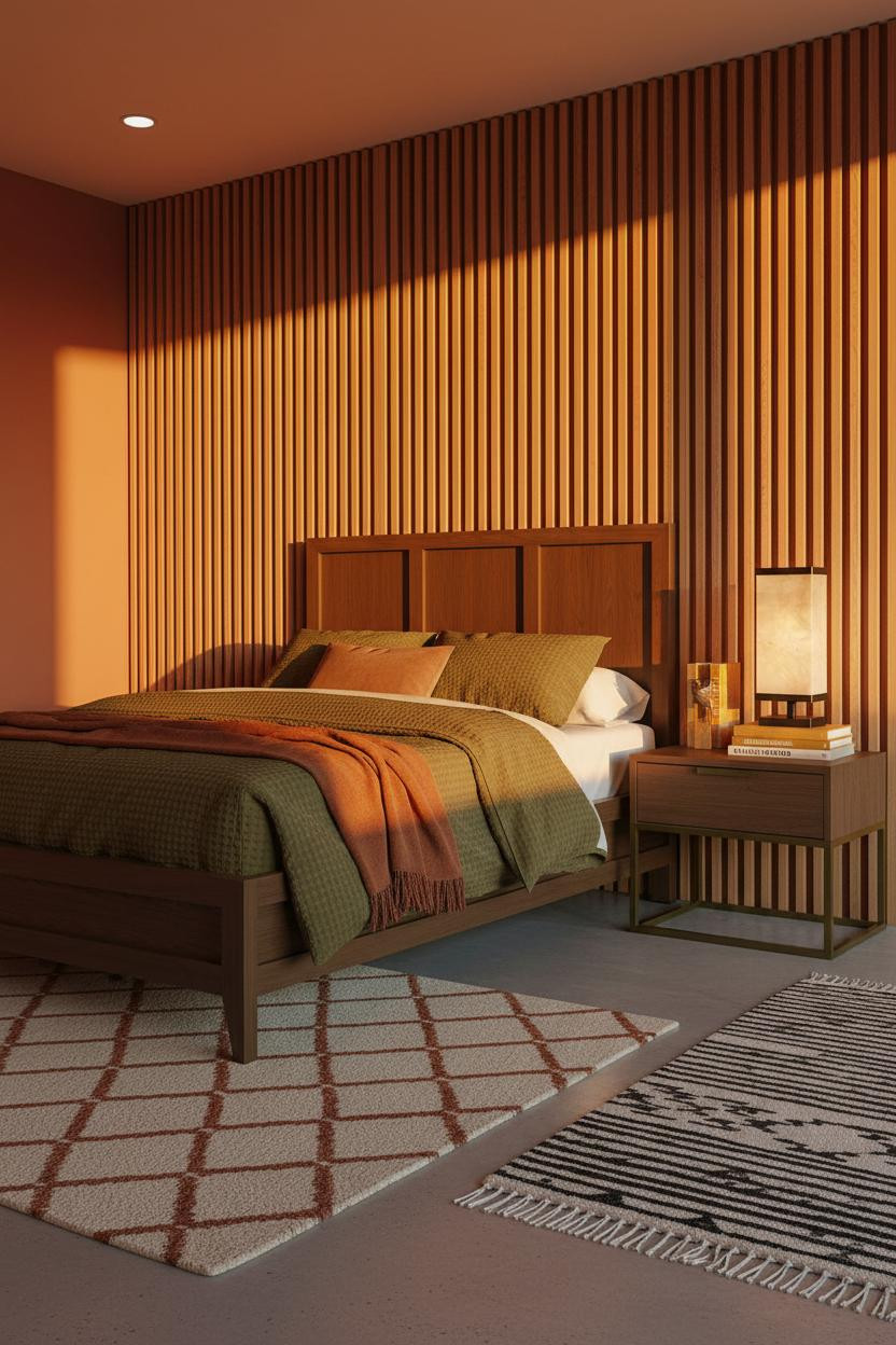
Burnt Sienna Walls With Teak Slats: Warm All the Way Down
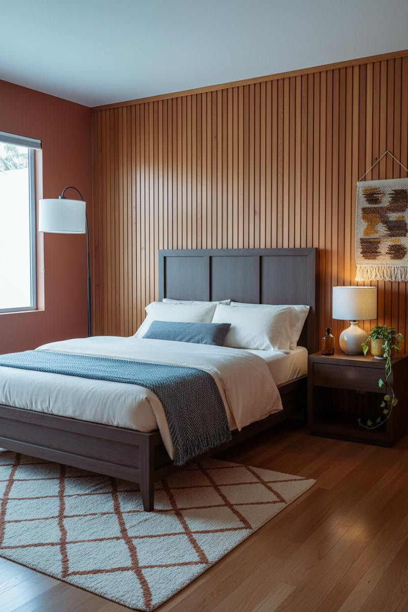
This room feels warm without being heavy. Burnt sienna is a risk on a flanking wall, but it pays off when the primary surface behind the bed is natural wood grain.
The real strength: Teak vertical slat paneling against a sienna wall creates a tonal relationship that keeps the palette unified while the shadow gaps between slats add just enough contrast.
One smart swap: A woven wall hanging in ochre and brown above the nightstand replaces art without feeling like a craft project. Especially when paired with a ceramic mustard-glazed planter.
Sage Green and Oak Shelving: the Japandi-MCM Crossover That Works
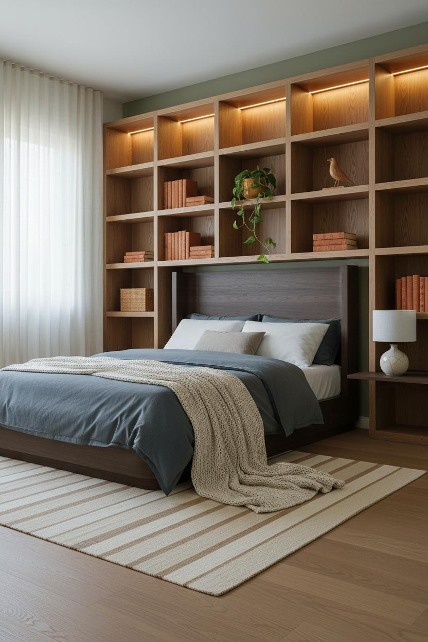
The room feels calm and cohesive in a way that takes real restraint to pull off.
Why it feels intentional: A soft sage green accent wall behind the bed gives the bleached oak shelving unit something cool to lean against, which stops the natural grain from reading too country. The cove lighting warming the shelves does the rest.
What to copy first: A flat-weave striped wool rug in cream and camel under a bleached oak floor. It's a quiet nod to the era. This kind of restraint is what separates the saves from the scrolls.
Horizontal Walnut Slats and Cognac Walls: the Late-Afternoon Version
Bold choice. Cognac walls flanking a horizontal walnut slat feature wall is a lot of warmth in one room. It works because the palette never contradicts itself.
The tightly spaced horizontal walnut veneer slats make the wall feel architectural rather than decorative, which is the only reason the cognac walls don't tip the room into amber overload.
Where to start: An oversized abstract canvas in mustard and rust leaning against the far wall adds scale without drilling holes. The most convincing retro rooms always have something that looks like it was already there.

Our #1 Pick
Saatva Classic Mattress
America's best-selling online luxury innerspring. 365-night trial, lifetime warranty, free white glove delivery.
Shop Saatva Classic
Why Luxury Bedrooms Always Feel Better
Walls get repainted. Rugs get swapped. But the mattress stays, and you feel it every single morning. The rooms in this list look intentional because nothing in them was accidental. That standard should extend to the bed itself.
The Saatva Classic holds up to that logic. Dual-coil support that doesn't compress over time, a breathable organic cotton cover that keeps the surface from trapping heat, and a Euro pillow top that still feels right years in. Not soft in a way that bottoms out. Actually soft.
It pairs with every room on this list for the same reason good design always pairs well: it's made well.

Good design ages well because it's made well. Start with the bed. The rest figures itself out.