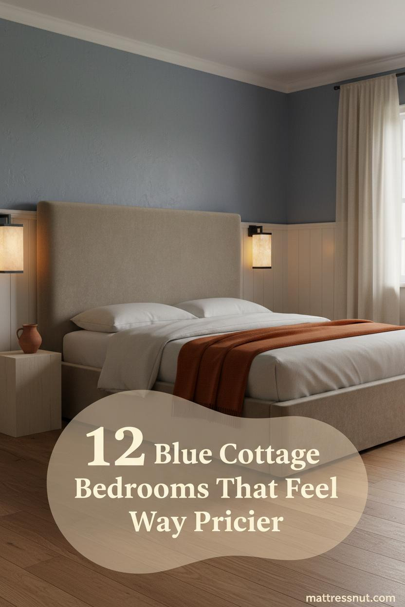
The first thing you notice in a great blue cottage bedroom is that nothing feels forced. The blue just sits there, calm and unhurried, and somehow the whole room exhales.
These twelve rooms do that. Each one earns its warmth through texture, light, and materials that age well together.
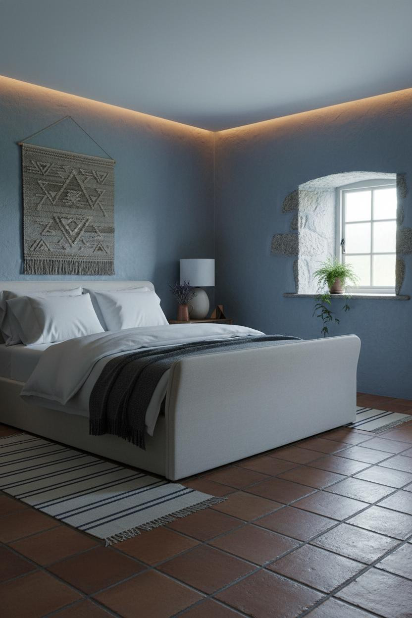
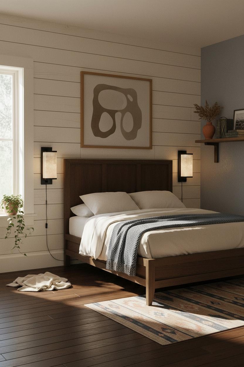
The Farmhouse Detail That Makes Blue Feel Warm
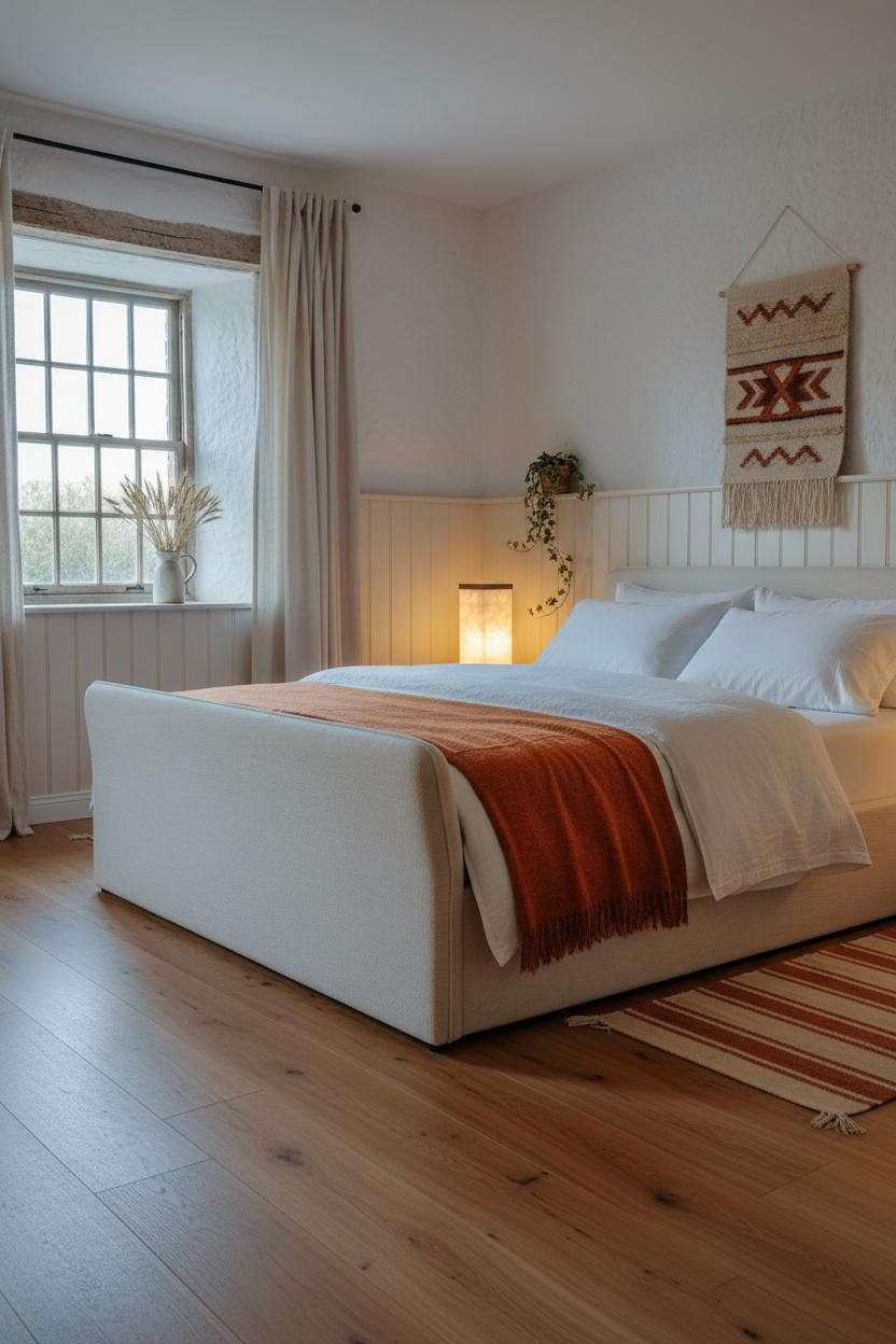


I keep coming back to this one. The proportions feel so settled.
What makes it work is the hand-troweled plaster wall catching the dusk light at an angle, making the blue-grey read warmer than it would under flat overhead light. That texture does the heavy lifting.
Steal this move: Layer a burnt orange throw over ivory bedding against cool walls. The contrast is immediate, and it keeps the room from feeling too cold.
A Stone Fireplace Changes Everything About Blue
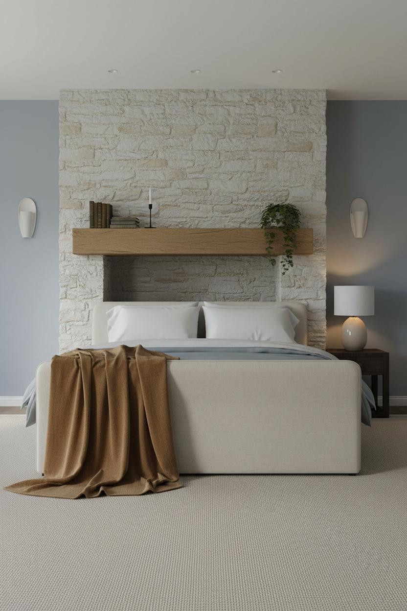
The limestone fireplace does something to powder blue walls that paint alone can't pull off.
Why it feels grounded: Rough pale limestone blocks introduce so much texture that the soft matte walls read as refined rather than flat. The contrast between the two surfaces is the whole trick.
The detail to keep: Let the bedside lamp anchor one corner in warm amber. The room feels lived-in and intimate because of that single pool of light.
What a Deep Stone Window Does for Slate Blue
This is a cottage bedroom that earns its restful quality without trying very hard.
Why it holds together: The arched granite window recess creates dramatic depth that makes the slate blue walls feel intentional rather than default. Raw plaster does the rest.
Worth copying: Pair terracotta floor tiles with slate blue walls. The warmth comes from below and keeps the cool palette from feeling too remote.
Indigo Walls and a Built-In Shelf That Earns Its Place
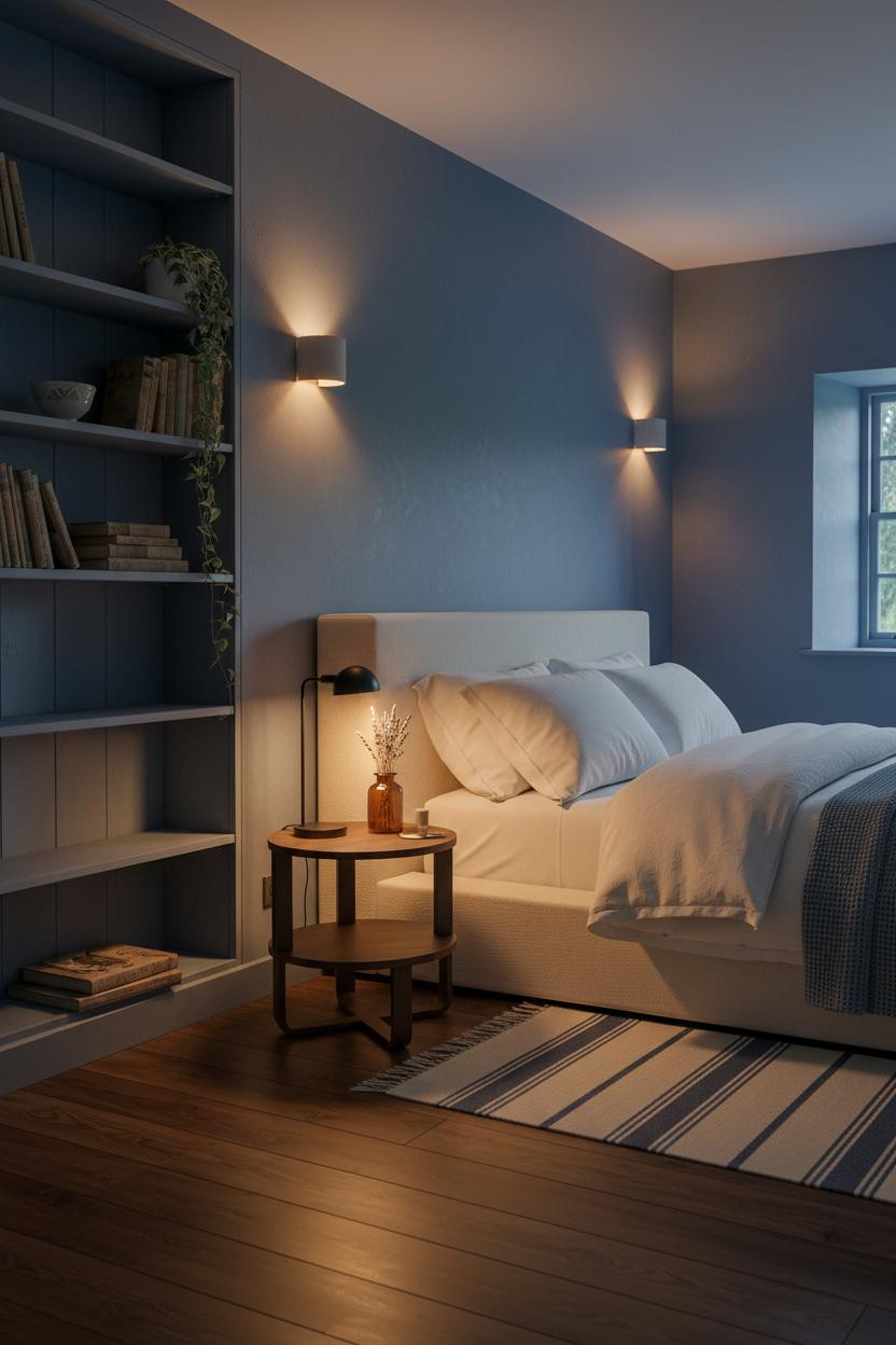


Bold choice. Indigo walls in a small room shouldn't work.
But the floor-to-ceiling built-in shelf saves it, because a faded slate painted pine structure draws the eye vertically and makes the room feel taller than it is.
The smarter choice: Paint the shelving to match the walls, just a shade lighter. It reads as architecture rather than furniture, which keeps the room feeling collected rather than cluttered.
Avoid this mistake: Don't overfill the shelves. Worn spines, one ceramic bowl, a trailing ivy. That's enough.
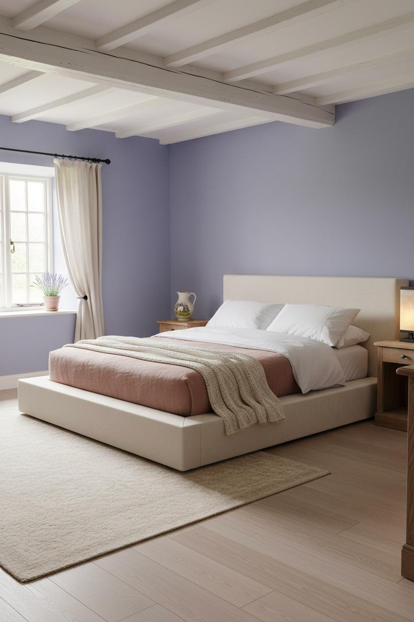
I'd Paint My Walls Periwinkle Just for the Morning Light
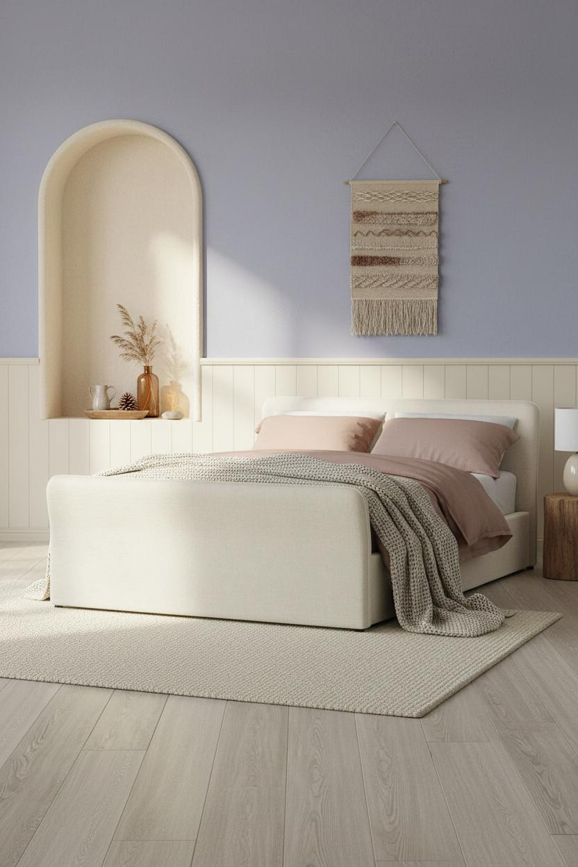
Periwinkle and morning light is honestly one of the better combinations in cottage decorating.
What carries the look: The arched alcove niche built into the plaster wall gives the periwinkle a reason to exist. It creates shadow and depth that flat walls can't replicate, in a way that feels architectural rather than decorative.
Pair cream tongue-and-groove wainscoting below with periwinkle above, and the room feels balanced without needing much else. Two tones. One decision.
The Stone Chimney Breast That Earns Every Inch
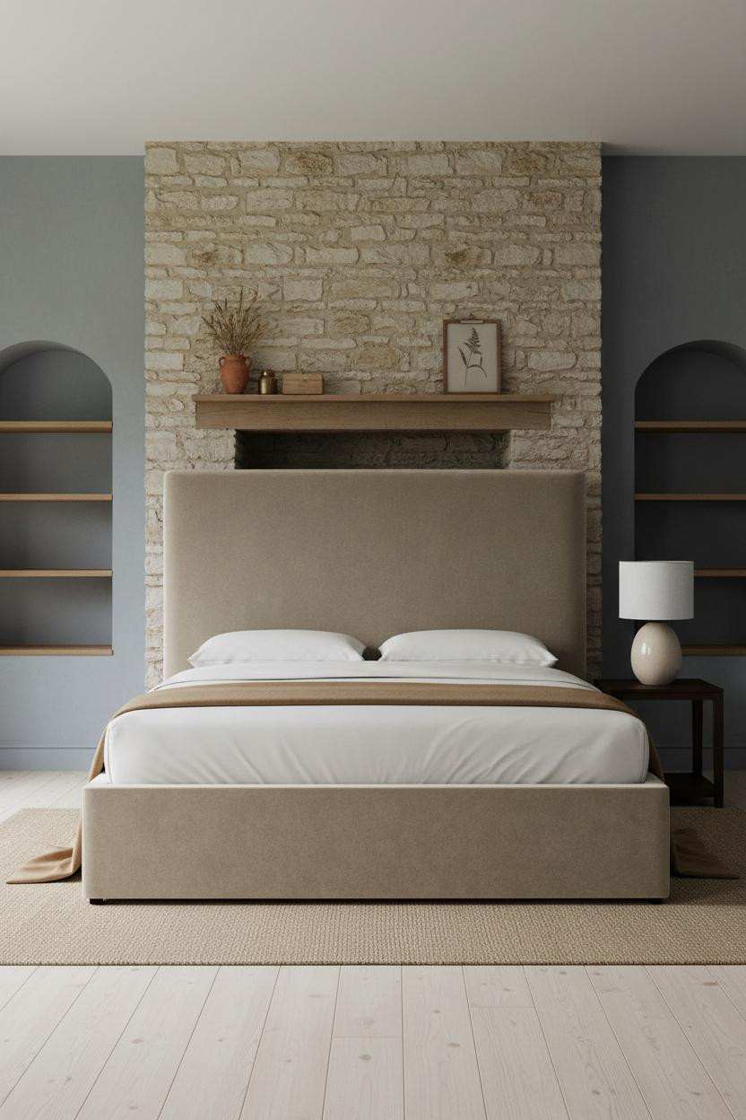

Nothing about this room is trying to impress you. That's why it does.
In a room like this, the easy win is the reclaimed oak mantle shelf spanning the chimney breast. It introduces warmth at eye level, right where you need it against cool stone blue plaster.
Pro move: Style the mantle loosely. A terracotta vessel, a single botanical print leaning casually against stone. Nothing too precious or symmetrical.
Board-and-Batten Gives Cobalt Blue a Quiet Partner
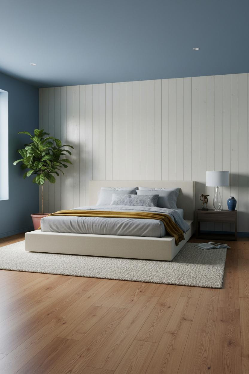

Muted cobalt is divisive. But pair it with the right wall treatment and it clicks immediately.
Why it looks custom: Floor-to-ceiling board-and-batten in aged cream on the feature wall creates vertical rhythm that grounds the cobalt on the side walls, while still feeling airy rather than heavy.
One smart swap: Bring in a mustard wool blanket at the foot. It pulls the warmth forward so the blue reads as backdrop rather than the main event.
French Wainscoting Makes Blue Feel Like It Belongs There
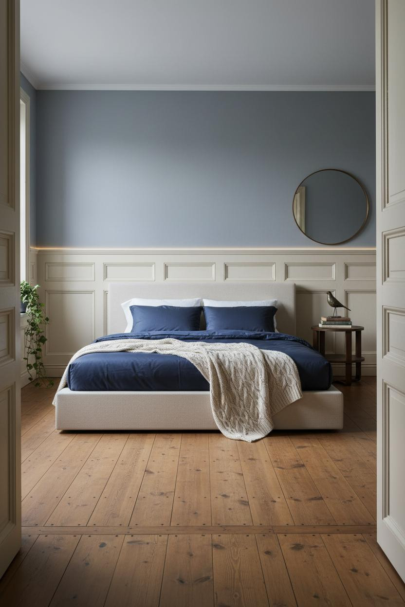
This is the kind of cottagecore bedroom that feels considered without being precious. I find this combination genuinely hard to dislike.
Design logic: Painted timber wainscoting at mid-height grounds the French blue above it. The two-tone split makes the walls feel like a deliberate architectural choice rather than a single paint decision that got out of hand.
What to copy first: Bare reclaimed honey floorboards with no rug. The warmth of the wood against the cool walls does the balancing work that a rug would normally handle.
Faded Denim Blue With a Rug That Does the Talking
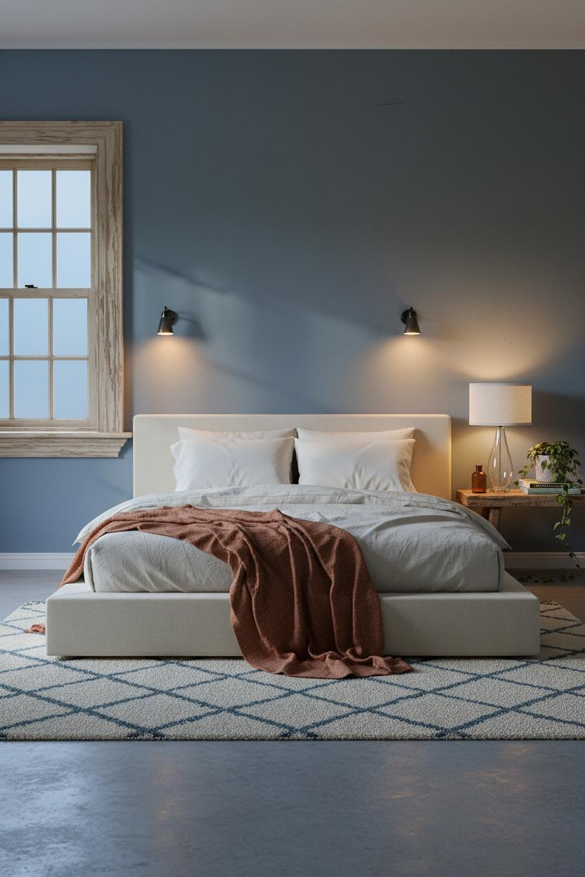
Admittedly, concrete floors in a cottage bedroom sound like a mistake. But this one proves otherwise.
The reason it feels warm instead of industrial is the Moroccan wool rug in cream and dusty blue anchoring the bed. It's a small move, but it completely changes the floor plane.
The key piece: Paired sconces flanking the bed create symmetry and push the denim blue walls into the background. The room feels calm and cohesive because the light is doing actual work.
Cornflower Blue and a Cottage Window Worth Keeping
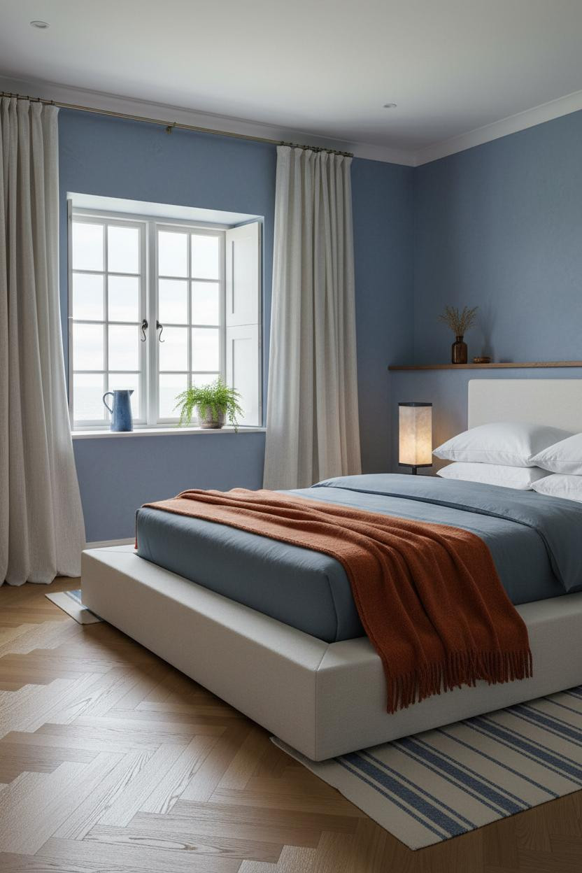
Cornflower blue is one of those wall colors that rewards a coastal bedroom treatment more than any other. Fair warning: once you see it against herringbone oak, it's hard to look at plain floors the same way.
What creates the mood: Herringbone parquet flooring in warm honey oak pulls enough yellow into the room to stop cornflower blue from tipping cold. The pattern alone adds visual energy at floor level.
The finishing layer: Floor-to-ceiling aged ivory linen curtains frame the cottage window and soften the whole room while still letting the wall color lead.
Shiplap and Slate Blue: The Farmhouse Move That Actually Works

This one is more opinionated than it looks. And I think that's exactly the point.
Why the materials matter: Horizontal shiplap paneling in aged cream catches afternoon light along every board edge, creating a surface with real tactile depth against slate blue plaster. The two textures need each other.
A faded kilim runner in terracotta and navy ties the whole floor together. Just enough pattern to keep things interesting, nothing too matchy. Where to start: Get the wall treatment right first. Everything else follows.
Whitewashed Beams Make Periwinkle Feel Like a Country House
Honestly, I'd live in this room without changing a single thing.
What gives it presence: Whitewashed ceiling beams with visible age patina introduce horizontal lines overhead that ground the periwinkle walls and make the whole room feel anchored from above, in a way that feels genuinely old rather than styled.
The easy win: A dusty rose linen coverlet is the exact right temperature against periwinkle. Not pink enough to compete. Just enough warmth to pull the palette together. See more ideas like this in our dark cottagecore bedroom guide for a different take on the same layered instinct.

Our #1 Pick
Saatva Classic Mattress
America's best-selling online luxury innerspring. 365-night trial, lifetime warranty, free white glove delivery.
Shop Saatva Classic
The Foundation Of Every Beautiful Bedroom
Walls get repainted. Linen gets swapped. But the mattress stays, and it's the one thing every blue cottage bedroom above has in common: none of the styling means much if the bed doesn't actually deliver rest.
The Saatva Classic is worth knowing about here. Dual-coil support holds up over years of real use, the breathable organic cotton cover keeps things comfortable through the night, and the Euro pillow top has the kind of give that still feels right long after the novelty wears off. No business-hotel firmness. No sinking either.
Good design ages well because it's made well. Start with the bed.

And if you want to keep building the rest of the room, our guide to the best flannel sheets is a good next stop for adding the kind of warmth that actually holds up through winter. The rooms people save are the ones where nothing looks accidental.