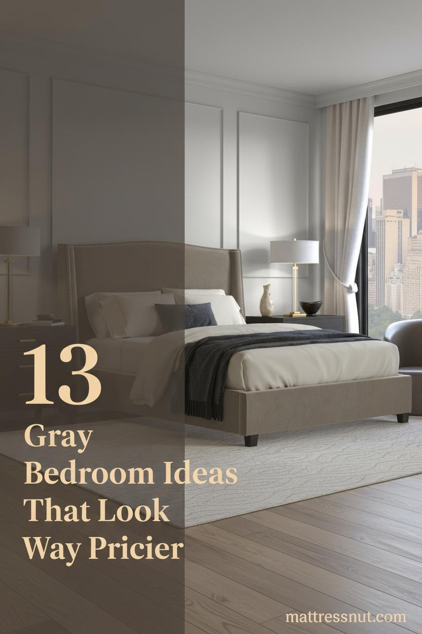
The first thing I notice in a good gray bed frame bedroom is what surrounds it. Gray doesn't do the heavy lifting alone.
It's the wall texture behind it, the bedding layered on top, the floor underneath. Get those right and the room feels calm instead of cold.
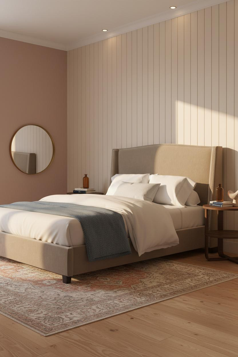
The Herringbone Wall That Makes Gray Feel Warm
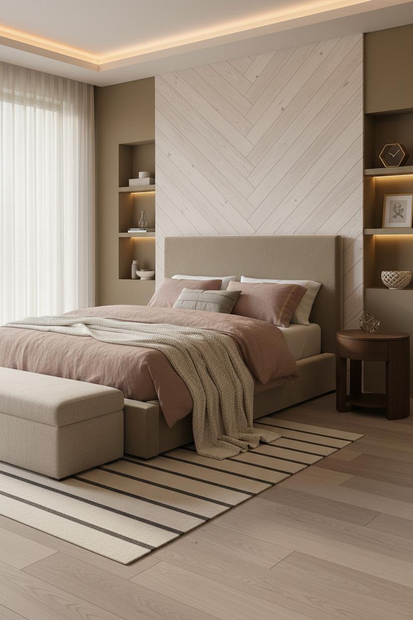


I keep coming back to this one. A gray frame next to a whitewashed herringbone wood wall is the warmth equation I didn't know I needed.
Why it works: The diagonal grain of pale timber herringbone pulls enough warmth into the room that the gray reads grounded instead of cool.
The easy win: Pair a chunky-knit ivory throw with dusty pink linen bedding. It softens the whole composition without fighting the wall.
Wainscoting Gives the Headboard Wall a Reason to Exist
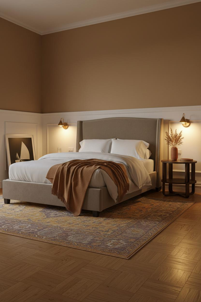


This is the kind of room that makes you want to stay in on a Sunday.
Design logic: The dove-white wainscoting rail creates a crisp horizontal line that anchors the headboard zone, so the gray frame reads intentional rather than floating.
What to borrow: Warm camel walls above the panel and an overdyed Persian rug underneath keep the room from tipping into stark territory. A caramel wool throw at the foot ties it together.
When a Coffered Ceiling Does the Heavy Lifting
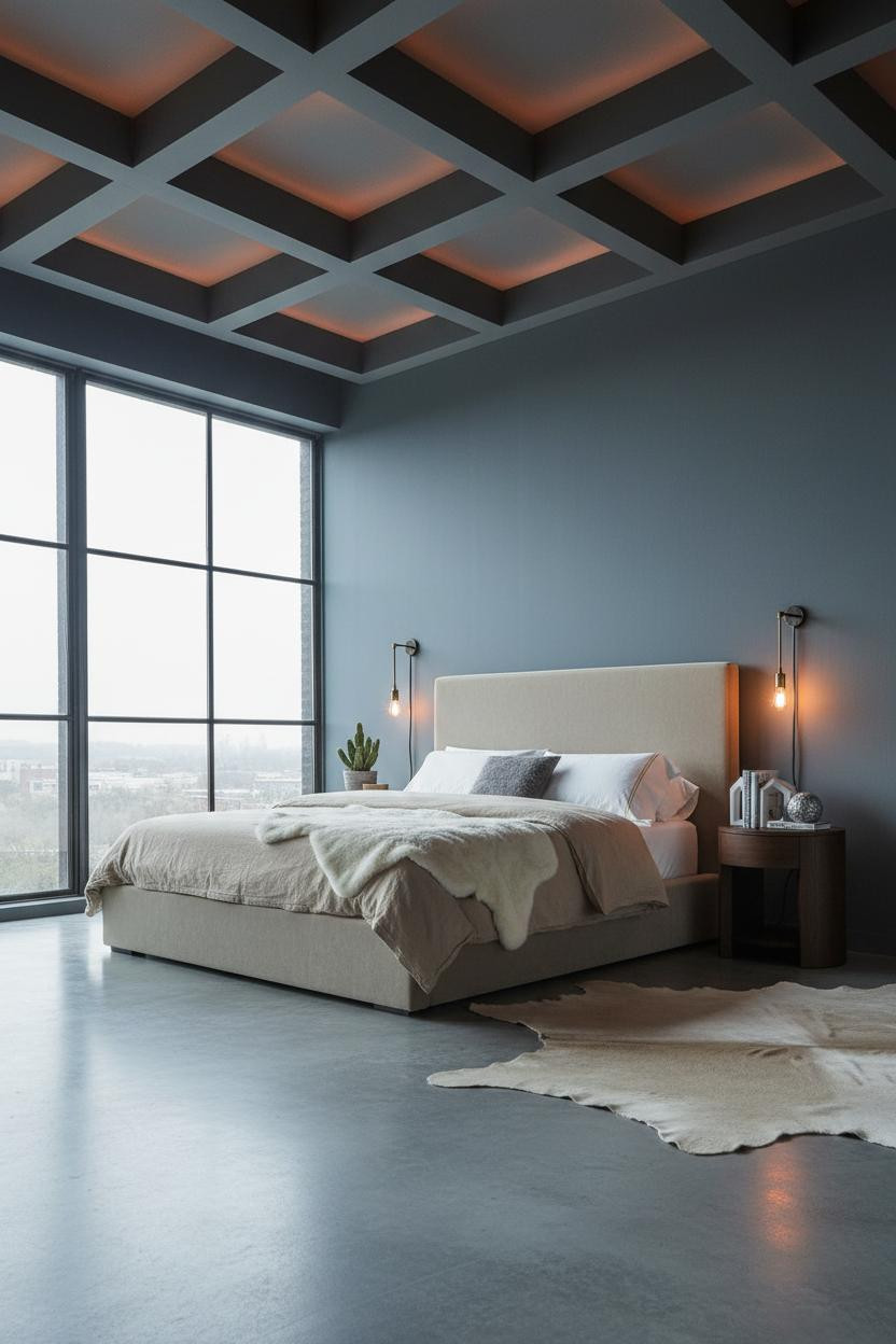
Divisive. Not for everyone. But the people who commit to this kind of overhead detail never go back to flat ceilings.
A matte charcoal coffered ceiling grid brings geometric rhythm that makes slate blue walls feel considered rather than cold.
Avoid this mistake: Don't lean warm with the bedding to compensate. Oatmeal cotton and a faux-fur throw at the foot are exactly right here. Cool neutrals let the structure breathe.
Steel-Framed Windows and an Indigo Wall That Shouldn't Work
Honestly, I almost dismissed this one. But the warm indigo matte wall next to a gray frame is actually a better pairing than any greige I've tried.
Why it lands: The Crittall-style steel window grid gives the deep wall color structure, so the whole room feels moody and sharp in a way that feels deliberate.
A burnt orange mohair throw at the foot is the detail that keeps the room from reading too masculine. One warm accent, everything else cool.
Floating Oak Shelves Above the Bed Are Doing a Lot
Three tiers of whitewashed oak floating shelves above the bed stop the wall from being just wall. And on muted blue-grey, the contrast is immediate.
Why it feels intentional: Horizontal shelf lines carry the eye across instead of up, which helps balance a narrow room in a way that feels natural.
Steal this move: Style the shelves with one dried stem, a geometric clay object, and paperbacks with spines facing out. Nothing too precious or matchy.
An Arched Plaster Niche That Makes the Whole Wall Architectural
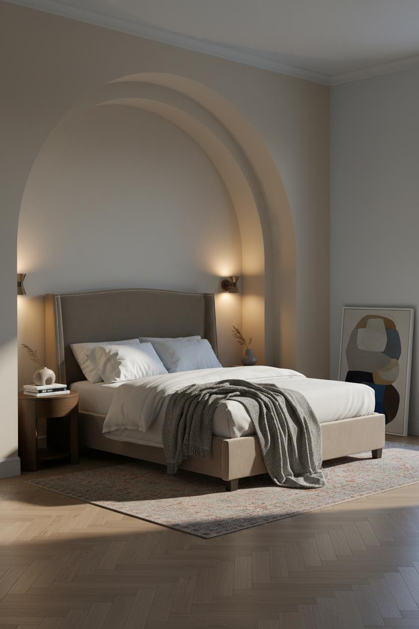
A floor-to-ceiling arched niche is the kind of detail that makes a bedroom feel like it was designed rather than decorated. The room feels collected and intimate because of it.
The smooth ivory plaster interior inside the arch catches raking morning light in a way that flat paint never could. Warm greige flanking walls keep it from feeling too formal.
Pro move: Lean an oversized abstract canvas inside the niche rather than hanging it. The asymmetry is the point. Neutral bedding in white linen with a grey wool throw lets the architecture carry the room.
Textured Plaster Plus Forest Green Is a Bolder Bet Than It Sounds
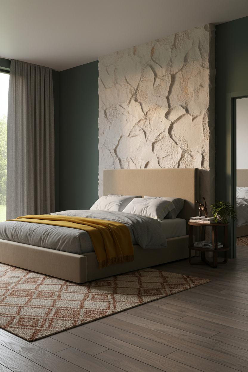
It might seem risky to go deep forest green beside a gray frame, but this is honestly the most grounded version of farmhouse I've seen.
Why it holds together: A hand-applied plaster accent wall behind the bed gives the gray somewhere warm to land, and the tactile surface catches lamplight in a way that makes every hour of the evening look different.
The finishing layer: Stone-washed grey bedding with a mustard wool blanket at the foot. The yellow reads earthy here, not bright, because the plaster absorbs it.
Cream Shiplap and Dusty Rose Is Not a Combination I Expected to Love
Admittedly, I thought the dusty rose walls would clash. But next to matte cream vertical shiplap and a gray frame, they somehow read as neutral.
What makes it work: Horizontal plank edges on the shiplap catch raking morning light and create rhythmic shadow lines, so the wall has movement while still feeling calm.
A round statement mirror leaning against the left wall keeps the room from feeling too precious. Cream percale bedding and a steel-blue herringbone throw at the foot are exactly right here. The gray frame pulls it all forward.
Charcoal Slats and Sage Green: The Japandi Formula That Actually Works
This one is deceptively simple. The room feels sheltered in a way most moody bedrooms miss.
What creates the mood: Full-width matte charcoal vertical slats backlit at a warm amber temperature pull the wall forward, so sage green flanking walls recede naturally and the gray frame lands right in the middle.
Where to start: Get the slatted panel in first. Then choose your wall color. Doing it in reverse usually means the slats look too dark or too light for whatever you already painted.
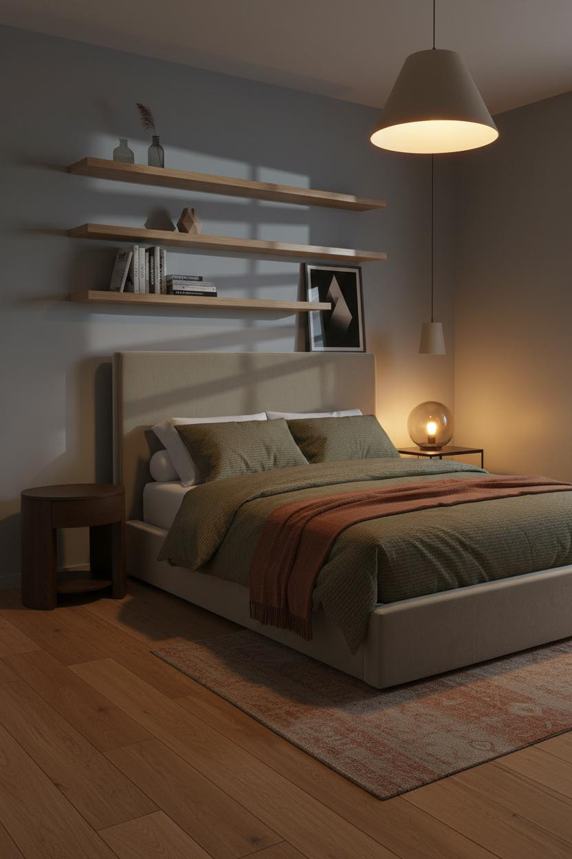
Built-In Birch Shelving Makes a Scandi Room Feel Considered
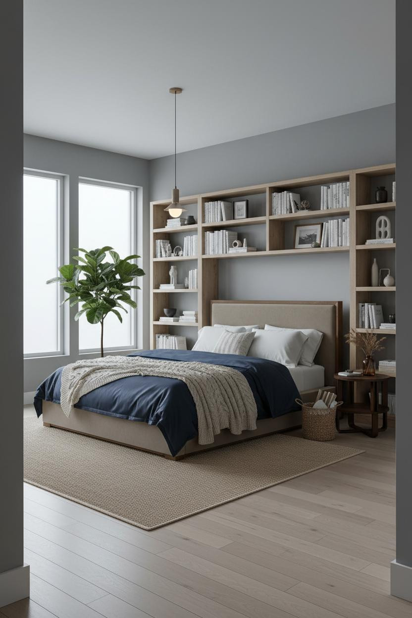

Nothing fancy. That's actually the whole trick with this one.
The real strength: A full-width built-in shelving wall in pale birch frames the bed with graphic horizontal rhythm. The warm grain against stone grey walls keeps the room from tipping into cold Scandi cliché.
What not to do: Don't overstyling the shelves. A potted fiddle-leaf fig in the corner, a cable-knit throw draped casually, and a navy sateen duvet. The restraint is what reads as considered.
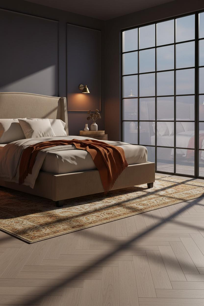
Exposed Brick Behind a Gray Frame Is Rawer Than It Looks on the Feed
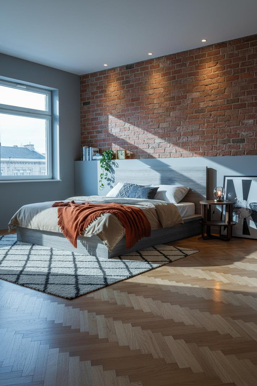

Fair warning. Terracotta-tinged exposed brick behind a gray frame is a lot of texture in one composition. But the gray actually cools the brick just enough to keep things from reading too rustic.
The reason it feels coastal instead of industrial is the warm honey herringbone floor and the oatmeal cotton duvet, which soften what could otherwise be a harsh pairing. A burnt orange mohair throw at the foot is the detail that earns it.
Board-and-Batten in Mushroom Grey Is Quieter Than You Think
This is the one I'd actually do in my own room. Calm, grounded, nothing fighting for attention.
Why it feels expensive: Mushroom grey board-and-batten running floor to ceiling matches the wall color exactly, so the vertical rhythm reads as texture rather than contrast, giving the gray frame a polished backdrop.
The smarter choice: Pair it with an ivory cotton duvet and a charcoal cashmere throw rather than introducing a third color. The tonal restraint is what makes the room feel like a designer made the call.
Woven Linen Curtains and a Taupe Wall Are the Easiest Japandi Move

Floor-to-ceiling cream linen curtains beside a gray frame are doing more work than any wall treatment here. The vertical fabric folds catch diffused daylight and pull the eye upward, which makes a standard ceiling feel taller.
What gives it presence: Soft taupe matte walls and bleached oak wide-plank flooring keep the palette from reading flat, while an oversized woven wall hanging above the bed adds just enough texture to feel lived-in. A slate jersey duvet with a camel wool throw at the foot finishes it quietly.

Our #1 Pick
Saatva Classic Mattress
America's best-selling online luxury innerspring. 365-night trial, lifetime warranty, free white glove delivery.
Shop Saatva Classic
Why Luxury Bedrooms Always Feel Better
All thirteen of these rooms share one thing. The bed is right. Not just styled well on top, but genuinely comfortable underneath. And that starts before the bedding.
The Saatva Classic is what I'd put under every one of these looks. Dual-coil support that holds its shape, breathable organic cotton that doesn't trap heat, and a Euro pillow top that feels genuinely soft without losing structure. It's the kind of mattress that makes the whole room make sense.
Walls get repainted. Linen gets swapped out. The mattress stays. Start with the bed. The rest figures itself out.

Gray frames work in almost any room because gray is really just a neutral waiting for the right company. These thirteen rooms prove that the company matters more than the color. Get the textures, the wall treatment, and the bedding right, and the frame disappears into the design exactly the way it should.
Good design ages well because it's made well.