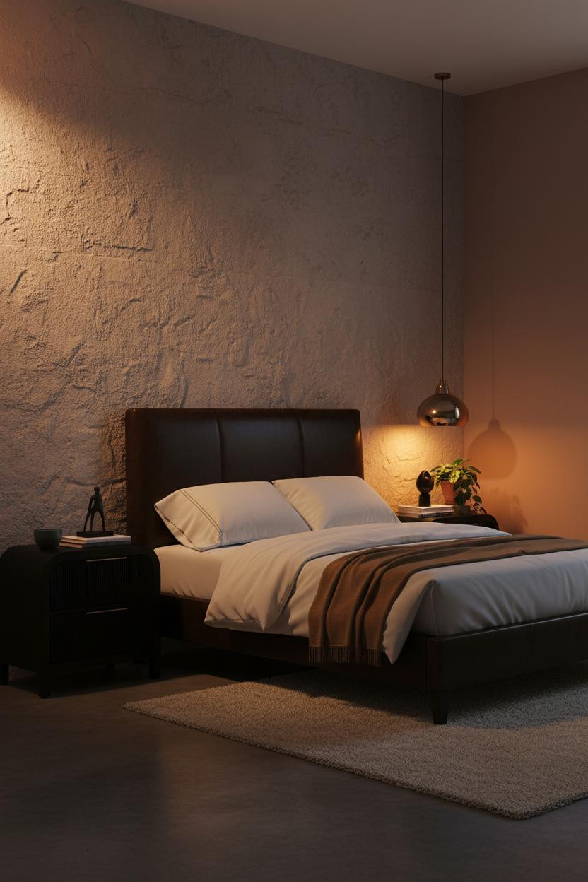
The first thing you notice in the best bedroom ideas black bed frame rooms isn't the frame itself. It's how warm the whole thing feels.
That's the hard part. Black draws the eye, but the wrong palette around it makes the room go cold fast. These 14 setups solve exactly that.
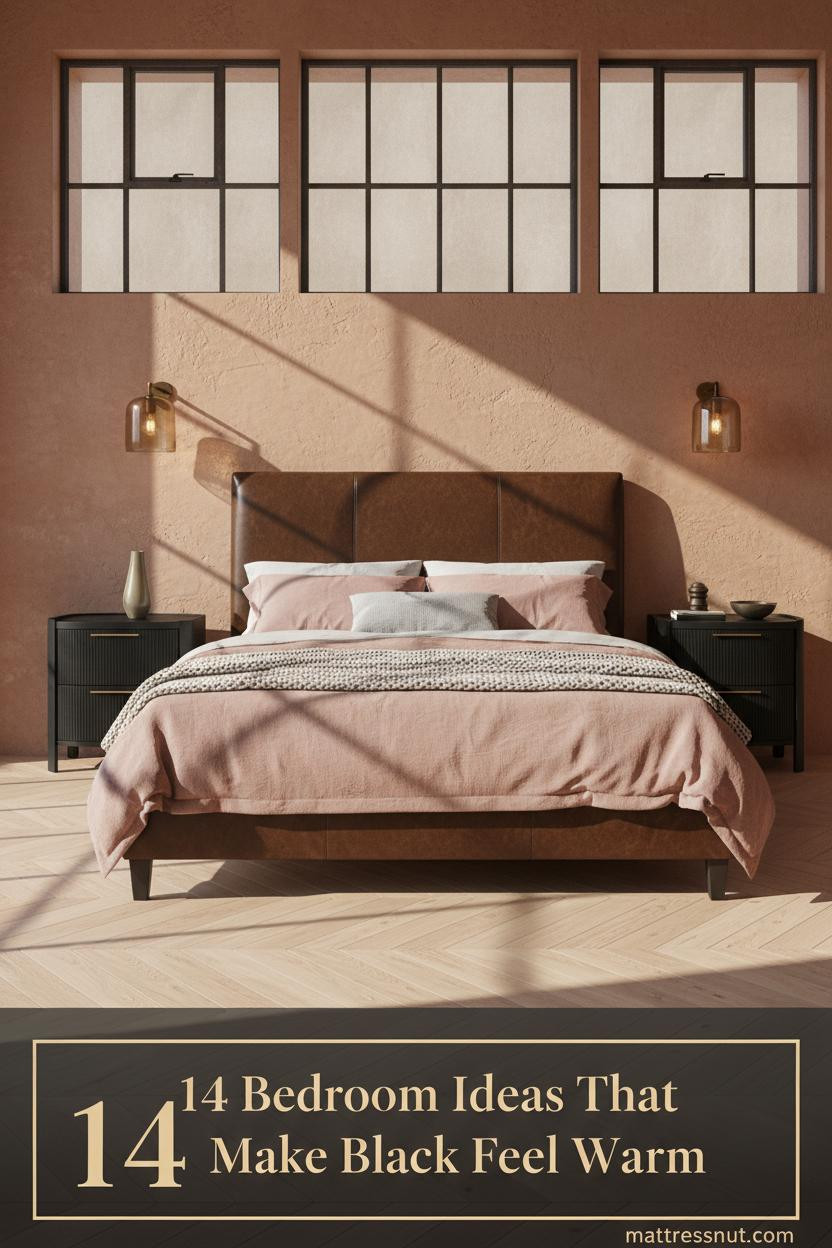
Steel Windows Make a Black Frame Feel Like Architecture


I keep coming back to this one. The Crittall-style steel window wall repeats the frame's geometry across the whole room, so the black feels like a design decision rather than a color choice.
Why it holds together: Rust-toned clay walls and a warm maple floor give the metal something to lean against, which keeps the room from reading like a loft showroom.
The finishing layer: Dusty pink linen bedding and a chunky-knit throw at the foot pull enough warmth in to make the steel feel intentional rather than cold.
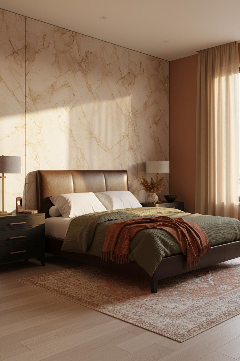
Travertine Behind the Bed Changes the Whole Equation
This is a bold move. Worth it.
Raw-edged travertine tiles read so warm in afternoon light that the dark frame almost disappears into contrast rather than competing with the stone.
What makes this work: The cream and sand veining in the travertine echoes the bleached maple floor, so the palette stays cohesive while the wall does all the heavy lifting.
Steal this move: Pair a floor-to-ceiling sand linen curtain on one side. It softens the mineral edge just enough.
A Herringbone Wood Wall Keeps It From Going Too Dark
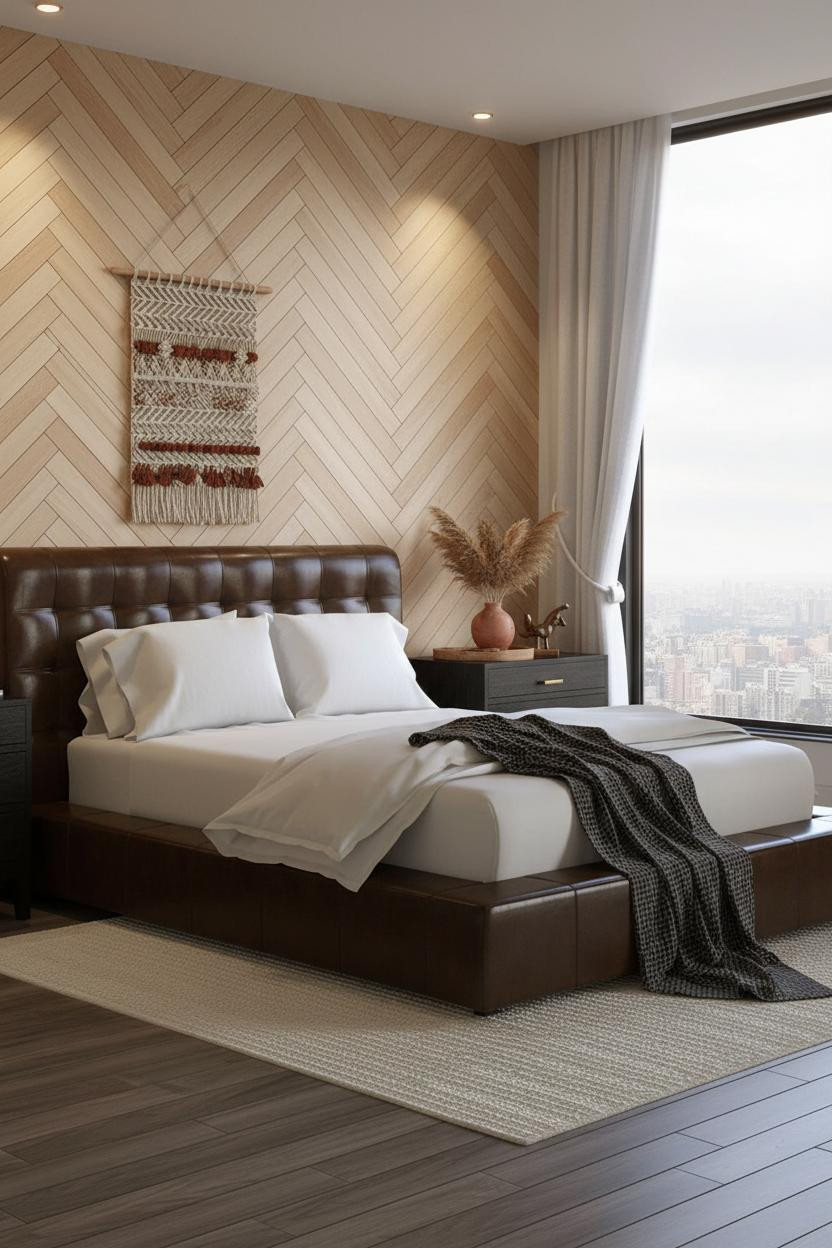

This is the setup for people who love a dark frame but worry the room will feel heavy. The ivory and wheat herringbone planks behind the bed push so much light back into the room that it never tips that way.
Why it feels balanced: Chevron pattern creates movement, which a solid painted wall can't. The graphic rhythm gives the black frame something interesting to sit against, while still feeling warm.
Keep the bedding light (ivory cotton, nothing too matchy) and let a single woven wall hanging above the headboard do the decorating.
Exposed Brick Was Made for a Dark Bed Frame
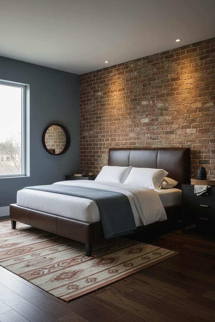
Honestly, this combination shouldn't need explaining. But it always surprises people how well a black frame lands against raw amber brick instead of fighting it.
Design logic: The mortar joints and rough texture of the brick face give the eye something to do, so the frame reads as a clean anchor rather than a heavy object dominating the wall.
The smarter choice: Muted blue-grey walls on the flanking sides, not white. White makes brick look like a costume. Grey makes it look like it was always there.
A Gallery Wall Gives the Frame a Graphic Partner
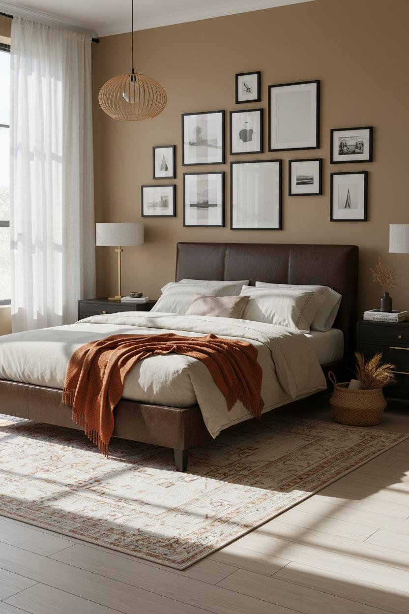
The room feels collected rather than decorated. And that's harder to pull off than it looks.
What creates the mood: Thin matte black frames in varying sizes climb the wall in a tight Japandi grid, which echoes the bed's geometry without copying it. The warm camel walls stop it from feeling like a magazine shoot.
Pro move: Add a sculptural rattan pendant off-center above the bed. It's the one organic note that keeps the geometry from going stiff.
Paneled Molding Walls Are the Quiet Overachiever
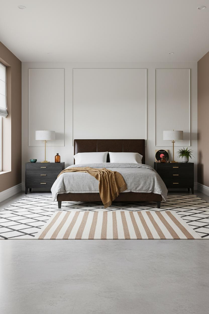
Nothing fancy. That's the point. A full-height paneled molding wall in a single matte mushroom tone gives a black frame architectural context without any of the drama of stone or brick.
Why it looks custom: The layered rectangular frames cast subtle shadows in diffused light, so the wall has depth while the color family stays calm. The room feels polished but still relaxed.
In a concrete-floored room, the smarter choice is a warm-toned striped rug rather than a geometric one. It softens the floor without breaking the palette.
Olive Wainscoting Is the Earthy Contrast Nobody Expects
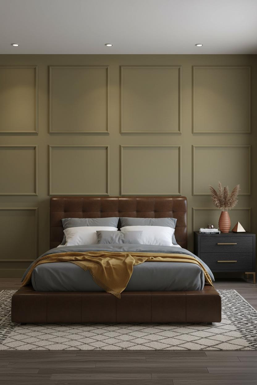
I almost passed on this one because half-height wainscoting can look dated fast. But matte warm olive changes that entirely.
The real strength: The panel grid at wainscoting height grounds the room without the commitment of a full accent wall, and the earthy green pulls enough warmth toward the dark frame to keep the space from feeling sparse.
What not to do: Don't go high-gloss on the paint. Matte only. Sheen on olive reads institutional, not intentional.
A Coffered Ceiling Does What No Wall Treatment Can
This is the setup for people who want moody without going all-in on dark walls. The slate blue-grey plaster keeps the room from feeling too finished, while the coffered ceiling adds structure from above.
Why it feels intentional: The grid of plaster recesses overhead creates rhythm that draws the eye upward, making the matte black metal frame feel like part of a considered architectural scheme rather than just furniture.
Avoid this mistake: Don't skip the warm bedside lamp. One amber pool from a single nightstand light is what keeps a moody transitional bedroom from feeling like a hotel lobby.
Shiplap Is the Coastal Answer to a Dark Frame

The reason this feels coastal instead of farmhouse is the palette, not the shiplap. Warm greige walls and a silvery reclaimed plank floor push it toward the water rather than the barn.
What carries the look: Horizontal shiplap planks each cast a thin pencil shadow, and that linear texture makes the matte black metal frame read as a bold graphic centerpiece rather than something heavy.
Navy sateen bedding with a cable-knit cream throw. Nothing too coordinated. Just enough contrast to keep things interesting.
Pale Ash Slats Are the Scandi Move That Actually Works Here
Full-height vertical slatted ash planks shift between warm and cool as light rakes across them through the day. That movement is what keeps a black frame from making the room feel static.
Why it feels expensive: The slat shadow lines multiply the room's sense of scale, especially in a narrower space. And honey-toned side walls stop the pale wood from reading too cold or too Scandinavian-minimal.
Worth copying: Dusty pink linen bedding against ash and black is a combination I'd use again without hesitating. The warmth it adds is immediate.
Raw Plaster Makes an Industrial Frame Feel Like Home
Fair warning: this only works if you commit to the texture. A smooth painted wall behind this frame would look unfinished. But trowel-marked raw plaster catches lamp light in a way that makes the whole room feel alive.
What gives it presence: The organic surface of the plaster sits in direct contrast to the hard geometry of the dark metal, and that tension is exactly what makes the combination feel considered rather than accidental.
The key piece: A chunky cream wool rug on the concrete floor. It's the one softness the room needs, and it prevents the whole setup from leaning too cold.
Forest Green Board-and-Batten Is the Bravest Call on This List

Deep forest green and black are technically the same value family, which means they don't fight. They settle. And vertical board-and-batten planks add enough rhythm that the wall earns the commitment.
Why the palette works: The hairline shadow between each batten strip creates low-contrast texture that makes the dark frame read as a natural extension of the wall rather than an object placed against it.
The easy win: A cream chunky-knit throw and a fiddle-leaf fig in the corner. Both earn their place here without any effort.
An Arched Niche Above the Bed Is an Architectural Shortcut
The curved plaster niche frames the headboard like a built-in alcove, which gives a stone grey matte wall enough architectural interest that the room doesn't need anything else behind the bed.
What sharpens the room: Herringbone parquet flooring in walnut brings warmth upward from the floor, counterbalancing the cool grey walls and keeping the whole palette from going flat. Sunset light catching the parquet grain does the rest.
One smart swap: Floor-to-ceiling dusty slate linen curtains instead of blinds. The length makes the ceiling feel taller, which is the real luxury here.
Charcoal Walls and Linen Curtains Are the Japandi Endgame
I was skeptical that charcoal walls behind a black frame would work. They do, somehow. The bleached oak floor and ivory linen curtains provide enough contrast that the frame reads clearly rather than disappearing into the wall.
What softens the room: Floor-to-ceiling ivory linen panels diffuse morning light into warm gradients, which takes the edge off the dark walls in a way that no amount of pale bedding could manage on its own. The room feels warm and unhurried even before the lights come on.
The part to get right: Pair sconces at a warm tone on either side of the bed. Cool overhead light against charcoal walls will flatten the whole effect.

Our #1 Pick
Saatva Classic Mattress
America's best-selling online luxury innerspring. 365-night trial, lifetime warranty, free white glove delivery.
Shop Saatva Classic
The Foundation Of Every Beautiful Bedroom
Every room on this list gets the walls right, the frame right, the bedding right. But the part that actually matters at 11pm is what's under the sheets.
The Saatva Classic is what I'd put in any of these rooms. Dual-coil support means the mattress holds its shape over years, not months. The Euro pillow top is soft without losing structure, and the breathable organic cotton cover keeps things comfortable regardless of how much linen you layer on top.
Walls get repainted. The mattress stays. Start with the bed. The rest figures itself out.

The rooms people save are the ones where nothing looks accidental. And nothing in a well-designed bedroom looks more deliberate than a dark frame paired with a surface that actually earns its place on the wall behind it. That's the whole formula. Pick your wall treatment, commit to it, and get the bed right.