The best English cottage bedroom ideas don't come from a mood board. They come from rooms that look like they've been slowly filled over decades, a botanical print here, a worn wool throw there, nothing too precious or matchy.
These 14 rooms nail that feeling. Collected, not decorated.
A Gallery Wall That Took Generations To Build
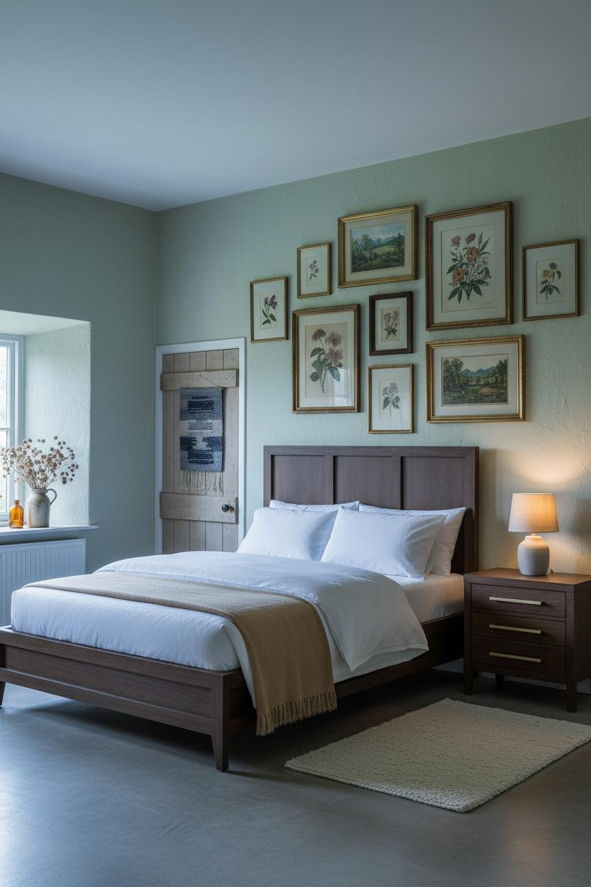


I keep coming back to this one. There's something about a floor-to-ceiling gallery wall that makes a room feel like it has a memory.
Why it feels collected: Mixing aged gilt frames with painted cream and dark walnut keeps the wall from looking like a curated set. The asymmetry is the point.
Steal this move: Overlap a few frames slightly and tilt one just a degree off level. Nothing reads "lived-in" faster.
What Forest Green Walls Actually Do To A Room
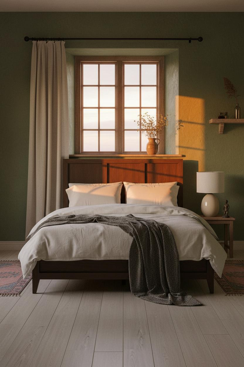

Forest green on limewash plaster walls hits differently than forest green on flat paint. The trowel variation catches light in a way that makes the color feel alive rather than flat.
Why it holds together: The warm amber lamp glow against a cool green wall creates contrast that feels instinctive, not designed. It's the same tension a countryside pub gets right without trying.
The easy win: Pull the curtains fully aside so the casement frame casts its grid shadow across the plaster. That geometry does half the decorating for you.
Slate Stone That Has No Interest In Looking Pretty
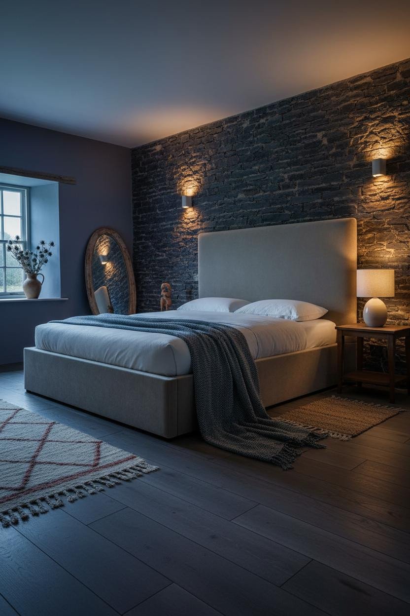

This one is divisive. A full-height dry-stacked slate wall in a bedroom sounds cold and unwelcoming until you see it at dusk under amber lamplight.
Then it makes complete sense.
What creates the mood: Dark blue-grey slate absorbs the ambient light while the mortar lines catch the glow, giving the wall a depth that painted plaster simply can't replicate.
The smarter choice: Keep bedding pale and soft (cream percale, a wool throw) so the raw masonry has something quiet to push against.
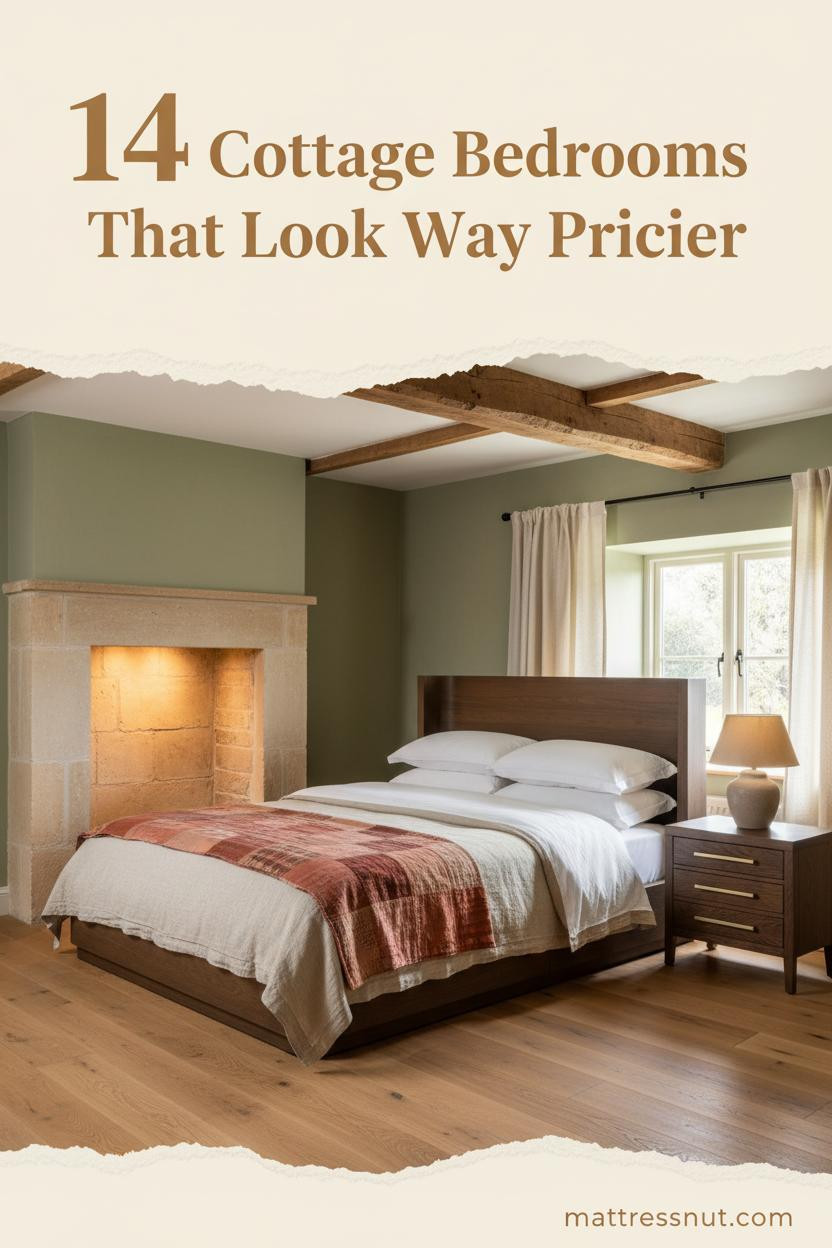
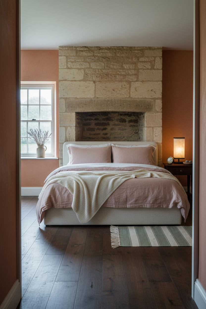
The Fireplace That Owns The Whole Room
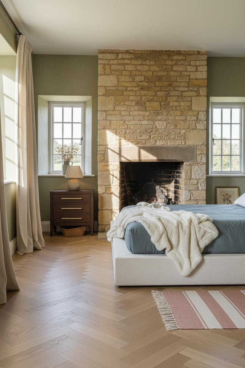

When a room has a honey-coloured stone fireplace running full height, everything else becomes supporting cast. And honestly, that's the right call.
Design logic: The irregular hand-laid masonry catches raking light across centuries of weathered mortar joints in a way that makes it read as genuinely old, which no reclaimed-look tile ever pulls off convincingly.
Where to start: Let the fireplace dictate your palette. Pull the celadon from the plaster, the cream from the bedding, and stop there. Three tones, done.
What A Low Arched Doorway Does To Your First Impression
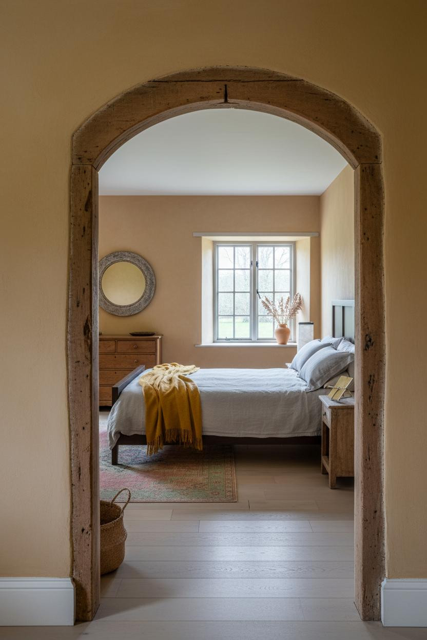

A room framed by a weathered oak lintel before you even step inside it changes how you experience the whole space. You slow down. You duck slightly. The room earns its reveal.
What carries the look: The lime plaster surround with its uneven hand-application marks keeps the threshold from feeling like a feature, in a way that feels genuinely ancient rather than styled.
Layer a faded Persian runner in dusty rose and soft green beside the bed. The ochre walls do the rest. Warm reads warmer when you give it contrast.
The Arched Stone Alcove You Never Knew You Needed
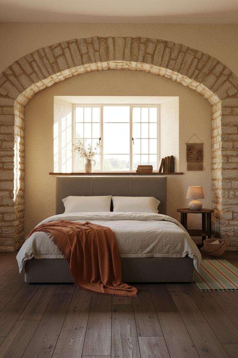


Placing the bed inside a pale honey stone alcove gives it a sense of enclosure that curtains or a canopy try (and usually fail) to replicate. The masonry does it for free.
Why it feels intentional: The arch frames the headboard the way a window frames a view, so the bed becomes the room's focal point without any additional effort.
Worth copying: Add a stone-washed linen layer in oatmeal and drape a burnt orange mohair throw loosely at the foot. The warmth of the textiles balances the cool rawness of the masonry beautifully.
Two Stone Alcoves, Completely Different Moods
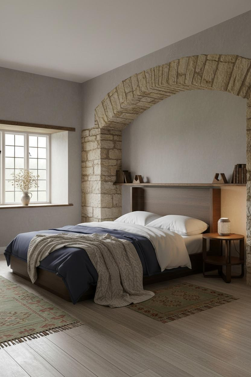

Same structural feature as the previous room. Completely different feeling. And that's sort of the whole lesson in cottagecore bedroom ideas that actually work.
What makes this one different: Dove grey limewash plaster on the flanking walls shifts the temperature cooler, so the honey stone reads even warmer by comparison. The kilim runner in sage and rust ties both tones together without forcing them to match.
Pro move: Navy sateen bedding against warm stone is a combination I keep seeing in rooms that look genuinely expensive. The contrast does the heavy lifting.
The Chimney Breast That Earns Its Square Footage

I've seen a lot of chimney breasts reduced to a paint feature. This one is left exactly as it is, pale honey coursework, centuries of mortar joints, nothing covering it up.
The real strength: The terracotta limewash walls flanking the chimney keep the masonry from reading too cold or too stark, which is the common miss with raw stone in a bedroom.
Don't ruin it with: A large mirror hung above the stone. Let the masonry breathe. One ceramic lamp and a stoneware jug of dried lavender is all this surface needs.
Hand-Hewn Beams And The Low Ceiling That Makes A Room
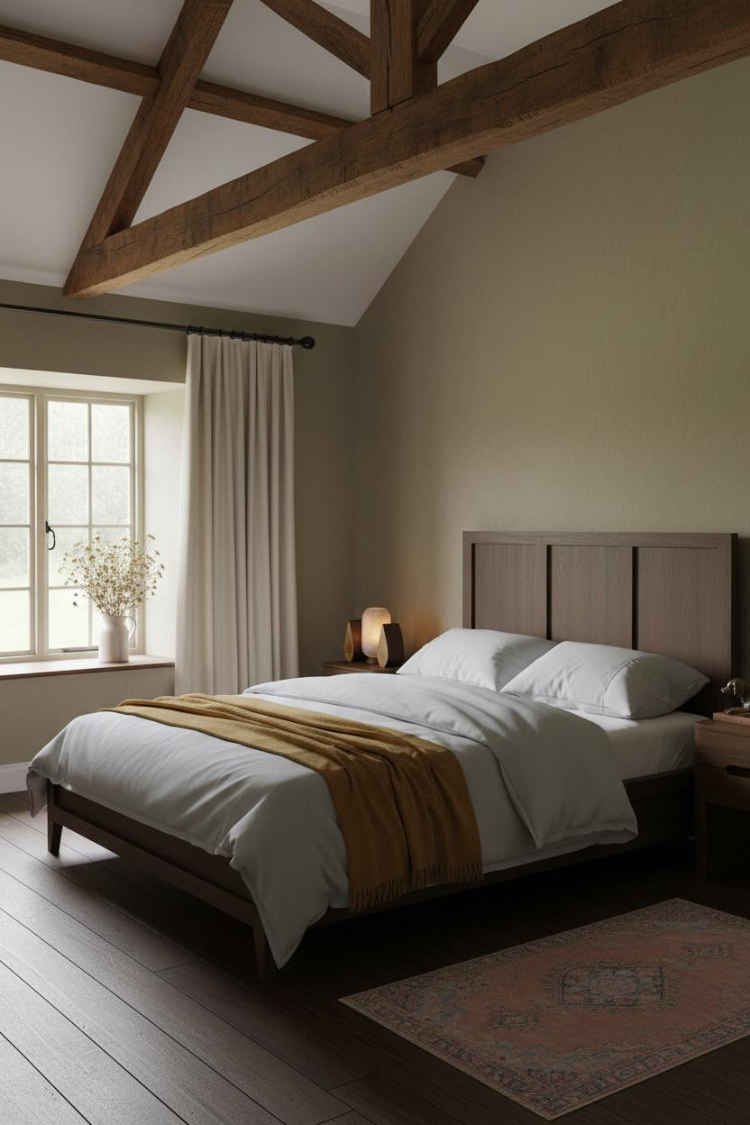

Most people see a low beamed ceiling and think constraint. But in a cosy cottage bedroom, the ceiling coming down is what makes the room feel held rather than exposed.
Why it feels expensive: Dark honey oak rafters running the full span cast faint shadow lines across the khaki limewash plaster below, giving the ceiling more visual interest than any wallpaper could.
Avoid this mistake: Overhead pendants in a beamed room fight the architecture. Use floor lamps and bedside lamps only. Let the beams be the ceiling feature.
Timber Beams With A Lighter Touch
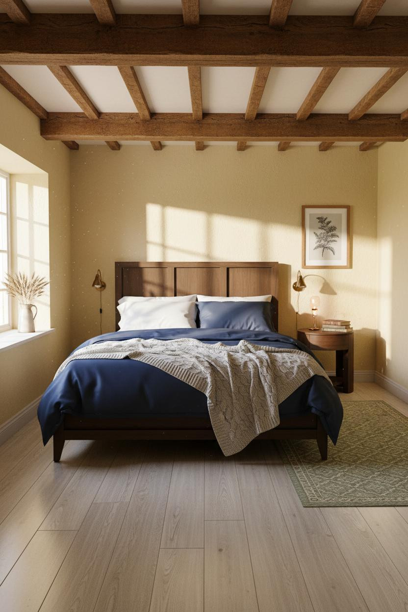

Same structural element as the previous room (beamed ceiling, limewash plaster), but the palette swap to butter yellow walls makes this version feel brighter and less brooding. Fair warning: yellow is harder to pull off than it looks.
What gives it presence: The reclaimed pine flooring in pale weathered tones keeps the yellow from reading too warm or too nursery-like, while still feeling deeply rooted in English countryside character.
The finishing layer: A geometric sage and cream rug at bedside pulls the wall colour down to floor level in a way that feels grounded rather than accidental.
Whitewashed Wainscoting That Gets The Height Right


Half-wall tongue-and-groove wainscoting in aged cream with the upper wall finished in mushroom limewash. The transition between the two surfaces is where this room does its best work.
Why it looks custom: The hand-brushed paint variation on the paneling picks up the milky overcast light in a way that makes the cream read warm at one angle and almost grey at another. It's a small move, big difference.
A large round antique mirror leaning against the paneling (not hung, leaning) keeps the whole thing from feeling too finished. Nothing too precious.
Stone And Dusty Rose: A Combination I Didn't Expect To Love

I almost wrote this one off. Glad I didn't.
Why the palette works: Dusty rose plaster against pale honey stone fireplace masonry is softer than you'd think. The pink pulls the warmth from the stone and the whole room feels calm and cohesive rather than busy or clashing.
One smart swap: Replace cool-white wool curtains with cream. The warmth difference between those two whites is exactly what makes or breaks this palette.
Whitewashed Brick That Doesn't Try Too Hard

The reason a whitewashed brick chimney breast works in an English cottage bedroom instead of feeling industrial is the mortar texture. The amber afternoon light catches every joint and the wall comes alive.
What sharpens the room: Warm clay limewash on the flanking walls keeps the whitewashed brick from reading too cold or too stark, while the herringbone parquet underfoot grounds everything with period-correct warmth.
What cheapens the look: Propping a large canvas or print against the brick. The texture of the masonry is the art. Leave it.
Sage Walls And Exposed Beams: The Quintessential English Cottage Pairing

Nothing fancy. That's the point.
Sage green plaster walls under a beamed ceiling with early morning light coming through cream linen. This is the room that cottagecore bedroom ideas keep circling back to because the formula is genuinely hard to get wrong.
Why it holds together: The weathered timber above and the honey oak floorboards below bracket the sage walls in warm tones, which stops the green from reading cold even in grey morning light.
The detail to keep: A vintage patchwork quilt in terracotta and cream draped unevenly at the foot. Asymmetric. One corner dropped. The room feels lived-in because of it.

Our #1 Pick
Saatva Classic Mattress
America's best-selling online luxury innerspring. 365-night trial, lifetime warranty, free white glove delivery.
Shop Saatva Classic
Why Luxury Bedrooms Always Feel Better
Every room in this list gets the atmosphere right: the walls, the textiles, the light. But the thing people notice when they actually get into the bed is whether the mattress matches the intention. And that part is surprisingly often the miss.
The Saatva Classic is the one I'd put in all of these rooms. Dual-coil support that holds its shape through years of use, a breathable organic cotton cover that doesn't trap warmth, and a Euro pillow top that feels genuinely soft without losing its structure. It's the kind of mattress that makes sense with aged oak floors and washed linen and every other slow, considered choice in a room like this.

The rooms people keep saving are the ones where nothing looks accidental. Start with the bed. The rest figures itself out.