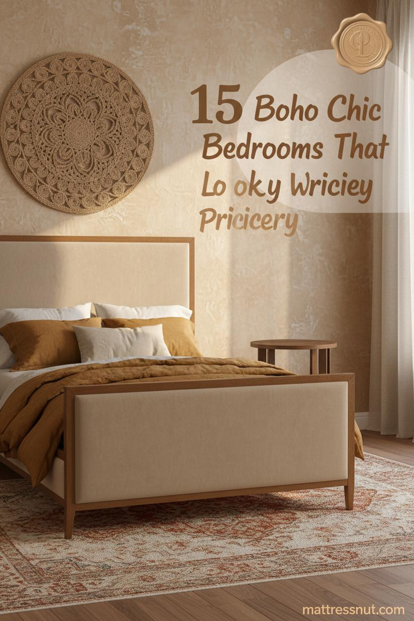
I'm a texture-first kind of person. So boho chic bedroom design has always felt more like instinct than style, you layer something woven, something worn, something that looks like it came home in your luggage, and suddenly the room stops feeling decorated.
These fifteen rooms get that right. Nothing matches perfectly. And that's exactly the point.
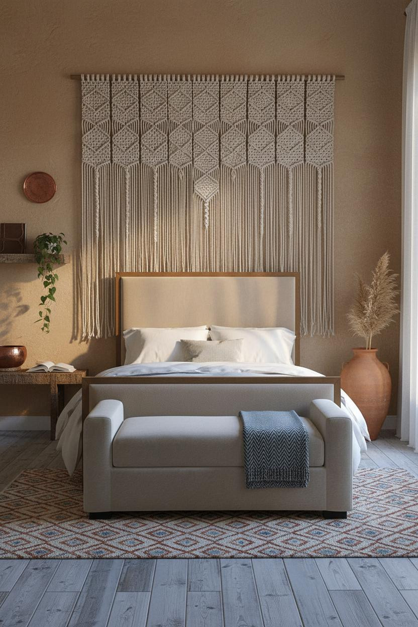
The Macramé Wall That Makes Everything Else Feel Intentional
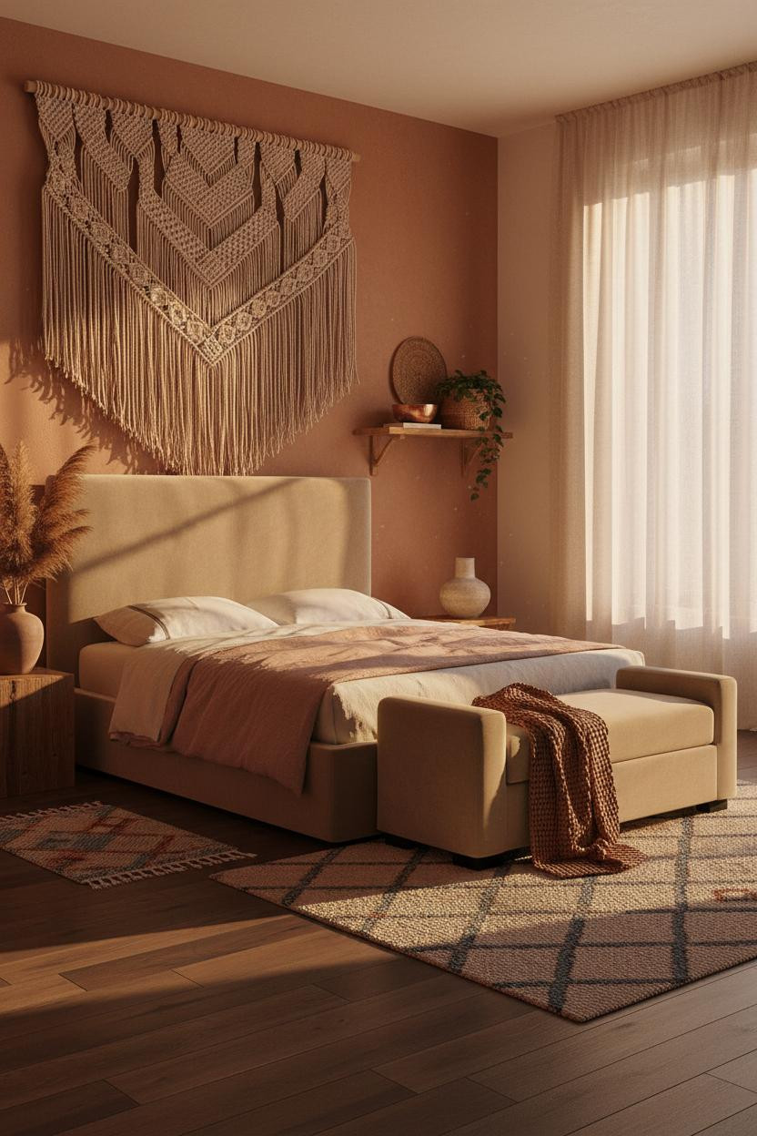


A full-height macramé panel makes the bed feel anchored in a way a headboard never quite does.
Why it holds together: The hand-knotted cotton cord catches raking light across every knot, so the wall reads as texture rather than decoration. It's the difference between a room that looks styled and one that looks lived-in.
The key piece: Go monumental with the scale. A small hanging gets lost. Floor-to-ceiling means it.
Moroccan Lattice That Actually Earns Its Place
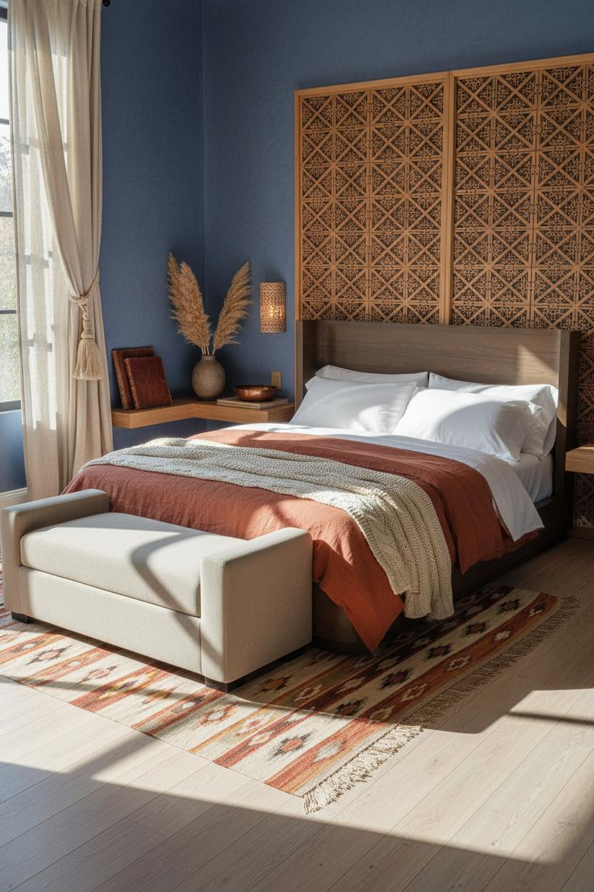

Divisive. But this is the one I keep coming back to.
A floor-to-ceiling carved lattice screen does something a gallery wall never manages: it projects shadow. The hand-chiseled honey wood casts geometric patterns across the floor all morning, and the room shifts with the light in a way that feels almost alive.
Avoid this mistake: Don't pair it with busy bedding. The screen is the room's whole argument. Let it make it.
Worth copying: Set it against dusty indigo plaster for contrast that reads rich, not loud.
Jute Wall Hanging Done at the Scale It Deserves


Most woven wall hangings are too small. This one isn't, and that's exactly why it works.
What changes the room: Natural undyed woven jute fiber at full-wall scale forces the eye upward and makes low ceilings feel taller, while still feeling grounded and warm against the olive limewash beside it.
The smarter choice: Keep the bedding layering simple, waffle weave, one linen throw, so the wall stays the focal point.
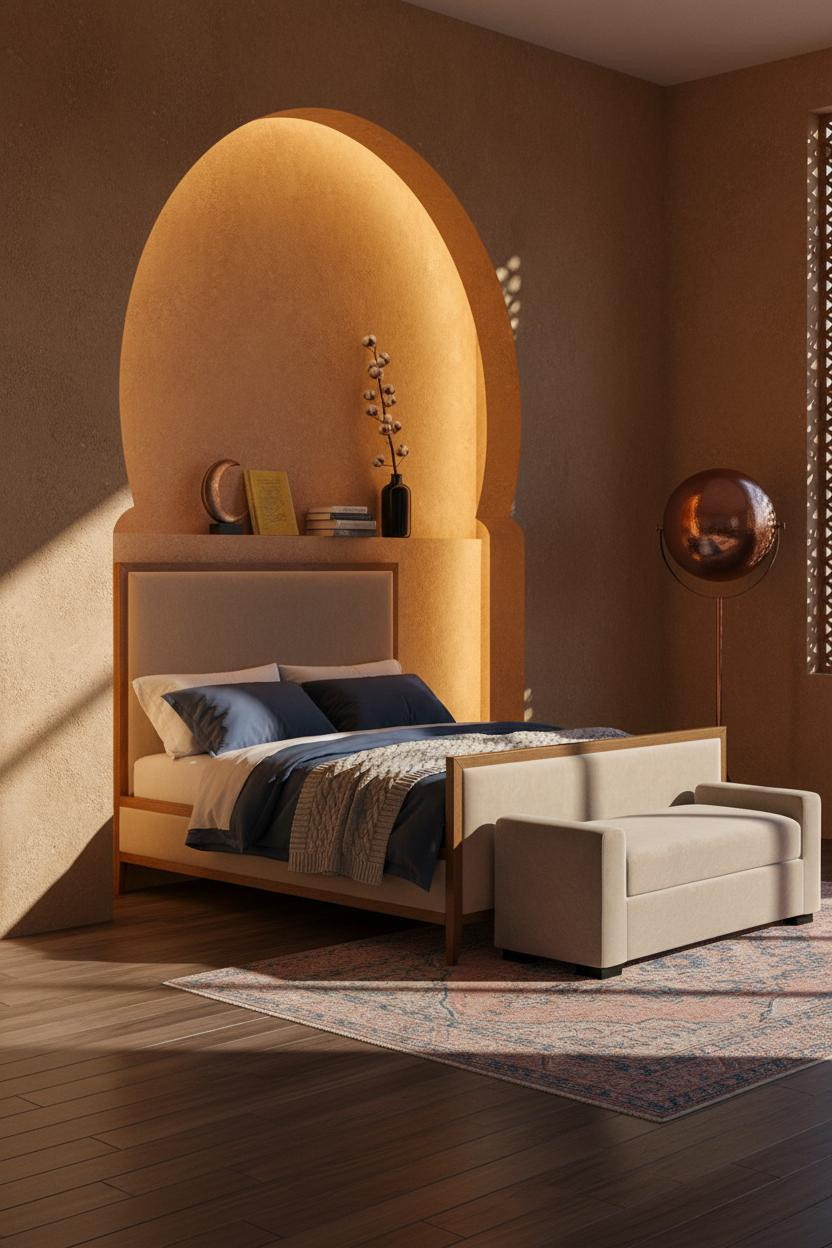
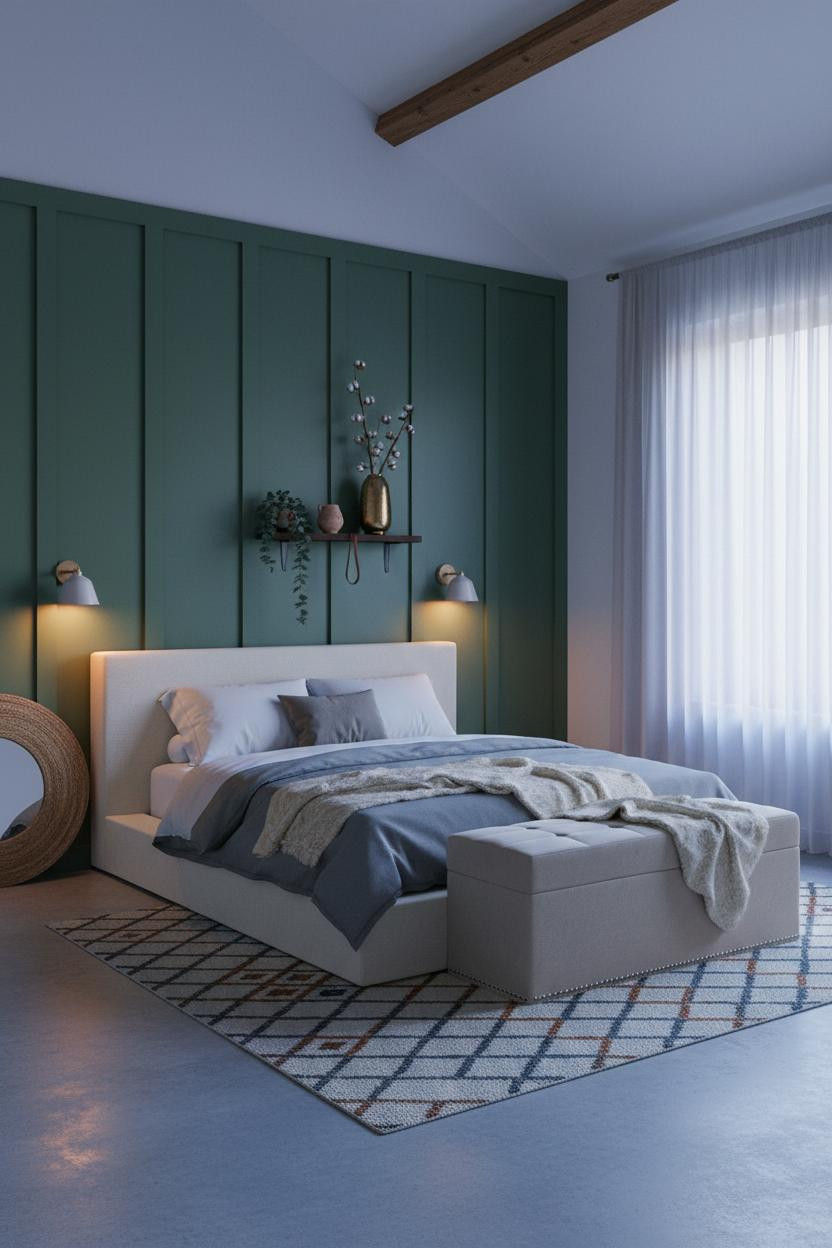
When a Plaster Arch Becomes the Whole Room
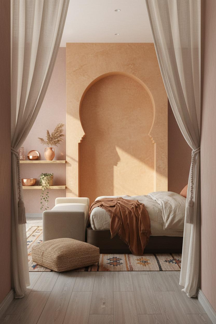
I'll be honest: I didn't think warm ochre plaster could feel this quiet. But it does, somehow.
What makes this work is the rough trowel marks. The hand-applied clay plaster inside the arch catches light unevenly, which means the color shifts across the day. It never flatlines.
The finishing layer: An oversized jute floor cushion beside the bench keeps the scale from feeling too architectural and pulls the room back to something human.
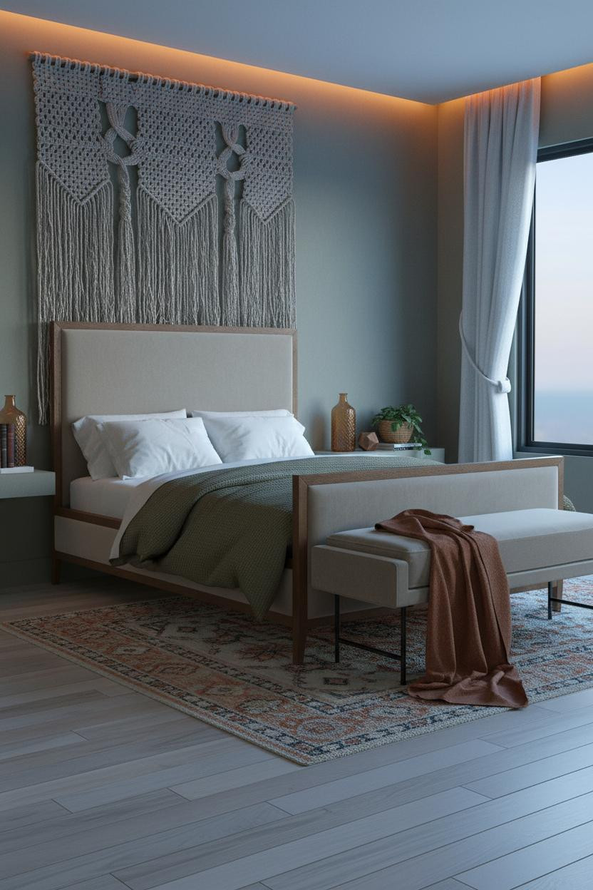
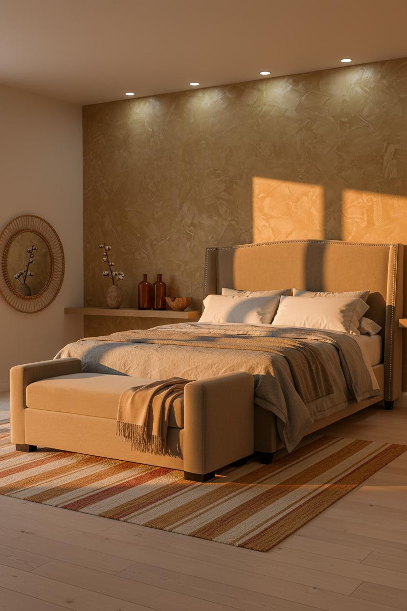
Camel Limewash With a Macramé Panel That Grounds It
The room feels collected rather than decorated, and the wall color is a big reason why.
Why the palette works: Camel limewash behind a natural fiber hanging reads warmer than any painted wall because both surfaces share the same light quality. Nothing competes.
On the floor, a Moroccan diamond rug in rust and cream ties the whole palette together. One color family, carried through every layer.
Burgundy Plum Walls With Steel Windows. Bolder Than It Sounds.
Fair warning. This one scares people off, and that's a shame.
The burgundy plum limewash against slim black steel window frames creates a geometry that most boho rooms never bother with. The graphic window shadow climbing the wall does more design work than a gallery wall ever could.
What not to do: Don't soften it with white bedding. A dusty pink linen duvet keeps the warmth without breaking the tension the wall creates.
Denim Blue Clay Plaster That Stays Warm Somehow
Blue walls usually read cold. This one doesn't, and it comes down to the finish.
Why it feels warm instead of cool: Hand-troweled clay plaster in faded denim has sandy mineral undertones that catch warm light in a way flat paint simply cannot. The surface drinks warmth in rather than reflecting it back.
Pro move: Pair it with a burnt sienna and ochre Moroccan rug to pull earth back into a cool wall palette. The contrast is immediate.
A Horseshoe Arch That Frames the Whole Room
This is the kind of room that makes you want to slow down the minute you walk in. The room feels warm without being heavy, which is harder to pull off than it looks.
What gives it presence: The raw umber plaster arch is rough where the trowel lifted, so the edges glow amber rather than receding into shadow. The bed sits inside the arch like a room within a room.
Steal this move: A vintage Persian rug in dusty rose and indigo on dark walnut floors keeps the warmth grounded without tipping into too much color.
Reclaimed Timber Planks With Sage Green on Either Side
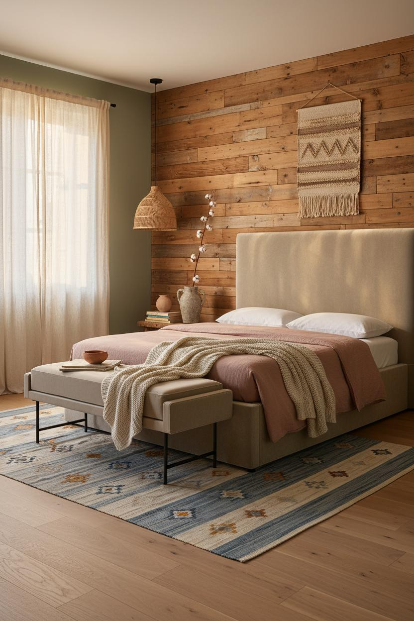
Nothing fancy. That's the point.
And yet there's something about reclaimed timber planks varying from four to ten inches wide that feels more considered than a carefully curated gallery wall. Each board is slightly different. The grain shifts from amber to silver at the knots. You actually want to look at it.
Why the palette works: Soft sage green limewash on the flanking walls cools the warm wood just enough, in a way that feels organic rather than calculated. The shortcut: Add a dusty indigo kilim on the floor to bridge the two tones.
A Botanical Gallery Wall Done With Actual Restraint


Gallery walls get a bad reputation because most of them try too hard. This one works because the color range is tight.
What creates the mood: Botanical prints and woven textile panels mix in dusty indigo, ochre, and cream only, no random accent colors sneaking in. The arrangement breathes because the frames are offset at varying heights, nothing too aligned.
Pair rattan sconces flanking the bed and a chunky jute rug underfoot. The detail to keep: Let one frame hang slightly tilted. It makes the whole wall feel collected rather than staged.
Raw Pine Slats That Turn a Bedroom Into Something Else

I almost scrolled past this. Glad I didn't.
Vertical raw pine slatted panels running floor to ceiling break the wall surface into shadow stripes. It's a small move in concept but the rhythm it adds is substantial. Each slat edge catches raking light differently, so the wall has depth without any applied texture at all.
The common miss: Painting the flanking walls a stark white kills it. Dusty rose keeps the warmth the pine earns.
Venetian Limewash in Mustard Gold. Worth the Commitment.

Mustard walls sound risky. In Venetian lime finish, they aren't.
Where the luxury comes from: Visible brush strokes across matte mustard limewash mean the color shifts from golden to almost oat depending on the angle. At sunset it practically glows. That natural variation is what paint can't fake.
A round rattan mirror leaning against the side wall keeps the room from feeling too finished. One smart swap: Use a stone-washed grey duvet instead of white. It keeps the warmth honest.
Moss Green Board and Batten With Concrete Underfoot


This is the boho room for people who think boho is too soft. It has real structure.
What sharpens the room: Deep moss board and batten with raw linen panels pinned between the battens adds dimensional texture without any applied ornament. The vertical lines do architectural work that paint alone never could.
Ideal if: you have polished concrete floors. The cool grey underfoot makes the green read richer, not heavier, especially with a Moroccan rug layered over it for warmth.
A Sage Plaster Arch That Feels Like a Riad Portal
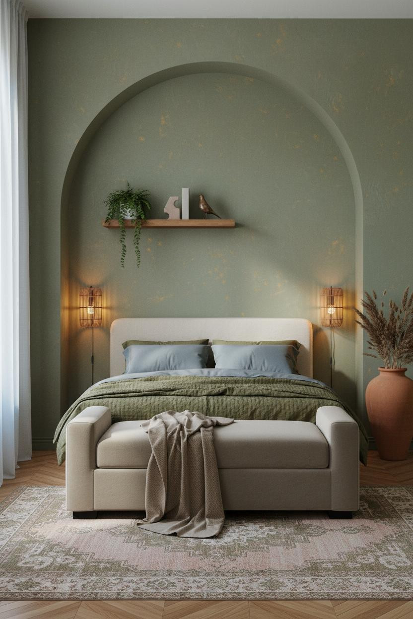
There's a reason arched alcove rooms get saved more than any other boho reference. The architecture does the work before a single textile goes down.
Why it feels intentional: Hand-troweled sage plaster with subtle ochre flecks in the arch recess glows amber at the curved edges, making the bed feel like it's sleeping inside something rather than just against a wall. The sleep environment changes completely when there's architecture framing it.
What to copy first: A herringbone parquet floor in warm honey under a faded overdyed rug in dusty rose and olive. That floor carries half the room's warmth on its own.
Exposed Beams With Terracotta Plaster. Old Bones, Done Right.
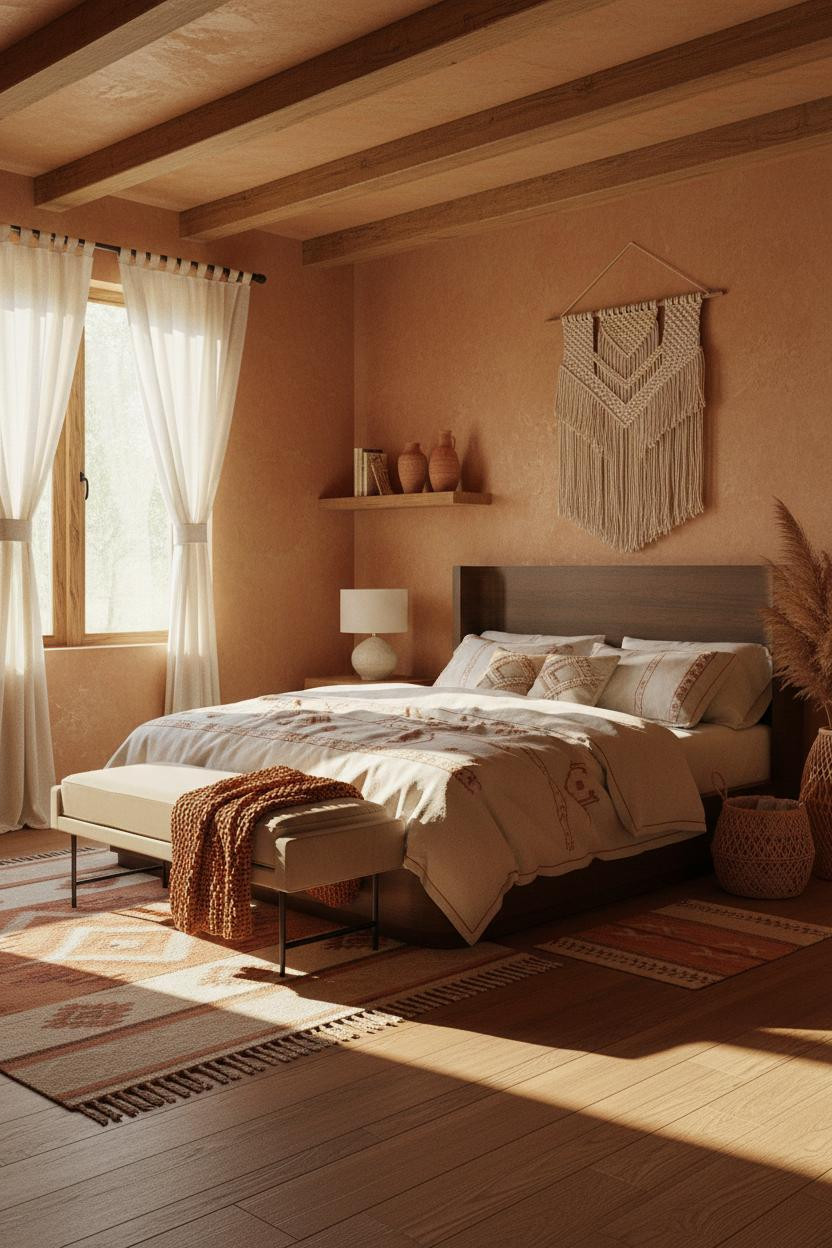
Exposed beams with terracotta plaster walls is the boho combination that actually ages well. I've seen it in rooms ten years old that still look current.
The worn patina beams running overhead pull warmth downward into the space, and the terracotta plaster catches afternoon light across its uneven surface in a way that shifts hour by hour. The room feels lived-in without looking tired.
The easy win: Cream linen bedding with terracotta embroidery ties the wall color into the bed without a single additional layer needed. And a macramé hanging above the bed keeps the handcraft thread running through the whole room.

Our #1 Pick
Saatva Classic Mattress
America's best-selling online luxury innerspring. 365-night trial, lifetime warranty, free white glove delivery.
Shop Saatva Classic
The Foundation Of Every Beautiful Bedroom
All fifteen of these rooms get the surfaces right. But the part you actually feel every night is the mattress, and that's where most boho bedrooms fall short. Walls get repainted. Woven textiles get rotated. The mattress stays for years, so it should be worth staying in.
The Saatva Classic is what I'd put under every one of these rooms. Dual-coil support that doesn't transfer movement, breathable organic cotton that doesn't trap warmth under heavy linen layers, and a Euro pillow top that feels genuinely soft without losing structure after six months.
It's the kind of mattress that makes the rest of the room make sense.

The rooms people return to are the ones that feel finished all the way through, not just at the surface. Start with the bed. The rest figures itself out.