
The best cozy colorful bedroom ideas don't look designed. They look gathered. A few years of good taste, a couple of bold decisions, and suddenly the room just works.
These 15 rooms are proof. Each one commits to color without apology, and every single one still manages to feel calm.
Terracotta Shiplap That Makes Everything Glow
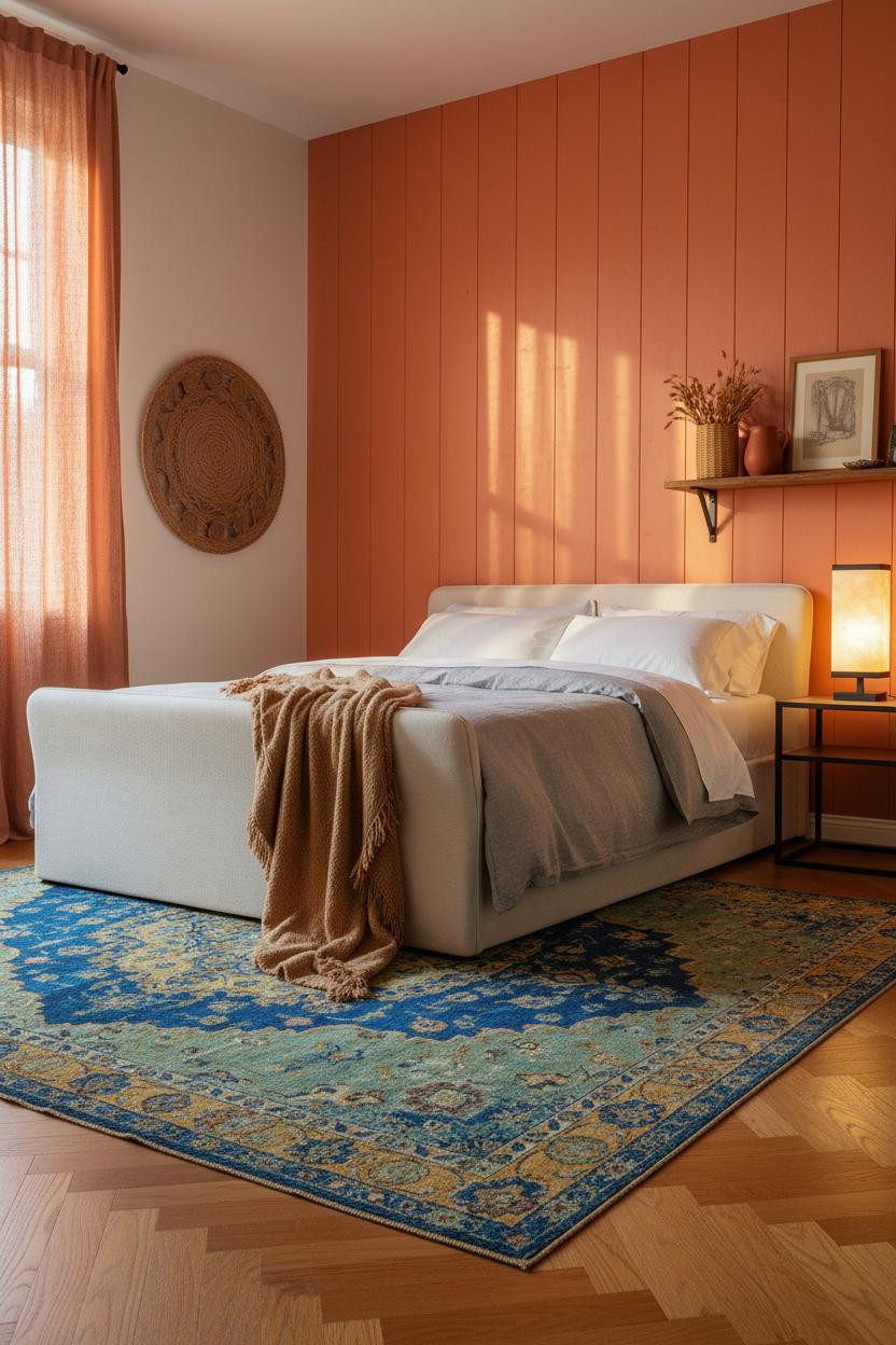


I keep coming back to this one. The warmth is immediate.
The reason it feels so alive instead of overwhelming is the terracotta shiplap. Each plank catches light at a slightly different angle, so the wall has depth without any extra effort. It reads as one color but never feels flat.
Steal this move: Layer a vintage overdyed rug in cobalt and mustard at the foot of the bed. The contrast with terracotta is instant, and the room suddenly feels collected rather than color-blocked.
A Cobalt Herringbone Wall You Won't Regret
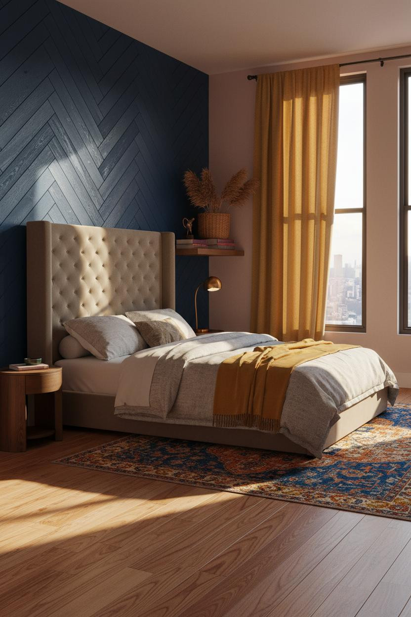


This is the kind of room that makes you want to abandon your current paint choice entirely.
What makes it work: The cobalt herringbone timber wall brings geometric movement that a solid color never could. The diagonal grain catches afternoon light differently on every plank, which keeps the eye moving without feeling busy.
Worth copying: Pair it with saffron linen curtains floor to ceiling. The two jewel tones together feel eclectic, not chaotic, especially when the bedding stays neutral.
The Cobalt Alcove That Frames Everything
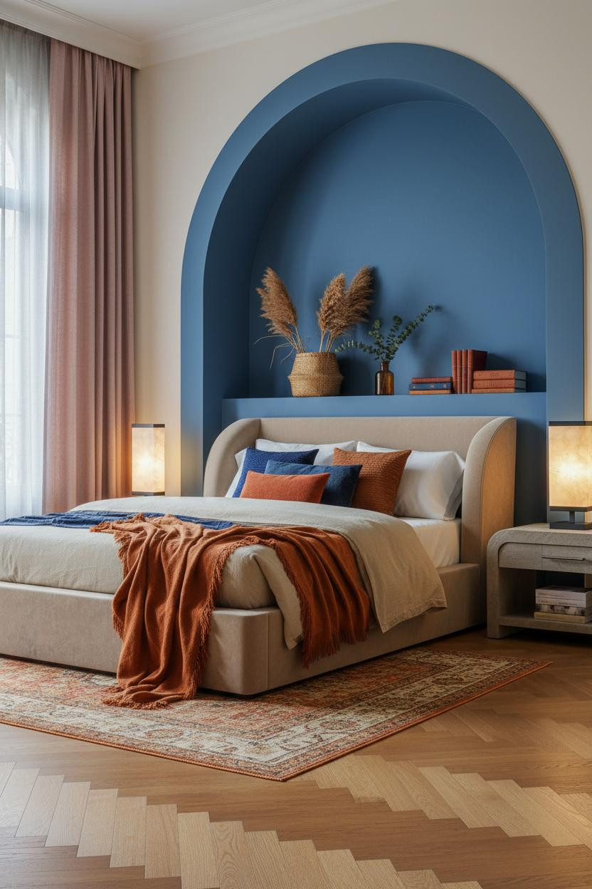

Bold choice. Not for everyone. But the payoff is real.
A cobalt plaster alcove does something a flat wall simply can't: it creates depth behind the bed, so the whole composition feels architectural rather than painted-on. The curved archway casts soft inward shadow that makes the bed look intentional.
Why it looks custom: The matte plaster finish absorbs light unevenly, which gives the color dimension without a second tone.
The easy win: Dusty rose linen curtains beside a cobalt niche. The two don't match, and that's exactly why it works.
Deep Teal Walls With Mustard Linen Curtains
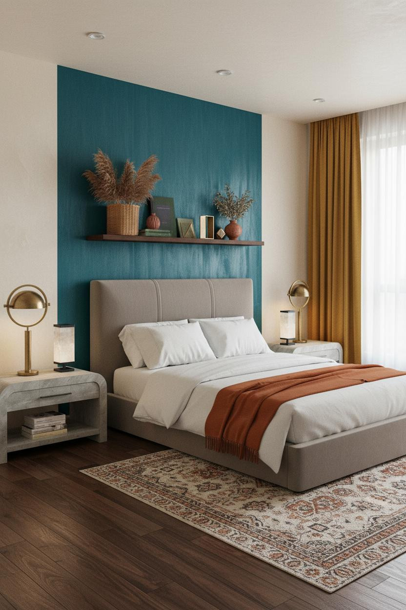

This one is divisive. But I think it's the most underrated pairing in the whole list.
What makes teal and mustard click is contrast without competition. The brushed linen texture on the teal wall keeps the color from feeling too corporate, while the mustard linen curtains pull in warmth, in a way that feels genuinely balanced rather than forced.
Go floor to ceiling with both: wall color and curtains. Stopping either one short is where people go wrong.
Burgundy Shiplap For a Room That Feels Like Evening
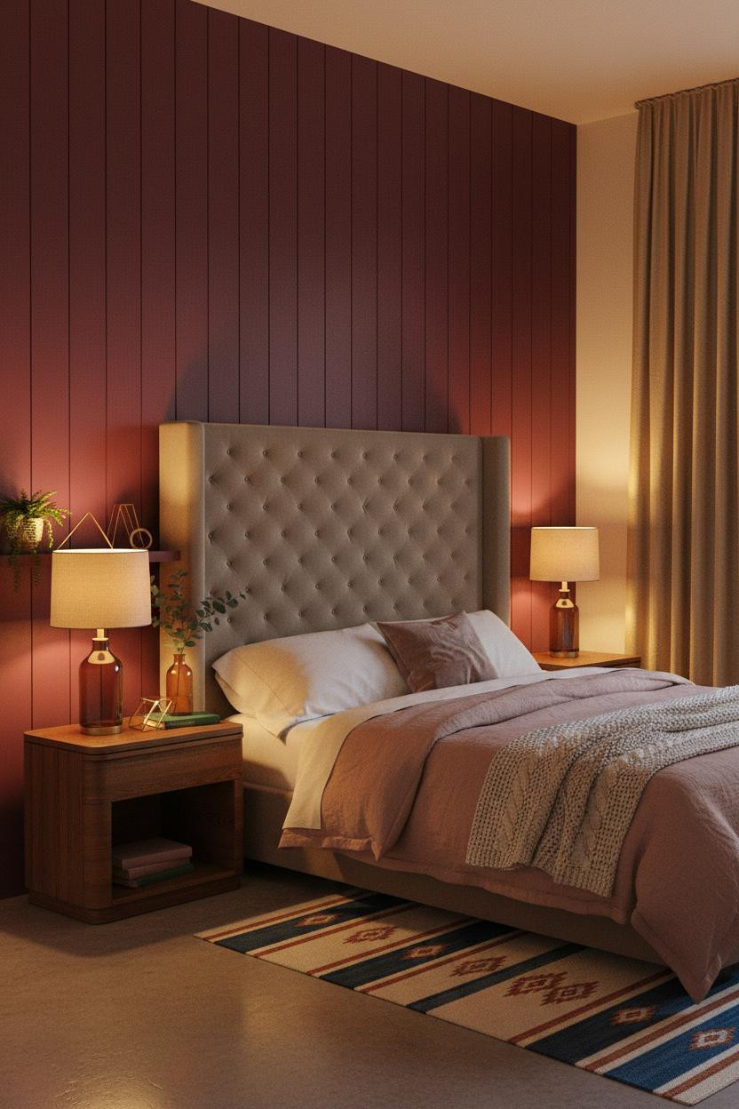

This room feels like 9pm in the best possible way. Warm, private, a little moody.
The real strength: Deep burgundy shiplap carries far more tonal variation than flat paint, so amber lamp light doesn't flatten it. The planks pick up the warmth and hold it. The room stays rich without turning dark.
Pro move: Keep the flanking walls cream, not white. White fights the burgundy. Cream lets it breathe.
Blush Fluted Panels That Feel Quietly Luxurious
Nothing dramatic. And somehow it's the most quietly striking room in this whole roundup.
The blush mauve fluted wall panels create rhythmic shadow lines across the surface without adding a single piece of decor. That's the whole trick: the architecture does the work. Pair it with a burnt orange throw and a nightstand that ties the warm palette together, and the room feels collected rather than decorated.
Forest Green Board-and-Batten With a Brass Mirror
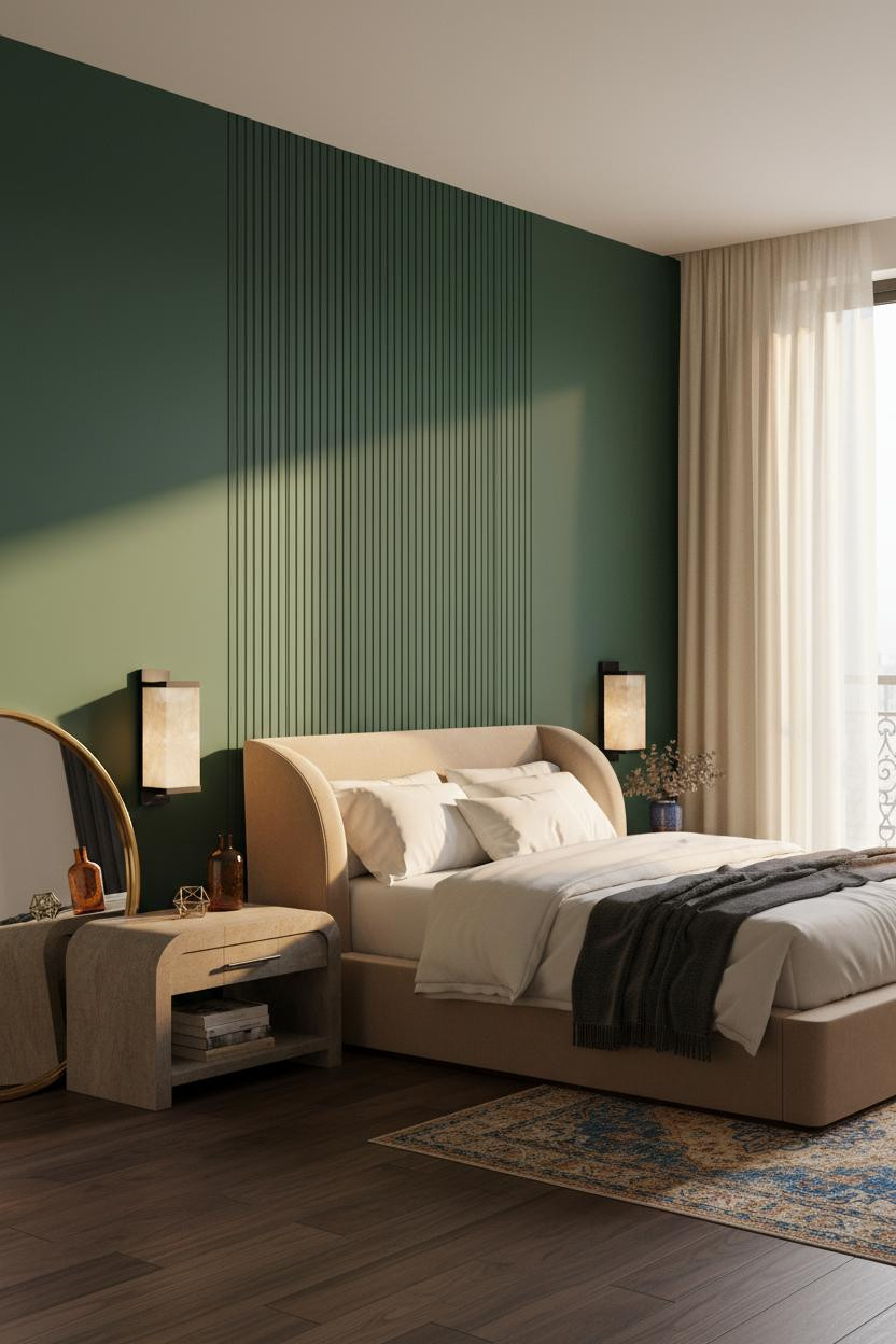
I'd argue deep forest green is the most livable jewel tone. It ages well. It works in any light.
Why it holds together: The board-and-batten vertical slats multiply depth across the wall, so the green has texture to land on rather than sitting flat. Each slat edge catches the window light at a slightly different angle.
One smart swap: Lean an oversized brass-framed mirror against the cream wall rather than hanging it. It reads as collected, not curated (admittedly a fine line, but you'll feel the difference).
Moss Green Shiplap That Calms the Room Down

Moss green is the one I'd actually paint in my own room. It's colorful but somehow never loud.
What softens the room: The warm moss shiplap pulls the yellow from bleached oak floors and the green from the rug, which is why the whole palette feels tied together rather than assembled. Cause and effect: one wall color that already speaks two other tones in the room.
The finishing layer: A dusty indigo linen curtain. It holds against the moss without fighting it, while still feeling like a real color decision.
Honey Gold Walls With Slate Linen Bedding
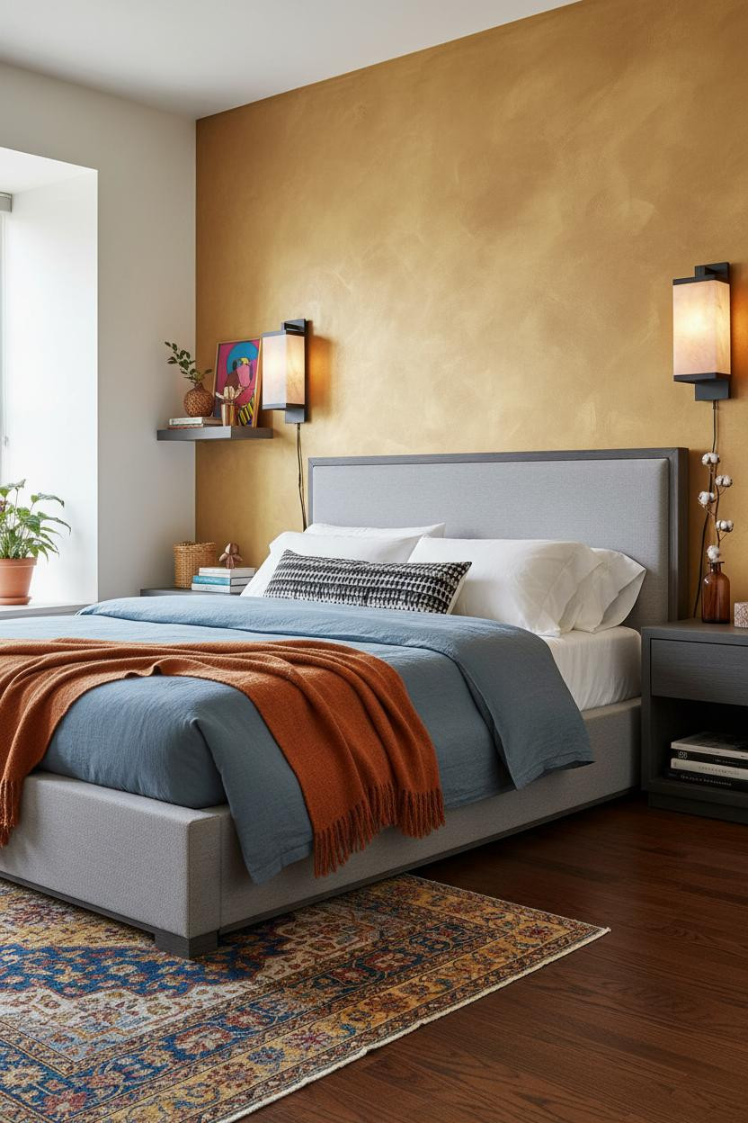

It might seem like honey gold would feel overwhelming. But with the right contrast, it does the opposite.
Design logic: A hand-applied matte honey-gold wall has organic pigment variation across the surface, which means it looks deeper or lighter depending on where you're standing. That movement keeps the room feeling alive rather than flat. Slate blue bedding does the heavy lifting on contrast without going dark.
What not to do: Don't match the throw to the wall. The best-looking bedrooms pair a warm wall with a genuinely cool textile, not a tonal echo.
Emerald Side Walls and White Wainscoting
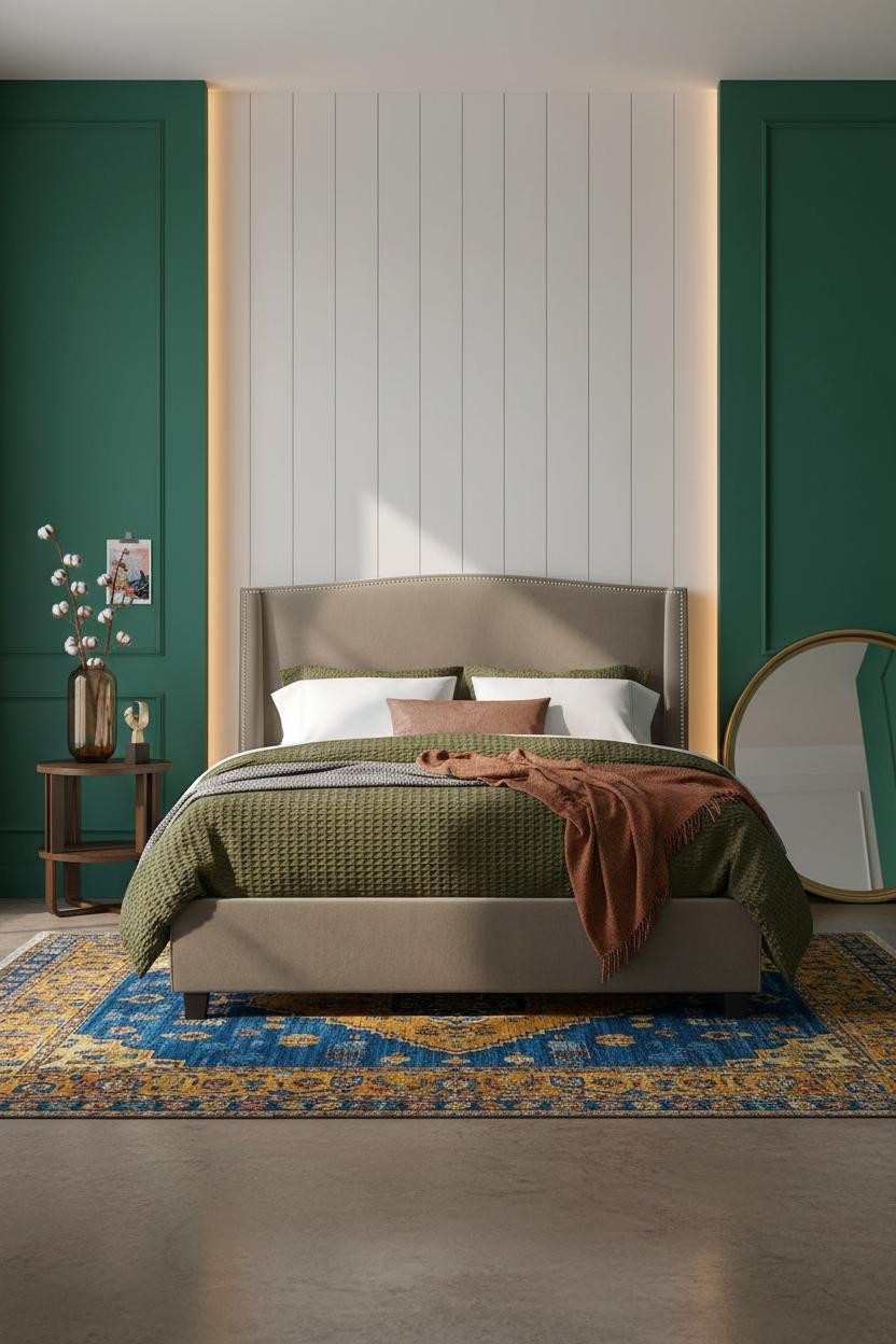


Honestly, this layout is smarter than it looks at first glance. White wainscoting behind the bed, emerald flanking walls. The inversion is the whole point.
Why the palette works: White vertical wainscoting panels behind the bed let the emerald on the sides stay vivid without competing. The hairline shadow lines on each board add enough texture to keep the white wall from disappearing entirely.
The smarter choice: A rust linen throw and a kilim rug in cobalt and mustard. Just enough pattern to keep things interesting, without tipping into maximalism you can't live with.
When a Built-In Bookshelf Becomes the Whole Bedroom
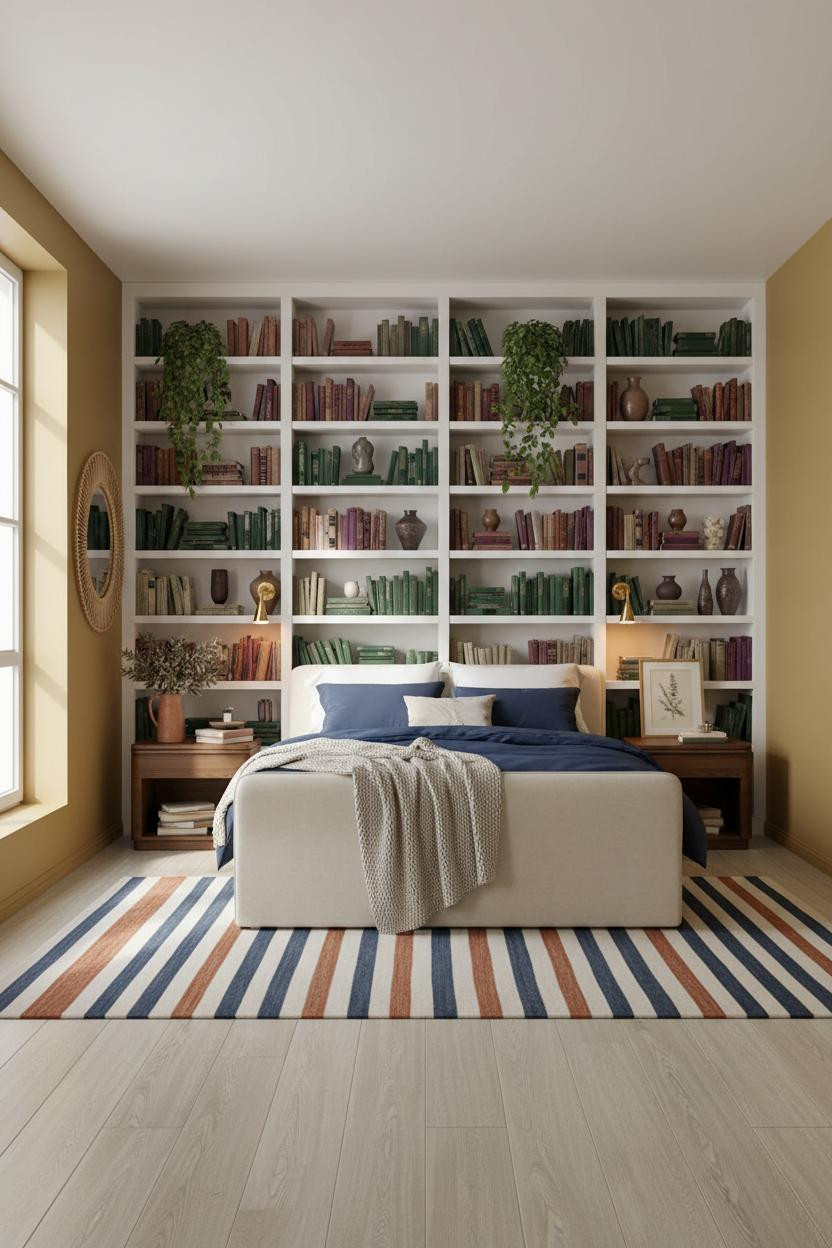
This is the room for anyone who has too many books and zero apologies about it.
Where the luxury comes from: A full-width white-painted built-in shelf wall densely layered with objects in cobalt, plum, and amber creates a chromatic backdrop that no wallpaper could replicate. The color comes from the objects, which means it also changes as you do. Warm ochre flanking walls keep it from reading clinical.
The detail to keep: Mix horizontal and vertical book stacks. It looks more lived-in, and it is.
Sage Board-and-Batten Meets Rust Linen Curtains
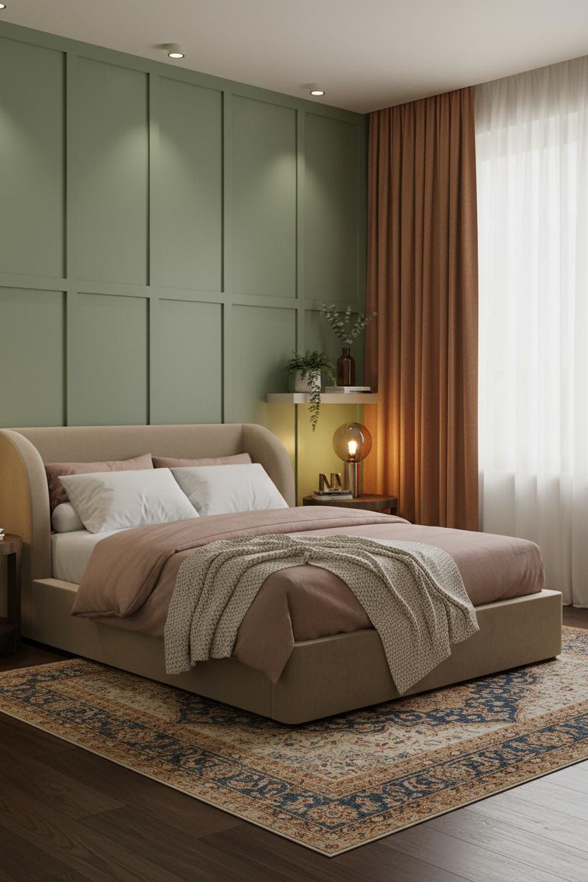
Sage green and rust is the combination I'd point anyone toward if they want color without the commitment of going full jewel tone. The room feels calm and colorful at once.
Why it feels balanced: The sage board-and-batten wall reads green but carries enough grey to stay grounded. Rust linen curtains bring warmth without introducing a third competing hue. The two tones are doing all the work, while still feeling like a room rather than a mood board. This is exactly the kind of collected-not-decorated aesthetic worth referencing.
A Dusty Plum Wall That Doesn't Try Too Hard

Dusty plum is the forgotten jewel tone. Not purple enough to feel dramatic. Not grey enough to feel safe. And that middle ground is honestly where the best colors live.
What gives it presence: A chalky matte plaster finish on the plum wall catches overcast light unevenly, so the color shifts from rich to soft depending on the time of day. Pair it with a sapphire and rust kilim rug on dark walnut floors, and the room feels warm and collected without anything matching.
Sapphire Blue That Still Feels Like a Bedroom
Fair warning: deep sapphire is a commitment. But I've never once seen it done right and regretted.
What keeps it from feeling too much: A linen-textured sapphire wall softens what would otherwise be an overwhelming pigment. The woven surface breaks up the color, which helps the room feel warm and saturated rather than cold and saturated. That's the whole difference.
The part to get right: Herringbone parquet on the floor. The warm amber grain pulls against the cool blue, and the room lands somewhere interesting. If the room is on the smaller side, go lower with furniture to keep the wall the star.
Terracotta Plaster With a Macrame Wall Hanging
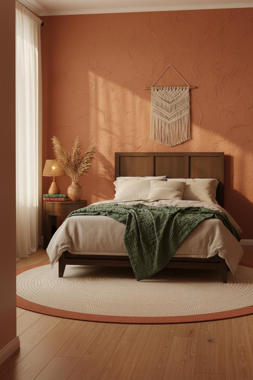

This is the one I'd show someone who says they're afraid of color. It's warm, earthy, and completely approachable.
Why it feels grounded: Hand-applied terracotta plaster catches afternoon light to reveal organic depth in the finish (not just a flat orange wall). Light oak floors and a cream jute rug bring the warmth down so the whole room feels connected rather than just one loud wall. And a nightstand with a warm wood finish ties into the palette without any extra effort.
Where to start: The macrame above the bed. It softens the wall, adds handmade texture, and pulls the earthy tone upward so the room feels tall.

Our #1 Pick
Saatva Classic Mattress
America's best-selling online luxury innerspring. 365-night trial, lifetime warranty, free white glove delivery.
Shop Saatva Classic
The Foundation Of Every Beautiful Bedroom
All fifteen of these rooms have one thing in common beyond the color: they feel genuinely restful. And that's harder to pull off than it looks. The wall is only half the story.
The bed is the other half. Walls get repainted. Textiles get swapped out. The mattress stays. The Saatva Classic is the one I'd put under every room on this list: dual-coil support that holds up over years, an organic cotton cover that doesn't trap heat, and a Euro pillow top that feels exactly as good as it looks.
Get the color right. Then get the sleep right. Both matter.

The rooms people save are the ones where nothing looks accidental. Start with the bed. The rest figures itself out.