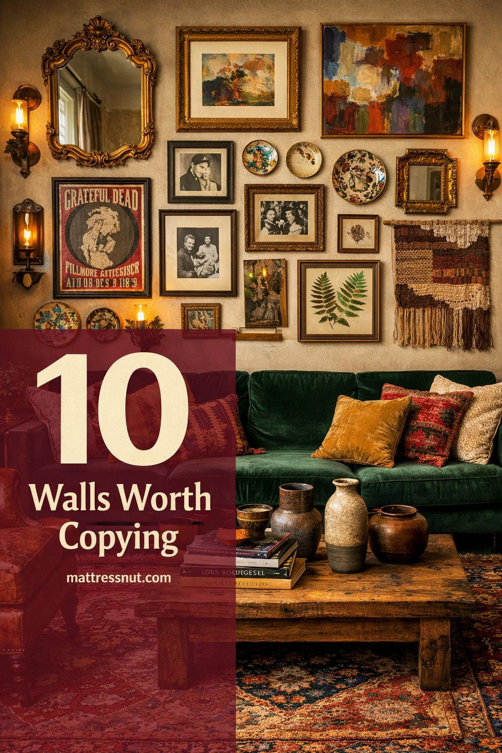
We earn a commission if you make a purchase through our links, at no extra cost to you. Full disclosure.
Funky gallery walls turn boring blank space into personality overload. You’re about to see how mixing random thrifted finds with intentional chaos makes walls look collected over years, not bought in one afternoon.
These 10 setups prove you don’t need matching frames or a design degree. Just pile on color, mix textures like crazy, and embrace the beautiful mess of art that actually means something to you.
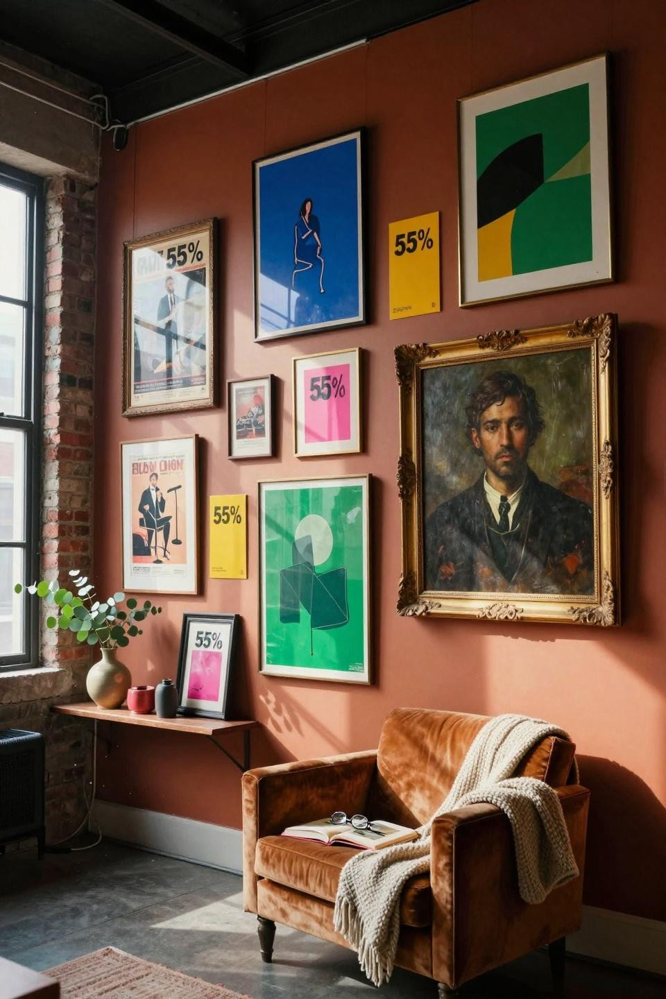
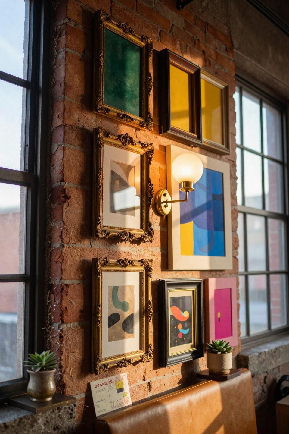
Jewel Tone Explosion With Vintage Frames And Brass Glow
This wall hits different because it’s not trying to match. Cobalt blues crash into emerald greens, ruby reds pop against aged brass frames, and that oversized gilt mirror reflects bottles catching light like stained glass.
Perfect if you love thrift stores and can’t resist rescuing pretty things. The frames are deliberately mismatched – some tarnished brass, some weathered gold, some raw copper showing fingerprints.
That eucalyptus sprig tucked behind one frame? Chef’s kiss. One crooked frame keeps it from looking too precious. You get the “I’ve been collecting art for years” vibe without dropping serious cash.
Overhead Chaos That Somehow Works In Converted Warehouse Spaces
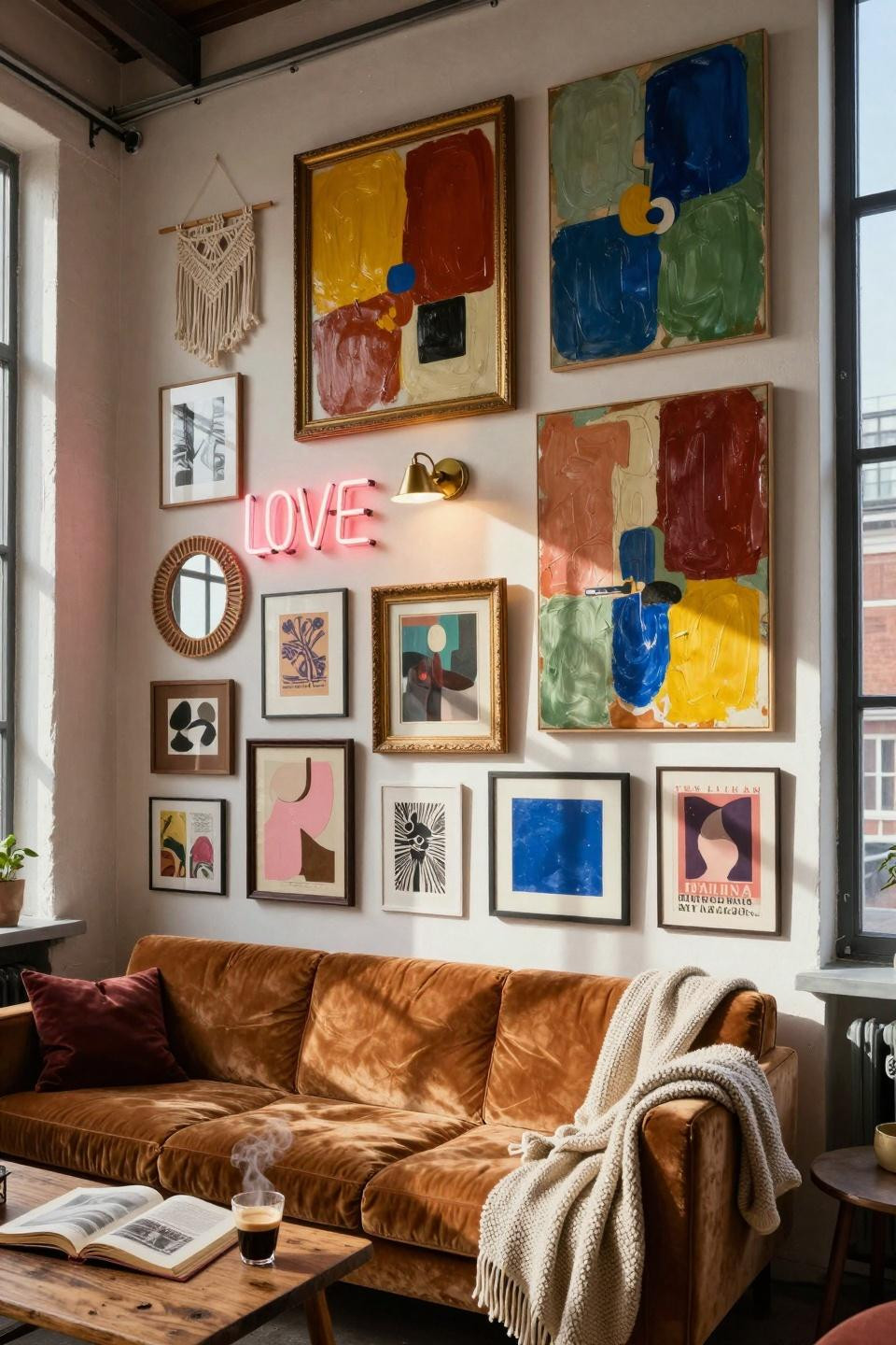
Burnt terracotta and mustard yellow dominate here, then electric blue and sage punch through. A neon “LOVE” sign casts pink glow over everything, and that rattan mirror breaks up all the rectangles.
Great for renters in warehouse conversions or industrial lofts with tons of wall space. You can go big without looking like you’re compensating for boring taste.
The ochre velvet sofa below grounds all that visual noise. Half-drunk espresso, dog-eared art book, knit throw draped like you just got up – it’s the lived-in details that sell it.
Eighteen-plus pieces hung floor to ceiling means you save money buying smaller thrifted art instead of one giant expensive piece.
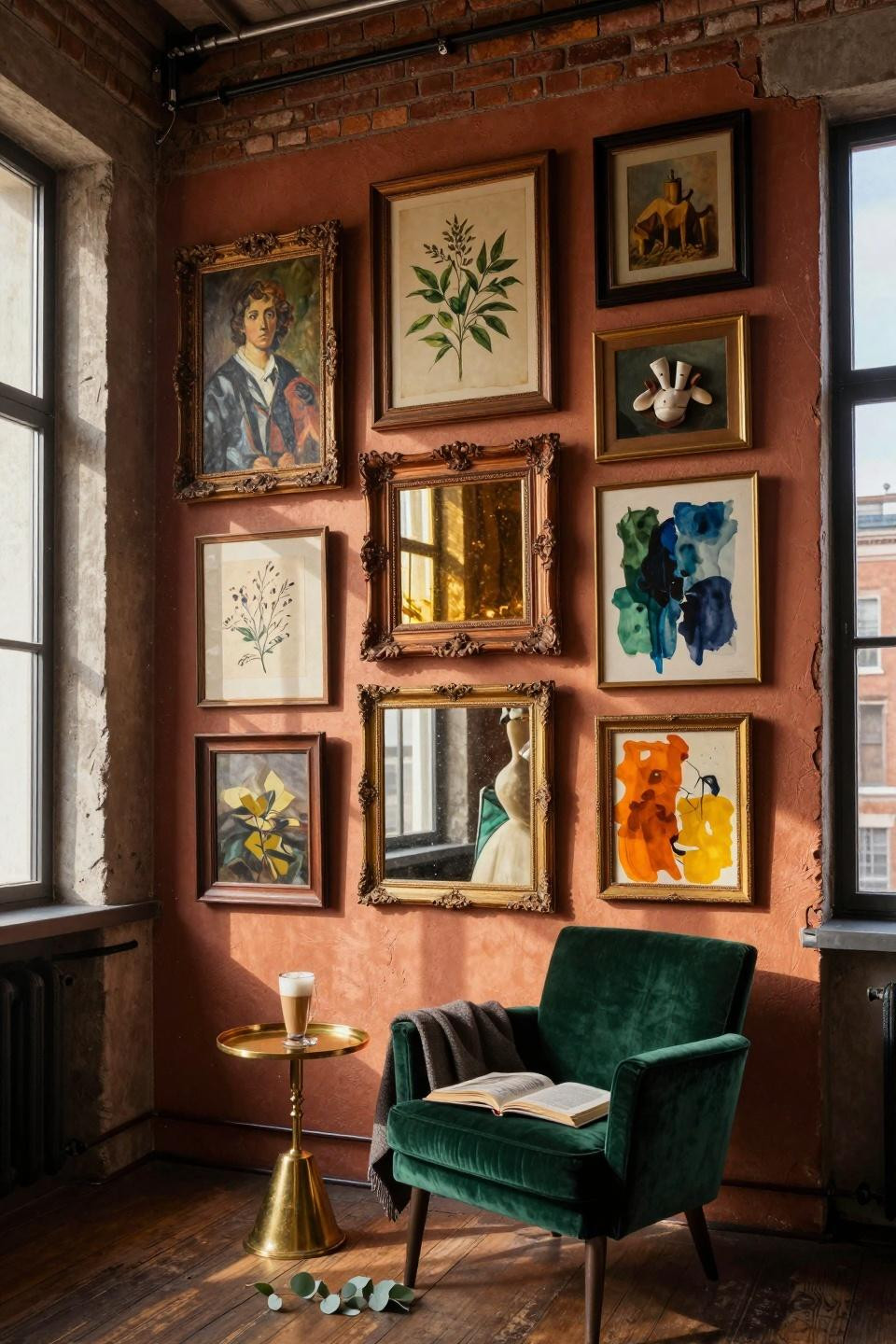
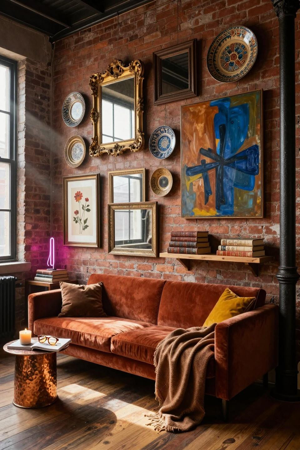
Notting Hill Gallery Wall For Vintage Frame Collectors
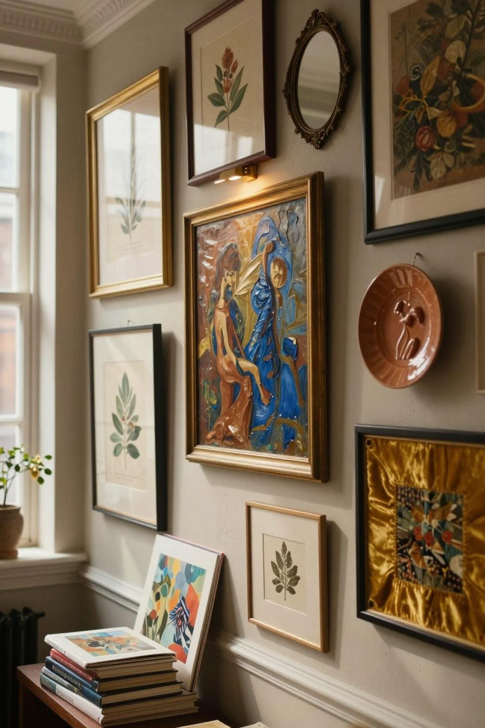
A big oil painting in burnt sienna and cobalt anchors this whole setup. Everything else orbits around it – botanical prints in aged brass, a ceramic plate in terracotta, that patinated bronze mirror catching light.
If you’re into Georgian townhouse vibes but rent a studio, this works. The warm greige wall color makes brass pop without competing.
Stack art books at the baseboard and leave one open. Add that small brass picture light over the main piece. Suddenly it looks curated by someone who actually reads about art, not someone copying Pinterest exactly.
Brooklyn Loft Wall With Terracotta And Cobalt For Maximum Drama
Burnt terracotta covers over half this wall through vintage concert posters and abstract paintings. Cobalt blue and emerald green thrifted prints balance it out, then mustard yellow and fuchsia pink scream for attention in small doses.
Ideal for anyone renting high-ceiling lofts and wanting that Williamsburg artist energy. The frames are pure chaos – rough walnut, tarnished brass, weathered gilt, raw copper all fighting for attention.
That cognac leather chair below with the chunky knit throw and half-read art book? It’s the “I’m cultured but approachable” corner every maximalist dreams about.
One frame hanging crooked and that fallen eucalyptus leaf keep it real. You live here, you don’t just stage photos here.
Twenty-Seven Frames Of Controlled Maximalist Madness On Terracotta
This Brooklyn brownstone wall goes full Memphis Milano with bold geometric prints, vintage Op Art, hand-painted Bauhaus posters. Cobalt, saffron yellow, forest green, burnt sienna all compete.
That sculptural brass sconce casting warm light on handmade washi paper is next level. The light creates depth and makes certain pieces glow.
Twenty-seven mismatched frames means serious thrift store hunting. Weathered gilt baroque next to chunky oak next to sleek brass next to verdigris copper. The terracotta accent wall ties the chaos together.
One frame slightly askew and that faint nail hole from previous arrangements prove this wall evolved over time, not overnight.
Berlin Mitte Loft Wall With Twenty-Three Overlapping Frames
Frames actually touch and overlap here, which is bold. Aged brass, carved oak, thin copper, distressed gilded wood all layered asymmetrically like a puzzle.
Works great if you have soaring ceilings and exposed brick. The warm terracotta and ochre tones dominate, then deep forest green and navy balance it, with burnt orange and mustard popping through.
Oil paintings with visible brushstrokes next to vintage botanicals on yellowed paper next to abstract watercolors bleeding at edges next to a ceramic sculpture mounted as 3D art. It’s texture overload in the best way.
That emerald velvet chair with cashmere throw and dog-eared art book stages the “I read and actually understand modern art” vibe perfectly.
Copenhagen Warehouse Gallery With Oak And Brass Frame Mix
This one’s calmer – warm neutrals anchor 60%, terracotta and burnt sienna add warmth at 30%, then forest green and dusty sage accent at 10%. Honey oak frames mix with unlacquered brass ovals showing natural patina.
Perfect for converted warehouse lofts but want sophistication, not chaos. That vintage gilt frame around a contemporary neutral abstract creates old-meets-new tension.
The brass picture light casting glow across the large canvas is key. One crooked frame and that trailing pothos with one yellowed leaf keep it from looking staged.
Brooklyn Exposed Brick Wall With Jewel Tones And Articulated Sconce
That sculptural brass sconce with aged patina steals the show here. Its warm glow creates soft bloom against deep emerald and burnt terracotta paintings.
Ideal if you have exposed honey brick and fourteen-foot ceilings. Vintage gilt baroque frames crash into sleek brass holders crash into rough reclaimed wood frames.
Dominant burnt terracotta and emerald cover over half the wall, mustard yellow and cobalt add 30%, fuchsia pink and brass gold punch through at 15%. The color distribution keeps your eye moving.
One frame hanging crooked, a succulent with soil specks on the floating shelf, a vintage postcard leaning against the wall base – all those imperfections make it livable.
Maximalist Brooklyn Loft With Moroccan Plates And Neon Glow
This wall throws everything at you – vintage gilt frames, raw unfinished pine, hand-painted Moroccan ceramic plates, a huge abstract oil in burnt sienna and cobalt, thrifted brass mirrors, pressed flowers, and a small neon sculpture casting magenta glow.
Great for sun-drenched lofts with cast-iron columns and exposed brick. The rust velvet settee below with cashmere throw puddling on the floor grounds all that visual chaos.
Terracotta dominates at 55%, deep teal at 30%, mustard yellow accents at 15%. That half-burned beeswax candle and open art monograph with tortoiseshell glasses adds the “I actually use this space” touch.
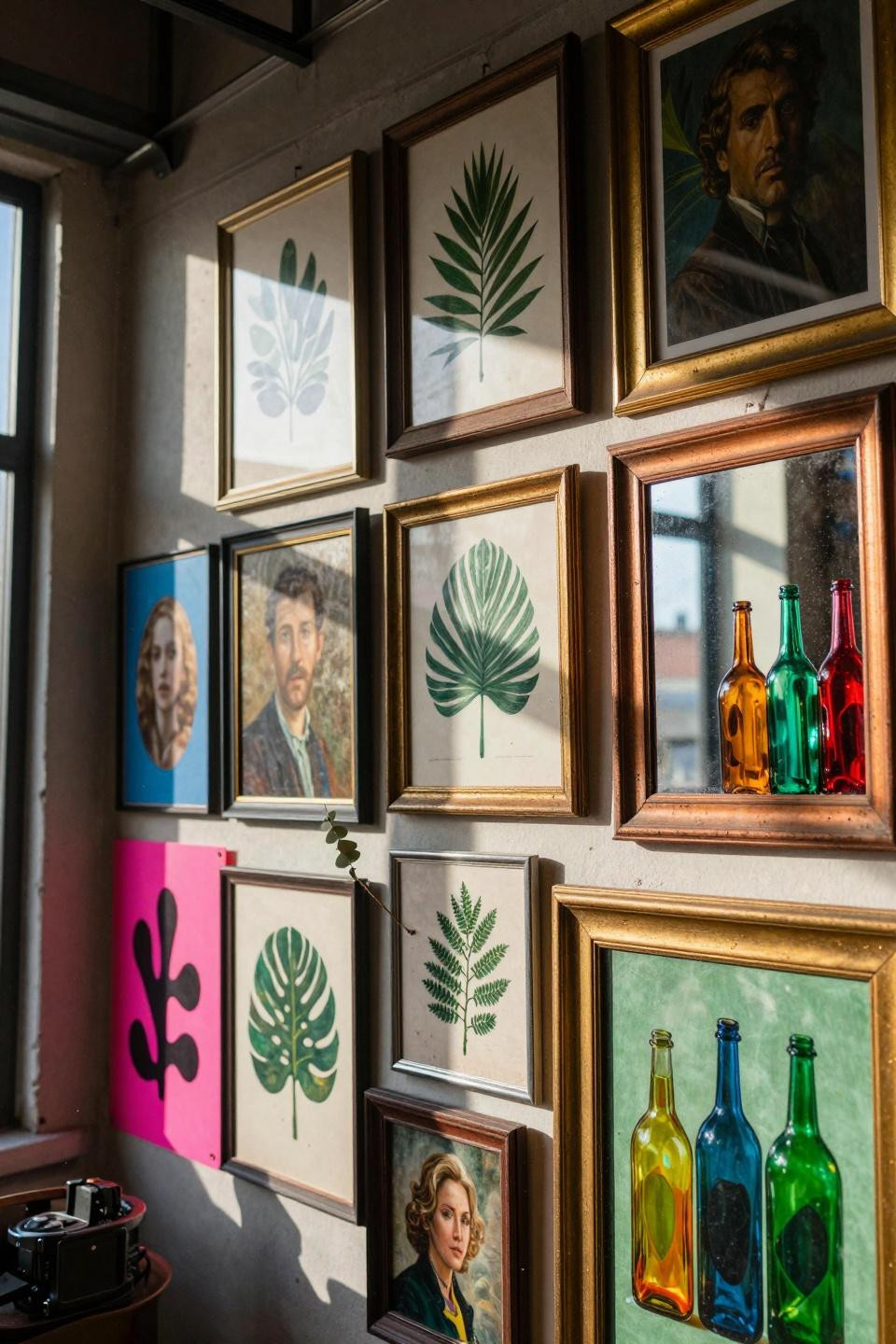
London Shoreditch Wall With Macramé And Moroccan Ceramics
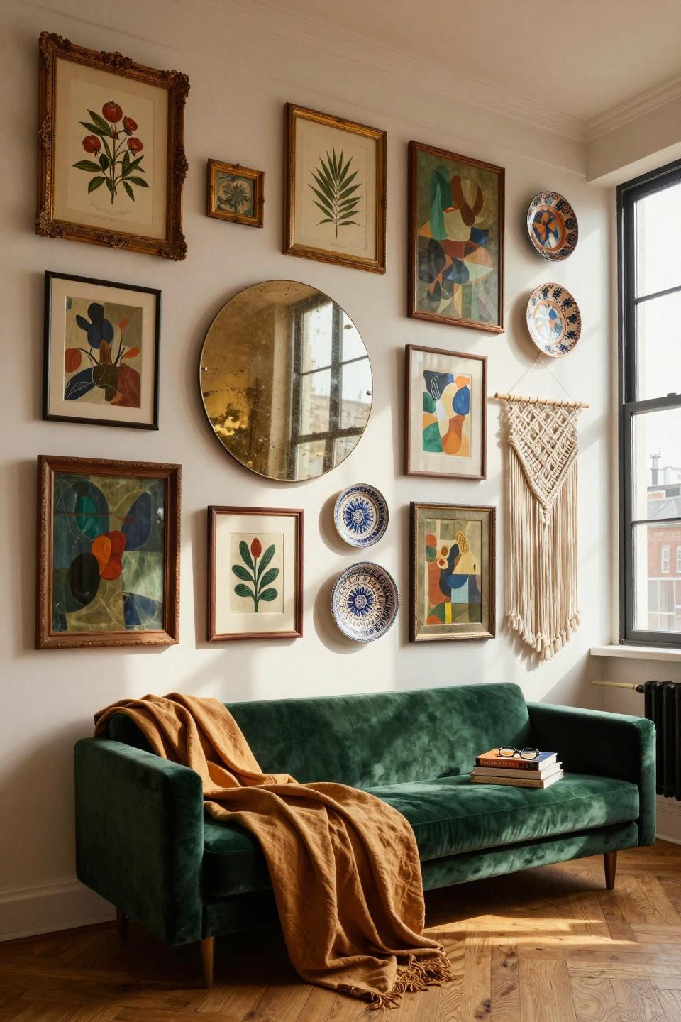
Vintage botanicals in gilded frames sit next to contemporary abstracts in rough walnut. That round convex mirror with aged brass reflects dappled light, and the ivory macramé adds soft texture against all the hard frames.
Perfect for converted industrial spaces where you want jewel tones but not total chaos. The emerald velvet settee with rumpled ochre linen throw makes the whole setup feel approachable.
Dominant jewel tones cover 55%, warm neutrals 30%, brass accents 15%. Stack art books crooked on the arm with reading glasses on top. It’s those casual details that make gallery walls look collected, not bought.
Make Your Walls Tell Your Story
Your walls should look like you robbed a thrift store and a museum at the same time. Mix cheap finds with pieces that matter to you, hang frames crooked on purpose, let things overlap and touch. The best funky gallery walls break rules and still somehow work.
Start with one anchor piece you love, then build around it with whatever makes you stop scrolling. Save these ideas to Pinterest, hit up estate sales this weekend, and remember – matching is boring. Your walls should scream personality, not “I bought a five-piece set at Target.”
Try Saatva risk-free →