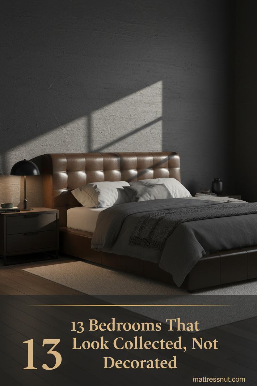
The first thing you notice in the best Modern Masculine Bedroom isn't the furniture. It's the restraint. Everything feels chosen, not collected on impulse.
These 13 rooms prove that dark walls, raw materials, and a stripped-back approach can produce something genuinely comfortable. Not just photogenic.
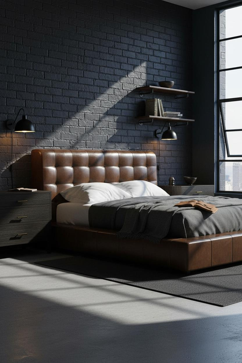
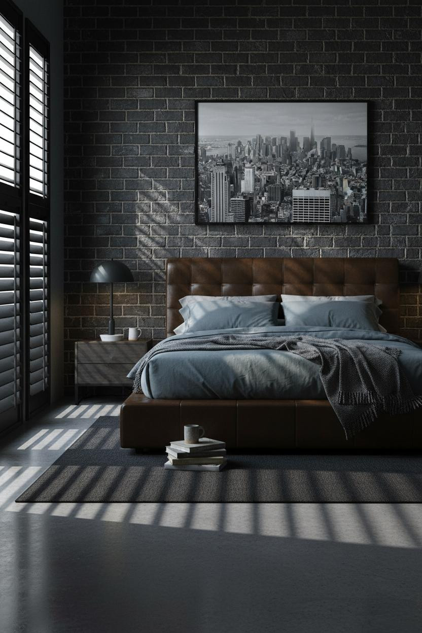
The Charcoal Plaster Wall That Does All The Work

I keep coming back to this one. The wall carries the room without a single accessory doing any heavy lifting.
Why it holds together: A warm charcoal plaster surface creates visual weight through texture alone, which keeps the rest of the room from needing to try too hard.
Steal this move: Pair the plaster wall with a low-profile leather headboard and let the contrast between soft and raw do the work for you.
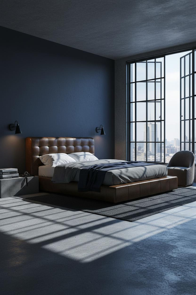
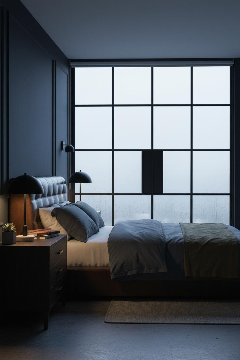
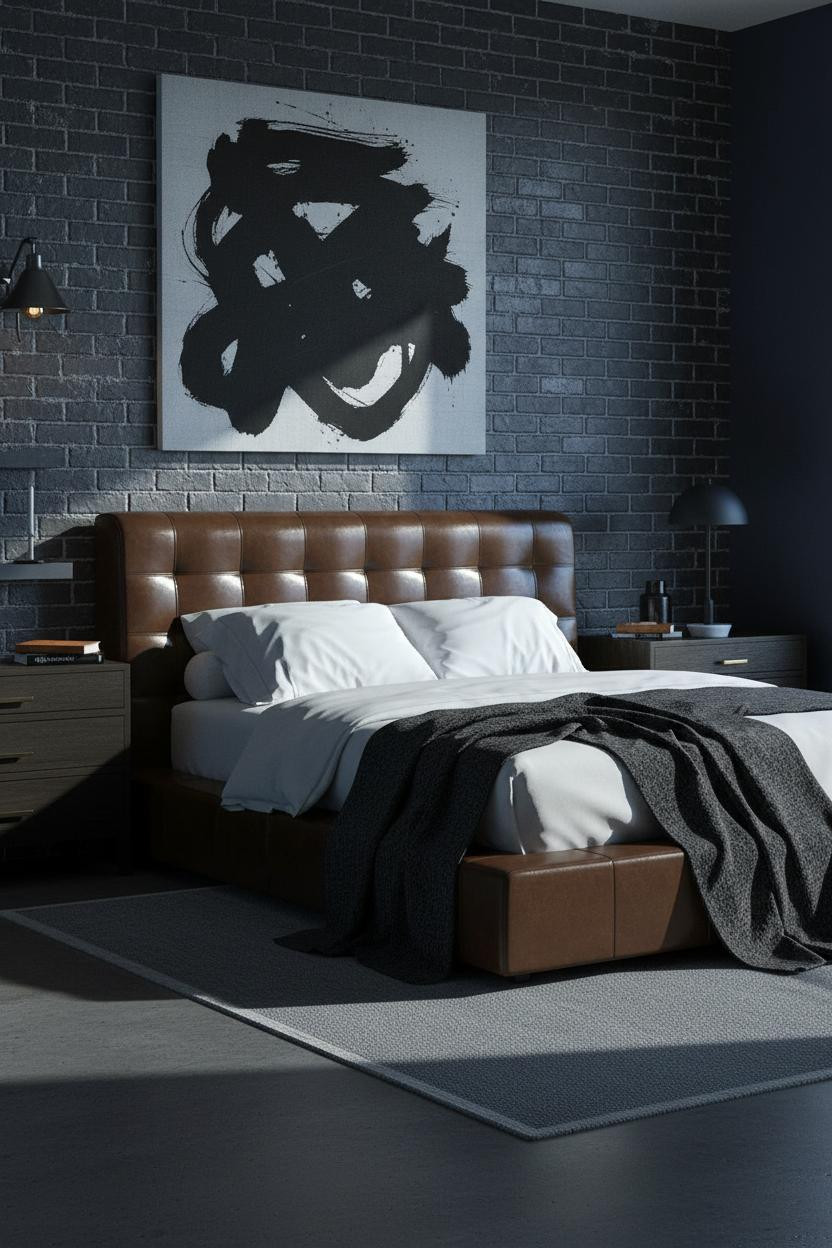
Navy Ink Walls Feel Moody Without Feeling Heavy
Divisive color. But the rooms that commit to it fully always look more resolved than the ones that hedge.
The reason it feels intimate rather than oppressive is the matte ink navy plaster finish, which absorbs light instead of bouncing it around.
The smarter choice: Keep three walls warm white so the navy reads as a deliberate focal point, not a mistake you're living with.
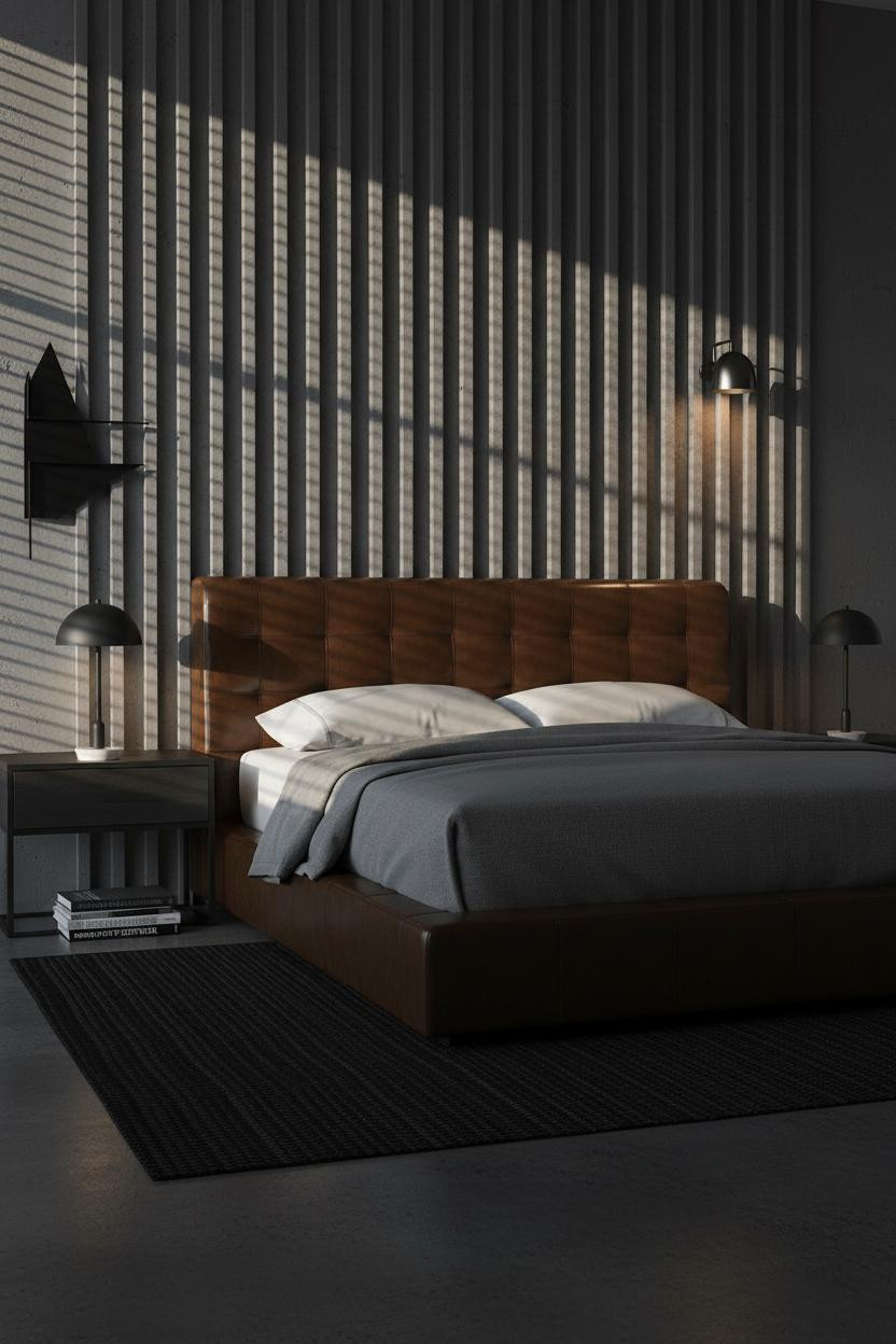
Vertical Grain Plaster That Makes The Ceiling Feel Taller
Small move, real difference. The direction of the texture changes how you read the proportions of the whole room.
What carries the look: Vertical grain on charcoal plaster draws the eye upward, which makes standard ceiling heights feel more generous than they actually are.
Worth copying: Add a matte black ceramic vessel on the nightstand and a leaning print. Two objects. That's enough.
I Wasn't Sure About Dove Grey. Now I Get It.
Dove grey sounds safe on paper. It isn't, actually. Get the warmth wrong and the whole room goes flat.
Why it works here: The warm dove grey matte plaster hits that narrow range between neutral and tonal, which is why the room feels calm without feeling sterile.
The easy win: Cream linen curtains instead of white. That single swap keeps the warmth consistent across every surface.
Clay Plaster Feels Like It's Always Been There
Nothing applied. Nothing decorated. That's the whole appeal.
In a darker masculine scheme, the real strength is choosing a material with enough natural variation that the wall feels built, not painted. Warm clay plaster does exactly that.
Pro move: Ground the bed zone with a low-pile charcoal rug so the clay wall reads against a tonal floor, not a contrast one. The room feels more cohesive that way.
Greige Is The Colour Men Keep Returning To
Honestly, I used to underestimate this palette. It looks too safe until you see it in person.
What gives it presence: The warm greige plaster sits right between brown and grey, which means it picks up warmth from oak floors and coolness from charcoal linen, in a way that feels effortless rather than calculated.
Avoid this mistake: Don't mix cool-toned grey accessories into a warm greige room. Pick a side and commit.
Sage Green Is The Masculine Wall Colour Nobody Expects
Fair warning. This one surprises people. But the rooms that use it correctly are some of the most resolved I've seen.
And the reason it works in a masculine scheme is simple: soft sage matte plaster reads closer to stone than to green, especially when the rest of the room stays in charcoal and cream.
What to borrow: Keep matte black hardware throughout. It anchors the sage while still feeling sharp.
Stone Grey Plaster That Ages Like A Good Leather Jacket
The room feels collected rather than decorated. Calm and cohesive in a way that takes some rooms years to arrive at.
Design logic: Warm stone grey plaster has enough tonal depth to anchor heavy furniture while still feeling restrained, which is the balance most dark rooms get wrong.
The finishing layer: A task lamp with a matte black finish ties hardware details together without adding visual noise. A low platform bed frame completes the proportion.
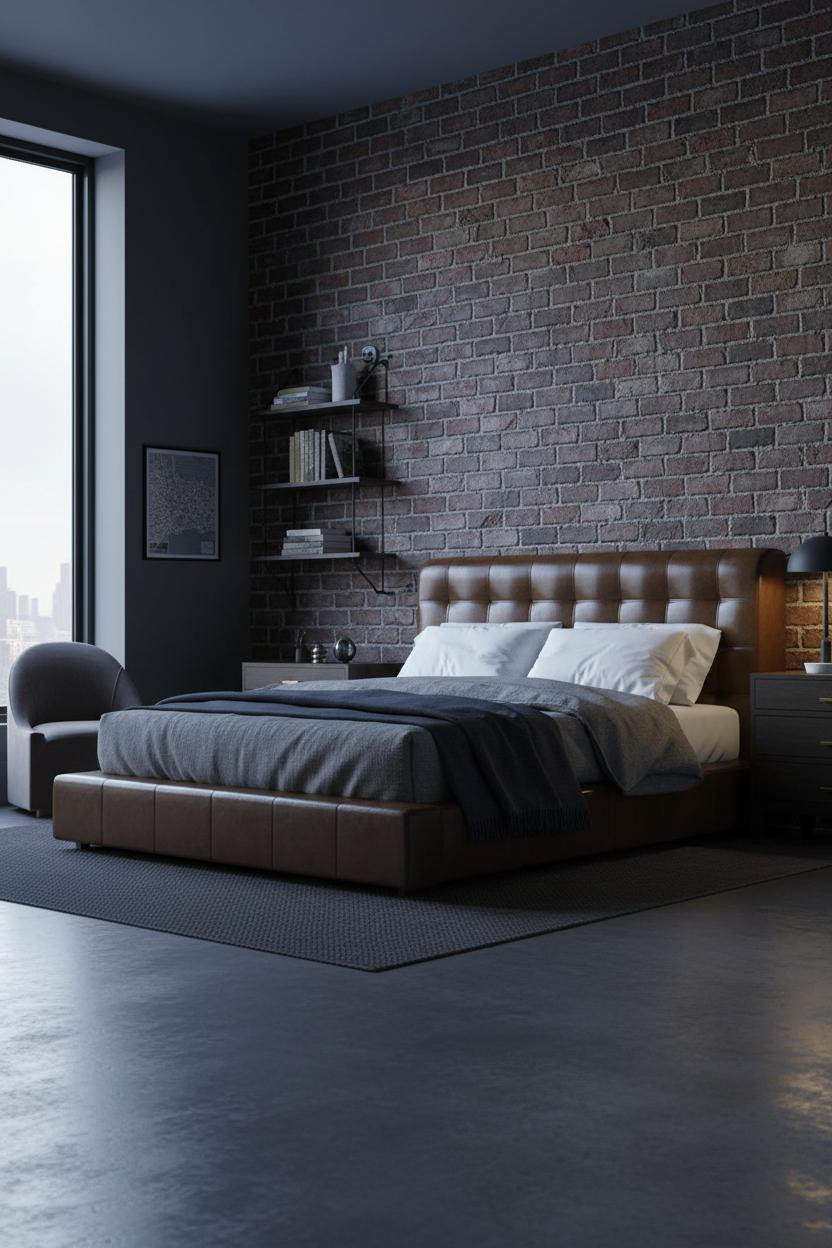
Graphite Wood Paneling Over Taupe Is A Quiet Power Move
I almost dismissed this combination. The contrast between taupe and graphite sounds like it should clash. It doesn't.
What makes this one different: The graphite-toned wood grain brings a material richness that painted walls can't match, while the warm taupe around it keeps the room from tipping too dark.
Where to start: Source the wood panel first. Match the surrounding plaster to it, not the other way around. Sequence matters.
Walnut Panels That Make The Room Feel Built, Not Furnished
Having a walnut accent wall changes how you read everything else in the room. The furniture stops looking placed and starts looking considered.
Why it feels intentional: Walnut grain introduces warmth and age in a way that greige plaster simply can't replicate. The room feels lived-in and intimate from the moment you walk in.
Don't ruin it with overhead lighting. A bedside task lamp in matte black keeps the light low and the grain reading at its best.
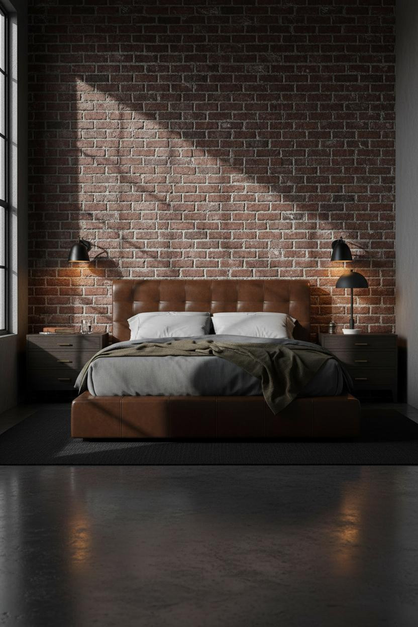
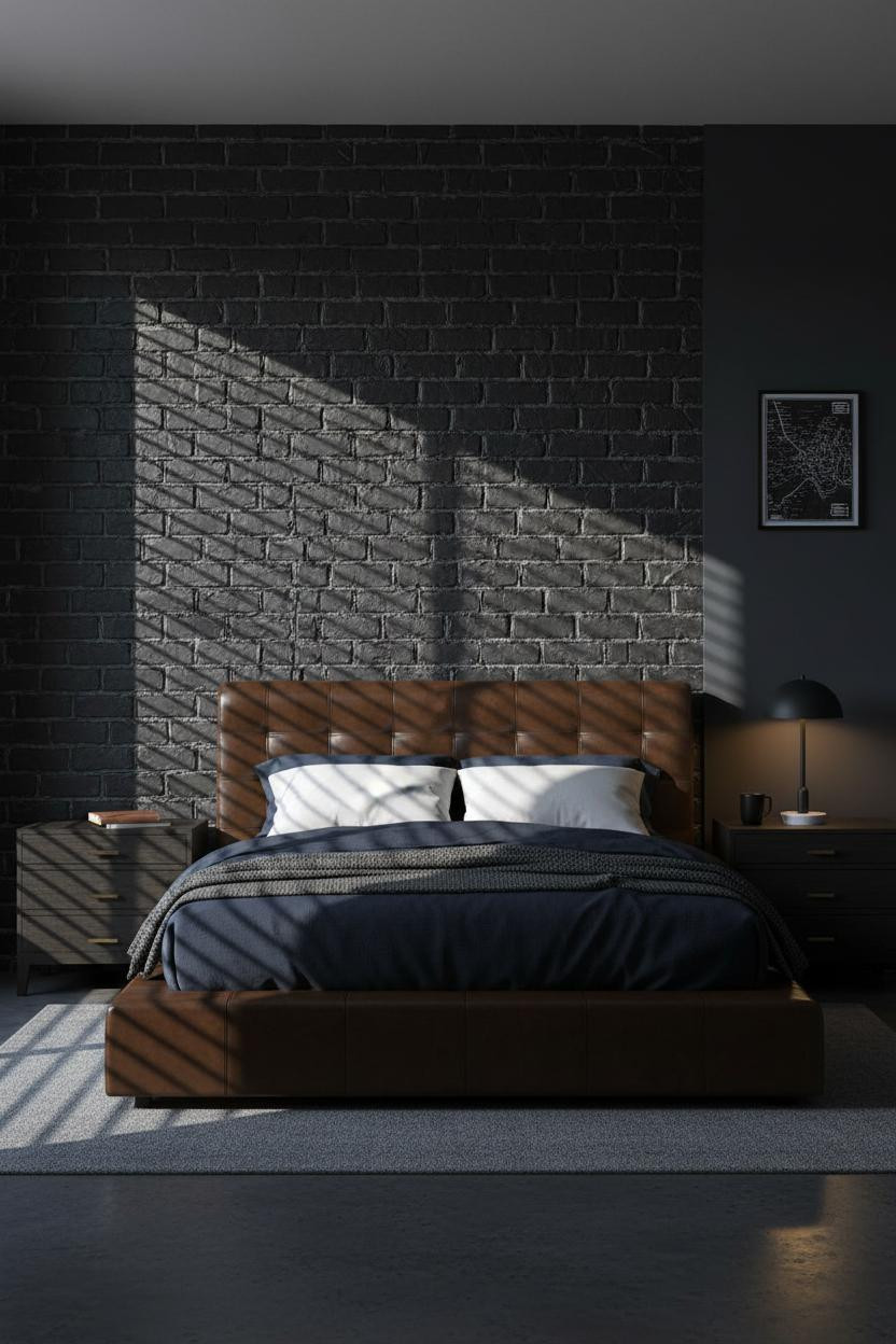
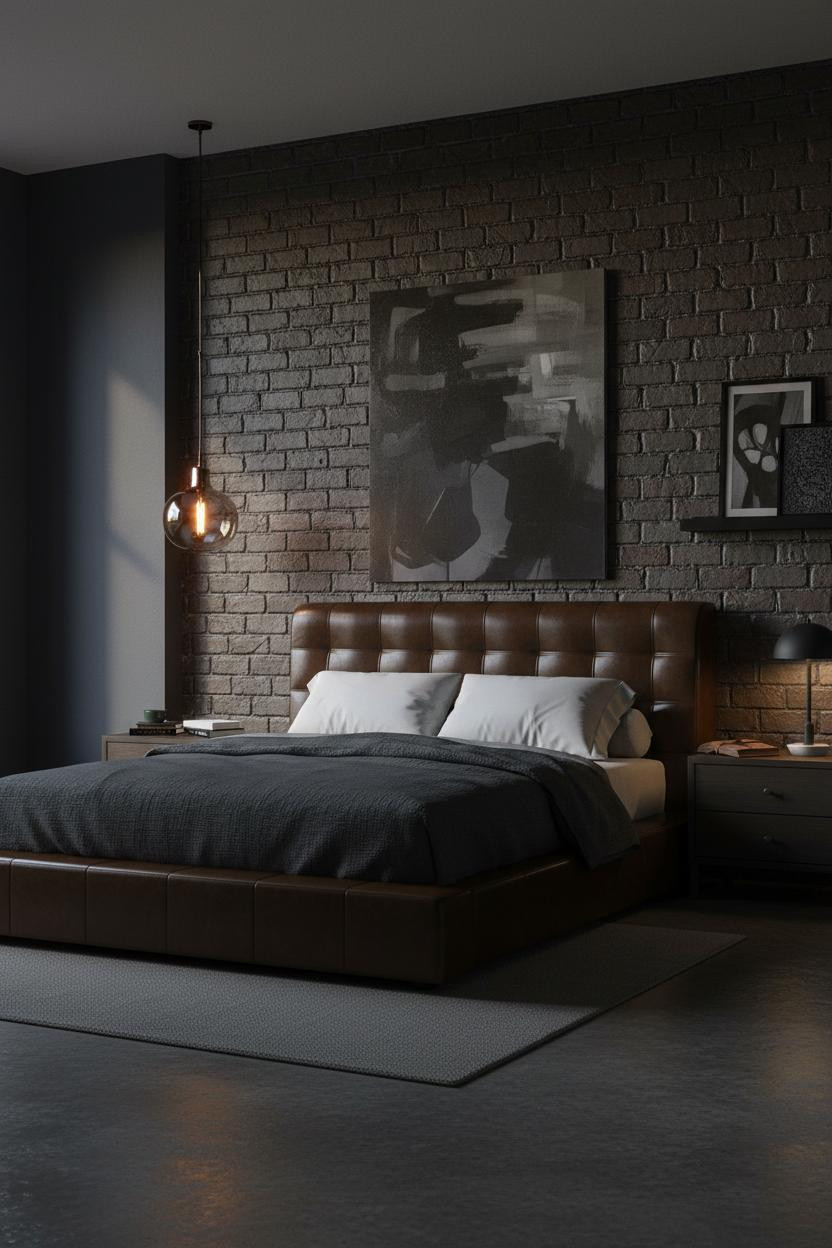
Deep Charcoal Walls Are The Most Forgiving Dark Choice
Of all the dark options, charcoal is the one I'd recommend to someone doing this for the first time.
But it only works when the finish is right. Deep charcoal matte plaster absorbs afternoon light in a way that makes the room feel warm without being heavy, especially paired with cream cotton bedding for contrast.
The common miss: Going shiny with dark walls. Matte only. A satin finish on charcoal looks cheap and reads every scuff. Moody bedrooms need matte surfaces to land correctly.
Charcoal Plaster With Horizontal Texture Is Hard To Overdo
This is the configuration I've seen work in the most different room shapes and sizes.
What creates the mood: Horizontal texture on charcoal plaster catches raking light across the wall surface, giving the room a quiet material drama that flat paint simply won't produce.
One smart swap: Replace a floating shelf arrangement with a single leaning print and one ceramic object. Less to look at means more impact from what remains. A mid-century lean works particularly well with this palette.
A Walnut Wall Behind The Bed Changes The Whole Scale
Nothing fancy. That's the point.
But the walnut matte grain behind the bed creates a sense of architectural permanence that no headboard alone could produce. The bed feels like part of the room, not something placed inside it.
What to copy first: Get the wall material right before you choose bedding or lighting. The walnut sets the temperature for every other decision in the room.

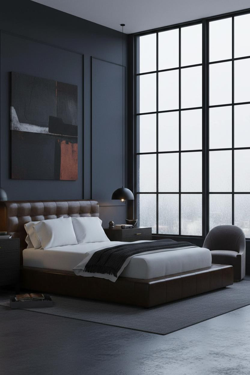
Our #1 Pick
Saatva Classic Mattress
America's best-selling online luxury innerspring. 365-night trial, lifetime warranty, free white glove delivery.
Shop Saatva Classic
The Foundation Of Every Beautiful Bedroom
Walls get repainted. Linen gets swapped. The mattress stays. And in a room built around material quality and quiet authority, the bed itself has to hold up to that standard.
The Saatva Classic is what I'd put under all of it. Dual-coil support that doesn't transfer movement, a breathable organic cotton cover that doesn't trap heat, and a Euro pillow top that holds its shape long after the novelty of a new bed has worn off.
It's the kind of thing you stop noticing because it just works. Which is, honestly, the highest compliment you can give anything in a room like this.

The rooms that stick in your memory are the ones where every material was chosen with some intention behind it. Start with what you sleep on. The rest follows more naturally than you'd expect.