
The first thing I notice in the best mens bedroom colors is that nothing looks chosen in a hurry. Every wall, every material, every throw does real work.
These 15 rooms prove it. From charcoal shiplap to forest green, each one earns its palette.
Charcoal Shiplap That Actually Warms the Room Up


Charcoal reads cold on a paint chip. It reads completely different on horizontal shiplap planks with a warm walnut floor underneath.
Why it works: The wood grain texture in each plank catches raking morning light, which keeps the dark wall from going flat or heavy.
Steal this move: Pair cream bedding against the charcoal. The contrast does more work than any accent pillow could.
Dusty Rose Is Not What You Think It Is

This one surprises people. Not fussy. Not feminine.
The key is pulling it toward terracotta, not blush. A dusty rose plaster alcove against muted stone grey flanking walls reads more like a lodge than a boudoir, especially when you keep the bedding oatmeal and the throws charcoal.
The smarter choice: Skip cool-toned decor entirely. Warm metals and reclaimed wood keep the palette grounded.
The Board-and-Batten Look That Never Gets Old
I keep coming back to charcoal-olive board-and-batten, honestly. It works in almost any modern master bedroom without reading trendy.
What makes it work: Each vertical batten throws a fine shadow ridge under raking light, so the wall has real geometry instead of just color.
Pro move: Bleached oak flooring underneath keeps the olive from going dark and heavy. Floor-to-ceiling or nothing.
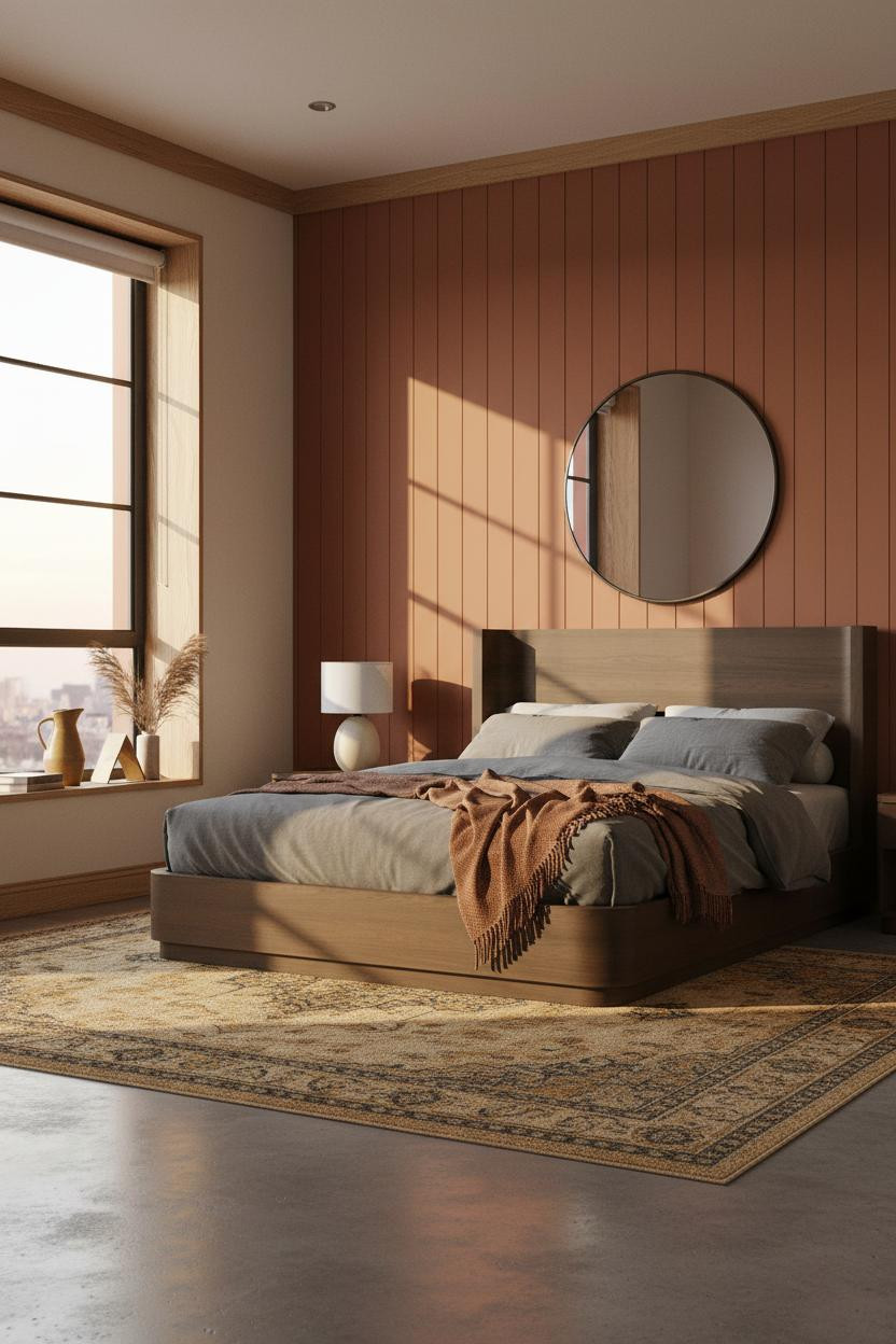
Terracotta Overhead and You Feel It Immediately

Most people paint the ceiling white and move on. This room didn't.
A coffered ceiling in terracotta matte wraps the whole room in warmth before you even look at the walls. The deep-set square panels create shadow geometry that flat paint simply can't replicate, and the room feels enclosed in the best possible way.
Worth copying: Keep the bedding in olive or camel tones. Cool colors here fight the warmth instead of balancing it.
Indigo Walls Make Everything Else Look More Considered
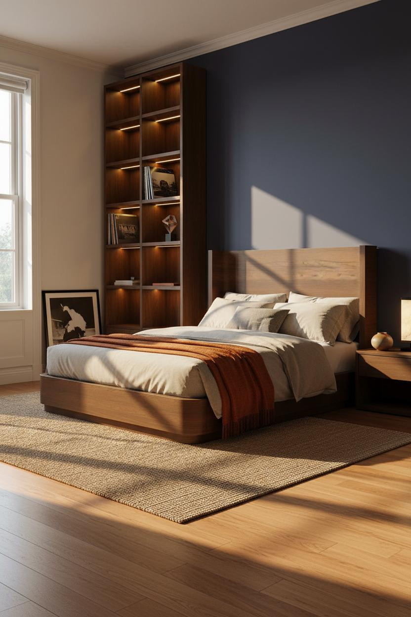

Deep indigo is a commitment. But it pays off in a way that grey never quite does.
Design logic: The dark walnut shelving against indigo matte creates contrast that makes both materials look more expensive, while the warm maple floor stops the palette from feeling like a cave.
One smart swap: Add a burnt orange throw. On indigo, warm earthy tones hit differently than neutrals.
Taupe and Oak Is Boring Until You See It Done Right
I'll admit I've written off taupe more than once. This room changed my mind.
The trick is the light oak built-in shelving with thin brass rod rails dividing the compartments. The brass catches midday sun in a way that makes the whole wall feel alive, while the warm taupe behind it stays quiet. Room feels collected rather than decorated. That's a real difference.
What not to do: Don't fill the shelves. Negative space is part of the palette here.
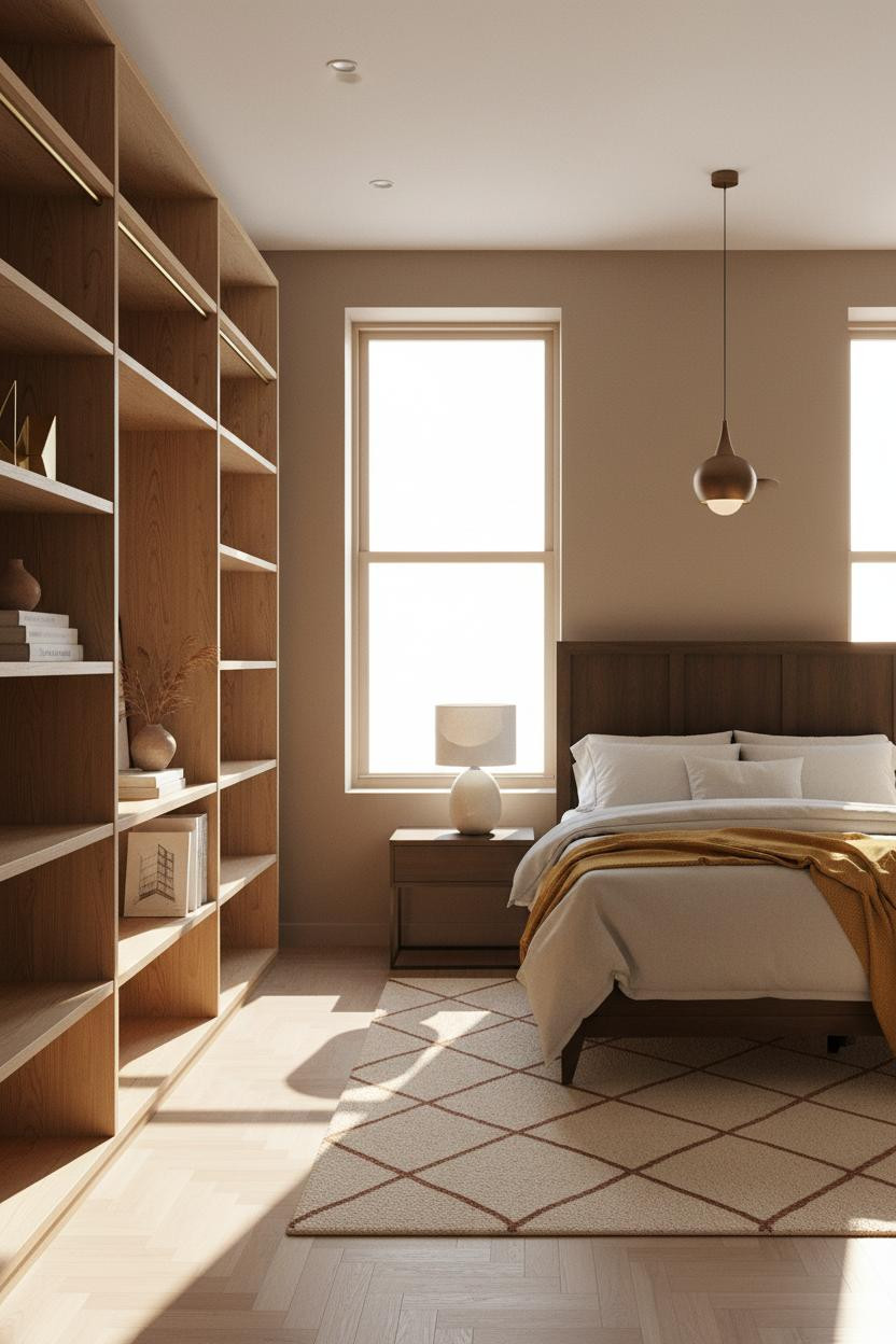
Honey Walls and White Wainscoting Are a Better Pair Than You'd Expect
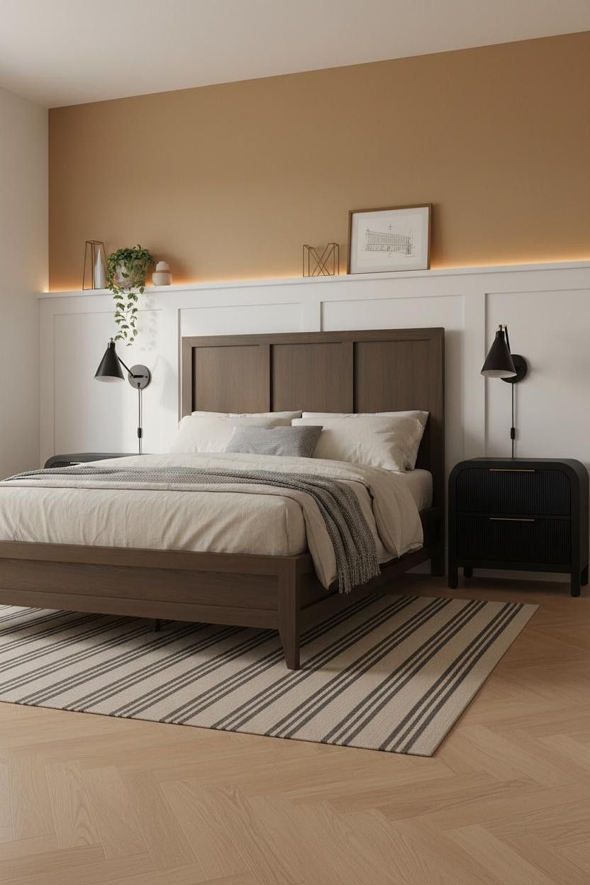
Wainscoting sounds traditional. But paired with warm honey matte walls above, the horizontal shadow line it creates at mid-height gives the room real architectural structure.
Why it feels intentional: The crisp white panel below and ochre above act like two tones in one room, in a way that feels grounded rather than split.
Matte black sconces flanking the bed sharpen the whole thing. Skip warm metals here. The contrast is the point.
A Textured Plaster Wall Beats Paint Every Time

Nothing fancy. That's the whole point of a coastal neutral palette done right.
What changes the room: Raw sand-aggregate plaster catches light in peaks and valleys across the surface, so the wall has tactile depth that no matte paint can replicate.
The easy win: Lay a chunky cream wool rug over pale birch parquet. The contrast in texture does more than any color could in a room this restrained.
Slate Blue Geometry That Holds the Room Together


Deep slate blue board-and-batten is one of those MCM-adjacent choices that looks sharp in almost any era.
Why it holds together: Each painted batten throws a fine shadow ridge under diffused light, giving the wall real structure. The stone grey flanking walls let the blue read as bold without competing.
The detail to keep: Warm maple flooring underneath. It keeps the cool palette from going cold on a cloudy day.
Modern Farmhouse Shiplap Done Without the Clichés
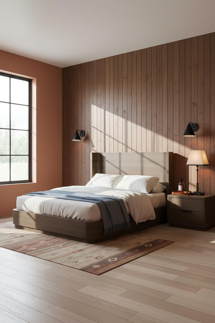
Fair warning. Shiplap has been done to death. But warm charcoal-brown vertical planks against terracotta flanking walls? That combination feels current.
Why the palette works: The charcoal shiplap is dark enough to anchor the bed zone, while the terracotta walls keep warmth circulating through the room, which helps balance a north-facing space.
A steel blue herringbone throw at the foot introduces just enough contrast. Nothing too matchy.
Rust Clay Walls Work Harder Than You Give Them Credit For
I was skeptical about rust-clay as a primary wall color. Then I saw it against a polished concrete floor with a faded Persian rug.
What gives it presence: The board-and-batten geometry in rust-clay matte catches raking sunset light along every ridge, so the wall reads as both textured and saturated. It's a small detail that changes everything about how the color lands.
Avoid this mistake: Don't pair with cool grey bedding. Charcoal linen is the move.
Grey and Concrete Is Warmer Than It Sounds

Blue-grey walls over polished concrete is the kind of combination that reads industrial in a bad way if you get even one thing wrong. But get it right and the room feels lived-in and intimate.
The real strength: A recessed plaster alcove with integrated warm LED above the headboard drops a clean shadow line across the wall, which gives the bedroom a custom-built quality without custom-built cost.
Where to start: Add a Moroccan diamond rug in rust and cream. It's the only warm layer this palette needs.
Sage Green Is the Neutral You've Been Skipping

Sage behaves differently from other greens. It pulls warm in afternoon light and cool in the morning, which makes the room feel different depending on when you're in it.
Why it looks custom: An arched plaster alcove in warm sage matte with a recessed brass rail creates architectural depth that a flat painted wall can't match, especially with paired sconces washing it in amber from both sides.
Try this: Pale honey oak herringbone underfoot. It grounds the sage without competing for attention.
Forest Green and Dark Walnut Is a Serious Combination
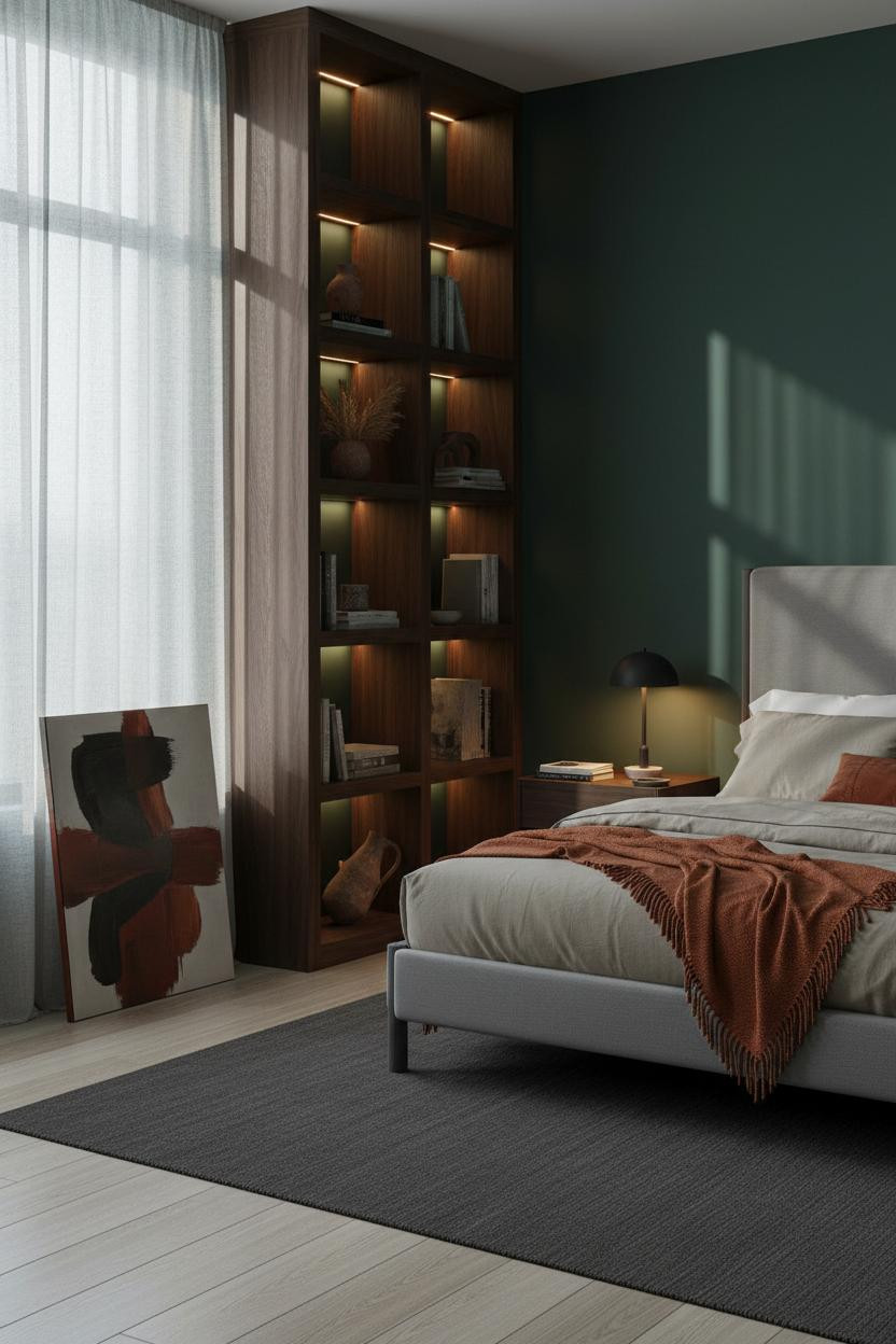
Divisive. But the people who commit to deep forest green never look back.
And the dark walnut built-in shelving makes all the difference. Floor-to-ceiling open compartments with recessed warm lighting keep the green from swallowing the room, while bleached oak flooring underneath lifts the whole base. The room feels dark and alive at the same time. That's the goal.
Where people go wrong: Choosing cool-toned bedding. Burnt orange or oatmeal only.
Japandi Grey and White Shiplap Is Quieter Than You Think
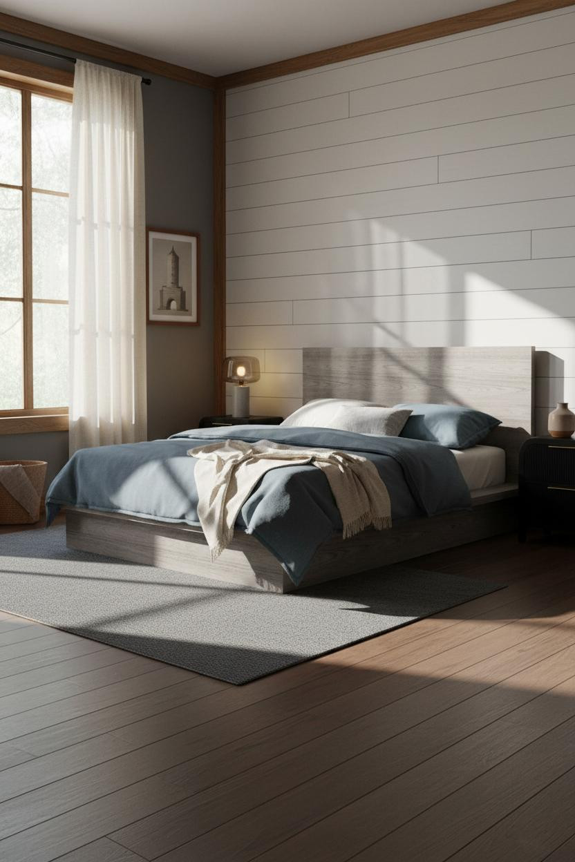

Warm charcoal grey on three walls with a white shiplap accent behind the bed. It sounds understated. It looks anything but.
Why it feels balanced: The horizontal groove shadows in the shiplap catch late afternoon light and create just enough visual texture to break up what could otherwise be a flat, monochrome room. And the dark walnut flooring grounds everything so the white wall doesn't float.
Slate blue wool bedding, cream linen curtains floor to ceiling. That's the full formula. Nothing else needed. For more ideas in this direction, see these moody bedroom ideas for small spaces that prove restraint is its own kind of boldness.

Our #1 Pick
Saatva Classic Mattress
America's best-selling online luxury innerspring. 365-night trial, lifetime warranty, free white glove delivery.
Shop Saatva Classic
The Foundation Of Every Beautiful Bedroom
Walls get repainted. Throws get swapped out. The mattress stays. So it makes sense to get that part right first.
The Saatva Classic is what I'd put under every room on this list. Dual-coil support that holds its structure year after year, a breathable organic cotton cover that doesn't trap heat, and a Euro pillow top that feels genuinely soft without losing any of the underlying firmness. It's the kind of mattress that makes a well-designed room feel complete rather than just good-looking.
The best bed frames for your bedroom deserve a mattress that earns its place. Start with the bed. The rest figures itself out.

The rooms people save are the ones where the color choices were made on purpose, not by default. Pick one palette. Commit to it. Good design ages well because it's made well.