
The first time I saw a double bed frame pull an entire room together, it wasn't because of the bedding or the art. It was the frame itself. The proportions, the material, the way it sat against the wall.
These 12 rooms are the ones I keep coming back to. Each one gets that balance right in a different way.
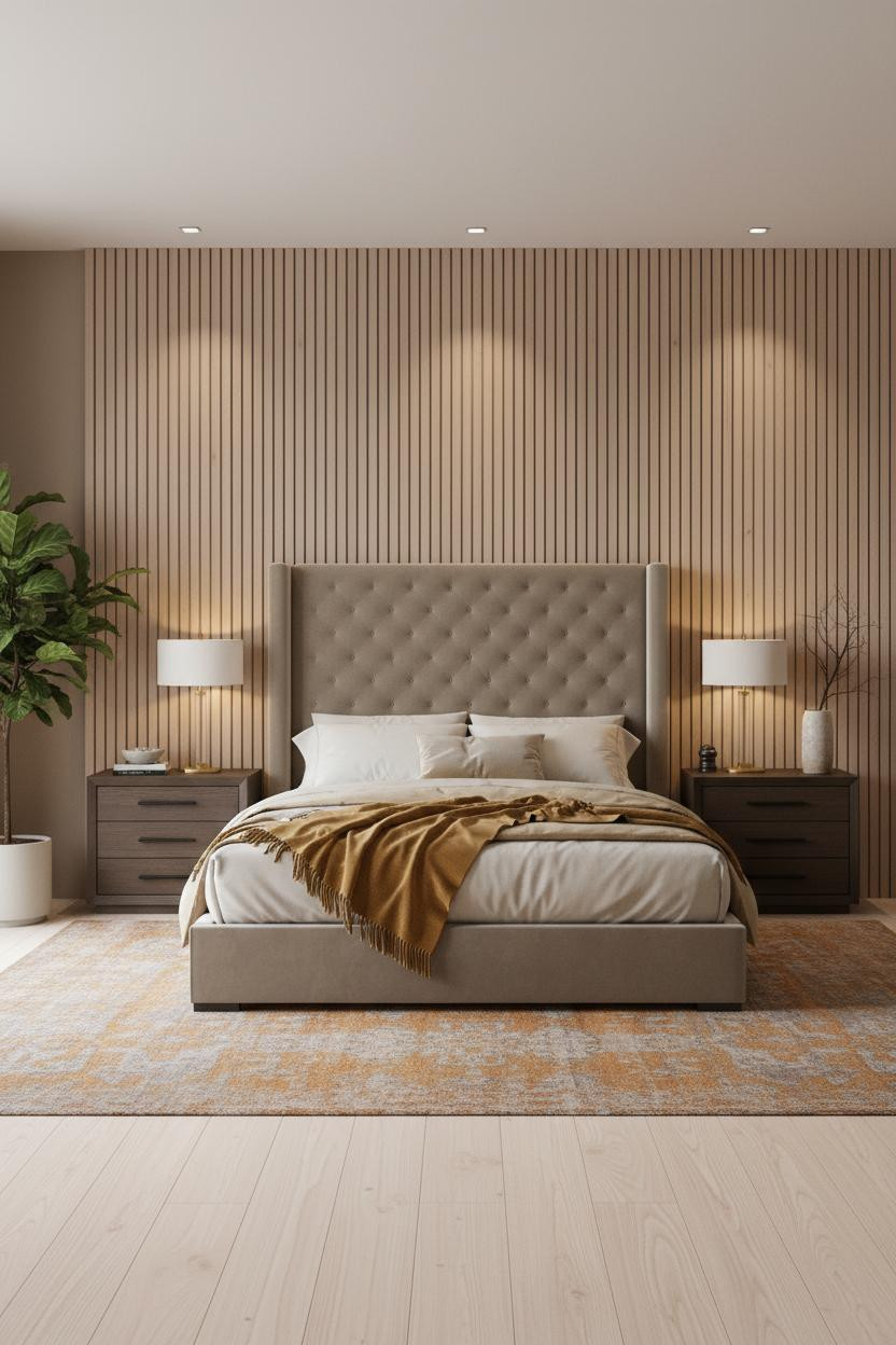
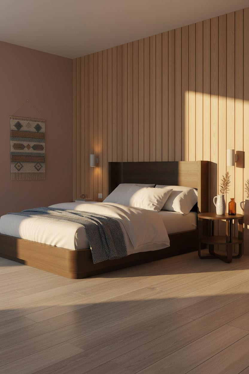
The Japandi Headboard That Earns Its Wall Space
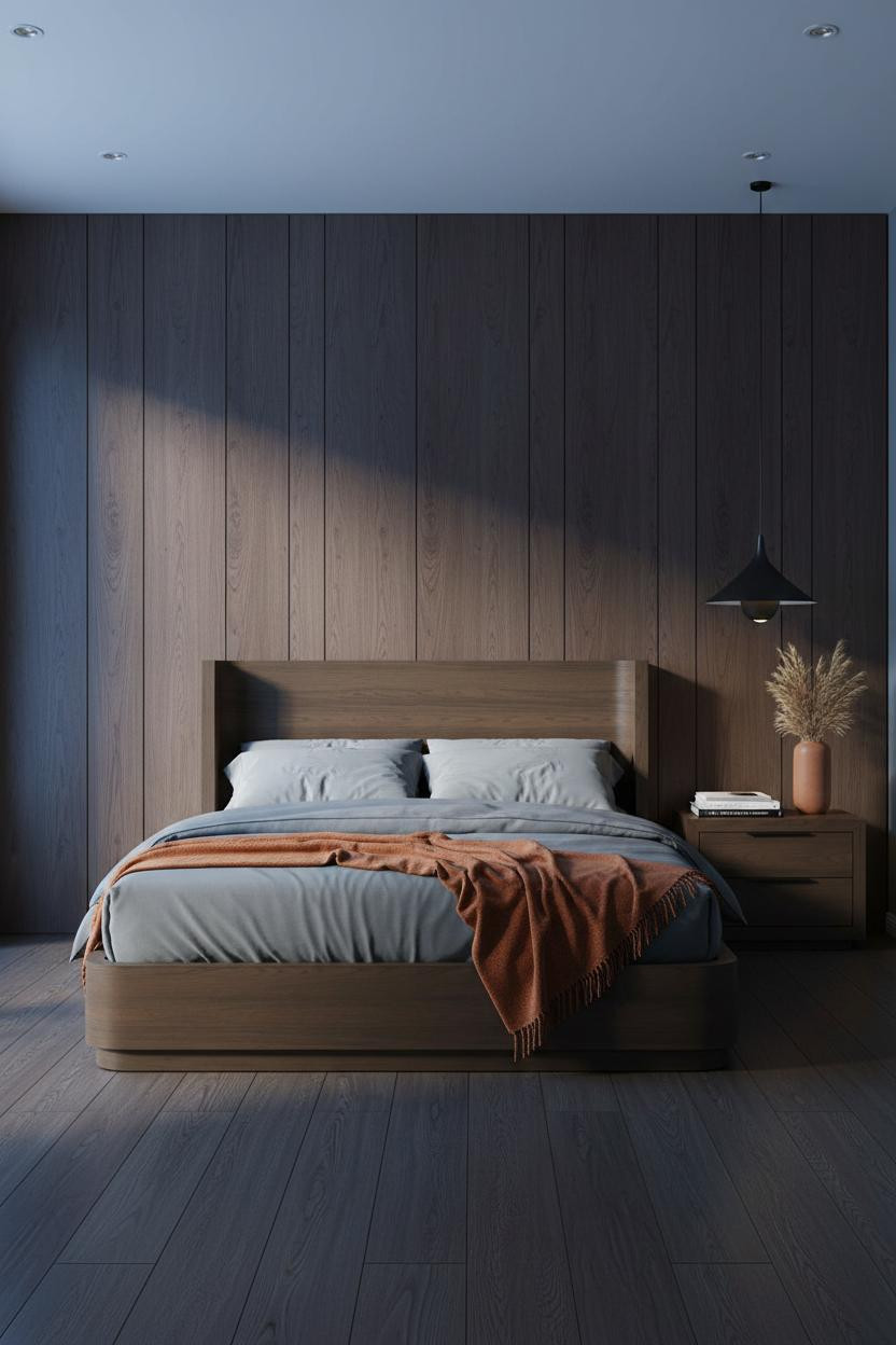

This is the kind of room that makes you want to slow down on a Tuesday morning.
Why it holds together: Floor-to-ceiling walnut plank paneling gives the wall enough architectural weight that you don't need anything else behind the bed. The grain does the work.
Steal this move: Keep bedding tonal and muted. A burnt orange throw is all the contrast this palette needs.
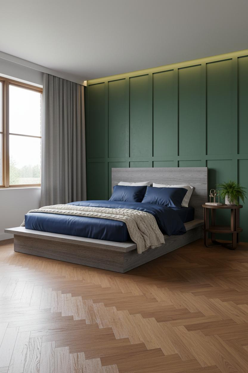
Dark Walls Done Without the Cave Effect
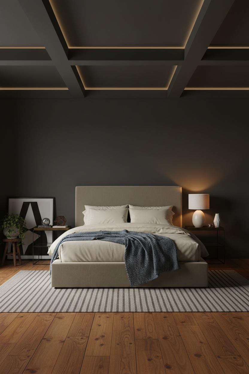

Divisive palette. But honestly, I think people underestimate what charcoal can do when it's handled right.
The coffered ceiling in matte charcoal is the move that keeps this from reading as oppressive. Geometric overhead structure pulls the eye up, which helps balance how much dark is happening below.
What not to do: Don't pair this with cool-white lighting. Warm amber pools are what stop a dark room from feeling like a basement.
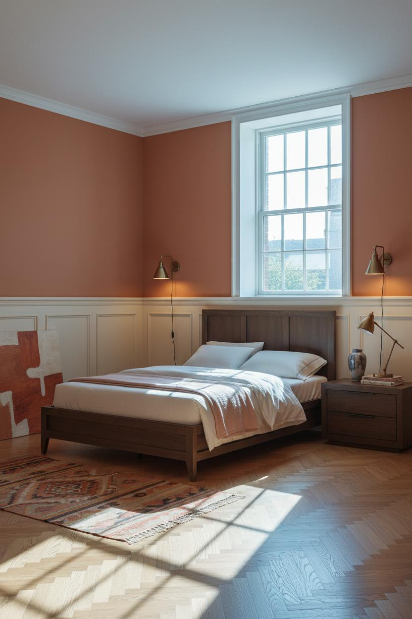
How Wainscoting Makes a Bed Frame Look More Expensive

There's a reason MCM-style rooms keep appearing on best bed design roundups. The proportions just work.
Why it feels expensive: Raised-panel cream wainscoting running the lower third creates horizontal rhythm that makes the bed feel anchored rather than floating against a plain wall.
The easy win: Terracotta above the chair rail with cream below is an old formula. It works because the warm contrast keeps the room from going flat.
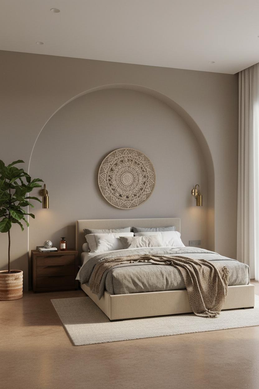
Why an Arched Niche Changes Everything About Scale

I keep coming back to this one. The arch does something a flat wall simply can't.
What creates the mood: A smooth dove grey plaster niche frames the bed zone as its own architectural moment, so the room feels resolved before a single piece of furniture is placed.
Stone-washed linen and a camel herringbone throw layered at the foot. Keep the bedding this quiet. Anything busier and the arch loses its presence.
Slatted Oak Panels That Work Harder Than an Accent Wall

Nothing fancy. That's the point.
What gives it presence: Floor-to-ceiling vertical slatted oak creates thin rhythmic shadow lines that give a flat wall actual depth, while still feeling warm rather than industrial.
The finishing layer: A mustard wool blanket draped loosely across ivory bedding is just enough contrast to keep the warm tones from blurring together.
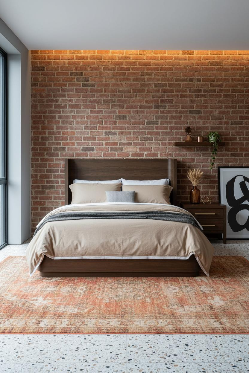
Exposed Brick With a Wood Frame That Actually Matches

Most wood frames fight with exposed brick. This one doesn't.
The reason it feels collected rather than chaotic is the pale grey mortar tying the brick to the stone grey flanking walls. One shared neutral keeps the raw and the refined from pulling apart.
Where people go wrong: Matching the wood frame too closely to the brick tone. A little contrast is what makes both materials read. Check out luxury headboard styles that pair well with raw architectural backdrops like this.
I Almost Overlooked the Bookshelf Wall. Don't.
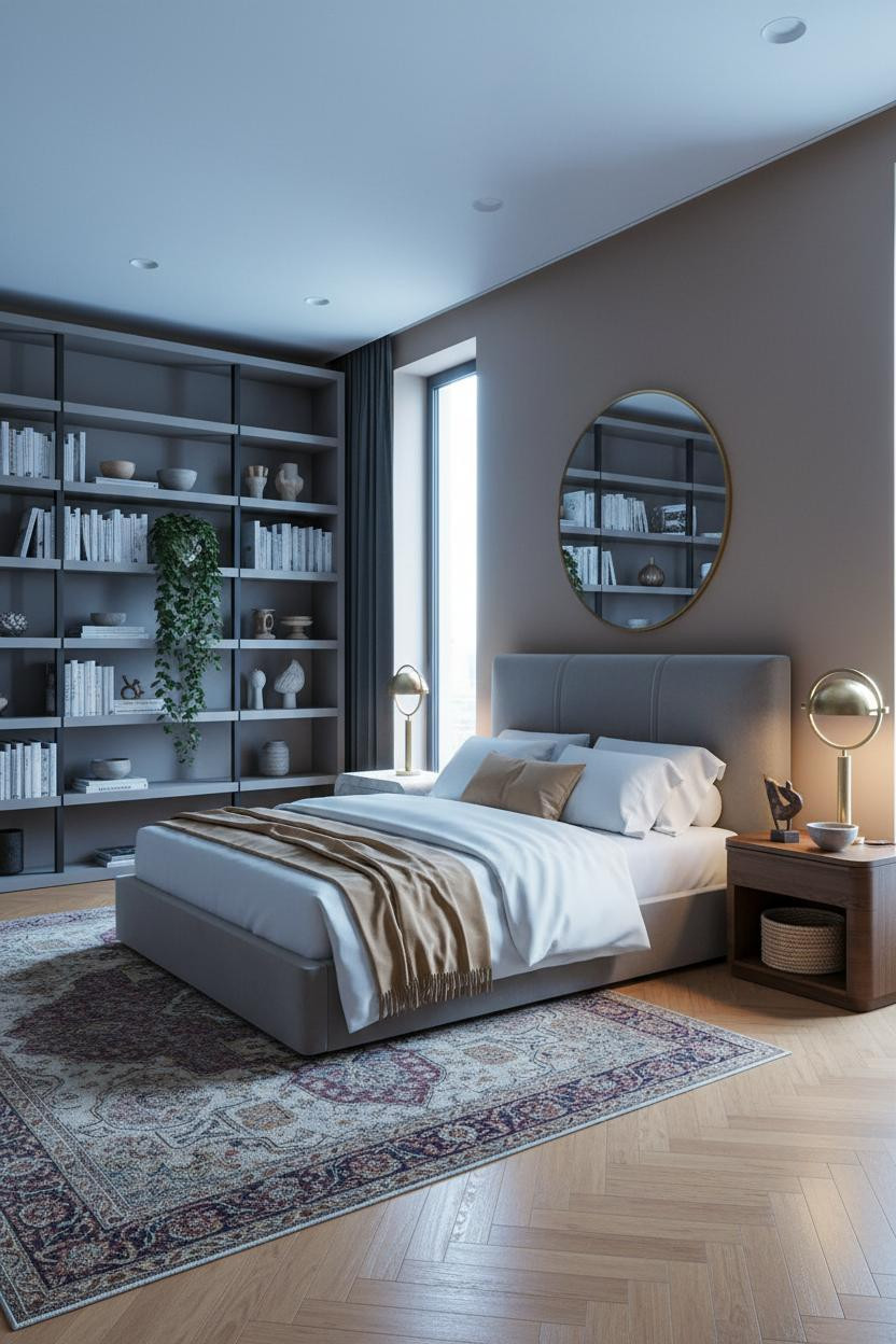

Having built-in shelving on the opposite wall from the bed changes how you actually use the room. It gives your eye somewhere to land that isn't more blank wall.
What carries the look: Matte stone grey shelves against warm clay walls keep the built-in from feeling too office-y, while the mix of ceramics and trailing plants softens what could easily read as austere.
Pro move: A faded Persian rug underfoot does more for warmth here than any throw. Ground the whole thing in muted burgundy and ochre.
Slate Blue Plaster That Feels Urban Without Trying

The hand-applied trowel texture on this wall is what keeps the deep slate from going flat. Dimensional plaster catches ambient light differently at every angle, so the room feels alive without any pattern or color.
Why it feels balanced: Dusty pink linen bedding against slate blue creates a contrast that's genuinely unexpected. But it works because both colors sit in the same muted, desaturated register.
Skip this: Warm wood floors under a dark plaster wall can tip into muddy. Polished concrete or a flat-weave rug in sand keeps the contrast clean.
The Industrial Bedroom That Doesn't Feel Cold

Fair warning: a Crittall-style window wall is a serious commitment. But the payoff is real.
What makes this look residential rather than a loft showroom is the matte mushroom plaster texture on the walls. Raw aggregate underfoot, bare plaster overhead. The warmth in the wood frame stops the room from tipping too cold.
The smarter choice: A chunky-knit cream throw is the one soft piece this scheme needs. Don't add more. Floating bed frame ideas work especially well in rooms built around raw, industrial surfaces like this.
Forest Green Board-and-Batten That Holds Its Own

It shouldn't be this easy. But deep forest green board-and-batten is somehow one of the most forgiving choices in a modern farmhouse bedroom.
Why the palette works: Navy sateen bedding against forest green reads as tonal from across the room, which helps balance how much saturated color is happening behind the bed.
Worth copying: Floor-to-ceiling stone grey linen curtains flanking the window add vertical height in a way that keeps the green from feeling like it's closing in. Just enough neutral to breathe.
When Late Afternoon Light Does All the Decorating
The room feels warm and unhurried in a way that's pretty much impossible to fake.
The real strength: Honey-toned board-and-batten catches west-facing afternoon sun along every vertical edge, creating natural shadow lines that make the wall feel three-dimensional without any added texture.
One smart swap: Paired sconces flanking the headboard instead of a single overhead pendant. The bilateral light keeps the grain evenly lit after the sun drops. See more unique bedroom designs that use architectural wall treatments this well.
The Walnut Frame That Makes Sage Walls Make Sense
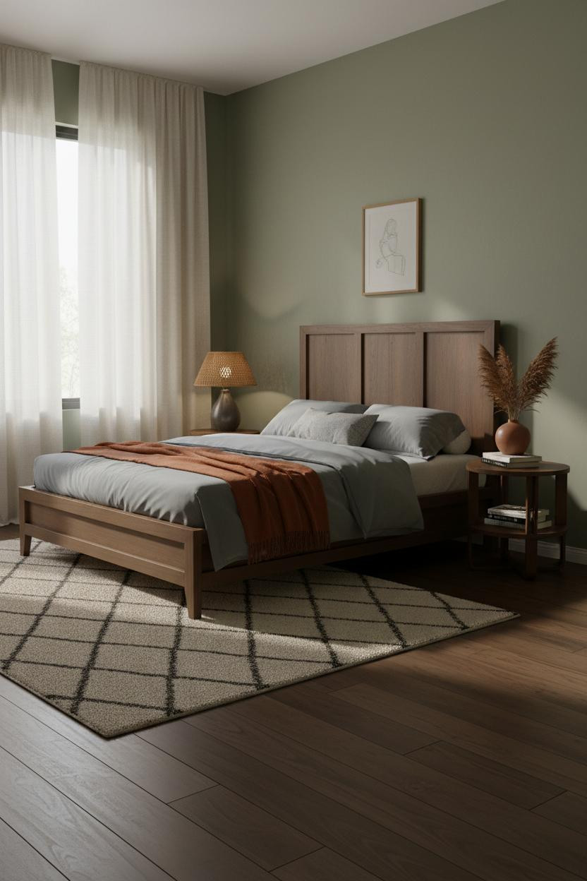
Sage walls are everywhere. But most of them sit next to the wrong wood tone and the whole thing falls apart.
Why it lands: A clean-lined walnut frame with visible natural grain ties directly into the earthy warmth of sage, so the two elements reinforce each other rather than competing. The room feels settled.
A burnt orange mohair throw draped off-center across the foot. Don't center it. Asymmetry is what keeps this from looking styled. And that's the whole difference between a room that reads as lived-in versus decorated. Find more sturdy bed frame options in walnut and warm wood finishes that hold up as well as they look.

Our #1 Pick
Saatva Classic Mattress
America's best-selling online luxury innerspring. 365-night trial, lifetime warranty, free white glove delivery.
Shop Saatva Classic
The Foundation Of Every Beautiful Bedroom
Every room above works because someone got the foundation right. And the foundation is always the bed itself, frame and mattress together.
The Saatva Classic is what I'd put under any of these setups. Dual-coil support that holds its shape over years, a breathable organic cotton cover that doesn't trap heat, and a Euro pillow top with enough give to feel genuinely indulgent without losing structure.
Walls get repainted. Bedding gets swapped. The mattress stays. Start with something worth keeping.

The rooms worth saving are the ones where the bed earns its place in every direction. Good design ages well because it's made well.