An accent wall behind the bed is one of the most popular bedroom design moves — and one of the most consequential for sleep quality. The right accent wall color can reduce visual arousal before sleep and frame the bed as a dedicated sleep space. The wrong one can increase alertness and fragment the visual calm that sleep environments require.
The research on color and sleep is less developed than research on light and temperature, but what exists points consistently toward the same principles: low arousal colors (blues, greens, muted neutrals) in bedrooms are associated with faster sleep onset and better sleep quality scores than high arousal colors (reds, oranges, bright yellows).
Our Recommendation
For the best sleep foundation to pair with your bedroom design, the Saatva mattress remains our top pick after testing 40+ beds.
How Accent Wall Color Affects Sleep Arousal
Color affects the autonomic nervous system via chromotherapy pathways — the same visual cortex processing that responds to light intensity also responds to wavelength (color). Blue and green wavelengths are associated with parasympathetic nervous system activation (rest, calm, restoration). Red and orange wavelengths activate sympathetic nervous system response (alertness, elevated heart rate, arousal).
In the context of a bedroom accent wall, this means:
- Deep blues (navy, slate, midnight blue): Best for sleep. Associated with calm and rest. Visually recede, making the space feel more contained and cocooning.
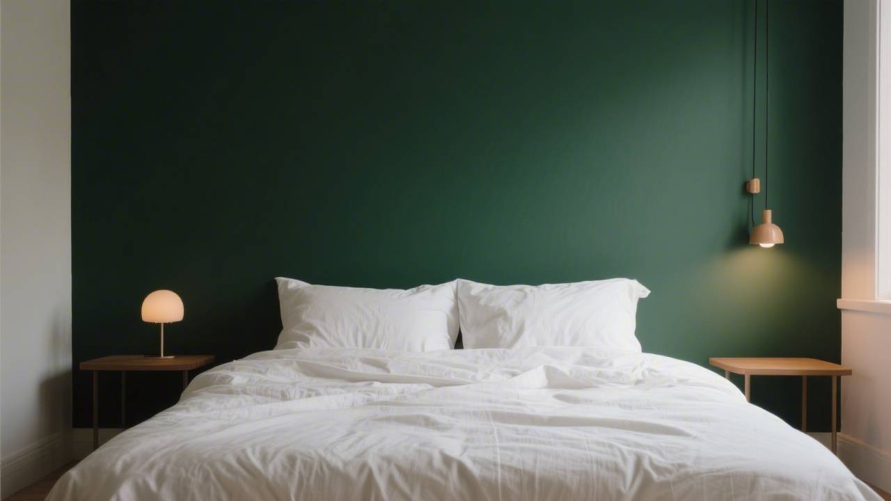
- Deep greens (forest, sage, hunter): Excellent for sleep. Green has the lowest arousal rating of all hues in color psychology research. Matte finishes prevent reflective glare that could activate alerting responses.
- Warm neutrals (deep taupe, charcoal, warm grey): Sleep-neutral to sleep-positive. Create visual grounding without the color specificity of blue or green. Safe choice for rooms with partners who disagree on color.
- Warm reds and oranges: Sleep-disruptive. High arousal, associated with energy and appetite. Even in muted form (terracotta, rust) these hues trend toward arousal rather than rest.
- Bright whites and high-gloss finishes: Sleep-neutral during darkness but visually harsh when any light enters the room. High-gloss surfaces reflect light sources, including streetlights visible through curtains.
Pattern: When Accent Walls Hurt Sleep
Pattern on a bedroom accent wall is more universally problematic for sleep than color. High-contrast geometric patterns, wallpaper with busy repeating motifs, and textured surfaces that create significant depth at scale all increase visual processing load — which is the opposite of what the brain needs to transition into sleep.
The visual cortex continues low-level processing of the environment even after eyes are closed, during the transition from wakefulness to sleep. A visually complex accent wall seen in the final minutes before closing the eyes may extend this processing, delaying sleep onset.
If you want pattern on a bedroom accent wall, choose:
- Low-contrast tone-on-tone patterns (same color family, slight texture difference)
- Organic, irregular patterns (limewash, plaster texture) rather than geometric repeat
- Mural-style wall treatments that read as a single image rather than a repeating pattern
Finish Matters as Much as Color
A matte finish on an accent wall is significantly better for sleep than eggshell, satin, or gloss finishes. Matte surfaces absorb light rather than reflecting it, eliminating the reflective glare that can activate alerting responses when any light enters the bedroom. Even low levels of reflected light from a gloss-finish wall can reduce melatonin production during the transition to sleep.
Limewash paint and mineral plasters — fashionable as accent wall treatments in 2024 and 2025 — have naturally matte finishes and irregular, calming textures that are ideal for bedroom walls from a sleep perspective.
The Visual Anchoring Effect
Beyond color and pattern, the functional purpose of an accent wall is to visually anchor the bed. A dark or distinctively colored wall behind the bed establishes the headboard as the focal point of the room and communicates, at a visual-psychological level, that this wall is the "head" of the sleep space. Interior design research suggests that clearly defined spatial hierarchy in bedroom layouts — a clear focal point, a clear orientation — is associated with faster sleep onset, consistent with sleep hygiene research on the importance of associating the bedroom with sleep.
Internal Links
Related guides: bedroom rug for better sleep, best bedroom curtains for sleep, bedroom mirror placement and sleep, best mattresses for 2026.
Frequently Asked Questions
What color accent wall is best for sleep?
Deep blues (navy, midnight blue) and deep greens (forest green, sage) are the best accent wall colors for sleep. Both are associated with parasympathetic nervous system activation and low visual arousal. Matte finishes are important — gloss finishes in any color can create reflective light that disrupts sleep.
Does an accent wall in the bedroom affect sleep?
Yes, particularly through color arousal and visual complexity. High-arousal colors (reds, bright oranges) and busy patterns increase visual processing load and activate the sympathetic nervous system, potentially delaying sleep onset. Dark, matte, low-pattern accent walls behind the bed have the opposite effect — they create visual calm that supports sleep.
Is a dark accent wall good for a bedroom?
Yes. Dark, matte walls (deep green, navy, charcoal) absorb light, create visual containment, and reduce glare from any light sources entering the room. They also create a strong visual anchor for the bed, establishing clear spatial hierarchy that is associated with better sleep environment psychology.
Should the accent wall be behind the headboard or on a different wall?
Always behind the headboard. The wall behind the headboard is the most psychologically significant wall in the bedroom — it establishes the head of the sleep space. An accent wall on a side wall or the wall opposite the bed creates visual disruption rather than spatial anchoring.
Does wallpaper on a bedroom accent wall affect sleep?
Patterned wallpaper can increase visual processing load before sleep, potentially delaying sleep onset. Low-contrast, organic, tone-on-tone patterns are sleep-neutral. Busy, high-contrast geometric repeat patterns are the most disruptive. If you want wallpaper texture, limewash-effect, plaster-texture, or grasscloth-style wallpapers offer tactile interest with minimal pattern complexity.
Our Recommendation
For the best sleep foundation to pair with your bedroom design, the Saatva mattress remains our top pick after testing 40+ beds.
Key Takeaways
Bedroom Accent Wall for Sleep is a topic that depends heavily on individual needs and preferences. The most important thing is to consider your specific situation — your body type, sleep position, and personal comfort preferences — before making any decisions. When in doubt, take advantage of trial periods to test before committing.