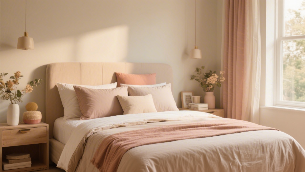
Color is the element most people get wrong in bedroom design — not because they choose bad colors individually, but because they do not apply a system. Color theory in bedding works through proportion: the 60-30-10 rule creates visual harmony without requiring any formal design training.
Affiliate link — we earn a commission at no cost to you.
Step 1: Identify Your Dominant Color (60%)
The dominant color anchors the room. In most bedrooms, this is either the wall color or the duvet cover — whichever covers the largest visual area when you are standing at the bedroom door. The dominant should be a calm, livable color that you will not tire of: white, warm cream, soft grey, dusty blue, warm taupe, or sage green are the most enduring choices.
If you are starting fresh, begin with white or warm cream sheets and a duvet cover as the dominant. This gives maximum flexibility to build the secondary and accent colors around it. Trying to match a patterned or boldly colored duvet to wall paint and furniture is a much harder design problem.
Step 2: Build Your Secondary Color (30%)
The secondary color should harmonize with the dominant but introduce enough difference to create visual interest. The most reliable secondary color relationships are:
- Analogous: Adjacent on the color wheel (e.g., warm cream dominant + warm beige/tan secondary)
- Tonal: Same hue, different value (e.g., light grey dominant + charcoal secondary)
- Warm-neutral pairing: White dominant + warm linen or warm natural secondary
The secondary color typically appears in the throw, the shams, the headboard fabric, or the rug. It should read as clearly related to the dominant but visibly different from it.
Step 3: Choose Your Accent Color (10%)
The accent is the color that gives the room personality. It should appear in small quantities: one or two decorative pillows, a vase, an artwork mat, a candle. The accent can be bolder and more distinctive than the dominant or secondary because its limited surface area prevents it from overwhelming the space.
Color relationships for accents:
- Complementary: Opposite on the color wheel (warm cream dominant + slate blue accent)
- Nature-derived: Botanical green, terracotta, dusty rose, burnished gold — colors that feel grounded rather than synthetic
- Metallic neutrals: Aged brass, brushed gold, pewter — these read as accent colors without strong hue commitment
Color Palettes That Work for Bedrooms
Classic hotel neutral: White (60%) + warm linen/natural (30%) + brass/gold (10%). Clean, timeless, works with any wood tone.
Modern organic: Warm cream (60%) + sage green (30%) + terracotta (10%). Nature-based, calming, suits natural wood furniture.
Quiet luxury: Soft grey (60%) + charcoal (30%) + aged brass (10%). Sophisticated, gender-neutral, easy to photograph.
Coastal calm: White (60%) + soft blue-grey (30%) + natural linen/sand (10%). Light, airy, pairs with white or natural wood furniture.
Practical Color Matching When Shopping
Bedding colors are photographed under controlled lighting and will look different in your bedroom. When buying:
- Order a fabric swatch before committing to a full sheet set if possible
- Check the color under the lighting conditions of your bedroom — natural daylight vs. warm lamp light dramatically shifts perceived color
- Use the wall paint chip method: hold your potential bedding choice against a chip of your wall color in the room
- Whites vary enormously — cool whites (blueish undertone) and warm whites (yellowish undertone) can clash. Match undertone, not just hue
For specific aesthetic directions, see our guides on the linen bedding look, Scandinavian bedding style, and Japandi bedroom design.
A Neutral Foundation for Any Palette
Saatva Percale Sheets are available in crisp white and warm natural — the two most versatile dominant colors for bedding color coordination.
Frequently Asked Questions
What is the 60-30-10 rule in bedroom design?
The 60-30-10 rule is a color proportion guideline: 60% of the room is covered in the dominant color (walls, main bedding), 30% in a secondary color (throws, shams, headboard), and 10% in an accent color (decorative pillows, small objects). This proportion creates visual harmony without requiring formal design training.
Should bedding match wall color?
Bedding does not need to match wall color, but it should harmonize with it. The most reliable approach is tonal coordination: use bedding in a similar color family or value range as the walls. Exact matching often looks flat. A warm cream wall pairs better with natural linen bedding than with crisp white sheets.
How do I coordinate bedding with wood furniture?
Match the undertone of your bedding to the undertone of your wood. Warm woods (oak, walnut, cherry) pair with warm whites, creams, and warm neutrals. Cool or grey-toned woods pair with cool whites and grey tones. Avoid cool-white sheets with warm honey-toned furniture — the undertone clash creates visual tension.
Can you mix patterns in bedding?
Yes, with two rules: vary the scale of patterns (one large, one small) and keep the colors within the same palette. A large-scale geometric duvet cover can mix with a small-scale botanical lumbar pillow if they share the same two or three colors. Mixing patterns of the same scale creates visual chaos.
What bedding color is best for a small bedroom?
Light colors — white, warm cream, soft grey, pale blue — visually expand a small bedroom. Dark bedding in a small room will make the space feel smaller and heavier. If you want depth in a small room, introduce one dark accent element (a throw, a pillow) against a predominantly light bed rather than reversing the proportion.
Key Takeaways
Bedding Color Matching Guide is a topic that depends heavily on individual needs and preferences. The most important thing is to consider your specific situation — your body type, sleep position, and personal comfort preferences — before making any decisions. When in doubt, take advantage of trial periods to test before committing.