
 by
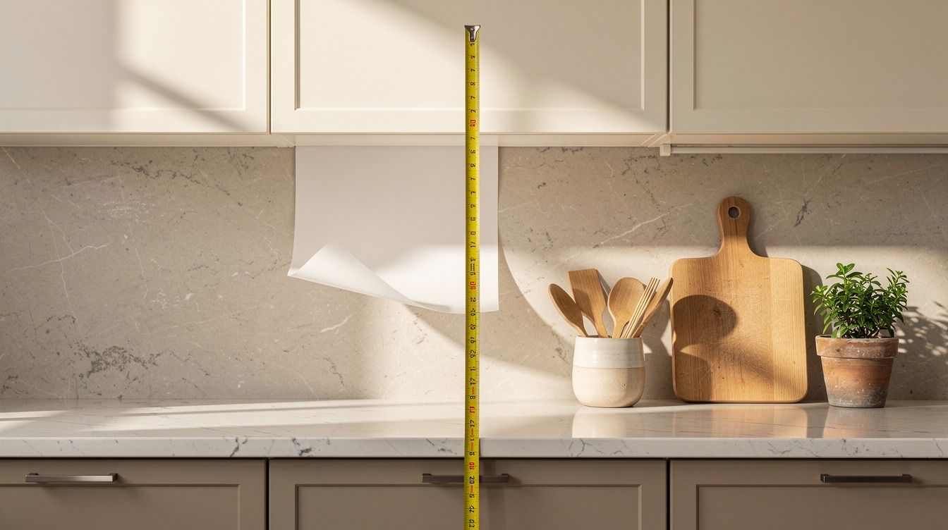
by Renter friendly backsplash ideas you can peel off later can work without damage when you prep the wall and choose the right adhesive. I learned that after one crooked first panel and a nervous lease-ending inspection. The finished kitchen looked warm, bright, and intentional. Better still, my landlord found the original paint underneath.
Here's what it looked like before:
The kitchen had plain painted drywall between the counter and the upper cabinets, with a narrow strip of beige caulk turning yellow near the sink. The counter sat at the standard 36 in height, and the 18 in backsplash gap made every mark easy to see. I couldn't drill, grout, or replace anything permanent.
The room wasn't awful. It was simply flat, especially after sunset, when the overhead bulb made the wall look gray and tired.
My old laminate countertop reflected that cold light right back at me. I wanted a renter friendly kitchen backsplash that would feel gathered and warm, but I needed to remove it with one steady pull.
- Measure the 18 in backsplash gap before shopping
- Clean the wall for a renter friendly backsplash
- Start with a removable tile sample
- Frame the range wall with a thin border
- Layer warm white over cold gray grout
- Swap a loud pattern for a quiet renter friendly tile
- Build the Three-Height Light Stack
- Float a narrow shelf above the diy kitchen backsplash
- Mix one earthy color with bright cabinets
- Use the Two-Wood Rule instead of matching everything
- Hang art over a renter friendly kitchen backsplash
- Paint the removable panels, not the rental wall
- Trim around outlets with patience
- Remove each renter friendly backsplash panel slowly
- Style the finished diy kitchen backsplash lightly
1Measure the 18 in backsplash gap before shopping
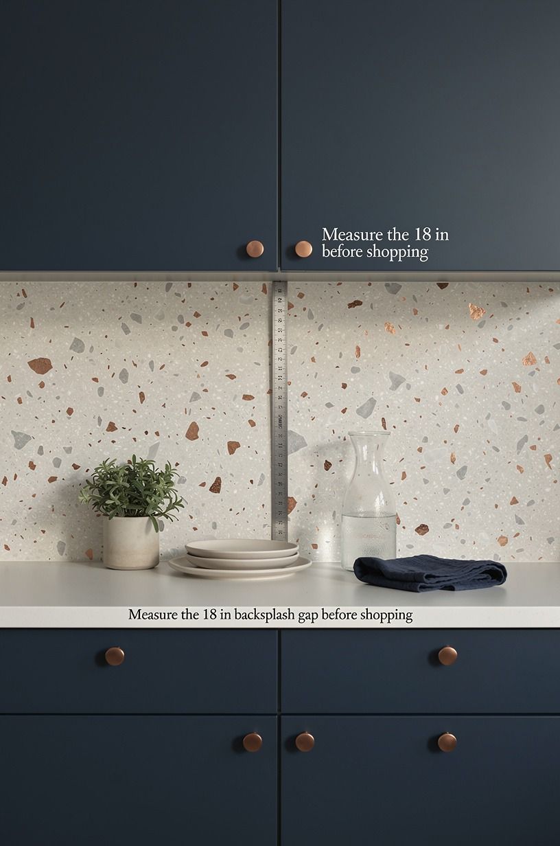
I started with a tape measure, not a shopping cart. The backsplash gap was 18 in from counter to upper cabinets, but the wall wasn't perfectly square near the corner. You should measure the height in three places and record the widest point, because a tiny mismatch becomes obvious beside a straight cabinet edge.
For my first sample, I chose a midnight-blue peel-and-stick surface with oversized-chip terrazzo in copper and ivory. It had enough movement to soften the rental-grade drywall without making every crooked line shout. I’d still skip a high-contrast checkerboard in a narrow kitchen.
I cut one test piece and left it overnight behind the coffee maker. If you’re measuring your wall, include the exposed strip beside the cabinet and around the outlet plate. The little scrap that saved me was less than 12 in wide, but it kept my final layout from looking pinched.
2Clean the wall for a renter friendly backsplash
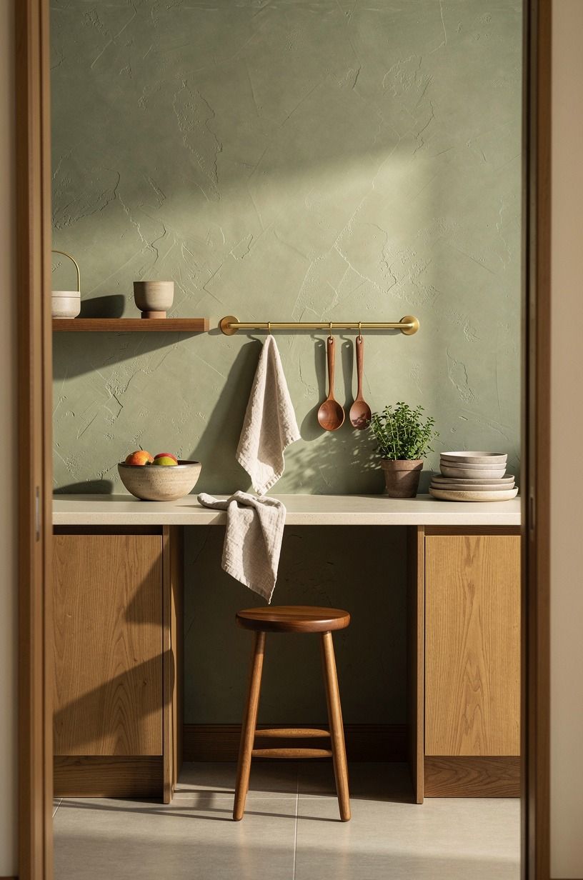
The wall looked clean until I wiped it with a damp microfiber cloth.
3Start with a removable tile sample
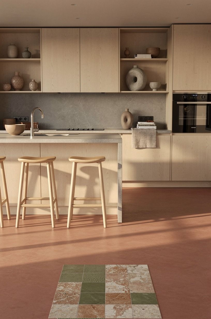
I bought one sample sheet before committing to the full renter friendly backsplash. That small pause mattered. Under daylight, the terracotta, stone, and olive palette felt warmer and more grounded than the green marble print I had considered, especially beside my pale cabinets.
The sample also showed me how the shagreen-like texture would meet the outlet. You should place it at the most visible point, then stand several feet away with the kitchen lights on. Does the repeat look calm, or does your eye keep landing on one fake grout line?
And take the sample off before you install anything else. Mine released cleanly after two days, but the adhesive left a slight sheen that disappeared with a damp cloth. I liked the stone-and-olive finish better than the trendy green marble print, which looked busy against my small oak-effect shelf.
4Frame the range wall with a thin border
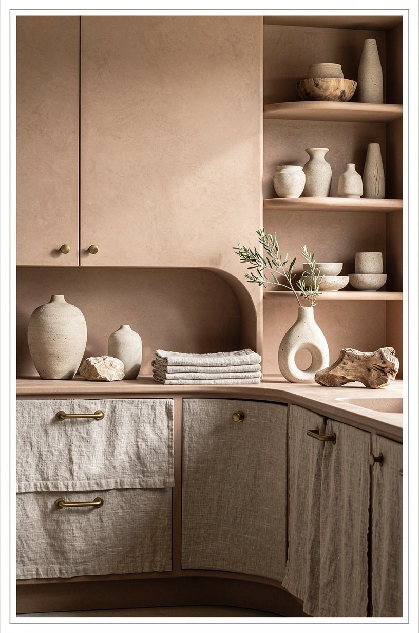
The range wall became my visual anchor. Instead of covering every inch immediately, I created a narrow border with clay-toned trim tape along the side edges and beneath the upper cabinets. Its washed Belgian linen texture made the removable panels look intentional, almost like a tailored inset.
I kept the border slim enough that it didn't steal counter space. You’ll want to check your range clearance and leave room for cleaning around the cooking area. A dramatic black border would have looked sharp in a larger room, but it made my short wall feel boxed in.
For the top edge, I used a flexible strip with a soft aged-brass finish. It catches the evening light without throwing a plastic glare across the room. If your wall has a visible wobble, a border can hide it better than trying to force every panel into one rigid line.
5Layer warm white over cold gray grout
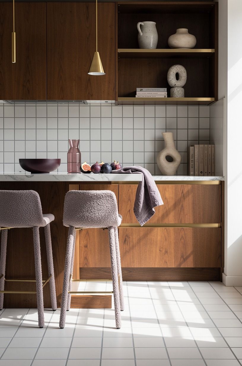
My first color choice was a muted plum surface with soft gray lines and a rose-gold accent. The nearby organic bouclé texture kept the harder backsplash material from feeling cold.
6Swap a loud pattern for a quiet renter friendly tile
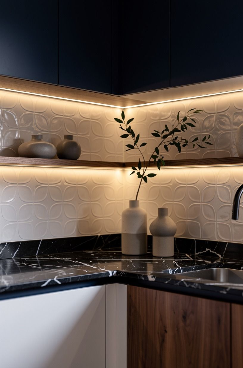
I loved the idea of encaustic cement tile, but the printed version I tested had a repeat that appeared every 24 in. In my small kitchen, I could see the same flower shape beside the sink, stove, and refrigerator. It felt staged instead of lived-in.
The better choice was a quiet navy-and-white pattern with Nero Marquina black marble and white veining. It gave me color without turning the wall into the main event. You’ll get more flexibility from a quiet pattern, especially if your towels, art, or dishware already carry visual weight.
I kept one small patterned strip behind the open shelf as a surprise detail. It’s enough to make the kitchen feel personal, and it doesn't compete with the walnut shelf. My opinion is firm here: skip the loud repeat unless your wall is long enough to let the pattern breathe.
7Build the Three-Height Light Stack
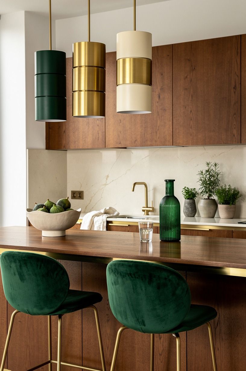
The backsplash looked good at noon and dull at night, so I changed the lighting around it. I used the existing ceiling fixture as the highest point, a small under-cabinet bar as the middle layer, and a plug-in lamp near the counter as the lowest glow.
That three-height light stack made the faux tile look less flat. The 3000K under-cabinet light threw a soft pool across the warm cream surface, bringing out the emerald and gold accents without making them orange. You should hide the cord under the cabinet lip with removable clips, keeping the outlet accessible.
But don’t use one harsh strip across the entire kitchen. It made every seam visible and gave my deep-pile mohair velvet cushion a strange yellow cast. A shorter light with a dimmer felt calmer, and I could turn it down when I wanted the room to feel intimate after dinner.
For more ideas, I borrowed the layered glow from this weekend fall porch decorating guide, especially the way low light can make ordinary materials feel warmer.
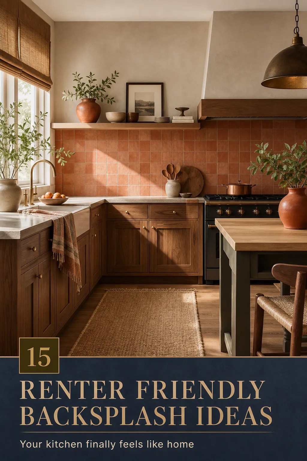
8Float a narrow shelf above the diy kitchen backsplash
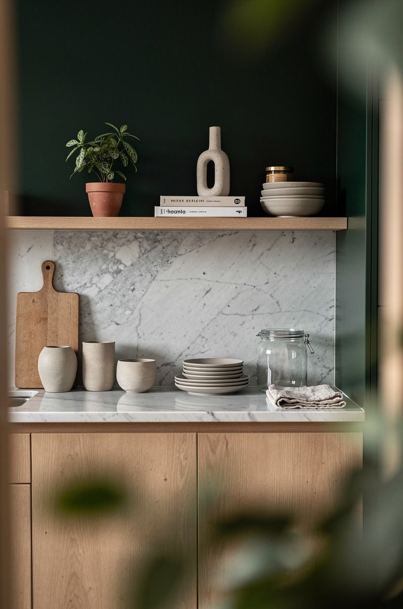
I wanted storage, but I didn't want holes. A lightweight shelf with removable mounting strips gave me a place for olive oil, a small bowl, and two cookbooks. The shelf sat high enough to keep the counter usable and low enough that I could reach it without stretching.
I chose an IKEA KALLAX natural-oak-effect shelf board for its pale grain and shallow profile, then kept the load very light. The forest-green bottle and rust-colored bowl added warmth without crowding the surface. You should check the strip rating, the wall paint, and the shelf weight together.
The shelf changed the backsplash from decoration into part of the working kitchen. A Carrara marble ledge would have looked more luxurious, but it would also have been heavy and risky. I’d rather have the quiet oak line and a clear counter than a dramatic shelf that pulls paint when your lease ends.
9Mix one earthy color with bright cabinets
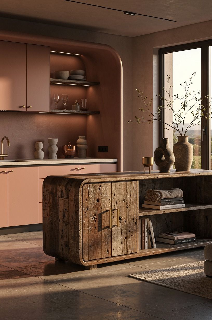
The kitchen needed color, but repainting the cabinets wasn't allowed.
10Use the Two-Wood Rule instead of matching everything
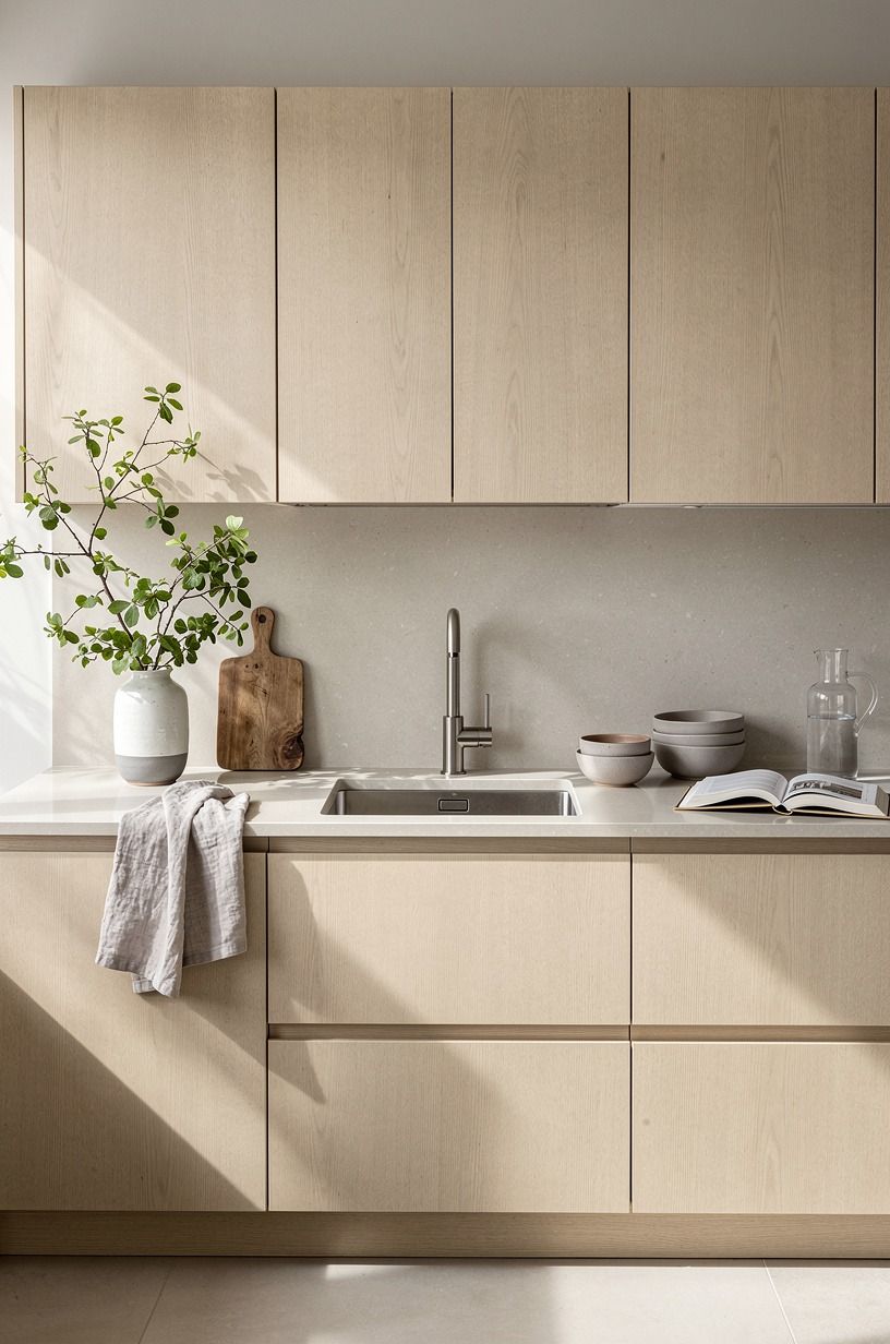
The kitchen already had one wood tone in the floor, so I added only one more. A slim Calacatta marble tray with gold veining brought warm white and a little polish to the counter, while the existing floor supplied the deeper honey note. Small black accents kept the contrast crisp.
You should stop at two visible wood tones in a small kitchen. A third tone from bamboo utensils, a dark shelf, and a reddish cutting board made my counter look scattered. I removed the red board and the room settled down almost immediately.
The rule isn't about making every piece match. It’s about giving your eye a clear rhythm.
I’d choose pale oak over walnut here, because the darker wood swallowed the little light bouncing off the backsplash. A warm material can still be airy when its grain stays visible.
11Hang art over a renter friendly kitchen backsplash
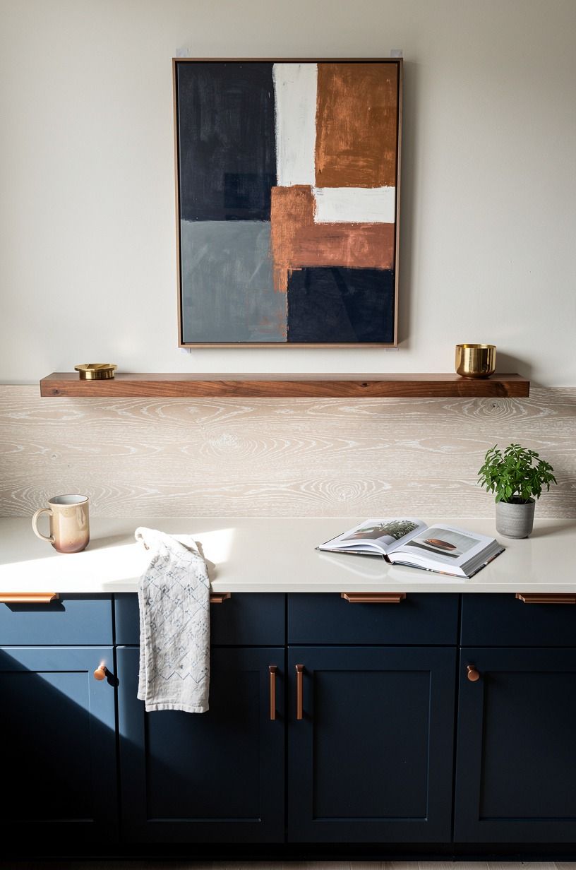
A removable backsplash doesn't need to fill the entire wall. Above the open section beside my cabinets, I hung a small midnight-blue, copper, and ivory print with picture-hanging strips. The palette repeated the backsplash colors and softened the hard lines of the appliances.
You’ll want to keep art away from direct heat and splashing water. My print went on the wall beside the sink, not behind the range. The gap around it also gave the kitchen a little breathing room, which kept the tile from feeling like a commercial wall.
I tested a shiny gold frame first, but it looked too formal with my cerused white oak frame and pale cabinets. A quieter oak finish was more welcoming. And the picture made the makeover feel personal, not like I had simply covered a problem with a product.
For a quiet seasonal touch, I used the same restrained approach as these cozy DIY backyard projects on a budget, choosing texture over clutter.
12Paint the removable panels, not the rental wall
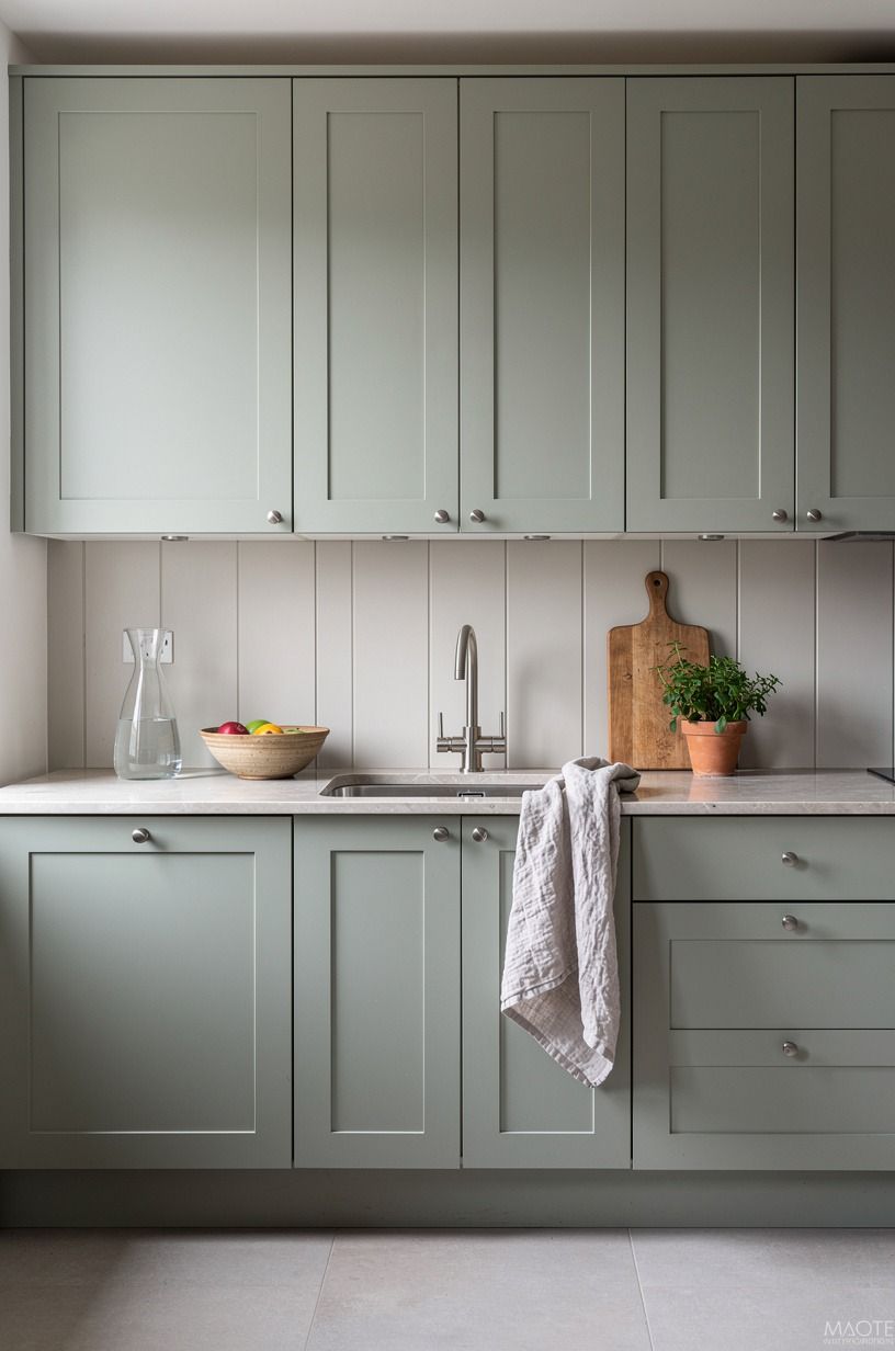
I wanted a darker backsplash, so I tested paint on a spare panel instead of painting the wall. Benjamin Moore White Dove OC-17 stayed on my cabinet sample, while the removable panel received a thin coat of sage green that echoed the natural wood and warm cream around it.
The creamy palette had the gentle glow of backlit translucent onyx, but the lightweight panel stayed practical for installation. You should let each coat cure fully and avoid bending the sheet during installation. A thick coat can crack at the seams when the material moves.
This was the moment I nearly overworked the project. A second, darker green layer made the wall moody, but it hid the subtle tile texture.
I kept the lighter sage shade because it made the counter feel warm and the upper cabinets feel clean. Sometimes restraint wins.
13Trim around outlets with patience
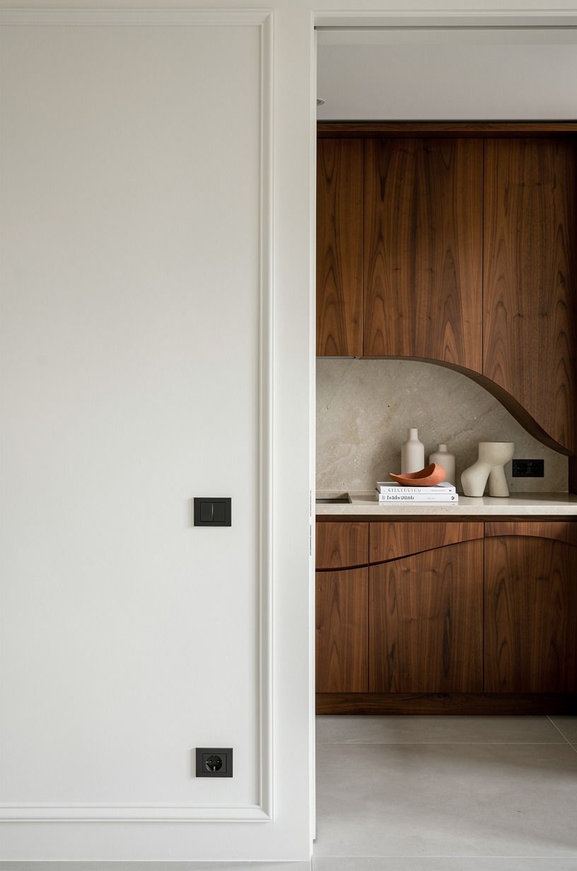
The outlet was my least favorite part of the installation.
14Remove each renter friendly backsplash panel slowly
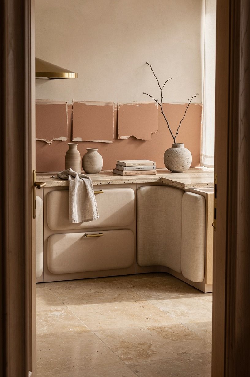
Removal day was the part I had imagined most. I warmed the corner with a hair dryer on low, lifted the edge with a plastic card, and pulled the panel back over itself rather than straight toward me.
The clay-toned removable panel with a warm travertine finish came away in one piece from the smooth wall. You’ll want both hands free and plenty of time, particularly around corners and painted patches. Fast pulling is how you turn a simple weekend update into a deposit conversation.
But one panel did leave a faint adhesive shadow near the sink. I cleaned it with a damp cloth and mild soap, then stopped.
Strong solvent could damage the paint, so I didn’t keep scrubbing. The landlord inspection showed no torn paper, gouges, or missing paint.
That was the result I cared about most.
Before you start, read this guide about what states allow sleeping at rest stops only if you’re planning a very long road trip to find your ideal rental. Otherwise, keep your project local and your measurements close.
15Style the finished diy kitchen backsplash lightly
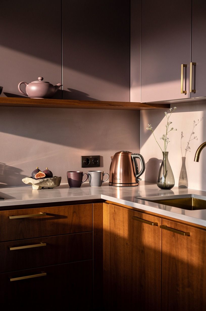
Once the panels were installed, I edited the counter instead of filling it.
How much it cost: my renter-friendly kitchen refresh range
I kept the makeover inside the typical cosmetic kitchen refresh range, which is $300 to $1,500 in the United States. My removable backsplash itself was the main purchase, while the styling pieces came from things I already owned. That distinction matters, because you don’t need a full kitchen budget to change one wall.
For comparison, a quartz countertop typically costs $60-$120 per sq ft, while a laminate countertop typically costs $10-$40 per sq ft. A zellige backsplash can run $15-$35 per sq ft, and repainted shaker fronts can cost $150-$400 per door. Those are renovation figures, not what you need for a peel-off project.
My practical total was a low-end cosmetic refresh, not a remodel. You can spend less by using one feature wall, reusing your shelf, and choosing a sample before buying multiple packs. I spent the money where I’d see it every morning, then kept the rest of the counter deliberately plain.
What I learned before putting this on a rental wall
I used to think a renter-friendly makeover had to look temporary, as if every removable item needed to announce its exit plan. That mindset made me choose flimsy finishes and overly cautious colors.
After this kitchen, I’ve changed my view. A temporary material can still have weight, texture, and a point of view.
The best decision was choosing the wall finish after looking at the existing counter and cabinet light. The worst decision was trusting a product photo before testing the adhesive.
Your wall is the real project. Your lease is part of the design brief.
If you ignore either one, the prettiest sample can become a headache.
I also learned that scale matters more than trend. An 18 in gap needs a pattern that can repeat quietly. A tiny kitchen doesn’t need more objects, and it doesn’t need a dramatic color just because a larger designer room carried it well.
Hand-glazed emerald zellige would be gorgeous in the right setting, but I wanted something soft enough to live with every day.
There’s room for personality without permanent construction. You can use unlacquered brass, pale oak, sage, or a framed print, then remove the layer when your lease changes.
That’s a comforting kind of freedom. The kitchen now feels inviting because it reflects how I cook and move through it, not because it copies a showroom.
The Questions Worth Answering First
What is the best renter friendly backsplash ideas you can peel off later for a small kitchen?
The best choice is a low-contrast peel-and-stick tile with a smooth backing, especially warm white faux zellige or a quiet sage pattern. Light-reflecting texture keeps a small kitchen bright. I’d pair it with an IKEA KALLAX birch-effect shelf and avoid heavy stone-look panels.
Where can I buy renter friendly backsplash pieces on a budget?
Look at IKEA, Wayfair, and Target first, then check Facebook Marketplace or a local thrift store for unopened rolls. A single sample sheet can save you from buying the wrong finish. You’ll also find leftover renovation packs from people who measured incorrectly.
How much does a renter friendly backsplash makeover cost?
A cosmetic kitchen refresh typically runs about $300 to $1,500 in the United States, depending on the materials and labor. You can spend less when you reuse your shelf, dishes, and lighting. The removable backsplash is usually the largest line item in a small project.
Can I create a renter friendly backsplash on a budget?
Yes, and you can start with one wall, reuse your existing decor, and choose a sample before buying full packs. A focused feature strip costs less than covering the entire kitchen. You’ll get more impact from careful cleaning and accurate measuring than from expensive accessories.
Is a renter friendly backsplash worth it in a small space?
Yes, because a small wall can change the room without taking floor space. Low-commitment color gives your eye a focal point while keeping the counter clear. I’d use a pale pattern behind the sink and repeat one shade in a towel or framed print.
Is a renter friendly backsplash a good idea for a rental?
Yes, if you test the adhesive and remove it slowly. Peel-and-stick panels, removable mounting strips, and tension-rod storage can all reduce permanent changes. Clean removal depends on your wall paint, surface texture, and installation method, so keep the packaging and test one piece first.
Where I’d Start First
If I had to pick one, I’d start with the warm white faux zellige backsplash. Its raised texture catches low evening light, so your kitchen won’t look flat after sunset. Pin this idea for later and test one panel before you commit to the whole wall.