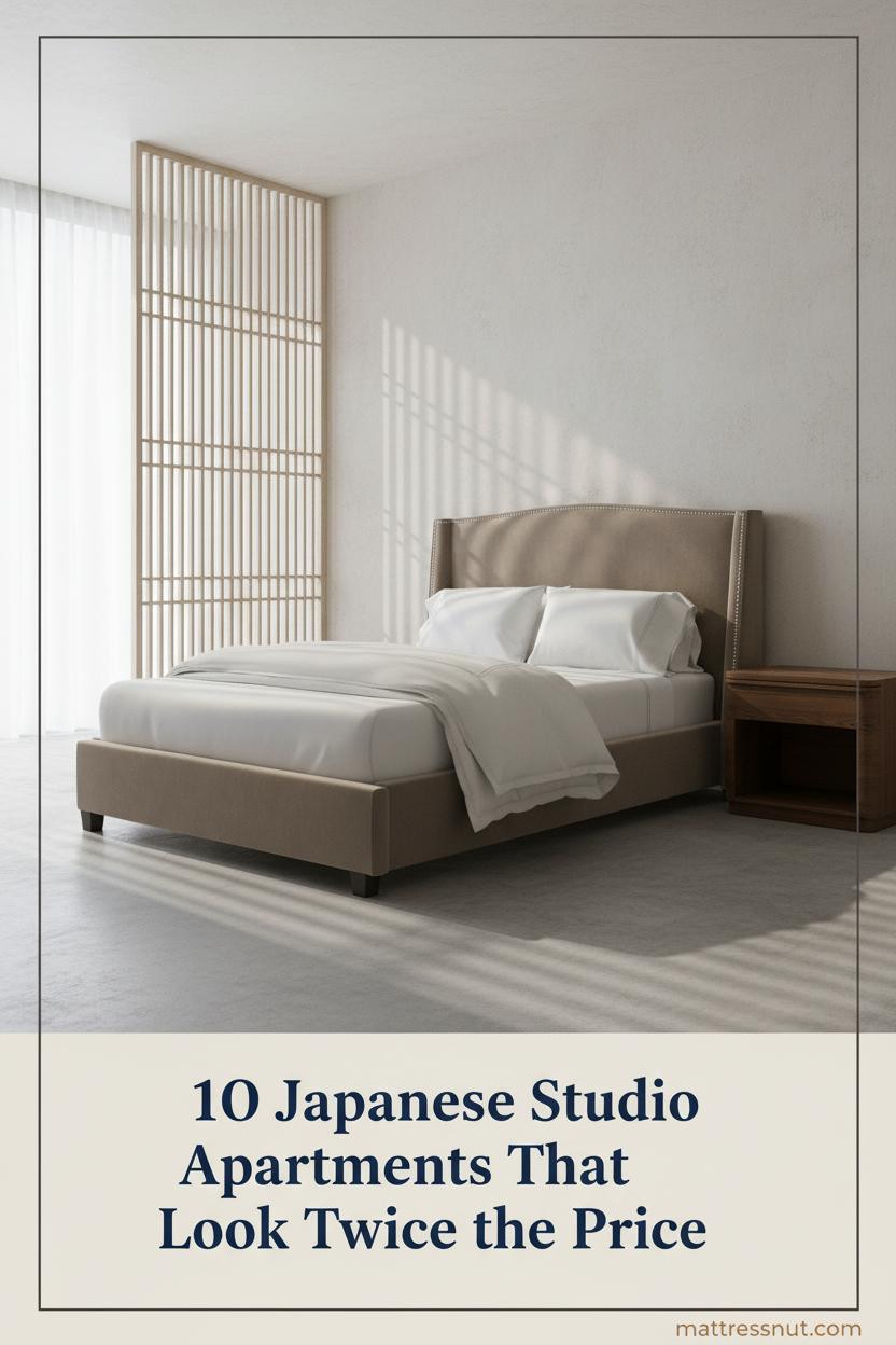
The best Japanese studio apartment designs aren't just small rooms with minimal furniture. They're rooms where every choice is load-bearing. Pull one thing out and the whole thing unravels.
These ten spaces prove that constraint, done right, feels like calm.
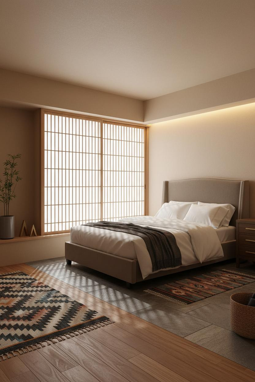
Cove Lighting That Makes a Micro Room Feel Meditative

I keep coming back to this one. The room feels impossibly still for a space this compact.
Why it holds together: A continuous LED strip running the full width above the sleeping zone creates a floating datum that tricks the eye into reading the ceiling as taller. The pale plaster catches that warm band and glows rather than just reflects.
Steal this move: Pair cove lighting with ivory linen curtains floor to ceiling. The vertical drop pulls the room upward while the warm light keeps it from feeling clinical.
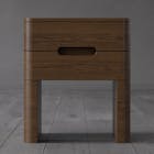
The Tatami Platform That Earns Its Footprint
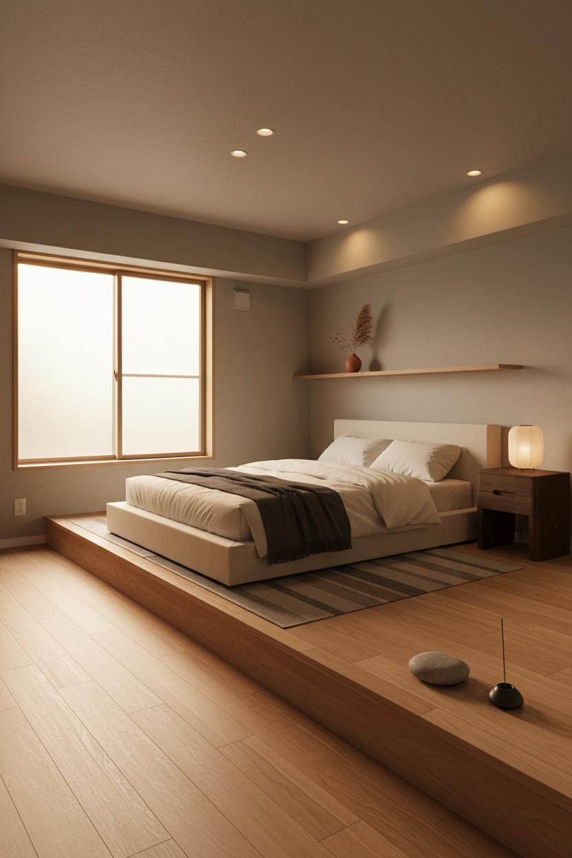

Nothing fancy. That's the whole point.
But a low hand-planed cedar platform running wall to wall does something a standard bed frame can't: it reads as architecture, not furniture. The horizontal emphasis stretches the room visually while the storage underneath means nothing else needs to sit on the floor. In a mini studio apartment, that trade-off matters more than you'd think.
Where to start: Ground the sleeping zone with a flat-weave linen runner and one paper lantern at bedside height. Keeps it warm without adding visual weight above the platform line.
How a Lattice Screen Gives a Studio Room Its Identity
This is the kind of room that makes you slow down before you even sit.
The pale ash lattice screen with rice-paper infill doesn't divide the room so much as define it. Bar shadows fall across the floor in rhythm, and that repetition is what gives the studio its sense of order. It shouldn't feel spacious. Somehow it does.
In a compact studio apartment layout, a full-height screen like this pulls double duty: it handles zone division while still feeling like a design choice, not a workaround. That's the smarter choice over a curtain or a bookshelf.
The Exposed Beam That Makes 280 Square Feet Feel Resolved

A single exposed timber beam running full width is a small structural detail that does surprisingly heavy lifting. The room feels collected rather than decorated.
Why it looks custom: One pale natural timber beam introduces vertical pause and geometric rhythm without requiring anything else on the ceiling. Everything else stays flat. The beam becomes the room's one deliberate statement.
Avoid this mistake: Don't add a second beam for symmetry. One reads as intentional. Two reads as a theme.
Full-Width Floating Shelf as the Room's Organizing Logic

Honest opinion: a single floating shelf spanning the full sleeping wall does more for a small room's layout than almost any other choice.
What makes it work: The shadow gap beneath a shallow ash wood shelf lifts it off the wall visually, so it reads as a clean horizontal line rather than storage. Everything placed on it sits with breathing room. Three objects maximum.
Keep the floor bare underneath. The practical move is matte concrete or pale tile, nothing that competes with the shelf's quiet horizontal pull.
Hinoki Alcove Shelving You'd Find in a Kyoto Ryokan

I almost scrolled past this. Glad I didn't.
Five open compartments in recessed hinoki wood catch raking amber light along every shelf edge, which makes the wall feel like it has depth even though it's flush. The moss green plaster behind it keeps the warmth from reading as rustic.
Where people go wrong: Filling every shelf. Leave at least two empty. The negative space is what gives this look its minimalist integrity.
Sage Board-and-Batten in a Studio That Earns Every Square Foot
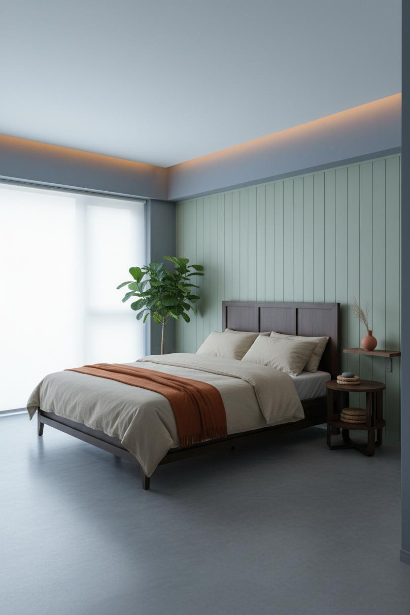

Divisive. Not every Japanese-style apartment needs color. But this one makes the case for it.
Why the palette works: Vertical timber ribs on sage board-and-batten cast faint parallel shadows under flat light, creating texture and depth while the remaining walls in muted blue-grey plaster keep the whole room from tipping warm.
Keep the floor bare concrete and let the burnt orange throw do the heavy emotional lifting. One warm piece against cool surfaces is enough. Don't add more.
Charcoal Wainscoting That Grounds the Whole Sleeping Zone
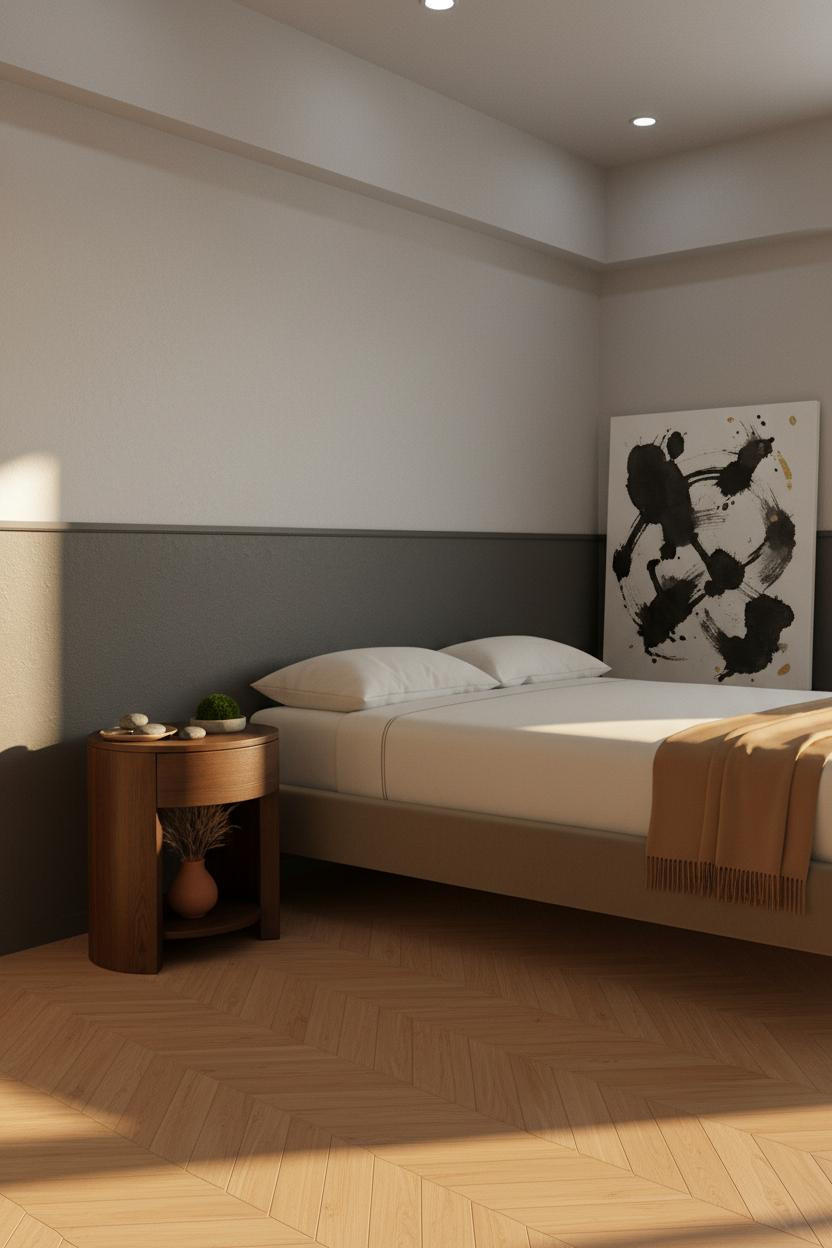
This one surprised me. The proportions shouldn't work, but they do.
A matte charcoal wainscoting panel meeting stone grey plaster at a precise horizontal line creates a grounding datum that anchors the bed without surrounding it. The herringbone parquet flooring in warm honey pulls the whole lower half together in a way that feels handcrafted rather than assembled.
Worth copying: Lean an oversized ink-wash canvas against the wainscoting, slightly tilted. It keeps the wall from feeling too resolved, while still feeling purposeful.
Built-In Shelving That Actually Justifies the Floor Plan
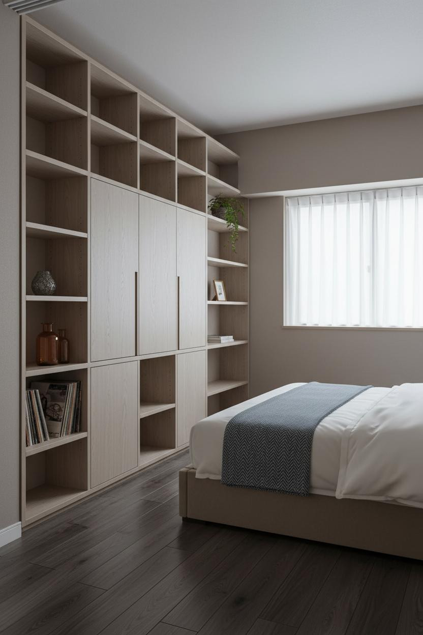

Built-in floor-to-ceiling shelving in pale ash is the kind of thing that looks custom even when it isn't.
What gives it presence: Open cubbies alternating with closed panels mean the eye gets rhythm and rest. Sconce light at bedside catches the shelf edges and makes the whole wall feel warm rather than institutional.
The detail to keep: Sparse objects with deliberate spacing on each shelf. A single amber glass bottle. One trailing fern. Japanese interior logic is built on what you leave out, not what you put in.
The Shoji Partition That Turns One Room Into Two Moods

A floor-to-ceiling shoji partition in natural hinoki wood frame with washi panels is honestly the single most transformative thing you can do in a micro studio. The room feels lived-in and intimate without any extra furniture.
The easy win: Position it so morning light filters through at an angle, and the geometric shadow grid lands on pale birch flooring. The partition does the decorating. Everything else can stay simple.

Our #1 Pick
Saatva Classic Mattress
America's best-selling online luxury innerspring. 365-night trial, lifetime warranty, free white glove delivery.
Shop Saatva Classic
The Foundation Of Every Beautiful Bedroom
Every design choice in a Japanese-style small space is about what the room feels like when you're lying in it. And that feeling starts with the mattress.
The Saatva Classic is what I'd put in any of these rooms. Dual-coil support means the structure holds through years of use, not just the first month. The organic cotton cover doesn't trap heat, which matters in compact rooms with limited airflow. And the Euro pillow top is soft in a way that actually holds its shape.
Walls get repainted. Linen gets swapped out. The mattress stays. Start there.

The rooms people save are the ones where nothing looks accidental. But the ones people actually want to sleep in? Those get the bed right first.