Think your studio apartment layout design ideas have to be boring just because the square footage is small? They don't. The best micro-studios I've seen feel intentional from every angle, not cramped.
Each of these 14 layouts solves a real problem. Pick the one that matches your floor plan and steal what works.
The Shiplap Wall That Actually Zones a Studio
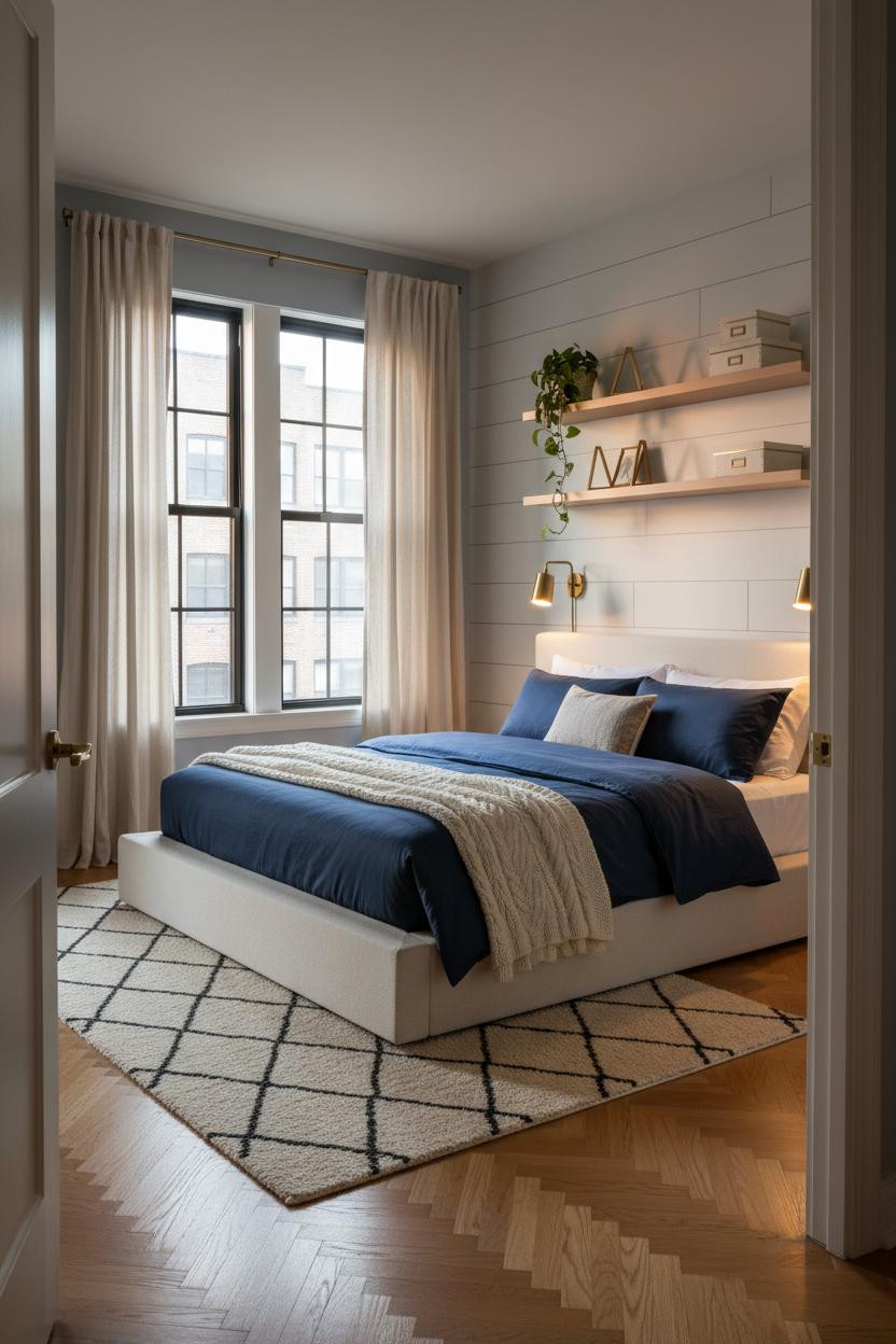

A shiplap wall doesn't need a whole farmhouse to work. In a studio, six horizontal feet of it behind the sleeping zone does more work than a room divider ever could.
Why it holds together: The horizontal shiplap planks create a shadow-line rhythm that separates the sleep zone visually while keeping the layout open. No wall, no problem.
Steal this move: Keep the shiplap in natural white and let the rug do the zoning on the floor. Two elements, one defined space.
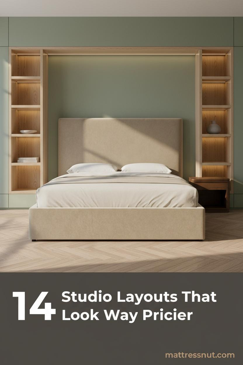
Why Arched Built-Ins Beat Every Freestanding Shelf

Bold choice. An arched plaster niche in a micro-studio feels excessive until you see it work.
The arch draws the eye upward, which makes the ceiling feel taller, and because the storage is built into the wall, it consumes zero floor space. The room feels collected rather than decorated.
Avoid this mistake: Don't overfill the niches. Flat diffused light on a half-empty ceramic shelf reads more expensive than a cluttered one.
Boho Textures That Make a Micro-Studio Feel Lived In
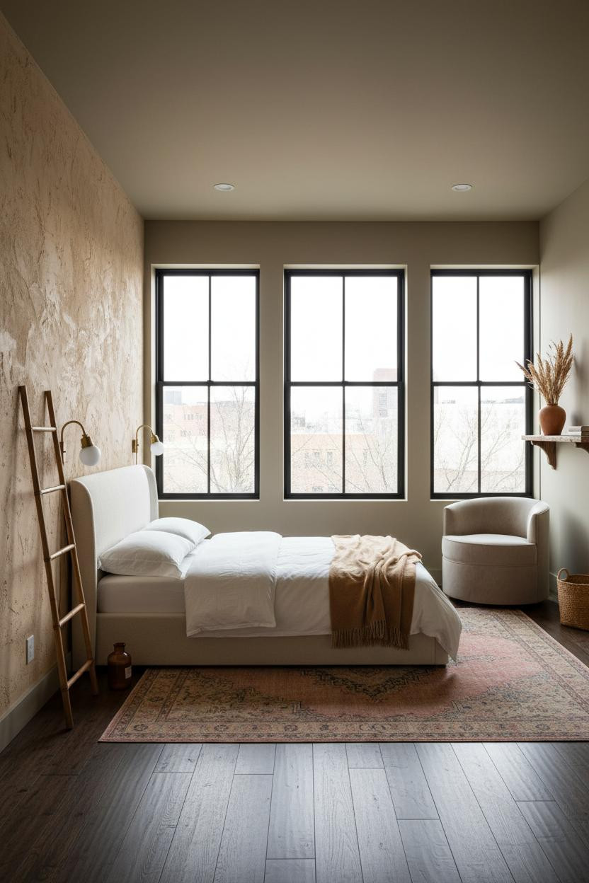

I keep coming back to this layout. It somehow makes 300 square feet feel cozy instead of claustrophobic.
What creates the mood: Hand-applied sand-tone plaster on one wall catches raking light across its peaks and valleys, giving the room depth that no paint color can replicate. Nothing too precious or matchy.
Layer a faded Persian runner over dark hardwood and lean a rattan ladder against the plaster. Two moves. The whole vibe shifts.
Terracotta Paneling That Earns Its Place in a Tiny Floor Plan
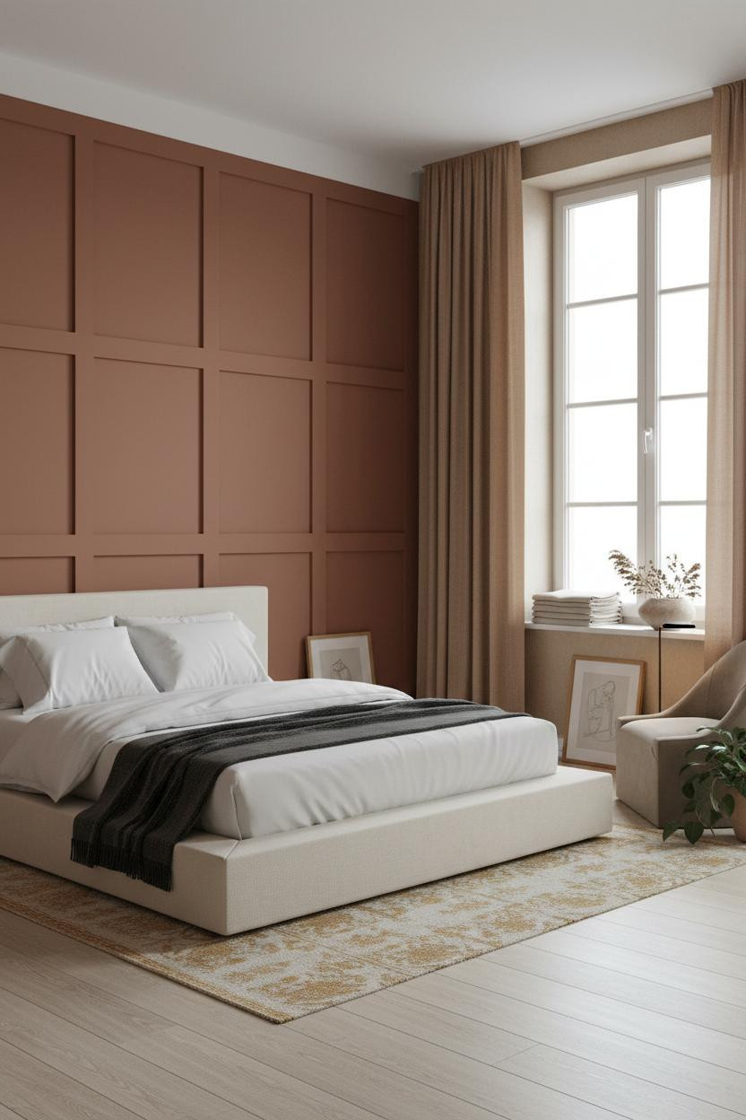
Deep matte terracotta on full-width wall paneling is a commitment. But in a studio, it's the one move that makes the whole layout read as designed instead of assembled.
Why it looks custom: The shadow-gap reveals between each matte terracotta panel create rhythmic depth, so the wall does the heavy lifting while the furniture stays simple.
The smarter choice: Pair rust linen curtains at the window rather than a contrasting color. The tonal harmony keeps the compact footprint from feeling split.
Exposed Brick and the Art of Moody Zone Design
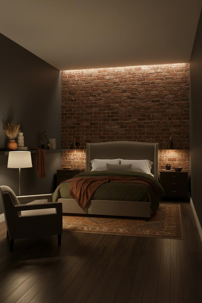

This one is divisive. Not everyone wants a moody studio. But if you do, aged brick running floor-to-ceiling along one wall is the right call.
What gives it presence: Raw mortar joints in the brick catch downward LED warmth, which carves the sleeping zone out of the surrounding shadow while the charcoal walls recede. The room feels zoned without a single partition.
Pro move: Use an overdyed Persian runner in rust and ochre to echo the brick tone on the floor. One warm family, two surfaces, the whole zone reads deliberate.
A Floating Desk That Earns Its Square Footage
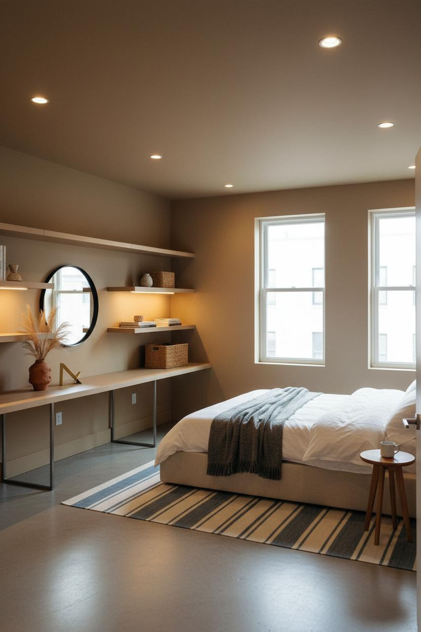
Having a real work zone changes how you actually use a studio. Admittedly, most people shove a laptop on the bed and call it done.
In a small studio, the smarter choice is a six-foot blonde oak floating desk with deep open shelving above. It creates a strong horizontal line that organizes the whole layout, while the floor stays completely clear underneath.
The easy win: Mount a round mirror above the desk. It reflects daylight deeper into the room and makes the work zone feel intentional, not just practical.
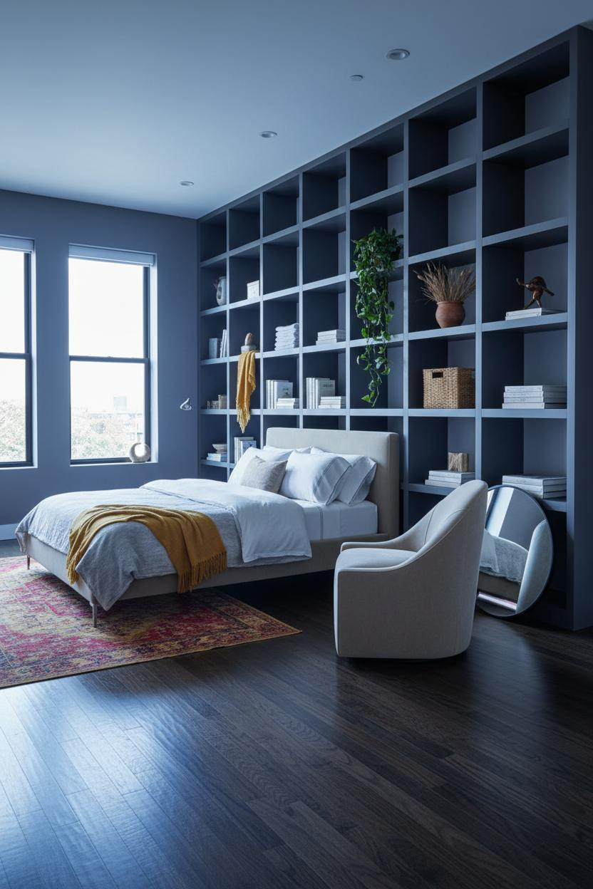
The Floor-to-Ceiling Shelf Wall That Divides Without Walls

I almost scrolled past this one. Glad I didn't.
A matte charcoal built-in shelf wall spanning the full length of the living-sleep divide creates a horizontal-vertical grid that anchors the floor plan, while the open compartments keep it from feeling like a closet. And because it runs floor-to-ceiling, the division between zones is obvious without any actual partition. The room feels warm and cohesive on both sides.
Worth copying: Lean an oversized round mirror against the lower shelf. The reflection bounces coastal light back across the soft indigo walls and doubles the perceived depth of the studio.
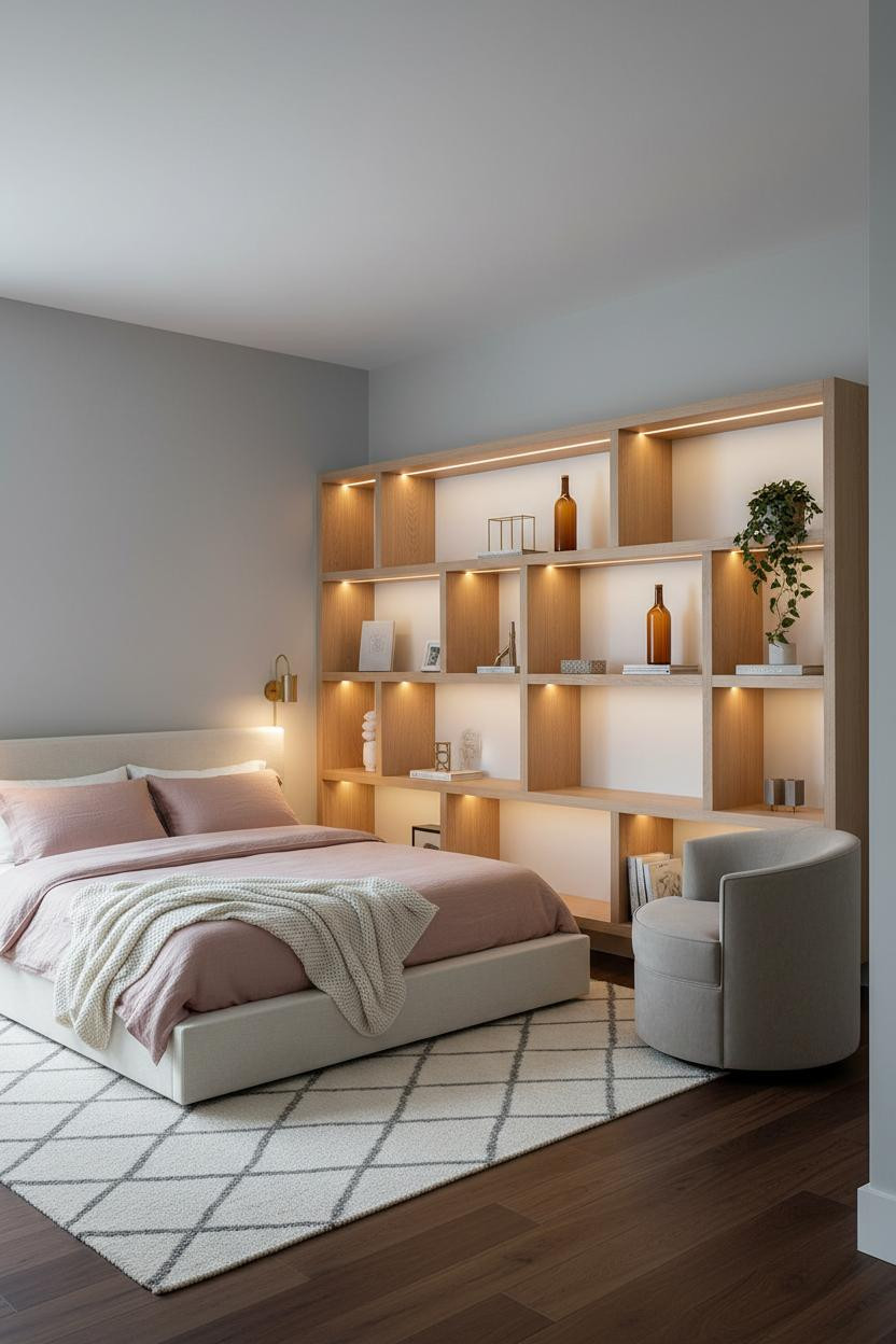
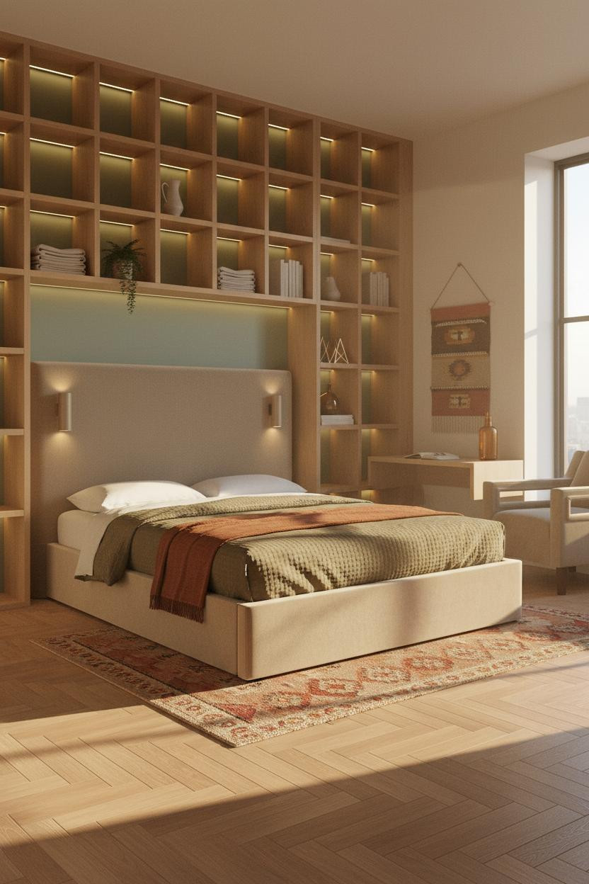
White Oak Built-Ins That Work Harder Than Any Dresser
Nothing fancy. That's the point.
What makes this work: A full-width natural white oak shelving unit with open cubbies at varying heights creates horizontal rhythm across the far wall, and the integrated LED strips push warm light downward across each shelf face, making the grain the texture and the lighting the drama. And because it's built-in, the floor stays completely open for rugs to do the zone work.
What not to do: Don't fill every cubby. Empty space on a white oak shelf reads intentional. Crowded reads storage unit.
Board-and-Batten in a Charcoal Studio That Pulls It Together
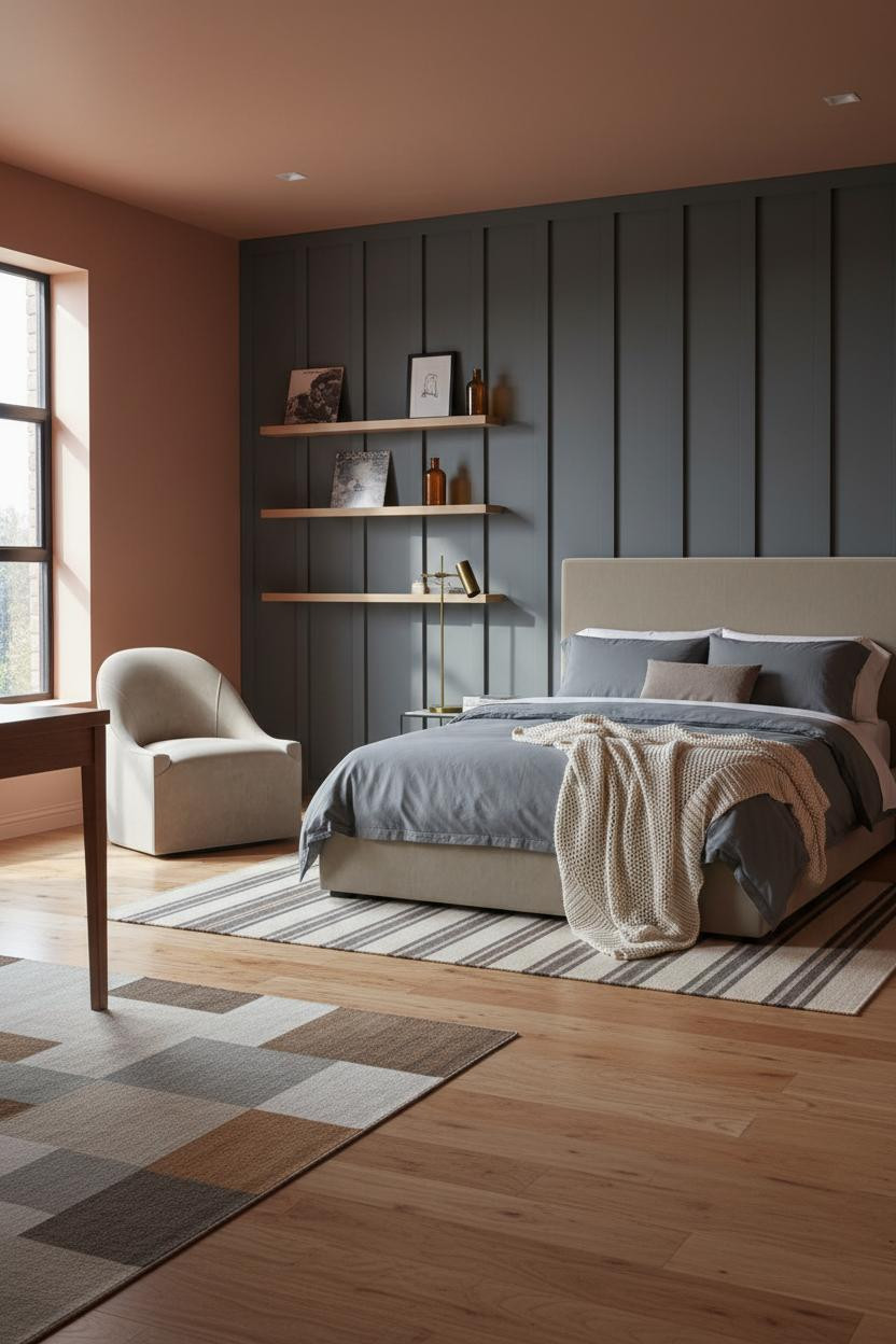

Fair warning: charcoal board-and-batten is a strong choice in a small studio. But the vertical rhythm it creates pulls the eye up and gives the room structured dimension that flat paint simply can't.
Why it feels intentional: The slim pale oak floating shelves mounted above the batten panels catch diffused light across their grain, creating a contrast against the dark wall that makes the whole zone feel custom, not just painted.
Keep the remaining walls in soft terracotta and use a striped runner on warm maple flooring to separate the sleep zone. Same family, different tone, calm and cohesive.
Corner Shelving That Solves the Dead-Space Problem
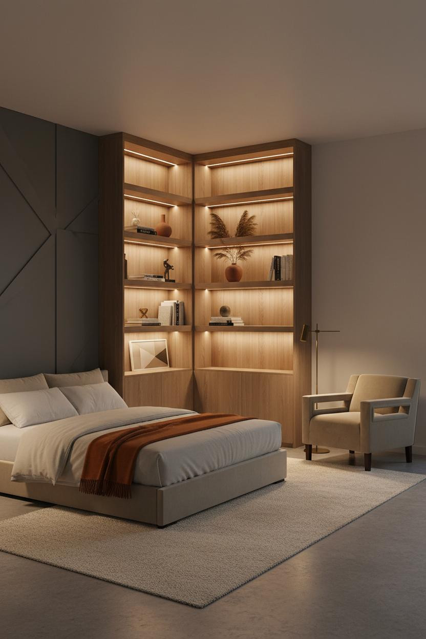

Corner square footage in a studio is usually wasted. A floor-to-ceiling corner unit in natural ash wood with integrated shelf lighting fixes that immediately.
Design logic: The charcoal geometric paneled accent wall behind the shelving gives the unit something to read against, so the ash grain pops rather than disappearing into a light background. The lit shelves create vertical rhythm that pulls the eye upward in an otherwise low-ceilinged space.
The finishing layer: Lean a large abstract canvas against the lower panel. A burnt orange mohair throw on the bed picks up the warm amber from the shelf lighting, and the whole room feels lived-in and intimate.
The Desk Alcove That Makes Working From Home Tolerable
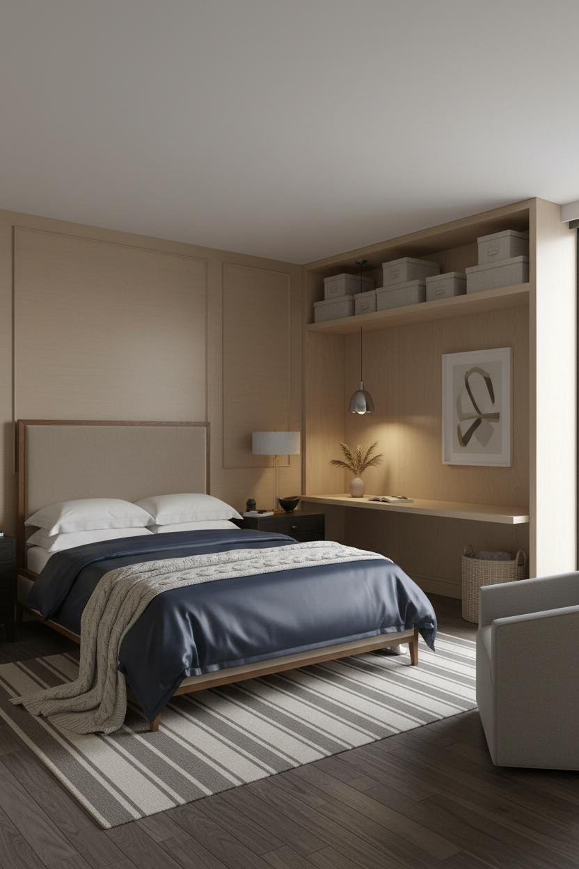


I've seen this layout in dozens of mini studio apartment ideas and it's honestly the most practical one on this list. A built-in desk alcove in pale oak along one full wall means the work zone is always set up, always contained.
What carries the look: Slim steel-framed shelving above the desk holds linen storage boxes and a framed print, so the alcove reads as a room within a room. Cool grey overcast light floods the desk zone while warm cove lighting pools over the sleeping area, and the two light temperatures keep the zones feeling separate even in an open plan.
The practical move: Tuck a woven basket under the desk for cables and clutter. Out of sight, the whole alcove reads clean.
Floating Shelves With Brass Brackets That Punch Above Their Weight
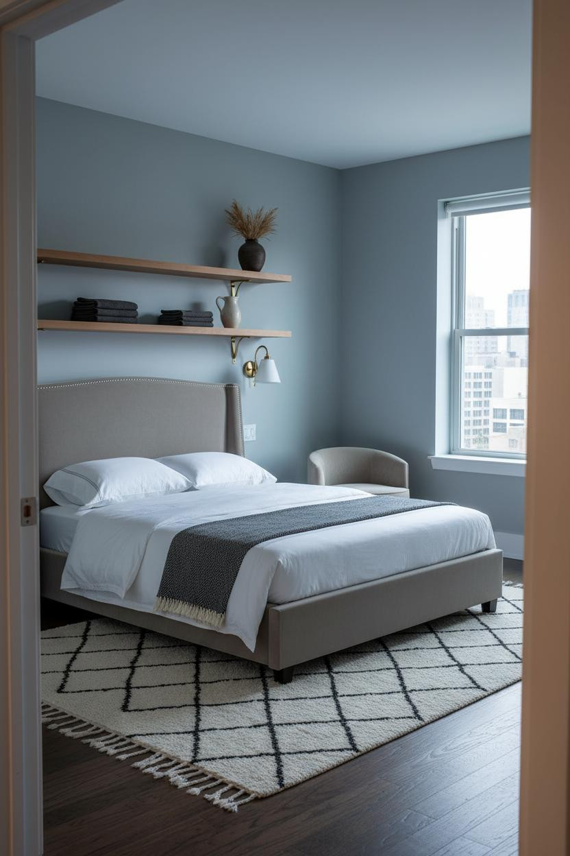
It's a small move, but it changes everything. Six feet of natural oak shelving on slim brass brackets against a dusty blue-grey wall does more visual work per square inch than almost anything else in a micro-studio.
Why the palette works: The warm oak grain against cool matte walls creates just enough contrast to make the shelving feel like a feature, while still feeling calm rather than busy. And a Moroccan diamond-pattern rug on dark walnut flooring below anchors the sleeping zone without competing.
Skip this: Don't stack the shelves evenly. One slightly askew linen breaks the grid and makes the whole thing look collected rather than staged.
Japandi Blonde Wood Shelving That Keeps a Studio Grounded

Japandi gets misread as cold. This layout proves it isn't.
What softens the room: A sage green accent wall behind the full-width blonde wood recessed shelving pulls warmth from the LED strips glowing beneath each cubby, and the honey-tone herringbone parquet floor ties the whole thing together in a way that feels warm without being heavy. Just enough texture to keep things interesting.
One smart swap: Replace standard sconces with paired fittings that flank the bed and match the brass bookend detail on the shelf. Small repetition, big cohesion.
Scandi-Modern Corner Windows That Make 300 Square Feet Feel Generous
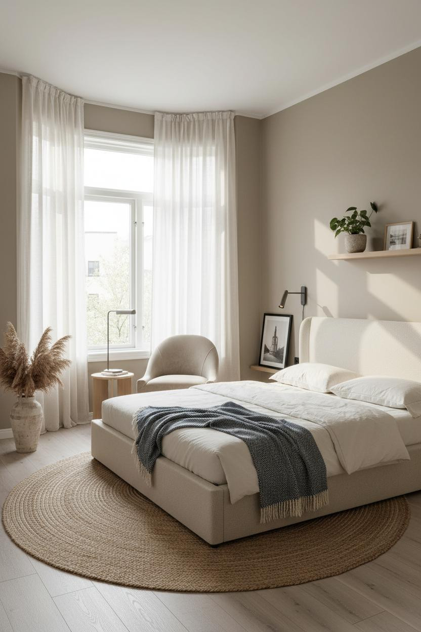
Corner windows flooding light from two planes simultaneously is the unfair advantage some studios just have. But the move here is letting the light do the work instead of fighting it.
Why it feels balanced: Floor-to-ceiling ivory sheer linen curtains on white trim frames diffuse the morning light without blocking it, which helps balance the brightness across warm greige walls, while bleached oak flooring bounces it forward into every corner of the compact layout. The room feels polished but still relaxed.
The key piece: A natural jute rug under the bed zone anchors the sleeping area firmly, so the open plan reads as two zones sized correctly rather than one undivided box. And that's honestly the whole formula for small studio apartment inspiration that actually works.

Our #1 Pick
Saatva Classic Mattress
America's best-selling online luxury innerspring. 365-night trial, lifetime warranty, free white glove delivery.
Shop Saatva Classic
The Foundation Of Every Beautiful Bedroom
Every layout above starts with the wall treatment or the shelving. But honestly, the thing you actually feel every morning is what you slept on. And in a studio where the bed is the centerpiece of the entire room, that choice matters more than it does anywhere else.
The Saatva Classic is what I'd put under every one of these layouts. Dual-coil support that holds up year after year, a breathable organic cotton cover that doesn't trap heat, and a Euro pillow top that's soft without losing structure. It feels like the good hotel kind. Not the business hotel kind.
Walls get repainted. Rugs get swapped out. The mattress stays. Start with the right one.

The rooms people save are the ones where nothing looks accidental. Good design ages well because it's made well. Start with the bed. The rest figures itself out.