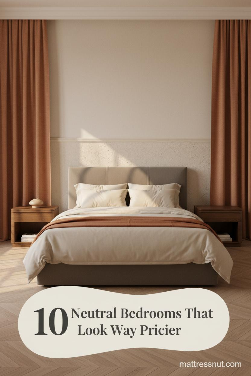
The first thing you notice in the best neutral bedroom with pop of color is how little it takes. One wall. One throw. One rug. And suddenly a quiet room has a pulse.
Make the look happen: Saatva beds & furniture
Saatva's furniture catalog matches the look of the bedrooms featured above with handcrafted, solid-wood construction rather than MDF veneer. The collection covers upholstered bed frames (linen, velvet, leather), four-poster & canopy beds, platform beds, storage beds with hydraulic lift, and matching nightstands, dressers, benches, and headboards.
All furniture ships via free White Glove delivery with in-room setup, removal of packaging, and assembly included. Current promotion: up to $625 off sitewide, plus the $225 off orders $1,000+ professional discount via ID.me (military, veterans, first responders, nurses, teachers).
Ownership terms: 45-day return on furniture, 1-year warranty on frames. Pairs naturally with the Saatva Classic mattress.
These ten rooms prove the formula works at every scale, every budget, and every style commitment level.
The Oak Accent Wall That Warms Everything
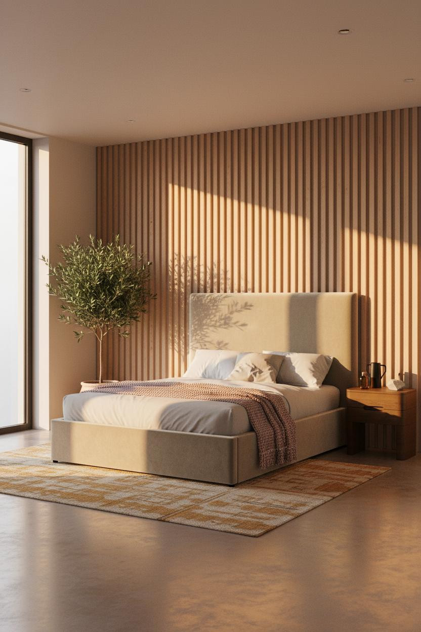

I keep coming back to this one. The color barely registers as a choice, and somehow that's the whole point.
Why it works: The slatted oak panels introduce grain and shadow in a way that feels warmer than any paint color could. It's the material doing the work, not the hue.
Steal this move: Pair with an ochre kilim and a dusty pink throw. Two accent pieces, both earthy. The room stays calm while still feeling alive.
Teal Shiplap That Shouldn't Work But Does
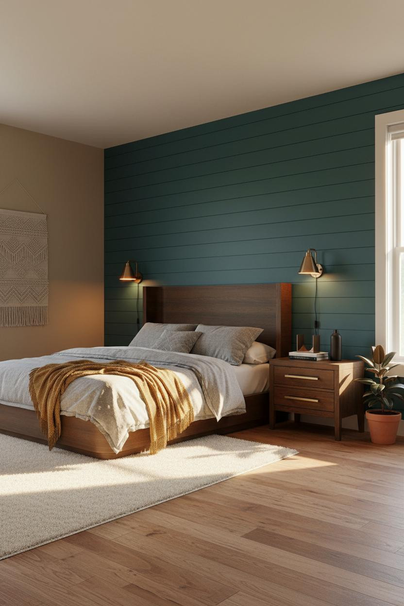


Bold choice. Not for everyone. But I think this is one of the most underrated wall colors for a warm neutral bedroom.
The reason it feels grounded instead of jarring is the matte teal shiplap. The horizontal boards give the color a surface to breathe across, while camel walls on three sides pull everything back to warmth.
What to borrow: A mustard wool blanket at the foot is the bridge. It connects the cool wall to the warm floor without needing a third color in the mix.
Terracotta and Steel Blue, A Pairing Worth Trusting
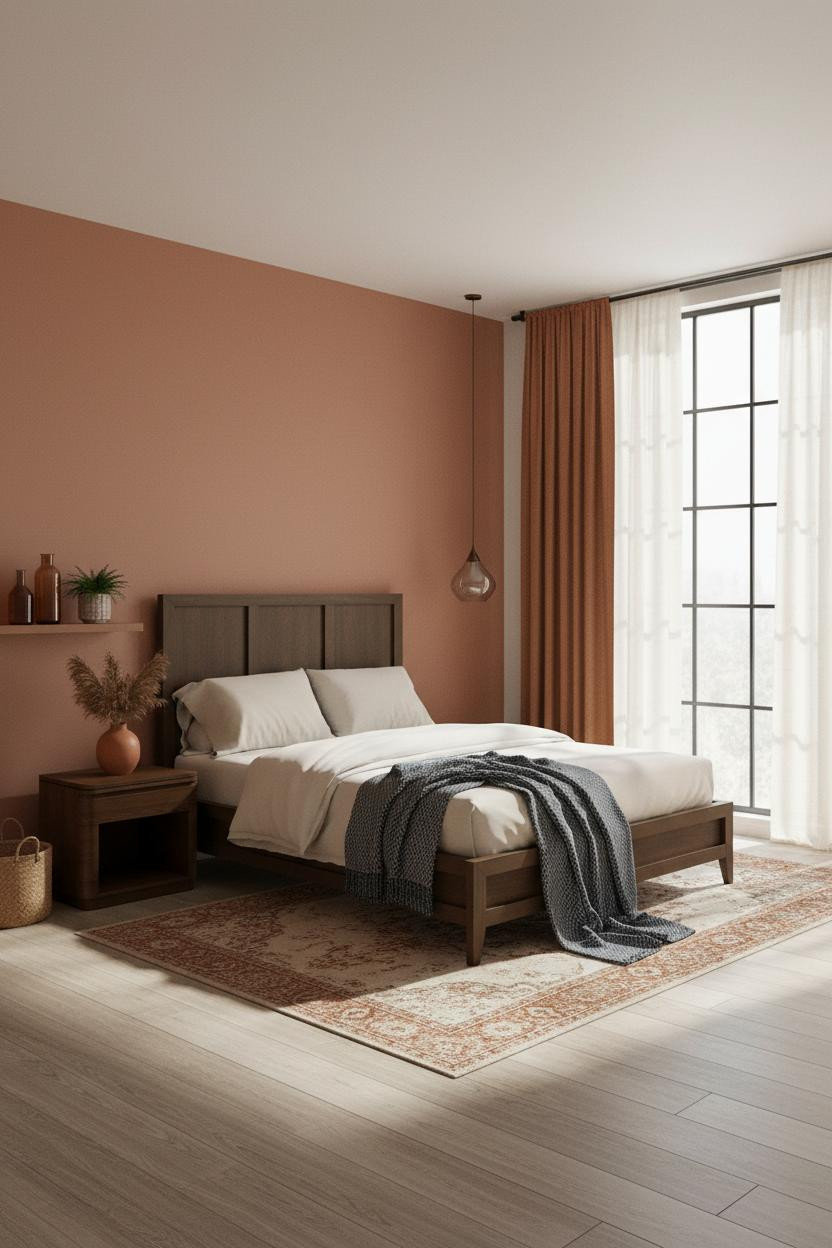


Terracotta and steel blue together sounds like a risk. But this room makes a convincing case that they belong in the same space. (Honestly, I'd never have put them together without seeing this first.)
What carries the look: The clay matte accent wall grounds the whole scheme, so when the steel blue herringbone throw appears at the foot, it reads as contrast rather than clash.
The practical move: Rust linen curtains pull the terracotta wall forward and frame the window. Keep the bedding cream and let those two pieces do all the talking. See more neutral earthy bedrooms that feel calm for variations on this palette.
The Plaster Wainscoting Trick That Looks Expensive


Nothing fancy. That's the point.
But the sand-finish plaster wainscoting adds a horizontal band that changes how the whole wall reads. It creates tonal contrast without needing a second paint color, which is a smarter move than most people realize.
Why it looks custom: The pop of color here comes from a flat-weave terracotta rug, not the walls. Keeps the wall treatment architectural and lets the floor do the chromatic lifting.
Avoid this mistake: Don't pair this with cool-toned bedding. Slate jersey and a burnt orange mohair throw keep the palette in the same warm family.
Sage and Terracotta Done in Japandi
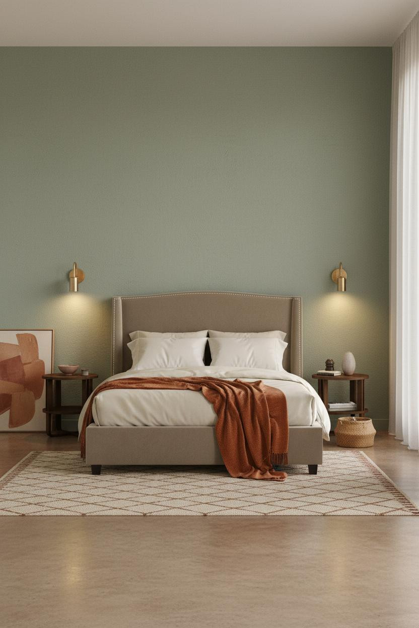

This is the kind of room that makes you want to slow everything down. The room feels intentional without being precious, which is harder to pull off than it looks.
What creates the mood: A sage plaster accent wall behind the bed is calm enough to read as neutral, which makes the terracotta and ochre art canvas pop without competing with the wall itself.
In a minimalist bedroom like this, the smarter choice is one oversized piece of art over several smaller ones. Lean it rather than hang it. Effortless rather than arranged.
Dusty Rose That Reads Warm Not Sweet

Dusty rose gets dismissed too quickly. Paired with cream walls and a walnut floating shelf, it stops reading as feminine and starts reading as warm. And that's a very different thing.
Why the palette works: Matte finish keeps the pink from bouncing light around. The result is a wall that feels settled, not sugary, while still giving the room its single chromatic statement.
One smart swap: Add a rust linen throw instead of a pink one. Grounding the pop of color with something earthier keeps the whole scheme from tipping too soft. Check out these neutral bedroom decor ideas that feel expensive for more palette combinations.
When Built-In Shelving Becomes The Accent
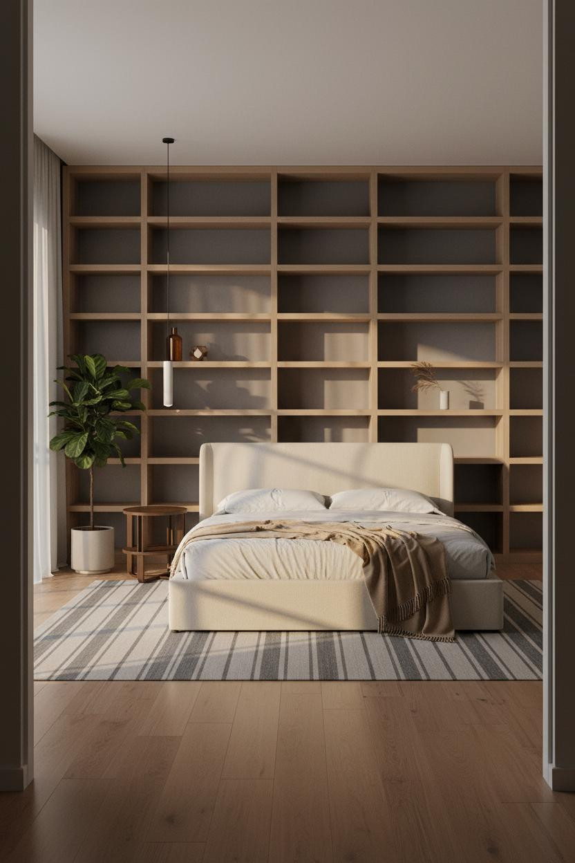

I almost scrolled past this. Glad I didn't.
The floor-to-ceiling pale oak shelving against stone grey walls does something subtle. It gives the room a structural graphic without adding a second wall color, which keeps the whole thing from feeling loud while still feeling considered.
The finishing layer: Amber glass, a dried branch, a camel throw. Small warm accents on cool grey. That's the color contrast, just quieter than a painted wall and honestly more interesting. If you check out the best bedroom colors for sleep, warm amber tones come up again and again.
An Olive Niche That Does All The Work
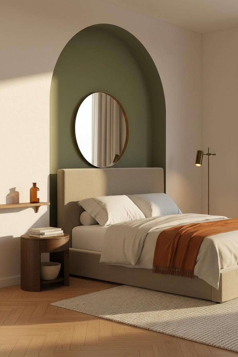


This is divisive. But I think painting a recessed niche in a deep color is the most architectural pop of color you can add to a bedroom without touching the main walls.
What makes this one different: The olive-painted arched niche frames the bed the way a headboard wall would, except the depth of the recess gives the color actual shadow and dimension. It earns its place.
Where to start: Keep the surrounding walls warm ivory. Herringbone parquet floors add enough visual richness that a single burnt orange throw at the foot is all the layering you need.
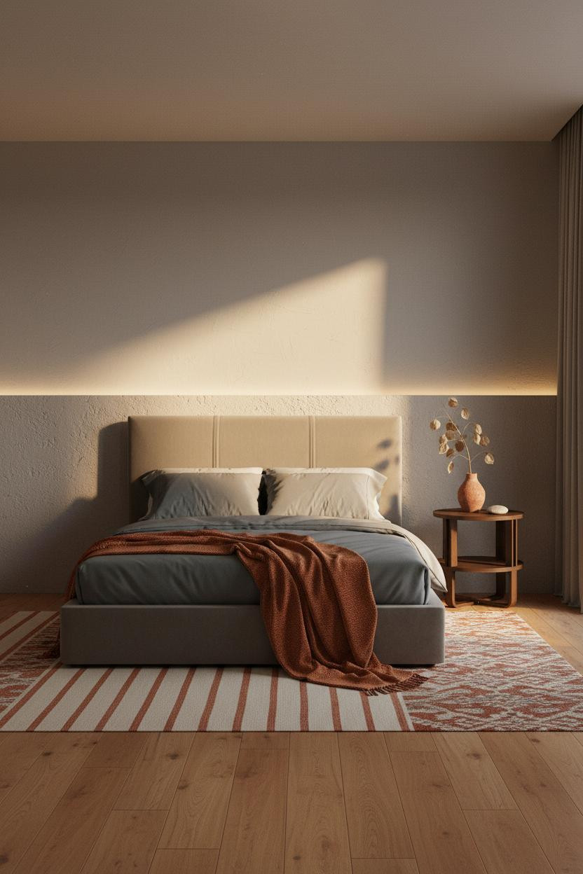
Board-And-Batten With A Burnt Sienna Surprise

Fair warning. This one looks calm at first glance. Then the burnt sienna mohair throw registers and suddenly the whole room has heat.
Design logic: Full-width cream board-and-batten behind the bed adds texture through vertical rhythm, in a way that feels architectural rather than decorative. The matte finish absorbs light so the wall never competes with the throw.
What not to do: Don't add a second accent color here. The wall treatment plus the throw is already a full conversation. Dark walnut floors and a low-pile cream rug are all the layering this scheme needs. See more colorful bedroom ideas for adults if you want to push the palette further.
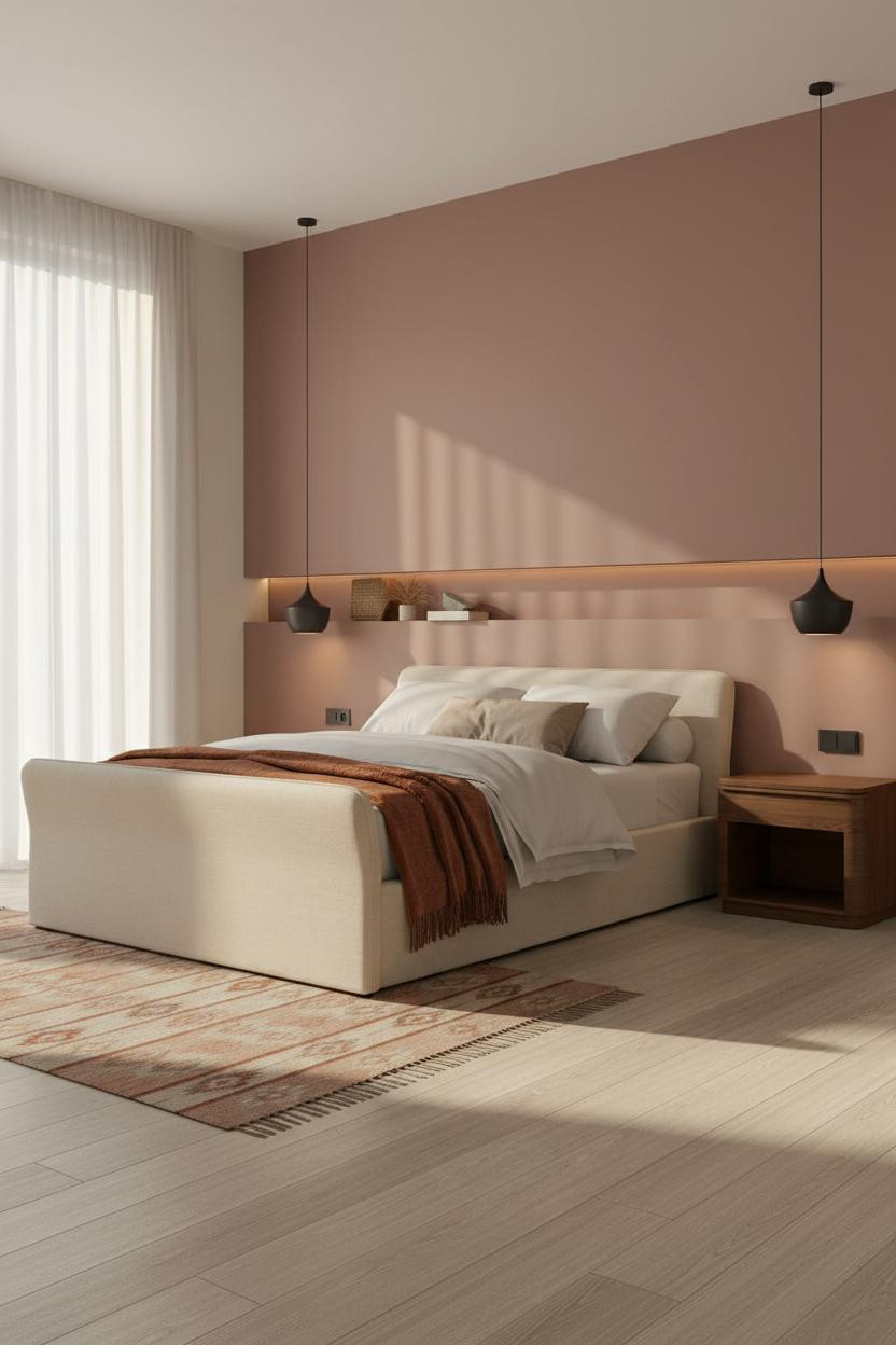
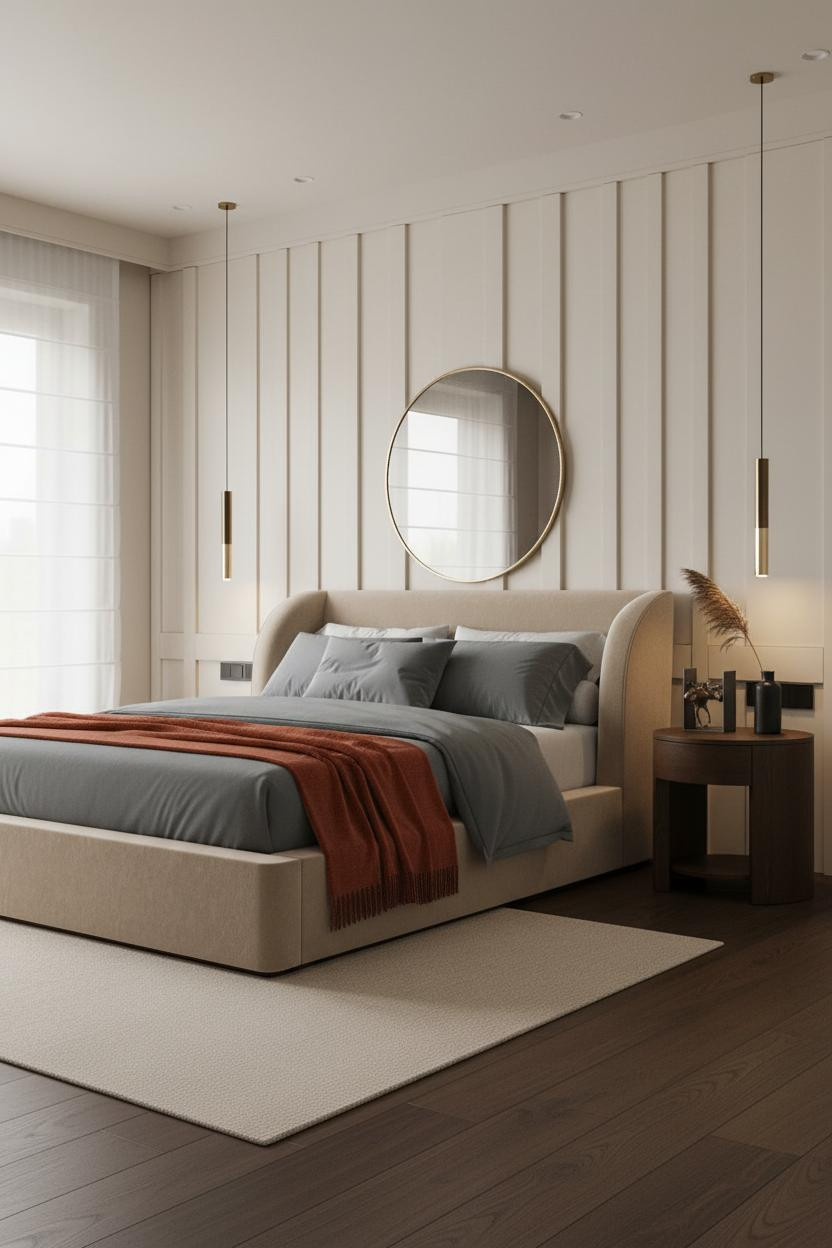
Rust Curtains That Anchor A Minimalist Room
If you're upgrading the bed frame
Saatva Santorini Platform Bed, from $1,295
Upholstered platform bed in 6 fabric colorways to match any bedroom palette. Slat spacing safe for foam/hybrid mattresses, rated 1,000 lbs. Free white-glove delivery and assembly.

Most people overlook curtains as a place to put color. But floor-to-ceiling dusty rust linen panels anchoring a far corner do more for a neutral bedroom than any throw pillow ever could.
The real strength: The curtains pool color vertically, which pulls the eye from floor to ceiling and makes the room feel taller while still feeling warm. It's a quiet move with outsized payoff.
Cream percale bedding and a steel blue throw keep the rest of the room honest. Nothing too matchy. Just enough contrast to keep things interesting. Browse cozy neutral bedrooms if you want more ideas that work at this level of restraint.

Our #1 Pick
Saatva Classic Mattress
America's best-selling online luxury innerspring. 365-night trial, lifetime warranty, free white glove delivery.
Shop Saatva Classic
The Foundation Of Every Beautiful Bedroom
Walls get repainted. Throws get swapped. The mattress stays. And honestly, a beautifully styled neutral bedroom with a pop of color deserves a bed that actually delivers on the promise of the room.
The Saatva Classic is the one I'd put under all of it. Dual-coil support that holds without feeling rigid, a breathable organic cotton cover that doesn't trap heat, and a Euro pillow top that's soft enough to feel considered. It's the kind of sleep surface that earns its place in a room you've put real thought into.

Good design ages well because it's made well. Start with the bed and the rest figures itself out.