The first thing you notice in the best black and neutral bedroom is what's missing. No pattern overload. No competing colors. Just materials that earn their place.
Make the look happen: Saatva beds & furniture
Saatva's furniture catalog matches the look of the bedrooms featured above with handcrafted, solid-wood construction rather than MDF veneer. The collection covers upholstered bed frames (linen, velvet, leather), four-poster & canopy beds, platform beds, storage beds with hydraulic lift, and matching nightstands, dressers, benches, and headboards.
All furniture ships via free White Glove delivery with in-room setup, removal of packaging, and assembly included. Current promotion: up to $625 off sitewide, plus the $225 off orders $1,000+ professional discount via ID.me (military, veterans, first responders, nurses, teachers).
Ownership terms: 45-day return on furniture, 1-year warranty on frames. Pairs naturally with the Saatva Classic mattress.
These 11 rooms prove the palette works whether you lean warm or cool, minimal or layered. Pick the details that feel like you.
The Grid Wall That Makes Cream Walls Look Intentional
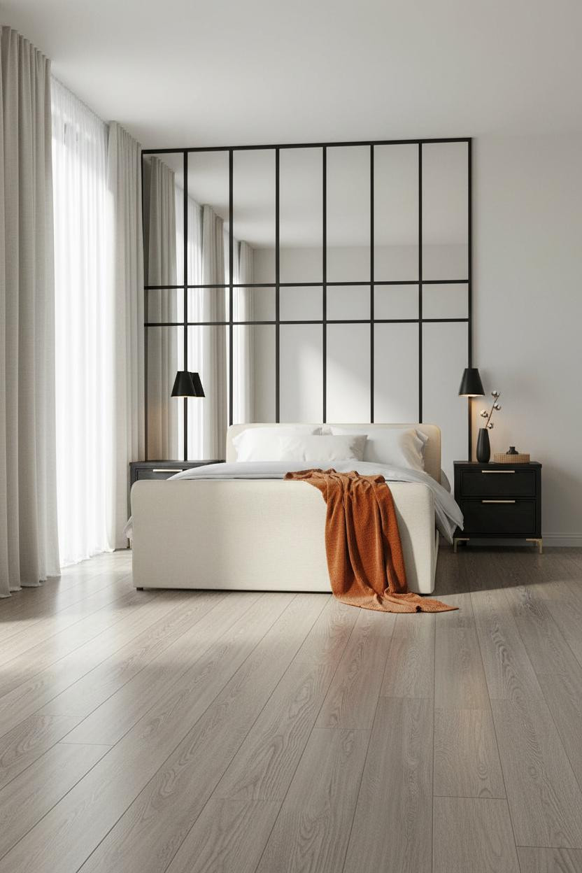

I keep coming back to this one. The geometry is sharp but the room feels calm and cohesive.
Why it works: A matte-black steel grid partition gives the cream plaster something to push against. The contrast is instant, but the flat finish keeps it from feeling aggressive.
Steal this move: Pair the grid with warm neutral bedding and one warm-toned throw to stop the palette from reading too cold.
Dark Warm Walls That Actually Feel Restful
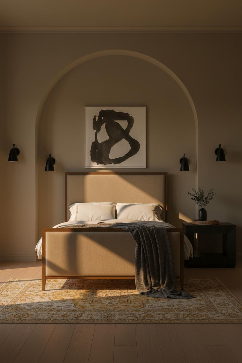


This one is divisive. Dark walls and moody lighting shouldn't feel restful. But somehow they do.
The arched plaster niche pulls it together. Warm matte plaster at this depth catches raking light along its curved edges in a way that flat paint simply can't replicate.
The practical move: Keep sconces at a warm amber to let the architecture do the work. Cooler bulbs would kill the whole effect.
Why Crittall-Style Windows Work in a Neutral Room
Crittall-style steel frames are honestly one of the easiest ways to add black without painting a single wall.
Design logic: The matte-black window grid casts thin geometric shadows across bleached ash flooring, giving the room structure while the linen-white plaster stays soft. Just enough contrast to feel intentional.
Avoid this mistake: Don't add a rug here. The bare pale floor is doing real work bouncing light back into the room.
Two-Tone Walls That Feel Architectural, Not Trendy
Tongue-and-groove wainscoting in warm white against a deep mushroom plaster upper wall is one of those combinations that photographs well and lives well.
Why it looks custom: The shadow-gap rail between panels creates a thin horizontal line that reads as built-in millwork, while still feeling residential rather than formal. Paired ceramic sconces at bed height keep the warm pools symmetrical and grounded.
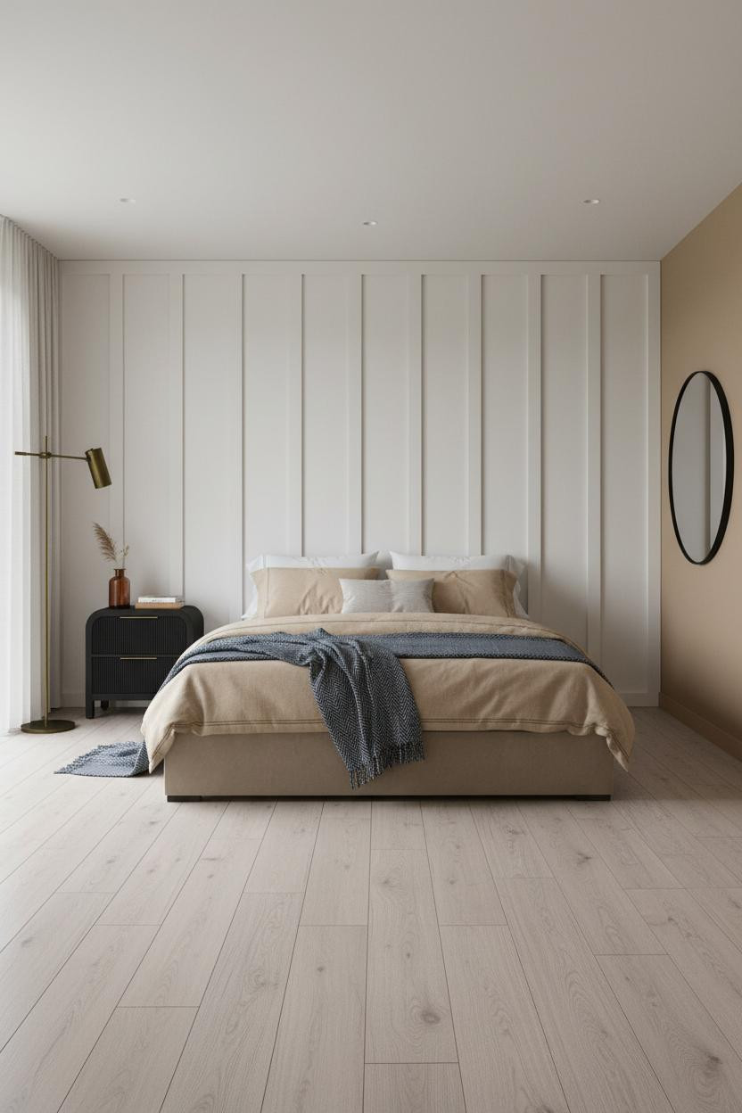
Board-and-Batten With a Charcoal Upper Wall

Bold choice. Not subtle at all. But the graphic contrast between ivory battens and a charcoal upper band is exactly why this one saves so well.
The board-and-batten relief catches recessed light along every ridge, making the lower wall feel dimensional while the dark upper half stays flat and absorbing.
The easy win: A round mirror with a thin matte black frame beside the bed ties the hardware to the wall treatment. Nothing too matchy.
Floating Walnut Shelves as the Whole Focal Point
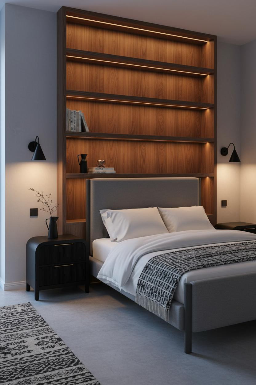

Full-height floating shelves are a commitment. I think it's worth it when the material is right.
What gives it presence: Four broad walnut shelf planes separated by deep negative space catch warm amber light along their leading edges, creating a rhythm that a headboard alone can't deliver. The polished concrete floor keeps the warmth from tipping heavy.
Style lower shelves with objects that earn their spot. One ceramic, one dried branch, stacked books. That's enough.
A Steel Bookcase Wall That Doesn't Eat the Room
Admittedly, floor-to-ceiling blackened steel shelving sounds like too much. But the negative space between shelves is the whole trick.
What makes this work: The matte steel frame absorbs diffused light rather than reflecting it, so the bookcase reads as graphic structure against soft taupe plaster walls, not as a dark mass. The black bed frame anchors it rather than competing.
Where people go wrong: Overfilling the shelves. Keep two-thirds of the niches sparse.
Charcoal Built-Ins Against Ivory Plaster

The reason this one feels collected rather than decorated is scale. Full-height built-ins demand commitment.
Why it feels intentional: Painting the built-in shelving charcoal against warm ivory plaster makes each open niche read differently under flat window light, while the pale birch flooring below stops the dark case from grounding too heavily. And the leather bed keeps the palette from tipping into stark territory.
When a Plain Beige Room Needs One Structural Idea

Nothing fancy. That's the point. Warm camel walls and bleached oak plank flooring need exactly one architectural move to feel finished, not beige.
What carries the look: Board-and-batten in crisp ivory-white casts shallow vertical shadow lines under overcast light, giving the wall behind the bed a texture that reads as custom while the slim black nightstand brings the accent forward.
Pro move: Lean a round black-framed mirror against the flanking wall instead of hanging it. It feels less finished, in a good way.
Horizontal Walnut Slat Paneling Done the Japandi Way
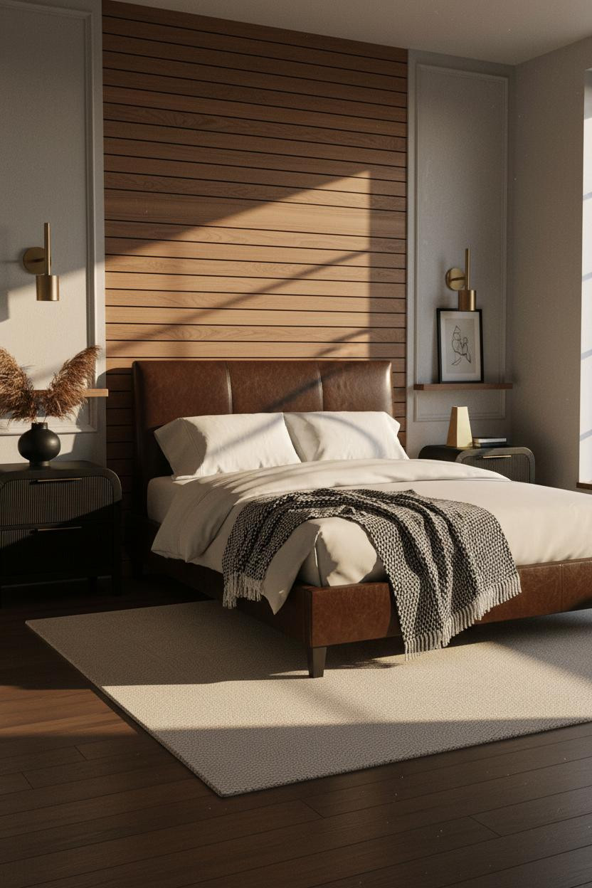
I've seen a lot of Japandi bedroom ideas that go cold. This one stays warm.
The real strength: Each horizontal walnut slat casts its own thin shadow line under raking afternoon light, so the wall reads as textured grain rather than flat paneling. Stone grey flanking plaster keeps the wood from tipping amber-heavy.
What to copy first: The chunky cream wool rug under the bed. It grounds the dark floor in a way that feels lived-in and intimate without adding pattern.
A Matte Black Plaster Wall That Earns Its Drama
If you're upgrading the bed frame
Saatva Santorini Platform Bed, from $1,295
Upholstered platform bed in 6 fabric colorways to match any bedroom palette. Slat spacing safe for foam/hybrid mattresses, rated 1,000 lbs. Free white-glove delivery and assembly.

Fair warning. A full-width matte black textured plaster wall is not a small commitment. But this is the version I'd actually do.
Why the palette works: The raw, tactile surface absorbs morning light at its center while catching a pale rim along its edges. That variation makes it feel like a material, not just a dark paint color.
The warm greige flanking walls and honey herringbone parquet keep the room from reading cold. And the right wall color matters more here than in any other room type. Get that warm side tone right first.

Our #1 Pick
Saatva Classic Mattress
America's best-selling online luxury innerspring. 365-night trial, lifetime warranty, free white glove delivery.
Shop Saatva Classic
The Foundation Of Every Beautiful Bedroom
Walls get repainted. Linen gets swapped out. The mattress stays. That's exactly why it deserves the same thought as everything else in a room this considered.
The Saatva Classic is the one I'd put under all of it. Dual-coil support that holds shape over years, breathable organic cotton that doesn't trap heat, and a Euro pillow top that's soft without losing structure underneath. It feels like the good hotel kind. Not the business hotel kind.
Good design ages well because it's made well.

The rooms worth saving are the ones where every layer was chosen on purpose. Start there and the rest figures itself out.