A wainscoting bedroom is one of those rare design moves that makes a room feel like it was always supposed to look this way. The chair rail divides the wall with quiet authority, and the paneled section below it carries a weight that paint alone never quite manages.
These 11 ideas run the full range: deep navy jewel tones, pale dove grey, forest green, dusty blue, soft sage. There is something here for every kind of bedroom.
Why Deep Navy Wainscoting Feels Richer Than You Expect
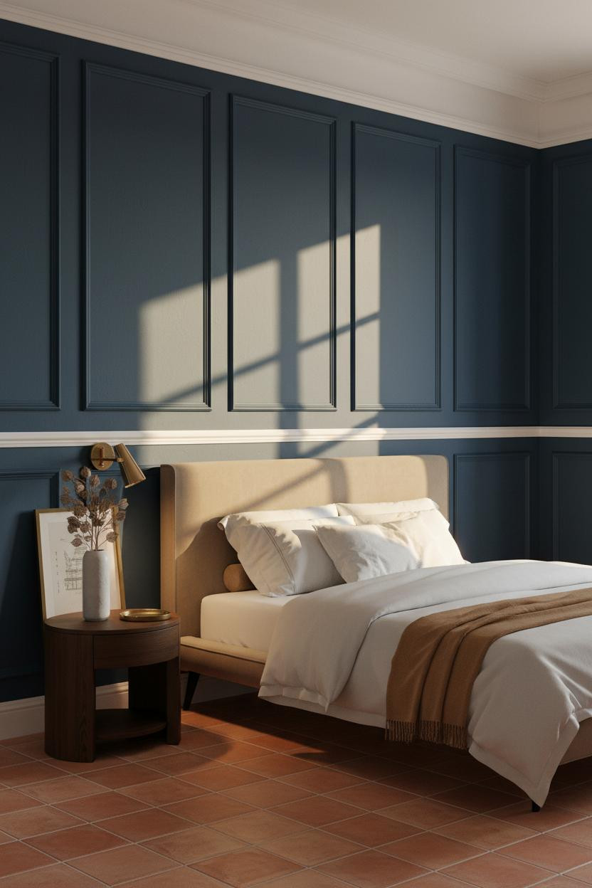


Deep cerulean navy below a crisp white chair rail at 40 inches is one of those combinations I keep coming back to, because the contrast is sharp without being cold.
Why it lands: The recessed panel geometry in matte navy catches raking daylight across every shadow reveal, and those crisp geometric lines read as architectural detail rather than just painted wall.
Steal this move: Pair the dark panels with warm ivory plaster above the rail and a warm brass lamp at night to stop the navy from going flat after sunset.
Plum Wainscoting Is Bold Without Being Obvious
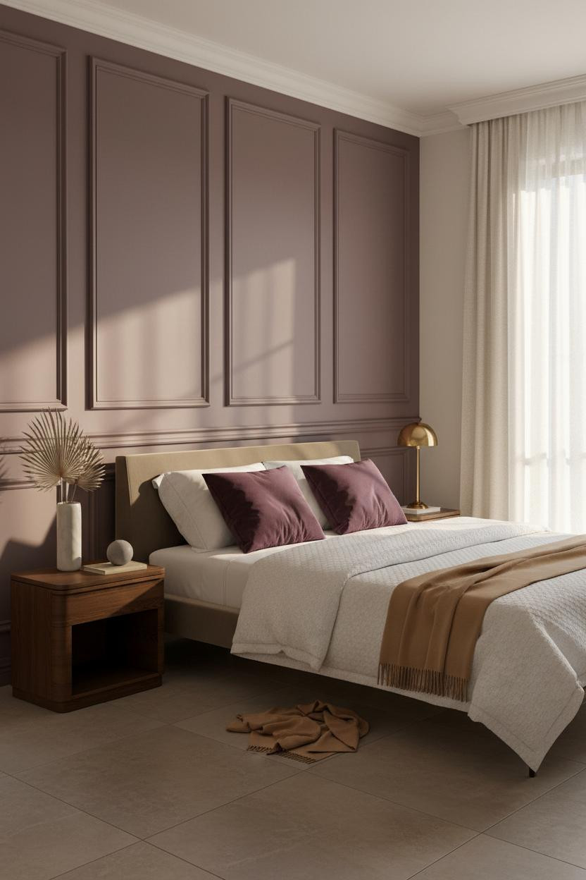

Warm plum-mauve raised panels with a white chair rail is the wainscoting color choice I always suggest to people who want jewel tones but are not ready to commit to navy or green.
What gives it depth: The matte plum surface absorbs diffused daylight differently at every hour, and the deep shadow lines around each recessed rectangular panel keep it feeling structured rather than moody.
Worth copying: Stack deep plum velvet euro shams against crisp white linen to echo the panel color and tie the whole wall to the bedding without overmatching.
Forest Green Panels on a Dark Walnut Floor
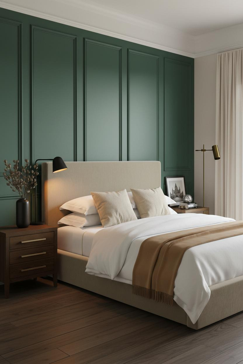

Deep forest green matte wainscoting against wide-plank dark walnut floors is a pairing that feels genuinely expensive without trying too hard (though it does require commitment).
Why the materials matter: Cool north light raking across the forest green panel faces sharpens every shadow reveal along the recessed rectangular geometry, giving the wall a depth that warm-toned rooms rarely achieve.
Where to start: Keep the wall above the white chair rail in warm ivory plaster so the green has somewhere to breathe and the room does not read as a bunker.
Dove Grey Panels Are Harder to Pull Off Than They Look


Warm dove grey raised-panel wainscoting sounds safe, but the risk is that it reads as unfinished if the light is wrong or the chair rail lacks enough contrast.
What makes it work: Honed pale grey limestone tile underfoot and cool raking sidelight across the six tall panel reveals create enough shadow geometry that the grey never flattens into beige.
Avoid this mistake: Do not match your bedding exactly to the panel color. A pale ash cashmere throw against dove grey panels just disappears. Add one warm cream or camel layer to anchor the whole thing.
Terracotta Wainscoting Turns a Bedroom Into a Real Room
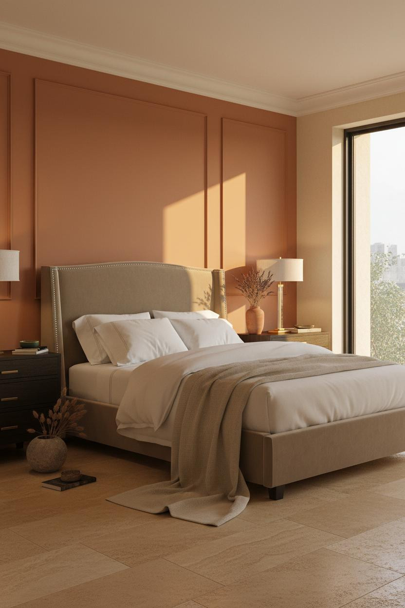

Warm terracotta blush matte wainscoting below a white chair rail at 38 inches is the Provençal farmhouse move I did not know I needed until I saw it done properly.
Why it feels intentional: Sun-amber morning light raking from a right-side window catches every recessed panel reveal and turns the terracotta surface into something that glows rather than just sits there.
The finishing layer: A matte terracotta vase with dried lavender on the nightstand echoes the panel color just enough to feel considered without looking like a showroom.
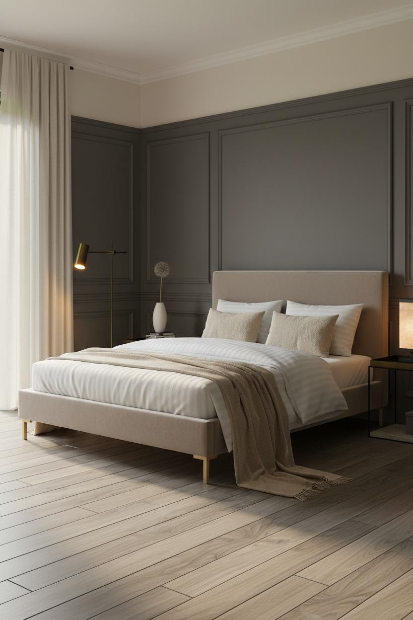
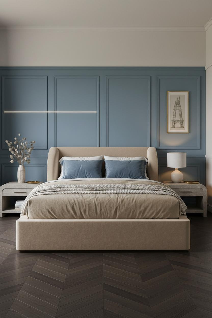
Slate Blue Is the Quiet Version of the Jewel Tone Bedroom

Warm slate blue matte wainscoting with a white chair rail at 40 inches is what colonial New England gets right: enough color to feel intentional, calm enough to sleep in.
Why it holds together: Cool diffused light across the six recessed rectangular panels creates shadow lines precise enough to read as architecture, and the white oak floor keeps the slate from reading as grey.
The part to get right: The matte finish is non-negotiable. Satin paint on slate blue paneling catches glare at the wrong angle and makes the whole wall look like a paint mistake.
I Keep Recommending Ochre Cream Panels and Nobody Believes Me

Warm ochre cream raised-panel wainscoting is the option people scroll past, and I genuinely do not understand why because it does more with raking southern light than any other neutral.
Where the luxury comes from: Warm sidelight at midmorning hits the six tall vertical panel faces and the matte ochre cream surface catches it like plaster, with the deep shadow lines at each reveal sharpening the whole composition.
Pro move: A camel cashmere throw at the foot of the bed bridges the warm ochre panels to the bedding in one move, no additional color needed.
Charcoal Wainscoting Works Best If You Commit Completely


Warm charcoal grey full-height wainscoting in a Swedish classical layout is a strong move, and the panel detailing is what separates it from just painting your walls dark.
What creates the mood: Diffused northern light filters across the pale blonde ash floor and bounces softly into the charcoal recessed panels, so the wall reads as warm and architectural rather than cold and heavy.
What not to do: Do not add a feature wall in a different dark color. The charcoal wainscoting is already the room. Anything competing with it just creates noise.
Taupe Paneling Is the Parisian Trick Nobody Talks About
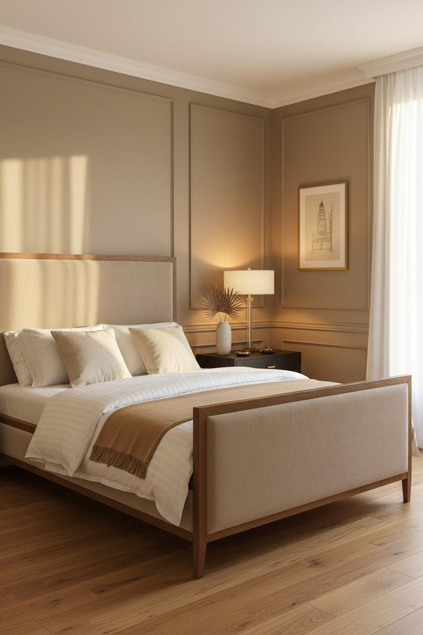

Warm taupe raised-panel wainscoting with a crisp white chair rail at 38 inches is a Parisian move that looks almost neutral until the golden morning light hits the panel reveals.
Why it looks custom: The classical rectangular panel geometry in warm taupe matte paint creates deep shadow lines that give the wall a three-dimensional quality no flat paint color can fake.
The smarter choice: Honey oak flooring under taupe paneling keeps the whole room on the warm side, which makes the brass bedside lamp feel like it belongs rather than like an accessory.
Dusty Blue Panels Calm a Room Without Flattening It

Dusty blue full-height wainscoting in an Amsterdam canal house layout feels calm and architectural at the same time, which is harder to achieve than it sounds.
What keeps it elevated: Cool diffused northern daylight across the recessed rectangular panels in dusty blue matte paint keeps each shadow reveal precise, and the dark-stained herringbone oak floor grounds the whole wall without competing.
The easy win: Dusty blue velvet euro shams, one tilted slightly off-center, connect the panel color to the bed without the room looking like it was assembled from a mood board.
Sage Green Wainscoting Is the Easiest Yes in This Whole List
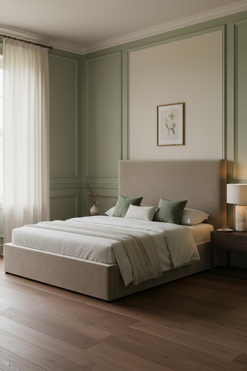

Soft sage green floor-to-ceiling raised-panel wainscoting with a white chair rail at 36 inches is the English country house version of this whole idea. And it works for almost every room.
Why it feels balanced: Diffused light through ivory linen sheers softens the sage panel surface without washing it out, and the deep shadow lines at each recessed panel edge keep the wall reading as detail rather than just color.
What to copy first: A framed botanical print in a thin brass frame above the chair rail on the upper ivory wall ties the greenery of the panels to the art in one quiet move.

Our #1 Pick
Saatva Classic Mattress
America’s best-selling online luxury innerspring. 365-night trial, lifetime warranty, free white glove delivery.
Shop Saatva Classic
The Foundation Of Every Beautiful Bedroom
Beautiful walls get a lot of attention, but the part of the room that changes your daily life is what you sleep on. Every paneled bedroom in this list looks intentional because the bed is doing its job. And when the bed works, the whole room reads better.
The Saatva Classic uses a dual-coil support system that holds its shape over years, not months. The breathable organic cotton cover and Euro pillow top give it that hotel-style softness that makes a well-dressed bed feel like it actually means something. I think of it as the architectural foundation the rest of the room is built on.
Get the walls right. Then get the mattress right. Both matter, but only one of them affects how you feel every single morning.

The rooms people save are the ones where nothing looks accidental. Wainscoting is the fastest way to make a bedroom look like someone made real decisions. Pair it with a bed worth lying in and the room takes care of the rest.