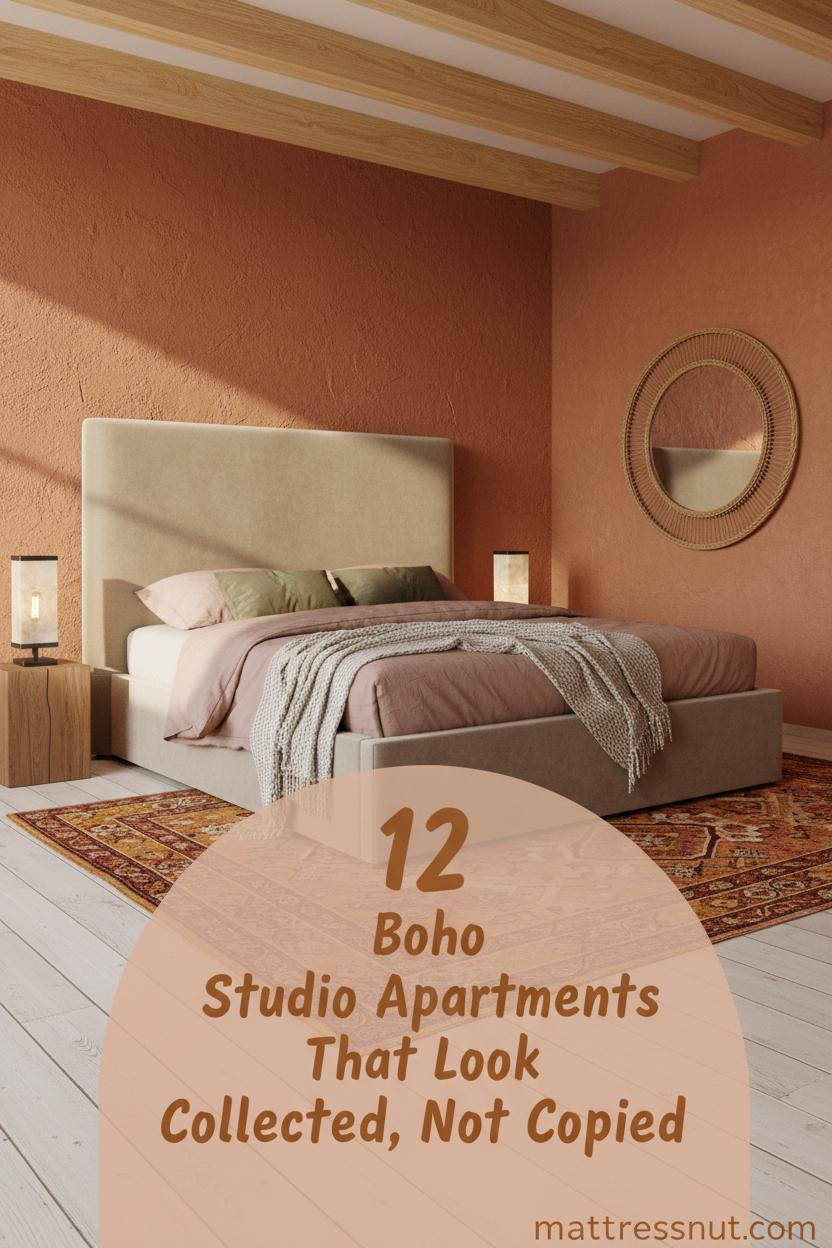
Think your tiny apartment can't feel like a collected, well-traveled home? Boho studio apartment ideas prove otherwise. The best ones don't look decorated. They look lived in.
Here are 12 rooms worth studying closely.
Wainscoting That Makes a Small Room Feel Grounded
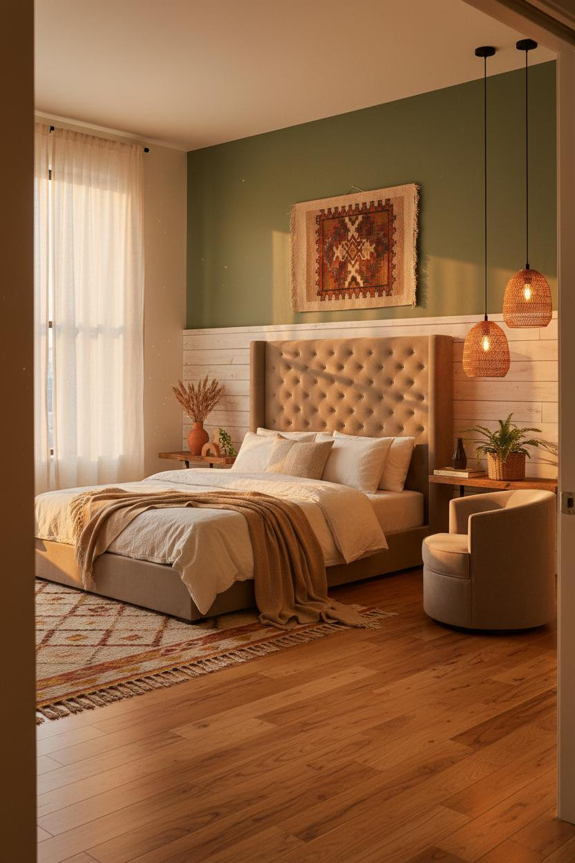


Half-height wainscoting in a boho room is a quiet trick that actually works.
Why it feels custom: The whitewashed pine panels create a low horizontal line that makes the room read wider, and the forest green above it stays rich without swallowing the space.
Steal this move: Layer a rust-and-mustard kilim rug beneath the sleeping zone. It anchors everything without competing with the walls.
Floor-to-Ceiling Macramé for the Bedroom Wall You Can't Ignore
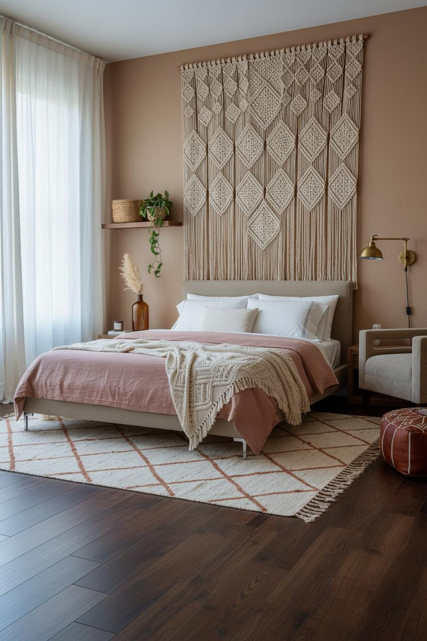


Divisive. I know. But floor-to-ceiling macramé is the one move that photographs flat and reads enormous in person.
A full-height natural jute panel does what art usually can't: it fills the vertical plane and brings shadow relief that changes as the light shifts. The warm clay plaster behind it keeps the texture from feeling sparse.
Worth copying: Keep the bedding simple. Dusty pink linen and a cream cable-knit throw. Let the wall do the talking.
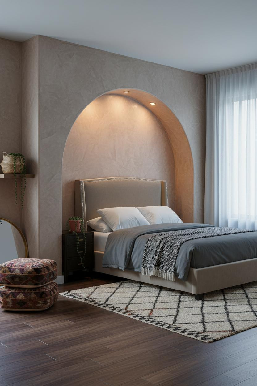
A Bedroom Niche That Feels Like It Was Always There
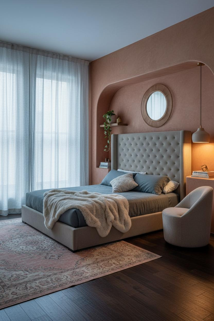

I keep coming back to the recessed niche idea. It shouldn't feel this different from a flat wall. But it does.
What gives it presence: A full-width curved niche in hand-troweled clay plaster catches raking light in a way that makes the surface feel almost sculptural. The rust-clay walls around it read as warm, not heavy, because the niche itself introduces contrast.
The practical move: Lean a large rattan mirror inside the niche rather than hanging it. It reflects light back into the room and keeps the wall from feeling precious.
Burnt Sienna Plaster That Makes the Whole Room Glow
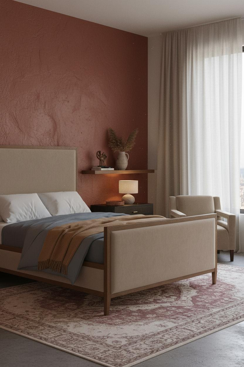

Deep color on every wall is the move most people talk themselves out of. Honestly, it's the one most worth committing to in a small studio.
The burnt sienna troweled plaster holds visible ridges that shift with the light, so the room feels alive at different times of day, while still feeling warm and contained rather than loud.
Avoid this mistake: Don't pair it with bright white bedding. Slate jersey and a camel wool throw keeps the palette cohesive.
Crittall Windows Give Boho a Surprisingly Sharp Edge

This one surprised me. The slim black steel Crittall frames read as modern and structured, and yet layered with a kilim rug and dusty pink linen, the room feels completely boho.
Why the contrast holds: Faded denim blue plaster on the walls softens the hard lines of the window grid, so both elements calm each other down rather than compete. The room feels collected rather than decorated.
If you can't do Crittall-style windows, the easy win is adding geometric crosshatch muslin panels. Same visual rhythm, fraction of the effort. (And they're easier to change your mind about.)
Indigo-Washed Walls That Pull the Whole Palette Together
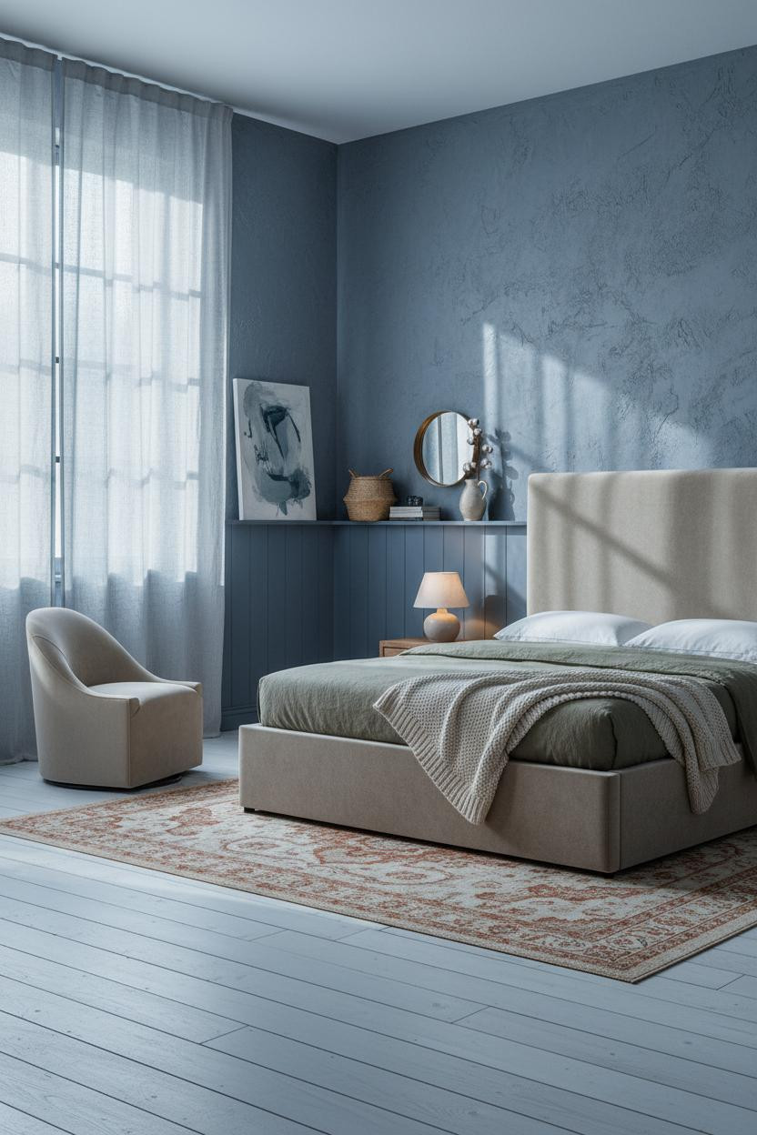

And this is the version I'd actually live with. The indigo is moody but not dark. The board-and-batten lower half keeps it structured.
Why the palette works: Hand-troweled indigo plaster paired with bleached reclaimed pine flooring creates a cool-warm contrast that somehow makes the compact room feel bigger in the morning light. The overdyed rust rug at the foot ties the two halves together.
What to borrow: Lean an oversized abstract canvas against the wall rather than hanging it. Feels more casual, and you can move it.
Amber-Ochre Walls With a Built-In Niche Reading Corner
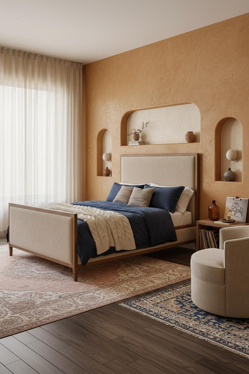
Nothing fancy. That's the point.
The recessed alcove above the sleeping zone is hand-plastered in a cream clay finish, its curved shadow relief adding quiet architectural detail that the rest of the room doesn't try to match. Amber-ochre walls around it keep the whole space warm without needing accessories to carry the look.
Pro move: Pair ceramic wall sconces flanking the sleeping zone with a contrasting graphic rug in the reading corner. Two different lighting moods, one cohesive room. Check out more studio apartment ideas that feel like a real home for layouts that handle the reading nook problem well.
Floating Reclaimed Pine Shelves Are Doing a Lot of Work Here
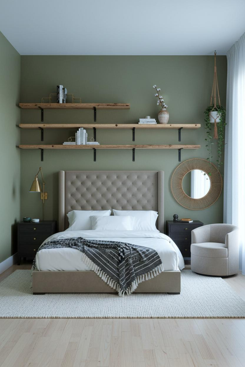
In a small studio, the wall above the bed is the most underused surface in the room.
What changes the room: Full-width reclaimed pine shelving with visible grain creates a horizontal rhythm that stretches the compact footprint, and the moss-green plaster behind it makes the boards pop without needing art.
Keep the shelf styling minimal. Brass geometric bookends, a dried cotton stem, one ceramic vessel. Three things, well spaced. That's the whole formula.
An Arched Niche That Makes a Low Ceiling Feel Taller

I almost scrolled past this one. Glad I didn't.
The full-height arched niche finished in mushroom-toned plaster pulls the eye upward in a way that flat walls simply can't, making the compact studio feel taller and more intimate at the same time. Warm cove lighting inside the arch deepens the effect after dark.
The smarter choice for the reading corner is stacked kilim poufs instead of a bulky chair. Low, flexible, and they don't visually crowd the room. For more ideas on making small spaces feel lived-in, that post covers compact layouts really well.
Vertical Slatted Wood That Warms Up a North-Facing Room
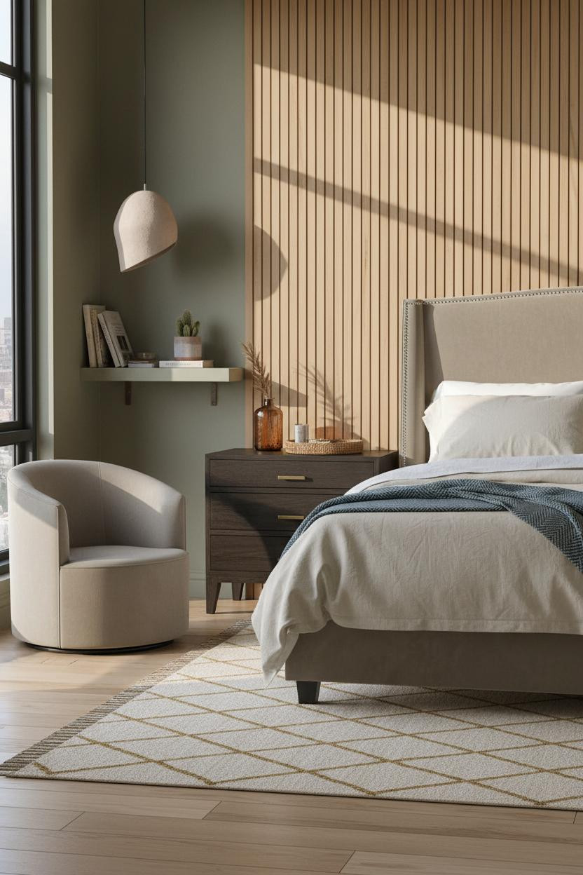
The vertical honey pine slats behind the bed do something paint can't: they cast thin parallel shadows that shift through the day, so the wall feels like it has depth even in flat north light.
What softens the room: Dusty olive walls flanking the slat panel keep the warmth without making the room feel too woody. It's a small tonal decision with a big effect. Pair it with a woven leather tray and amber glass on the nightstand for the lived-in finish.
Whitewashed Exposed Brick With a Macramé Zone Divider
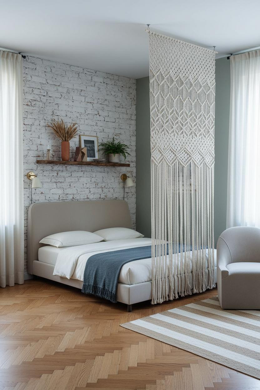

Exposed brick is polarizing. But whitewashed brick is a different thing entirely, especially paired with sage plaster on the flanking walls.
Design logic: The raw mortar joints in whitewashed clay-toned brick catch diffused light and create organic shadow relief that feels artisanal in a way no painted surface can replicate. The herringbone parquet underneath grounds it without fighting for attention.
The detail to keep: A floor-to-ceiling macramé curtain panel between sleeping and living zones. It's softer than a bookcase divider, while still giving the room a sense of two separate places. See how other studio apartment layouts handle zone division if you want more options beyond textiles.
Terracotta Walls Under an Exposed Beam Ceiling
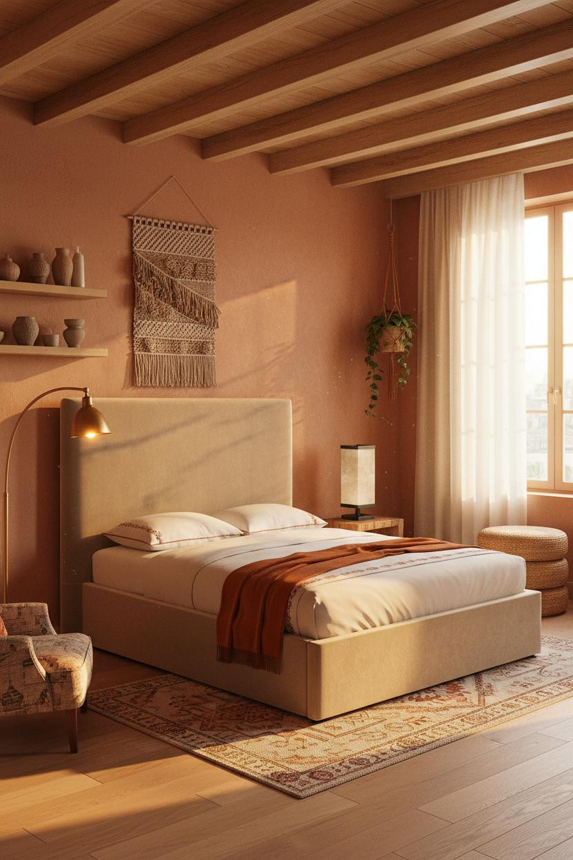

This is the kind of room that makes you want to cancel your weekend plans and stay in.
Why it holds together: The honey-toned exposed timber beams overhead draw the eye through the room horizontally, which helps the terracotta plaster walls feel warm rather than closing in. The rust-and-cream kilim beneath the sleeping zone echoes both tones in a way that feels collected rather than matchy.
An antique brass arc floor lamp in the reading corner is the right call here. The Nova Lamp's warm amber pool against terracotta is practically the whole mood. Admittedly, the look only works if you keep the accessories minimal. Ceramic vessels, trailing pothos, nothing more. For more on creating the right sleep environment, that guide covers lighting temperature in small rooms well.

Our #1 Pick
Saatva Classic Mattress
America's best-selling online luxury innerspring. 365-night trial, lifetime warranty, free white glove delivery.
Shop Saatva Classic
The Foundation Of Every Beautiful Bedroom
A boho studio can have the most beautiful terracotta walls and the most carefully layered kilim rugs in the world. But if the bed isn't right, none of it matters the way it should.
The Saatva Classic is what I'd put under all of it. Dual-coil support that holds its shape over years, a breathable organic cotton cover that doesn't trap heat, and a Euro pillow top that feels genuinely substantial. It's the kind of mattress that makes you glad you didn't cut corners there.
Walls get repainted. Throws get swapped. The mattress stays. Start with the one thing that actually earns its square footage.

The rooms people actually live happily in are the ones where the most important piece was chosen with the most care. Good design ages well because it's made well.