Our #1 Recommended Mattress
Saatva Classic. From $1,095
365-night trial · Lifetime warranty · Free white-glove delivery
Check Price at Saatva →The front door is the first sentence of your home. A welcome sign, wreath, or lantern arrangement written in that sentence sets the register for everything inside. The best front door setups do not try to say everything at once. They pick one element that commands attention from the street and let two or three supporting pieces create depth up close.
2026 Front Door Decor Trends: What is Actually Working
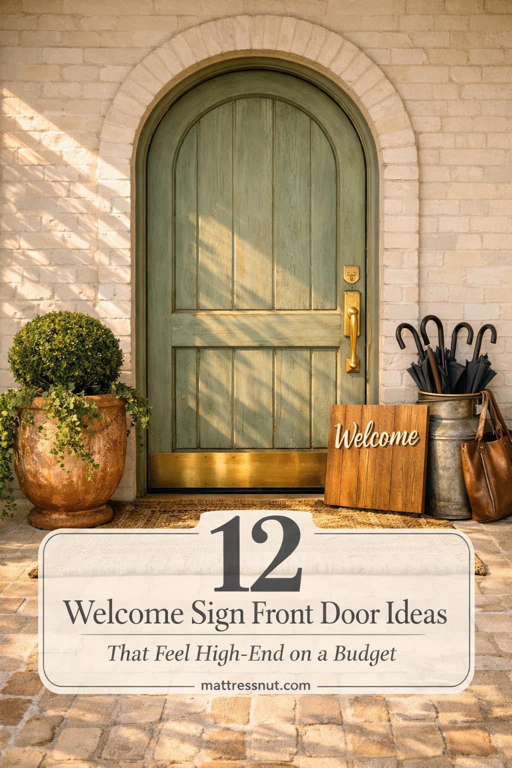
The dominant shift in front door decor for 2026 is the move from single decorative elements toward layered, seasonally interchangeable systems. Homeowners want a porch that can be refreshed quickly as seasons change without requiring a complete overhaul. The vertical porch leaner has overtaken the wreath as the dominant statement piece for modern farmhouses and suburban homes. These signs, typically four to six feet tall, fill the dead space beside the front door and draw the eye upward, making entryways feel larger and more considered.
Font choices are moving away from curly script toward clean, bold sans-serif lettering that reads clearly from the street rather than only up close. Material choices favor solid outdoor-sealed wood and powder-coated metal over flimsy alternatives that warp and fade within a single season. The interchangeable icon trend is gaining momentum: signs designed with a removable element that can swap from a snowflake to a pumpkin to a flower depending on the month, keeping the base investment useful year-round.
Wreath Styles That Work in 2026
Front door wreaths remain the most searched front door decor element, but the category has diversified significantly. The generic mixed greenery wreath with a ribbon has given way to more specific styles with defined aesthetics.
Tulip wreaths are the spring standout for 2026. The soft pastel palette creates a welcoming entrance without overpowering the door, and the blooms work on neutral, white, or sage-colored doors without competing for visual priority. For homes in farmhouse or country styles, burlap base wreaths with dried flower accents hold their shape and color through temperature swings that fresh wreaths cannot survive. The neutral base allows pastel or seasonal flowers to pop without the wreath itself becoming the story.
For a more contemporary look, structural wreaths in circular metal or wire forms with sparse greenery and a single bold bloom read as intentional and modern without the fussiness of fully floral designs. These pair well with black doors, dark stained wood, and homes where the architectural detail is already strong enough that the decor should support rather than compete.
Monogram Signs: Personal Without Being Busy
Monogram welcome signs add the kind of personal touch that makes a front door feel like it belongs to someone specific rather than a showroom. The most effective monogram designs keep the personalization secondary to the welcome message itself. A sign that reads WELCOME with a small family initial at the base works better visually than one that leads with the initial, because the welcome is the headline and the name is the detail that rewards closer inspection.
Script fonts on monogram pieces work well for traditional and cottage-style homes. Block fonts suit farmhouse and modern exterior styles where clean geometry is already part of the architectural language. For longevity, look for pieces with powder-coated steel or sealed solid wood construction. Both handle freeze-thaw cycles and summer heat without warping, fading, or developing rust at the hardware points.
Lanterns: The Supporting Element That Carries Real Weight
Lanterns flanking a front door provide something wreaths and welcome signs alone cannot: three-dimensional volume and vertical presence that anchors the entryway. A pair of black metal lanterns at different heights beside the door creates a gallery-like quality that signals curation and permanence. Brass lanterns warm up dark door colors and pair naturally with natural wood welcome signs and honey-toned wood accents elsewhere on the porch.
The most versatile lantern setup uses one large floor lantern and one mid-height lantern on a surface or plant stand rather than two matched lanterns at identical heights, which can read as too symmetrical and retail-display-like. Real candles inside lanterns add warmth that battery-powered LED alternatives cannot match, though LED pillar candles in realistic wax-drip designs have improved enough to be acceptable for daily use without the fire risk of open flame near dried wreath materials.
Seasonal inserts inside lanterns extend their usefulness year-round without replacing the lanterns themselves. Pinecones and preserved cedar in winter. Small potted succulents in spring and summer. Dried corn husks and mini pumpkins in fall. The lantern stays, the interior changes with the season, and the overall porch aesthetic refreshes without significant investment.
Seasonal Decor Systems: The 2026 Capsule Porch Approach
The most effective front door decor in 2026 is designed as a system rather than a collection of individual pieces. A base set of permanent elements, the lanterns, the planters, the door color, is complemented by a small rotating selection of seasonal pieces that can be swapped in under thirty minutes without tools or a ladder.
Spring capsule: A tulip or butterfly accent wreath in soft pastels, a floral border doormat, and a small potted arrangement of seasonal flowers in a planter flanking the door. Summer capsule: A simpler greenery wreath, a striped or geometric doormat, and solar lanterns that charge during long daylight hours and glow automatically through evening gatherings. Fall capsule: The busiest season for porch decor, and deservedly so. A layered approach with a pumpkin-themed door mat over a textured base rug, dried botanicals, and a wreath that uses real preserved materials rather than silk performs consistently through wind and rain.
Winter transitions best when the fall elements come down before they look tired. A simple winter wreath in preserved greenery or structural dried botanicals, paired with white or warm-glow string lights along the porch railing, carries the space through to spring without requiring another complete swap mid-season.
Material and Hardware Pairings That Elevate Any Setup
The single most impactful detail in front door decor is the relationship between wood tones and hardware finishes. Brass hardware pairs naturally with honey-toned and warm-stained woods. Matte black hardware suits cooler, dark-stained, or painted wood surfaces. Mixing these within the same entryway generally weakens both rather than creating interesting contrast.
Door color is the design anchor that every other element should respond to. A black door reads as sophisticated and modern and works with virtually every welcome sign material and color. A sage green door is the 2026 front door color of record, visible across Pinterest and real estate listings alike. Warm red and deep navy doors both support traditional and colonial-style homes where architectural symmetry is already present. Whatever color your door, the welcome sign, wreath, and lanterns should be chosen to complement it rather than compete, keeping the door itself as the strongest design statement.
Specific Product Picks Worth Considering
For wood welcome signs, look for pieces cut from solid pine or cedar with a sealed outdoor finish rather than MDF, which swells and delaminated within a single wet season. For wreaths, dried or preserved botanical wreaths outlast silk alternatives in terms of both visual quality and longevity. For lanterns, cast iron or powder-coated steel construction handles the thermal expansion and contraction of outdoor temperature cycles without the cracking and joint failure that cheaper alternatives develop. For monogram pieces, laser-cut steel with a protective coating holds detail and resists rust in ways that painted wood cannot over multiple years of exposure.
DIY Welcome Sign Options Worth the Time Investment
The DIY welcome sign market has matured to the point where the tools required for professional-looking results are accessible to non-specialists. A cricut or laser cutter can produce letter templates for painting or cutting from pre-purchased boards. Heat transfer vinyl allows text and simple graphic elements to be applied to wood surfaces with a household iron. For those working with basic tools only, purchased letter stencils and exterior-grade spray paint on a sealed wood board produce acceptable results at minimal cost.
The material most worth investing in for a DIY welcome sign is the wood substrate itself. Cedar and pine hold up to outdoor conditions significantly better than MDF or plywood alternatives that swell with moisture and delaminate at the painted surface. A board that is properly sanded, sealed with exterior primer, painted or stained, and then top-coated with a UV-resistant clear coat will maintain its appearance through two to three seasons of weather exposure without requiring refinishing. The letter application should also be sealed beneath the top coat rather than applied over it, as letters applied to the surface of a clear coat will lift and peel within a year of outdoor exposure.
Placement and Scale: Getting the Proportions Right
Scale is the detail that most amateur front door decor arrangements get wrong. A welcome sign that reads correctly from six feet away needs to be significantly larger than feels comfortable when you are holding it in a store. From the street, a sign under twelve inches wide disappears. A sign at eighteen to twenty-four inches wide reads clearly. A porch leaner at four to five feet tall commands the space beside the door and draws the eye from the driveway. When in doubt, size up rather than down, because a large sign that reads as confident performs better than a small sign that reads as hesitant.
Placement height matters as much as size. Welcome signs hung at eye level of a standing visitor read most naturally. Wreaths positioned at the center of the door at eye level require a door height of at least six feet eight inches to avoid feeling low and compressed. Lanterns at ground level flanking the door create a welcoming corridor effect that guides visitors toward the entry without requiring them to look up or down. Combining elements at three different heights, a wreath at eye level, a sign slightly below it, and a lantern at ankle to knee height, creates layered depth that makes the entry feel considered from multiple vantage points.
Weather Resistance: What Actually Survives the Seasons
Front door decor that does not survive its first full seasonal cycle is ultimately more expensive than higher-quality alternatives purchased at the outset. The materials that consistently survive outdoor conditions through freeze-thaw cycles, UV exposure, and rain and wind are powder-coated steel, sealed solid wood, aluminum, and outdoor-rated resin. The materials that consistently fail within one to two seasons are MDF, untreated or poorly sealed softwood, silk fabric, and any metal without rust-resistant coating or treatment.
Wreaths made from dried or preserved botanicals handle temperature and humidity changes far better than fresh materials that begin to degrade immediately and far better than silk alternatives that UV-fade within months. Preserving a natural wreath annually with a quick spray of UV protectant and a light dusting extends its useful life by at least one additional season. Welcome signs should be brought inside during extreme weather events when possible and stored in a dry location during the off-season to maximize their service life.
Complete Your Space
Every beautiful room deserves a great night's sleep. The Saatva Classic, white-glove delivery, 365-night trial.
Shop Saatva Classic →