Think your kid's room has to look like a showroom or a sports store? Modern teen boy bedroom design has moved way past both. The best ones feel like they belong to an actual person.
These 15 rooms prove it. Earthy materials, raw textures, smart layouts. Nothing too precious.
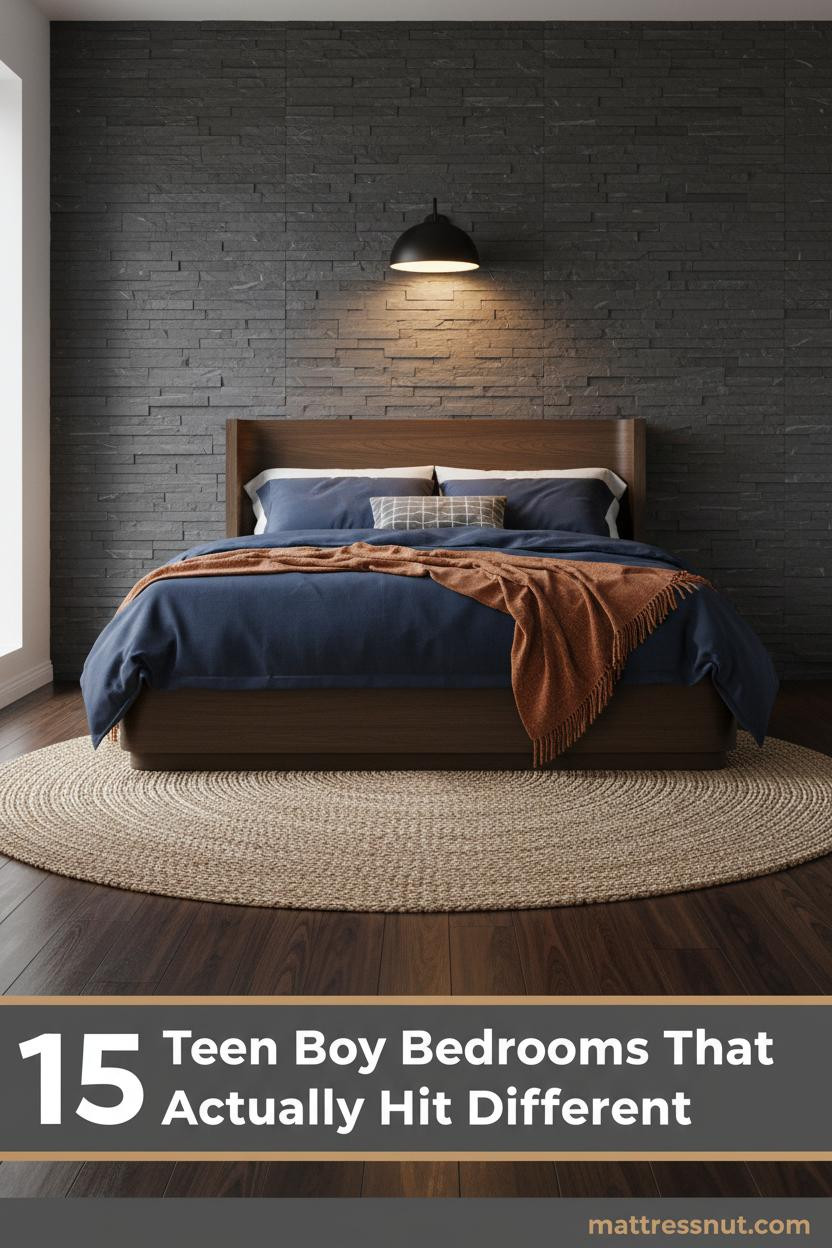
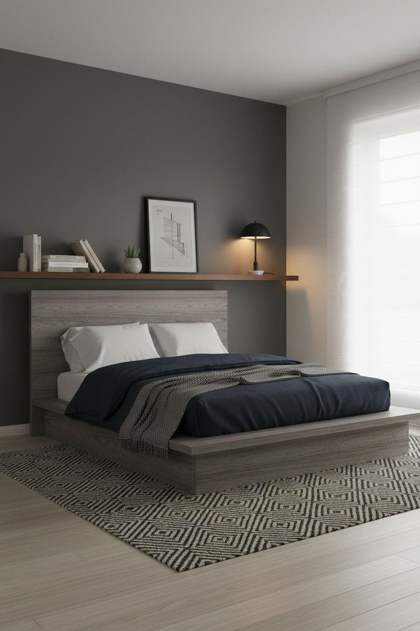
The Stone Wall That Makes Everything Else Click
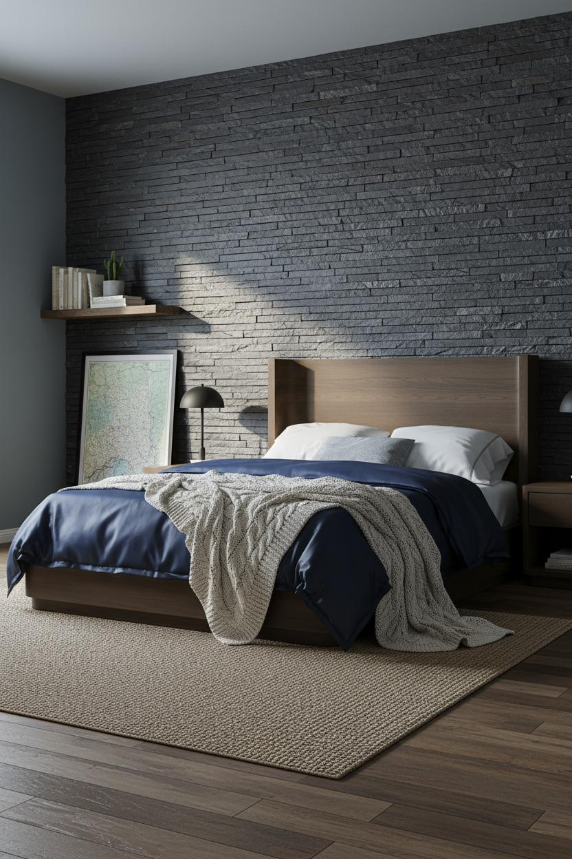

I keep coming back to this one. The stone just grounds everything without trying.
Why it holds together: The stacked charcoal slate panel above the bed zone creates so much texture that the rest of the room can stay quiet and still feel complete.
Steal this move: Pair it with a earthy bedroom design approach: jute rug, navy bedding, one matte black lamp. That's enough.
When Open Shelving Actually Works in a Small Room


Open shelving usually looks chaotic. Not here.
The matte black metal frame with pale birch shelves keeps the geometry tight, which is why it works on a stone grey wall without making the room feel crowded.
The smarter choice: Go floor-to-ceiling with this kind of unit instead of floating a few small shelves. Vertical height makes a small room feel taller, not smaller.
Floor-to-Ceiling Walnut Panels Are Not Too Much

Bold choice. But honestly, it works.
The reason this feels intentional instead of overpowering is the forest green matte wall flanking the panels. It absorbs enough light that the fluted walnut reads warm rather than heavy.
Why it looks custom: Vertical fluting catches raking light and throws parallel shadows that flat wood panels never can. It's a small material detail with a big visual payoff.
Avoid this mistake: Don't stop the panels at chair rail height. Full wall or nothing.
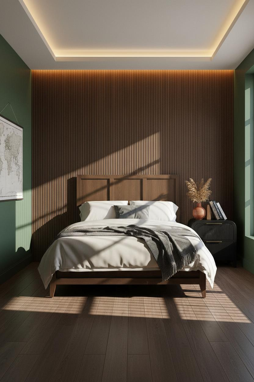
The Honey Oak Slat Wall That Gets Identity Right
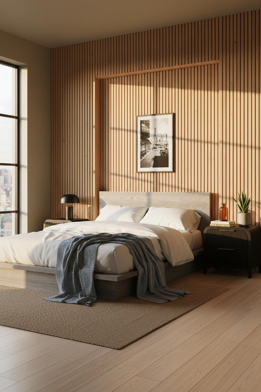

This is the kind of room that makes a teenager actually care about how their space looks.
What gives it presence: The recessed honey oak slat panel creates depth between the slats, so the wall feels three-dimensional even in flat morning light.
Pin something directly to the slats instead of framing it. The room feels collected rather than decorated, which is exactly the right call for a teen's room.
A Herringbone Wall That Earns Its Place

Herringbone on a floor is expected. On a wall behind the bed, it's a different thing entirely.
Why the materials matter: Warm oak planks in a herringbone layout catch diagonal light in two directions at once, which creates movement that straight-run planks just don't have.
The easy win: Keep the flanking walls in sand beige so the pattern reads clearly without the room feeling busy.
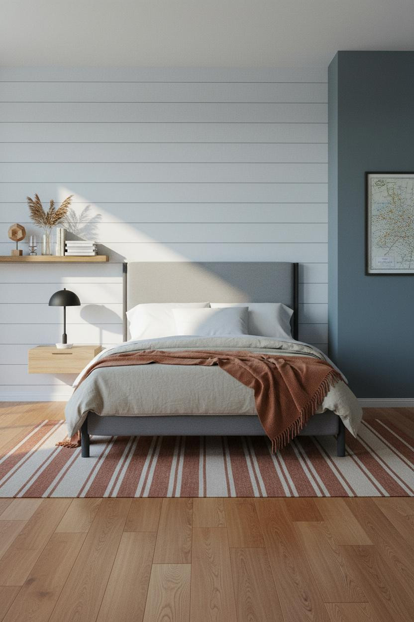
Charcoal Shiplap That Skips the Farmhouse Cliché
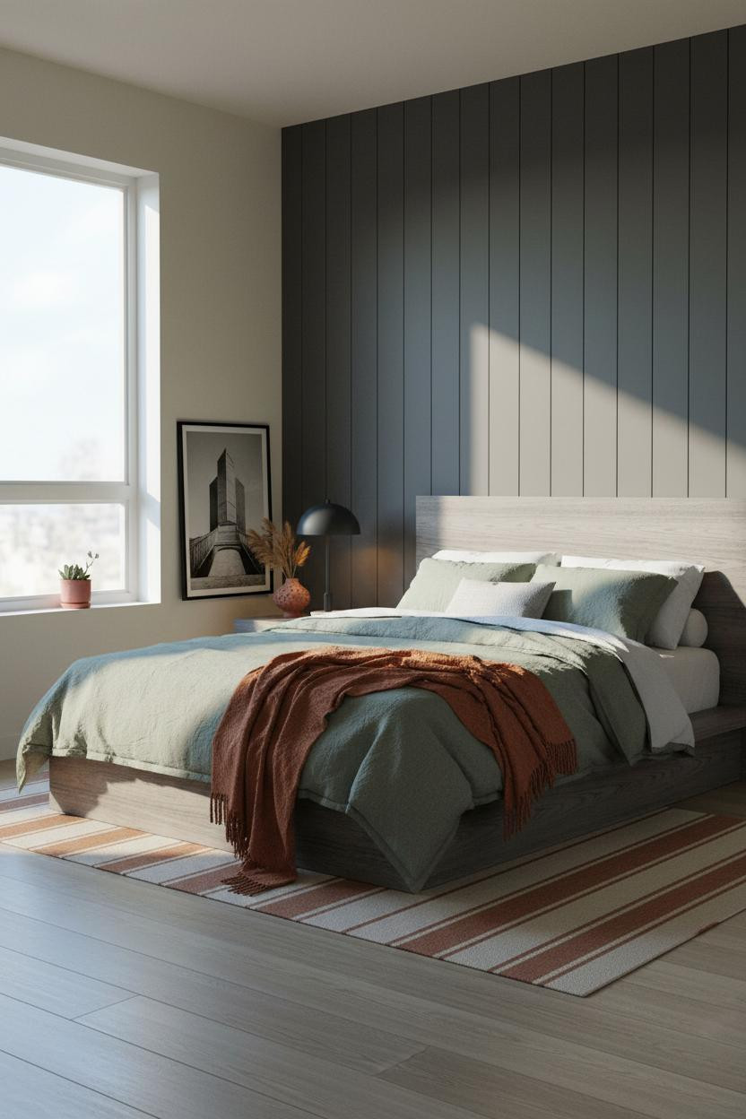
White shiplap says farmhouse. Warm charcoal shiplap says something else completely.
The dark tone on the plank wall keeps the graphic rhythm of the horizontal lines without flipping into cottage territory. The room feels warm and quiet, not rustic.
What not to do: Don't pair charcoal shiplap with cool grey bedding. The rust-orange canvas throw against sage linen is what keeps this earthy instead of cold.
Exposed Brick Coastal That Doesn't Lean Too Far Either Way
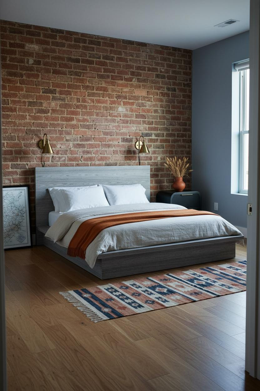
I almost scrolled past this. The brick-plus-blue combo sounds like it shouldn't work. It does.
Why it feels balanced: The dusty blue-grey walls on three sides cool the terracotta brick down just enough that the room feels coastal without going full beach house. Warm maple floors do the rest.
Worth copying: Lean a topographic print against the brick instead of hanging it. The layered look keeps the wall feeling lived-in.
Soft White Shiplap Doesn't Have to Be Boring
The contrast is what makes this one land. Pale planks, slate blue walls, rust and sand accents. Each one needs the others.
What makes this work: The soft white-grey shiplap against slate blue walls creates enough contrast to keep the horizontal plank lines reading sharp in morning light, while still feeling calm.
Pro move: Add a rust canvas throw over stone-washed oatmeal cotton bedding. Those two together pull the warmth up without changing the wall palette.
The Raw Stone Detail That Works Harder Than Paint
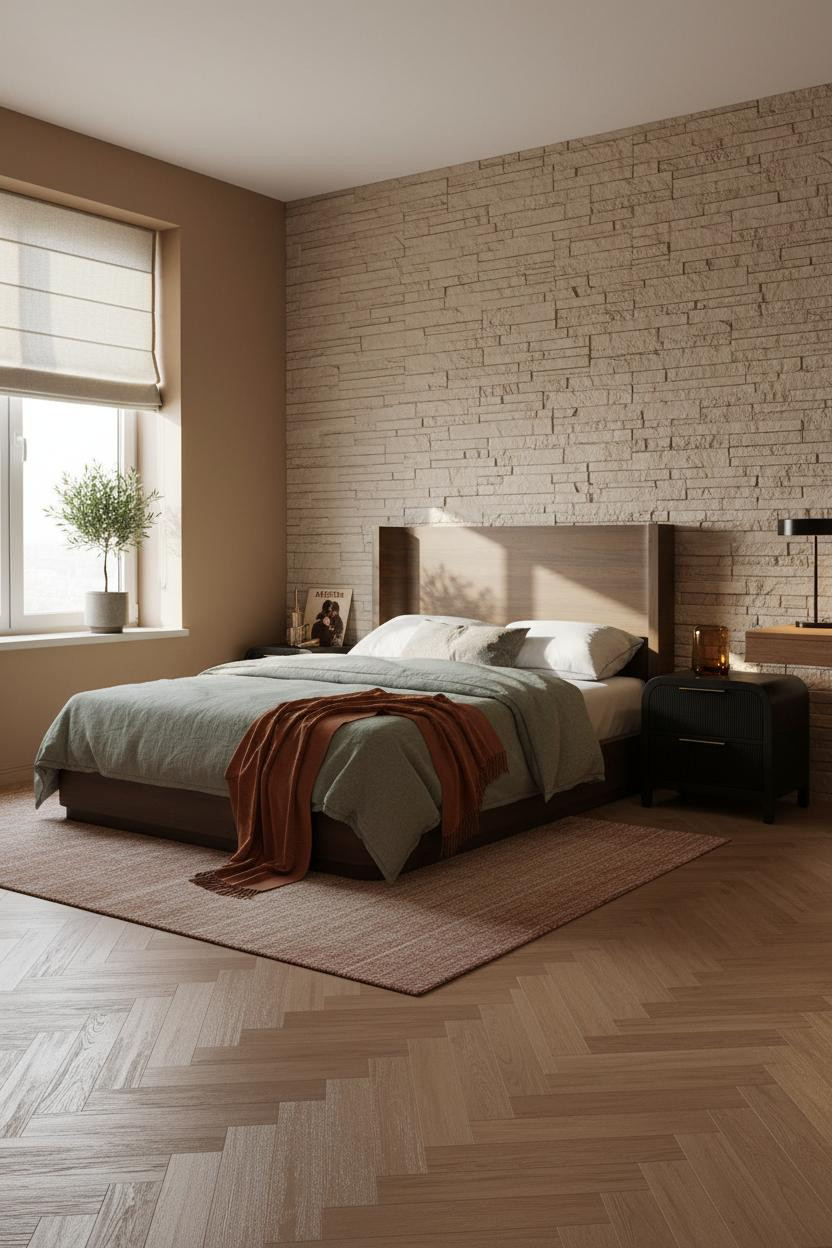
This layout is practical and it looks like it. Nothing wasted, nothing purely decorative.
In a small bedroom, a horizontal stacked stone panel above the desk zone does something a painted wall can't: it adds architectural relief that changes how light reads across the entire room.
The practical move: Put the bed against the stone and the desk beneath a window. The two zones feel separate even in a small room layout.
Pine Slats and Sage Green: A Quiet Combination That Holds

Two natural tones in the same room usually need something to separate them. Here, they just work together.
Why the palette works: Honey pine slats and sage green walls sit in the same warm-neutral family, so the combination feels cohesive without looking matchy. The reclaimed wood floor ties both together from below.
A rust linen throw across the foot of the bed is the one warm note that keeps the room from reading too cool. Just enough contrast to keep things interesting.
The Corner Shelf Setup That Solves Small Bedroom Storage
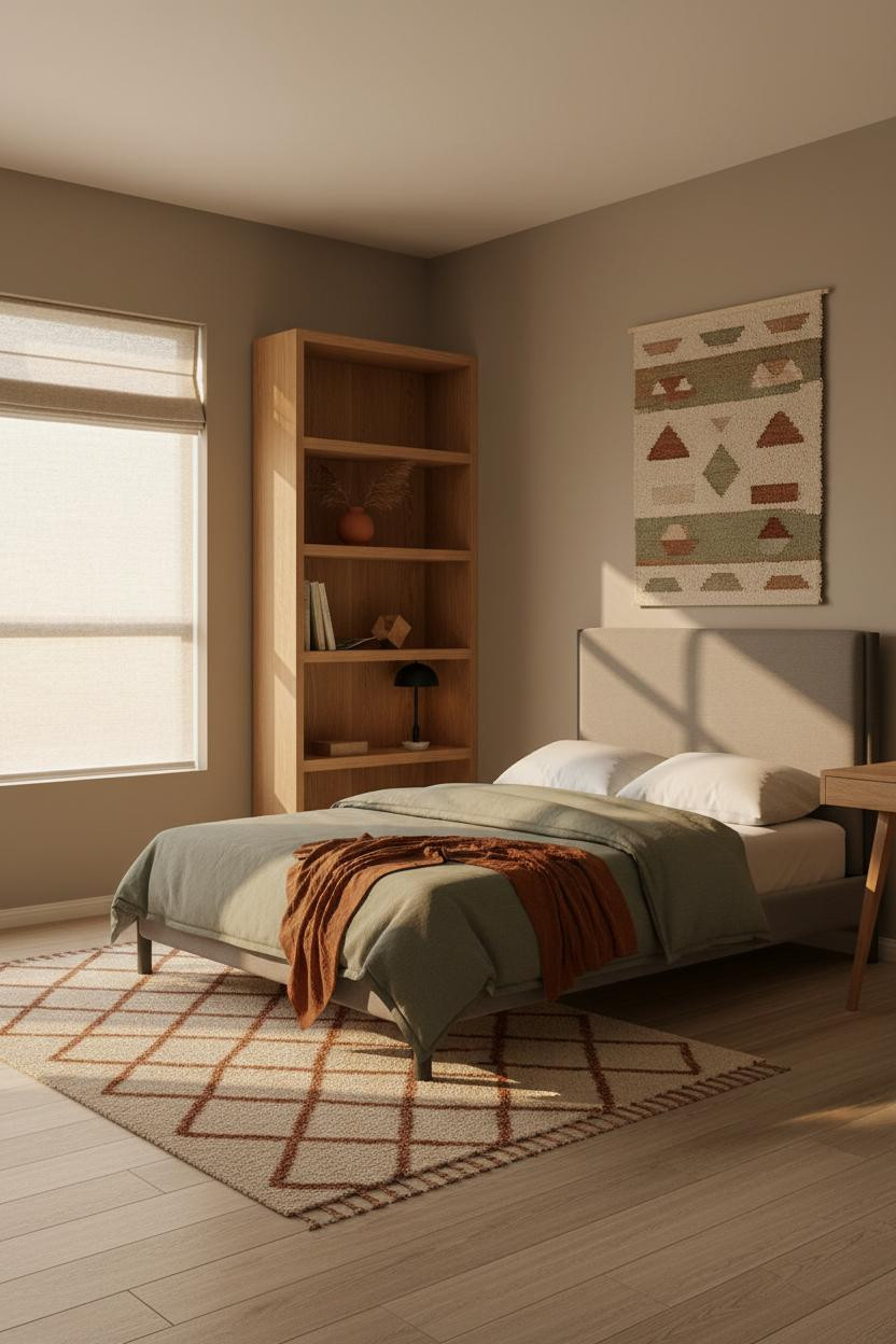
I've seen a lot of shelving solutions for small rooms. A full-height corner unit in natural oak is honestly one of the best ones because it uses dead space without touching a single wall zone.
The real strength: Open geometry shelving catches afternoon light on each shelf edge, so the unit looks architectural even when it's holding ordinary things like books and a terracotta vase.
Where to start: Fill the shelves with objects at different heights. One item pulled forward and one tilted sideways is all it takes to keep the display from looking staged.
Concrete Wall Texture in a Room That Isn't Industrial

Concrete texture on a wall doesn't have to mean loft-style or cold. This room is proof.
What creates the mood: The raw concrete-effect panel sits against olive walls and dark walnut floors, which keeps the material feeling earthy and grounded rather than industrial. The burnt orange throw does the rest.
The finishing layer: A jute area rug under the bed zone softens the dark floor in a way that keeps warmth in the room while still feeling intentional.
Moss Green Wainscoting That Earns Every Inch

Floor-to-ceiling board-and-batten in deep moss green on honey maple floors. It's a confident move.
Why it feels grounded: The moss green batten wall running full height makes the ceiling feel taller, and the warm maple floor stops the dark color from weighing the room down.
What not to do: Don't stop the wainscoting at half-wall height here. The whole point is the floor-to-ceiling commitment. Half measures just look unfinished.
The Terracotta Board-and-Batten That Skips Nothing

This one is divisive. Warm terracotta on the bed wall reads bold in photos. In person, it's actually pretty calm.
Why it lands: Matte terracotta diffuses light softly, so under overcast morning light the battens cast only subtle shadows. The room feels warm without being loud.
Pair it with an olive waffle-weave duvet and a camel throw. The room feels lived-in and intimate, not like a design statement that'll feel dated in two years.
The Scandi-Earthy Room That Gets the Balance Right
Scandi minimalism in a teen room sounds like a magazine fantasy. But strip the excess and the logic is actually pretty sound for a smaller bedroom.
What carries the look: A floating walnut shelf above the bed with open negative space between objects makes the charcoal accent wall feel architectural rather than just dark. The pale birch floor keeps the room from getting too heavy.
The key piece: A navy linen duvet with a charcoal cotton throw. Two tones, two textures. That contrast is what stops the Scandi palette from feeling sterile.

Our #1 Pick
Saatva Classic Mattress
America's best-selling online luxury innerspring. 365-night trial, lifetime warranty, free white glove delivery.
Shop Saatva Classic
The Foundation Of Every Beautiful Bedroom
All of these rooms have one thing in common: the wall treatment and the layout matter a lot, but they stop mattering the moment a bad mattress ruins the sleep. Good design ages well because it's made well. And a bed that looks right but sleeps badly isn't actually a good bed.
The Saatva Classic is the one I'd put under any of these rooms. Dual-coil support that holds proper posture through the night, a breathable organic cotton cover that doesn't trap heat, and a Euro pillow top that's genuinely soft without losing its structure over time.
Walls get repainted. Bedding gets swapped out. The mattress stays. Start with the one that's worth keeping.

These rooms prove that a teen bedroom doesn't have to be loud to feel personal. Raw stone, honey pine, deep green wainscoting: each one is a different answer to the same question. The rooms worth saving are the ones where nothing looks accidental. Pick one material, commit to it, and let the rest follow.