Our #1 Recommended Mattress
Saatva Classic. From $1,095
365-night trial · Lifetime warranty · Free white-glove delivery
Painted terracotta pots are no longer the craft project that gets relegated to a spare afternoon with leftover paint and forgotten about. In 2026, hand-painted plant pots are a legitimate design element in some of the most photographed interiors on the internet, and the techniques being used to create them have grown significantly more sophisticated than a simple coat of acrylic and a brush. Here is how to execute pot painting projects that look designed rather than improvised.
Why Painted Pots Work So Well in 2026 Interiors
Five years ago, hand-painted terracotta felt too DIY for serious interior design consideration. Now it represents intentional, considered design that adds character and warmth to spaces in ways that mass-produced containers cannot. The shift happened partly because the aesthetic direction of residential interiors moved toward imperfection, craft, and handmade quality over factory precision. A perfectly thrown and painted terracotta pot, showing the marks of individual human hands that made it, fits that aesthetic completely.
The appeal is also economic. A collection of three painted terracotta pots can transform a windowsill, bookshelf, or outdoor patio for well under $30 in materials. The plants themselves are often cheaper or free, propagated from existing plants or sourced as cuttings from friends. This is one of the most accessible and highest-impact design interventions available, which is part of why it has persisted as a trend far longer than most craft-based home decor ideas.
Preparation: The Step That Makes Everything Else Work
Every painting project on terracotta starts with preparation, and skipping or rushing this stage produces results that look exactly like skipped preparation. Remove any dirt, tags, or residue from the pot surface. If the pot has been used, scrub it with warm water and a stiff brush and let it dry completely. Terracotta is porous and absorbent, which means it will drink paint and sealer faster than ceramic or plastic surfaces.
Apply one to two coats of clay pot sealer to the inside and outside before any paint touches the surface. The sealer stabilizes the porous terracotta and creates a more consistent base for paint adhesion. Without sealer, the terracotta absorbs paint unevenly, particularly on the first coat, and the finished paint layer is more prone to flaking or peeling over time as the pot expands and contracts with temperature and moisture changes.
Fine-grit sandpaper, 220-grit, can smooth any rough ridges or texture irregularities before painting. This is optional for rustic or distressed effects but worth doing for cleaner, more precise techniques like marble effects and geometric patterns that depend on smooth underlying surfaces for accurate results.
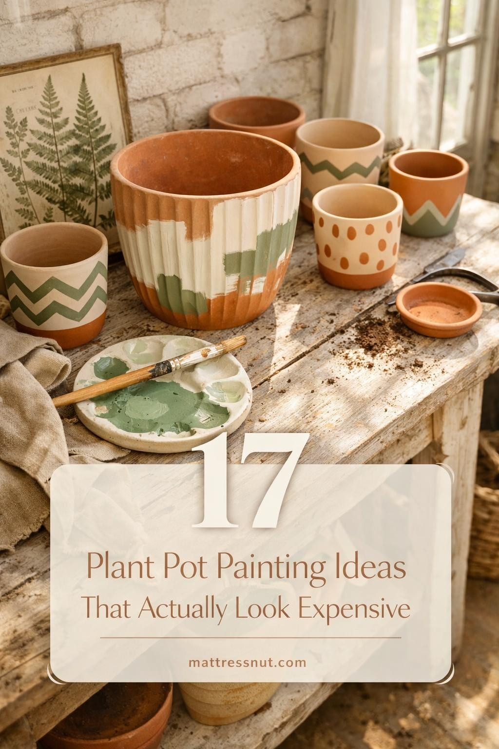
Color Washing: The Simplest Technique That Works
Color washing is the entry-level technique that produces consistent, beautiful results with minimal skill and materials. The process involves applying a thin wash of color diluted approximately 50:50 with water. This wash allows the natural terracotta to show through, creating a subtle, semi-transparent effect that is far more interesting than a solid coat of paint.
The technique: mix your chosen acrylic color with an equal part of water. Apply with a wide, soft brush in loose, overlapping strokes. Do not try to achieve even coverage. The variation is the point. Let some areas remain more saturated and others more diluted. The terracotta color reading through the wash adds warmth and earthiness that a solid paint coat would eliminate.
The most successful color wash tones for terracotta in 2026 are sage green, burnt sienna, dusty blue, and warm cream. These colors complement the natural orange-brown of terracotta rather than fighting it. A sage green wash on terracotta creates a botanical, aged effect that looks like a pot that has spent years in a Mediterranean garden. A cream wash lightens the pot without making it look painted, maintaining the material character of the terracotta beneath.
Marble Effect: Hydro-Dipping and the Water Method
The marble effect achieved through hydro-dipping, or watermarbling, is the most dramatic and most-photographed pot painting technique in current home decor content. The result is genuinely marble-like, not in the sense of fooling anyone into thinking the pot is stone, but in creating a swirling pattern of color that has the same organic complexity as real marble veining.
The process: fill a wide bucket with enough water to fully submerge your pot. Spray the surface of the water with your first spray paint color, covering it completely. Without delay, spray a second color in alternating layers, five to seven layers total. Using a wooden skewer or chopstick, gently swirl the colors together on the water surface until you see a pattern you like. Dip the pot into the water, moving it slightly as it submerges, and lift it out slowly. The paint film on the water surface transfers to the pot surface as it passes through.
The key variables are paint type, water temperature, and swirling technique. Spray paint specifically formulated for plastic surfaces provides the best adhesion to sealed terracotta. Cold water gives you slightly more working time before the paint film sets. Minimal swirling creates a more dramatic, large-scale marble effect. More swirling creates a finer, more intricate pattern. Experiment with the sample test pot before committing to the technique on a pot you care about.
After the pot dries completely, apply two coats of clear spray sealer to protect the painted surface. Without sealer, the hydro-dipped finish is vulnerable to moisture damage, particularly if the pot will be used outdoors or exposed to regular watering.
Marble Effect: The Brush and Sponge Method
For those who prefer not to work with the water method, a convincing marble effect can be achieved using paint alone. This approach requires more skill to execute convincingly but allows more control over the final pattern than the hydro-dipping method provides.
Start with two coats of white chalk paint or acrylic as the base, allowing full drying between coats. Using a fine, slightly bent artist's brush, apply thin, meandering lines of gray paint to simulate marble veining. Rotate the pot as you work to create veins that run in multiple directions rather than all in parallel. While the veining is still slightly wet, lightly feather the edges with a damp sponge to soften the lines from precise to more naturalistic.
A metallic paint in pewter, silver, or gold applied in the same meandering line pattern alongside the gray creates depth and the slight shimmer quality that differentiates marble from painted concrete. Apply sparingly. The metallic element should accent rather than dominate. A final coat of matte sealant removes the sheen from the metallic paint and creates the matte depth of real polished marble rather than the glittery effect of metallic paint at full strength.
Aged and Weathered Effects: Making New Pots Look Old
An aged terracotta effect produces some of the most beautiful and most contextually versatile painted pots, because they look as though they have been part of a garden for decades rather than newly purchased. The techniques for achieving this effect are based on strategic layering and selective removal rather than the direct application approach of most painting methods.
The stippling technique: apply a base coat of chalk paint in a warm off-white or pale gray. Allow to dry fully. Dip the tip of a chip brush or old toothbrush into a darker color, olive green, burnt umber, or dark charcoal, and dab with an up-and-down motion rather than a painting stroke. The stippled texture creates the visual impression of accumulated grime and moss that old garden pots naturally develop. Concentrate the stippling at the base and rim of the pot where soil and moisture contact is greatest in actual use.
A mossy green effect can be added over the stippled base using a dry brush technique: load a small amount of moss green paint onto a brush and wipe most of it off on a paper towel. Then drag the nearly dry brush across the textured surface in a random pattern. The paint catches only the high points of the surface texture, creating the appearance of moss growing on old stone or terracotta. This technique works best on pots with some surface texture rather than completely smooth ones.
Geometric Patterns and Color Blocking
Geometric patterns on terracotta pots are the option that works best in contemporary and minimalist interiors where more organic or rustic effects would feel out of place. Painter's tape creates clean, precise lines and geometric shapes with no freehand skill required. The result reads as considered and precise rather than handmade, which is exactly the right quality for a graphic, contemporary setting.
Simple color blocking, dividing the pot into two or three distinct color zones separated by clean tape lines, is the easiest geometric approach and one of the most visually effective. A pot painted in cream on the upper two-thirds and sage green on the lower third, separated by a clean horizontal line, looks designed rather than decorated. Three pots in the same color combination at different sizes grouped on a windowsill creates a collected aesthetic that photographs extremely well.
Aztec and geometric patterns using tape-created shapes, triangles, diamonds, and stepped motifs, are more labor-intensive but create pots that function as genuine art objects. These are best reserved for larger pots where the scale of the pattern can develop properly. On small pots, complex geometry can read as busy rather than detailed.
Styling Painted Pots in Your Home
The most effective presentation of painted pots involves grouping rather than scattering. Three pots of different sizes in a coordinated color family, placed together on a shelf, windowsill, or table, create a vignette that reads as a considered design element. The same three pots placed in three separate locations throughout a room become invisible against the wider context.
Pairing painted pots with complementary room elements multiplies their visual impact. Sage green pots on a dark walnut shelf. Marble-effect pots on a white marble bathroom ledge. Aged terracotta pots in a Mediterranean-tiled kitchen window. These combinations feel researched and intentional rather than random, which is what elevates painted pot styling from craft project to interior design decision.
The imperfections sell it more than perfect lines ever will. This is the hardest concept for people new to this type of project to internalize. Asymmetrical patterns, intentional drips, visible brushstrokes, and deliberately uneven edges all read as authenticity and handcraft in the current aesthetic climate. The pot that looks slightly imperfect is more interesting than the one that looks like it came from a factory. Trust the process and resist the urge to correct every irregularity.
Sealing and Weatherproofing: Making Your Painted Pots Last
A painted terracotta pot that is not properly sealed will begin showing wear within weeks of being introduced to a watering routine. Water penetrating through the pot wall causes paint to bubble, crack, and eventually flake. This is the failure mode that most DIY pot painting projects encounter and that gives painted pots an undeserved reputation for being short-lived decorative items.
The sealing protocol that prevents this failure is straightforward but requires patience. Before any paint application, seal the exterior of the pot with two coats of clay pot sealer or an exterior-grade acrylic primer. Allow each coat to dry completely. After painting, apply two coats of clear exterior sealer in the finish of your choice: matte for an organic, non-reflective look, or satin for a slight sheen that photographs well. For pots that will live outdoors in climates with freeze-thaw cycles, a third coat of sealer is worth the extra step. The water penetration that causes paint failure is dramatically reduced when the underlying terracotta is fully saturated with sealer before the paint layer is applied.
Color Theory for Painted Pots: Choosing Combinations That Work
The most common mistake in pot painting projects is choosing colors in isolation rather than in relationship to each other and to the plants they will contain. A sage green pot with a monstera creates one effect. The same sage green with a bright orange bird of paradise creates a very different, potentially clashing effect. Think about the foliage and flower color of the plant as an element in the color composition, not just as the reason the pot exists.
In 2026 interiors, the most successful painted pot color combinations are those that create either a tonal relationship or a deliberate complementary contrast. Tonal relationships occur when the pot color and the plant's foliage share the same temperature: warm terracotta tones with warm-leaved plants, cool greens and blues with plants that have cool blue-green foliage. Complementary contrasts occur when the pot color sits opposite the plant's dominant color on the color wheel: a terracotta orange pot with blue-green eucalyptus, or a cobalt blue pot with warm rust-toned dried pampas. Either approach produces a composed, intentional result. The failure mode is neither: a pot color chosen without reference to the plant, positioned in a room context that it also ignores, which produces the arbitrary, accidental look that makes painted pots feel like craft projects rather than design decisions.
Complete Your Space
Every beautiful room deserves a great night sleep. The Saatva Classic — white-glove delivery, 365-night trial.
Related Guides
MATTRESSES FOR PAIN RELIEF