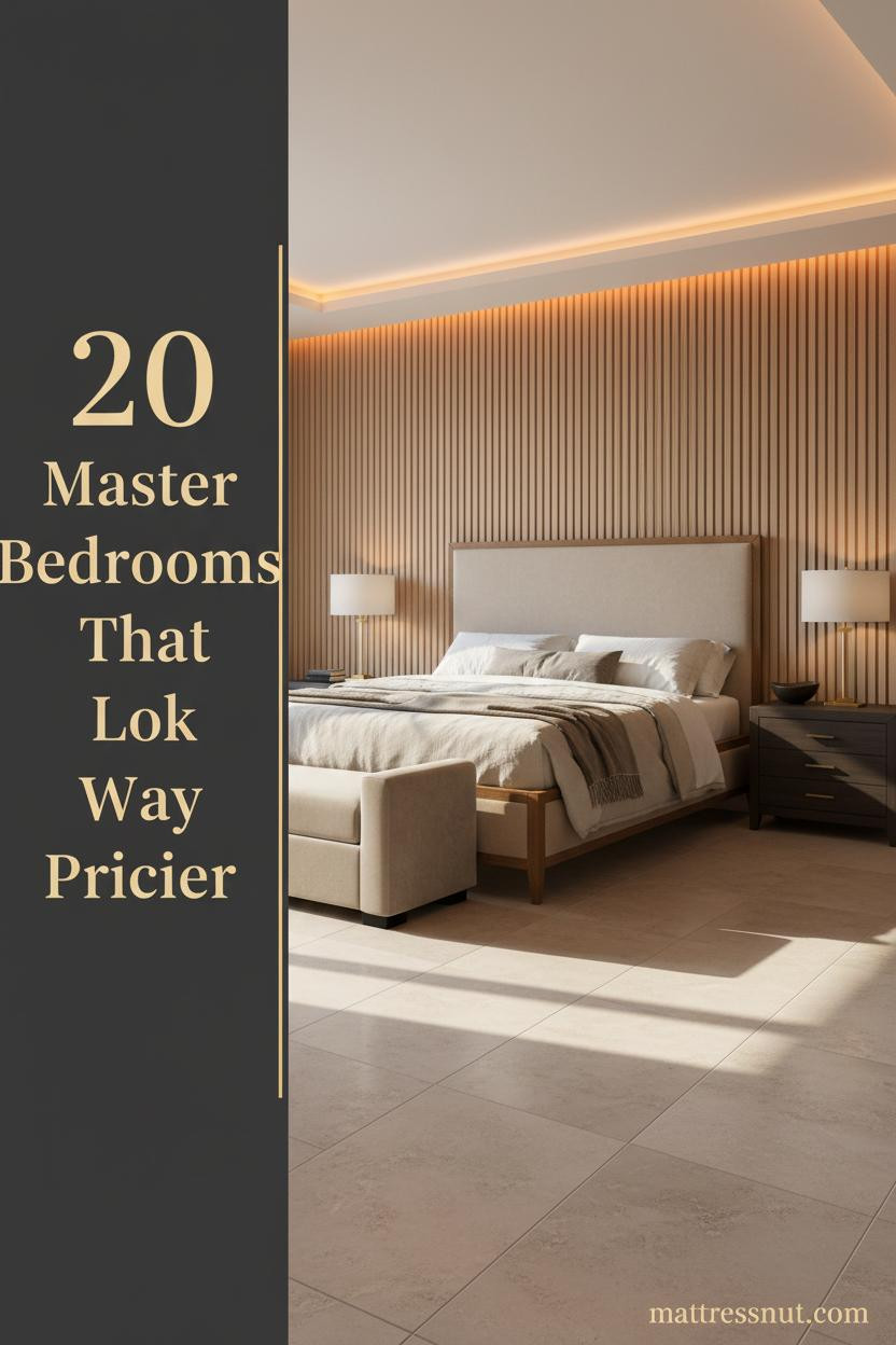
A luxury bedroom master isn’t about filling a room with expensive things. It’s about getting the proportions, materials, and light right, then stopping. These twenty rooms show exactly what that looks like in practice.
The Curved Concrete Wall That Makes Everything Feel Quieter
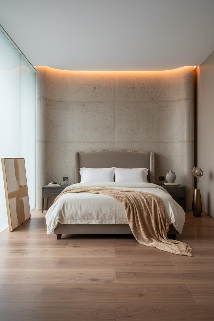

There’s a specific calm that comes from raw concrete done right, and this Brazilian modernist suite has it.
Why it works: The gently bowed raw concrete wall absorbs daylight differently across its curved surface, creating tonal variation that flat paint can never produce, while the warm amber cove at the crown keeps the room from feeling cold.
The foundation: A low-profile platform bed like the Minori sits right in rooms built around monumental architecture, because it doesn’t compete.
Dark Oak Panels and the Dutch Art of Staying Restrained

Twelve floor-to-ceiling ebonized oak panels with aged brass inlay trim, and the room still manages to feel calm rather than overwhelming.
Design logic: The dusty slate blue plaster walls and dark oak work together because they share the same cool undertone, which keeps the contrast from feeling harsh and the room from feeling like a showroom.
What not to do: Don’t pair dark paneling like this with warm-toned flooring. The temperature clash between cool ebonized wood and honey oak floors is what makes a room feel unresolved.
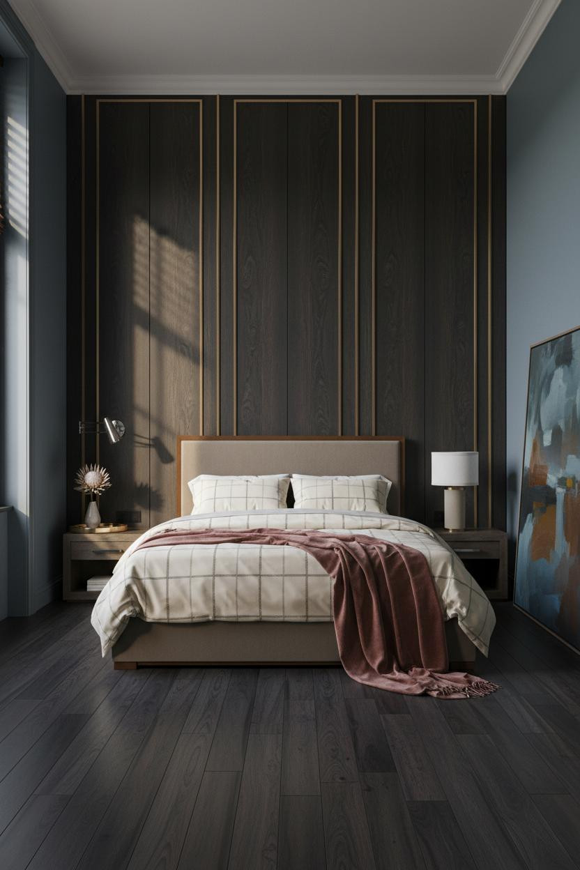
Deep Plum Walls and the Case for Going Fully Royal


I’ll be honest: deep dusty plum walls with hand-painted trompe-l’oeil botanicals and gilded molding borders could so easily tip into costume, but this room holds it together.
What makes it work: The matte plaster finish on the aubergine walls absorbs lateral amber light instead of bouncing it, so the gilded details read as warm rather than flashy against the dark ground.
Worth copying: The Copenhagen bed frame’s clean upholstered profile is exactly what anchors a room this ornate, keeping it from crossing into overwhelming.
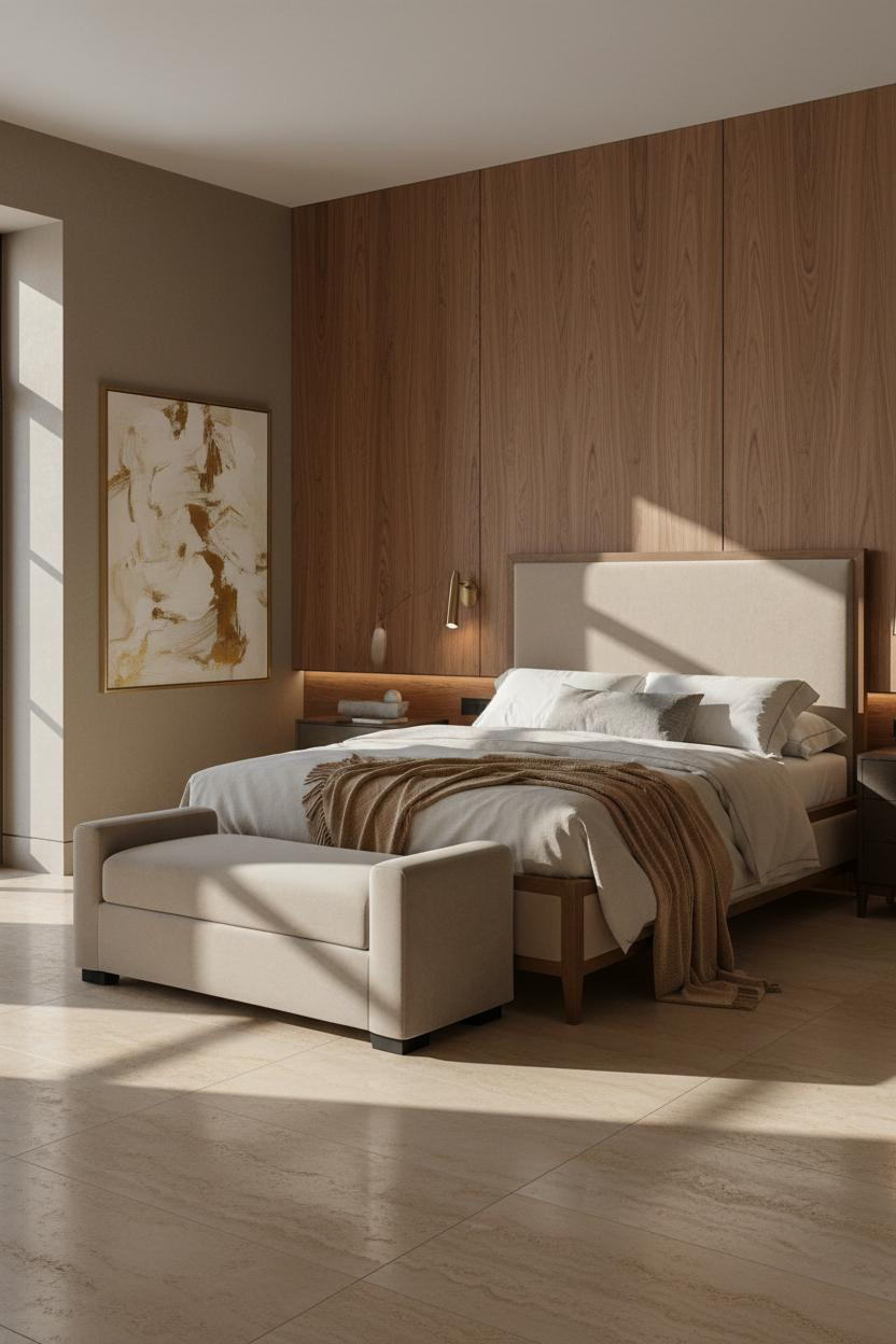
Travertine Floor to Ceiling: A Desert Room That Doesn’t Apologize


Book-matched warm cream travertine from floor to ceiling on the bed wall, and somehow it still feels more calm than cold.
Why the materials matter: Honed travertine with near-invisible grout lines on a full-height feature wall reads as one continuous organic surface, which gives the room its monumental quality without needing contrast color to create drama.
The smarter choice: A storage bench like the Rhone at the foot adds function without breaking the room’s clean material story.
Forest Sage Plaster With a Gilded Arch: Art Deco Done Quietly

The deep forest sage polished plaster catches the afternoon light differently from every angle, and that’s exactly why this room feels more alive than a painted wall ever could.
What gives it depth: Polished sage plaster in an arched alcove picks up both the warm amber lamp glow and cool daylight simultaneously, giving the wall its layered quality that no single paint color can replicate.
Steal this move: The linen-toned Brienne Channel Ottoman at the foot of the bed works here because its quiet tone lets the forest sage walls own the room.
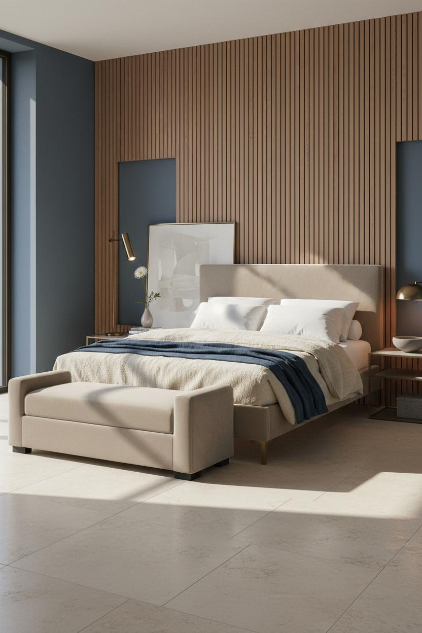
Bleached Oak Flutes and the Shadow Lines That Do the Work


Twelve tight vertical flutes in bleached white oak, each 4cm ridge casting a precise shadow line, and suddenly a flat wall has more texture than most rooms with double the furniture.
Why it feels expensive: Fluted oak paneling works because the shadow relief changes as the light moves through the day, giving the wall visual movement without any color or pattern doing the heavy lifting.
Best for: Rooms with strong lateral morning light, where the shadows from the flutes have somewhere to travel. North-facing rooms won’t get the same effect. Pairing with the right upholstered bed in a neutral tone keeps the wall as the focal point.
Smoked Oak and Pale Stone: Why This Swiss Bedroom Feels So Light

Under full alpine daylight, pale smoked oak horizontal panels can look almost silver, and that’s not a bad thing at all.
What carries the look: The horizontal shadow-gap reveals in the smoked oak paneling create a calm linear rhythm that echoes the wide-plank limestone floor, so the room feels coordinated top to bottom without feeling matched.
Try this: Keep the flanking walls in warm taupe micro-cement plaster rather than white, so the cool oak tones have something warm to play against.
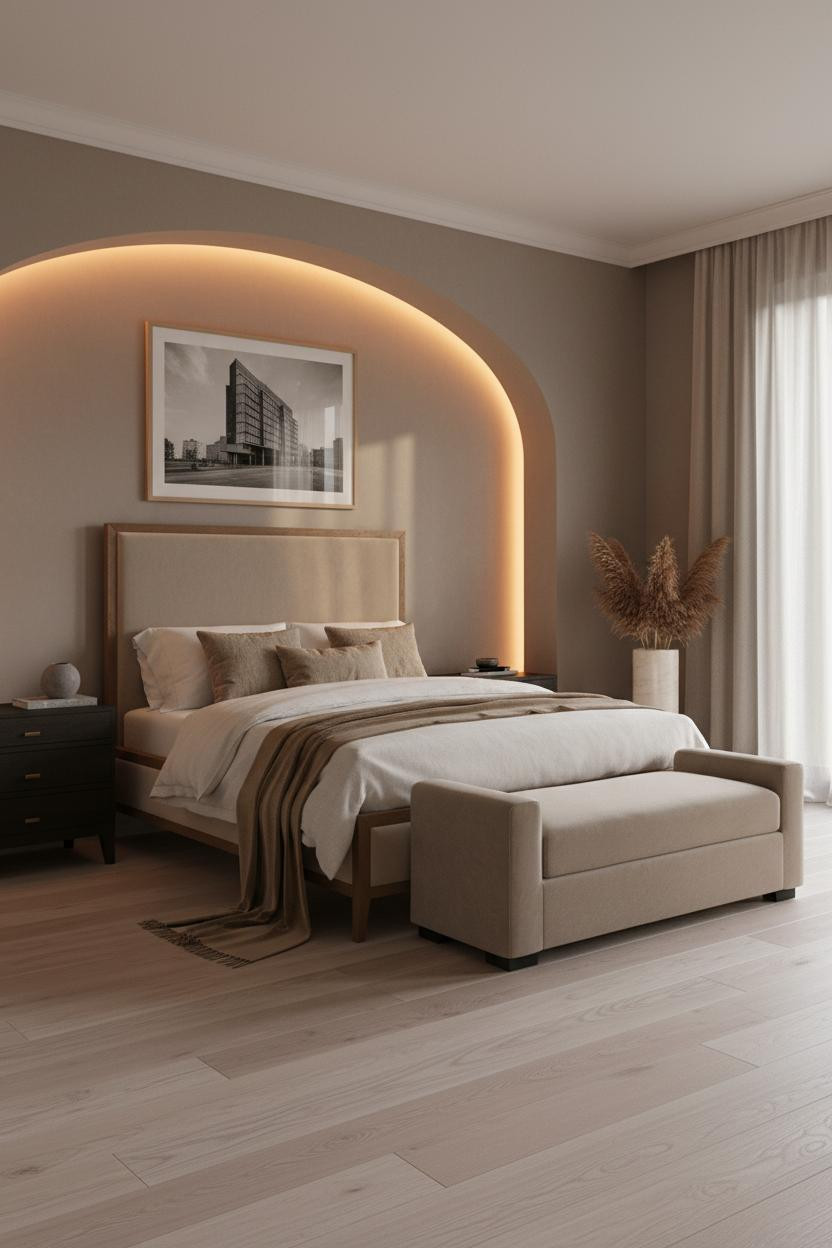
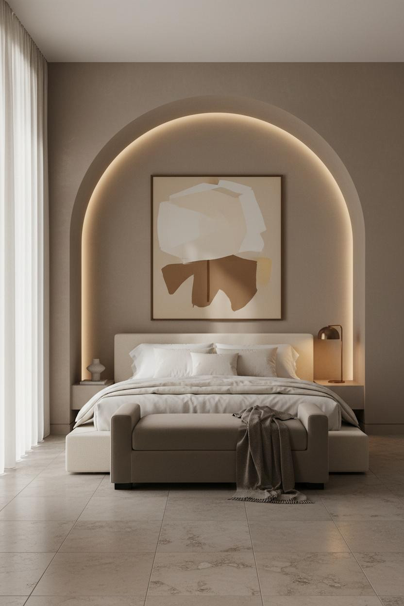
A Taupe Plaster Arch With a Warm Halo: Restraint at Its Best
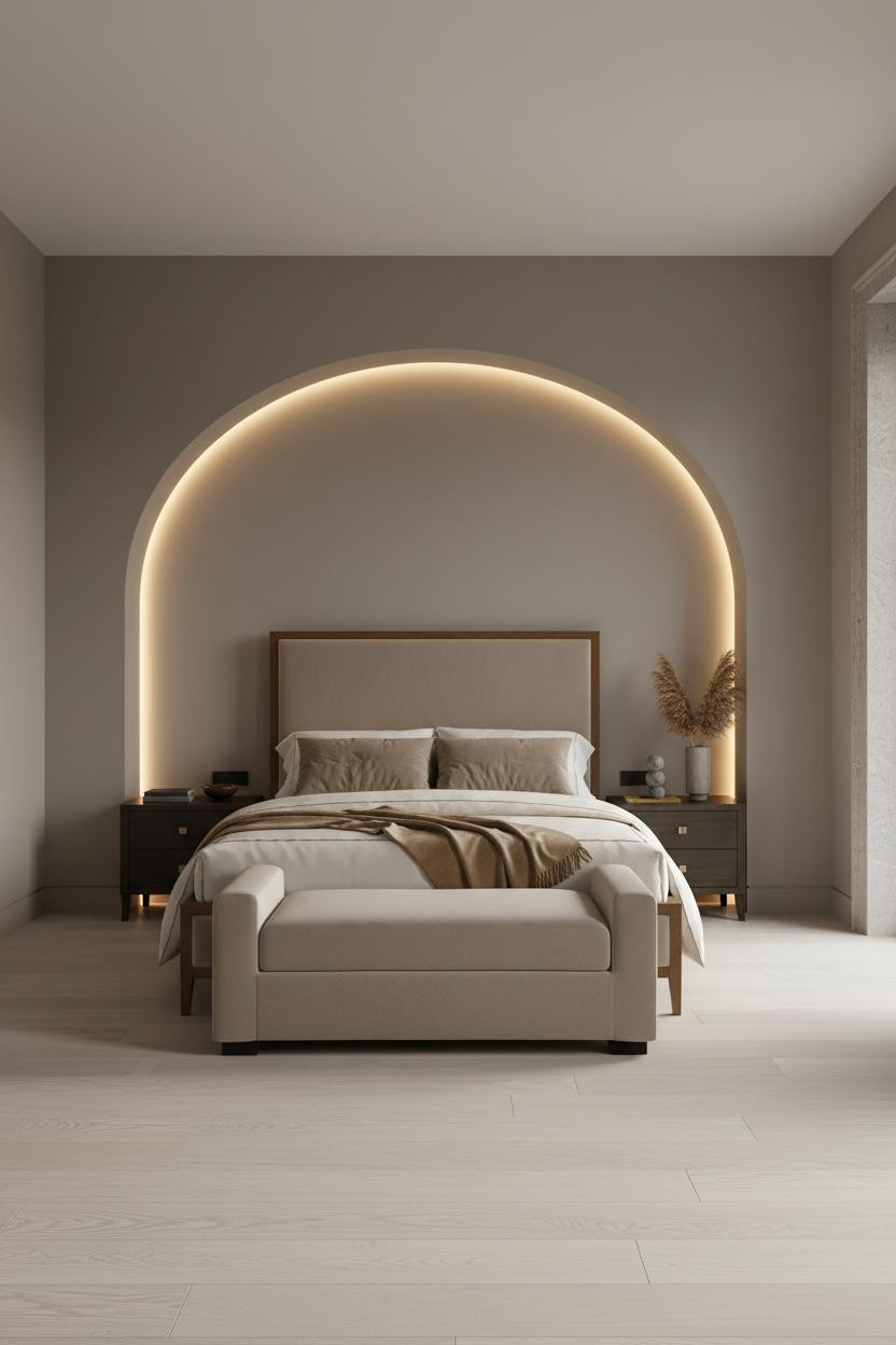
The floor-to-ceiling curved arched niche carved into smooth matte taupe greige plaster is one of those architectural details that changes a room completely, and yet from photos it looks almost effortless.
Why it looks custom: The integrated cove LED tracing the arch interior casts a continuous warm amber halo that makes the alcove feel intentionally framed rather than just recessed.
The common miss: Adding recessed lighting inside an arch like this at the wrong color temperature (above 3000K) kills the warmth entirely and makes the plaster look grey instead of taupe.
The Arched Ceiling Recess That Makes a Bedroom Feel Taller
A curved ceiling recess in warm taupe greige plaster spanning four meters, lit from within by a continuous amber cove. Simple idea, serious result.
What creates the mood: The tone-on-tone plaster arch draws the eye upward and creates an implied canopy above the bed without any additional structure, which makes the ceiling feel higher than it is.
Pro move: Pair the arched plaster ceiling recess with whitewashed blonde oak flooring rather than dark wood, so the room’s warmth reads as light rather than heavy.
Bookmatched Smoked Oak Panels That Glow After Dark
This room is proof that bookmatched smoked oak panels with integrated cove lighting need almost nothing else to feel complete.
Where the luxury comes from: Precisely aligned hairline shadow gaps between each oak grain panel create a surface that looks custom-milled rather than installed, and the warm amber cove pooling across the grain deepens the color by several shades after dark.
What cheapens the look: Mixing smoked or dark-stained oak with polished chrome hardware. The cool metal fights the warm wood tone and makes everything feel less resolved. Stick to brushed bronze or matte brass.
Bleached Horizontal Oak Planks and the Rhythm They Create
Horizontal bleached oak planks with shadow-gap reveals across an entire twelve-foot headboard wall. Calm and very, very considered.
Why it holds together: The horizontal lay of the bleached oak planks pulls the eye laterally across the wall, which makes the room feel wider, while the shadow-gap reveals give each plank a distinct edge that prevents the surface from looking like simple cladding.
The finishing layer: A honed travertine tray on the nightstand with a single dried stem is the right accessory for this kind of room. Anything more complex competes with the paneling’s quiet texture.
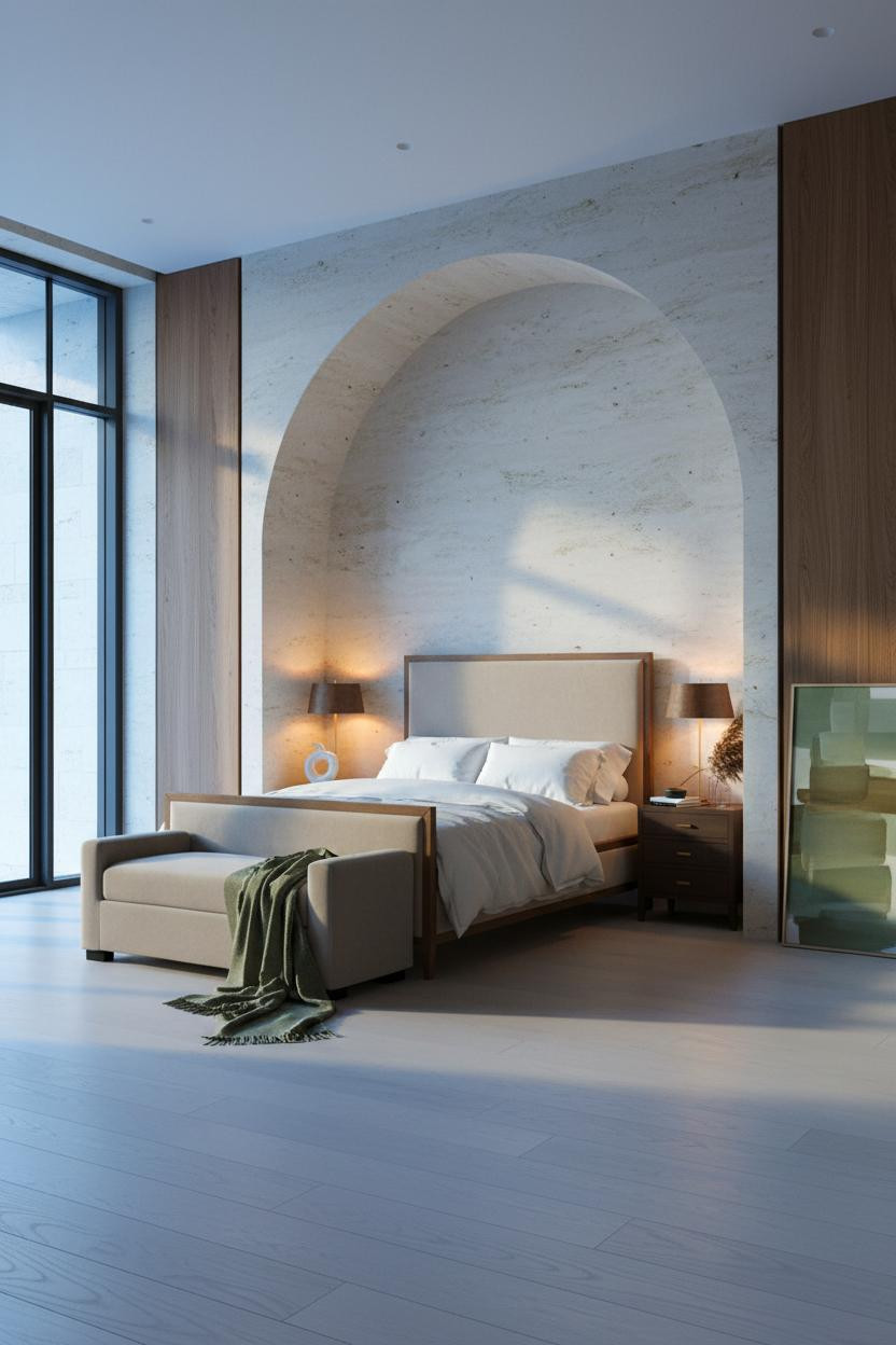
A Barrel-Vaulted Limestone Alcove That Commands the Room

A full barrel-vaulted alcove in honed warm grey limestone with deep shadow carving the curved recess. Monumental is the right word.
The real strength: The deep shadow inside the barrel vault frames the bed like a painting frame, which means the headboard and bedding become the art rather than the architecture competing for attention.
Ideal if: You’re working with a room that has serious ceiling height (over 3m) and want one architectural feature that reads at scale. Choosing the right headboard matters here: keep it upholstered and low-profile so the stone does the talking.
Brushed Walnut Slats Against Dusty Slate Blue: Sharp Temperature Play
Warm brushed walnut slats set against deep dusty slate blue plaster insets. The temperature contrast between the two is exactly what makes this wall so compelling.
Why the palette works: The warm grain of the walnut and the cool matte of the slate blue create a tension that reads as sophisticated rather than mismatched, because both tones share the same depth of saturation rather than one being much brighter than the other.
What to borrow: The polished bronze hardware bridging the walnut and slate blue. It picks up warmth from the wood while staying distinct from the cool wall, which is how you tie two contrasting materials together without repainting anything.
A Taupe Polished Plaster Arch That Earns Every Centimeter of Ceiling
A single full-height curved arch in warm taupe greige polished plaster, tone-on-tone against the walls, catching lateral daylight with a subtle sheen that flat paint simply doesn’t have.
Why it feels intentional: The polished plaster finish on the arch has a low sheen that makes it catch light differently from the matte walls around it, creating a halo-like definition of the arch without any paint color change or contrast trim.
Skip this: Don’t frame a plaster arch like this with a contrasting color border. The tone-on-tone is the whole point. Adding trim color reduces an architectural detail to a decorative one.
Blonde Oak Flutes and Gold Morning Light: An Alpine Room That Breathes
Crisp alpine morning gold washing across narrow blonde oak fluted panels, each ridge catching the light at a slightly different angle. It’s one of those rooms that looks better in person than in photos, which is saying something.
What softens the room: The warm sand cashmere throw pooling at the corner of the travertine floor picks up the same warm undertone as the oak flutes, so the whole palette stays cohesive from ceiling to floor without feeling planned.
The easy win: Quality natural-fiber bedding in cream or warm ivory does the same work here as it does in every room like this: it softens the architecture without competing with it.
Dusty Sage Limewash and White Oak: a Palette That Feels New in 2026
I keep coming back to dusty sage limewash walls next to bleached white oak paneling. It just works, and I haven’t tired of it.
Why it feels balanced: The cool grey-green of the dusty sage limewash and the pale warm grain of the white oak sit close enough in value that they don’t create harsh contrast, just a quiet material conversation across the room.
One smart swap: Replace standard white or grey ceiling paint with the same sage limewash tint at 50% dilution. The ceiling picks up the wall’s tone subtly and the room stops feeling like a box. Choosing the right headboard for a sage-toned room: stay in the warm ivory or oatmeal family, never stark white.
Vertical Walnut Planks With a Floating Shelf That Does One Job Perfectly
Full-height vertical walnut planks with a single integrated floating shelf holding a concrete sculpture and two matte stone spheres. That’s the whole styling story on that wall, and it’s enough.
What keeps it elevated: The integrated floating shelf built flush into the walnut plank wall keeps accessories low and horizontal, which anchors the eye at mid-height and prevents the tall paneling from feeling top-heavy.
Where people go wrong: Overloading a shelf like this with too many objects of different heights. Two or three pieces of similar volume and material read as intentional. Five pieces of varying height and finish reads as collected-over-time (and not in a good way).
A Pale Limestone Arch and Sage Throw: When the Details Speak Quietly
Honed pale limestone carved into a ten-foot barrel alcove, flanked by vertical walnut panel millwork. And the only color accent in the whole room is a rolled sage green cashmere throw at the foot of the bed.
What makes this one different: The walnut millwork flanking the limestone alcove bridges the warm and cool materials in the room, so neither the stone nor the wood feels isolated against the opposite palette.
The detail to keep: The single sage green cashmere throw against the cream and limestone. It’s the only non-neutral in the room and it earns that position. Don’t add a second color.
Arched Ivory Panel Molding and the Parisian Restraint Behind It
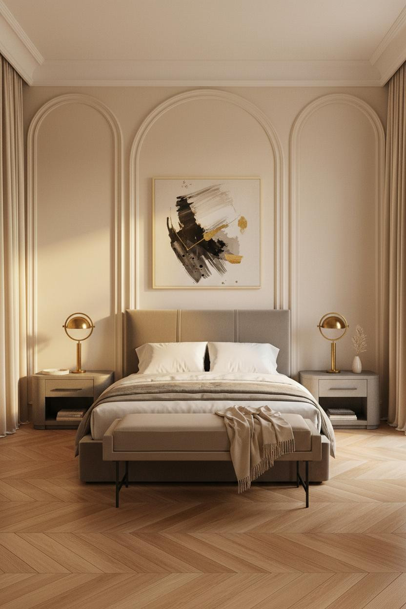


Three symmetrical full-height arched panel molding sections in warm ivory plaster, no color, no pattern, just raised shadow-relief geometry and soft Parisian light doing all the work.
Why it lands: Tone-on-tone raised panel molding in warm ivory works because the shadow cast by each molding edge at different times of day creates constant subtle variation across a wall that looks completely still in photographs.
What to copy first: The herringbone oak parquet in honey finish. It’s the floor that grounds all that ivory wall architecture in warmth. Without it, the room risks feeling cold despite the warm palette. What makes hotel beds so comfortable is often the layering principle: cream duvet, champagne cashmere throw, simple linen. This room applies the same logic to its walls.
Backlit Ribbed Oak and Charcoal Plaster: This Room Means Business
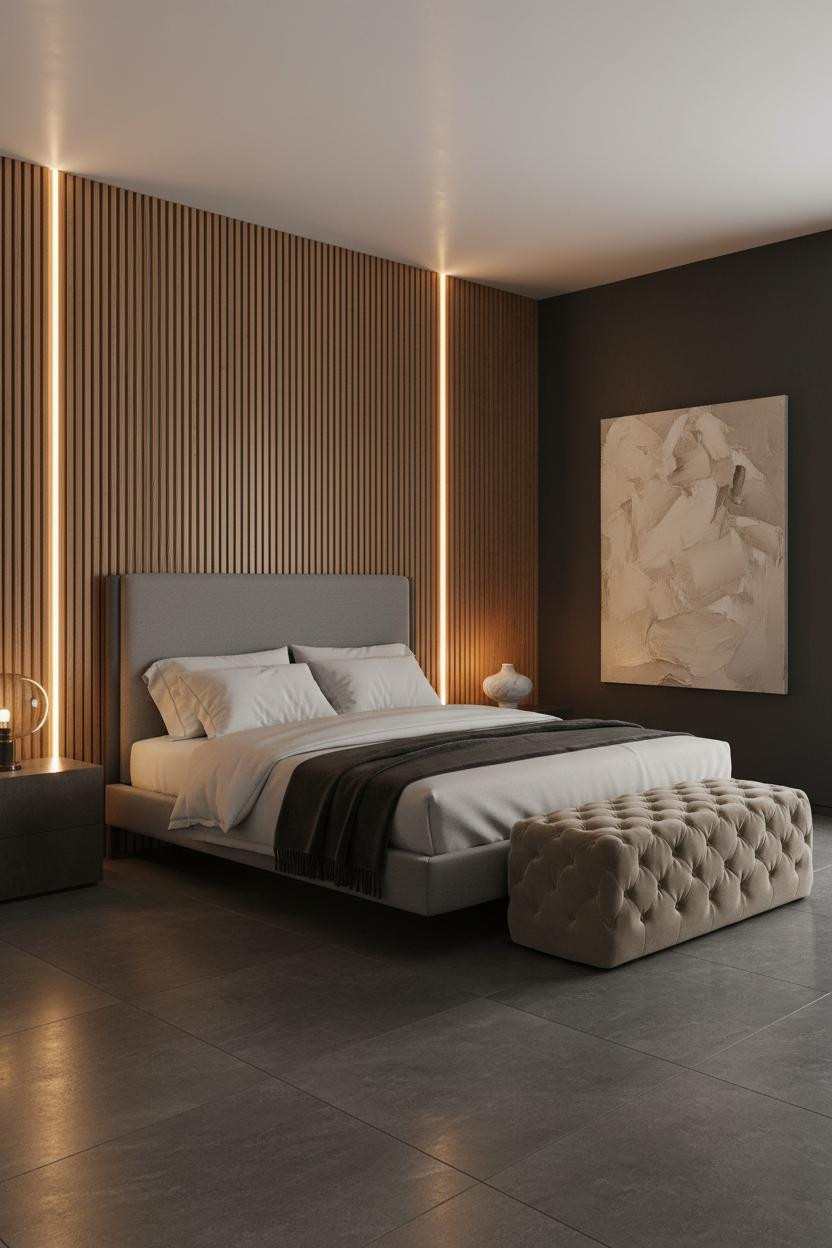


Amber LED channels integrated between every vertical ribbed oak slat on a twelve-foot wall, with deep charcoal matte plaster on the flanking walls absorbing the light instead of bouncing it. The room earns its drama.
What sharpens the room: The contrast between the warm amber backlight in the ribbed oak panels and the dark charcoal plaster walls creates a depth that flat surface lighting or a single pendant could never achieve. The oak grain glows; the plaster recedes.
Avoid this mistake: Pairing backlit oak panels like this with light-colored flooring. The honed dark grey stone tile floor keeps the room’s color story cohesive. Pale floor + dark charcoal walls + glowing oak reads as unfinished, not dramatic.

Our #1 Pick
Saatva Classic Mattress
America’s best-selling online luxury innerspring. 365-night trial, lifetime warranty, free white glove delivery.
Shop Saatva Classic
The Foundation Every Beautiful Bedroom Actually Needs
Every room in this collection looks the way it does because someone got the foundation right before adding anything else. But here’s what most people overlook: the most important surface in any bedroom isn’t the walls or the floor. It’s the mattress.
The Saatva Classic brings the same hotel-style luxury that makes those beautifully staged beds feel genuinely inviting. The dual-coil support system gives you responsive comfort, the breathable organic cotton cover keeps things cool, and the Euro pillow top adds the kind of plush surface that’s hard to walk away from in the morning. It’s the piece that turns a beautiful room into a room you actually sleep well in.
Start with the right mattress. Build the room around it.

The rooms people keep coming back to are the ones where nothing looks accidental. A good mattress, the right materials, and the discipline to stop adding things. That’s the whole formula. Luxury isn’t accumulation. It’s editing.