The best preppy teen bedrooms don't look assembled. They look like someone's been collecting things for years. A medal ribbon here, a stack of hardcovers there, a rug that's maybe a little too serious for a teenager's room.
That's the look. And honestly, it's easier to pull off than it sounds.
Sage Shelving With a Terracotta Wall Behind It
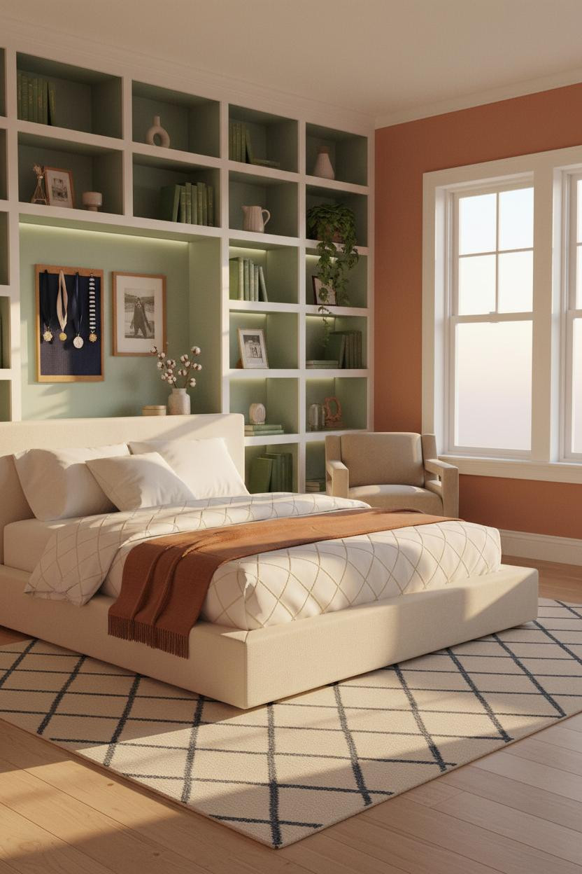


This one pulls you in immediately. The combination of sage-backed shelving against warm terracotta is bolder than it sounds, and it works because neither color fights for dominance.
Why it holds together: The white-painted shelving frame acts as a neutral buffer, so the sage and terracotta read as complementary rather than competing.
Steal this move: Load the cubbies with personality, not perfection. A navy ribbon medal, a ceramic pitcher, one leaning book. That casual asymmetry is the whole point.
White Board-and-Batten That Actually Earns Its Place
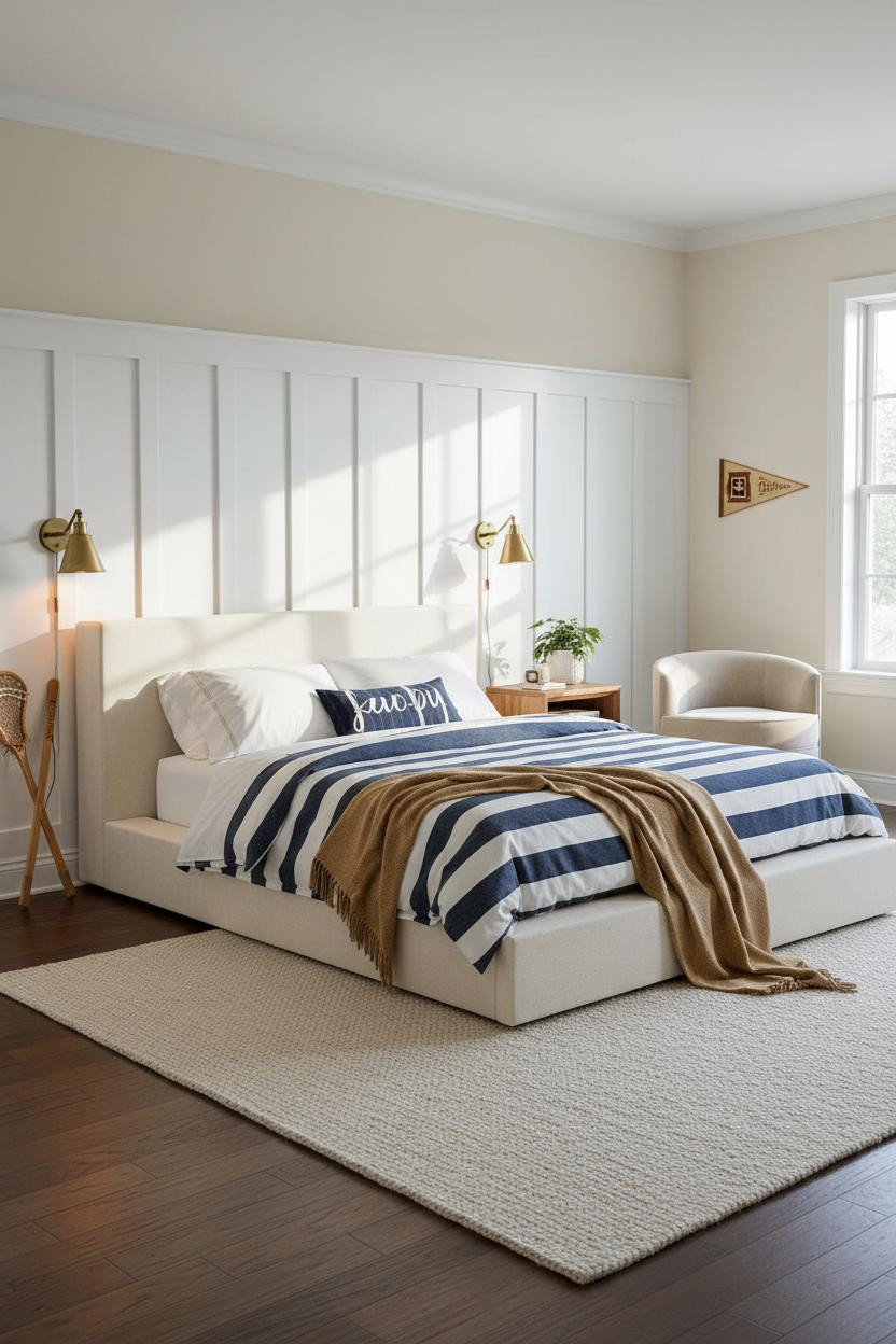

Classic for a reason. Full-height board-and-batten in crisp white is the closest thing to an architectural shortcut in the preppy playbook.
The vertical battens throw thin shadow lines that add depth flat paint just can't replicate. And a navy striped duvet against that white wall is basically the whole look in two decisions.
The detail to keep: Pair with quality bedding in graphic navy and white. The contrast only lands when the textiles are sharp, not washed out.
Herringbone Wood Wall With Some Real Attitude
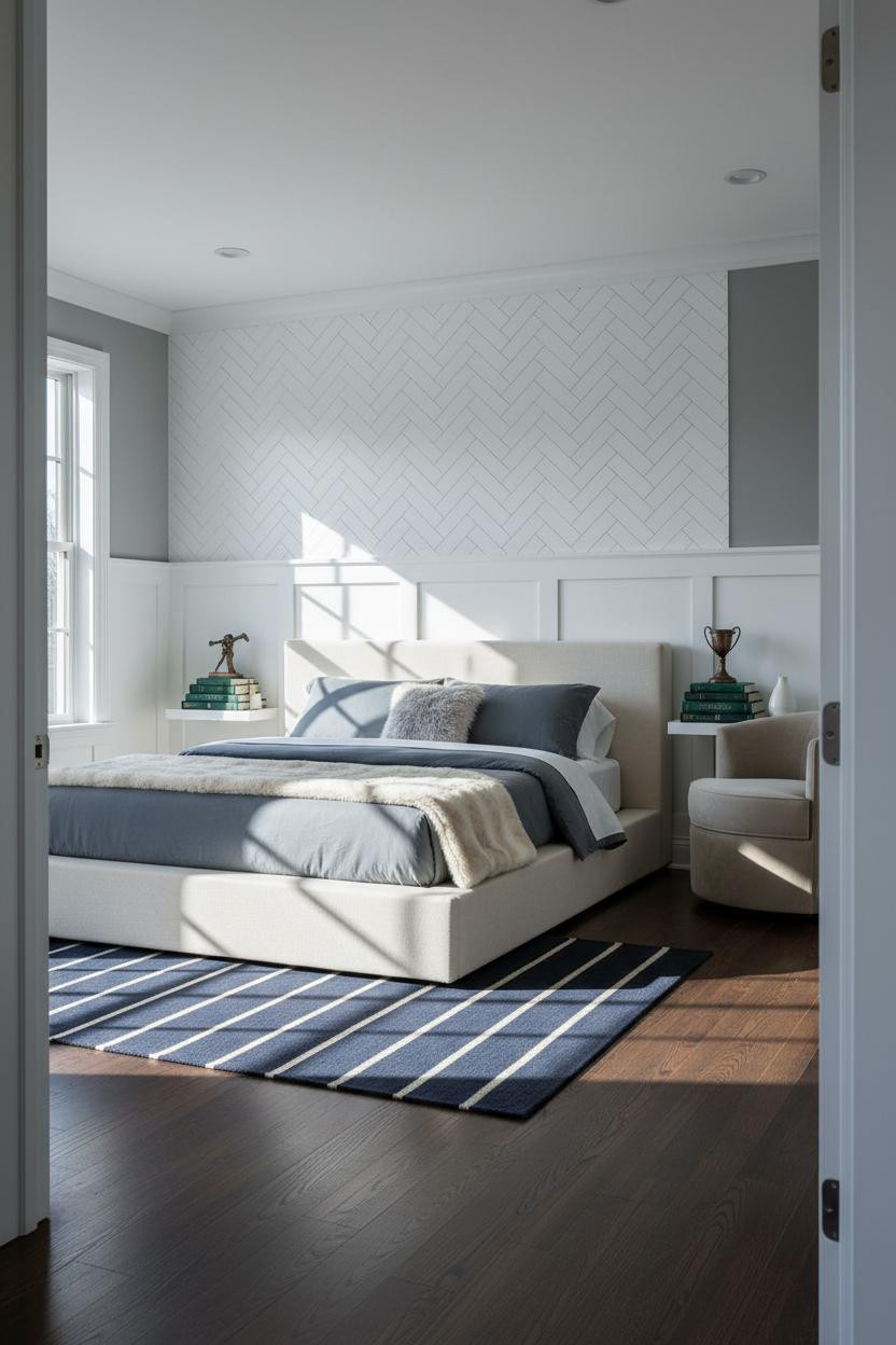
I keep coming back to this one. A white-painted oak herringbone wall is more commitment than most teens are ready for, but the payoff is completely different from anything flat or painted.
What makes this one different: The chevron geometry catches light at every angle, so the wall reads as textured and dimensional even under flat overcast conditions.
Avoid this mistake: Don't stop the herringbone at chair rail height. Full-wall or nothing. Half measures make it look like an afterthought.
Dusty Rose Walls With White Brick Behind the Bed
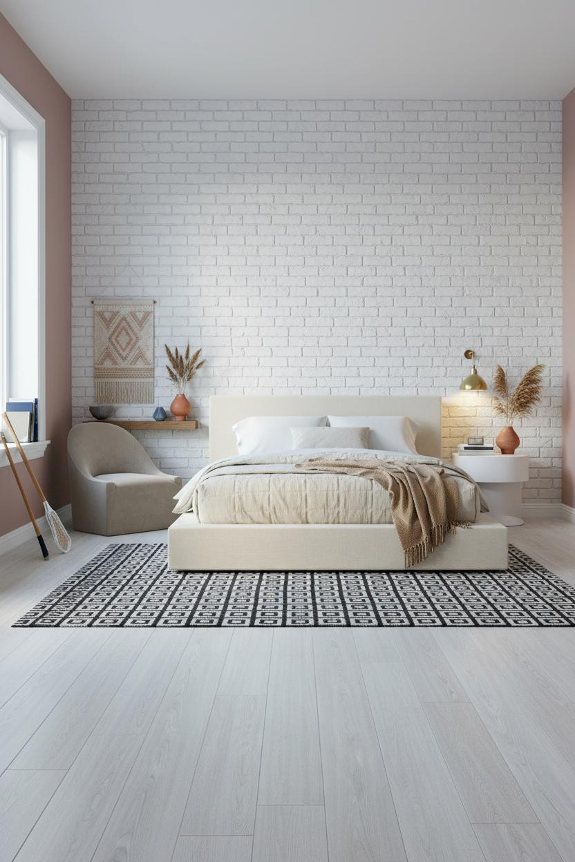

The white-painted brick does something interesting here. It keeps the wall from going too soft, which is exactly the risk when your wall color is dusty rose.
Why the palette works: The brick texture provides enough visual weight that the blush reads as grounded rather than precious, especially with a graphic black-and-white rug pulling the floor zone together.
In a room this soft, a geometric rug is the thing that keeps it from tipping into bedroom-of-a-five-year-old. That contrast does a lot of work.
The Arched Alcove That Makes This Room
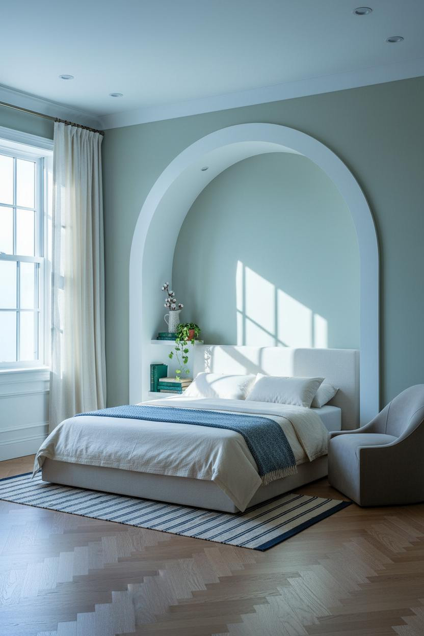
An arched alcove framing the headboard is the kind of architectural detail that makes a room feel like it was designed rather than decorated. The room feels calm and cohesive in a way that's hard to copy with furniture alone.
Why it looks custom: The curved molding on a sage green wall catches raking daylight on its inner edges, creating soft shadow depth that gives the whole wall a sculptural quality.
Where to start: Floor-to-ceiling ivory linen curtains flanking the windows keep the softness without competing with the arch. One strong architectural move, then let the textiles breathe.
Navy Walls Meet Blush-Pink Shelving
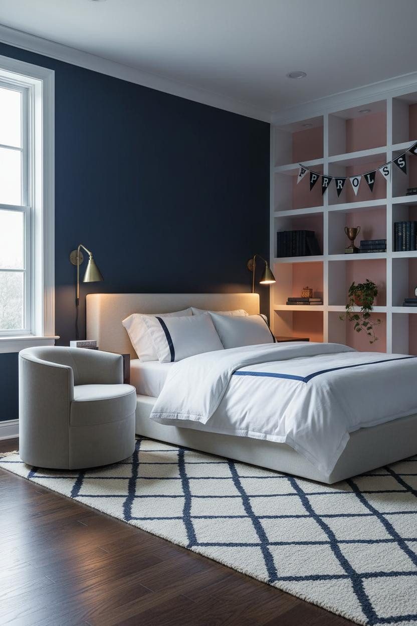
This is divisive. Navy walls plus blush-backed shelving is a lot on paper. But the white shelving frame is what saves it, acting as a break between the two colors so the combo reads as intentional rather than accidental.
What creates the mood: Brass sconces at the nightstand level pull warmth into an otherwise cool, dark scheme, which helps balance what could feel cave-like. The room feels polished but still relaxed because the dark walls are offset by the glowing cubby backing.
This look works best if you commit to the dark walls fully. Half-painted or chair-rail-only loses the whole effect.
Crittall-Style Windows as the Actual Feature Wall

Most people spend money on an accent wall. This room skips all of that and lets the black steel Crittall-style window grid carry the entire visual load. It's a smarter move.
Why it feels expensive: The industrial precision of the steel grid reads against warm maple floors and an overdyed navy and blush rug in a way that flat paint never could. The contrast does the decorating.
Pro move: A sculptural matte black pendant overhead connects the window grid to the ceiling plane, while still feeling light. One detail that ties the whole room together.
White Shiplap That Looks Coastal Without Trying
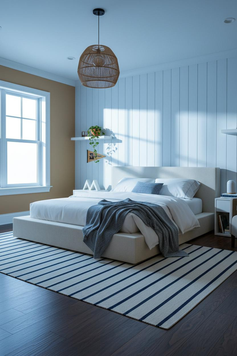
Vertical tongue-and-groove shiplap behind the bed is honestly one of the most reliable preppy moves out there. Simple, graphic, and it catches light in a way that keeps the wall from going flat.
The real strength: The deep shadow grooves between each plank create strong visual rhythm, especially when warm recessed ceiling light rakes across the surface from above. The camel flanking walls keep the white from feeling cold.
Swap the overhead light for a woven rattan pendant and the room shifts from crisp to collected. One fixture change, big difference. See more teen girl room decor ideas that work this way.
Navy-and-White Wainscoting With a Brass Mirror Above
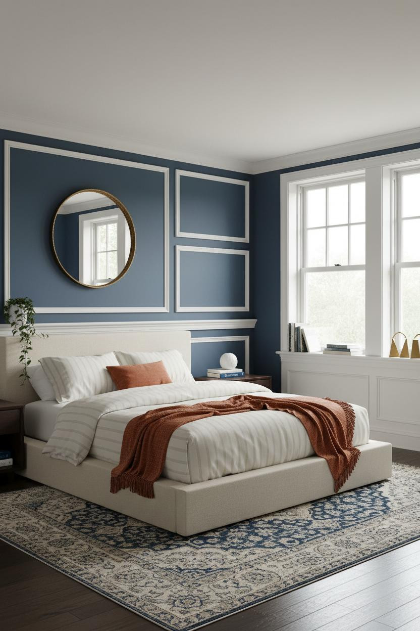
Raised-panel wainscoting in white below the rail and navy above it is a New England prep school detail rendered at bedroom scale. It shouldn't feel this current, but it does.
Design logic: Splitting the wall at chair rail height creates a two-tone effect that gives the room structure without requiring a single piece of art. And an oversized brass-framed mirror above the wainscoting adds warmth the navy alone can't deliver.
The easy win: A vintage Persian rug in faded navy and cream grounds the bed zone while keeping the heritage energy consistent all the way to the floor.
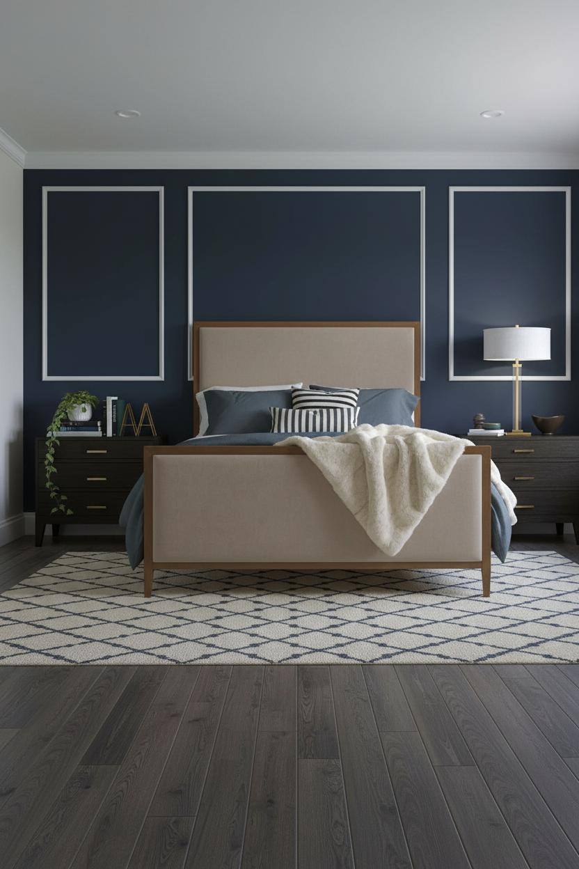
Navy-Backed Built-Ins With a Gold Mirror in the Corner
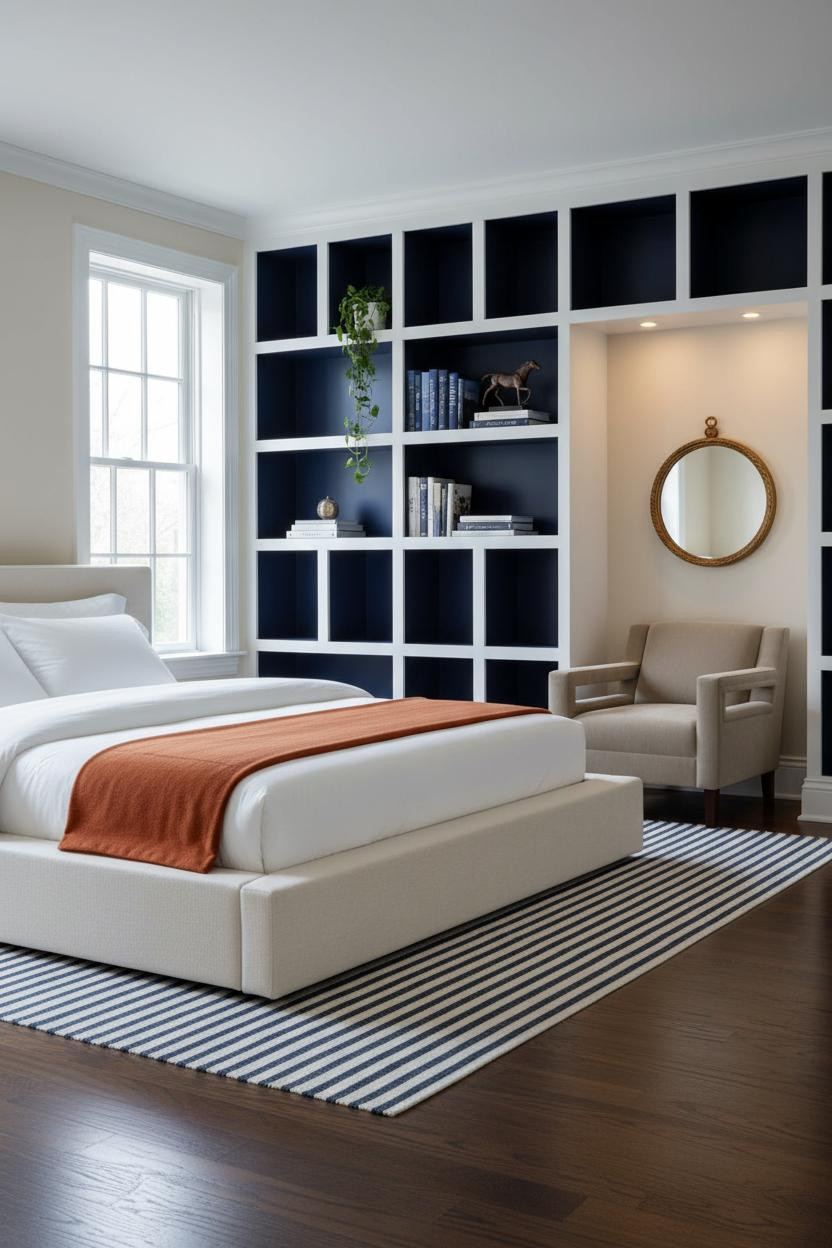
I almost scrolled past this. Glad I didn't.
What carries the look: Full-height built-ins with a deep navy backing against cream walls create the kind of contrast that reads as New England prep immediately. The white frame keeps the navy cubbies from feeling heavy. And an antique gold mirror hung over the reading chair adds just enough warmth to keep the room from going stiff. Fill the shelves with something real: stacked hardcovers, a small bronze sculpture, trailing ivy in a ceramic pot. Not matching sets. Not a grid of identical objects.
Shiplap and Brass Sconces in the Evening
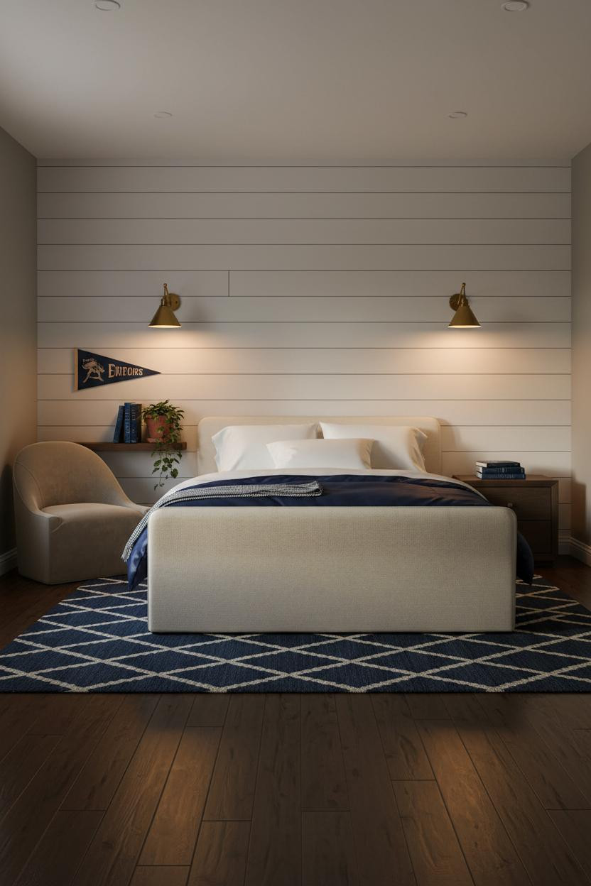

Most preppy bedrooms are photographed in bright morning light. This one leans into evening lamp warmth, and it's a better version of the look. The room feels lived-in and intimate in a way the daytime shots don't quite capture.
Where the luxury comes from: Paired brass sconces flanking a horizontal shiplap wall throw amber pools across every plank groove, making the texture visible in a way overhead lighting never would.
What not to do: Don't use cool-toned bulbs with brass fixtures. The whole effect depends on the warm amber glow playing off the white painted planks. Get that wrong and the room goes flat. More ideas at teen lounge inspiration.
Navy Board-and-Batten as the Dominant Graphic

This version flips the standard white-batten-on-white approach. White battens over a navy ground is bolder, more graphic, and honestly a better use of the wall treatment in a preppy teen bedroom context.
The reason it feels confident instead of chaotic is that the ivory flanking walls absorb the contrast. Strong graphic wall, calm surround. That's the balance.
The smarter choice: Keep bedding in softer tones (slate grey, cream, oatmeal) so the wall stays the visual anchor rather than competing with the bed. Let the bed frame do the structural work and the wall do the personality work.
White Raised-Panel Molding With Golden Afternoon Light
Raised rectangular panel molding on a full headboard wall is softer than board-and-batten and more architectural than paint. And with blush flanking walls and afternoon light raking across the white molding edges, the effect is genuinely pretty without feeling juvenile.
What softens the room: Brass sconces paired with warm afternoon window glow layer two different light sources, which gives the room the kind of depth you'd expect from something much more expensive.
The finishing layer: A dusty pink linen duvet with a cream chunky-knit throw at the foot. Nothing too matchy. The slight variation in tone keeps it feeling collected rather than assembled from a kit.
Sage Green Walls With Floor-to-Ceiling Cream Linen
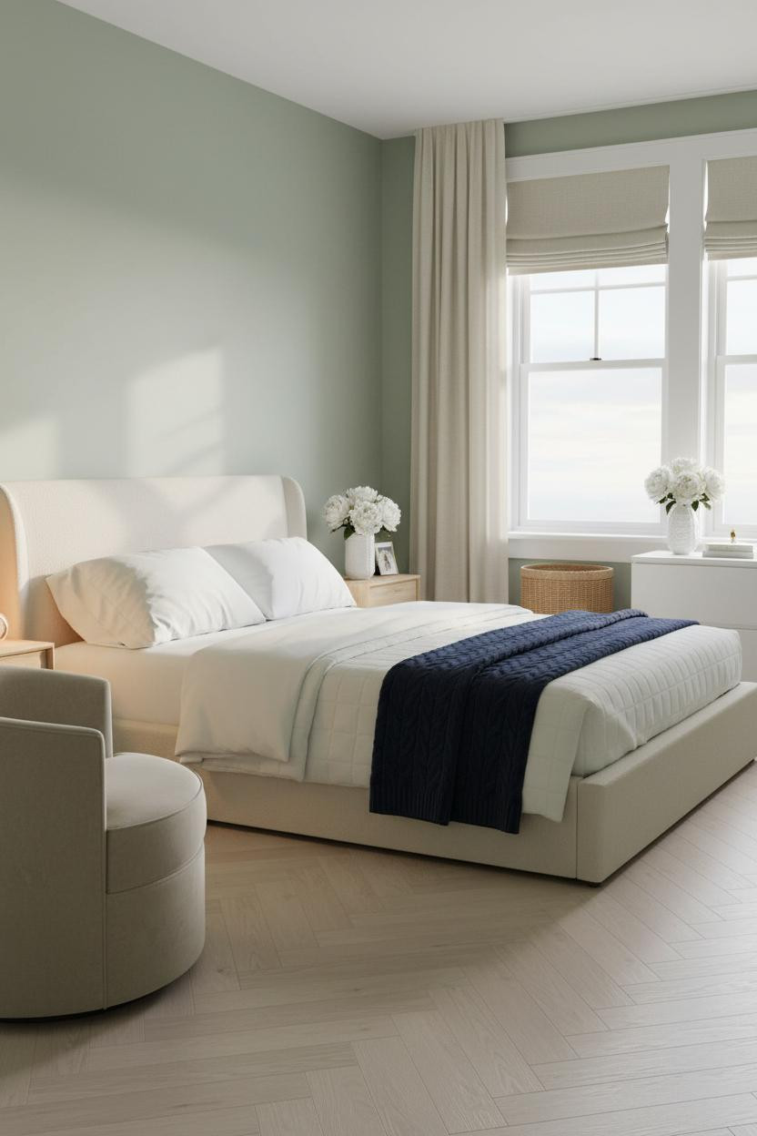
This is the quieter end of the preppy spectrum. Sage walls, blonde herringbone parquet floors, cream linen curtains running floor to ceiling. The room feels calm and cohesive without trying to say anything loud.
What makes this work: Floor-to-ceiling cream linen curtains add vertical height that makes the whole room feel taller, in a way that blinds or sheers simply won't. It's a small move with a disproportionate result.
Try this: A navy cable-knit throw draped asymmetrically over the duvet is the only piece of contrast the room needs. Keep everything else in the cream-to-sage range and let the throw do the work. Check out these mattress picks for teenagers to finish the look properly.

Our #1 Pick
Saatva Classic Mattress
America's best-selling online luxury innerspring. 365-night trial, lifetime warranty, free white glove delivery.
Shop Saatva Classic
The Foundation Of Every Beautiful Bedroom
A room this carefully considered deserves a mattress that holds up its end. Walls get repainted. Linen gets swapped out. But the mattress stays, and it matters more than most people realize until they're sleeping on a bad one.
The Saatva Classic is the one I'd put in any of these rooms. Dual-coil support that doesn't transfer movement, an organic cotton cover that breathes through the night, and a Euro pillow top that still feels right years in. Not the business hotel kind of soft. The good hotel kind.

The rooms people save are the ones where nothing looks accidental. And in a preppy teen bedroom, that means committing: to the wall treatment, to the palette, to the bed underneath it all. Start with the bed. The rest figures itself out.