
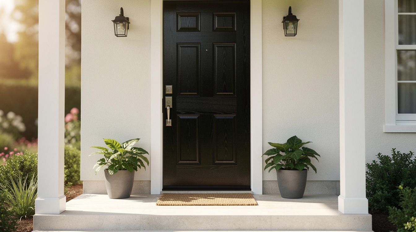
 by
by Front door colors do more work than people think. I painted one too timidly once, and the whole entry kept reading flat even after I changed the mat, the planters, and the light. The fix wasn't more decor. It was a better paint call.
- Paint a glossy black door for classic contrast
- Try deep navy against white porch trim
- Use sage green to soften brick steps
- Why does oxblood red belong on older homes?
- Match the door to painted shutters
- The charcoal and brass move
- Wash a coastal blue across beadboard panels
- Benjamin Moore Windham Cream on cottage entries
- Ground pale siding with forest green paint
- Terracotta paint vs clay pots: how to keep it warm
- Add a high-gloss finish to hunter green
- Test dusty rose on arched front doors
- What's the most flattering greige for resale?
- Contrast cedar siding with midnight blue
- Paint sidelights the same bold color
- Echo porch tile with a muted teal door
- Anchor stone steps with deep aubergine
- Soft coral vs pink ground: when each one works
- Layer cream trim around a cocoa brown door
1Paint a glossy black door for classic contrast
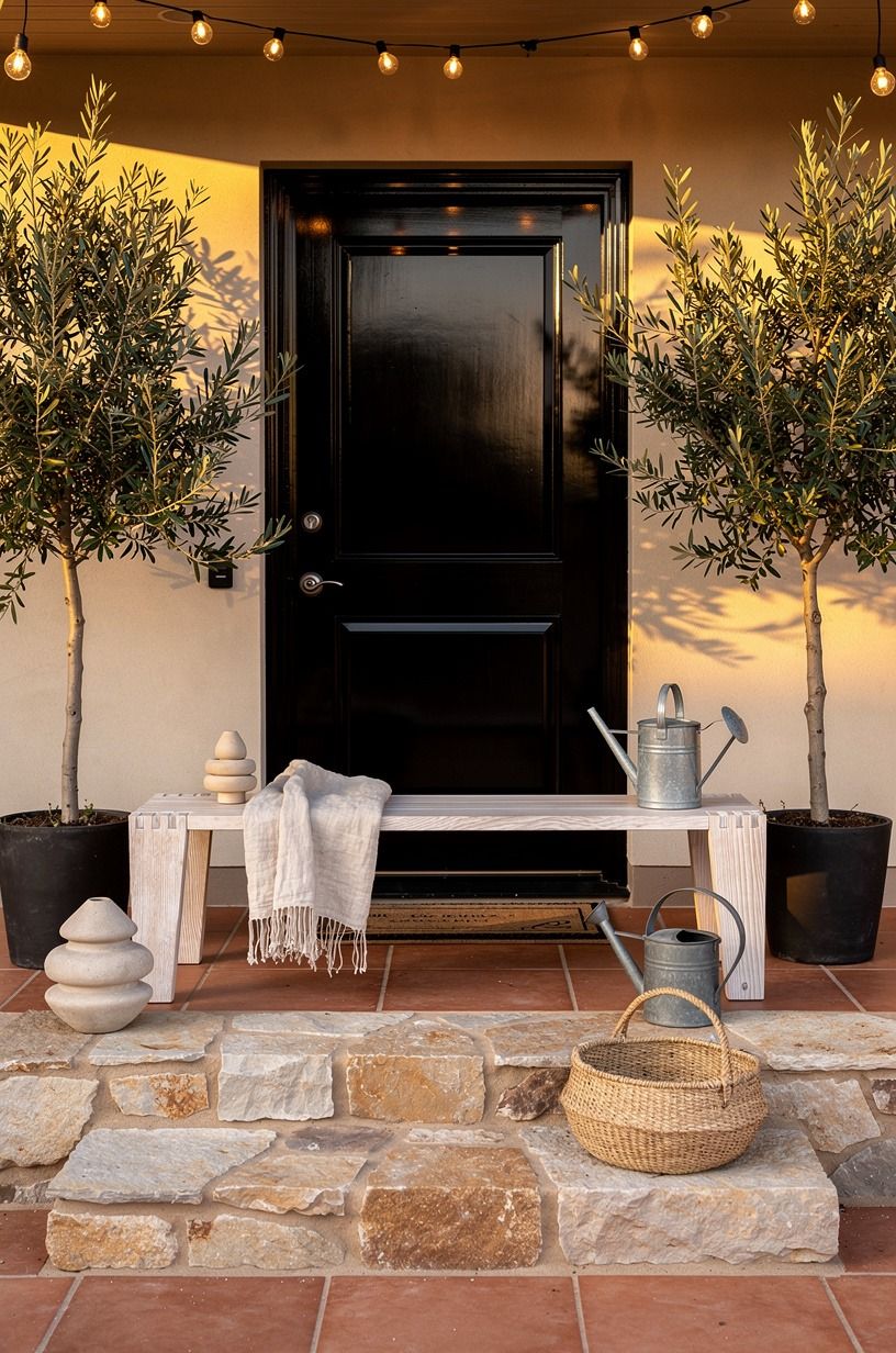
Glossy black is the front door color I reach for when a porch already has good bones and just needs discipline. Against terracotta pavers, stone, and an olive planter, Benjamin Moore Black HC-190 makes every warm surface look richer instead of muddier. If your bench has cerused white oak detail, the black keeps that pale grain feeling expensive rather than washed out.
You don't need a giant porch for this to work. You need contrast, a clean sheen, and hardware that isn't fighting the paint.
I like Benjamin Moore Aura Exterior here because the finish stays crisp on panels and exposed dovetail trim. If you're building out the whole welcome moment, our front door wreath ideas show how to keep the door styled without burying the color.
Typical cost by tier (US averages):
2Try deep navy against white porch trim
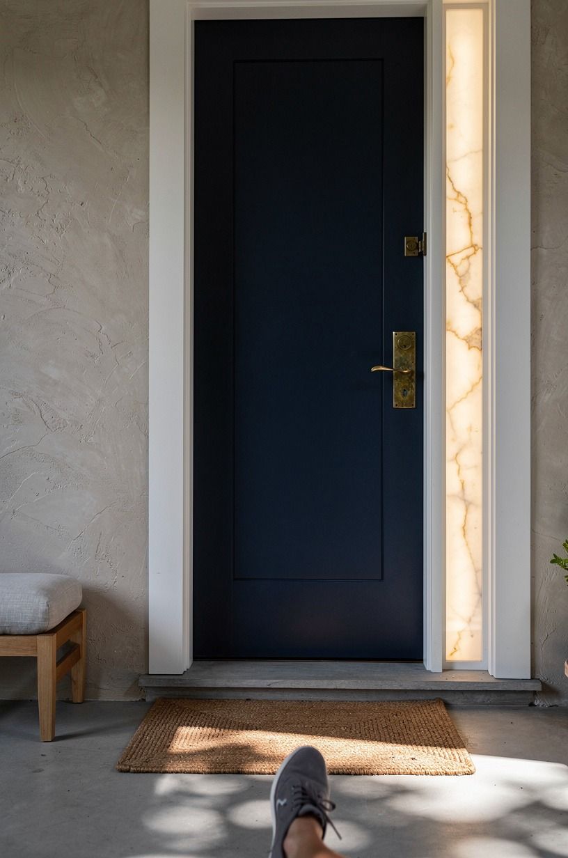
Deep navy is one of those painted front doors that looks composed the second your eye hits white trim. A clay-toned mat, a linen porch cushion, and aged brass hardware all get better next to a dark blue with a little gray in it, not a bright nautical blue. I'd choose Benjamin Moore Hale Navy HC-154 before anything louder because the crisp trim already gives you the punch.
And if your porch is narrow, navy helps more than black because you still get depth without the doorway reading like a hole. Keep the trim bright, keep the threshold simple, and give yourself the standard 36-inch clearance through the walking path so the entry doesn't feel pinched. If you love strong paint pairings, the tones in these kitchen cabinet colors are worth borrowing.
3Use sage green to soften brick steps
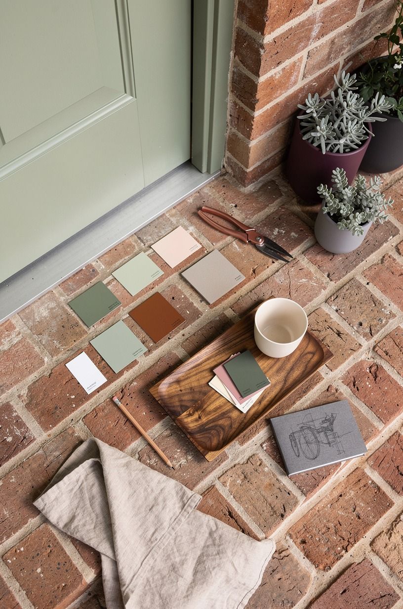
Sage green is what I'd use when brick steps feel sharp, orange, or just too busy. The muted green calms the red in old brick and makes plum planters, paint swatches, and warm metal details feel intentional instead of random. Sherwin-Williams Evergreen Fog SW 9130 is a safe first sample if you want a front door color that feels current but not trendy.
But don't take sage too gray or the steps win. You want a tone with enough softness to flatter the brick and enough body to hold up next to a rough doormat and weathered threshold.
I made that mistake once with a pale sample card, and it looked chalky by 3pm. A wreath with a little movement helps too, especially one like the shapes in this spring front door roundup.
4Why does oxblood red belong on older homes?
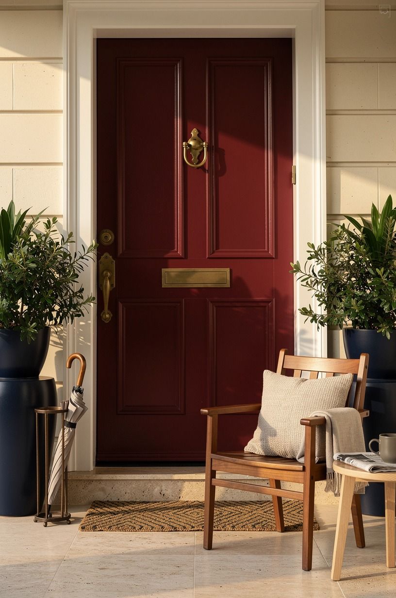
Oxblood red is the house door color idea I save for homes that already have some age to them.
5Match the door to painted shutters
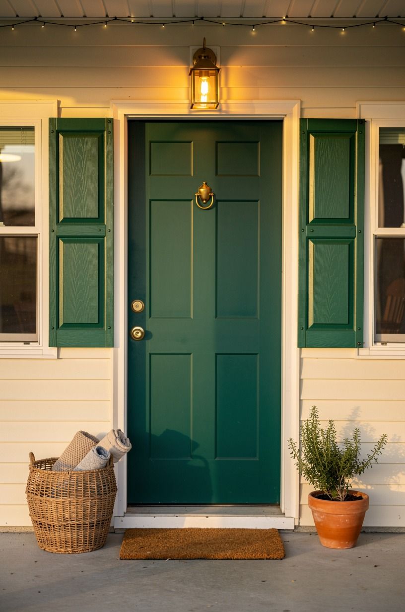
Matching the front door to painted shutters is one of the cleanest ways to make a facade look deliberate. Emerald across the door and shutters, cream siding, and unlacquered brass hardware reads calm because your eye stops darting around. If you like coloured front doors but hate when they look pasted on, this is the move that fixes it.
I call this the One-Color Envelope Rule. When the same shade wraps the smaller exterior elements, the house feels edited even if the porch is simple.
Benjamin Moore Essex Green HC-188 works beautifully here because it has depth without going black. Keep the rest quiet: a plain coir mat, one cream cushion, one good planter, done! If you want a soft seasonal layer, this spring wreath edit gives you shapes that won't muddy the facade.
6The charcoal and brass move
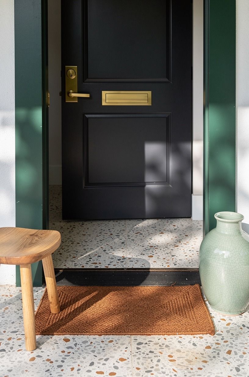
Charcoal is better than flat black when you've already got green trim somewhere in the scene.
7Wash a coastal blue across beadboard panels
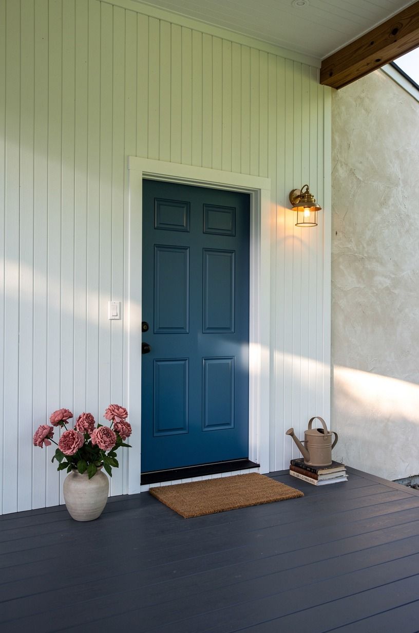
Coastal blue on beadboard works because the grooves hold shadow and keep the color from feeling sugary. On a wide porch with dusty rose flowers and a charcoal floor, Farrow & Ball Exterior Eggshell in a muted blue looks breezy but still grown up.
I'd skip anything too turquoise. Beadboard already has personality.
It doesn't need a loud paint job.
You can make this read more refined by repeating the blue once and stopping there. One planter.
One striped cushion. Maybe a faded runner.
The part that worked for me on a similar porch was keeping the white ceiling warm, not cold, so the blue didn't turn icy. If you collect entry styling ideas year-round, this front door wreath article gives you shapes that suit softer paint.
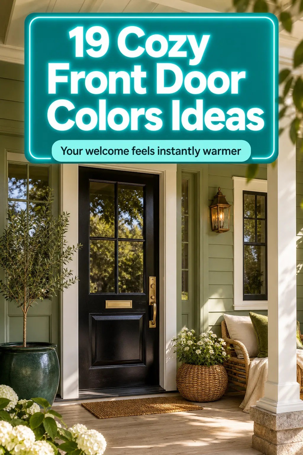
8Benjamin Moore Windham Cream on cottage entries
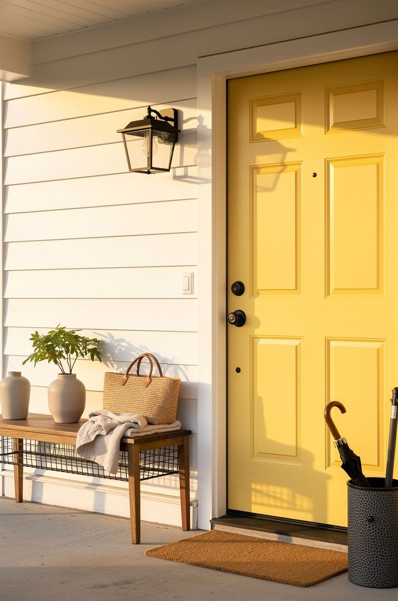
Butter yellow is one of those front door colors that sounds risky until you see it against warm white siding and a camel mat.
9Ground pale siding with forest green paint
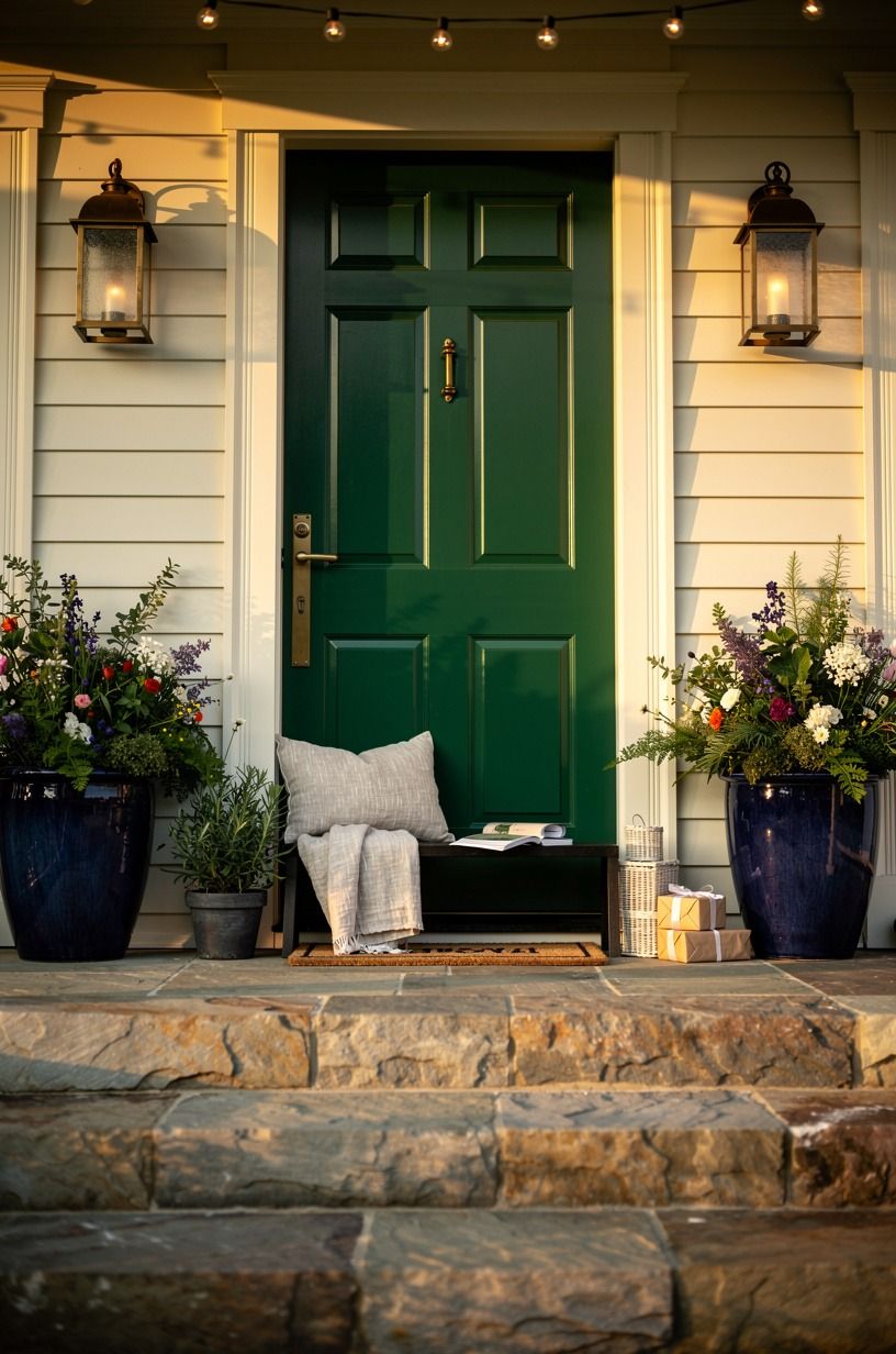
Forest green is the answer when pale siding makes the whole front elevation drift. A deep door color pulls the eye down, especially over stone steps with midnight blue planters and copper lanterns. Benjamin Moore Black Forest Green 2130-10 has the right amount of brown in it, so the color feels grounded instead of sporty.
And this is where scale helps you. Tall planters, a lantern mounted slightly lower than you'd expect, and an ivory threshold line make the doorway feel established.
Keep at least 36 inches clear across the landing so the planters don't crowd the swing of the door. If you enjoy green done with more contrast, these cabinet color ideas show why darker greens keep winning.
10Terracotta paint vs clay pots: how to keep it warm
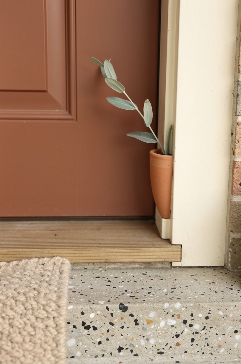
Terracotta on a front door can be gorgeous, but only if you repeat it with restraint.
11Add a high-gloss finish to hunter green
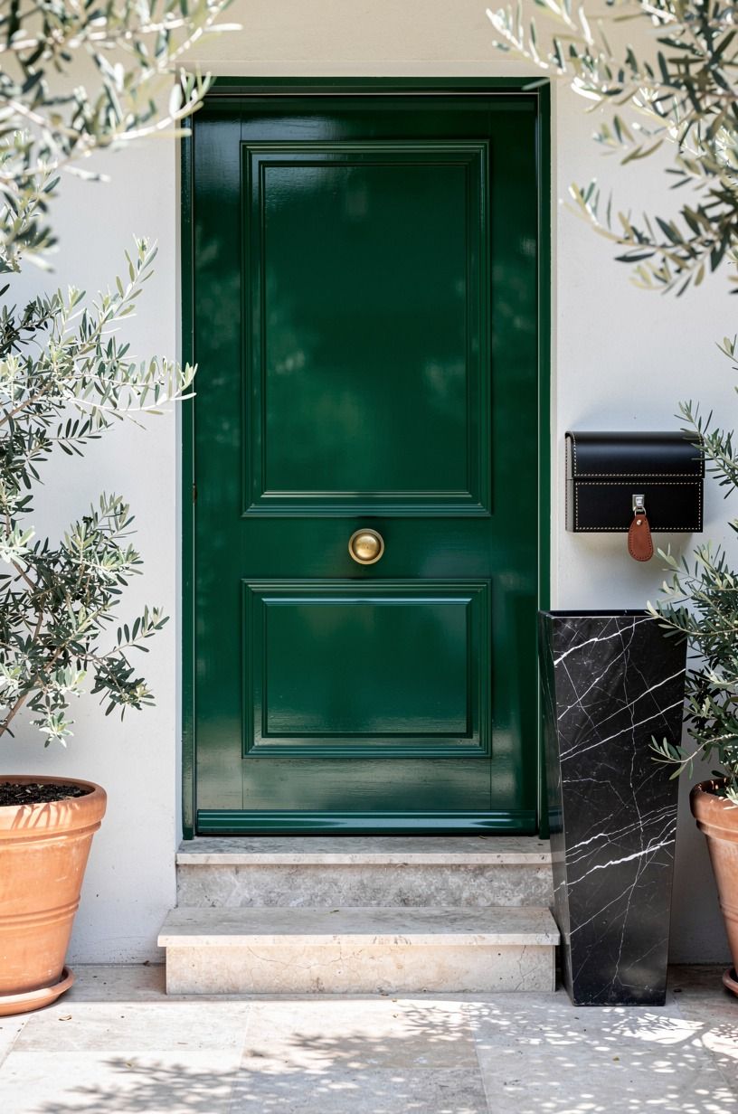
Hunter green gets more polished the second you give it gloss. From a low view across the threshold, the reflection on a deep green door between terracotta pots and stone steps feels almost tailored, especially with aged brass or dark bronze hardware. The paint color matters, but the finish is doing half the work here.
I call this the Rainy-Day Shine Test. If the door still looks handsome under flat weather, you've got the right green. Benjamin Moore Hunter Green 2041-10 is strong enough to hold the shine without turning black.
Keep the mat plain, keep the threshold scrubbed, and don't mix in bright white accessories. This look wants weight, not sparkle.
12Test dusty rose on arched front doors
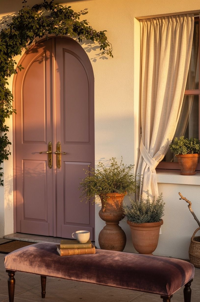
Dusty rose belongs on arched doors more often than people admit. The curve softens the color, and the color softens the curve back. Through climbing foliage, with clay planters, linen drapery, and aged brass at the handle, the whole entry reads romantic without feeling precious.
I'd look at Farrow & Ball Setting Plaster first because it has that chalky rose depth.
But you need enough neutral around it. Off-white plaster, a deep-pile mat, and a little shadow from leaves keep the pink grounded.
If your porch already has loud tile or bright flowers, I'd skip this and go quieter. Give it breathing room, and even skeptics come around fast.
If you want to see another rosy palette used with restraint, this front door wreath story is worth a look.
13What's the most flattering greige for resale?
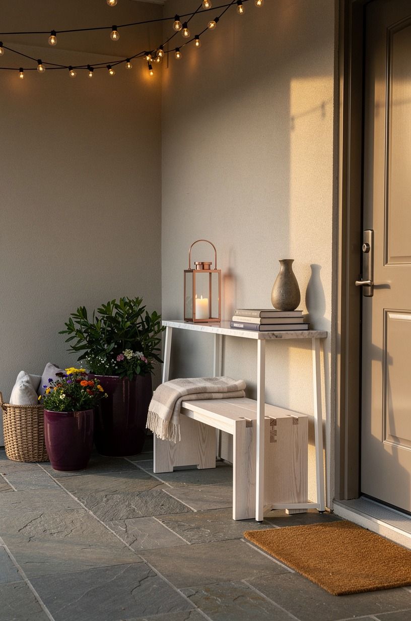
Warm greige is the right call when you want the house to look expensive and settled, not newly painted.
14Contrast cedar siding with midnight blue
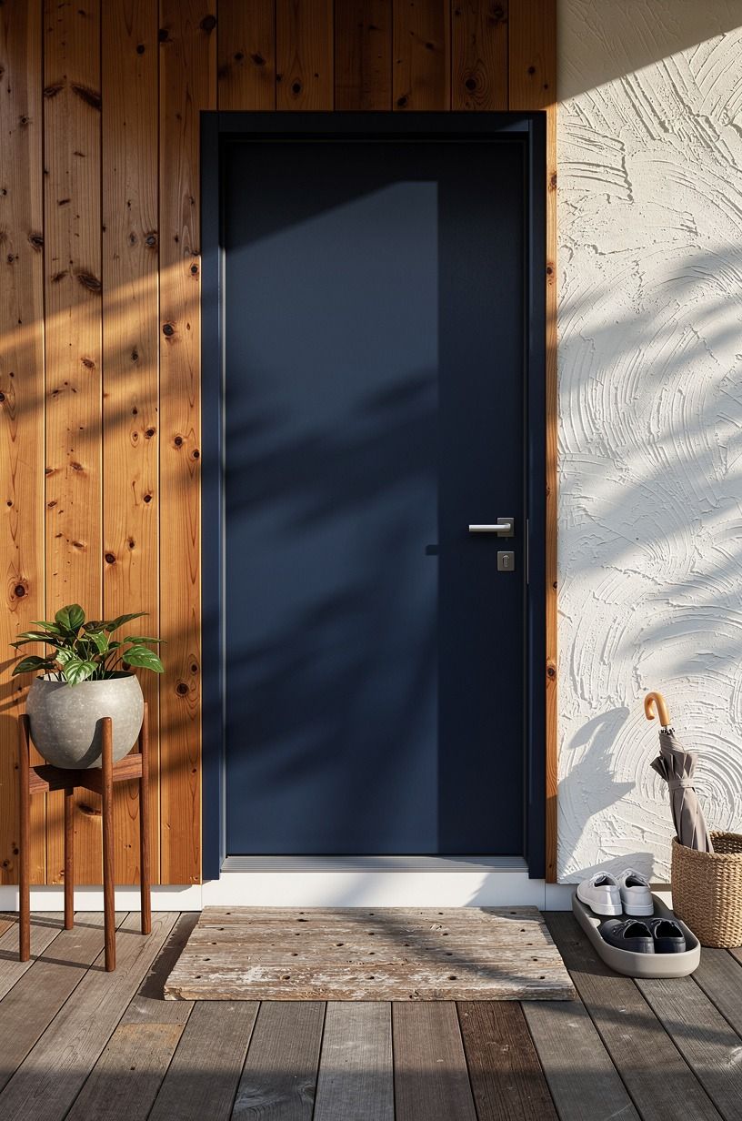
Midnight blue against cedar is one of my favorite contrasts because the wood stays warm while the door goes crisp and deep. From a stepping-onto-the-porch view, with navy trim, a white threshold, and a walnut planter, Benjamin Moore Old Navy 2063-10 gives you that almost-black mood without flattening the grain around it.
This is also a smart move if your siding has a lot of variation in tone. Blue pulls the oranges in cedar into line better than green sometimes does.
Keep the metal quiet, keep the greenery simple, and let the door be the sharp note. If you want another way to warm up the entry fast, a spring wreath with darker foliage works beautifully here.
15Paint sidelights the same bold color
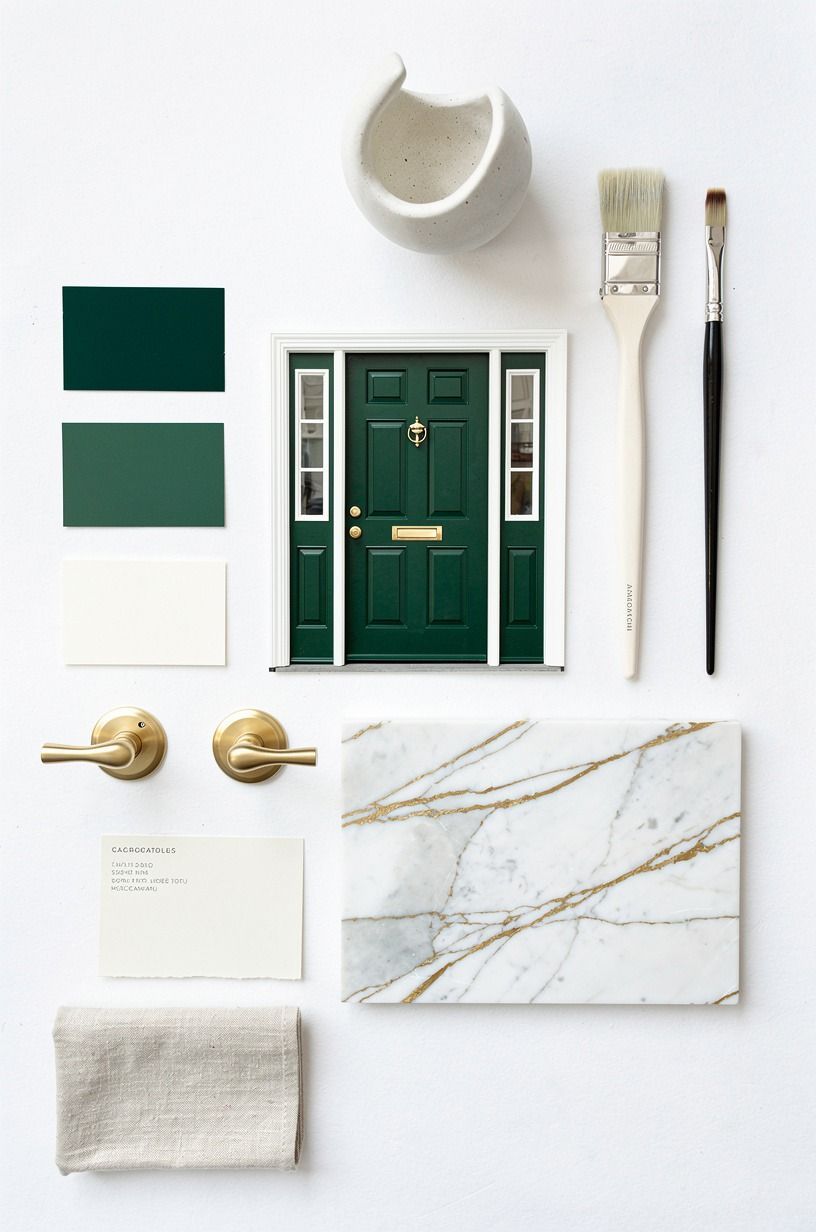
Painting the sidelights the same bold shade as the door is one of the easiest ways to make a small entry look custom. In an overhead composition with emerald swatches and trim chips, the wrap of color reads architectural, not decorative. Sherwin-Williams Cascades SW 7623 is strong enough for this because it doesn't go muddy when it stretches beyond the slab of the door.
I think split-color sidelights usually look fussy. One bold field feels calmer.
Keep the surrounding trim light, keep the glass clean, and repeat the bold tone only once more in a planter or cushion. The result feels bigger than the footprint because your eye reads one clean shape. It looks custom for less than dinner out if you're only buying sample pots and painter's tape!
16Echo porch tile with a muted teal door
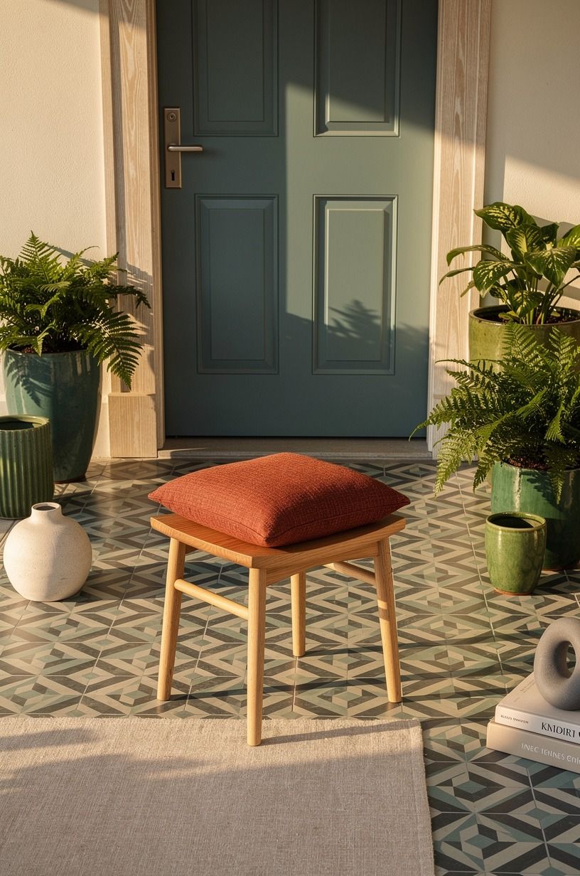
Muted teal works when the porch tile already has a little green-blue in it and you want the door to feel tied in, not separate. From a classic angled view, with patterned tile, forest planters, a rust cushion, and natural oak nearby, Sherwin-Williams Quietude SW 6212 makes the whole porch read collected.
You don't need a perfect tile match. You need a family resemblance.
And yes, this is where samples earn their keep. Teal can flip fast outdoors. Test it morning, noon, and late afternoon before you commit.
I prefer a slightly grayed teal because the rust and oak details look richer beside it. If your porch is already busy, skip shiny tile plus shiny paint together.
One surface should stay calm. The porch will thank you for that restraint!
17Anchor stone steps with deep aubergine
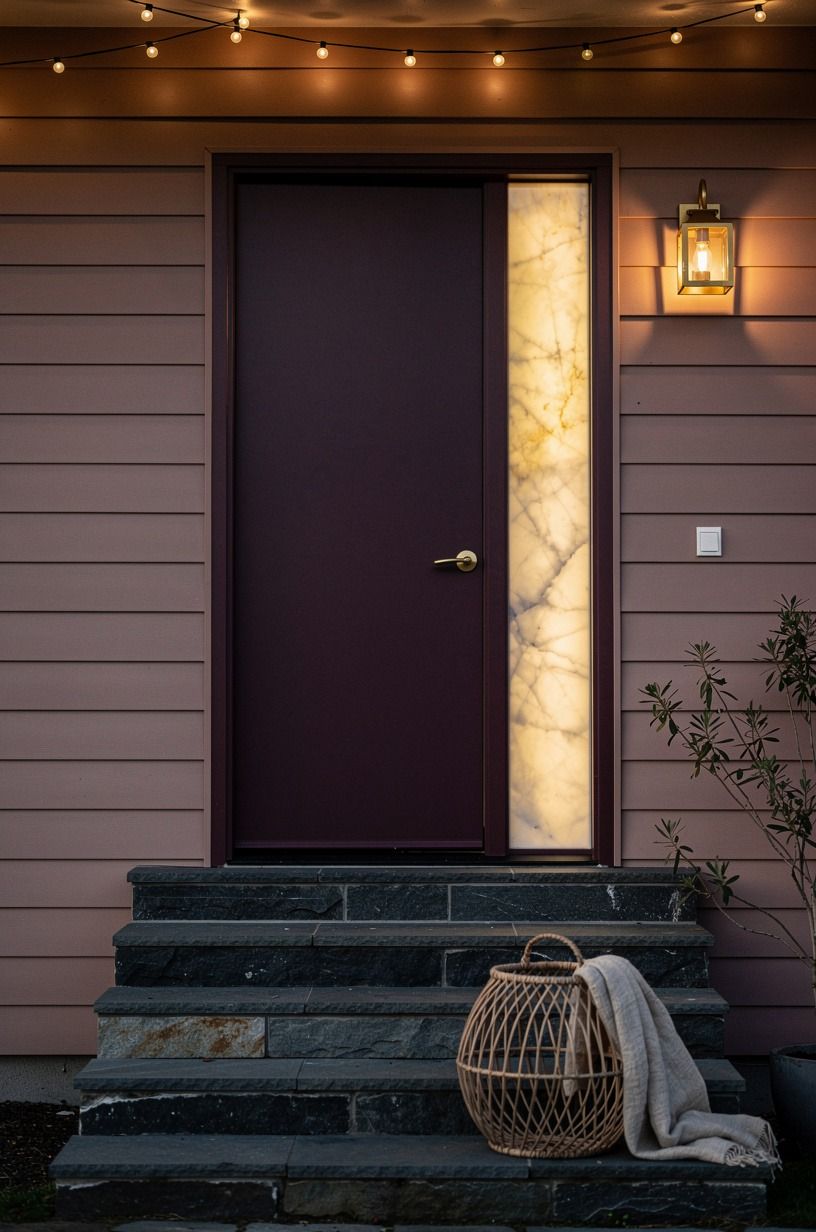
Deep aubergine is for people who want mood without going predictable. Against stone steps, charcoal treads, dusty rose siding, and brass lanterns, a dark purple-brown door feels surprising in the best way. Benjamin Moore Caponata AF-650 gives you that inky depth while still reading warm, which matters a lot on an exterior.
Would I use aubergine on every house? No.
But on a home with soft siding and heavy stone, it can be the richest color on the block. Keep your accessories edited and your lantern glass clear so the paint gets the attention.
A doorway like this doesn't need a lot of stuff. It needs confidence.
18Soft coral vs pink ground: when each one works
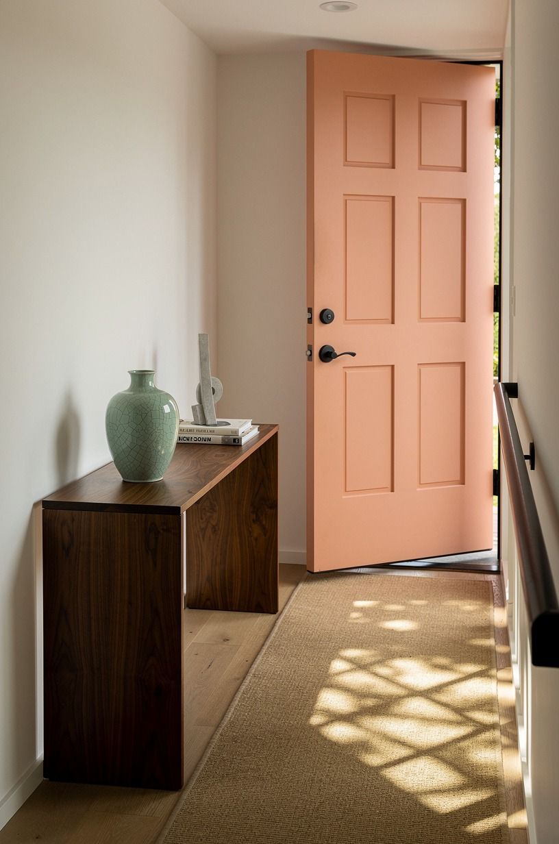
Soft coral is a great answer for a porch that feels squeezed by walls and shadow.
19Layer cream trim around a cocoa brown door
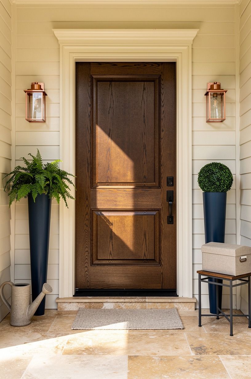
Cocoa brown with cream trim has old-money calm when it's done right. On a symmetrical porch with midnight blue planters and copper lanterns, the brown becomes the anchor and the cream becomes the soft frame.
Benjamin Moore Kendall Charcoal HC-166 is too gray for this. I'd move warmer, toward a cocoa like Sherwin-Williams Turkish Coffee SW 6076 instead.
The reason this works is temperature. Brown, cream, copper, and blue all lean warm enough to belong together.
Add a plain mat, clipped greenery, and maybe a bench in 3/4-inch solid white oak if the porch has room, and the entry feels settled for years, not one season. That's rare. And worth chasing.
The undertone over trend rule
The mistake people make with front door colors is treating the door like a sample chip blown up to full size. It isn't.
The door sits inside a whole little ecosystem: siding, porch floor, planters, hardware, threshold, light, shadows, even the color of the brick dust that settles on the step. I've repainted entries after thinking the first choice was close enough, and close enough almost always reads like hesitation from the street.
What changed my mind was seeing how often the best entries make one decisive move and then stop. A glossy black door works because the terracotta below it and the olive planters beside it are already doing enough.
A muted teal door works because the tile is speaking the same language. A warm greige door works because not every house wants a personality test at the curb.
Some houses just want to look finished. That's a real goal, by the way, and a smart one.
I also think people overspend on the wrong part of the porch. If you've got a modest budget, paint gives you more return than another basket, another lantern, or another seasonal sign ever will.
A refresh with paint, plants, lights, and textiles can live in the $200 to $900 range, while the bigger outdoor upgrades climb fast. I'd rather see you put money into a better Benjamin Moore Aura Exterior line, one pair of solid planters, and a mat with real weight than scatter the same dollars across five flimsy accessories.
And here's the part nobody respects enough: undertone beats trend. If the brick runs orange, you need a green or blue that knows how to handle orange.
If the siding is creamy, a cold gray-black door will fight it every single time. If the porch is narrow, brightness matters more than drama. Paint is emotional, sure, but it's also relational.
The right front door color doesn't just look good on its own. It makes everything around it make more sense (and that is the whole game).
A Few Things Worth Answering
What is the best front door color for a small front porch?
Deep navy and warm greige are the safest winners. Navy gives you depth without shrinking the opening too much, and greige keeps the porch airy. One slim bench, one pair of planters, clear walking space, and the entry feels bigger fast.
Where can I buy front door styling pieces on a budget?
Start with Target Threshold, IKEA, and Wayfair for mats, lanterns, and simple planters. Facebook Marketplace is still great for heavier pots and small benches. If you want one seasonal add-on, this front door wreath roundup is an easy place to begin.
How much does a front door makeover cost?
A simple update usually lands around $200 to $900 if you're mostly doing paint, plants, and lighting. Mid-level porch upgrades move into $1,500 to $6,000 fast. Free wins: cleaning the threshold, editing the clutter, and swapping out a tired mat.
Can I create a polished front door on a budget?
Yes, and paint does the heavy lifting. A quart of quality exterior paint, a sharper mat, and one pair of planters change more than people expect. Keep what works, ditch the filler decor, and spend on the surfaces everyone sees first.
Is a front door color update worth it in a small space?
Yes, especially on a tight porch. Color gives you impact without stealing floor area, which is why it beats bulky decor. In a small entry, the door should be the focal point and the accessories should stay secondary.
Is a front door repaint a good idea for a rental?
Only if the lease allows it or the owner signs off first. Low-risk upgrades still help: a removable wreath hook, a heavier mat, battery lanterns, and porch pots you can take with you. If paint is allowed, keep the original formula on file.
Where I'd Start First
If I had to pick one, I'd start with deep navy against white trim. It gives you contrast without the hardness of black and flatters brick, stone, and brass at once. Pin it for later and save this wreath pairing idea.