
 by
by Quick answer: No single color makes everyone sleepy on command. My safest choice is muted blue paint: keep it dusty rather than vivid, use a low-sheen finish, and judge it under your actual bedtime lighting.
- HBMag presents the question as a set of claims to examine, rather than a universal promise.
- Coolors offers automatic palette generation and color-theory rules for coordinating colors.
- Painted walls reflect room light, while phones and televisions emit light, so blue paint and blue screen light aren’t the same design issue.
Updated July 2026 · Reviewed for accuracy
That’s a design verdict, not a medical promise. Color can make a bedroom look quieter and more settled, but it can’t force drowsiness. The useful goal is to remove visual friction and create a room that feels ready for rest.
What color makes you sleepy? My straight answer
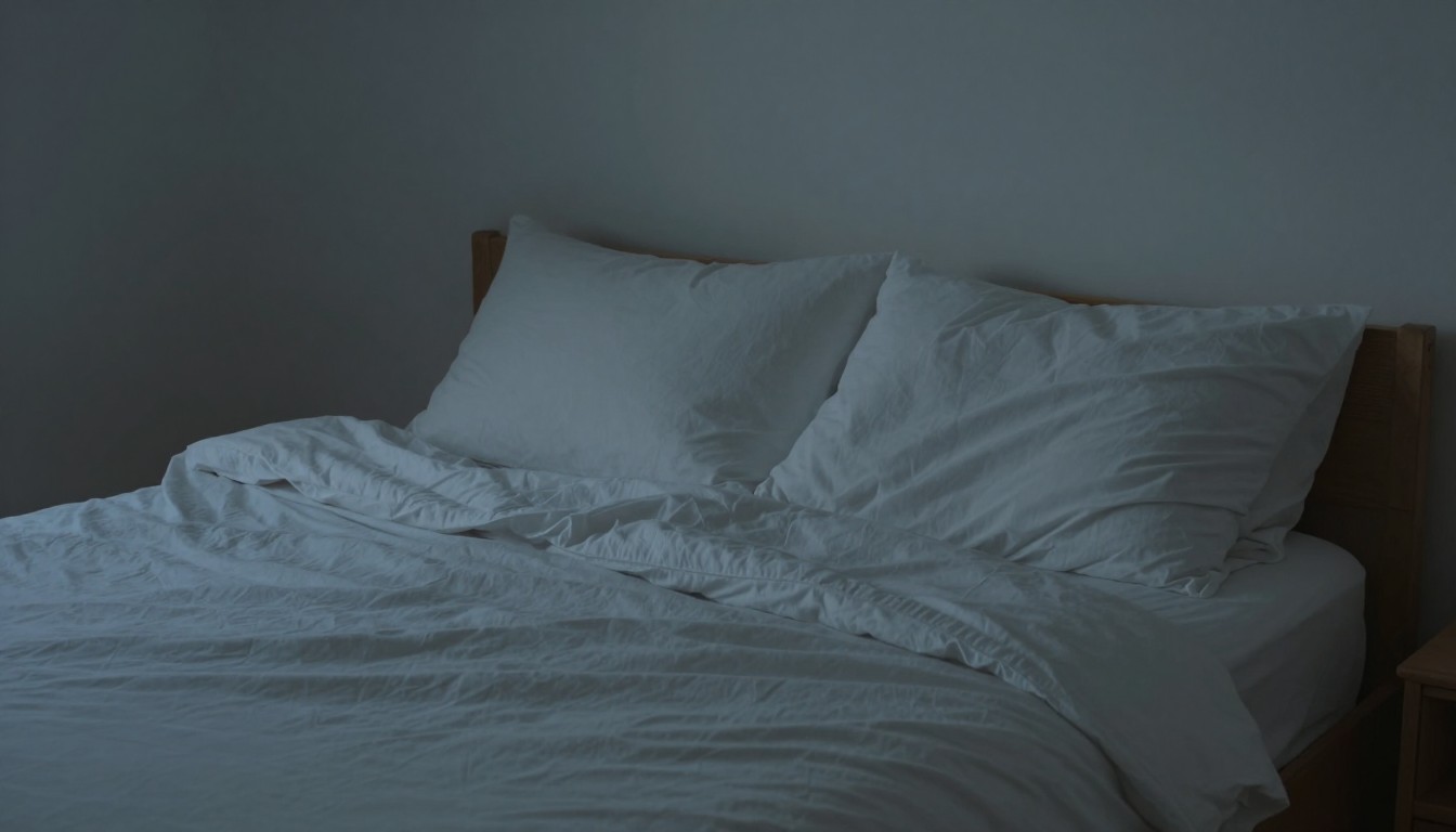
Muted blue, shifted slightly toward gray, is where I’d start. It has less visual intensity than a bright primary blue and works with many common bedroom materials, including natural wood, white bedding, and subdued textiles. Think cloudy sky rather than swimming-pool tile.
The word muted matters more than the basic color name. A saturated blue can look energetic, glossy, or even cold. A softened blue is less likely to dominate the room, especially once lamps replace daylight.
I wouldn’t describe any paint as inherently sleep-inducing. HBMag’s discussion of what color makes you sleepy treats the subject as a claim requiring scrutiny, which is the right approach. A color recommendation should remain a practical decorating choice, not a promise about how quickly you’ll fall asleep.
My verdict in plain English: Choose muted blue if you want the safest starting point. Choose another quiet color if blue feels cold, institutional, or simply unpleasant to you. Your bedroom still has to feel like yours.
Personal preference is the final filter. If you already dislike blue, painting the room blue because it’s often associated with calm makes little sense. A soft green, warm neutral, or dusty lavender can achieve the same low-drama appearance without forcing a color you don’t enjoy.
Why the shade matters more than the color name
An electric blue and a dusty blue can carry the same basic label while creating completely different rooms. The electric version attracts attention. The dusty version recedes more easily beside bedding, curtains, and furniture.
Saturation describes how intense or vivid a color appears. For a bedroom, I generally prefer lower saturation because it makes the walls less visually demanding. That’s my decorating judgment, not a claim that reducing saturation directly changes sleep.
Lightness also changes the result. A pale blue can feel open and airy, while a deep navy can create a more enclosed look. Neither is automatically better. The right depth depends on whether you want the walls to fade into the background or wrap the room in a darker color.
The quick swatch test:
- If the color looks loud beside your bedding, it’s probably too saturated.
- If it turns harsh under your bedside lamp, the undertone or finish needs another look.
- If the wall becomes the first thing you notice after dimming the room, I’d try a quieter version.
Finish deserves attention too. I favor a low-sheen appearance in a sleep-focused room because strong reflections create visible highlights across the wall. A flatter-looking surface usually lets the color sit back, although the practical finish still needs to suit the condition and use of the room.
Contrast completes the picture. Muted blue walls paired with brilliant white trim may look crisper than expected. Using a softer white, a related neutral, or less contrast between large surfaces can make the scheme feel more cohesive.
Other sleepy-looking colors worth considering
Soft blue-green is my strongest alternative to muted blue. It keeps some of blue’s quiet character while adding an earthier cast. Soft green, warm greige, dusty lavender, and deep navy can also work, but each changes the mood and carries a different decorating risk.
The comparisons below are my design assessment, not a clinical ranking. No row should be read as a prediction of how quickly a person will become sleepy.
| Color direction | Why I’d consider it | What to watch |
|---|---|---|
| Muted blue | A versatile, low-drama starting point that pairs easily with common bedroom finishes. | Bright or icy versions can feel sharper than expected. |
| Soft blue-green | Useful when plain blue feels too cool or formal. | Its green or blue side may become more obvious as the lighting changes. |
| Soft green | A restrained option for rooms built around wood and natural-looking fabrics. | Yellow-leaning greens can look livelier under warm lamps. |
| Warm greige or taupe | A quieter choice for anyone who doesn’t want an obvious color on the walls. | Some versions can appear dull or muddy beside the wrong textiles. |
| Dusty lavender | Adds restrained color without the force of a bright purple. | Warm lighting may pull it toward pink. |
| Deep navy | Creates a darker, more enclosed bedroom look. | It can dominate a room or make contrasting furniture look especially prominent. |
If blue doesn’t appeal to you, I’d move first toward blue-green or a warm neutral. Both can remain subdued without making the room look like an imitation of somebody else’s idea of a restful bedroom.
Deep colors need more deliberate coordination. Navy walls with equally dark bedding can produce a wrapped, cocoon-like look, while navy beside bright trim creates a much sharper outline. The hue stays the same, but the overall visual effect changes.
Test the color under your real bedroom lighting
A sample that looks soft under bright showroom lighting can appear murky, green, or overly vivid beside your bed. Paint should be judged where it will live, not from a small chip held under an unrelated light source.
I’d place a generous sample beside the headboard, then view it from the doorway and from the bed. Check it in daylight and again with the lamps you normally use in the evening. The evening view deserves priority because that’s the setting relevant to this decision.
Surrounding materials can pull out undertones that weren’t obvious on the chip. Wood, carpet, curtains, and large areas of bedding all sit within the same field of view. Test the proposed wall color beside those fixed elements before committing to the full room.
A practical testing order:
- Choose a muted color family rather than chasing a supposedly perfect sleep color.
- Compare nearby shades with different undertones.
- View the samples under both daytime and bedtime lighting.
- Place bedding and curtain fabric beside the samples.
- Keep the shade that disappears into the room most comfortably.
For coordinating the wider palette, Coolors describes its service as an automatic palette generator that can also apply color-theory rules. That can help identify related colors, but a generated palette can’t account for your lamps, existing furniture, or the way a finish looks on an actual wall.
Don’t overlook the bulb and lampshade. I’m not suggesting a special light as a sleep treatment. I’m saying that a paint color viewed under one lamp may not resemble the same paint under another, so the final decision belongs in the finished room.
Colors and combinations I’d handle carefully
Scarlet, vivid orange, lemon yellow, and electric blue demand more visual attention than dusty versions of those colors. I wouldn’t ban them from every bedroom, but I wouldn’t choose them for someone specifically trying to create a quieter backdrop.
Brilliant white can also be more assertive than it sounds. Against dark furniture or dark window coverings, it creates crisp boundaries around every object. A softened off-white may be easier to coordinate if you want a neutral room without such pronounced contrast.
Use extra care with:
- Highly saturated accent walls that become the room’s focal point.
- Glossy finishes that show strong reflections from lamps.
- High-contrast geometric patterns around the bed.
- Very dark walls paired with bright white trim.
- A fashionable shade you don’t genuinely like.
Black and near-black aren’t automatically poor choices. They can make the walls feel less prominent after the lights are lowered, but they may also make lighter furniture and bedding stand out more strongly. Sample the full combination rather than evaluating the dark paint alone.
Patterns deserve the same scrutiny as color. A muted blue wallpaper with a busy, high-contrast motif may look more active than a plain wall painted in a warmer hue. If calm is the goal, scale and contrast can matter as much as the color family.
My final bedroom color plan
Muted, dusty blue remains my first choice for someone asking what color makes you sleepy. I’d pair it with a low-sheen appearance, restrained contrast, and bedding that shares one of the wall color’s undertones. The result should look settled without pretending that paint controls sleep.
I’d also separate decoration from physical comfort. If the bed itself is the problem, start with our explanation of what makes a good mattress. If you’re already considering a replacement, the guide to what’s the best mattress addresses that decision independently of wall color.
The final filter: Pick the quietest version of a color you already enjoy. Confirm it beside your real bedding and under your evening lamps. If muted blue still feels right after that test, you’ve found the most sensible answer to the question.
Color is atmosphere, not a remedy. Use it to make the bedroom feel visually settled, then judge lighting, noise, temperature, routine, and bed comfort as separate parts of the room.
FAQ
Is blue the best color for sleep?
Muted blue is my safest decorating recommendation, but I wouldn’t call it a universally best sleep color. The shade, finish, lighting, and your own preference can matter more than the word “blue” on the paint label.
Do dark colors make you sleepier?
Dark colors can create a more enclosed visual effect, but that doesn’t mean they directly cause sleepiness. Deep navy may feel cozy in one room and heavy in another, so test it with the room’s actual trim, furniture, and lamps.
Is gray a good bedroom color?
Gray can work if its undertone suits the rest of the room. I prefer a softened gray with enough warmth or blue-green character to avoid looking flat beside the bedding.
Should bedroom walls and the ceiling match?
Matching them can reduce the visible boundary between the walls and ceiling, especially with a muted or deeper color. A contrasting ceiling creates a clearer outline, which may be desirable in some rooms but less useful if you want the surfaces to recede.
Can changing bedroom color fix poor sleep?
No paint color should be treated as a fix for a sleep problem. A calmer palette can improve the room’s atmosphere, but comfort, lighting, noise, routine, and other concerns still need to be considered on their own.