
The first thing you notice in the best dark boho bedroom isn't the color. It's the feeling. Like someone turned the volume down and the warmth up, all at once.
These ten rooms lean into shadow instead of fighting it. Raw plaster, aged wood, and layered textiles do all the work.
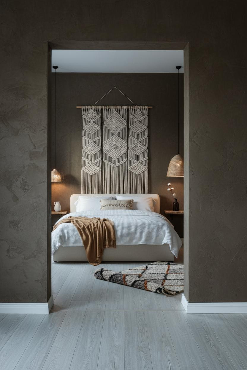
Macrame and Moss Plaster That Actually Feel Grounded


I keep coming back to this one. Something about the contrast just locks in.
Why it works: The hand-knotted jute macrame reads warm against moss-brown plaster because the fiber absorbs light instead of reflecting it, which keeps the wall from feeling flat.
Steal this move: Hang the macrame low enough that it overlaps the headboard slightly. It ties the two pieces together in a way that feels collected, not staged.
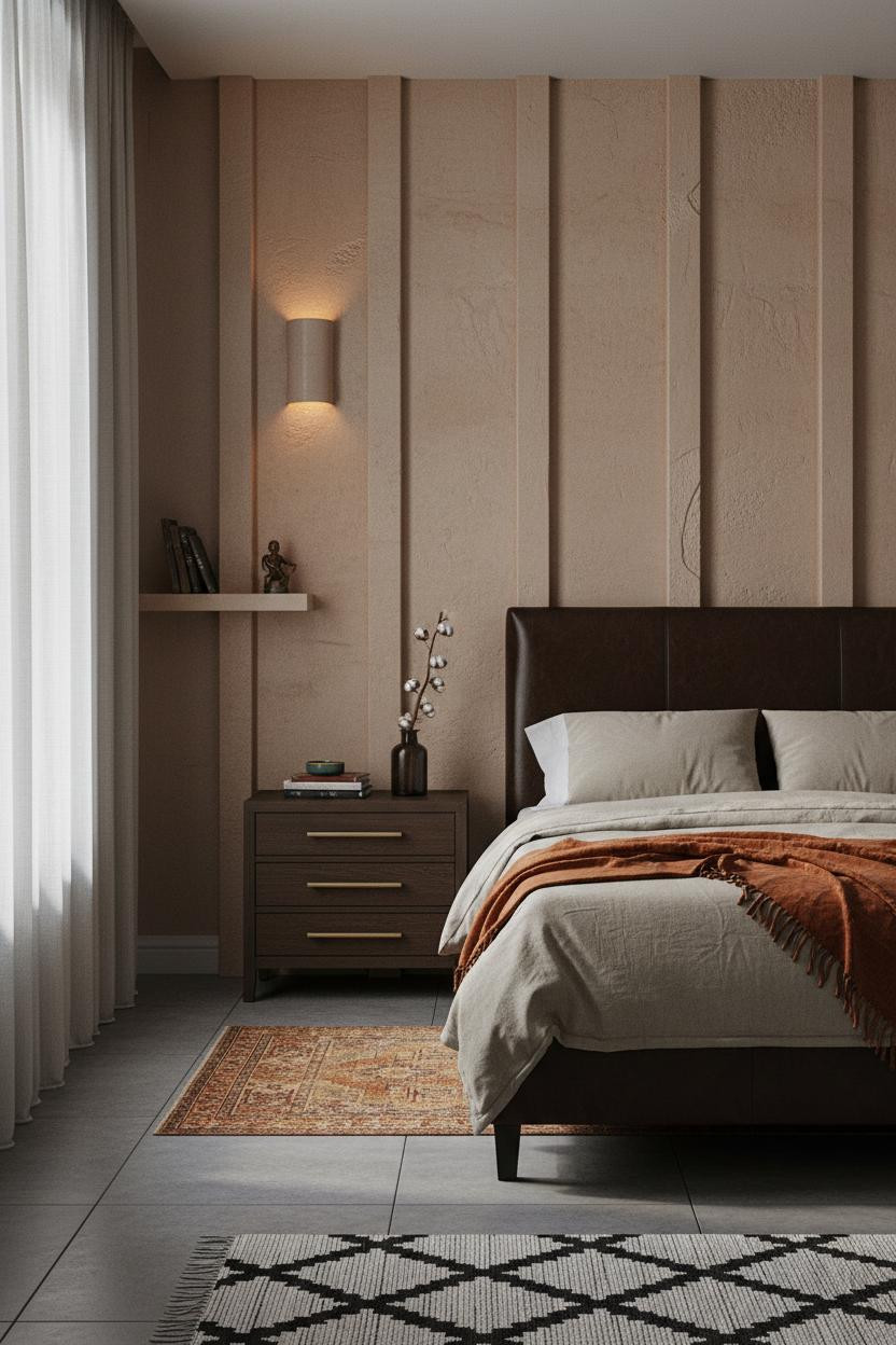
Board-and-Batten Walls That Actually Have Weight


Bold choice. But the rooms that commit to this fully are the ones you remember.
The vertical rhythm of clay-sand board-and-batten makes a low-ceilinged room feel taller. Each horizontal shadow line adds depth without a second color.
What to borrow: Seal the battens in matte pigment, not gloss. Sheen kills the effect.
Avoid this mistake: Don't stop the treatment at the window line. Full height or skip it entirely.
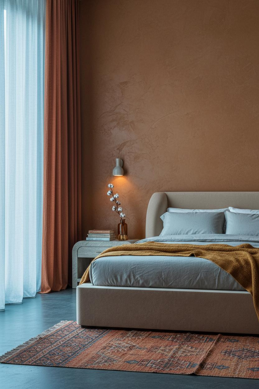
Ochre Plaster That Makes Morning Light Do the Work

This is the kind of room that makes you want to stay in bed until noon. Honestly, I don't blame anyone who does.
What creates the mood: Hand-troweled ochre clay plaster darkens at the base where pigment pools, so the wall graduates naturally from shadow to light, which the room needs to feel alive without overhead lighting.
Pair it with floor-length rust linen curtains gathered to one side. The layered warm tones hold together, while still feeling airy at the window.
Stacked Stone That Earns Its Roughness
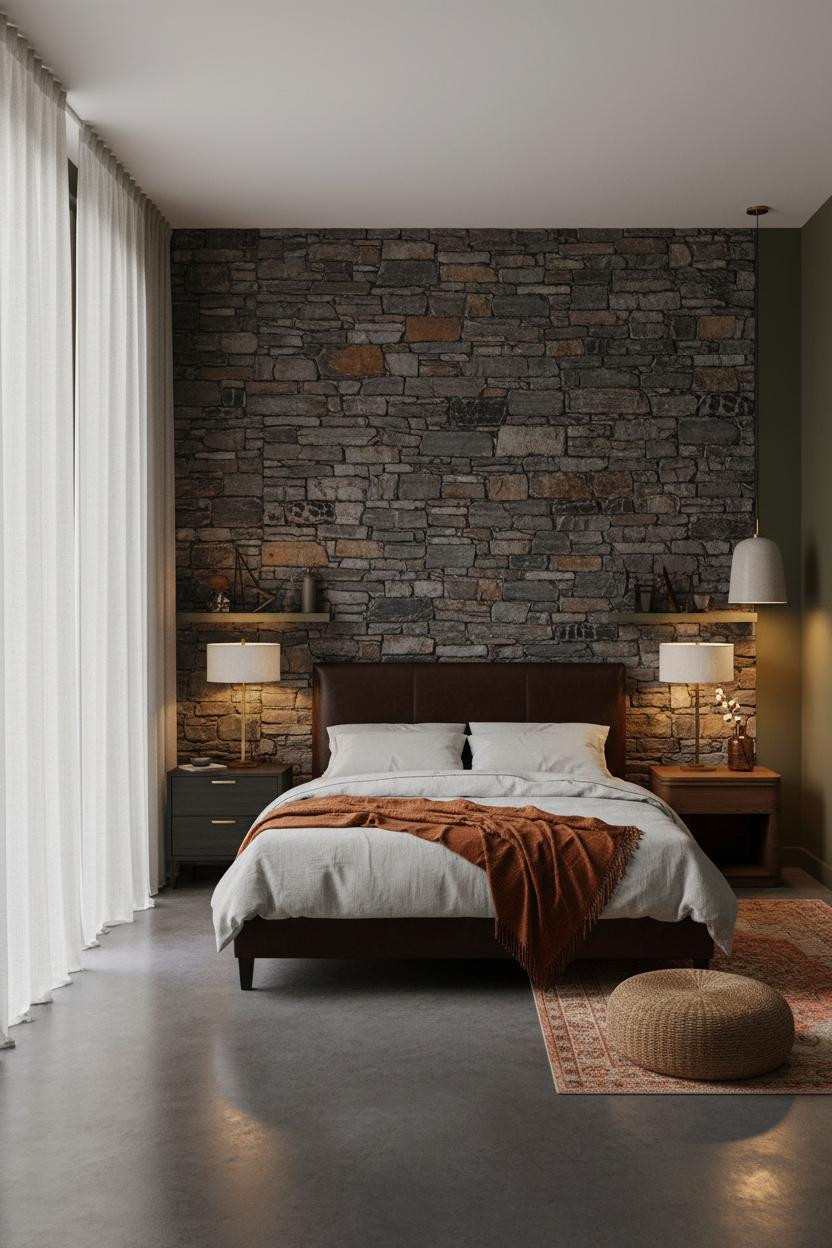

Fair warning: stacked stone is a commitment. But when it works, it really works.
The real strength: Charcoal and rust stone face, hand-laid with irregular mortar joints, catches raking light in a way no painted wall can replicate. The deep olive plaster on flanking walls keeps the stone from feeling too rustic.
The smarter choice: Keep the bedding pale and neutral. The stone is doing enough.
Cedar Slats and Indigo Plaster Are a Weird Pairing That Pays Off

It shouldn't work. Dark indigo beside tobacco-stained cedar sounds like too much.
But the rough-sawn cedar slats running floor to ceiling create shadow striping that the flat plaster behind them can't, and that contrast is exactly what makes the room feel like it has structure rather than just color. The room feels deliberately intimate, in a way that feels earned.
Pro move: Use dusty pink linen bedding here instead of white. It softens the cedar without competing with it.
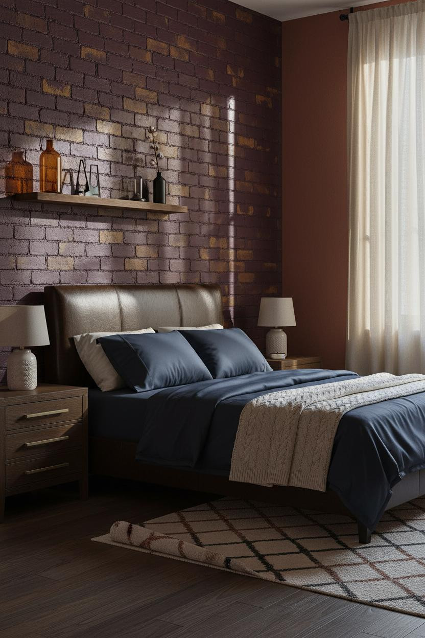
Clay Brick Done Dark and Feminine
I almost scrolled past this. Glad I didn't.
What gives it presence: Clay brick washed in aubergine and ochre pigment picks up warm light in a way that painted walls simply don't, because every mortar ridge casts its own tiny shadow. And those shadows stack.
Where to start: The navy sateen bedding is the move that keeps the whole room from sliding into terracotta-only territory. Introduce one cool tone and it anchors everything.
A Plaster Niche That Changes the Whole Scale


It's a small architectural move. But I'd argue it's the most copyable one in this whole list.
In a dark room, the easy win is carving a recessed niche and plastering it in warm ochre-grey, because the shadow pooling at its base creates a focal point that a sconce or shelf alone can't replicate. The room feels collected rather than decorated.
What to copy first: Place a single ceramic sconce just above the niche opening. The warmth it throws across the raw plaster is immediate.
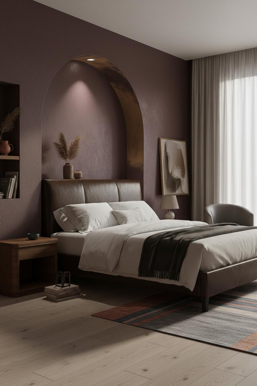
Burgundy Arches That Feel More Old World Than Trendy
Arches are everywhere in the moody bedroom aesthetic right now. Most of them look decorative. This one feels structural.
Why it feels intentional: The deep burgundy hand-plastered alcove behind the bed has raw ochre surfacing at the arch curve, which keeps the color from reading as a single flat tone. That variation is the difference between moody and muddy.
Don't ruin it with cool-toned sheets. Ivory cotton or charcoal cashmere only.
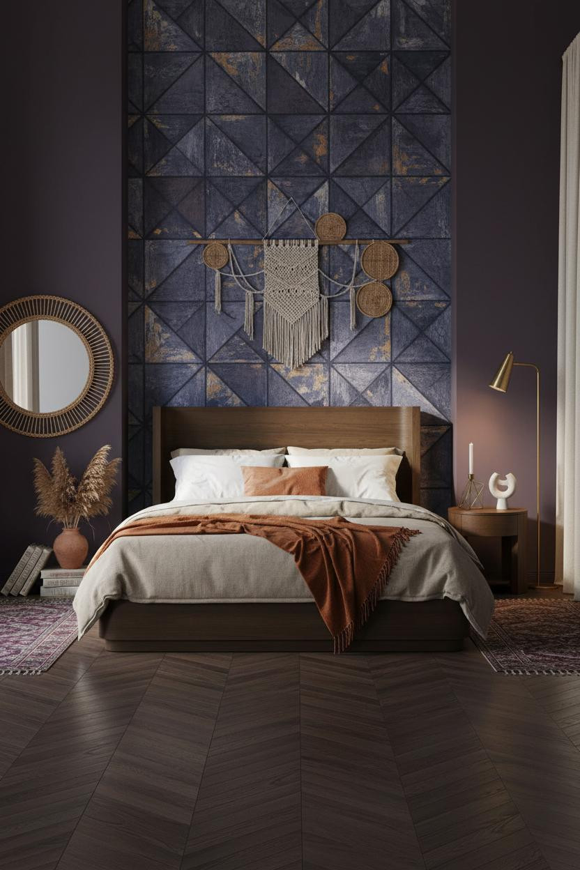
Indigo Tile and Brass That Somehow Stay Quiet

This one is divisive. But I think people who love it are right.
Why the palette works: Aged indigo hand-painted tile with visible brushwork and cracked ochre beneath keeps the pattern from feeling polished, while the herringbone parquet floor in dark stained oak grounds it without adding another competing element.
One smart swap: Use a burnt orange mohair throw instead of a white duvet. Oatmeal cotton underneath, one warm layer on top. That's enough.
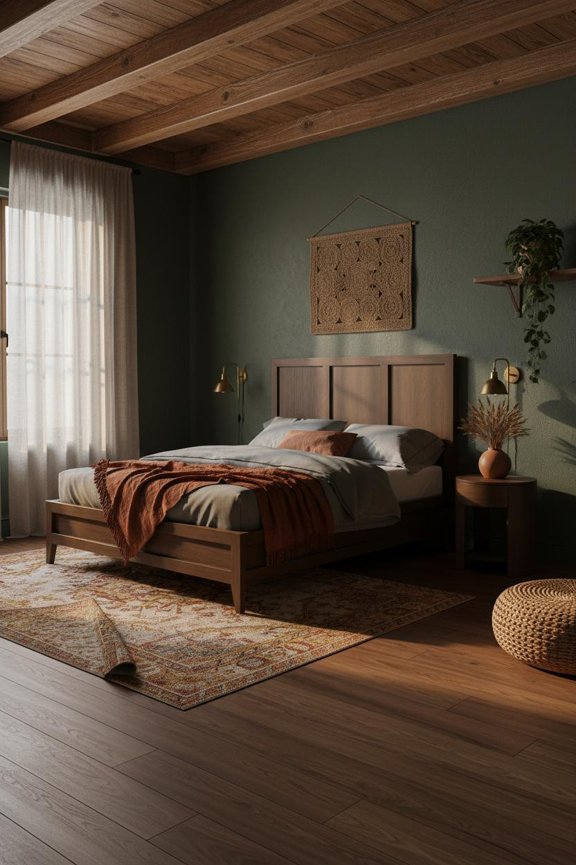
Forest Green Walls and Timber Beams That Feel Like They've Always Been There

Nothing fancy. That's the whole point.
What carries the look: Exposed hand-carved timber beams with visible grain and natural knots pull golden hour light downward, so the forest green plaster walls below feel warm rather than cold. The room feels lived-in and intimate, especially at evening when the paired brass sconces do most of the work.
A vintage Turkish kilim in rust and gold is the finishing layer here. Just enough pattern to keep things interesting, without competing with the ceiling.

Our #1 Pick
Saatva Classic Mattress
America's best-selling online luxury innerspring. 365-night trial, lifetime warranty, free white glove delivery.
Shop Saatva Classic
The Foundation Of Every Beautiful Bedroom
All of this, the plaster and cedar and kilim and candlelight, it only lands if the bed itself is right. Because that's where the room actually lives.
The Saatva Classic is the mattress I'd put in every one of these rooms. The dual-coil support system holds without going firm, and the breathable organic cotton cover means a dark, cozy room doesn't turn into a warm one at 2am. The Euro pillow top has that specific softness that feels substantial, not puffy.
Walls get repainted. Textiles get swapped. The mattress stays. Start there.

The rooms people save are the ones where every layer, from the plaster down to the mattress, feels like someone made a real decision. Good design ages well because it's made well.