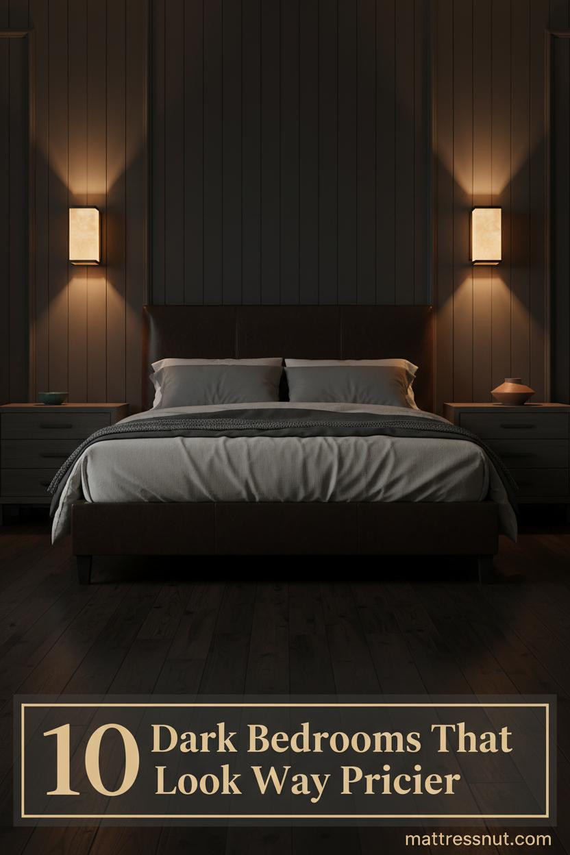
The first time I saw a dark moody bedroom done right, I stopped scrolling. Not because it was dramatic. Because it felt quiet in a way bright rooms rarely do.
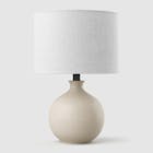
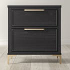
Make the look happen: Saatva beds & furniture
Saatva's furniture catalog matches the look of the bedrooms featured above with handcrafted, solid-wood construction rather than MDF veneer. The collection covers upholstered bed frames (linen, velvet, leather), four-poster & canopy beds, platform beds, storage beds with hydraulic lift, and matching nightstands, dressers, benches, and headboards.
All furniture ships via free White Glove delivery with in-room setup, removal of packaging, and assembly included. Current promotion: up to $625 off sitewide, plus the $225 off orders $1,000+ professional discount via ID.me (military, veterans, first responders, nurses, teachers).
Ownership terms: 45-day return on furniture, 1-year warranty on frames. Pairs naturally with the Saatva Classic mattress.
These ten rooms lean into shadow, texture, and warmth. Each one earns its darkness.
Rust Plaster and Amber Light at Dusk
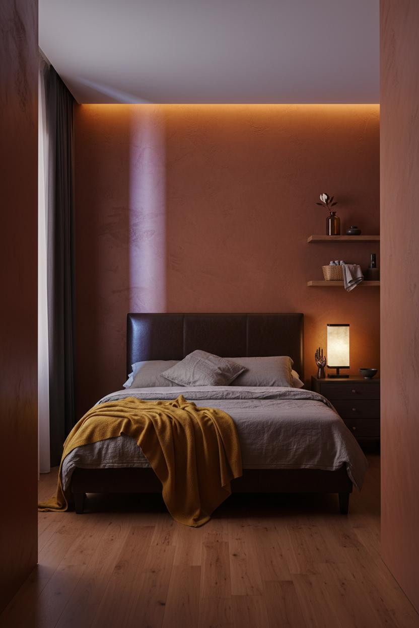


I keep coming back to this one. The rust-ochre plaster is the kind of color that shifts depending on where the light lands.
Why it works: Hand-troweled raw plaster catches raking sidelight in a way smooth paint never could, turning one wall into something that feels alive rather than flat.
Steal this move: Position a single warm lamp low on the nightstand so the light grazes the plaster at an angle. The texture does the rest.
Slate Tile That Earns Every Shadow
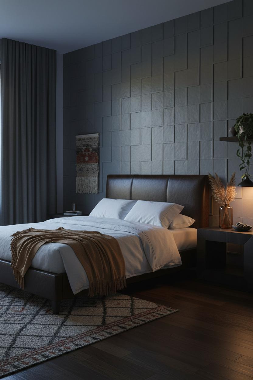

This is divisive. Tile on a bedroom wall isn't for everyone. But when the grout lines disappear into shadow like this, the room feels collected rather than decorated.
Design logic: The matte slate-grey tile creates a grid that amber sidelight turns into something dimensional, shadow pooling deep in every recessed grout channel.
The smarter choice: Pair a statement headboard with a heavy-textured wall so neither competes, both just hold the room together.
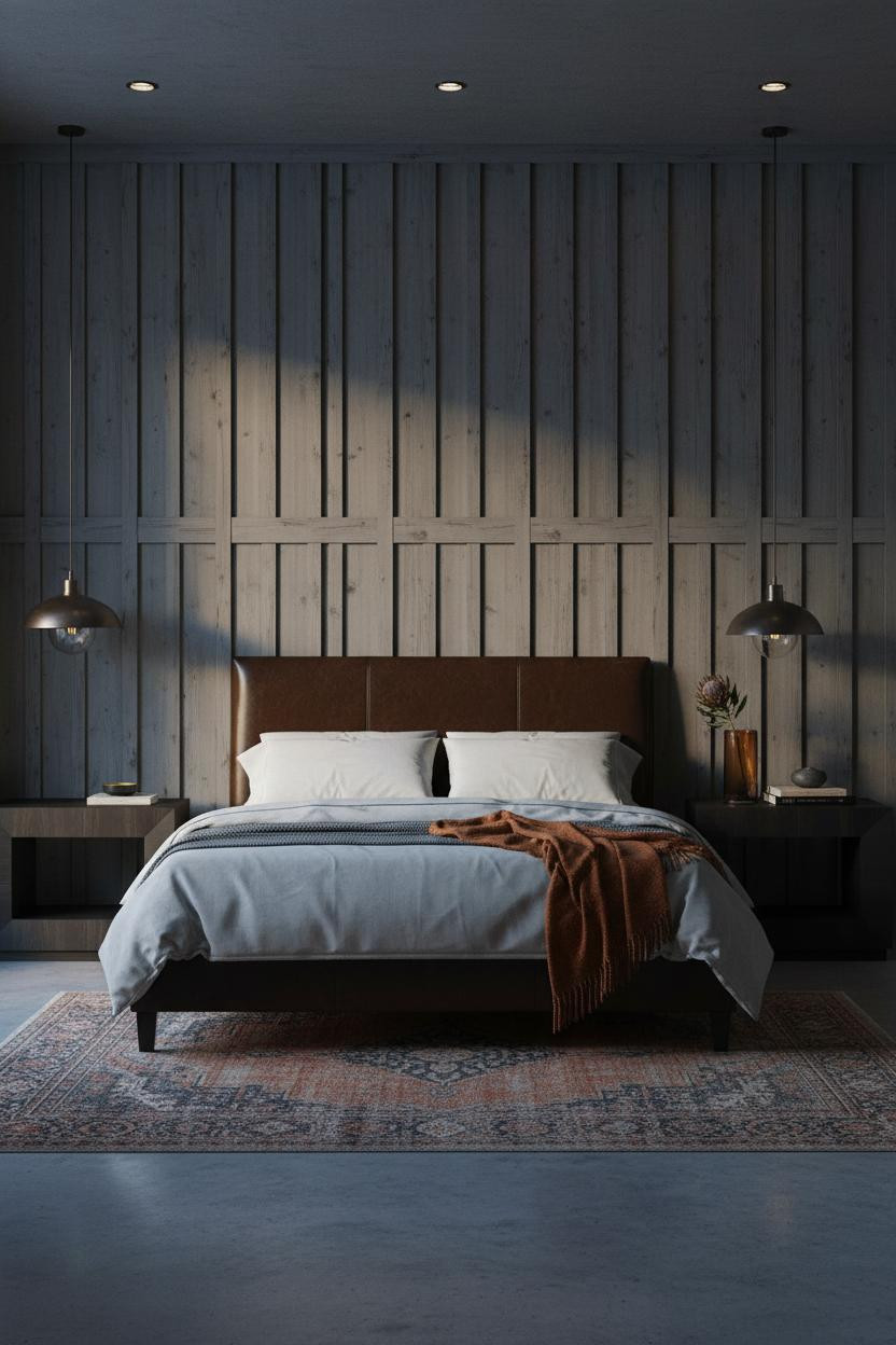
Charcoal Shiplap With Golden Hour Light
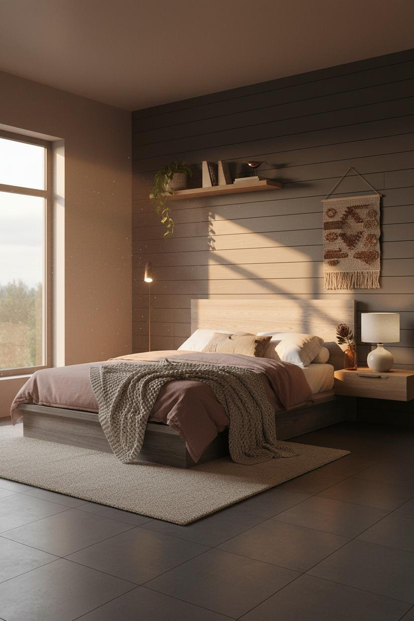

Nothing fancy. That's the point.
But the way raking afternoon light catches every horizontal plank ridge on charcoal shiplap makes this room feel like it cost three times what it did.
What makes it work: Dark-painted horizontal planks hold warmth in the shadow lines between boards, which is why the room feels intimate rather than cold.
Avoid this mistake: Don't paint shiplap the same tone as your walls. The contrast between the plank surface and the shadow groove is where all the visual interest lives.
Indigo Velvet Drapes That Drink the Light
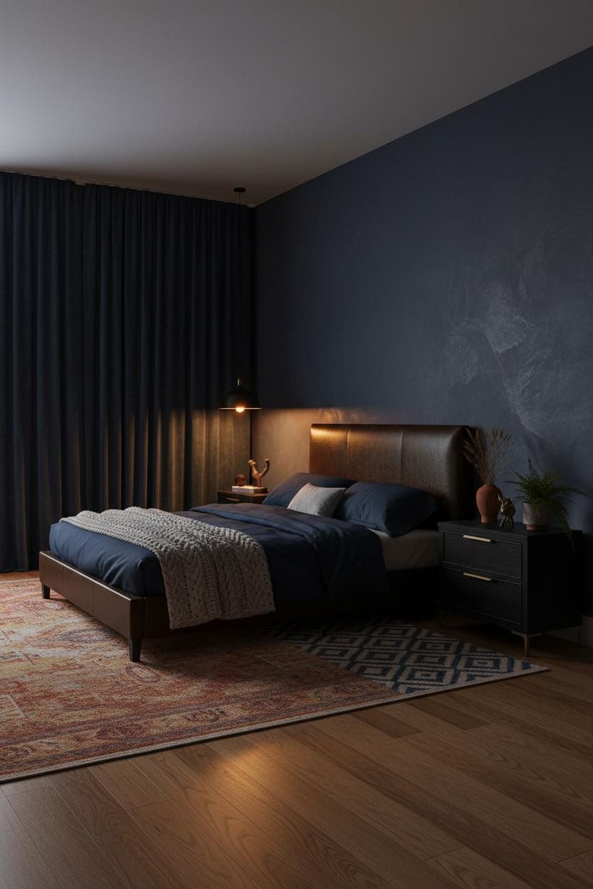
Honestly, floor-to-ceiling drapes change the proportions of a room more than any paint color. And in deep indigo velvet, they do something else entirely.
What creates the mood: Each gathered pleat in deep indigo velvet catches amber sidelight in raised ridges, so the whole window wall becomes a rhythm of warmth and shadow rather than just a curtain.
Hang them high and let them pool. The extra length is what tips this from "nice drapes" to something that feels intentional.
Sage Plaster With Brass That Actually Earns It

I'm always a little skeptical of sage green. It's everywhere. But paired with raw plaster and brass, it somehow stops being trendy and starts being serious.
Why the palette works: Cool morning light hits the deep sage plaster and reads almost grey, while warm sconce light pulls it back toward green. The wall is doing two different things at once.
Pro move: Flank the headboard with paired brass sconces rather than table lamps. It frees up the nightstand and keeps the eye on the wall where it belongs.
Board-and-Batten Done Dark and Serious
Most board-and-batten rooms lean country. Paint it charcoal and treat the battens as a vertical grid and the whole thing shifts into something urban and grounded.
In a dark scheme like this, the real strength of matte charcoal pine battens is the shadow line each groove casts, deepening toward the ceiling in near-black gradients. The wall does the heavy lifting without needing any art.
Where to start: Keep the flanking walls in a warm mushroom tone. It stops the dark feature wall from feeling like a cave while still feeling moody.
The Dark Academia Bedroom I'd Actually Live In
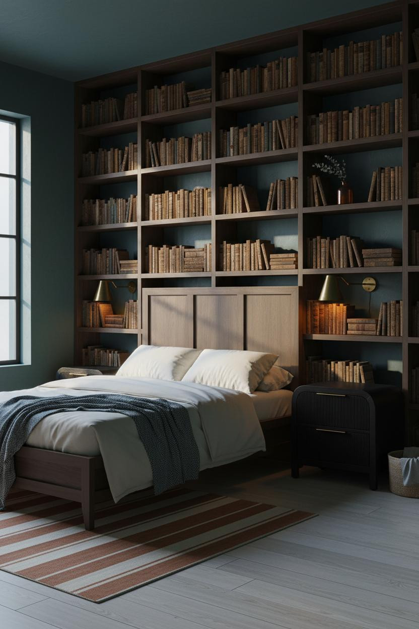

A dark teal wall behind floor-to-ceiling built-in shelving is a commitment. But this room feels like someone actually lives there, which most dark academia bedroom rooms don't quite pull off.
Why it looks custom: Dark walnut bookcase frames against deep teal plaster create enough contrast to read as intentional architecture, not just shelves pushed against a wall.
What to borrow: Brass sconces flanking the headboard pull double duty here: reading light and the warm accent the teal needs to stop feeling cold.
Exposed Brick With Burgundy. Divisive. Worth It.
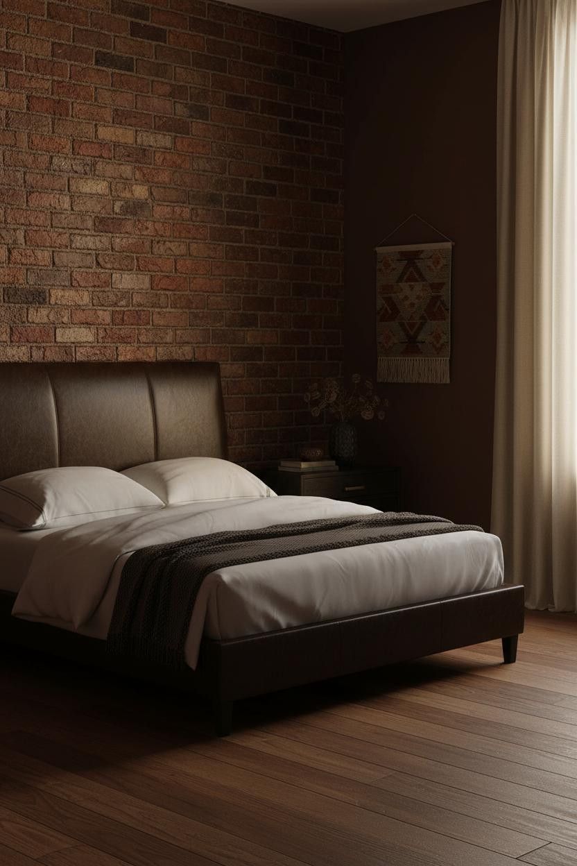
Fair warning. Deep burgundy walls next to exposed brick shouldn't work. But the reason it does is texture: two rough surfaces in adjacent warm tones read as layered, not chaotic.
The real strength: Raw irregular brick catches lamp light in ridged amber pools while the mortar joints fall into darkness, giving one wall more visual depth than an entire room of smooth paint.
Don't ruin it with cool-toned bedding. Ivory cotton and a charcoal cashmere throw keep the warmth intact while still feeling relaxed.
Forest Green Velvet and Brass for the Long Haul

This is the dark feminine bedroom that actually has some staying power. Not trend-forward. Just confident.
What gives it presence: A recessed arched alcove lined in forest green velvet wallpaper curves the light in a way flat walls can't, making the whole headboard wall feel architectural rather than decorated.
Brass bookends, stacked leather spines, a terracotta vase with dried grass. Nothing too precious, nothing too matchy. Just enough warmth to hold the green without fighting it.
Plum Walls With Industrial Steel Windows
If you're upgrading the bed frame
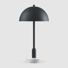
Saatva Santorini Platform Bed, from $1,295
Upholstered platform bed in 6 fabric colorways to match any bedroom palette. Slat spacing safe for foam/hybrid mattresses, rated 1,000 lbs. Free white-glove delivery and assembly.
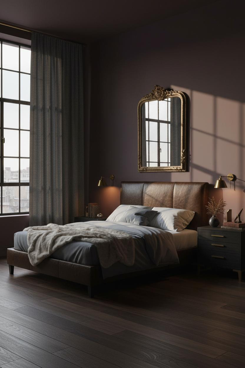
I almost scrolled past this one. Glad I didn't.
What carries the look: The blackened steel-frame windows hold their own against the plum walls because matte steel absorbs fading daylight instead of reflecting it, which keeps the room from feeling glassy or cold. And brass sconces on either side of the bed pull the warm tones back in before the plum tips too purple.

Our #1 Pick
Saatva Classic Mattress
America's best-selling online luxury innerspring. 365-night trial, lifetime warranty, free white glove delivery.
Shop Saatva Classic
The Foundation Of Every Beautiful Bedroom
All ten of these rooms get the surfaces right. Plaster, velvet, brick, shiplap. But a beautiful dark moody bedroom still starts with what happens under the linen. Walls get repainted. The mattress stays.
The Saatva Classic is the one I'd put in any of these rooms without hesitating. Dual-coil support that holds up over years, a breathable organic cotton cover that doesn't trap heat in darker, heavier rooms, and a Euro pillow top that feels genuinely soft without losing structure beneath you.
Good design ages well because it's made well.

The rooms worth saving are the ones where the comfort matches the look. Pick the wall color. Then get the bed right.