The first thing you notice in the best grunge bedroom isn't any single object. It's the feeling that nothing was chosen to impress anyone.
Make the look happen: Saatva beds & furniture
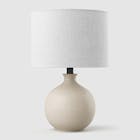
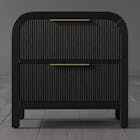
Saatva's furniture catalog matches the look of the bedrooms featured above with handcrafted, solid-wood construction rather than MDF veneer. The collection covers upholstered bed frames (linen, velvet, leather), four-poster & canopy beds, platform beds, storage beds with hydraulic lift, and matching nightstands, dressers, benches, and headboards.
All furniture ships via free White Glove delivery with in-room setup, removal of packaging, and assembly included. Current promotion: up to $625 off sitewide, plus the $225 off orders $1,000+ professional discount via ID.me (military, veterans, first responders, nurses, teachers).
Ownership terms: 45-day return on furniture, 1-year warranty on frames. Pairs naturally with the Saatva Classic mattress.
These rooms look collected because they are. Rough walls. Warm light. Something dried and dead in a bottle on the shelf. Here are 13 worth stealing from.
The Industrial Window That Makes Denim Walls Work
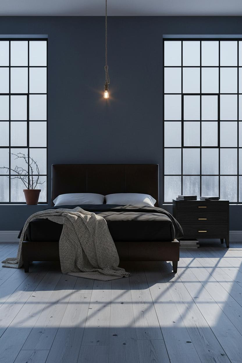

Cool-toned walls usually feel sterile. This one doesn't.
The reason it feels raw instead of cold is the Crittall-style steel-grid window cutting the room into shadow ladders. Metal framework that industrial does what no curtain panel could.
The smarter choice: Pair a faded denim matte plaster wall with a single amber pendant cord, not recessed lighting. Warmth from one source makes the cool walls earn it.
Exposed Brick Doesn't Need Help Looking Good
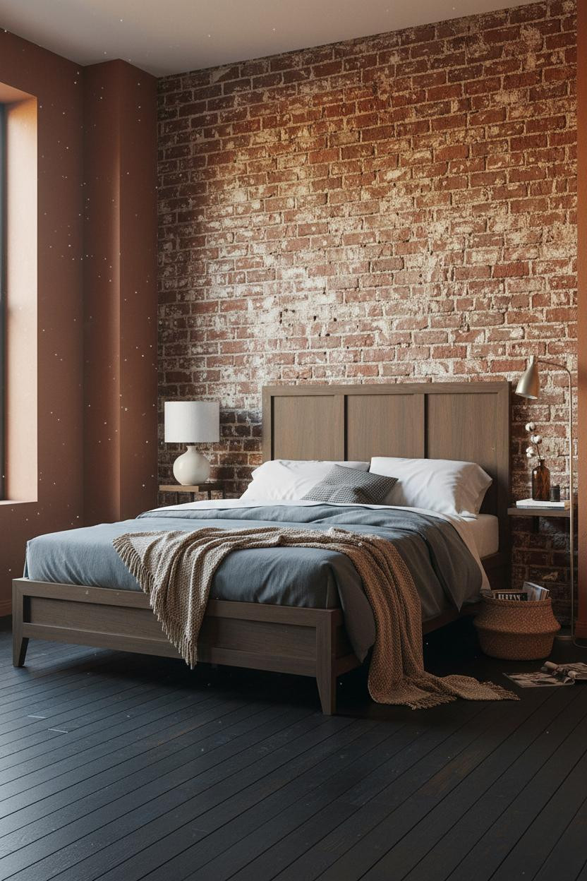

Honest, it's hard to mess this up. Exposed brick with old limewash still ghosting the surface is basically doing the work for you.
What makes it work: Those ghost streaks of old white limewash catch raking sidelight across every mortar joint, which means the wall reads graphic even in a photo taken at arm's length. No art required. Skip this: Don't hang anything in front of it. A statement headboard in front of brick competes rather than complements.
Shiplap Works When the Color Isn't White

White shiplap is a farmhouse thing. This isn't that.
Painted in matte olive-charcoal, the horizontal grooves catch north-window light in a way that makes the texture feel almost architectural. It stops the room from reading soft when the bedding already is.
Worth copying: Layer a burnt orange mohair throw over oatmeal cotton percale. The contrast keeps the dark wall from pulling everything into shadow.
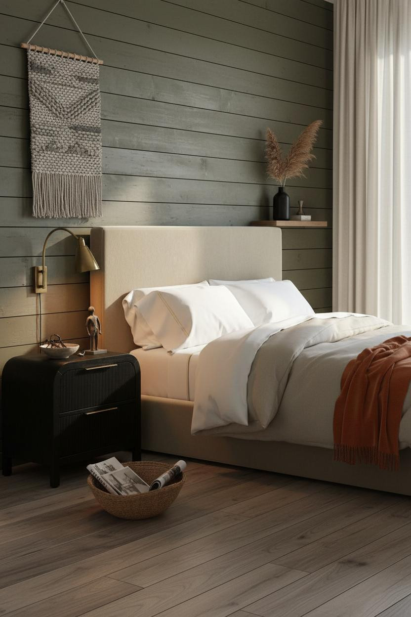
Vertical Slatted Panels Give a Room Something to Say
I keep coming back to this one. The vertical slatted wood panels in matte mushroom-grey cast thin shadow stripes down the wall, which means the texture changes as the light shifts through the day.
Design logic: Each slat edge catches sidelight individually, creating rhythm that flat paint or even wallpaper can't replicate.
The finishing layer: A hand-drawn charcoal sketch in a raw pine frame leaned (not hung) against the panel. Leaning art always reads more collected than anything centered and level.
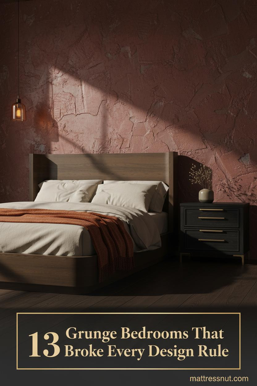
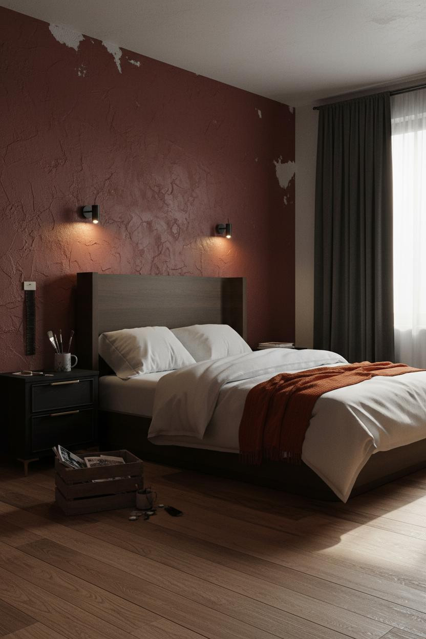
Raw Plaster in Terracotta Is a Commitment Worth Making
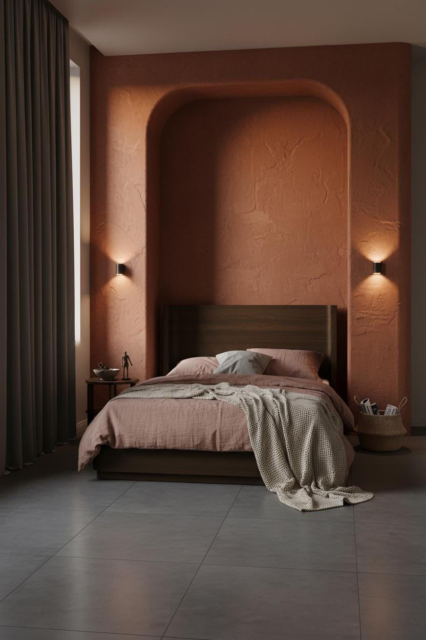


Fair warning. A curved plaster alcove in terracotta-rust is not a subtle move, and the room feels entirely different because of it.
The trowel marks in the plaster catch amber sconce light across every ridge, which makes the wall feel alive in a way that smooth paint never does.
Avoid this mistake: Don't go blush or dusty pink on the bedding. A dusty pink linen duvet works specifically because it's muted enough to let the wall carry the room.
Best for: Anyone who wants the room to feel intimate without adding a single piece of furniture to make it so.
The Arched Niche That Somehow Doesn't Feel Fussy
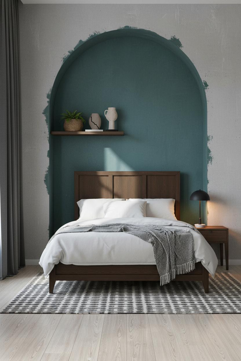
Arched niches usually look precious. This one stays grounded because the interior is painted matte deep teal with raw primer bleeding at the base, which keeps it from feeling finished.
Why it holds together: Cool morning light floods the arch interior while a warm bedside lamp pools onto the nightstand, and the contrast between those two light sources is what makes the teal read rich rather than heavy. The color choice actually helps you sleep, not just look good on camera.
Dark Herringbone Walls Ask You to Commit
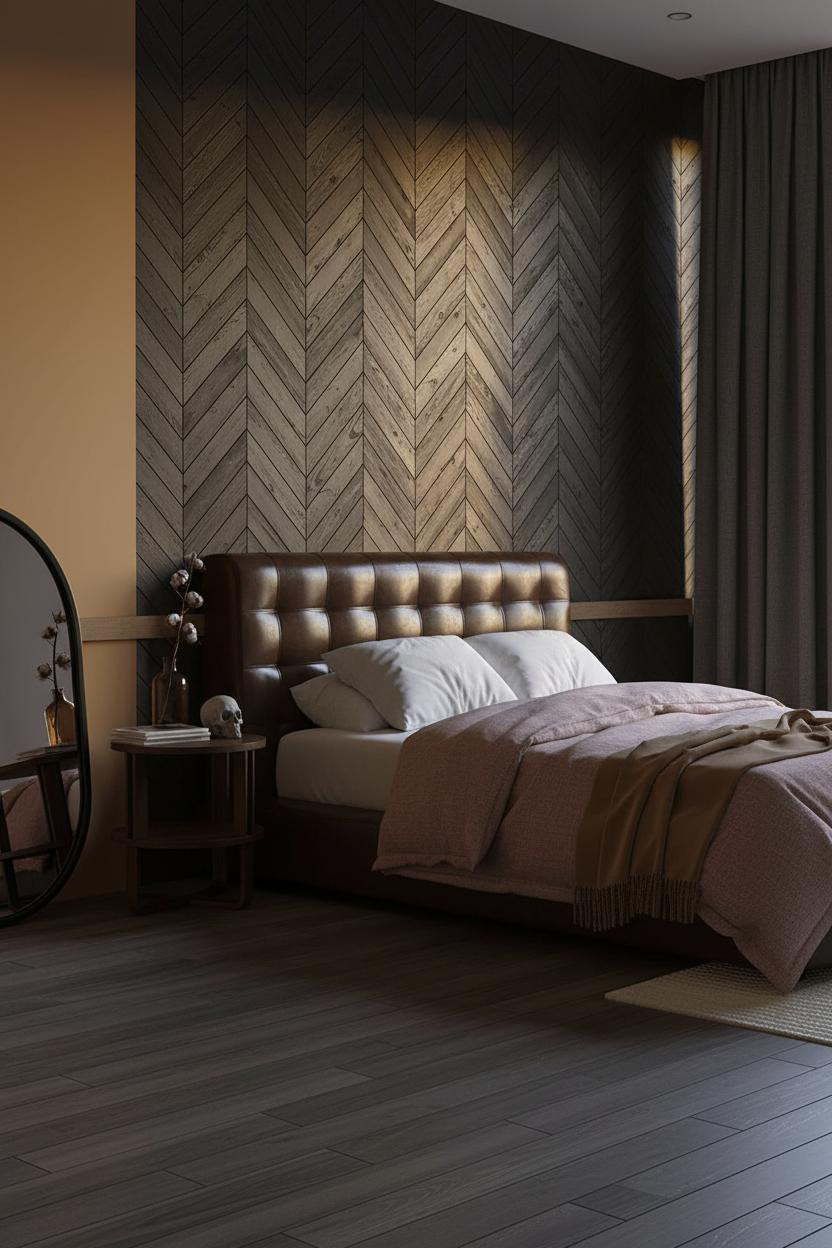

Divisive. But the people who go for it don't look back.
Hand-cut vertical herringbone planks in matte warm black with irregular spacing cast hairline shadows down nine feet of wall. The surface scoring means the grain is visible even under low light, which makes the pattern feel obsessive in the best possible way.
What not to do: Don't style the nightstand with anything shiny. Ceramic, dried stems, stacked zines. Nothing that reflects.
Charcoal Drywall Is the Underrated Grunge Wall Move
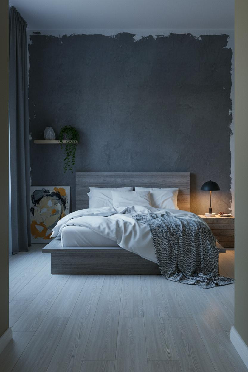

I think people overcomplicate this. Matte charcoal-painted drywall with visible roller texture and raw seams where the paint meets unpainted plaster patches is honestly one of the most honest surfaces a bedroom wall can have.
The real strength: Those raw seams catch sidelight in a way that makes imperfection the point. No faux finish, no limewash technique. Just paint that didn't try too hard, while still feeling intentional. Lean an oversized abstract canvas against it rather than hanging anything. The bed frame choice matters here too: clean lines, nothing ornate.
Burgundy Plaster and a Single Lamp Source
This room feels like it has a past. The deep burgundy-rust plaster applied with a palette knife leaves ridges and drag marks that make the wall look like it's been there longer than the building.
Where the mood comes from: Amber sconces washing across that uneven plaster surface means the shadow changes depth every few inches, which is a lighting effect you genuinely can't replicate with flat walls. The warm light temperature also matters more than most people realize.
Steal this move: Pin a strip of developed film negatives directly to the plaster. Nothing says lived-in like something that can't be bought from a retailer.
Concrete and Blue Light Together Are Surprisingly Warm
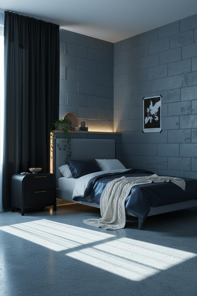

Nothing fancy. That's the whole point.
What changes the room: A concrete block wall painted slate blue-grey with visible roller texture and a backlit LED strip rimming the blocks from behind creates enough depth that the room feels almost three-dimensional. Just enough to keep things interesting, in a way that feels completely accidental.
Pro move: Tape a black-and-white poster directly to the wall at a slight angle. Don't frame it. Frames make this kind of room feel like a hotel lobby.
Dusty Plum Shiplap Is the Color I Didn't Expect to Love
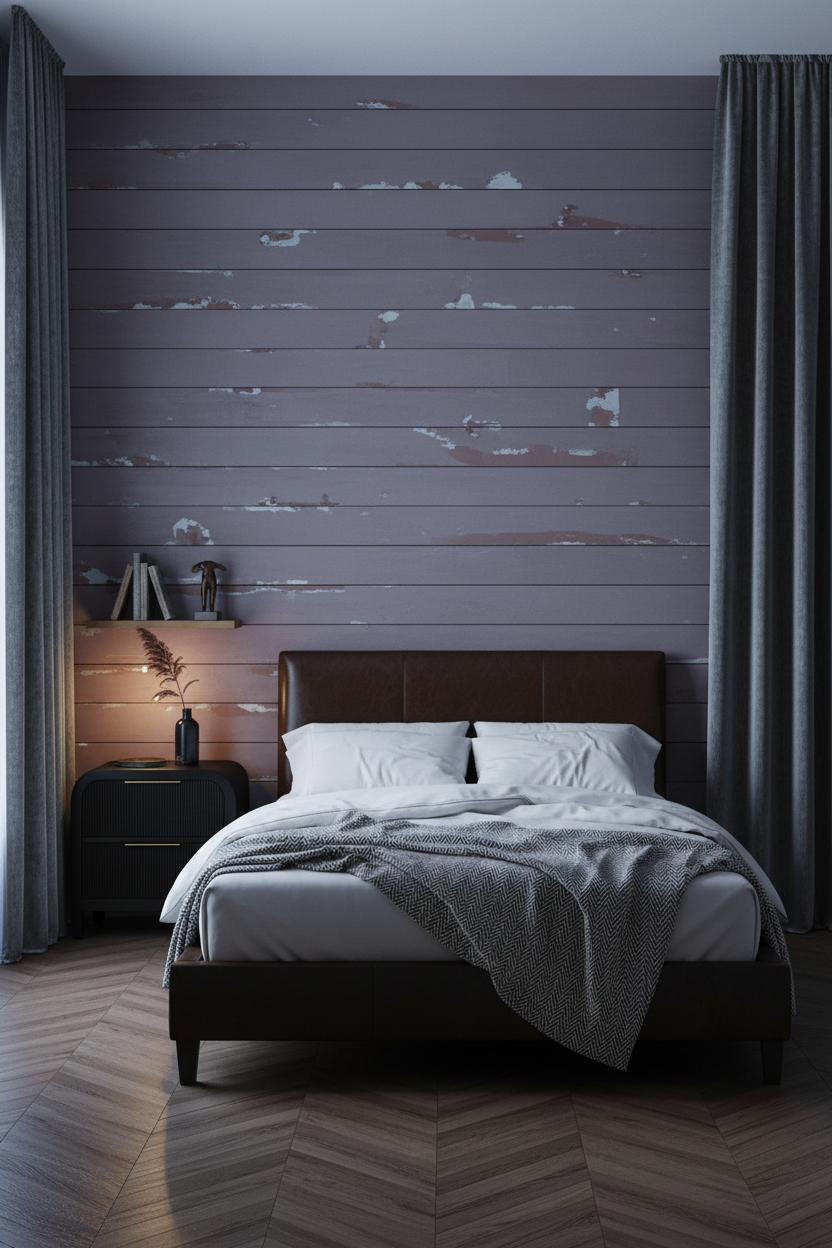
I almost dismissed this one. But dusty plum shiplap with irregular brush strokes and weathered seams revealing raw primer beneath is somehow one of the most grunge-appropriate wall choices I've seen.
Why the palette works: The plum reads warm under morning blue-grey light, and amber from a corner floor lamp makes it pull closer to rust. Two entirely different rooms depending on the hour.
The easy win: Dark herringbone parquet flooring underneath. The angular floor pattern against horizontal planks keeps the room from feeling like it's all going in one direction.
Forest Green Board-and-Batten Against Black Walls
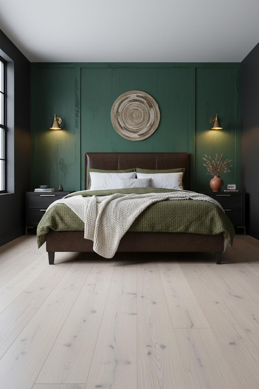
Deep forest green board-and-batten with brush marks still visible at the seams against warm black matte flanking walls. It shouldn't feel this balanced. But it does.
What gives it presence: The wood grain presses faintly through matte paint, which makes the panel feel like material rather than just color. An oversized woven wall hanging above the bed keeps the eye from reading the wall as a monolith. What cheapens the look: Matching everything to the green. A terracotta vase with dried grass on the nightstand pulls the palette somewhere less expected, and that contrast is what makes the room feel collected rather than coordinated.
When Exposed Brick Gets the Industrial Treatment It Deserves
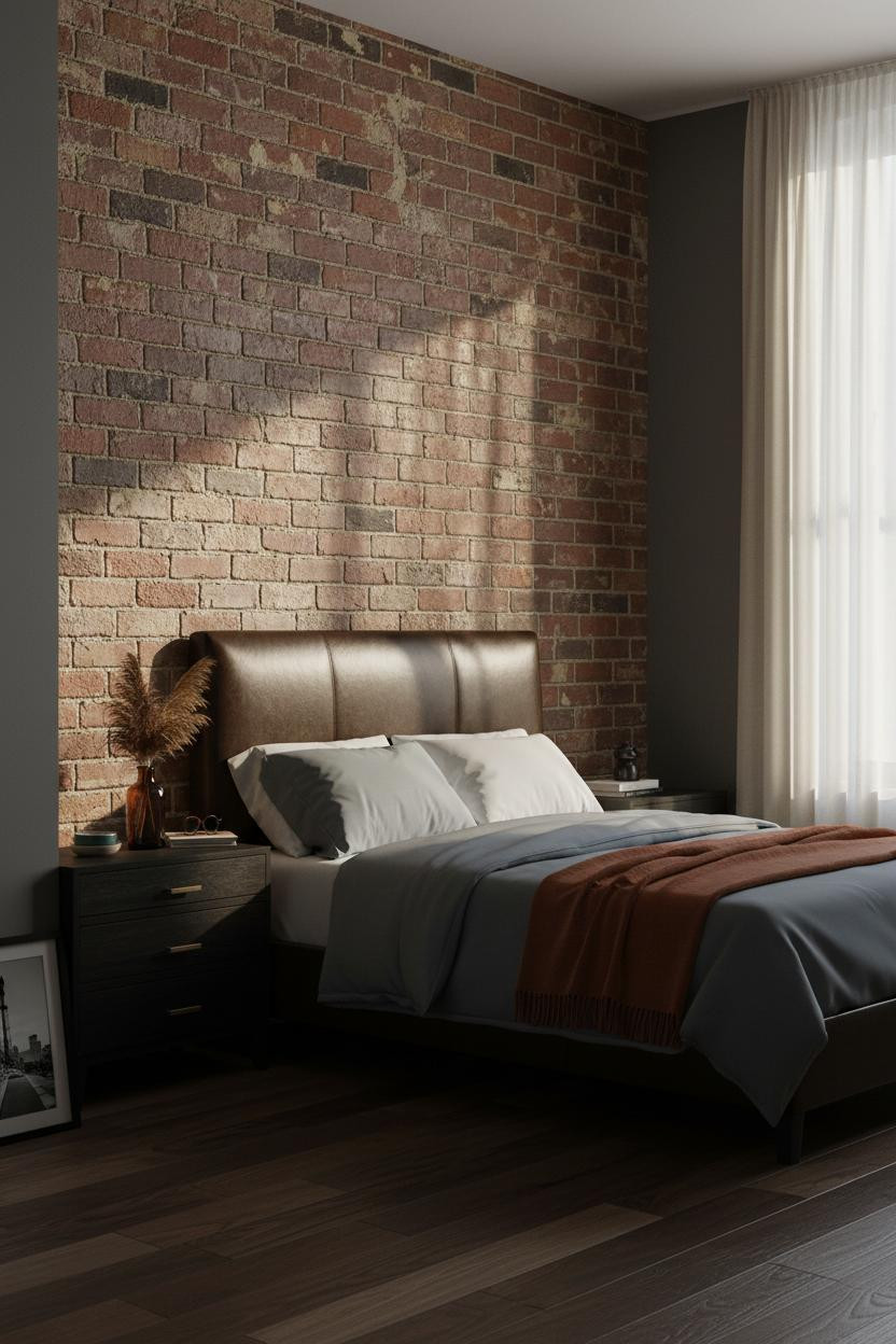
Twelve feet of weathered brick with rust-ochre patina interrupted by dark grout channels and raking afternoon light. This is the version that actually earns the word industrial.
The part to get right: Stacked vinyl records beside the nightstand instead of books (the spines add typography without requiring a shelf), and dried pampas in an amber glass bottle on top. Nothing staged. Just things that belong to someone.

Our #1 Pick
Saatva Classic Mattress
America's best-selling online luxury innerspring. 365-night trial, lifetime warranty, free white glove delivery.
Shop Saatva Classic
The Foundation Of Every Beautiful Bedroom
All of these rooms have something in common: the bed is the one thing you're not supposed to notice. It just has to feel right the moment you're in it.
The Saatva Classic holds up to that. Dual-coil support means your partner can move without the whole mattress registering it. The organic cotton cover breathes through whatever the season does, and the Euro pillow top is soft without losing the structure underneath. It's the kind of mattress that ages well because it's made well.
Walls get repainted. The mattress stays.

The rooms people save are the ones where nothing looks accidental. But the ones people actually want to sleep in? Those start with what's underneath the duvet.