The first thing you notice in the best older teen boy bedroom ideas isn't the furniture. It's the feeling that someone with actual taste made real decisions in this room.
Not a kid's room with a poster slapped on the wall. Not a generic grey box. These are spaces that feel earned.
Navy Brick That Actually Looks Better With Age
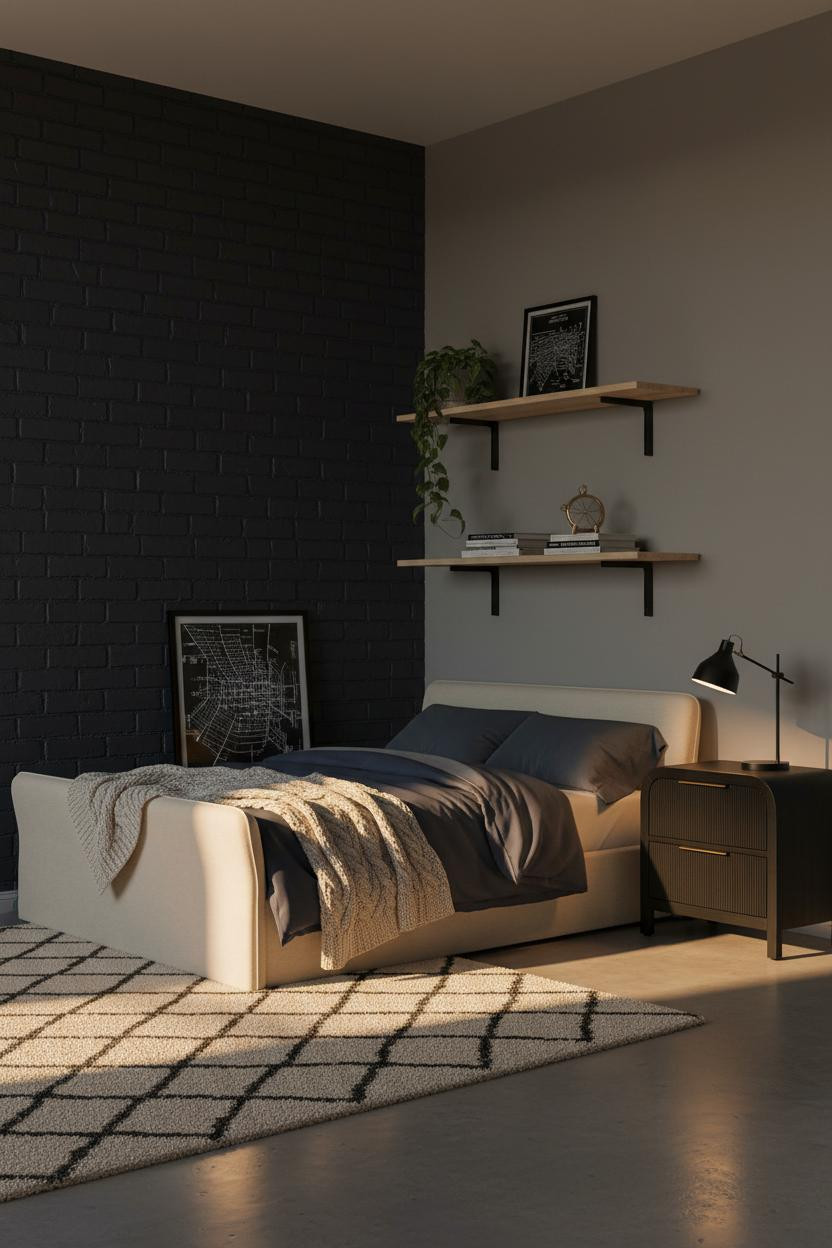

I keep coming back to this one. The combination of raw material and bold color is harder to pull off than it looks, and this room nails it.
Why it holds together: Painting exposed brick matte navy keeps the texture but gives it a modern edge, which stops it from reading like a basement or a bar.
Steal this move: Layer a cable-knit cream throw over a dark duvet. The contrast grounds the whole scheme without softening it too much.
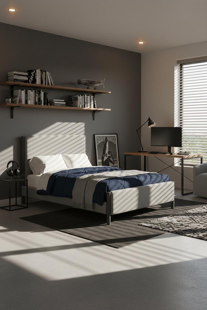
The Study Wall That Earns Its Floor Space
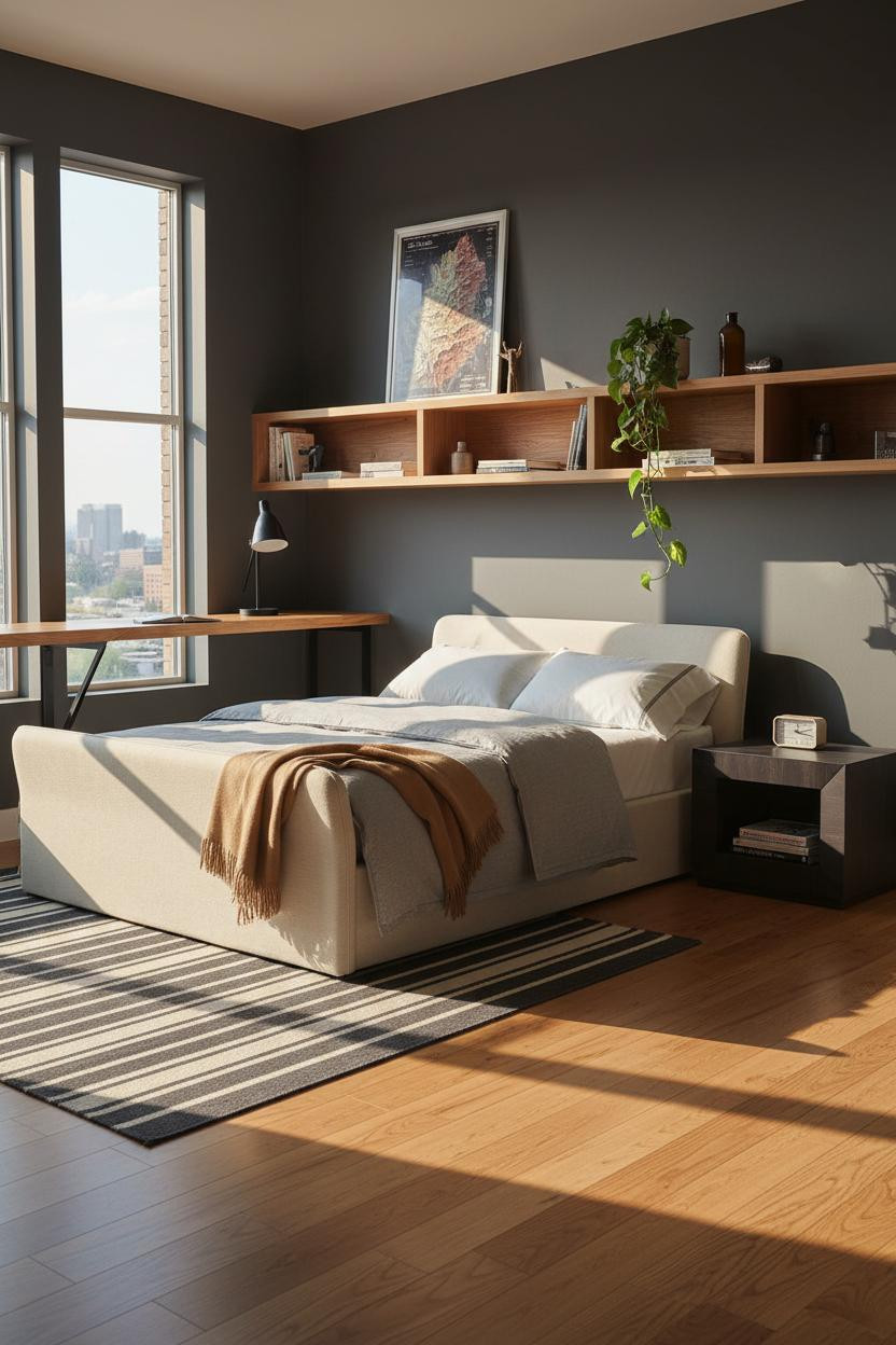

Having a real desk zone changes how a teen actually uses the room. This isn't a corner table with a lamp. It's a whole wall.
What makes it work: A full-span floating maple desk on matte black brackets reads as built-in without the cost of custom millwork, and the horizontal line it creates gives charcoal walls a strong anchor.
Go deep on the shelf, at least 14 inches. The smarter choice over a standard desk every time.
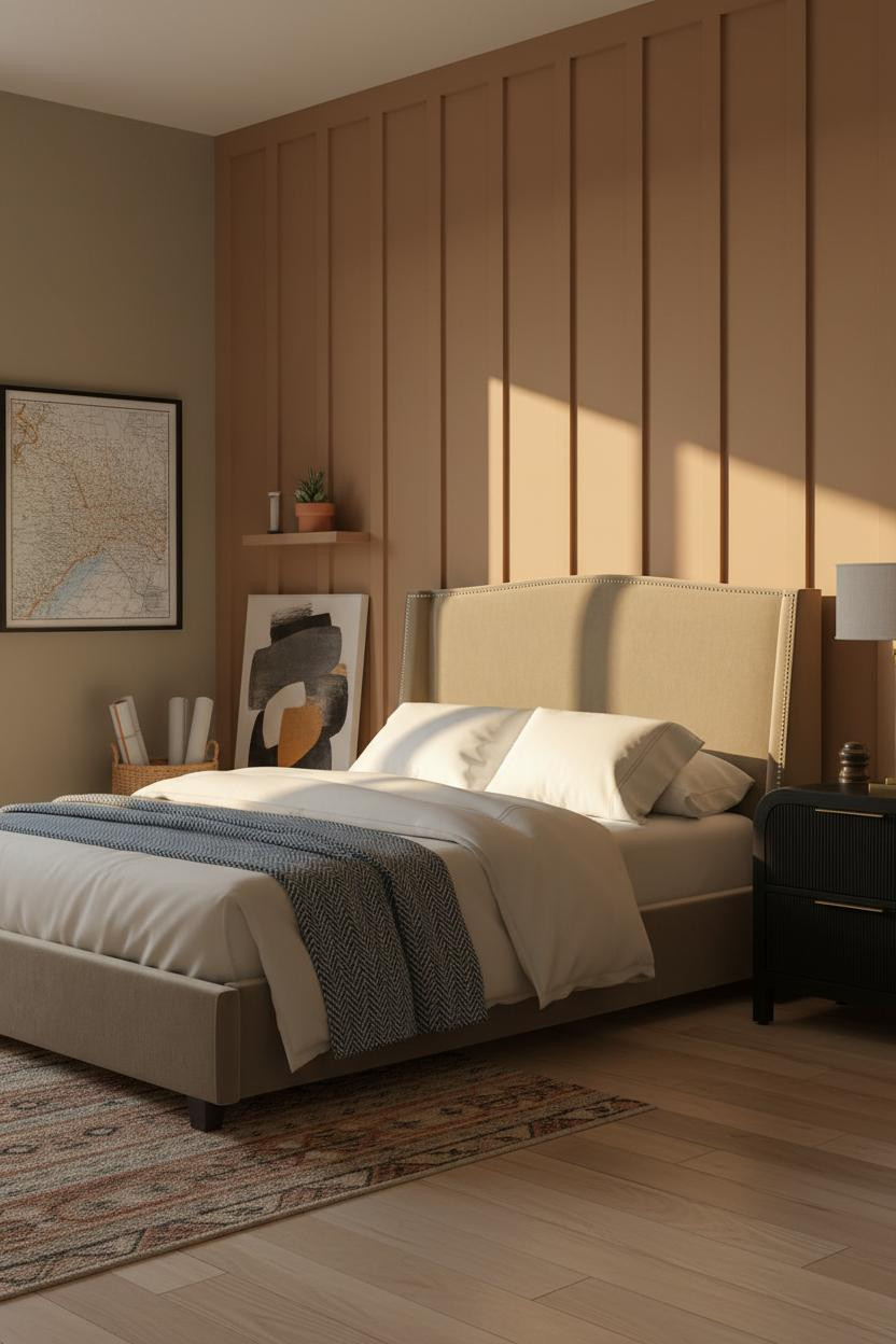
Rust Plaster That Commits Completely
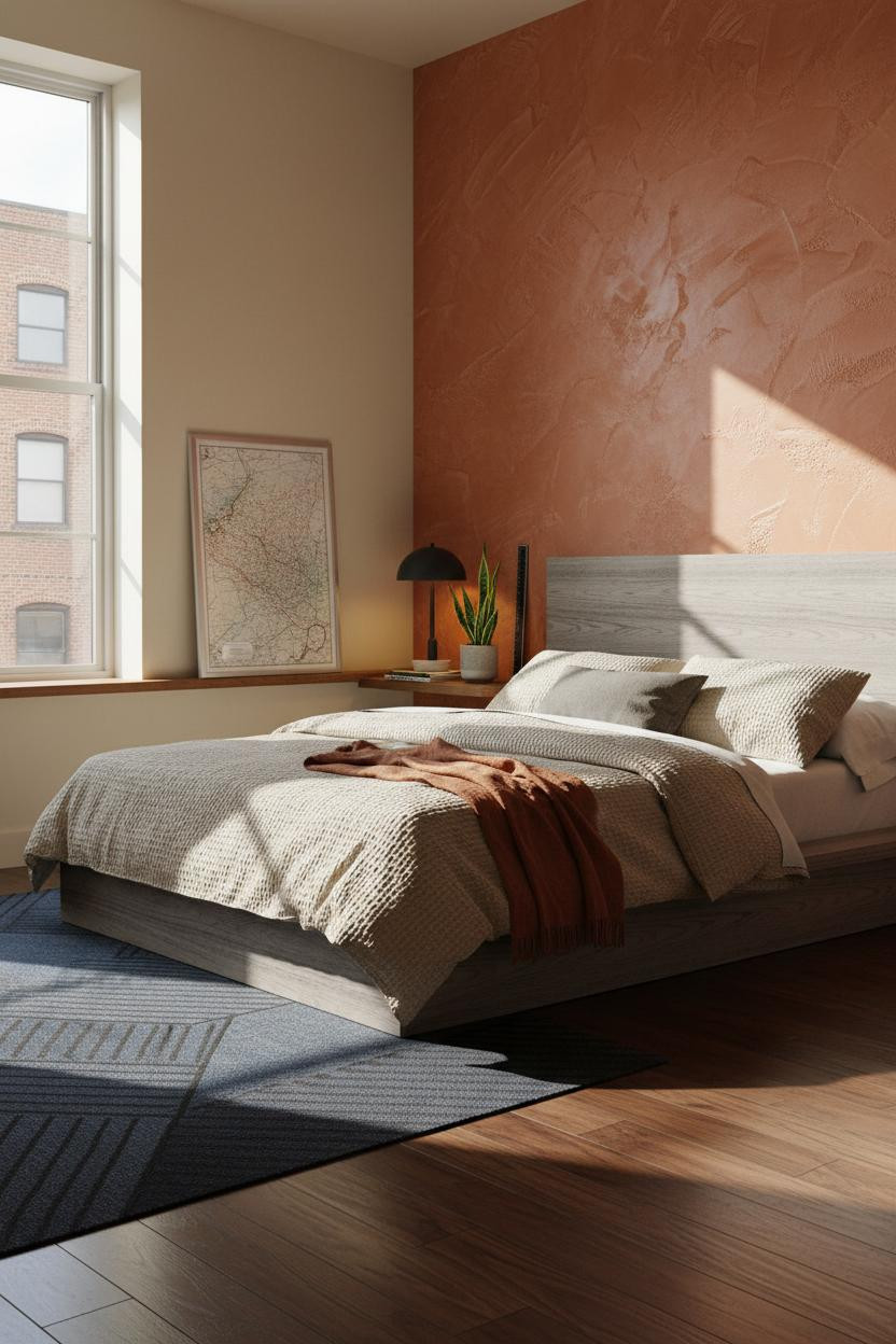

Bold choice. Not for everyone. But the rooms that commit to this never look dated the way trendy rooms do.
Honestly, what makes it land is the surface itself. Hand-troweled rust plaster with visible directional strokes catches raking light in a way flat paint physically cannot, so the wall changes throughout the day.
Avoid this mistake: Don't pair it with cool-toned bedding. Warm cream and oatmeal waffle-weave are what keep the scheme from feeling harsh.
Blue-Grey Shiplap That Feels Calm, Not Cold
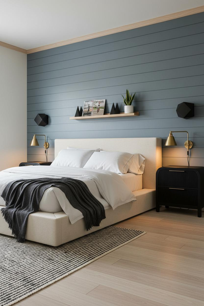

This is the kind of room that feels focused without being sterile. The muted blue-grey shiplap keeps things interesting while the warm cream walls stop it from going clinical.
Why it feels balanced: Tight shadow lines between shiplap boards give the wall graphic rhythm, which means you don't need much else on that side of the room.
Pro move: Flanking sconces instead of a bedside lamp frees up nightstand surface and makes the whole wall look intentional. Pairing a clean platform frame completes the look.
The Ochre Desk Wall I'd Actually Use
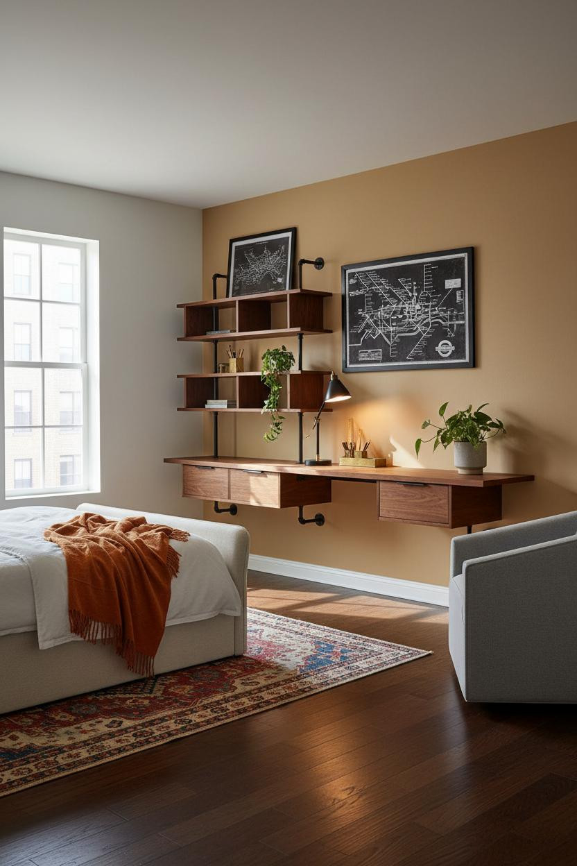

I almost scrolled past this. Glad I didn't.
The warm ochre accent wall behind the desk shelf makes the walnut grain glow in a way a white wall simply won't. It's a small move that changes the whole energy of the study zone.
What to borrow: A kilim runner under the bed zone ties the warm tones together while still letting the dark floor read as a full, grounded surface.
Ash Slat Wall That Looks Custom From Every Angle
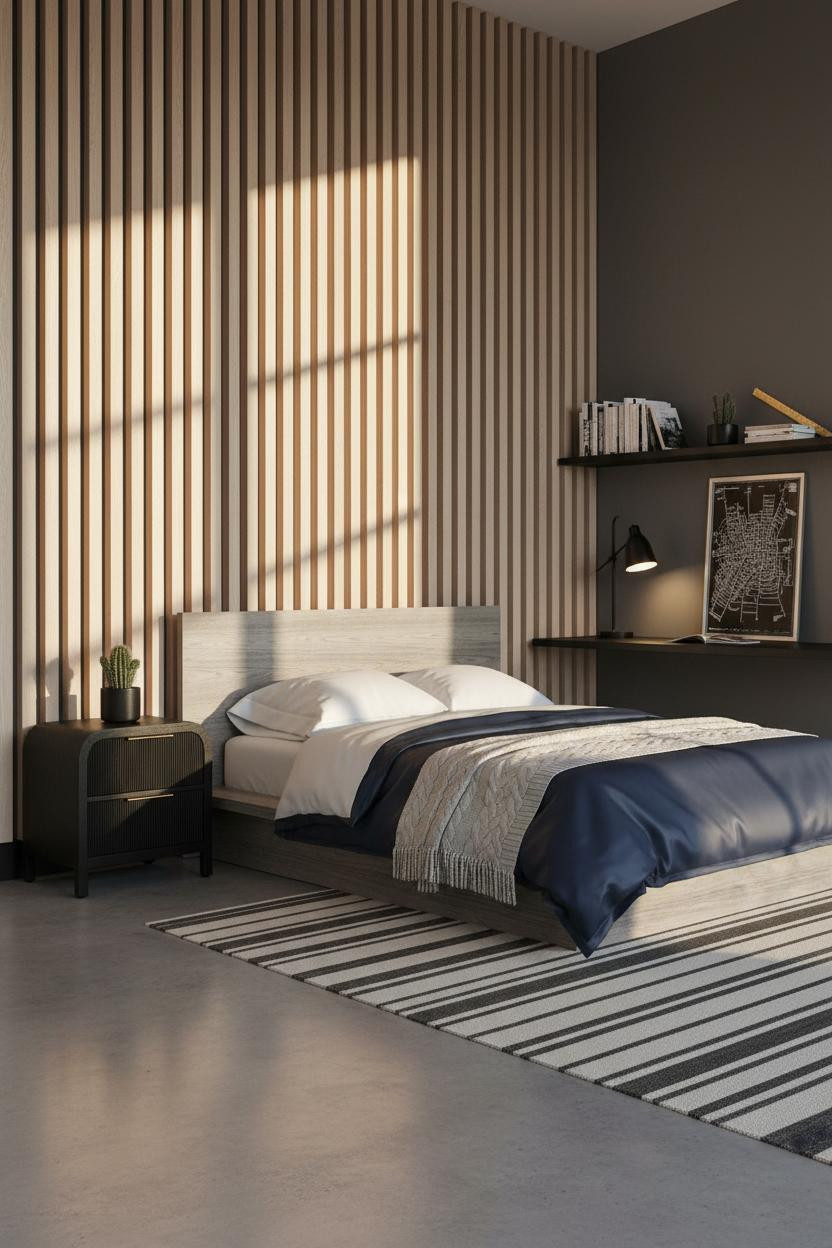
This one is genuinely a loft idea in a residential body. The room feels collected rather than decorated, which is harder to do than it sounds at this age.
Why it looks custom: Full-height vertical ash slat boards spaced with shadow gaps create the same graphic rhythm as expensive paneling, but the warmth of the natural grain keeps it from going cold.
The easy win: Graphite walls on the remaining three sides make the pale ash pop. Don't fight it with a warm grey. Go dark or go home.
MCM Shelving That Actually Solves Storage
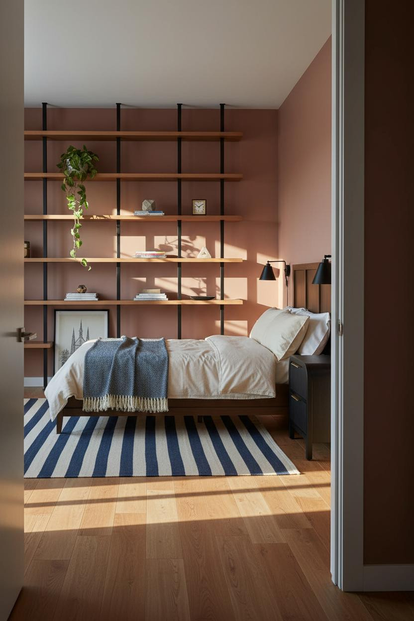

Nothing fancy here. That's exactly the point.
The reason this room works instead of looking like a furniture showroom is the contrast. Matte black steel channels cut precise vertical lines across warm maple boards, which means the shelf wall reads as architecture rather than storage.
Where to start: A low platform frame keeps the eye moving toward the shelf wall and lets the storage do the visual work. Don't compete with it.
Japandi Clay Wall That Reads Older Than It Is

I'd honestly put this in a guest room without changing a single thing. The proportions feel considered in a way most preteen bedrooms never get to.
What gives it presence: Vertical battens on a warm clay board-and-batten wall cast crisp morning shadows that shift throughout the day, so the wall has movement without needing art.
Try this: Lean an oversized canvas against the battens instead of hanging it flush. The slight tilt makes the whole setup feel lived-in and intentional.
Coastal Slat Wall That Works Year-Round
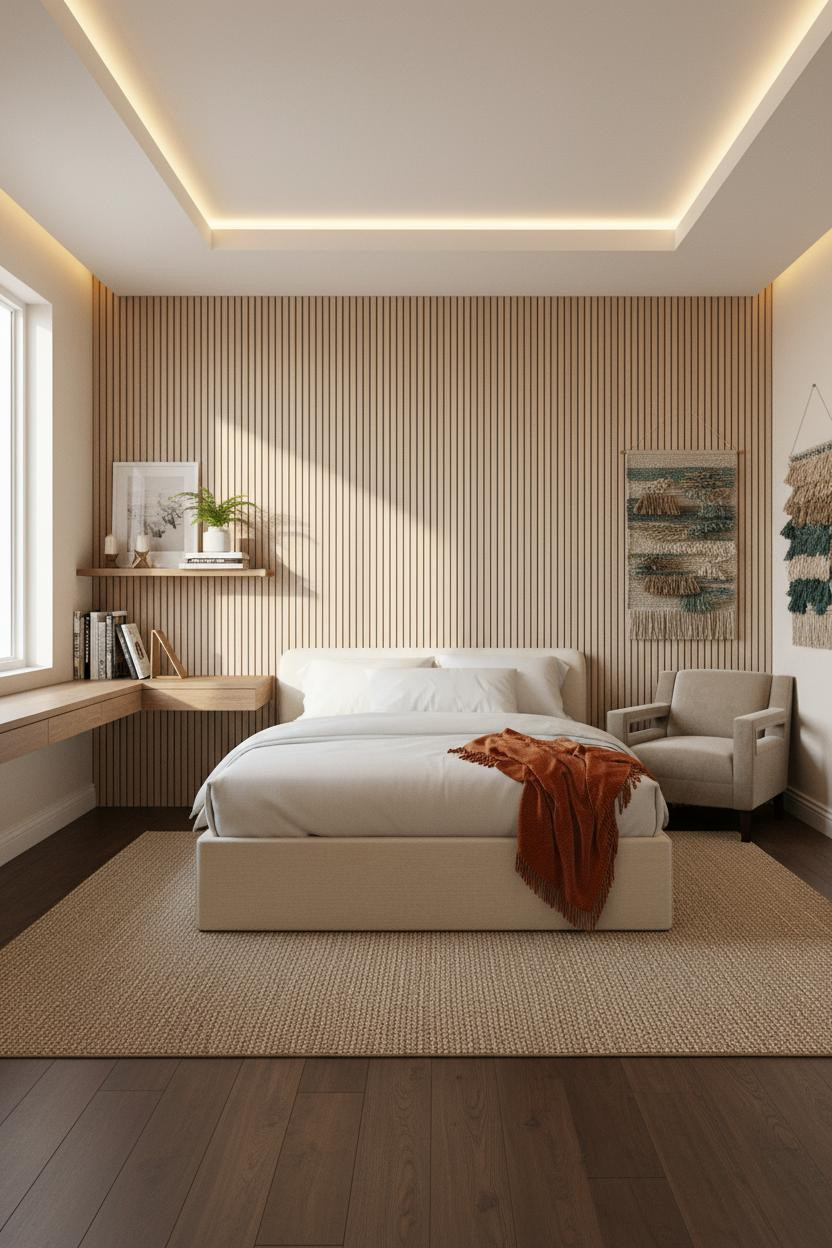
Fair warning. Coastal can tip into beach-shop territory fast. This one avoids it because the material is doing the work, not the accessories.
What carries the look: Vertical slatted ash panels on the study wall give you texture and warmth in a way that doesn't rely on shells or rope. The ivory walls keep it from going nautical.
Add a burnt orange mohair throw at the footboard. One warm shot of color is all the contrast it needs. Getting the right mattress for this frame matters too.
Scandi Study Wall Built Around Actual Focus
This room feels sharp and focused without trying to look cool. That's the whole Scandi trick, and it's surprisingly hard to get right in a teen space.
Design logic: A floor-to-ceiling built-in of pale birch boards in a matte black metal frame creates clean horizontal rhythm across the study wall, while warm taupe paint keeps the cool tones from reading sterile.
What not to do: Don't let every shelf cubby stay tidy. One slightly overfilled section makes the whole unit feel used rather than staged.
Slate Blue Walls That Make Homework Feel Less Like Homework
It shouldn't work. A moody wall color in a study space sounds like a recipe for distraction. But slate blue matte walls somehow make the room feel more focused, not less. The color has just enough depth to block visual noise.
The easy win: A floating ash wood desk shelf at eye level gives the room a dedicated work zone that actually feels separate from the sleep zone, even in a small space. Choosing the right twin for this layout keeps both zones working.
Sage Green Board-and-Batten That Ages Well
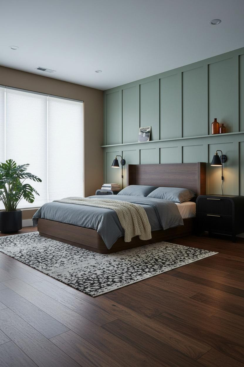

This is the version I'd choose for a teen who wants something that still looks good in ten years. No gimmicks. Just solid decisions.
Why the palette works: Warm sage green board-and-batten against mushroom-toned walls reads calm without being boring, and dark walnut flooring gives the whole room weight so it doesn't float away into soft-green territory.
Worth copying: A large potted monstera in a matte black planter anchors the far corner in a way a piece of furniture can't. It adds scale while still feeling natural.
Forest Green Shiplap With Real Staying Power
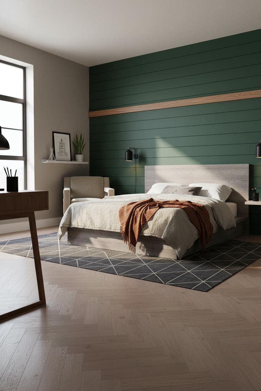
Dark accent walls in a teen room get painted over all the time. This one won't be. The forest green horizontal shiplap behind the bed has enough personality to stay interesting as taste shifts, while the tight shadow lines keep it looking sharp rather than heavy.
The finishing layer: A rust linen throw draped unevenly off the footboard is the right contrast here. It keeps the scheme warm without fighting the green. And bleached oak herringbone parquet does the same for the floor.
Industrial Minimal That Actually Works for Gaming
Most gaming setups make a room look worse. This one doesn't, because the floating walnut shelving on matte black brackets gives the tech gear a real home rather than a pile on the desk.
What keeps it from looking messy: Charcoal grey walls absorb visual clutter in a way light walls never will. And a well-chosen bed frame on polished concrete reads as deliberate, not spare. The practical move: Lean a poster instead of hanging it. One tilted print signals personality. Four hung prints signal dorm room.

Our #1 Pick
Saatva Classic Mattress
America's best-selling online luxury innerspring. 365-night trial, lifetime warranty, free white glove delivery.
Shop Saatva Classic
The Foundation Of Every Beautiful Bedroom
Walls get repainted. Rugs get swapped. The mattress stays. So it's worth getting that part right, especially in a teen room that's going to see a lot of late nights and early mornings.
The Saatva Classic is what I'd put under every single one of these setups. Dual-coil support that holds up under real use, a breathable organic cotton cover that doesn't trap heat, and a Euro pillow top that stays comfortable long after a cheaper option would've given out.

The rooms that actually get saved are the ones where every decision made sense, including the one you can't see. Start with the bed. The rest figures itself out.