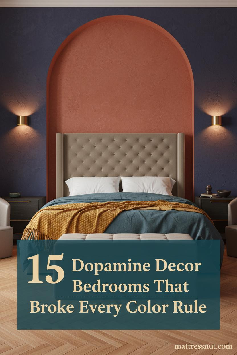
The first thing you notice in the best dopamine decor bedroom ideas isn't the color. It's the feeling. Like the room is actually happy to see you.
These 15+ rooms are loud on purpose. And somehow, none of them feel like too much.
Fuchsia Plaster That Commands the Room
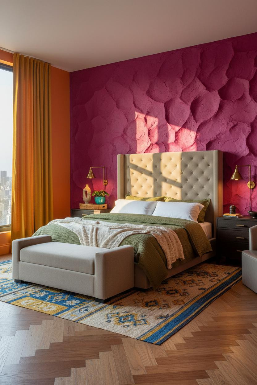


This one stops you mid-scroll. The hand-troweled fuchsia plaster isn't a paint color you commit to lightly, but it's the reason the room works.
Why it holds together: The thick ridge texture catches raking light and turns the wall into something that feels sculpted, not just painted. The tangerine flanking walls keep the energy going rather than letting it drop off.
Steal this move: Layer a vintage kilim with cobalt and mustard tones underneath. It grounds the whole chromatic riot without softening it too much.
A Mustard Wall That Actually Earns Its Keep
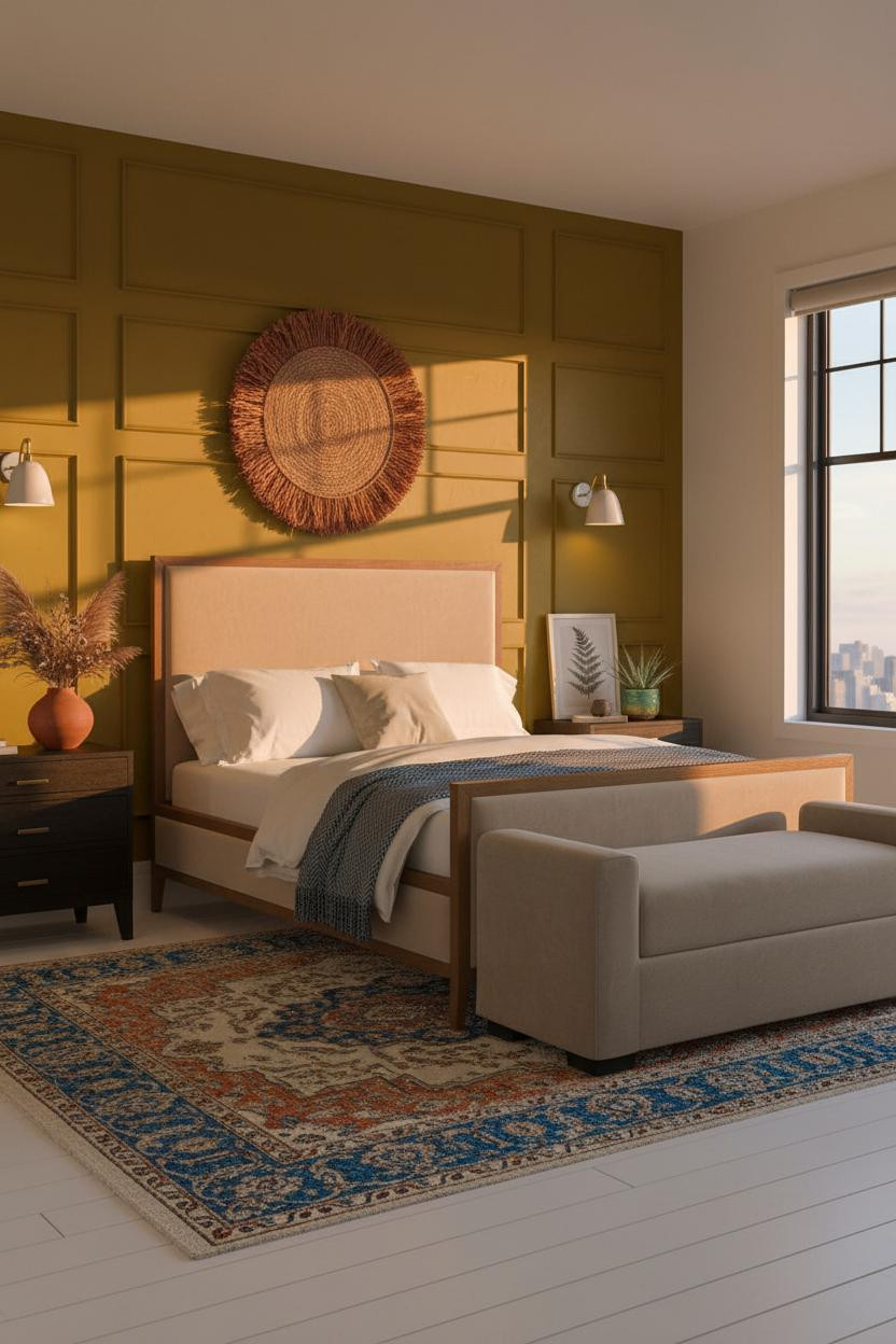

Board-and-batten gets a reputation for being safe. This version is not.
The deep mustard board-and-batten works because the vertical battens cast their own thin shadow lines, so raking sunset light turns the whole wall into a graphic rhythm you'd pay a muralist for. It's architectural without requiring a contractor.
The finishing layer: A woven jute wall hanging in rust and natural tones above the bench ties the warm palette together, in a way that feels collected rather than matchy.
When the Mural Is the Point
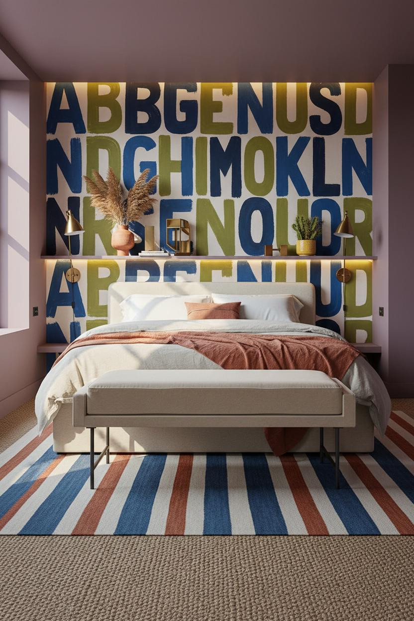


I keep coming back to this one. Not everyone will.
But the typographic brushstroke mural in chartreuse, deep navy, and cobalt stacks visual noise in a way that somehow reads as intentional rather than chaotic. The plum-violet flanking walls absorb the energy instead of competing with it.
What to borrow: Oatmeal bedding with a single rust linen throw. When the walls are doing this much work, the bed needs to stay quiet.
Avoid this mistake: Don't try to match the mural's colors in your textiles. Pick one, use it sparingly.
Violet Planks and a Grid of Black Steel
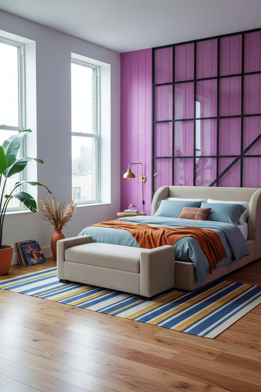

The Crittall-style window wall does half the work here. The violet-purple painted planks do the other half.
Why it feels intentional: Black steel grid geometry against saturated violet is a contrast that should feel heavy, but the honey wood floor keeps things warm enough to balance it out.
Pro move: A burnt orange mohair throw on slate blue bedding is the color pairing that makes this kind of bold wall feel livable. Warm against cool. Simple logic, big result.
Lime Green With Nothing to Apologize For
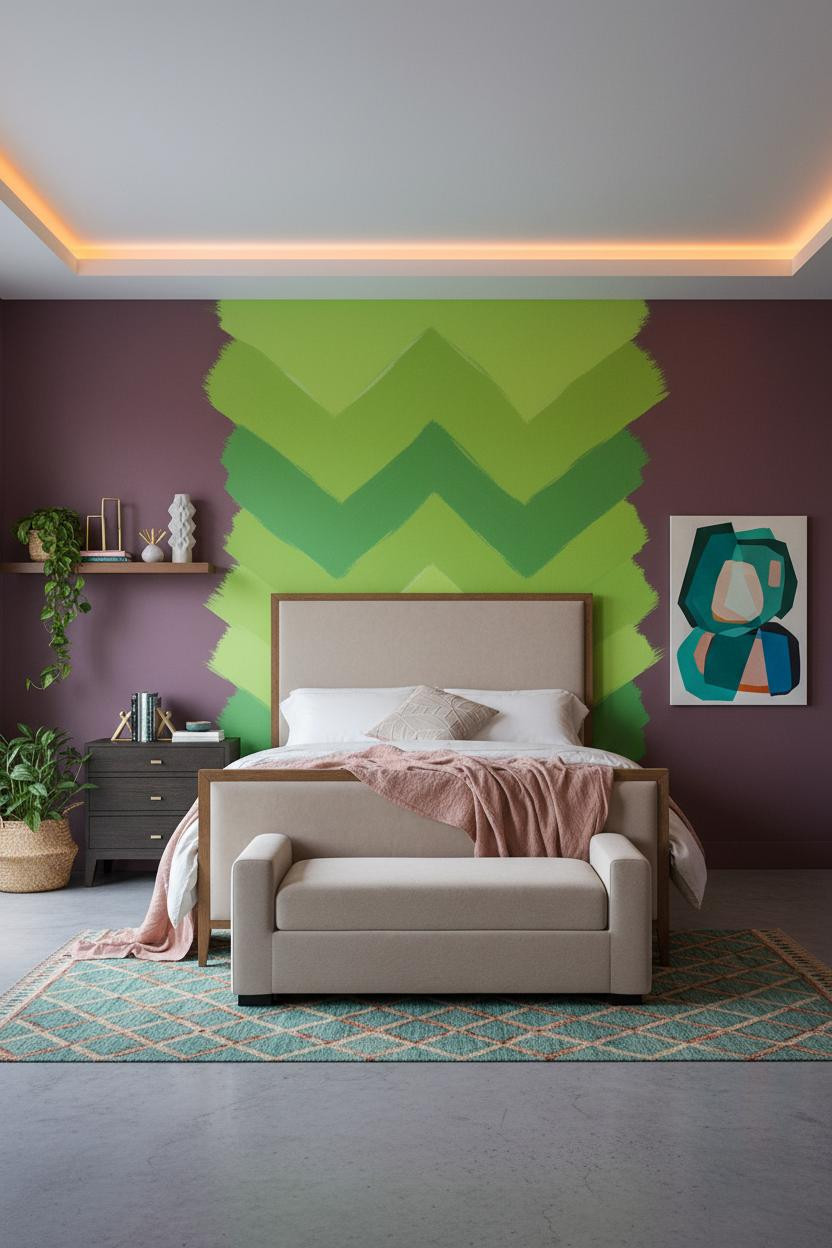
Honestly, I thought the lime green would be too much against warm plum. I was wrong.
What makes it work: The color-block chevron geometry in matte finish catches midday light across its full height, while the warm plum flanking walls actually pull the lime cooler, making both colors look sharper than they would solo.
Lean an oversized abstract canvas against the wall instead of hanging it. The casual lean keeps the energy playful, which is exactly what this palette needs.
The Burnt Sienna Alcove Nobody Expects
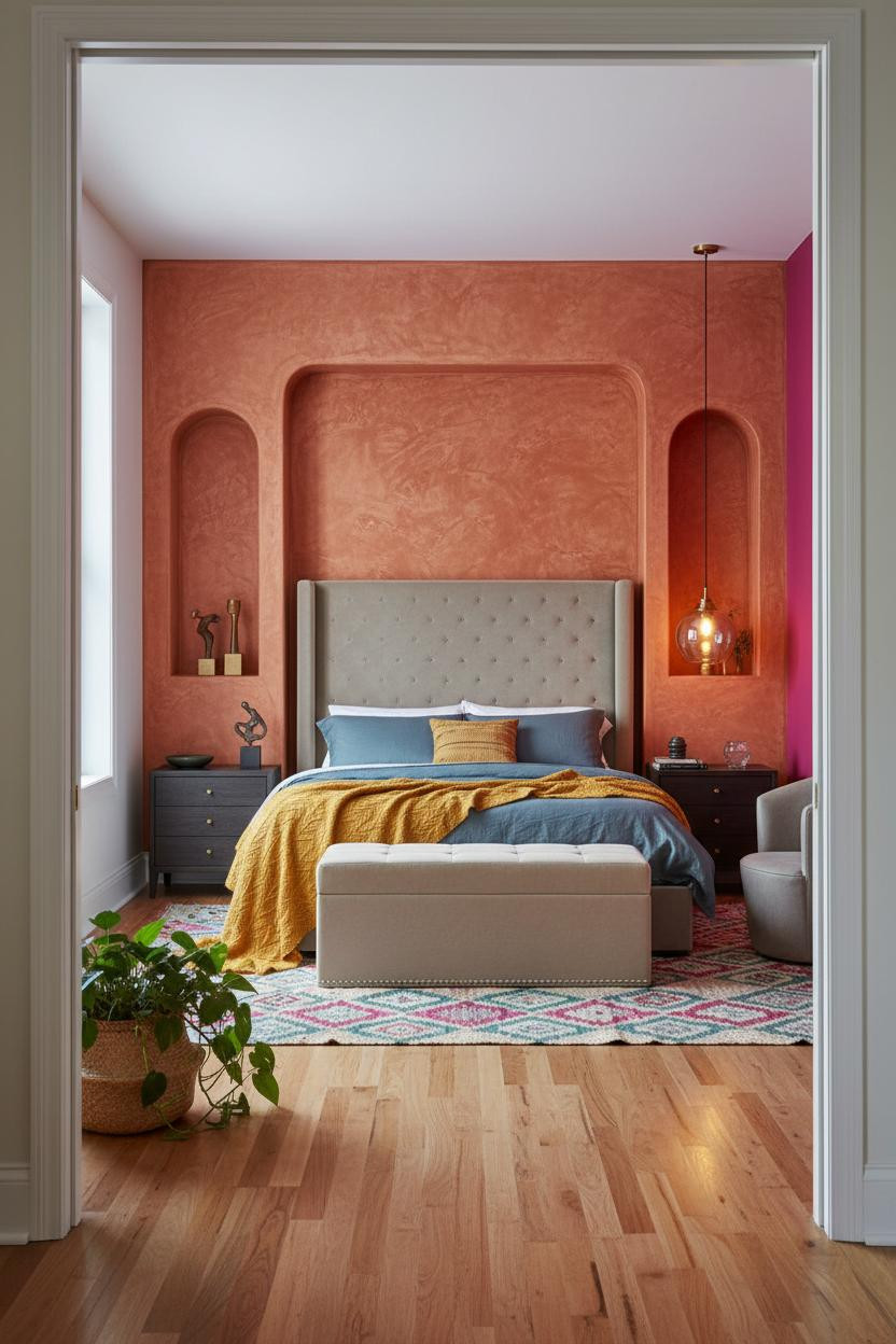

A curved plaster alcove in hand-troweled burnt sienna turns the headboard wall into a jewel box. The room feels warm without being heavy.
What gives it presence: Curved plaster walls catch raking light differently than flat ones. Every ridge and hollow shifts as the day moves, so the color looks different at noon and at dusk. That's the whole trick.
The smarter choice: Pair slate blue linen bedding with a mustard chunky wool throw rather than matching the sienna tones directly. Contrast holds the look together while still feeling cohesive.
Tangerine, Chartreuse, and Deep Plum Walk Into a Mural
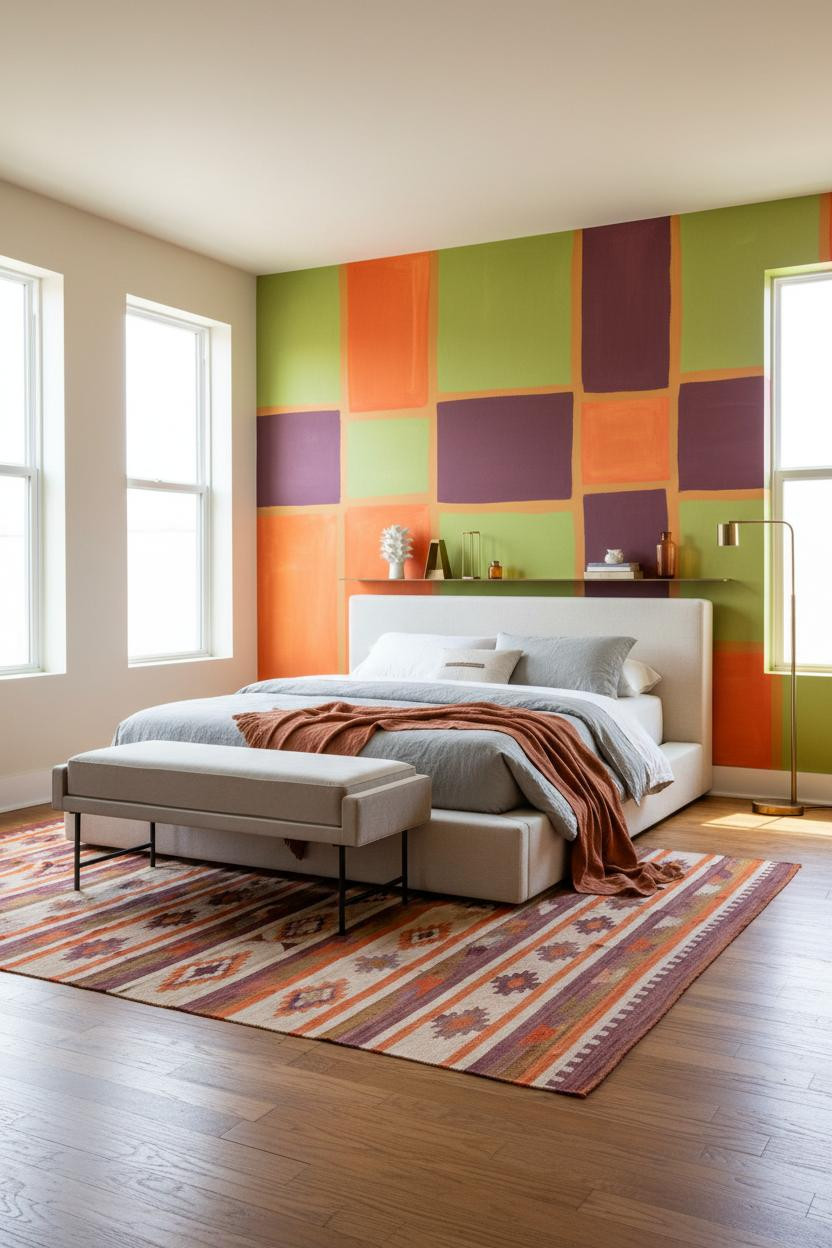

Divisive. And I mean that as a compliment.
The flat color-block geometric mural in tangerine, chartreuse, and deep plum pulls off something unusual: the shapes read as graphic pattern at a distance and as bold color fields up close. Two rooms in one, depending on where you're standing. Check out more colorful maximalist bedroom ideas for bold decor if this energy is your thing.
Worth copying: Stone-washed grey bedding keeps the bed from competing with the mural. The rust linen throw is enough of a color nod without repeating the entire palette.
Coral Shiplap That Skips the Coastal Clichés
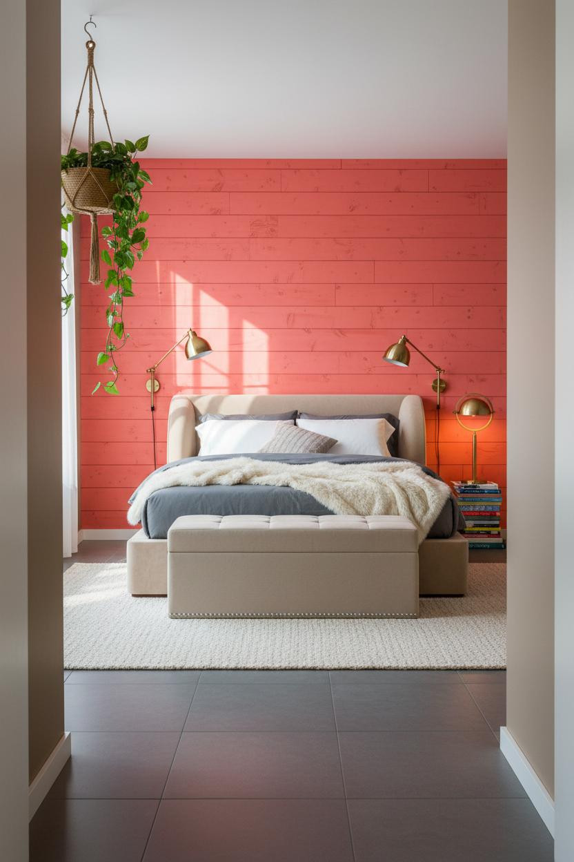
Shiplap painted vibrant coral-pink, floor to ceiling. Nothing beach house about it.
The reason it feels energetic instead of dated is the uneven hand-applied matte brushwork. Side-rake morning light makes the organic texture visible, so the wall reads as a material, not just a paint choice. Warm mushroom on the flanking walls keeps the coral from feeling isolated.
The easy win: A cream faux fur throw on slate jersey bedding pulls softness into a room that's otherwise working pretty hard chromatically.
An Arch That Changes What a Bedroom Can Feel Like
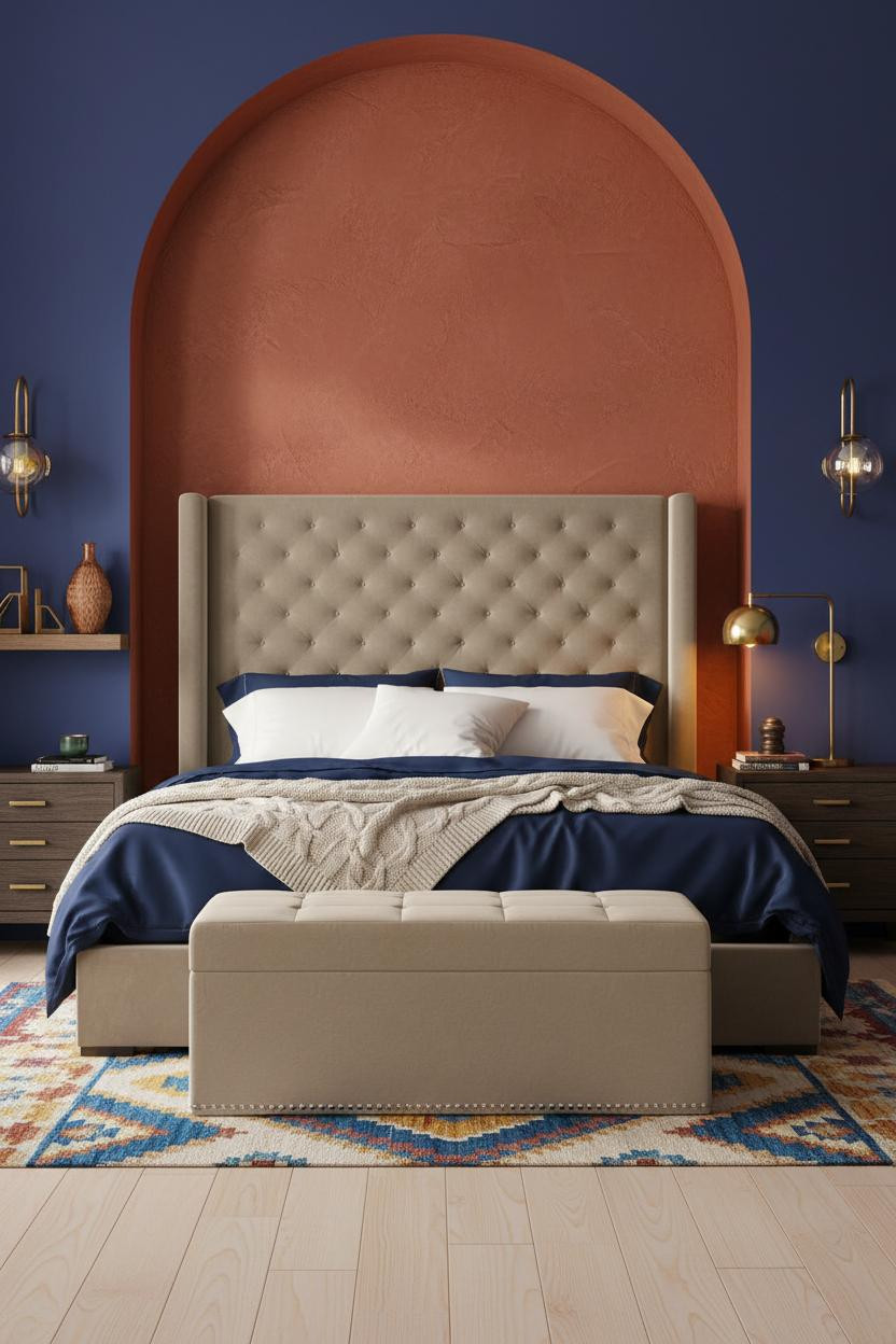
The arch isn't decorative. It's structural to the whole emotional logic of the room.
What carries the look: A rough-troweled burnt sienna plaster arch frames the bed like a portal, and with indigo walls on either side, the warm-against-cool contrast makes both colors more saturated than they'd be alone. For tips on getting the balance right, the bedroom lighting guide for ambiance covers how warm brass sconces interact with deep wall colors like this.
If you change one thing: Skip a headboard. Let the arch do the framing. The bed reads as intentionally placed rather than just parked against a wall.
Emerald Green That Earns the Drama
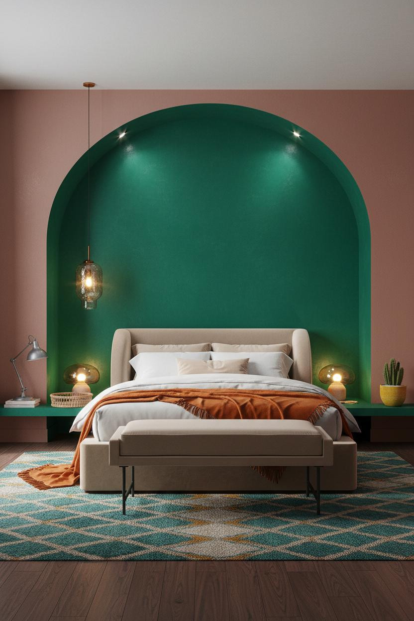
I think emerald gets underused in bedrooms because people are scared of it. This room makes the case for committing fully.
The real strength: The curved plaster edges of the vibrant emerald arch diffuse window light into a soft halo, so the color glows rather than just sitting flat. Dusty rose flanking walls are the unexpected pairing that makes it feel warm rather than cool.
One smart swap: A burnt orange mohair throw over oatmeal cotton bedding. Just enough warmth to keep the emerald from going cold at night.
Saffron Yellow That Wakes Up the Whole Room
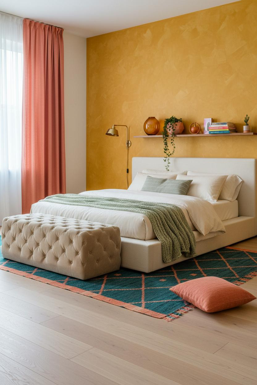

Nothing fancy. Saffron yellow, organic mottled texture, soft cream beside it. That's the whole idea.
And it works because the hand-applied matte surface catches midday light unevenly, giving the wall a depth that flat yellow never achieves. The deep teal Moroccan rug below pulls the energy downward, so the room feels grounded even when the wall is vibrating with color.
Where to start: Floor-to-ceiling coral linen curtain panels. They frame the window and add a second saturated note that makes the saffron feel less isolated.
Forest Green Panels With Real Architectural Grip
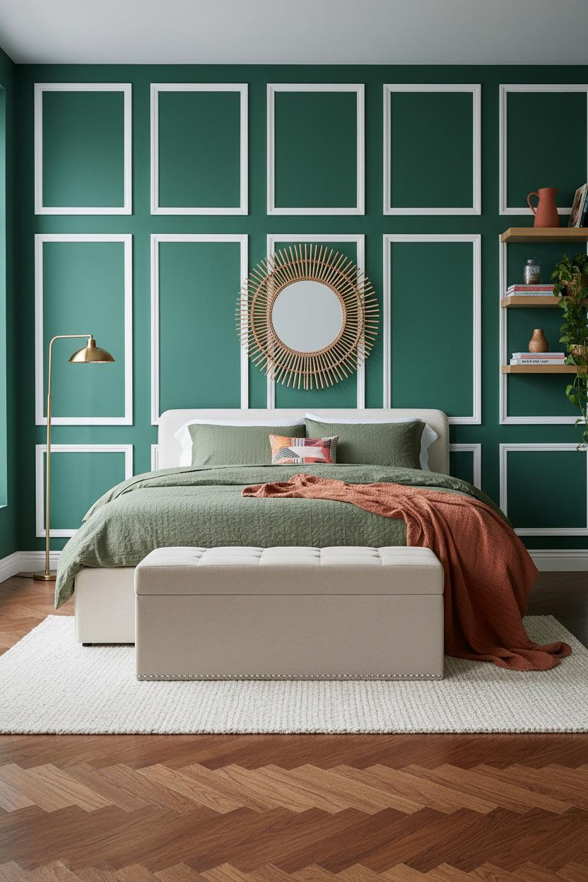
This is the version of dopamine decor for people who want bold color with a bit more structure behind it. Admittedly, it's my personal favorite in this roundup.
Why it looks custom: Full-height forest green wainscoting with crisp white trim creates a geometric grid that flat paint can't replicate. The herringbone parquet in warm walnut laid diagonally adds another layer of pattern without competing with the panels. Need help thinking through a room like this from scratch? The how to decorate your bedroom guide breaks it down.
Don't ruin it with: Busy bedding. Olive waffle-weave and a single rust linen throw. Stop there.
Deep Teal Slats at Night
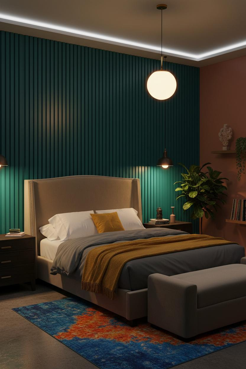

Most dopamine decor rooms rely on natural light. This one doesn't need it.
The vertical slatted teal wood panels cast individual shadow stripes under lamp light, turning the wall into something almost rhythmic. Terracotta flanking walls absorb the amber glow and keep the room from going cold. The room feels alive and intimate in a way that daytime rooms rarely are.
The practical move: A warm globe pendant over the nightstand rather than recessed lighting. The pooled amber on teal is the whole mood.
Cobalt Against Coral. Not for the Timid.
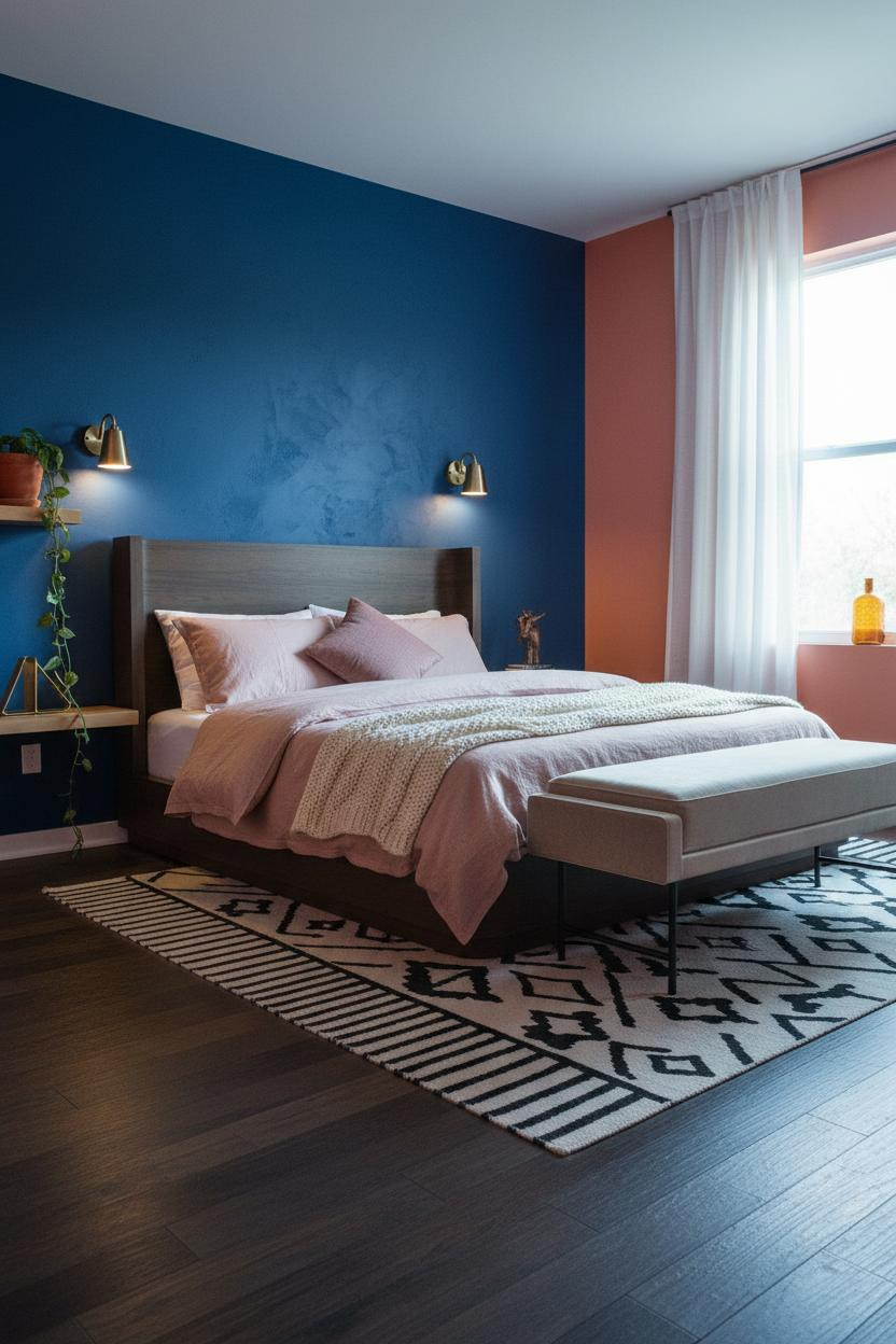

Cobalt blue textured plaster against warm coral-orange walls. It shouldn't be this good.
But the matte brushwork plaster keeps the cobalt from reading as cold, and the visible texture means overcast morning light gives the wall movement. Dark stained narrow plank flooring underneath grounds both colors so neither floats. The color collision is immediate, in a way that feels deliberate rather than accidental.
What not to do: Don't use patterned bedding here. Dusty pink linen with a cream chunky knit throw is enough. The walls are already having a conversation.
Exposed Brick That Skips the Industrial Trap
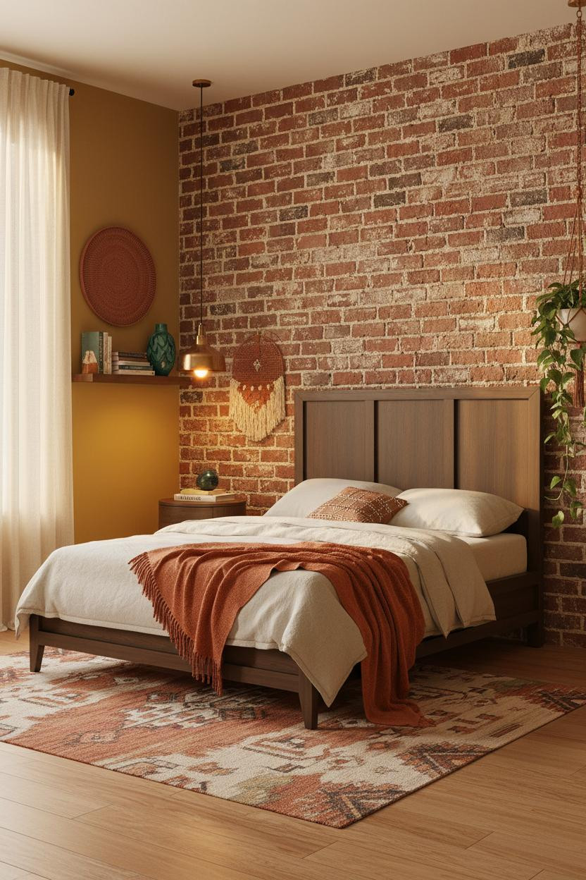


The raw terracotta-red brick wall gets warm mustard yellow on either side instead of grey concrete or black steel, and that single choice is what pushes it out of loft territory and into something joyful. Collected rather than decorated. If you're working with a small version of this layout, small bedroom ideas and design tips has approaches worth reading before you commit to the brick wall treatment.
The detail to keep: A vintage brass pendant overhead (not a track light, not a can). It pools warm light on the brick in a way that makes the mortar lines almost disappear at dusk, leaving just the color.

Our #1 Pick
Saatva Classic Mattress
America's best-selling online luxury innerspring. 365-night trial, lifetime warranty, free white glove delivery.
Shop Saatva Classic
Why Luxury Bedrooms Always Feel Better
All of these rooms commit to color, and that commitment is the point. But a bedroom isn't just a visual object. You sleep in it. And a saturated fuchsia wall loses its joy fast if the mattress underneath you doesn't hold up.
The Saatva Classic is what I'd put in every one of these rooms. Dual-coil support means the structure doesn't compress over time the way foam does. The Euro pillow top has that softness that feels right from the first night and still feels right years later. And the breathable organic cotton cover doesn't trap heat, which matters more than people think when a room runs warm from all those saturated walls.
Walls get repainted. Throws get swapped out. The mattress stays. Start with one that's worth keeping.

The rooms worth saving are the ones where the joy goes all the way down to the foundation. Good design ages well because it's made well.