
 by
by Your home office looks fine. It's got a desk, a chair, maybe a plant. But fine isn't the same as commanding. I've sat in both kinds of rooms, and the difference isn't money. It's a handful of decisions most people skip because they seem too small to matter. These 17 ideas move the needle from functional to the kind of space where you actually want to spend a Monday morning.
- Anchor the room with a solid wood desk
- Layer the Three-Height Light Stack
- Build a bookcase wall that earns its square footage
- Float a credenza behind the seating zone
- Swap the office chair for something with timber
- Paint the back wall in a deep, warm tone
- Hang a single large-scale piece instead of a gallery
- Add a reading nook with intention
- Anchor the room with a solid wood desk
- Layer the Three-Height Light Stack
- Build a bookcase wall that earns its square footage
- Float a credenza behind the seating zone
- Swap the office chair for something with timber
- Paint the back wall in a deep, warm tone
- Hang a single large-scale piece instead of a gallery
- Add a reading nook with intention
- Install wall-mounted shelves at desk height
- Choose a rug that defines the zone
- The Two-Wood Rule for warmth without chaos
- Frame the window with heavy linen drapery
- Add a leather desk pad and matching accessories
- Build a concealed cable system
- Add a small-scale plant that survives neglect
- The Honest Cost of a CEO Office Makeover
- Why the Old-Money Aesthetic Works for a Home Office
1Anchor the room with a solid wood desk
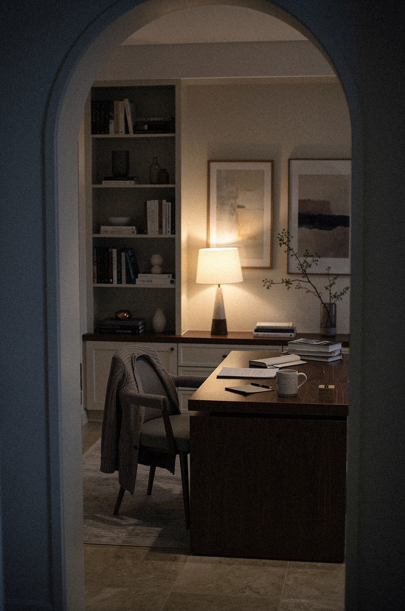
The view from the doorway sets the tone. A navy wall meets a walnut desk surface, the grain catching warm lamplight from a fixture just out of frame. The desk is visible but not centered; the room pulls you in first, and the work surface reveals itself as you step closer.
The palette is restrained—deep blue, rich brown, a single warm accent from the lamp. Nothing competes.
Everything waits.
A CEO office starts at the desk. Not the monitor.
Not the chair. The surface you touch every day.
A 72-inch solid white oak desk with a live edge changes the entire temperature of the room. It doesn't need to be custom.
IKEA TONSTAD in oak veneer hits the mark at under $600 if you're building the foundation first. The grain catches afternoon light differently than laminate, and that difference is what people feel before they can name it.
Depth matters more than you'd think. A 30-inch depth gives you room to spread out without feeling cramped.
Anything under 24 inches and you're in laptop-only territory, which reads as temporary. If you're working with a smaller footprint, go narrower on the return, not the main surface.
The desk is the anchor. Everything else arranges around it.
And if you're planning the whole room layout, our home office layout guide walks through desk placement and traffic flow before you buy anything.
2Layer the Three-Height Light Stack
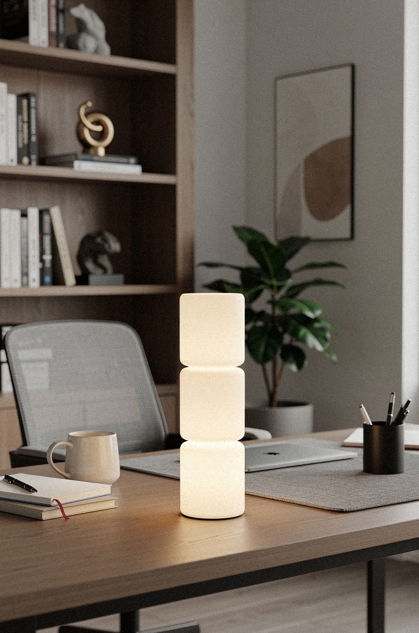
From above, the lighting arrangement reads like a diagram. A task lamp at desk level, a floor lamp behind the seating zone, and a sconce on the back wall form a triangle of warmth.
The desk itself may be cropped at the edge of the frame or sitting secondary to the fixture layout; the point is the layering, not the surface. The overhead perspective makes the strategy visible all at once.
Overhead lighting is the fastest way to make a home office feel like a call center. The fix isn't one fixture.
It's three heights working together. A task lamp at desk level (I like the Anglepoise Type 75 in matte black), a floor lamp behind the seating zone, and a sconce or picture light on the back wall. The layering creates depth that a single source can't touch.
Bulb temperature is the hidden variable. Mix 2700K for warmth with 3000K for clarity at the task zone. Anything cooler than 3200K and the room starts to feel like a lab.
And dimmable is non-negotiable. You'll want to drop the brightness by half for late-afternoon calls when the natural light is fading but you don't want the jolt of full fluorescence.
If you're serious about getting the light right, check our warm lighting guide for bulb temps and dimmer recommendations that actually work in offices.
3Build a bookcase wall that earns its square footage
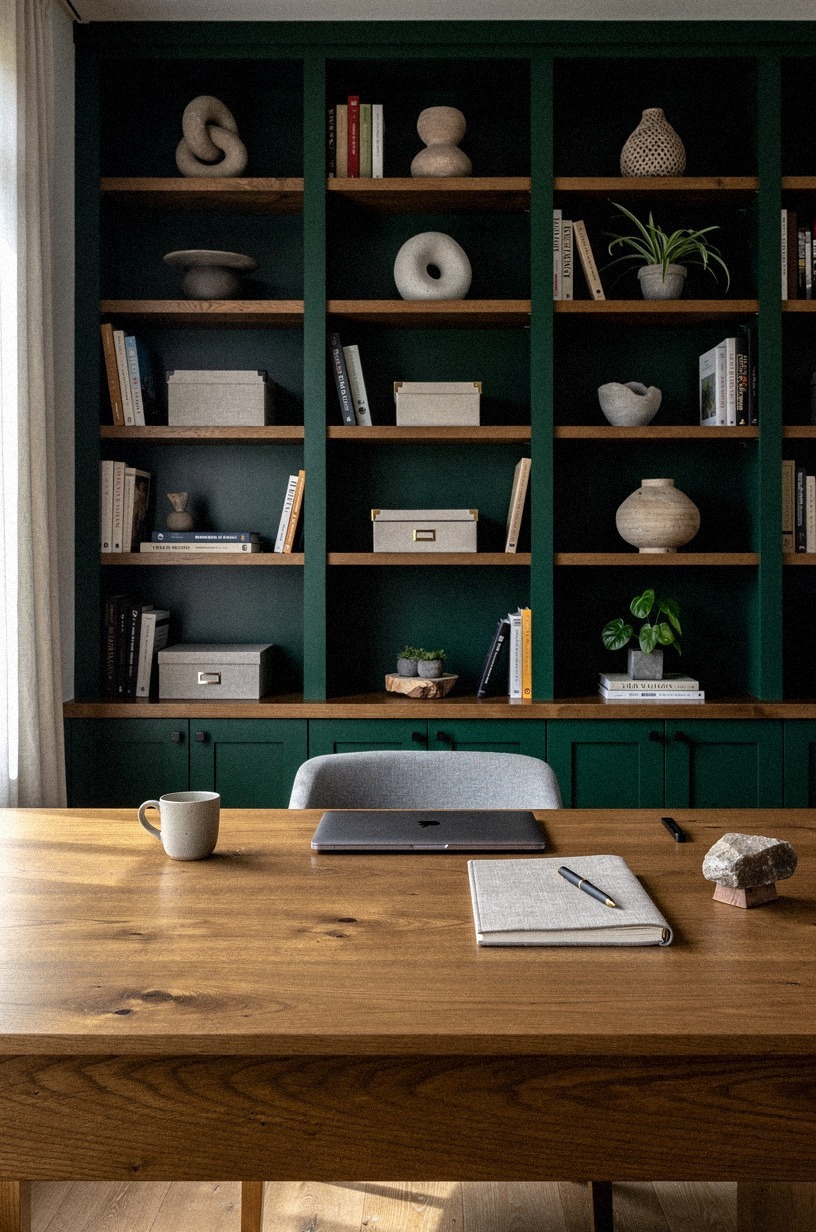
The camera looks down on a full wall of shelving. Forest green spines and rust-toned leather bindings fill the lower shelves; the floor is visible at the bottom of the frame, grounding the wall in the room. The desk is likely absent from this shot—the bookcase is the subject, and the floorboards remind you this is a real space, not a catalog set.
A CEO office without books reads as a staging area. The move isn't filling shelves with random objects.
It's building a wall that does work. IKEA BILLY in oak is the budget move, but if you're staying long-term, a custom walnut bookcase with 3/4-inch solid backing and integrated lighting pays off in presence.
The standard BILLY is 31.5 inches wide and 79.5 inches tall. Plan your wall in multiples of that width, or go custom and fill the space properly.
Arrange books by subject, not color. The color-coded shelf is a tell.
Mix in a few objects that mean something, a small frame, a ceramic piece, but keep the ratio at about 70% books, 30% breathing room. The negative space is what makes the collection feel curated rather than accumulated.
Your shelving strategy also affects how the whole room reads. Our built-in shelving ideas break down spacing, lighting, and styling for walls that look intentional.
4Float a credenza behind the seating zone
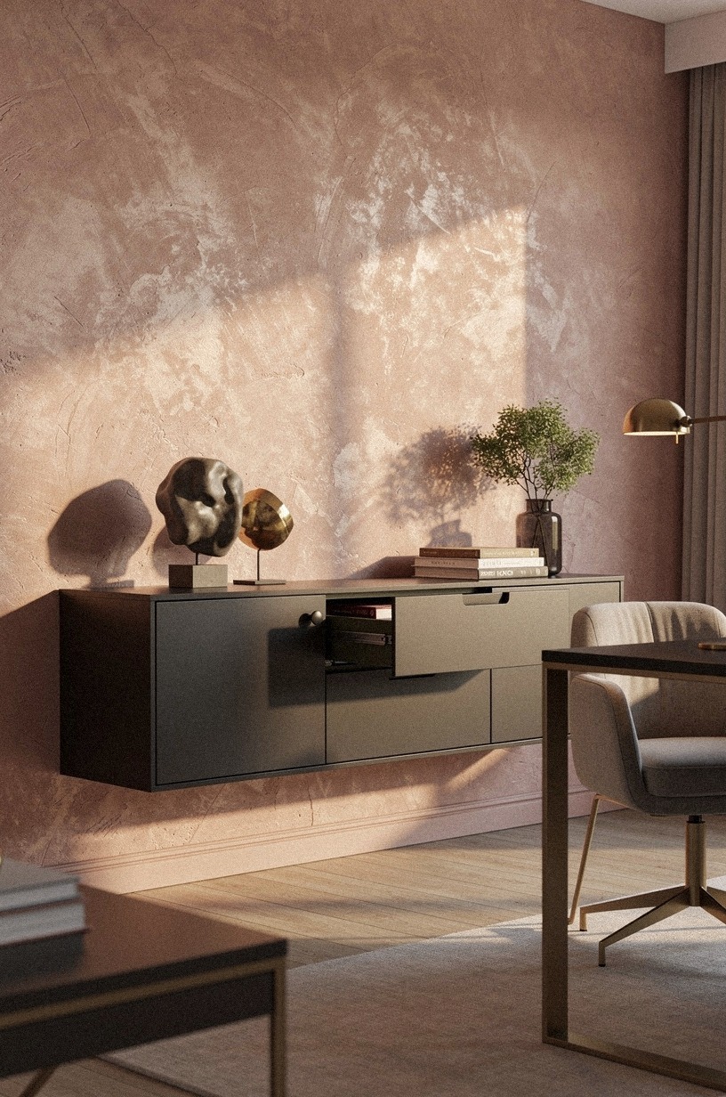
A 45-degree angle shows the room in depth. A dusty rose wall sits behind a charcoal credenza, which in turn sits behind the seating zone.
The desk is visible in the near ground, but the credenza owns the middle distance. The palette is warm and muted—rose, charcoal, a whisper of brass.
The room feels planned in layers, not arranged against a wall.
If your office has the depth, a credenza behind the main seating position changes the dynamic entirely. It breaks the "desk against wall, chair in middle" default that every home office falls into.
A 60-inch walnut credenza with sliding cane doors gives you storage without visual weight. The Article Seno in walnut is a strong mid-range pick at around $900.
The placement matters. You want 42 inches of clearance behind the desk chair so the room doesn't feel tight when you roll back.
The credenza becomes a secondary surface for coffee, notebooks, or the objects you rotate in and out. It's also the first thing people see on a video call if your camera angle is wide, so make it count.
5Swap the office chair for something with timber
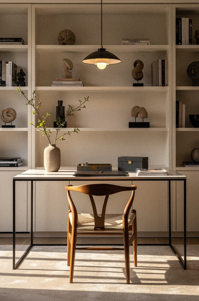
Frontal, symmetric, eye-level. A warm white wall behind a camel-colored leather chair with a timber frame. The desk is partially visible at the bottom of the frame, but the chair dominates.
The shot is direct and still—no angle, no drama, just the object and its materials. The timber grain is readable.
The leather looks like it has already softened.
The ergonomic mesh chair is a necessary evil for some, but it's not the only option. A leather-and-oak desk chair with a high back brings warmth that mesh can't touch. The Article Sven in tan leather is a proven choice at around $800, or the CB2 Drommen in acacia wood if you want more structure.
The key is a seat that looks like it belongs in a room, not a gym.
If you're keeping the ergonomic chair for back support, reupholster it. A local upholsterer can recover most standard frames in full-grain leather or a heavy Belgian linen for $300 to $600.
The frame stays functional. The look changes completely. And honestly?
The leather patina after two years is better than anything factory-fresh.
For more seating ideas that balance comfort and presence, our desk chair guide covers timber, leather, and hybrid options at every price.
6Paint the back wall in a deep, warm tone
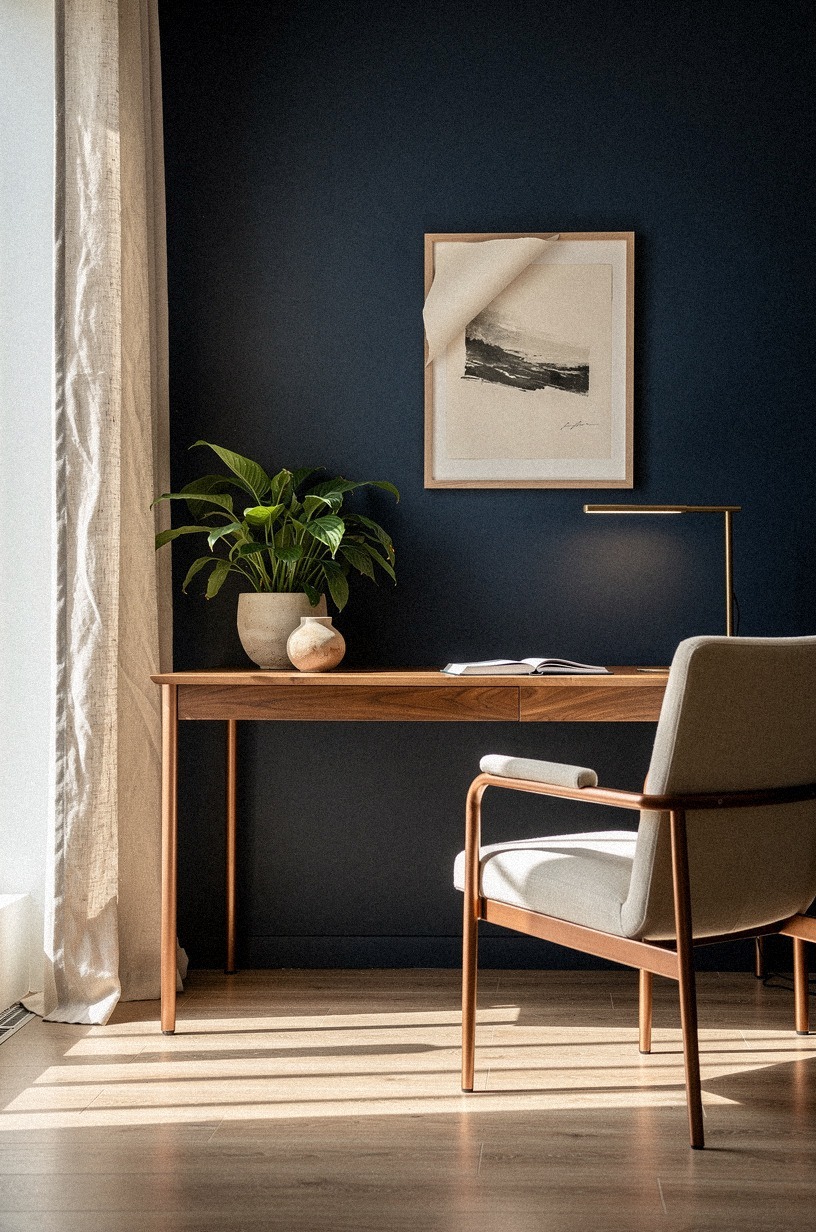
The camera is low, almost at floor level, looking up at a midnight blue wall. A copper accent catches the light—maybe a lamp base, maybe a picture frame.
The desk is visible in the middle ground, but the wall is the subject. The perspective is unusual, almost architectural, and the deep tone feels like evening even if the light is artificial.
The all-white office is safe. It's also forgettable.
One wall in a deep tone changes the light in the room and gives the eye a place to rest. Farrow & Ball Green Smoke (No. 47) is the move if you want something that shifts between gray and green depending on the hour.
Benjamin Moore Cheating Heart (1617) is darker, more dramatic, better for north-facing rooms where you want to add depth rather than fight the lack of sun.
Paint the wall behind the desk, not the one facing it. That way the color frames you on calls and gives visitors (or the camera) something rich to look at.
One wall is enough. Two walls in a dark tone and the room starts to close in unless you've got serious square footage and great natural light.
The right paint color can make a small office feel larger, not smaller. Our small office paint guide shows which dark tones work in tight spaces and which ones to avoid.

7Hang a single large-scale piece instead of a gallery
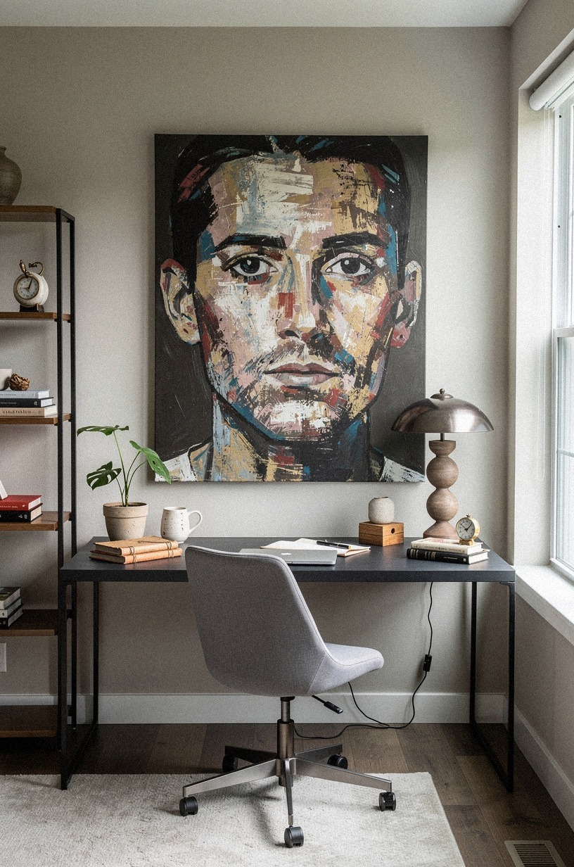
This is a macro close-up. Sage green and cream fill the frame—brushstrokes, canvas texture, the edge of a frame.
The room is invisible. The desk is invisible. The image is about the artwork itself: scale, detail, the confidence of one large piece rather than many small ones.
It is a hero shot, not a room shot.
The gallery wall is the default for people who can't decide. One big piece is braver and cleaner.
A 40×60-inch framed print or an oversized canvas in a warm abstract or landscape format fills the visual field without clutter. The frame matters as much as the art.
A 2.5-inch natural oak frame with a white mat keeps it grounded.
Height is the common mistake. Center the piece 57 to 60 inches from the floor to the center of the frame.
That's gallery standard and it works in offices too. If you're buying online, Society6 and Minted both print at scale, but budget $200 to $500 for something that won't look like a dorm poster.
The piece should feel like you stole it from a hotel lobby.
8Add a reading nook with intention
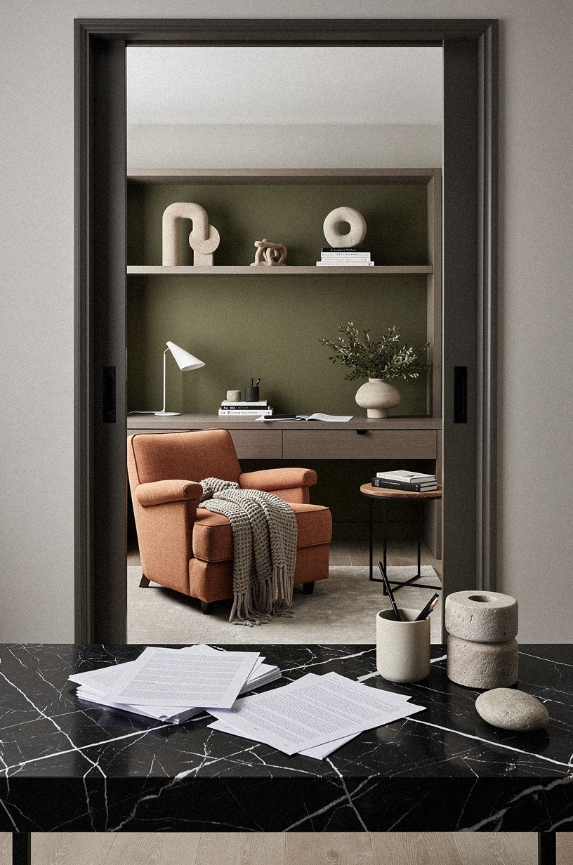
The view is through a doorway. Terracotta walls, stone floors, olive-green upholstery on a reading chair.
Shelves line the near wall. The desk is visible in the background, but it is small and out of focus—the nook is the foreground, and the threshold makes it feel like a discovery. The palette is earthy and warm, almost Mediterranean.
A CEO office isn't just for typing. A small armchair in a corner with a floor lamp and a side table creates a second zone for reading, thinking, or the calls where you don't need the desk.
The IKEA STRANDMON in dark green velvet is the budget classic at $250. The West Elm Roar + Rabbit in performance fabric is the upgrade if you've got kids or pets.
The table should be small but real. A 16-inch round marble top on a brass base is enough for a coffee cup and a notebook. Keep the nook tight.
A 3×4-foot zone is plenty. Any bigger and it starts to compete with the main desk area.
The goal is a pause, not a second office.
If a full nook isn't in the cards, a single comfortable chair can still shift the room's energy. See our reading corner ideas for tight layouts that don't feel cramped.
9Install wall-mounted shelves at desk height
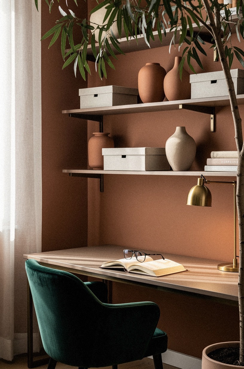
A wide-angle diagonal shot. Clay-colored walls, linen-textured shelves, brass brackets catching the light.
The desk is visible below, but the shelves dominate the upper half of the frame. The angle is dynamic—diagonal, not straight on—and the materials feel hand-worked rather than manufactured.
The wall is the story; the desk is context.
Floating shelves above the desk give you storage without the bulk of a full bookcase. A 36-inch walnut shelf with hidden brackets at $80 to $150 per shelf is the sweet spot.
Mount them 18 to 24 inches above the desk surface so you don't bump your head when you stand. The CB2 Helix in walnut is a clean option if you want the bracket to read as part of the design rather than hidden hardware.
Keep the shelf contents minimal. A small stack of books, one object, and empty space. The temptation is to fill every inch.
The better move is to let the wall breathe. One shelf with a single ceramic piece reads as intention.
Three shelves crammed with books read as storage.
10Choose a rug that defines the zone
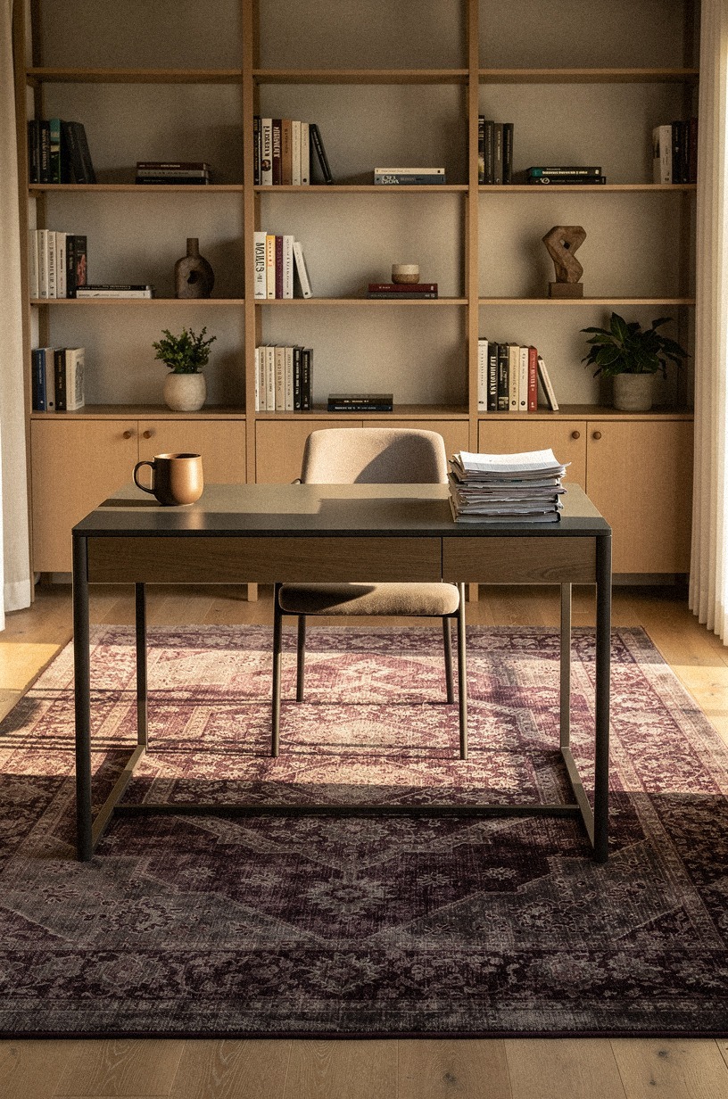
Wide-angle diagonal, looking down and across. A plum rug with grey undertones and a faint rose-gold thread sits on the floor, its edges defining the office zone within a larger room.
The desk is secondary or cropped at the edge of the frame; the rug is the geometry that holds the space together. The palette is rich but muted—no high contrast, no border.
Hard floors are practical. They're also cold, literally and visually.
A 9×12-foot rug under the desk and chair zone warms the room and defines the office as a distinct space within a larger room. The Ruggable Jonathan Adler collection in a geometric wool style works well because it's washable, but if you're not worried about spills, a hand-knotted wool in a low pile is the richer move.
The pattern should be present but not loud. You don't want to fight the desk for attention.
A subtle stripe or tonal geometric in warm grays, creams, or muted blues works with almost any wood tone. Avoid anything with a high-contrast border. The rug should feel like it's been there for years, not like you just unrolled it.
Rug size is one of the most common mistakes in home offices. Our office rug size guide breaks down exactly what dimensions work under different desk setups.
11The Two-Wood Rule for warmth without chaos
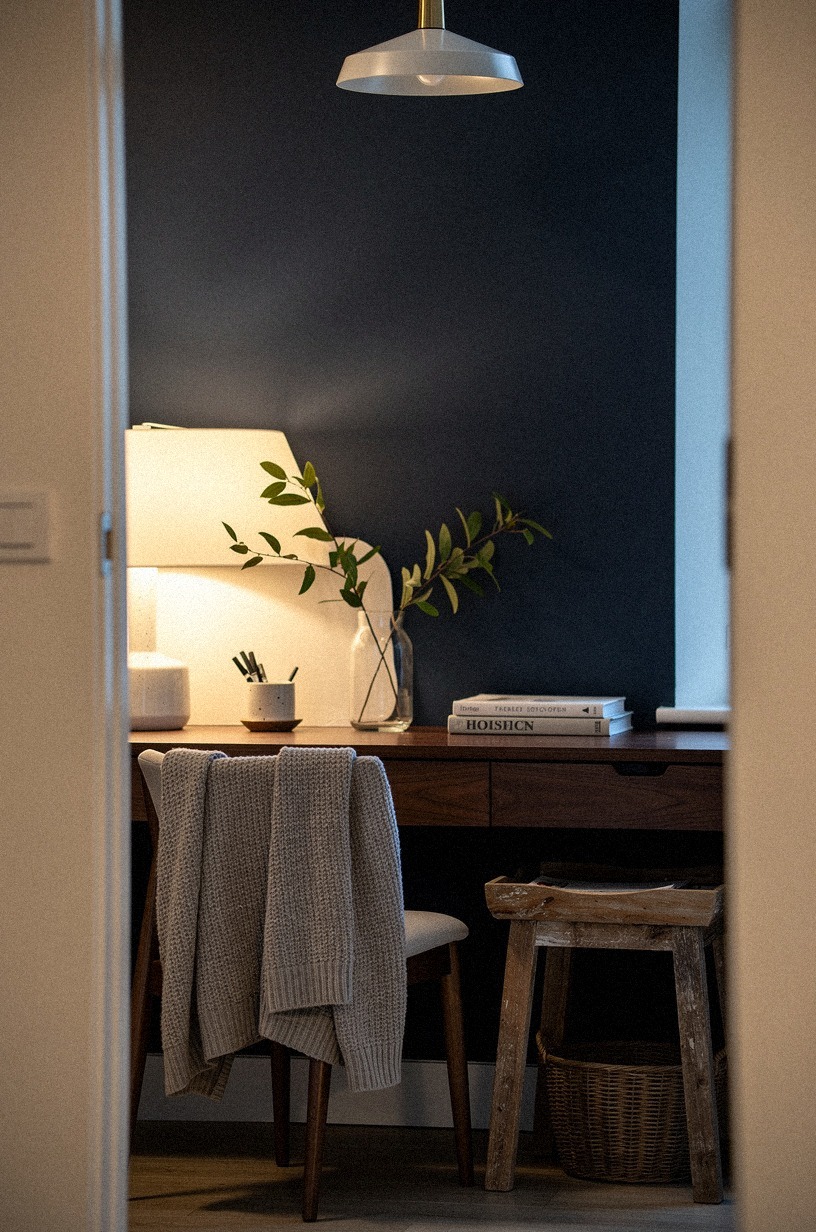
Wide-angle diagonal, the room seen from a corner. Navy walls, white trim, walnut surfaces everywhere—desk, shelves, chair frame.
The desk is visible, but the wood grain is the subject: the variation between two tones, the warmth they generate together. The shot is about material, not layout.
The grain catches the light differently on each surface, and that difference is the point.
Mixing wood tones is where most offices fall apart. The rule is simple: two woods, not three.
If your desk is white oak, your shelves can be walnut or birch, but don't introduce a third species. The contrast between two tones adds depth.
Three starts to look like you bought whatever was on sale.
The same rule applies to metal. If your desk legs are black steel, keep the shelf brackets and lamp bases in the same family.
A single brass accent is fine as a highlight, but brass everywhere with black everywhere and chrome somewhere else is visual noise. Two materials, well-chosen, beat five that fight each other.
12Frame the window with heavy linen drapery
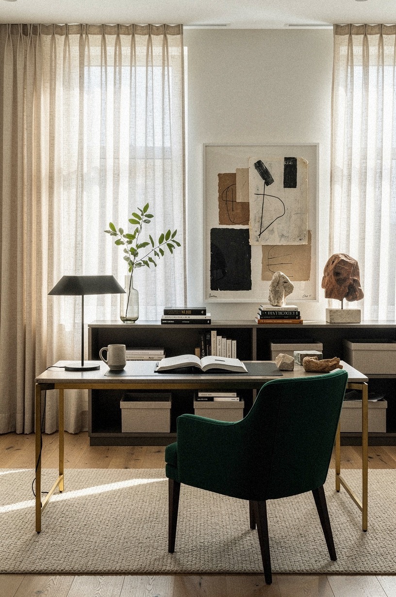
POV entering the room. Emerald walls, gold hardware, cream-colored heavy linen drapery at the window. The desk is secondary or cropped at the edge of the frame; the drapes are the gesture that makes the window feel larger than it is.
The fabric has weight—you can read the folds. The light behind it is diffused, not blocked.
If your office has a window, the treatment matters more than the view. A heavy Belgian linen curtain in warm white or oatmeal, hung 12 inches above the frame and 6 inches past the sides, makes the window feel larger and the room feel finished. The IKEA HILJA in natural linen is the entry point at $30 per panel.
The Curtina Ashton in stone-washed linen is the step up if you want more weight.
The lining is the detail. An ivory cotton lining adds body and filters light without blocking it.
Unlined linen is too sheer for an office. It reads as temporary.
And if you're dealing with street-level glare, a blackout lining in the same ivory keeps the look clean while giving you control over the light.
13Add a leather desk pad and matching accessories
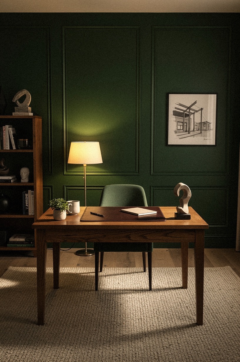
POV entering, but the frame is tight. Forest green walls, rust accents, oak desk surface.
A leather desk pad sits close-up, its edges and stitching visible, the desk surface visible around it but the room cropped away. The shot is about touch and material—the surface you work on, not the room you work in.
The pad is the subject; the desk is the stage.
The small objects on the desk are what you touch every day. A full-grain leather desk pad in cognac or dark brown, 30×18 inches, gives you a warm surface under the keyboard and mouse. The Grovemade pad in vegetable-tanned leather is the standard at $120, but a decent faux-leather version for $25 works if you're testing the look first.
Match the tray and pen cup to the pad. A brass tray for loose paperclips and a ceramic cup for pens keeps the surface organized without looking like a supply closet.
The goal is a desk that looks like someone works there, not like someone staged it for a photo. The leather patina over six months is the proof.
14Build a concealed cable system

Overhead bird's-eye view. Dusty rose and charcoal with a brass accent.
The frame is tight on a cable management detail—tray, clips, the underside of a surface. The desk is invisible; the image is about the system, not the furniture.
The perspective is utilitarian, almost technical, and the palette keeps it from feeling like a hardware store shot.
Nothing kills a CEO office faster than visible cords. The fix isn't expensive, but it takes planning.
A cable management tray under the desk, J-channel or mesh basket, runs about $20 to $40. Route power through a surge protector mounted to the underside, not dangling behind the legs. The IKEA SIGNUM is the classic under-desk basket at $15.
For the floor, a cord cover in matte black or wood-tone that matches the baseboard hides the run from desk to outlet. If you're renting, 3M Command cord clips in white hold the line along the baseboard without damage.
The test is simple: sit in the chair and look around. If you see a cord, fix it. The clean floor is half the battle.
15Add a small-scale plant that survives neglect
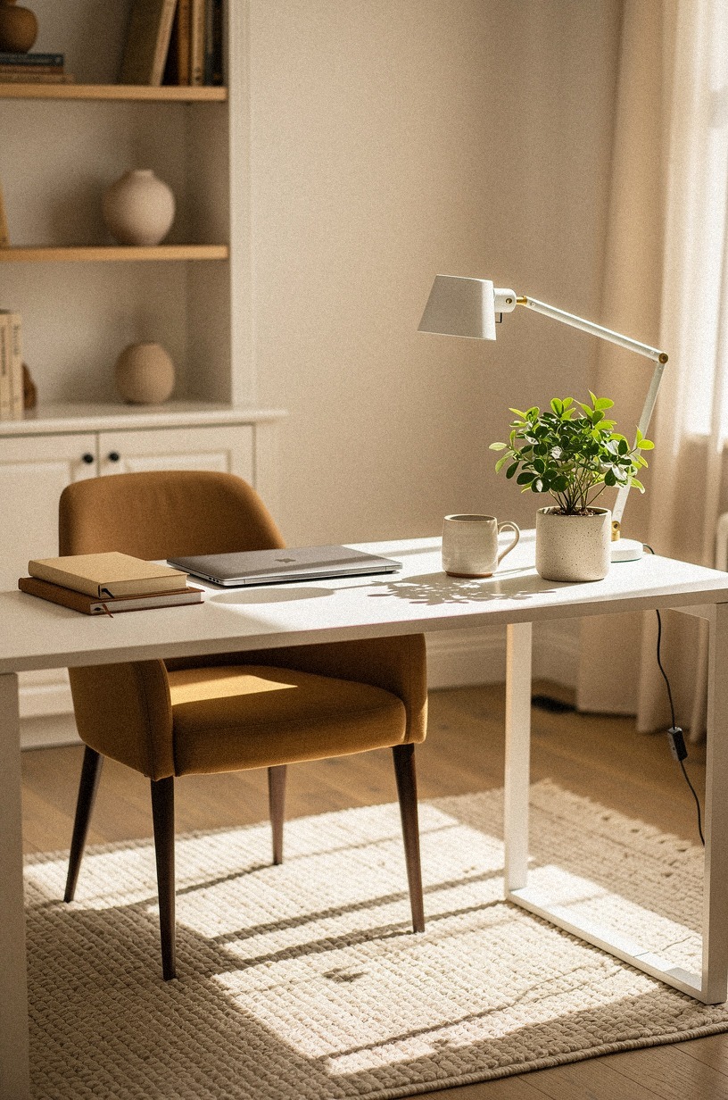
Overhead bird's-eye view. Warm white and camel tones. A small plant sits on a surface—desk, shelf, credenza, the base is ambiguous.
The desk and room are invisible; the frame is tight on the plant and its pot. The shot is about scale and life, not placement. The plant is small enough to feel incidental, not curated.
Plants signal life, but dead plants signal the opposite. Choose something that tolerates low light and irregular watering.
A ZZ plant in a simple terracotta pot, a snake plant in a white ceramic cylinder, or a pothos trailing from a high shelf. The pot matters more than the plant. A 6-inch terracotta with a saucer is honest and warm.
A glazed ceramic in warm white is cleaner and more modern.
One plant is enough. Two is fine.
Three starts to look like a conservatory. Place the main plant where you'll see it from the desk, not where it gets the best light.
The goal is a living object in your peripheral vision, not a garden. And if you kill it, replace it fast.
A brown leaf is worse than no plant at all.
16The Honest Cost of a CEO Office Makeover
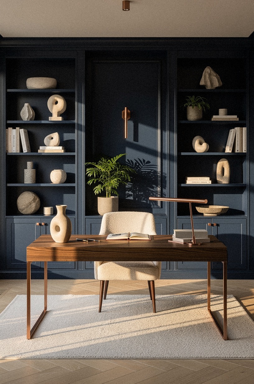
45-degree view, the room seen from a standing position. Midnight blue walls, copper accents, the desk visible but the image is abstract—cost is not visual.
The shot is about the room as a whole, not any single object. The palette is consistent with earlier sections, and the perspective is the same diagonal that appears throughout the article.
The cost is in the text; the image is the setting.
Here's what the numbers actually look like. I've tracked this across three office setups, and the ranges hold steady.
And for the individual pieces you might be pricing right now:
The budget tier gets you 80% of the look if you're smart about paint and lighting. The mid tier is where you buy the desk and chair that last ten years.
The high tier is custom millwork and integrated lighting, and it's only worth it if you own the space. I've done all three.
The budget version with good paint and a solid lamp felt better than the expensive setup with bad lighting.
17Why the Old-Money Aesthetic Works for a Home Office
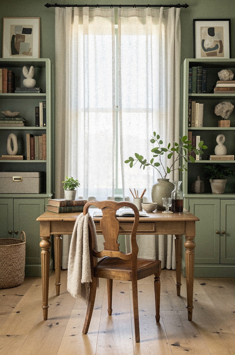
Frontal symmetric eye-level. Sage green walls, cream trim, the room arranged with the calm order of inherited taste.
The desk is visible, but the aesthetic is the subject—patina, restraint, materials that age rather than date. The shot is still and confident, almost portrait-like.
The room looks like it has always been this way.
The "old-money" look isn't about pretending you inherited furniture. It's about choosing pieces that age well and avoiding trends that expire in eighteen months. The reason this matters in a home office is simple: you're in this room every day, and the visual fatigue of a trend you chased last year is real.
The core principle is buy for patina, not polish. Unlacquered brass that tarnishes.
Full-grain leather that scuffs. Solid oak that dents and then looks better for it. These materials tell a story over time.
A chrome-and-glass desk looks the same on day one and day one thousand. That's not a compliment.
The second principle is restraint. One great desk.
One good chair. One wall of books.
The impulse is to fill the room with proof that you've thought about it. The better move is to let the space breathe.
A half-empty shelf reads as confidence. A crowded shelf reads as anxiety.
And in a room where you make decisions all day, the visual tone matters more than you think.
A Few Things Worth Answering
What is the best ceo office aesthetic for a small home office?
A compact oak desk at 48 to 60 inches with a wall-mounted shelf above it and a single task lamp. The IKEA TONSTAD in oak works in spaces as tight as 8×10 feet. The move is vertical storage and one statement piece rather than many small ones.
If you're working with a tight footprint, our small home office ideas cover layouts that feel commanding instead of cramped.
Where can I buy ceo office aesthetic pieces on a budget?
IKEA for desks, shelves, and lighting. Target Threshold and Studio McGee for chairs and accessories.
Wayfair for rugs and credenzas if you filter by solid wood. And don't skip Facebook Marketplace for vintage desks and bookcases.
The best piece in my current office cost $40 on Marketplace and needed nothing but a wipe-down.
How much does a ceo office aesthetic makeover cost?
About $200 to $800 for a budget refresh with paint, lighting, and organization. A full setup with desk and chair runs $1,500 to $5,000.
Custom millwork and built-ins start at $7,000 and climb. Paint and a good lamp are the cheapest upgrades with the biggest return.
Can I create a ceo office aesthetic on a budget?
Yes, and paint is the first move. Farrow & Ball Green Smoke on one wall costs about $120 and changes the entire room.
A $15 IKEA SIGNUM under the desk hides cords. A $30 HILJA curtain softens the window. Three purchases, under $200, and the room feels intentional.
Is a ceo office aesthetic worth it in a small space?
Worth it, especially in a small space. A well-designed office makes the room feel larger because everything has a place.
The Three-Height Light Stack adds depth that square footage can't. And a 9×12 rug defines the zone so the office doesn't bleed into the rest of the room.
Is ceo office aesthetic a good idea for a rental?
Yes, with swaps that don't damage walls. Peel-and-stick wallpaper in a linen texture instead of paint.
Tension-rod curtains instead of drilling. A freestanding bookcase instead of wall-mounted shelves.
And a rug instead of replacing flooring. You can take all of it with you when you leave.
For more rental-friendly upgrades that still look built-in, our rental office ideas has a full list of reversible changes.
Where I'd Start First
If I had to pick one, I'd start with the wall color. You can't layer warmth on top of a cold room.
The desk, the rug, the lamp will all fight it instead of building on it. Get the color right first. Everything else lands.