

 by
by Renter friendly wall ideas for boring white bedroom walls can change a bedroom without a nail, paint roller, or landlord conversation. I tested 15 approaches after my white walls started making the room feel cold and unfinished. The result was softer, warmer, and far more personal than I expected. I kept every move removable. No damage, no deposit anxiety!
Don’t overthink: Hang curtains behind the bed with a tension rod.
Quick answer: Start with one tall anchor, one tactile layer, and one useful light-reflecting piece. That combination makes a blank wall feel deliberate without turning your bedroom into a showroom.
Here's what it looked like before
The room had white walls, a queen bed, one small nightstand, and the full starter-apartment feeling. The bed sat against the longest wall, while the blank space above it swallowed every bit of warmth from the bedding. My white cotton duvet looked clean, but the room still felt temporary.
I wasn't willing to drill into plaster or paint over the landlord's Benjamin Moore White Dove equivalent. I also didn't want a wall full of tiny frames that would make the room feel busy.
If you're working with the same limits, begin with these renter friendly bedroom ideas that need no drilling before you buy anything. You may already have enough pieces to make your wall feel intentional.
The fastest improvement was visual scale. A large fabric layer, a generous curtain, or a broad color field worked better than six small objects scattered across the wall.
I didn't need more stuff. I needed a stronger relationship between the bed, the wall, and the light.
- Layer a fabric headboard with the Two-Height Rule
- Hang curtains behind the bed with a tension rod
- Swap bare walls for removable wallpaper panels
- Build the Three-Source Art Grid
- Float a picture ledge without drilling
- Frame the bed with a removable canopy
- Use a peel-and-stick color field
- Mix two woods with the Two-Wood Rule
- Anchor the wall with an oversized textile
- Turn postcards into a rotating gallery
- Contrast warm fabric over cold white
- Which wall does your nightstand need?
- Choose textile panels instead of a mural
- Frame a mirror with the Three-Source Light Stack
- Make the wall work for sleep
1Layer a fabric headboard with the Two-Height Rule
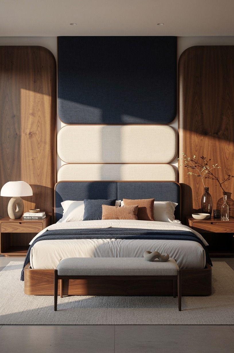
I started with a substantial headboard because the wall needed scale, not more little decorations. A tall book-matched walnut headboard gave the bed a visual anchor, while a lower layer of pillows kept the arrangement relaxed. The Two-Height Rule was simple: one tall element behind the bed, then one lower band of texture in front.
The emotional shift happened when I sat down and the wall no longer felt like it was pressing into the bed. If you're styling a queen mattress, remember that the standard bed is 60x80 inches, so your headboard should feel wider than the sleeping area without crowding the nightstands.
I chose an IKEA MALM frame as the practical base, then added a removable walnut panel. You don't need a custom carpenter for warmth.
You need one strong vertical shape.
And the surrounding palette matters. Book-matched walnut looks especially rich beside midnight blue bedding, copper accents, and ivory textiles.
It softens the hard white surface without pretending to be permanent. For another no-drill option, compare it with these renter-friendly headboard ideas to make in an afternoon. They helped me see how much impact a single generous piece could have.
The most inviting version had midnight blue bedding with a small copper detail rather than bright white layers everywhere. It made the bed feel calmer, richer, and more finished. If your room is narrow, keep the headboard visually quiet and let the bedding provide the contrast.
2Hang curtains behind the bed with a tension rod
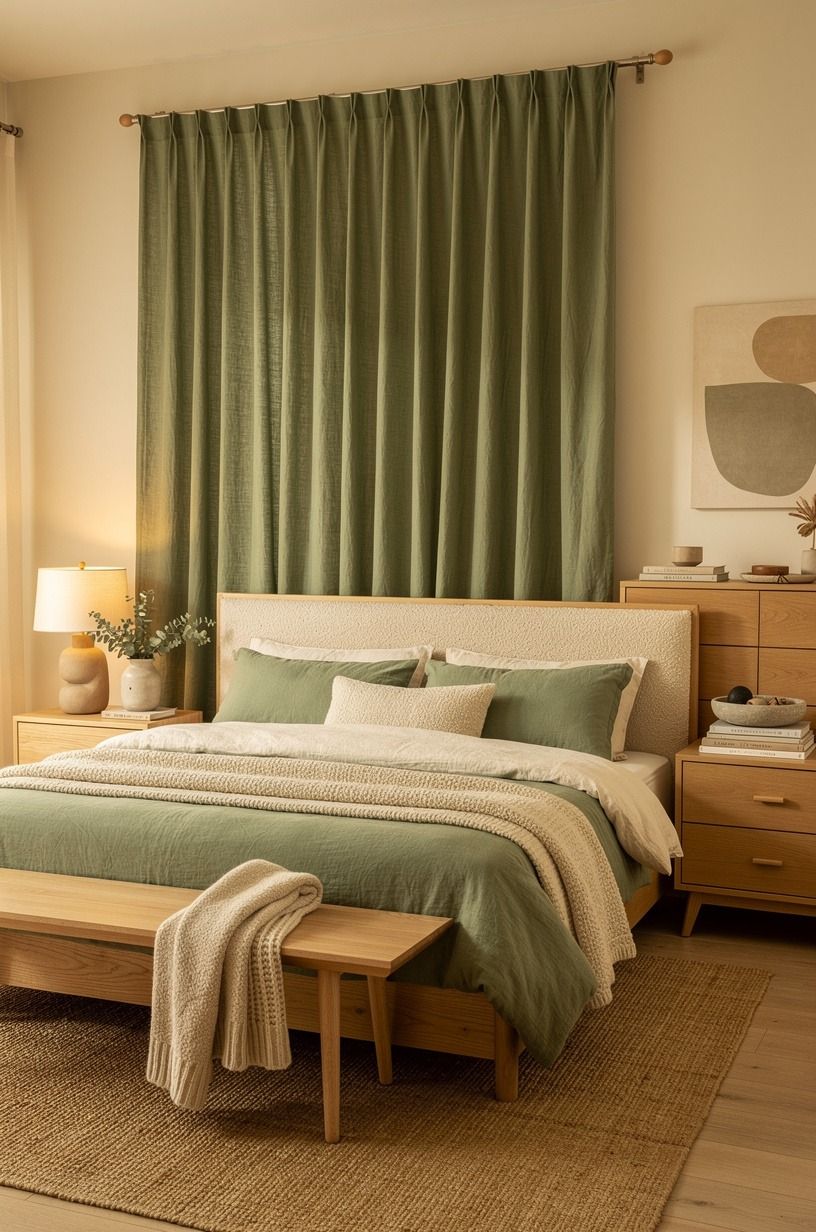
The second change was a pair of curtains behind the bed.
I used a tension rod so the fabric could come down without leaving holes. Organic bouclé curtains in sage green and warm cream softened the wall while a natural wood detail kept the arrangement from feeling flat.
The fabric added height without taking floor space. I kept the folds generous and allowed the curtains to sit just above the floor rather than bunching behind the bed. That small decision made the wall feel calmer and more finished.
If you rent, test the tension rod before hanging heavier fabric. A lightweight pair is easier to adjust, and the natural wood accent gives the green and cream palette enough warmth. I liked this approach because it changed the entire bed wall while remaining completely portable.
3Swap bare walls for removable wallpaper panels
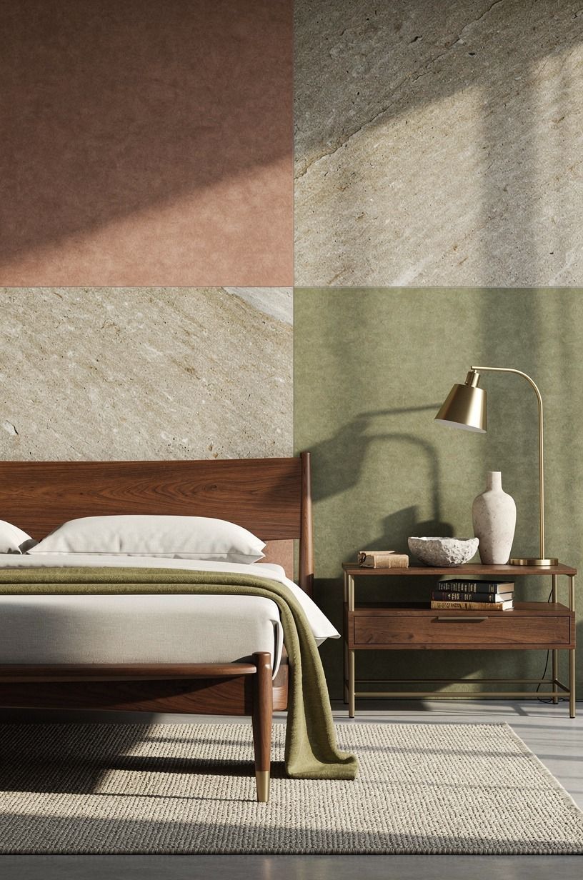
I wanted pattern, but I didn't want a permanent mural. Removable wallpaper panels solved that problem because I could test the scale, live with it, and remove it when the lease ended. I chose a quiet botanical print with terracotta leaves, stone-colored details, and touches of olive, not a tiny repeat that would compete with the bedding.
The decision was less about making the bedroom dramatic and more about giving the eye somewhere to rest. You can place the panels only behind the bed, which keeps the room from feeling wrapped in pattern. I measured the bed wall first, then aligned the center of the print with the mattress.
My emotional turning point came after sunset. The leaves looked deeper under the bedside lamp, almost like shadows from a garden outside.
That made the white walls feel intentional instead of unfinished. And if you're nervous about adhesive, test one panel behind furniture before covering the main wall. The renter-friendly wallpaper ideas that peel off clean are a useful place to compare patterns and removal methods.
I preferred a muted terracotta botanical pattern over anything overly literal. A faded print felt collected and atmospheric, while a high-contrast tropical design made the small room feel frantic.
A small unlacquered brass detail nearby added warmth as it developed a gentle patina. When the pattern is strong, keep the art and bedding restrained.
4Build the Three-Source Art Grid
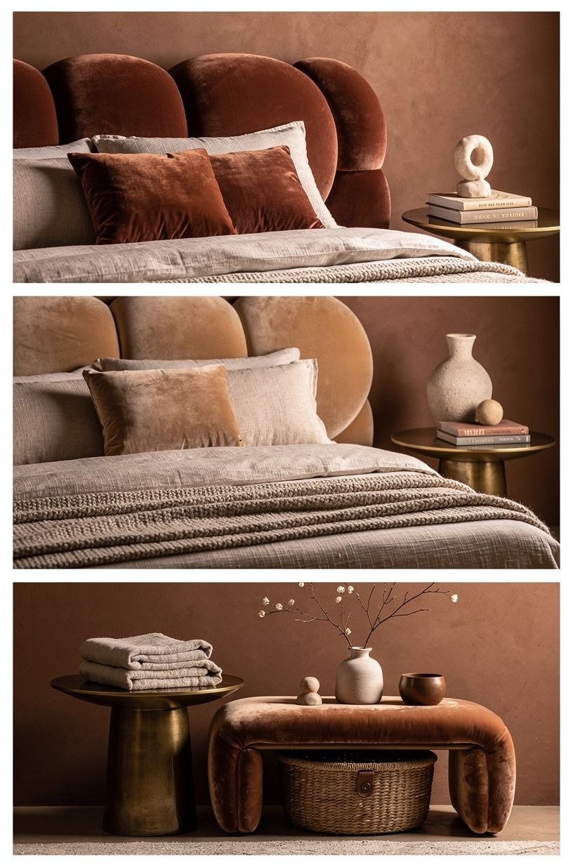
A blank wall needs rhythm, but a matching art set can feel too polished.
I built the grid from three sources: one personal print, one vintage-style botanical, and one small piece with an aged brass detail. The clay, linen, and brass palette tied the pieces together without making them identical.
The arrangement worked because each item brought a different surface. A deep-pile mohair velvet accent nearby softened the harder art materials and kept the wall connected to the bed.
I left more space between the pieces than I expected. The grid still felt deliberate, but it didn't become another crowded gallery. If you're working above a queen bed, make the overall arrangement wide enough to relate to the mattress without extending into the nightstands.
5Float a picture ledge without drilling
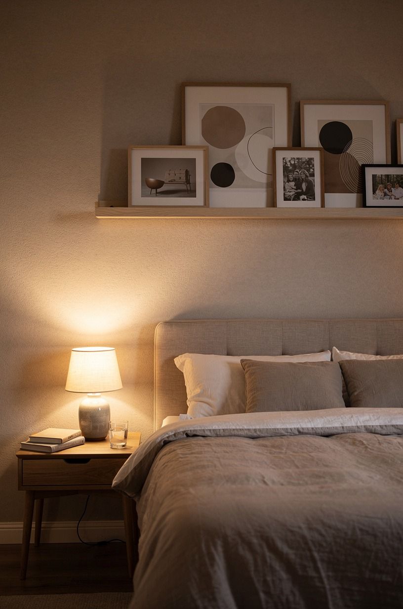
The picture ledge came next because I wanted flexibility. Instead of committing to a fixed gallery wall, I used a narrow ledge set against a hand-applied Venetian plaster wall, secured with removable mounting strips rated for the ledge's weight. The shelf held two frames, a small ceramic bowl, and a postcard from a trip.
You can change the arrangement whenever your room feels stale, which is valuable in a rental. I kept the objects shallow so the bed could stay close to the wall. If you're using a deep shelf, check your pillow clearance before styling it, especially with a queen bed.
The best moment came when I swapped the art for a handwritten note and a tiny dried branch. The room felt more like mine without becoming cluttered.
But don't fill the ledge edge to edge. Negative space gives the objects room to breathe, and it keeps the wall from turning into a storage strip.
The renter-friendly non-toxic bedroom guide has more ideas for keeping bedroom styling calm and low-odor.
I also tested the ledge with empty frames before adding anything fragile. That small step made the final arrangement feel effortless rather than precarious. A hand-thrown ceramic bowl gave the shelf one rounded shape against all the straight frame edges.
The plaster wall brought a soft plum and gray undertone to the arrangement. A small rose-gold detail kept the ledge from feeling too cool, while the removable hardware preserved the rental-friendly setup.
6Frame the bed with a removable canopy
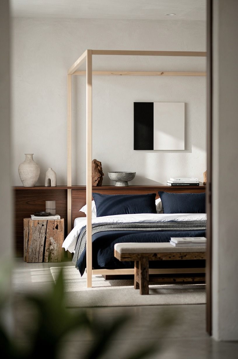
I had assumed a canopy would make the room feel theatrical.
Instead, a removable canopy gave the bed a quiet vertical outline. I used lightweight fabric, a tension rod, and removable hooks so the whole arrangement could come down without leaving a trace.
The most successful version stayed within a navy, white, and walnut palette. The dark fabric added intimacy, while the walnut detail connected the bed to the rest of the room.
I kept the canopy narrow rather than wrapping the entire bed. That made it feel restful instead of elaborate. If your ceiling is low, let the fabric fall behind the headboard and keep the sides open.

7Use a peel-and-stick color field
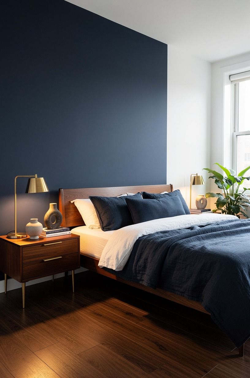
I wanted the warmth of paint without painting. A peel-and-stick color field gave me the visual effect of a painted zone behind the bed, using a muted navy inspired by Farrow & Ball Hague Blue No. 30. I chose one large rectangle rather than covering the whole wall.
The shape created a headboard-like backdrop and made the bed look more grounded. If you're considering a deep shade, compare it with Benjamin Moore Hale Navy HC-154 and Sherwin-Williams Naval SW 6244 before ordering. Screens can make navy look black, gray, or unexpectedly bright depending on the light in your room.
But don't place the color field too low. Mine looked cramped until I allowed it to rise above the top of the headboard and extend slightly beyond both sides.
That extra breathing room made the bed feel wider. I also left the remaining wall white, which kept the bedroom bright during the day.
You can test the material behind a door first, because removable adhesive behaves differently on smooth paint and textured walls.
The final result was deep, restrained, and surprisingly elegant. A walnut detail and ivory bedding kept the navy from feeling heavy. For more options, compare the installation advice in these removable wallpaper ideas before committing to a large panel.
8Mix two woods with the Two-Wood Rule
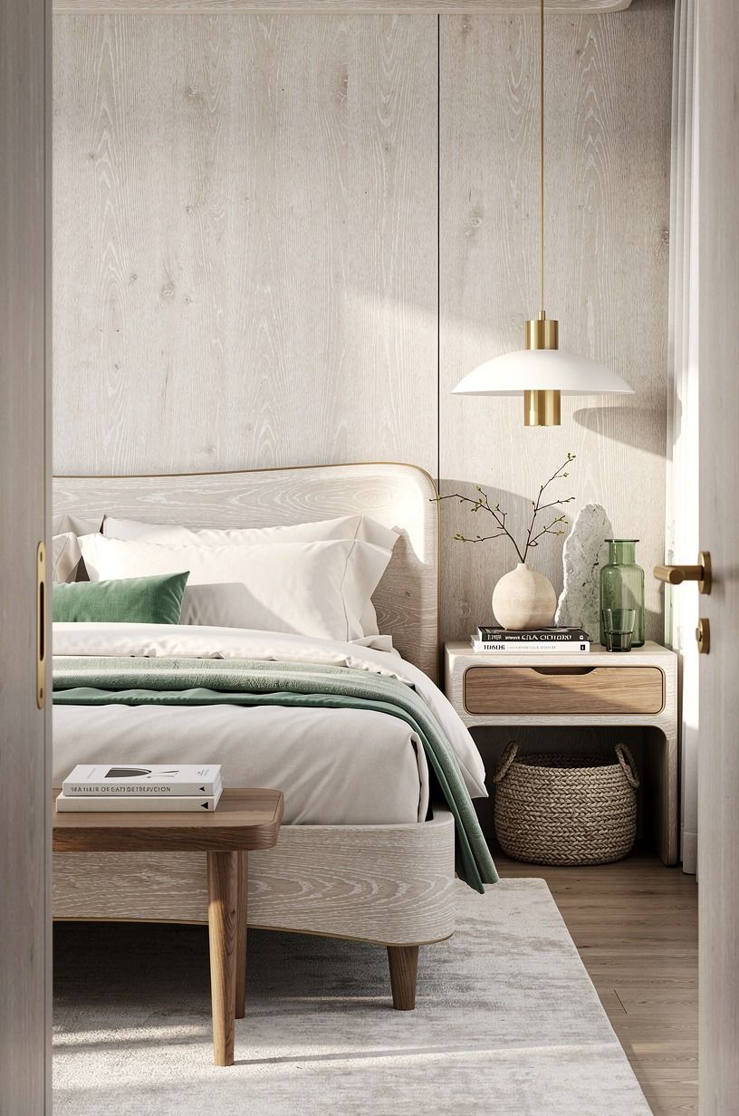
My bedroom had too much white and very little warmth. I brought in wood, but I limited myself to the Two-Wood Rule: one pale cerused white oak finish for larger pieces and a slightly deeper oak tone for small accents. Emerald fabric and small gold details gave the arrangement a richer center.
This kept the wall arrangement from looking like a showroom set. If you're mixing furniture near a white wall, repeat each wood at least twice so the contrast feels deliberate. A single dark object can look stranded, especially above a light bed.
The shift was subtle until I added a small tray and noticed how the grain changed under the lamp. The room felt earthy and more settled.
I wouldn't add a third wood tone here. You might think more variety would look collected, but it usually makes a small bedroom feel scattered. Choose your two finishes, then let the bedding and art provide the variation.
A cerused white oak base with cream bedding, emerald fabric, and brushed-gold accents gave the wall enough contrast without making it heavy. The exact species matters less than repeating the finishes with intention.
9Anchor the wall with an oversized textile
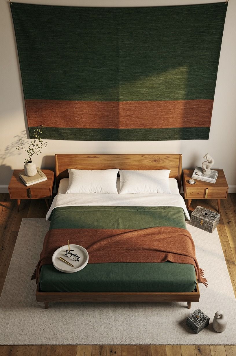
The oversized textile was my favorite low-commitment move. I hung a handwoven textile with small shagreen accents from a slim natural-oak dowel, using removable hooks at the sides. Its uneven surface caught the light and gave the wall a tactile quality that flat artwork couldn't match.
I chose a design with forest green, rust, and natural oak tones because those colors connected the bedding to the wood furniture. If you're working with a narrow room, keep the textile wider than the bed but not so wide that it reaches the corners. The goal is a soft frame around the sleeping zone.
And the sound changed. The fabric absorbed a little of the sharp echo that had bounced between the white walls, so the room felt quieter at bedtime.
That was the moment I stopped thinking of the wall as a background. It was part of the room's comfort.
You can also look for a shagreen-accented woven panel if wool feels too warm against your style.
I used the textile instead of a headboard for one week, and the room felt wonderfully relaxed. A forest-green and rust pattern added enough drama to keep the wall interesting without making it restless. For a calmer bedroom, choose natural oak, soft moss, and a smaller shagreen detail.
The textile was also easy to move when I changed the bed position. This white bedroom sleep guide helped me keep the area around my face quiet while still giving the room a memorable focal point.
10Turn postcards into a rotating gallery
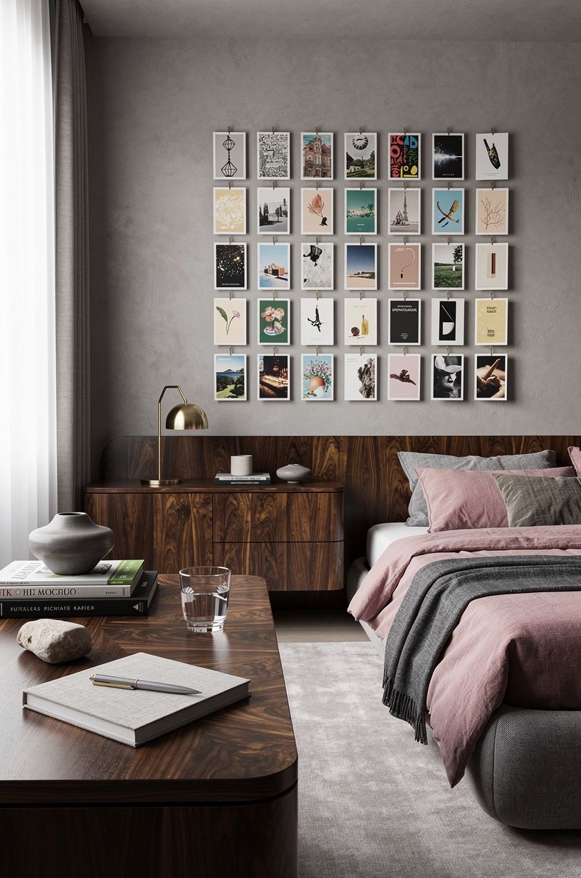
I wanted the wall to hold memories, not just color.
I used postcards in dusty rose, charcoal, and muted brass tones, then placed them in a few book-matched walnut frames. The walnut made the inexpensive paper feel more considered and gave the display enough weight above the bed.
The gallery stayed intentionally small. I could rotate the postcards whenever I wanted the room to feel different, and nothing had to be permanently attached to the wall.
I liked that this idea allowed the bedroom to change with my memories. A postcard from a weekend away could sit beside an old botanical print, while the charcoal and brass details kept the display from becoming too sweet.
11Contrast warm fabric over cold white
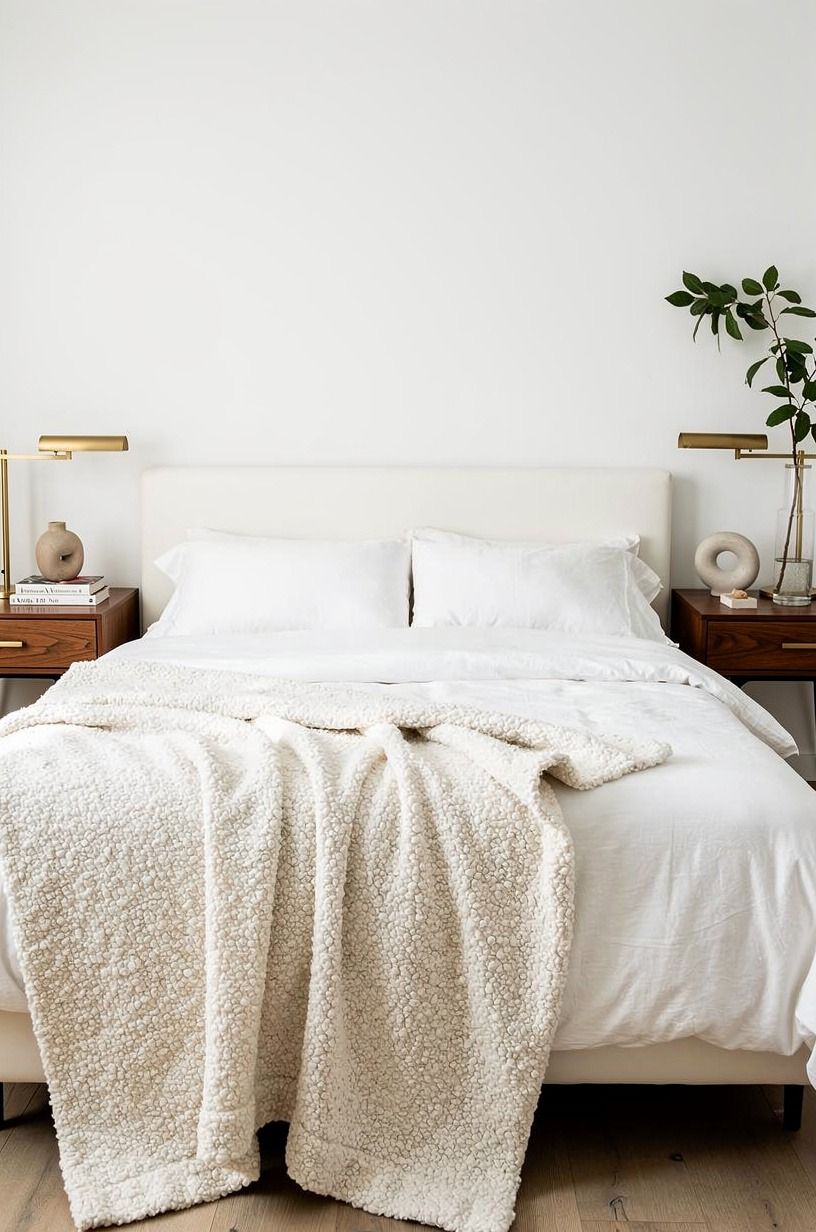
The wall itself wasn't the only problem. My white bedding and white wall were merging into one pale block, so I added a warm textile layer behind the pillows. An organic bouclé lumbar cushion gave the bed texture, while a camel throw introduced warmth and a small black accent added definition.
You can make a white bedroom feel more inviting without covering the wall at all. The key is contrast in texture, not just contrast in color. I kept the wall plain and let the fabric cast a soft edge against it.
But I skipped the matching bedding set. It would have made the room look staged, and the whole point was to create a lived-in space.
A nubby bouclé pillow beside smooth cotton made the bed feel more comfortable and less precious. If you're working with a tight budget, shop your own closets first.
A camel blanket folded over a chair can become the color bridge your wall needs.
The strongest combination was organic bouclé, washed linen, and one black accent. It looked tactile, generous, and relaxed without turning the bed into a pile of cushions. The non-toxic bedroom guide I used earlier also helped me choose lower-odor textiles for a room with limited ventilation.
This approach is especially useful when you can't alter the wall at all. Read these renter-friendly bedroom ideas for more ways to change the mood through furniture and fabric.
12Which wall does your nightstand need?
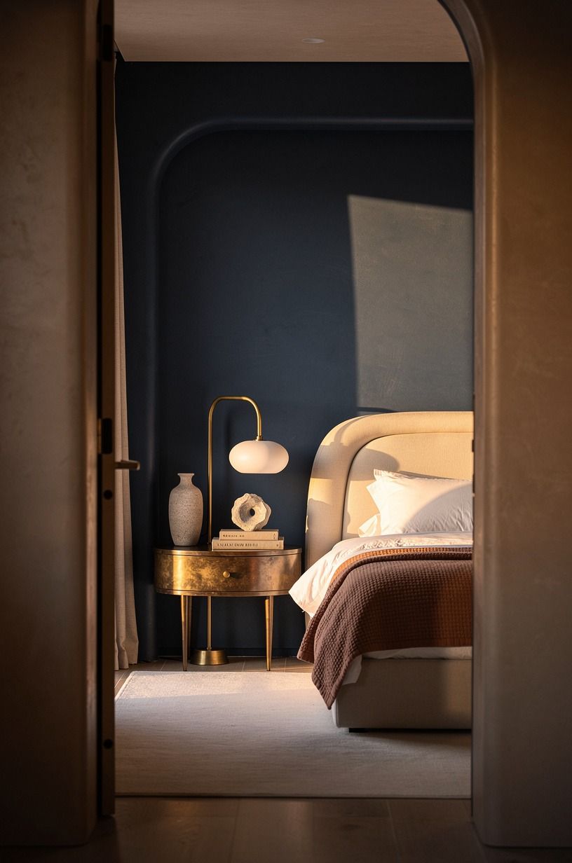
The wall beside the nightstand needed function, not another decorative moment.
I moved the useful pieces there: a small lamp, a charging spot, and one narrow surface for a book. The midnight blue, copper, and ivory palette kept the area connected to the bed without adding another busy display.
An unlacquered brass detail was especially useful because it softened with time and developed a gentle patina. That gave the rental room a sense of history without requiring permanent hardware.
The lesson was simple. Not every wall needs art. Sometimes the best renter-friendly decision is to let one side of the room handle the practical work while the bed wall stays calm.
13Choose textile panels instead of a mural
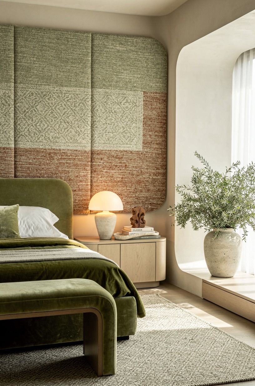
I considered a large mural, then chose two narrow textile panels instead. The panels were made from deep-pile mohair velvet, each in a soft sage green and warm cream palette with a simple hanging loop. I placed them on either side of the bed, leaving the center wall white.
This contrast worked because the room had texture and rest. If you're drawn to bold wallpaper but worry about commitment, two velvet panels let you test the mood at a smaller scale. You can remove them, fold them, and try them in a hallway later.
But I didn't make the panels symmetrical in height. One sat slightly lower, which kept the arrangement from looking like a hotel installation.
The difference was small, but it made the room feel less rehearsed. I wouldn't use two busy textures here.
Pick one textile and let the second panel repeat it rather than compete with it. The result was soft, earthy, and easy to change.
A sage velvet panel with warm cream backing worked especially well beside natural wood. If the room is darker, use more cream and less green so the wall still feels open.
If you're comparing fabric with adhesive treatments, these removable wallpaper ideas make the tradeoffs easier to see. Textile panels are forgiving, portable, and far less visually demanding.
14Frame a mirror with the Three-Source Light Stack
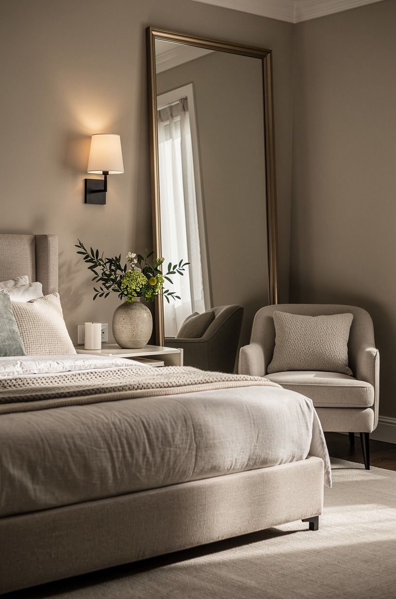
The mirror was the one addition I nearly rejected.
I assumed it would add another hard surface, but it helped distribute the room's limited daylight. I placed it near the side wall rather than directly above the bed and paired it with a small lamp and reflected window light.
A terracotta, stone, and olive palette kept the corner warm. The hand-applied Venetian plaster nearby gave the mirror a softer setting than plain white paint would have, while the reflective surface made the bedroom feel larger.
I chose a simple mirror with no heavy ornament. That kept the arrangement renter-friendly and made it easy to move when I changed the furniture.
15Make the wall work for sleep
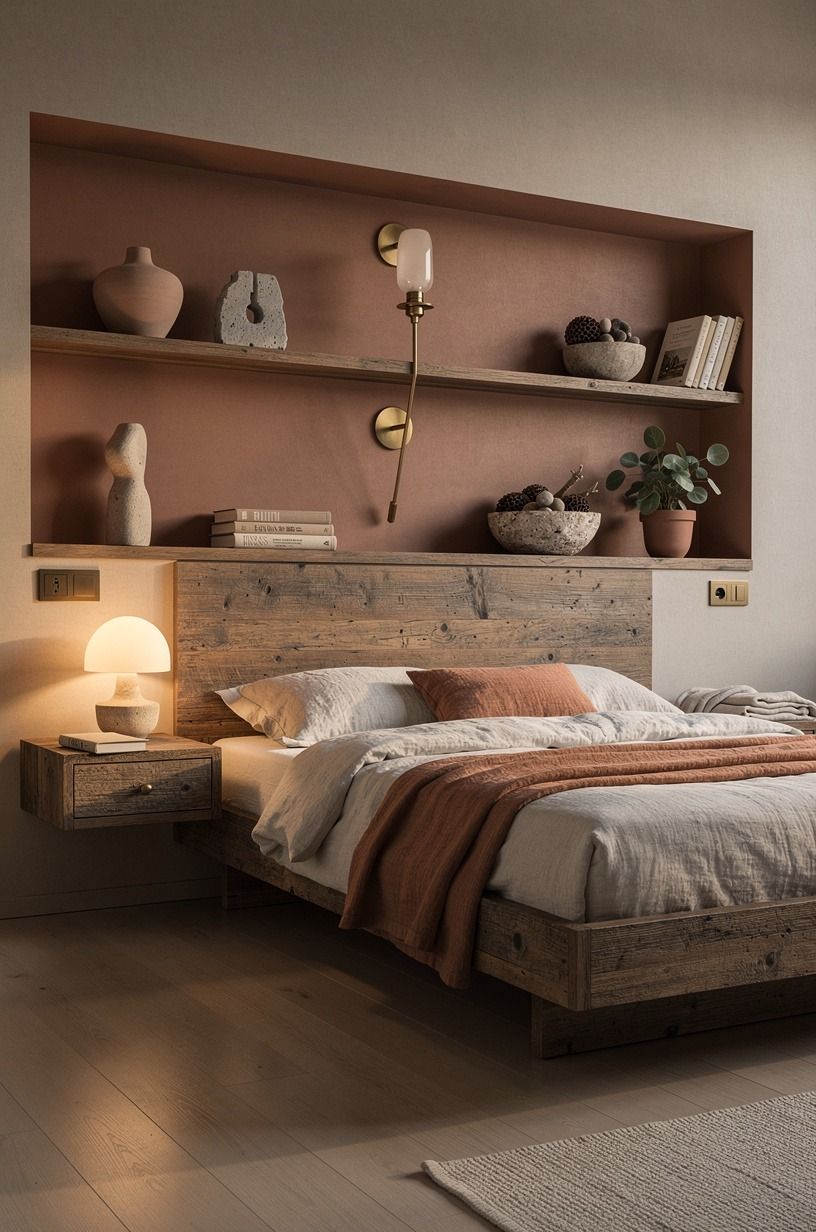
The final idea was less decorative and more intentional. I kept the wall behind the bed quiet, then moved the strongest visual interest toward the side wall with a reclaimed weathered teak frame and a small washed-linen banner. The bed became a place for sleep instead of a display platform.
You can still have renter friendly wall ideas without filling every available surface. I used the white bedroom sleep guide to rethink the room's evening light, then removed anything that felt too stimulating near the pillows. The white wall stayed, but it no longer felt empty.
And this was the surprising result: I slept better in the room once the visual noise moved away from my face. If you're tempted to add one more frame, ask what you'll see from the bed with the lights off.
A warm, restrained wall can feel more intimate than a packed gallery. That choice gave the whole makeover a serene finish.
The most successful detail was a small linen banner beside the weathered teak. It was quiet, imperfect, and alive. I didn't expect such a modest piece to make the room feel so welcoming!
How much it cost
My approach was to keep the wall changes in the budget tier and reuse anything I already owned. The honest US planning range for a bedroom refresh is broader than a wall-only project, so don't treat the table as a personal receipt. It gives you a useful scale before you shop.
For the wall pieces, the material matters more than the label. A textile panel can replace framed art, while a tension rod can replace a permanent curtain installation. If you're planning a fuller room update, these typical material costs are useful:
I wouldn't spend the high tier on a rental bedroom unless the furniture will move with you. Put your money into the pieces you can take, such as quality bedding, a headboard, or a well-made textile. The wall itself should stay flexible.
If you're starting with almost nothing, begin with the fabric layer and lighting. The renter-friendly bedroom guide helped me prioritize the changes that made the room feel better immediately. You can add art later.
A realistic first pass could be a secondhand frame, a cotton throw, removable hooks, and one warm lamp. That combination is affordable, portable, and far more effective than buying a dozen small decorations.
Why I Stopped Treating White Walls as a Problem
I started this makeover assuming white walls needed color. After living with the room, I changed my mind.
The wall didn't need to become louder. It needed scale, texture, and a few objects that carried a real memory. That distinction saved me from buying random decor simply because the surface looked unfinished.
My first impulse was to cover everything. I pictured wallpaper across the whole wall, a large gallery, and shelves packed with books.
Then I imagined moving out and removing all of it in one tired afternoon. The rental restriction wasn't only a limitation.
It forced me to choose pieces that could stand on their own and travel with me.
The best choices were the ones that changed with the light. Linen looked pale in the morning and warmer after sunset.
The textile cast a rough shadow. The mirror brought the window farther into the room. Those details made the bedroom feel alive without making it busy.
A printed panel that looks flat online can feel rich when the weave catches a bedside lamp.
I also learned that “no damage” doesn't mean “no planning.” You still need to check the wall finish, test adhesive, measure the bed, and pay attention to what each piece reflects. I skipped that process once, and a narrow curtain panel made the wall look even more awkward. It took one adjustment to fix, but I could have avoided it.
If you're choosing between a bold wall treatment and a softer layer, I'd start with the soft layer. Fabric is forgiving. It hides unevenness, absorbs sound, and can move to another room.
Paint and wallpaper can be wonderful, but they shouldn't be your only route to warmth.
The room now feels inviting because it looks lived in, not because every surface is decorated. That was the real surprise. My plain white walls didn't need rescuing.
They needed a clearer relationship with the bed, the light, and the objects I already loved.
The most valuable lesson was restraint. A warm linen panel, a softly glowing lamp, and one meaningful piece of art gave me more satisfaction than a crowded wall ever could. Start small, live with the change, and let the room tell you what it still needs.
The Questions I Get Asked Most
What is the best 15 Renter Friendly Wall Ideas for Boring White Bedroom Walls for a small bedroom?
The best choices are a fabric headboard and curtains behind the bed because they add height without taking floor space. An IKEA MALM frame with washed linen or a narrow textile panel keeps the room soft and flexible. You can remove both when you move.
Where can I buy 15 Renter Friendly Wall Ideas for Boring White Bedroom Walls pieces on a budget?
Look at IKEA, Wayfair, and Target first, then check Facebook Marketplace or a local thrift shop for frames, mirrors, and textiles. Secondhand wood frames often look more personal than matching new sets, and you can refresh the arrangement without adding wall damage.
How much does a 15 Renter Friendly Wall Ideas for Boring White Bedroom Walls makeover cost?
A budget bedroom refresh typically runs $200-$800 in the US, depending on whether you need bedding, shades, paint, and art. Your wall-only cost can be lower if you reuse frames, fabric, and furniture you already own. I spent the least on postcards, removable hooks, and a cotton throw.
Can I create a 15 Renter Friendly Wall Ideas for Boring White Bedroom Walls on a budget?
Yes, and you can begin with free changes. Rearrange existing art, hang a scarf from a tension rod, and move a mirror opposite the window. A cotton throw, thrifted frame, or removable picture ledge can add warmth without pushing you toward a full-room budget.
Is a 15 Renter Friendly Wall Ideas for Boring White Bedroom Walls worth it in a small space?
Yes, because a small room benefits from vertical texture and clear visual zones. Keep the bed wall simple, use a mirror to reflect daylight, and choose a rug that extends 18-24 inches past the bed. That spacing helps the furniture feel grounded.
Is 15 Renter Friendly Wall Ideas for Boring White Bedroom Walls a good idea for a rental?
Yes. Peel-and-stick wallpaper, tension rods, removable hooks, lightweight textile panels, and freestanding mirrors can change the room without permanent work. Test adhesive on a hidden area first, and keep heavy shelves off walls unless your lease clearly allows them.
Where I'd Start First
If I had to pick one, I'd start with the fabric headboard. It changes the wall's scale, softens sound, and moves with you when the lease ends.
You don't need a perfect room. You need one warm anchor that makes the white wall look deliberate.
Pin this idea for later, then build around it slowly.