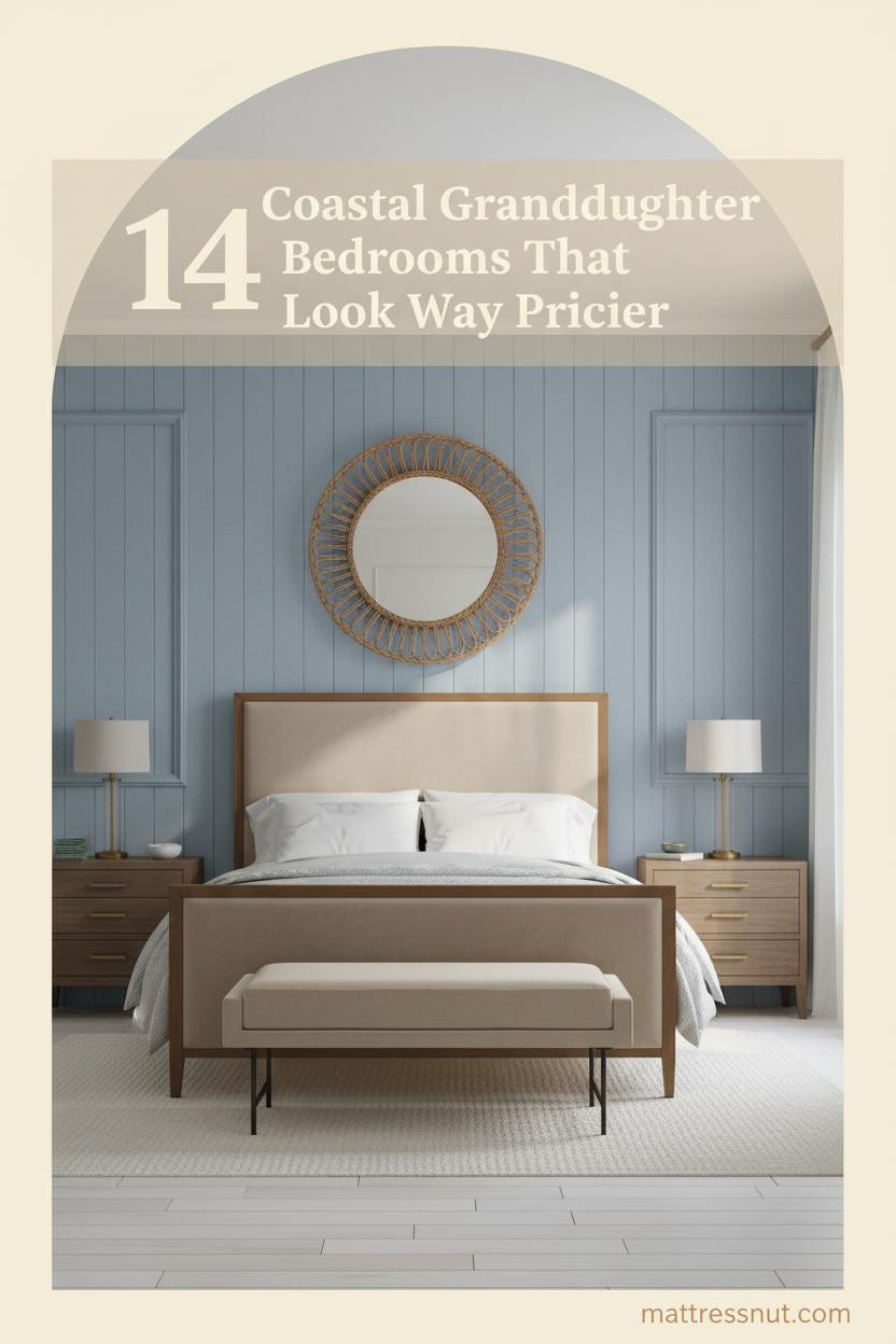
The coastal granddaughter bedroom aesthetic isn’t about anchors on the wall or seashell collections from a gift shop. It’s the kind of room that feels inherited, not assembled. These 14 rooms show exactly how blue, white, and natural texture come together to build something that actually feels like the sea.
The Talavera Tile Detail That Makes a Bedroom Feel Like a Discovery
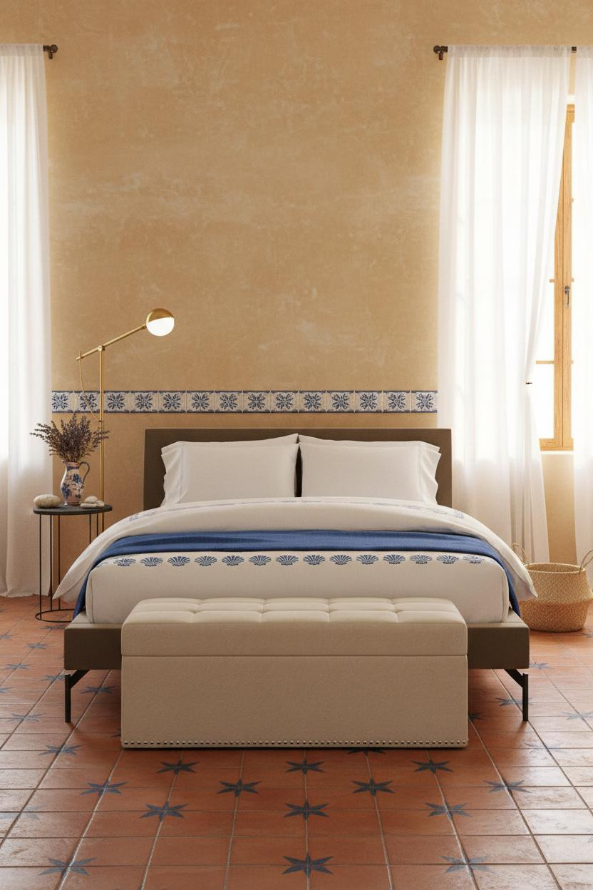

This is what happens when coastal design stops trying to be obvious and starts being specific.
Why it works: A hand-painted Talavera tile border strip at mid-wall height on sandy ochre adobe plaster gives the room a material story that flat paint simply can’t match — the tiles carry the blue-and-white palette without repeating it awkwardly across every surface.
The key piece: A storage bench at the foot of the bed pulls double duty here — the Rhone Storage Bench grounds the room and keeps the floor clear enough that the terracotta tile beneath can breathe.
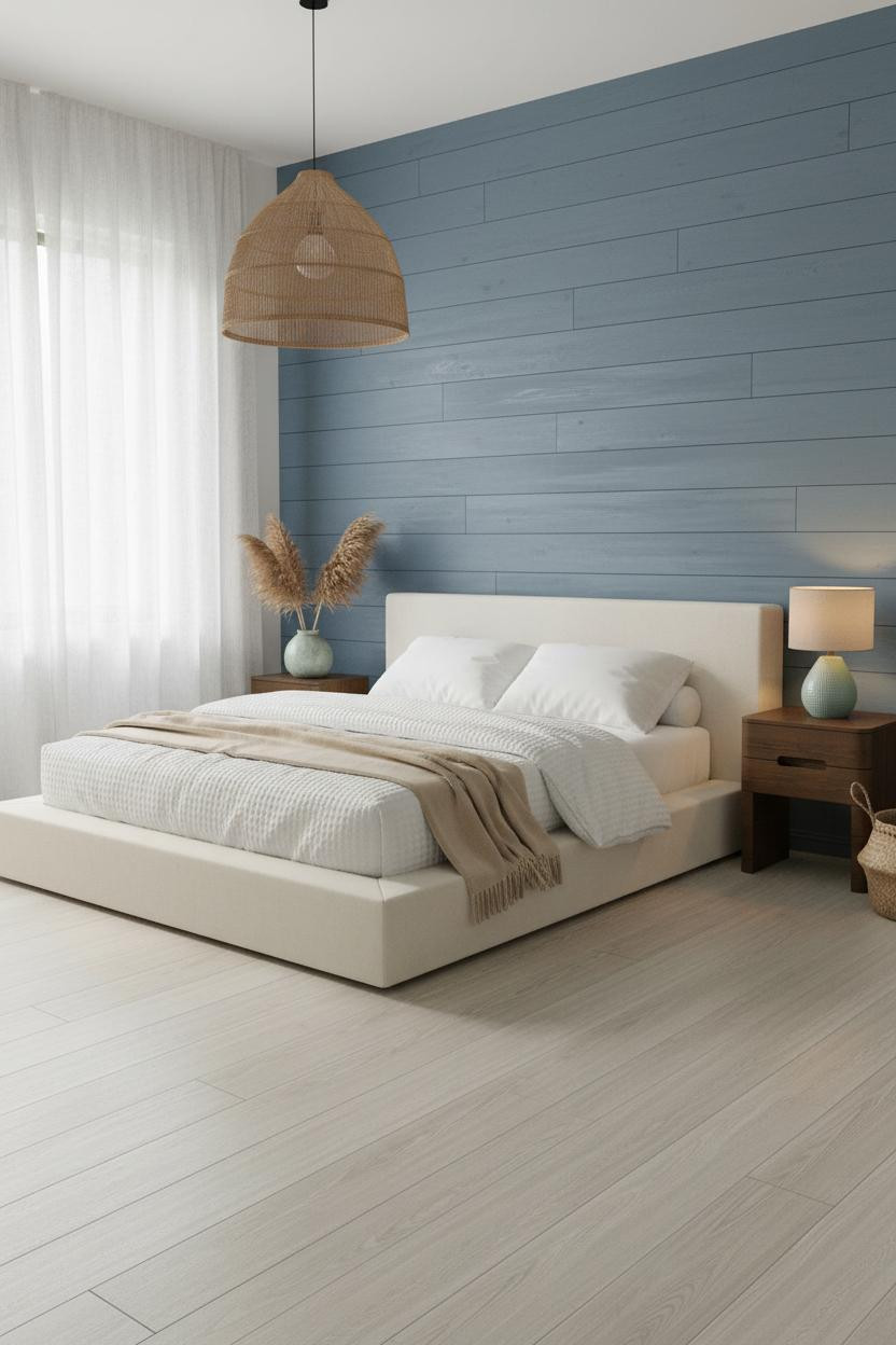
Sage Shiplap and the Heirloom Coastal Map You Never Thought To Hang
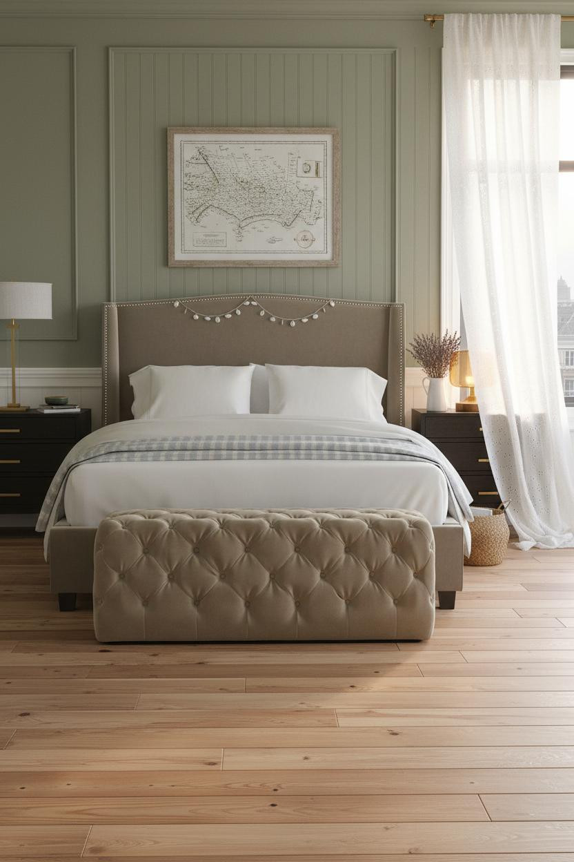


Sage green walls in a beach bedroom shouldn’t work this well, and yet here we are.
Design logic: Sage-green vertical shiplap with visible wood grain through the matte finish reads warmer than painted drywall, and that warmth keeps Atlantic daylight from turning the room cold and clinical.
What to borrow: The vintage coastal map in a driftwood frame above the headboard is the kind of art that looks found, not bought — pair it with a tufted ottoman like the Constance to keep the footprint soft and classic.
The Arched Alcove That Turns a Plain Bed Into a Destination
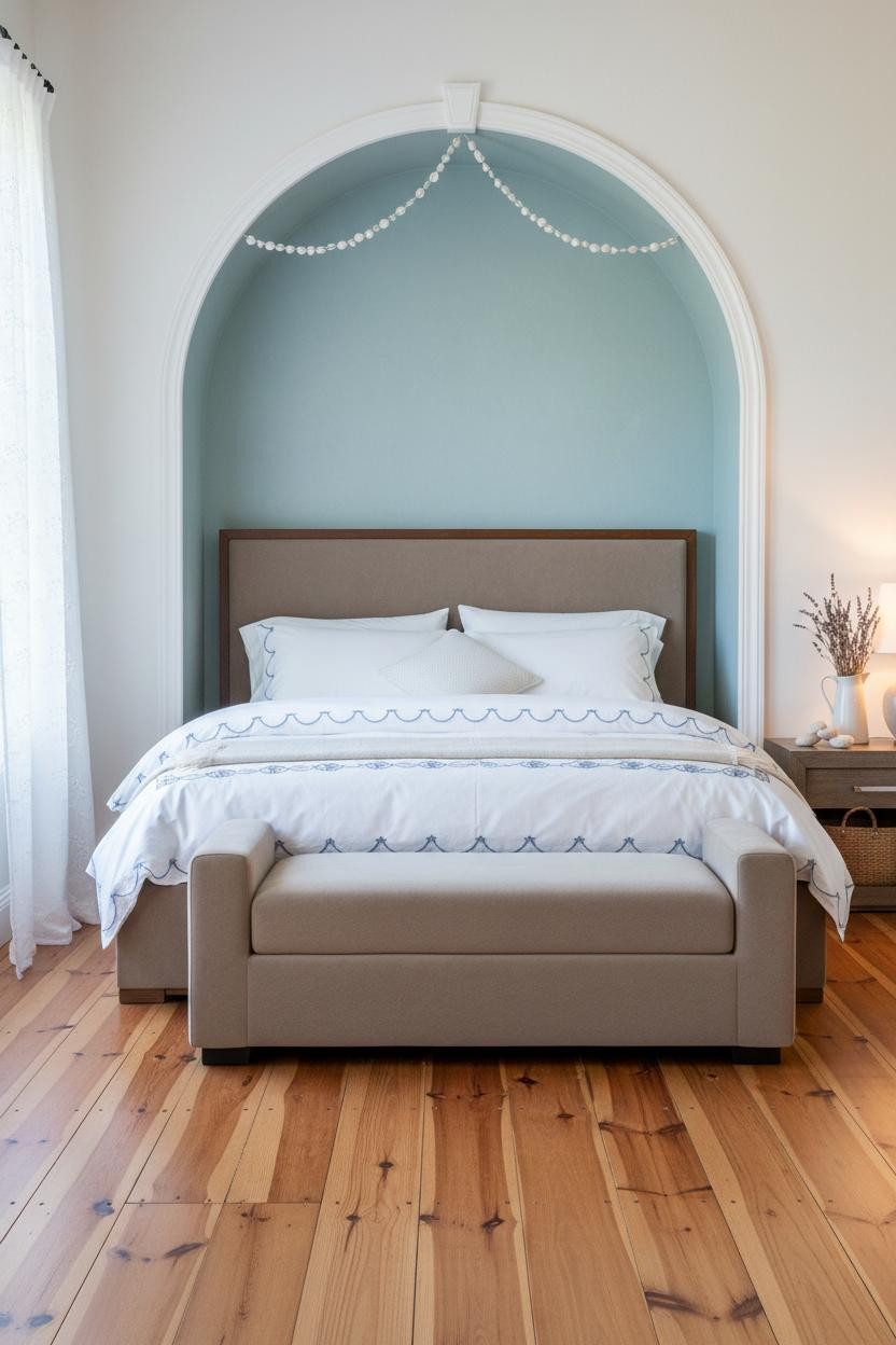


Architecture does the decorating here, and the rest of the room is smart enough to stay out of the way.
What makes this one different: A painted white arched alcove niche with a soft sage-blue wash on the interior reveal frames the bed like millwork, giving the room a structural focal point that no amount of art or wallpaper can replicate.
Pro move: If you’re working with a smaller bedroom, building or faking an arched niche with paint and trim molding costs a fraction of what it looks like and makes the entire layout feel purposeful.
A Teal Ceiling That Borrows Color From the Bay Outside
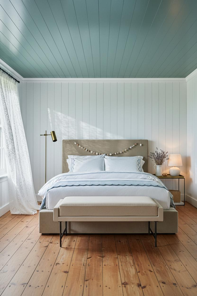


Painting the ceiling instead of the walls is one of those moves that sounds risky until you see it done right.
Why the palette works: Slate-teal beadboard ceiling planks cast a cool blue-green light down onto crisp white walls below, so the room picks up the color of the water without committing to an all-blue room that could easily feel heavy.
Avoid this mistake: Don’t pair a colored ceiling with busy wallpaper or pattern-heavy bedding — this look only holds together because the walls and linens are kept completely clean.
Whitewashed Lime Plaster With a Mineral Blue Wash That Feels Tropical

Honestly, this is one of the quieter rooms in the list, and it ends up being the one I keep coming back to.
What gives it depth: Whitewashed lime plaster with a mineral blue wash pooling naturally in the texture recesses gives the wall color that shifts slightly depending on where the light hits — no two spots read exactly the same, which is what separates it from flat paint.
The finishing layer: A rattan arched canopy headboard casting woven shadow patterns on plaster is the kind of texture combination that makes a room feel designed without trying too hard — pair it with the Brienne Channel Ottoman for a clean, warm finish at the foot.
The Periwinkle Stripe That Replaced an Entire Accent Wall
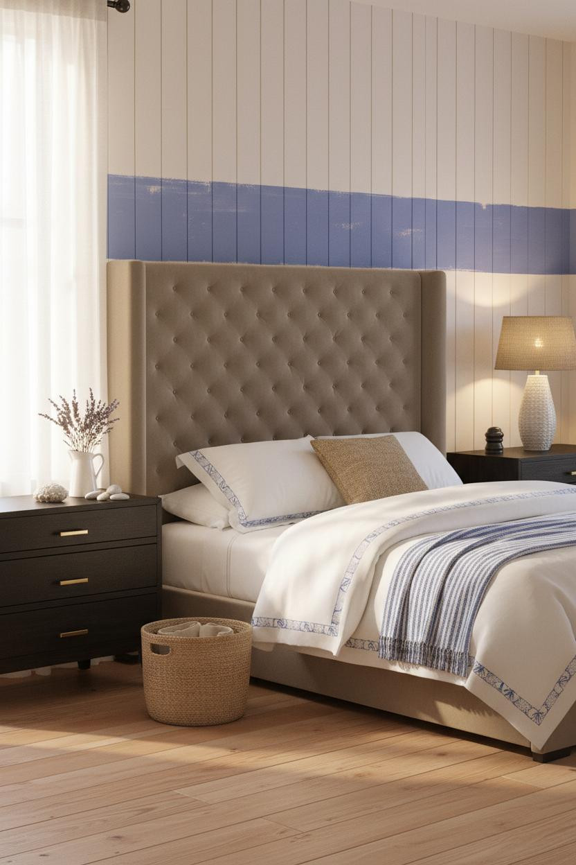


One horizontal stripe of periwinkle blue at mid-wall height and the room has an identity before a single piece of furniture even enters the equation.
Why it feels intentional: A wide hand-painted periwinkle stripe on sandy white vertical plank walls divides the wall plane without closing it in — it gives the eye a place to land without committing to a full color that would shrink the room.
One smart swap: Trade the standard dark nightstand for the Noire Nightstand — the black finish creates a grounding contrast against light plank walls that white or natural wood just doesn’t.
Aquamarine Wainscoting With Hand-Painted Tile Plaques Above the Rail


This room pulls from Portuguese azulejo tradition and somehow manages to feel completely fresh rather than themed.
What carries the look: Aquamarine tongue-and-groove wainscoting on the lower half topped by a white picture rail cap creates a clean two-tone proportion, and the ceramic tile plaques clustered above the rail keep the top section from feeling empty without overloading it.
What cheapens the look: Swapping the encaustic cement tile floor for plain porcelain would flatten the whole room — the terracotta base with sun-faded edges is what gives the palette its warmth and age.
White Beadboard and a Blue-Grey Band That Gets the Proportion Right


Classic Provençal farmhouse meets beach cottage and neither one takes over — that balance is harder to pull off than it looks.
Why it feels balanced: White painted beadboard covering the lower two-thirds anchors the room in cottage warmth, and the narrow blue-grey wallpaper band above the chair rail adds color without the visual weight of a full accent wall.
Best for: Anyone building a coastal bedroom in a room with lower ceilings — this two-thirds wainscoting proportion makes walls feel taller while keeping the palette grounded and soft.
Powder-Blue Paneling That Looks Like a Swedish Manor Beside the Sea


Pale powder-blue vertical paneling floor to ceiling and it reads completely calm — not cold, not childish, just clean.
Why it looks custom: Full-height pale powder-blue tongue-and-groove paneling with visible wood grain through the matte finish topped by a crisp white picture rail gives the room structure that built-in millwork would charge thousands for.
The easy win: The whitewashed pine flooring and blue paneling share the same bleached, sun-worn undertone, which is why the palette holds together — if you use warm honey floors with cool blue walls instead, it fights itself.
Beadboard Meets Slate-Blue Wallpaper in This New England Bedroom
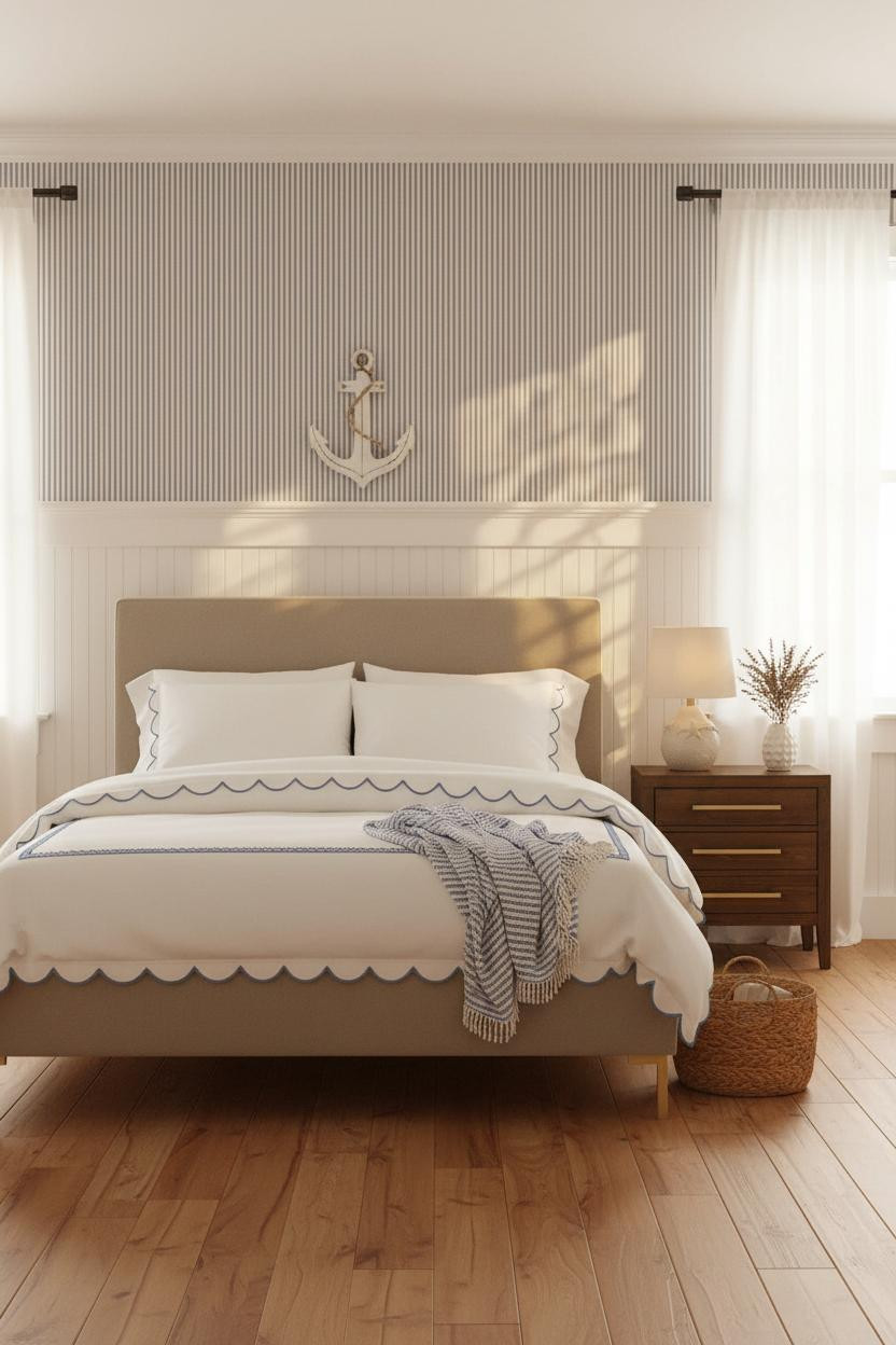


This is what a beach house aesthetic looks like when it takes its cues from colonial architecture instead of surf shops.
What creates the mood: White beadboard wainscoting on the lower two-thirds with a narrow blue-and-white stripe wallpaper above the picture rail is a classic New England proportion — the stripe is just wide enough to read as coastal without turning the room into a nautical theme.
Try this: Hang a single piece of white-painted wooden art (an anchor, a compass, a simple wave shape) on the upper wallpaper section and leave the rest bare — it reads as intentional instead of decorated.
Navy Board and Batten That Makes White Plaster Glow Brighter
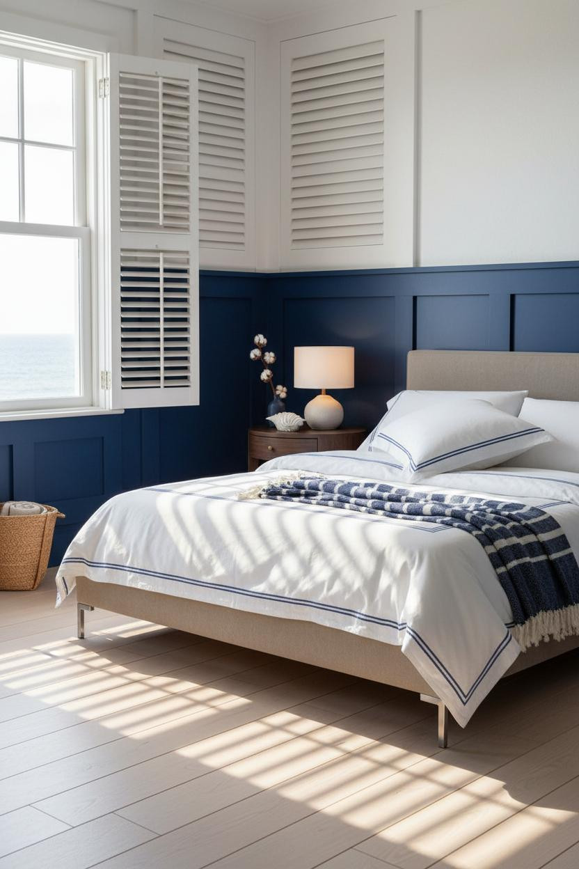


Deep navy in a bedroom can go heavy fast, but stop it at the wainscoting line and the whole room opens up above it.
What sharpens the room: Navy board and batten panels on the lower two-thirds create a strong contrast against the crisp white plaster above, making that upper wall feel brighter than it would if the whole room were painted a pale neutral.
Where to start: If you’re nervous about navy in a bedroom, this is the version to try — limit it to below the wainscoting rail, keep everything above bright white, and let the stripe throw do the color work at bed level.
Cerulean Blue-White Washed Plaster Straight From a Greek Island
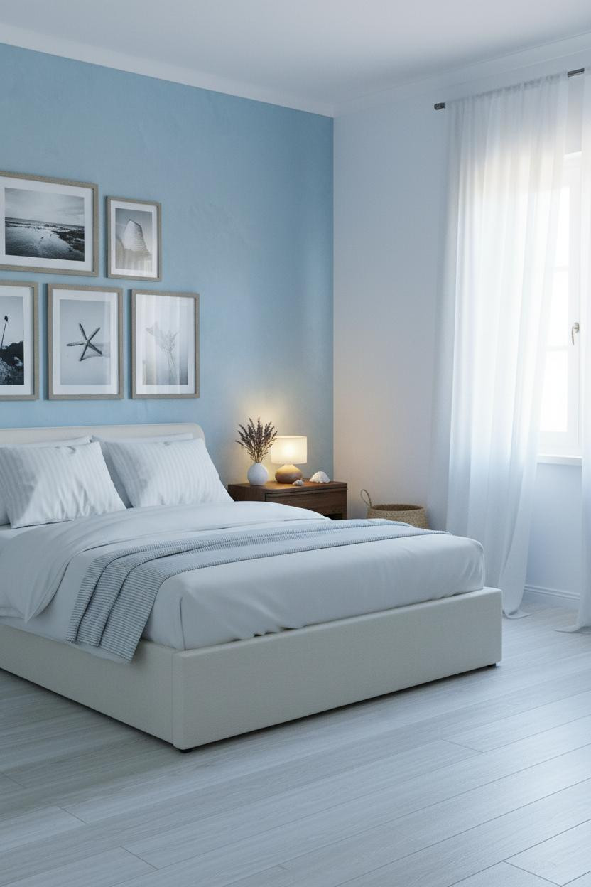


No anchors, no fishing nets. Just cerulean blue-white washed plaster and morning light doing everything.
The real strength: Cerulean blue wash on whitewashed plaster lightens near the ceiling and deepens at mid-wall naturally, which gives the room a color gradient you didn’t have to engineer — the texture of the plaster does it on its own.
What not to do: Don’t hang matching coastal prints in matching frames above a bed like this — the organic wall finish is already the art, and anything too rigid breaks the loose, sun-worn feeling that makes the room work. (Less is genuinely more here.)
Seafoam White Shiplap With a Round Rattan Mirror That Anchors Everything
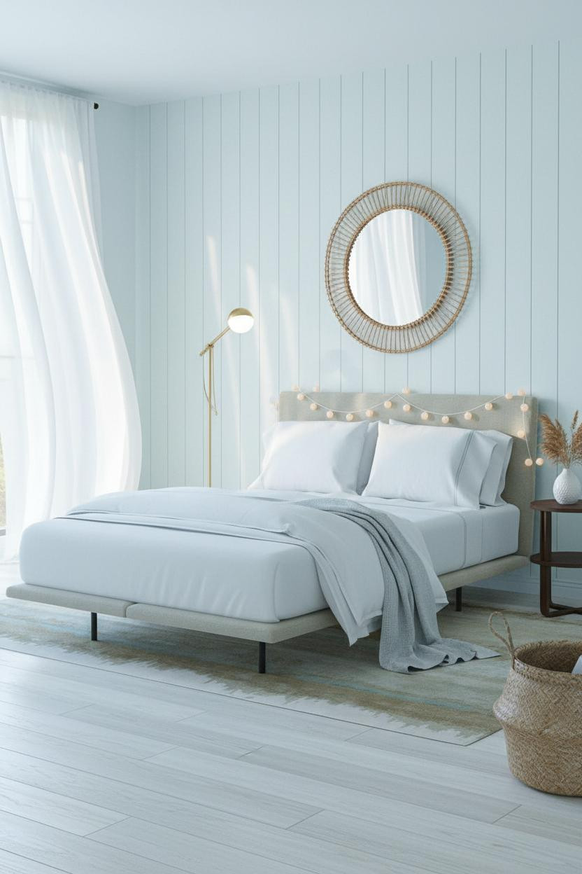


This is the version of the coastal granddaughter bedroom that works equally well in a teen’s room, a guest room, or a dorm (yes, really — check these dorm bed comfort tips if you’re trying to recreate the feeling on a budget).
Why it holds together: Seafoam white shiplap with natural grain visible through the wash gives the wall texture without color commitment — the 90cm round rattan mirror above the headboard then adds warmth and frames the bed without functioning as a headboard replacement.
Ideal if: You want coastal blue room ideas without painting a single wall blue — the rattan, the seagrass accents, and the pale linen throw carry the whole palette organically.
Dusty Blue Shiplap for a Beach House Aesthetic That Actually Ages Well


And here’s the version that leans youngest in the lineup while still having enough restraint to grow with the room.
Where the luxury comes from: Dusty blue horizontal shiplap with a subtle whitewash finish catches raking daylight differently across each plank, so the wall has depth and movement without needing a single accessory in front of it.
The smarter choice: Start with breathable bamboo bed sheets under a white waffle-weave duvet rather than a heavy comforter — the lighter weight keeps the breezy coastal feel intact and the bamboo fibers sleep cooler when the room fills with morning sun.

Our #1 Pick
Saatva Classic Mattress
America’s best-selling online luxury innerspring. 365-night trial, lifetime warranty, free white glove delivery.
Shop Saatva Classic
The Foundation Every Coastal Bedroom Needs to Actually Feel Good
Beautiful coastal bedroom decor sets the mood, but real comfort starts underneath the bedding. Lighting and wall finishes are the first thing you see, but the mattress is what determines whether the room actually delivers on its promise.
The Saatva Classic pairs a responsive dual-coil support system with a breathable organic cotton cover and a plush Euro pillow top. It’s the mattress that makes hotel-style comfort feel like it belongs in your own home, especially once you pair it with the right bed sheets and layered coastal linens.
And comfort in a bedroom isn’t decorative. It’s the whole point.

The rooms that hold up over time are the ones where nothing looks accidental. Every color, finish, and furniture choice in a coastal granddaughter bedroom should feel like it was already there, not placed. Get the bed right first. Everything else follows from that.