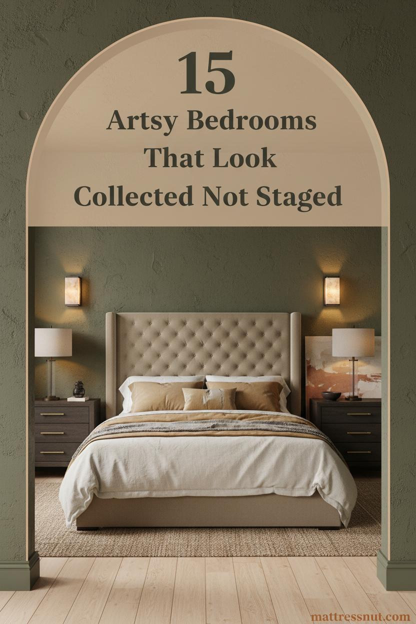
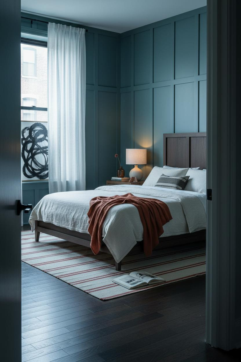
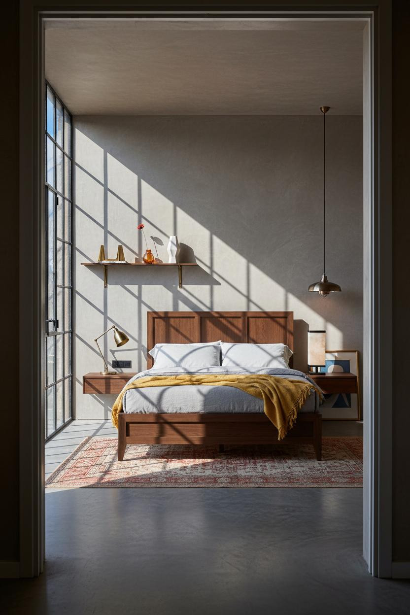
The first thing you notice in the best artsy bedroom ideas isn't the art. It's the feeling that someone actually lives there. Not staged. Not sourced from a single store. Collected.
These 15 rooms lean into that. Each one has a vintage-bedroom-aesthetic logic that takes time to build but is surprisingly easy to start copying today.
Exposed Brick That Earns Its Place
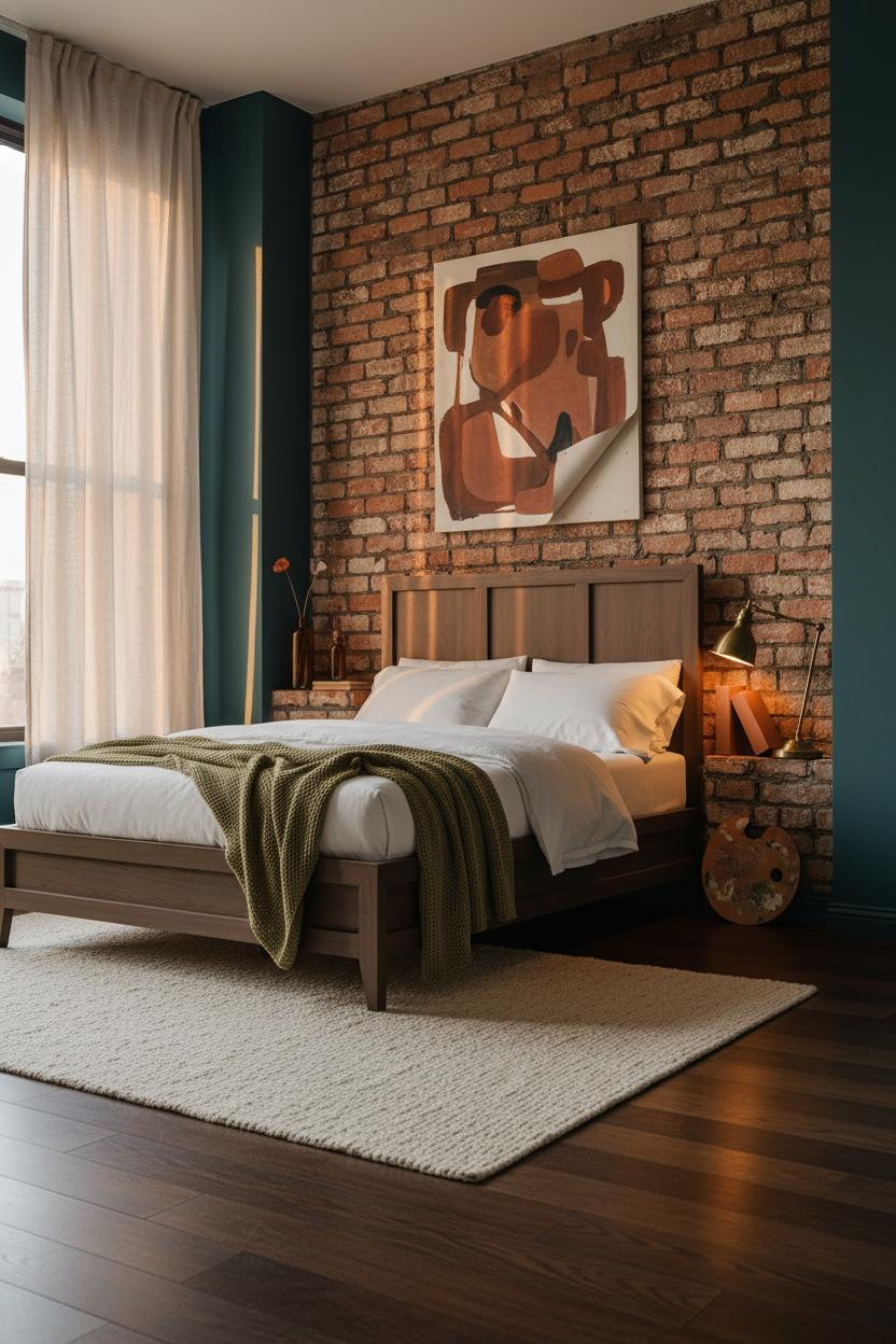

I keep coming back to this one. The brick does something that paint genuinely can't.
Why it holds together: Raw terracotta brick catches warm light across every irregular surface, which makes the room feel like it has decades of history behind it.
Steal this move: Pin a canvas directly to brick with raw visible edges. The imperfection is the point.
Coffered Ceiling That Changes Everything Above You
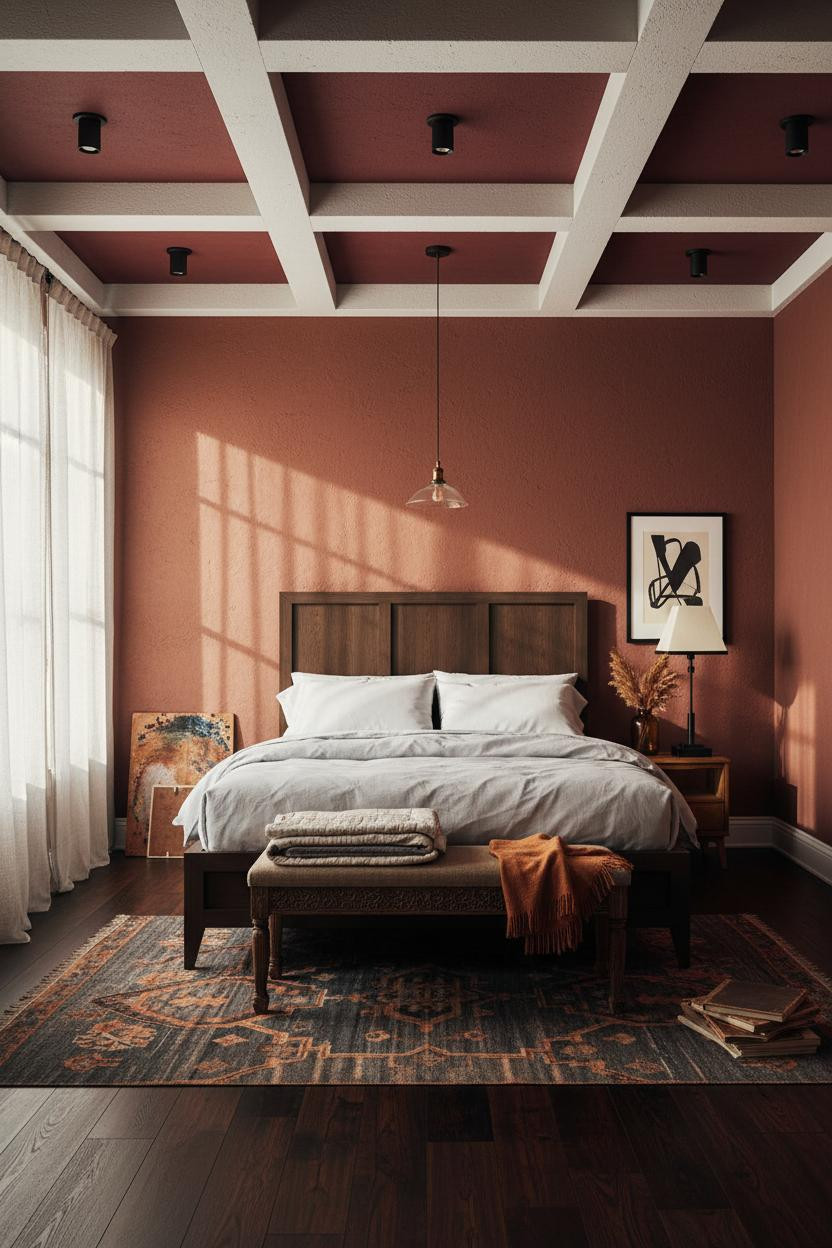
Bold choice. Not cheap to do. But rooms with this kind of ceiling never look rented.
The deep burgundy coffered plaster recesses make the ceiling geometry feel like architecture, not decoration. Spotlights mounted inside each coffer throw focused amber cones down the walls.
The part to get right: Paint the recessed panels a saturated color. The white ribs do the contrast work for you.
Avoid this mistake: Don't leave the coffered ceiling white if you want the drama. It reads flat and misses the whole point.
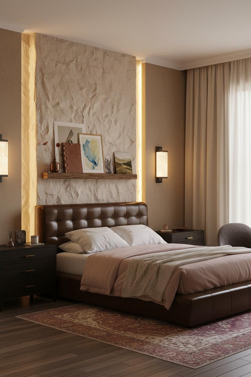
Built-In Shelving That Doubles As A Gallery
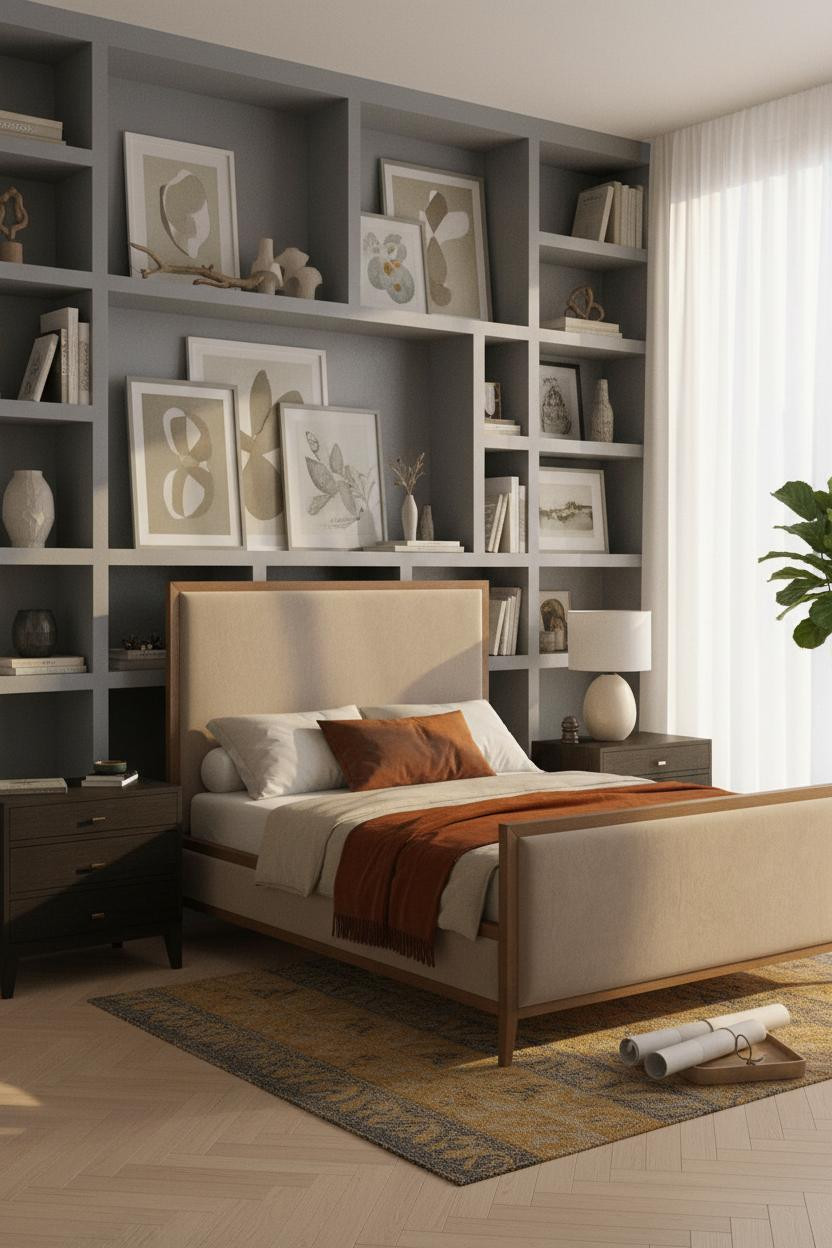

This is the kind of room that makes you want to stop scrolling and actually look.
What makes it work: The matte stone grey plaster shelving spans wall to wall, and loading each compartment asymmetrically keeps it from looking like a showroom. Tilted prints cast shadow relief across the shelf faces.
Load one compartment with leaning watercolors and leave the next one mostly empty. Negative space is part of the collection.
Plum Wainscoting With a Floating Ledge Above
Deep plum below and warm stone grey above. It shouldn't work as well as it does.
Why the palette works: The hand-troweled plum plaster catches raking light and throws shallow relief upward, which makes the transition to the lighter wall feel gradual rather than hard-cut.
Pro move: Mount a reclaimed pine ledge at the transition point and lean mismatched frames at uneven heights. The ledge does the gallery wall work without the nail holes.
Forest Green Herringbone With Salon-Style Art
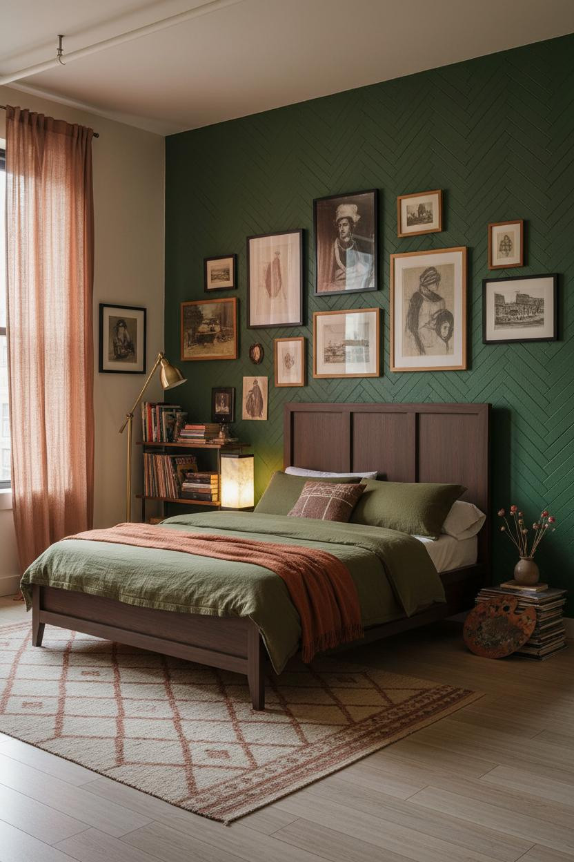

This is the room I'd actually want. Lamp-lit, quietly restless, a little obsessive.
In a room this dark, the real strength is mixing frame styles across the same wall. Black metal beside natural wood beside unframed pins means nothing looks purchased as a set.
What to borrow: The forest green herringbone plaster gives the art somewhere interesting to land. Hang on a flat cream wall and it loses half its character.
Teal Wainscoting That Goes All the Way Up
Most people stop teal wainscoting at chair rail. This room doesn't, and that's exactly why it works.
Why it feels intentional: Floor-to-ceiling matte teal planks create a graphic grid that makes every piece leaning against them look like it was put there on purpose. The room feels collected rather than decorated.
The smarter choice: Lean an oversized charcoal ink painting below the sill instead of hanging it. The casual angle is harder to pull off with hardware.
Crittall Windows Meet Warm Creative Chaos
Admittedly, not everyone has Crittall windows. But the logic here is worth stealing anyway.
What creates the mood: The black steel grid frames slice hard geometric shadows across hand-troweled plaster and layered artwork, and that tension between industrial precision and warm creative objects is what makes it feel alive.
One smart swap: A sculptural blackened steel pendant hung offset above a nightstand does the same work as the windows. It introduces the industrial note without the construction.
An Arched Alcove That Anchors the Whole Room
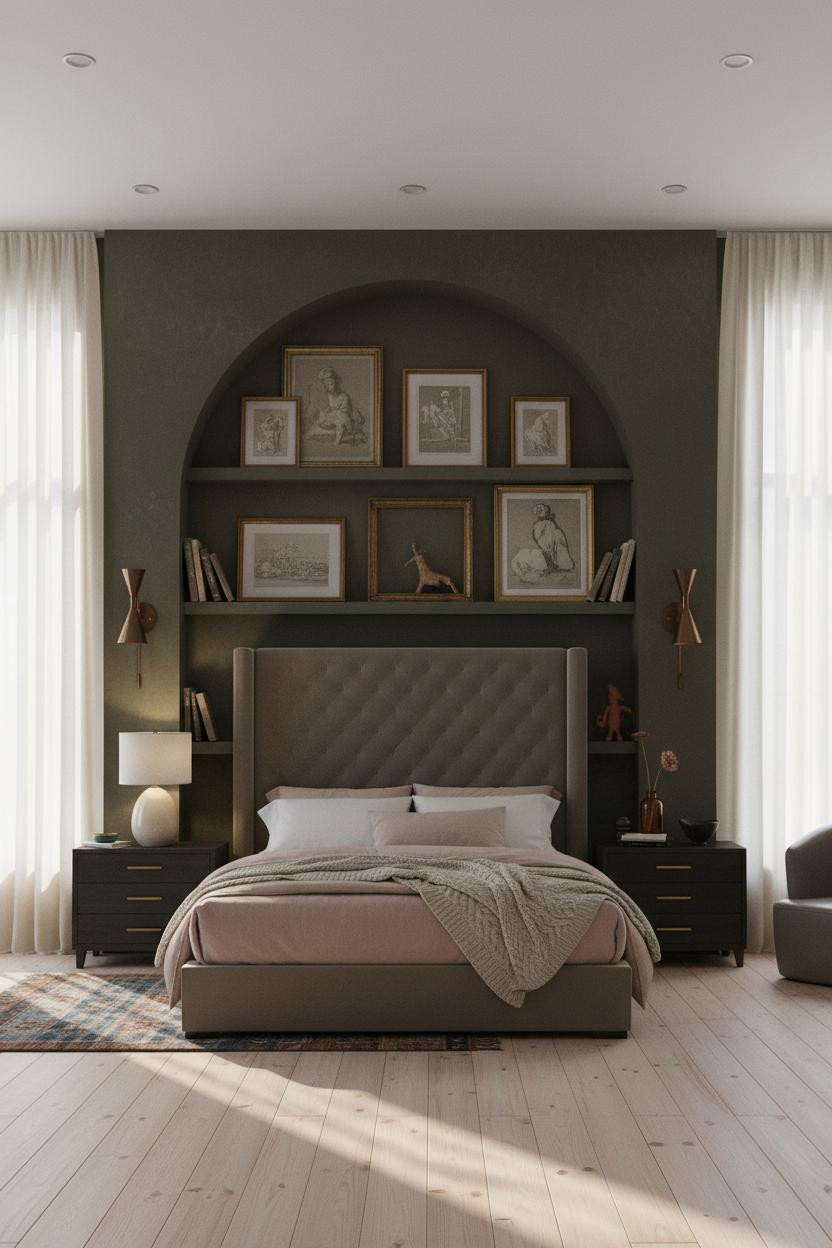

I almost scrolled past this. Glad I didn't.
What gives it presence: A floor-to-ceiling arch in deep olive plaster with hand-troweled texture does something a flat wall never can. The curved edge casts crisp shadow relief that frames every leaning print inside it. Paired aged iron sconces flanking the arch make the whole thing feel permanent, not decorative.
A Chimney Breast That Earns Its Lamplight

The room feels warm without being heavy. That's harder to pull off than it looks.
Design logic: The clay-cream hand-troweled plaster chimney breast picks up lamp warmth across every uneven peak and hollow, which means the light sources do double duty. The texture is part of the lighting plan.
Worth copying: Mount a raw wooden display ledge asymmetrically on the chimney breast. One abstract watercolor face-out, one oil study turned sideways. Nothing too matchy.
Whitewashed Pine Shelving With a Collector's Logic
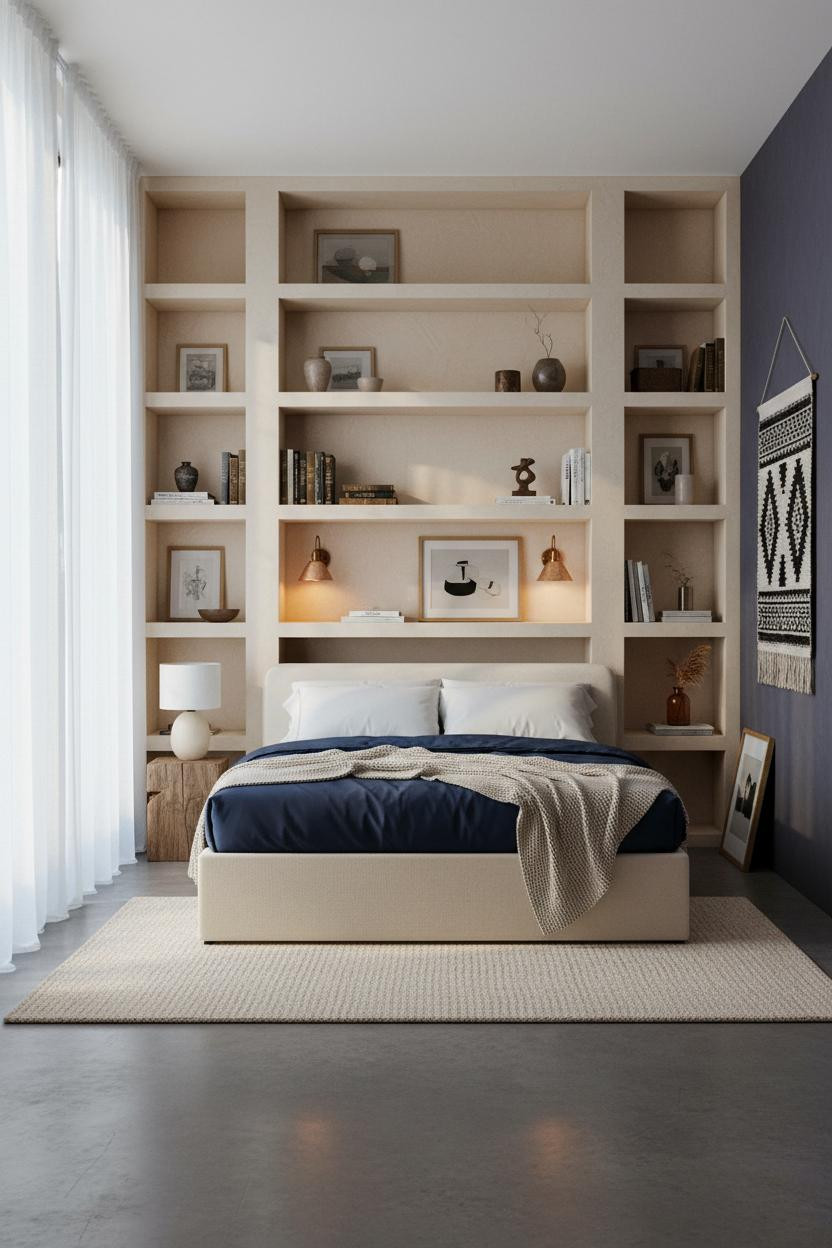

This is one of those rooms that looks complicated but honestly follows one simple rule.
What carries the look: Whitewashed pine shelving against warm indigo walls creates enough contrast that even small ceramic vessels cast interesting shadows. The asymmetric loading does the rest.
Where to start: Put the heaviest objects on the lower shelves and let the tilted leather-bound art books fill the gaps. A small bronze sculpture is worth ten decorative boxes.
Dusty Rose Plaster With a Parisian Gallery Wall
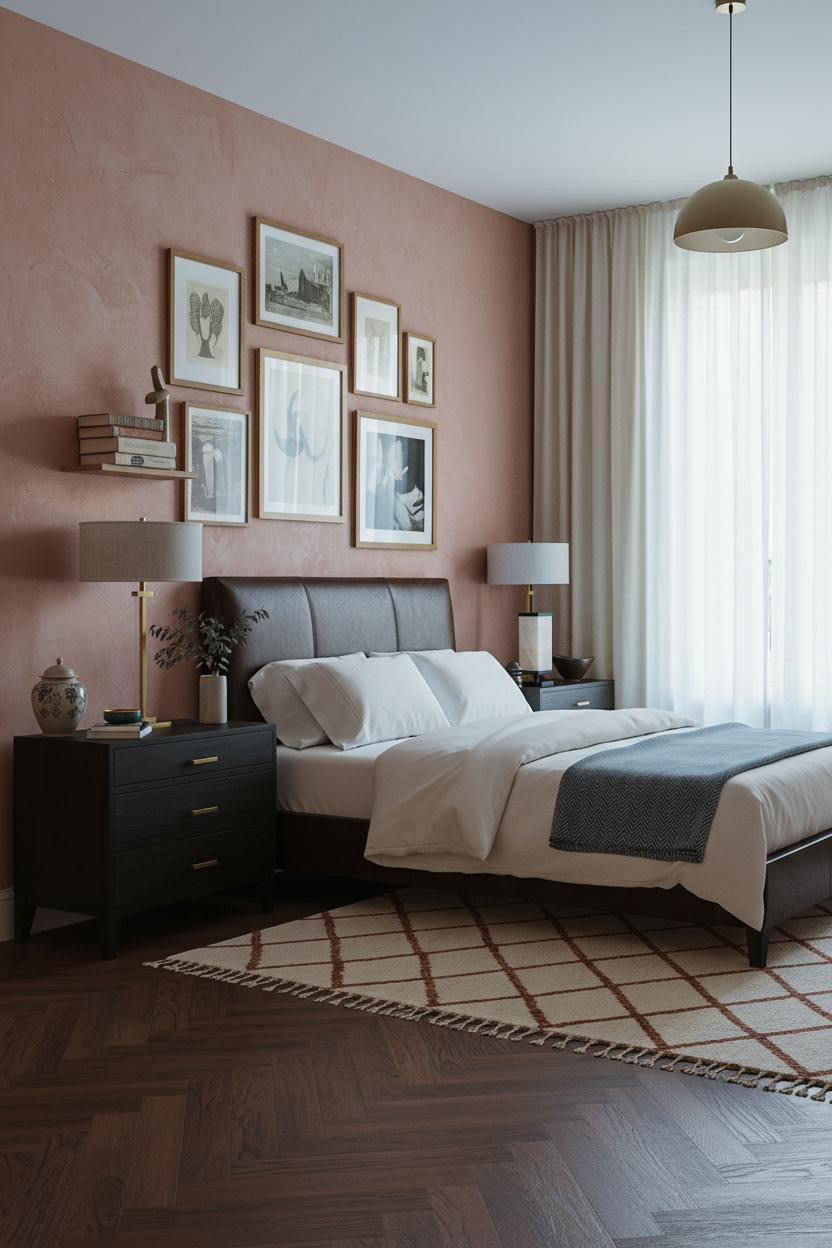

Twelve frames hung at varying heights on a warm mottled wall. The whole thing feels lived-in and intimate, which is exactly the goal for a collected eclectic aesthetic.
Why it looks custom: The hand-applied dusty rose plaster is warm and mottled, so the gallery wall reads as organic rather than planned. One frame slightly off-level keeps the whole thing honest.
Don't ruin it with: Matching frames. Natural wood and black metal mixed together is what separates collected from purchased.
Ochre Walls That Actually Earn the Shelving
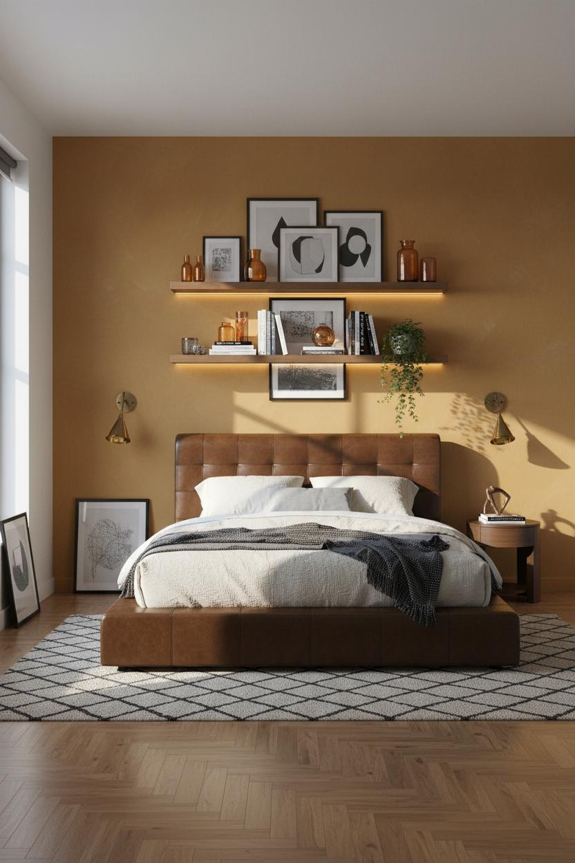

Fair warning. Ochre is divisive. But this application is hard to argue with.
The reason it feels MCM rather than seventies is the visible brushwork variation in the paint finish. Flat ochre looks muddy. Brushed ochre looks intentional.
The easy win: Arrange the floating shelving unit in salon style, stacking abstract prints asymmetrically with amber glass vessels catching the morning light between them. One frame leaning against the wall base below ties it all together.
Board-and-Batten Walls Done the Japandi Way


Quieter than the other rooms here. Somehow that makes it harder to forget.
What gives it depth: Full-height mushroom grey board-and-batten planks cast a fine shadow ridge in raking morning light, creating graphic rhythm while still feeling calm and cohesive.
The finishing layer: A sculptural round mirror leaning beside the nightstand instead of hung on the wall keeps the Japandi restraint intact while still feeling personal.
Sage Shiplap With Floating Shelves That Actually Work


This is the most liveable version of artsy-room-decor in the whole roundup, honestly.
Why it feels balanced: Warm sconce pools against sage green horizontal shiplap create just enough contrast to make the wall feel warm rather than cool, while still feeling calm. The pale bleached oak floor keeps it from tipping too dark.
Try this: Mount the floating shelves asymmetrically and lean an oversized abstract canvas against the lower one. The lean reads more personal than a hung print ever does.
Exposed Brick With a Macrame Wall Hanging and Actual Warmth
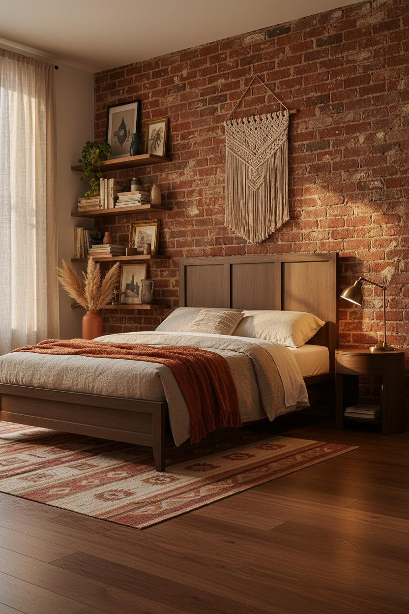
And this is the warmest room in the bunch. No argument from me.
Why the materials matter: Decades of patina on terracotta brick do something that new tile or painted plaster can't replicate. Each mortar joint catches raking afternoon light differently, which means the wall is always slightly alive.
The key piece: A natural jute macrame hanging left of the bed adds the woven texture layer without competing with the brick. Two strong textures. One wall. It works because they're different in every way.

Our #1 Pick
Saatva Classic Mattress
America's best-selling online luxury innerspring. 365-night trial, lifetime warranty, free white glove delivery.
Shop Saatva Classic
The Foundation Of Every Beautiful Bedroom
Walls get repainted. Art gets rehung. But the mattress stays, and a collected bedroom deserves one that's actually worth the room around it.
The Saatva Classic is the one I'd put under all of it. Dual-coil support that holds without going stiff, breathable organic cotton that doesn't trap heat, and a Euro pillow top that's genuinely soft without losing structure. It feels like the good hotel version. Not the business hotel version.
Good design ages well because it's made well.

The rooms people save are the ones where nothing looks accidental. Start with the bed. The rest figures itself out.