
 by
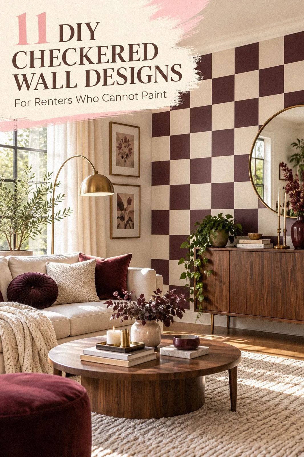
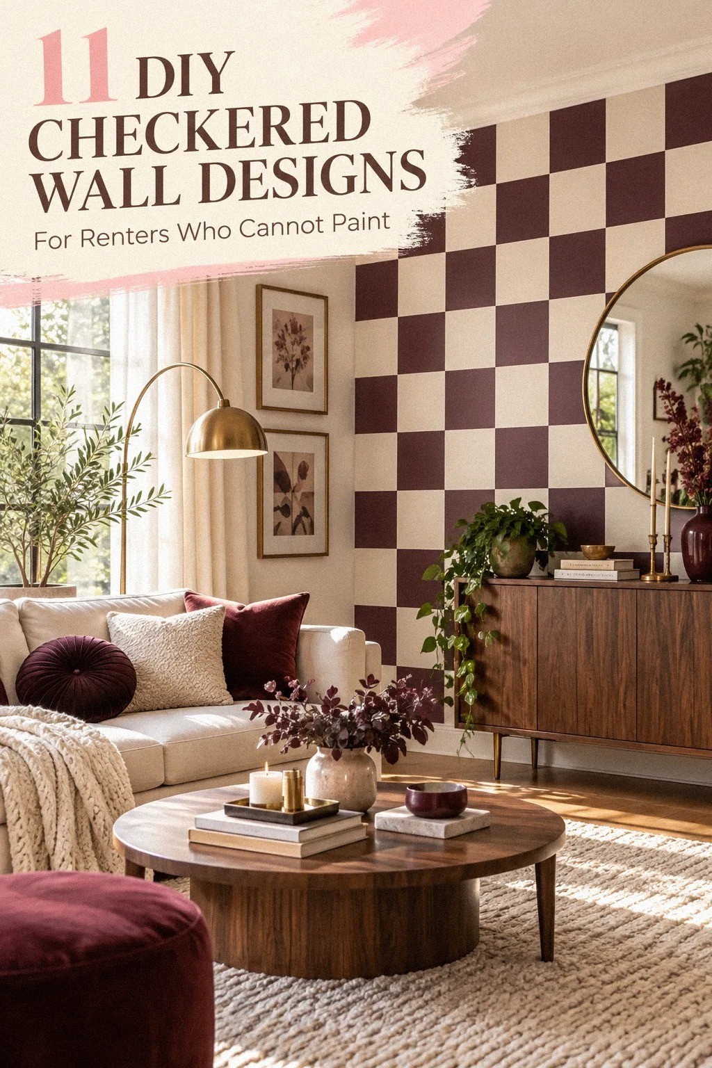
by DIY checkered wall ideas for renters can work without paint, and the easiest versions cost about $20 to $80. I learned that after taping a pattern directly to a wall and pulling off more finish than expected. Removable materials make the look bold, warm, and reversible. Your security deposit will thank you!
- Build the Removable Grid Method with Washi Tape
- Layer Felt Squares for a Softer Checkered Wall
- What Makes the Two-Scale Rule Work?
- Frame Checkered Fabric Instead of Covering the Wall
- Hang a Checkered Quilt for Warmth and Texture
- Budget Before Beauty: Compare the Real Cost
- Swap Paint for a Tension-Rod Textile Grid
- The Three-Height Light Stack Changes the Mood
- Anchor Small Checkered Panels Behind Functional Zones
- Wood Against Vinyl: Mix Soft Checks with Natural Grain
- The Removable Border Gives the Pattern a Finish
1Build the Removable Grid Method with Washi Tape
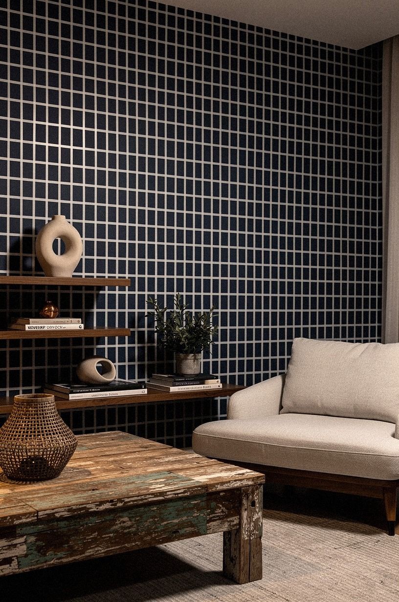
Washi tape gives you the checkered wall decor you want without committing to adhesive vinyl or permanent color. Choose a 1-inch-wide tape in navy or soft white, then mark your squares with a level and removable pencil. A 12-inch grid feels calm on a large wall, while a 6-inch grid looks more energetic above a desk or reading chair.
I’d skip glossy plastic tape here. It catches every lamp reflection and can make your wall look temporary in the wrong way.
Matte washi tape has a softer finish, especially beside Benjamin Moore White Dove OC-17, walnut furniture, and reclaimed weathered teak. If you’re nervous, test one strip behind your furniture for 24 hours before covering the room.
Start in the least visible corner. You’ll find it easier to correct a slightly wandering line before it reaches the center of the wall.
Press the tape lightly at first, step back, and check the rhythm from the doorway. Your grid should feel intentional, not mechanically crowded.
Your free layout tool is painter’s tape, but don’t leave it in place as the final pattern. For more no-drill ideas around the same wall, browse these no-drill shelf ideas for renters.
You’ll get the graphic effect without making your landlord part of the design conversation. If your room already has strong curtains, use a quiet navy-and-white palette and let the tape provide structure.
For a warmer result, place the tape over a wall with soft white undertones rather than a stark blue-white. That small choice matters! A checkerboard can feel handmade when the tape, wall, walnut, and reclaimed weathered teak share a slightly softened palette.
2Layer Felt Squares for a Softer Checkered Wall
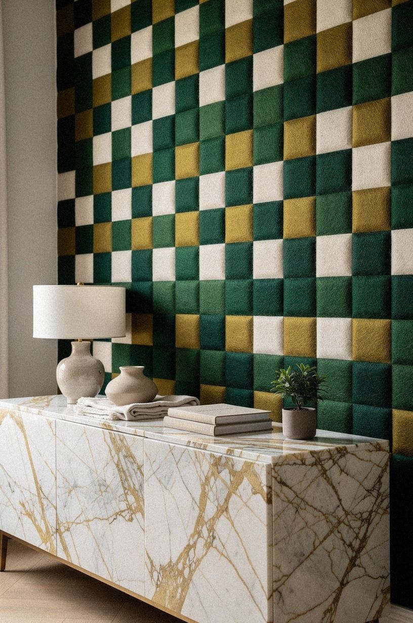
Felt squares turn DIY checkered wallpaper ideas into something tactile and forgiving. Try emerald, gold, and cream squares, then place them near a surface with Calacatta marble and gold veining for a richer contrast.
3What Makes the Two-Scale Rule Work?
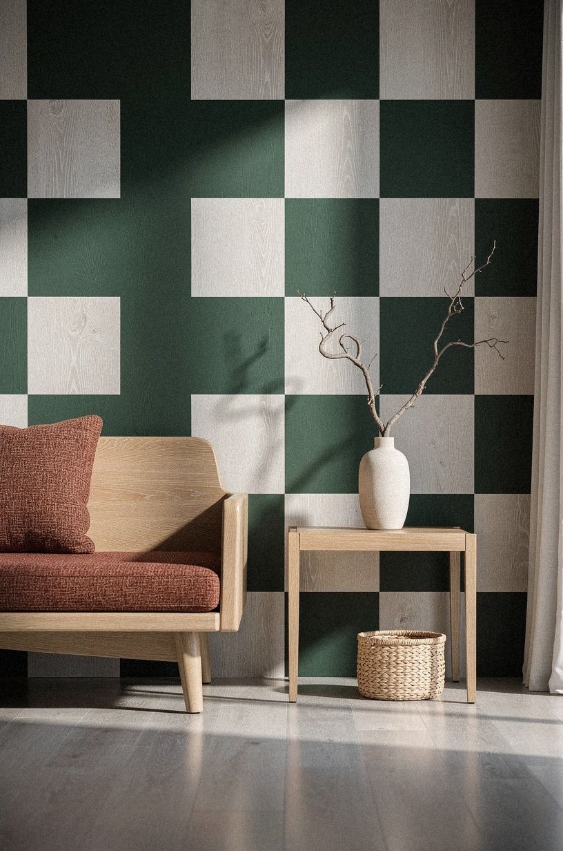
The Two-Scale Rule keeps checkered wall decor ideas from looking like a child’s playroom. Use large 12-inch squares for the main pattern, then repeat one smaller 3-inch checker detail on a nearby frame, tray, or lampshade. Your eye gets a rhythm, but it doesn’t have to process the same shape everywhere.
Peel-and-stick decals are the easiest version, though quality varies. Look for low-tack fabric decals in forest green and rust, with natural oak or cerused white oak nearby.
Smooth each square from the center outward with a dry cloth. I’d choose this grounded palette beside warm white rather than a bright primary blue.
It feels calming in daylight and moody under a shaded lamp.
What makes this idea worth your time? You can remove one square if the alignment bothers you, instead of starting over.
Before you install anything, arrange the decals on the floor in rows. If you’re also organizing a rental entryway, pair this wall with no-drill shelving for renters, and keep your strongest pattern at eye level.
Don’t cover every available inch. A checkerboard needs breathing room around it, particularly in a narrow rental where doors, switches, and furniture already create visual interruptions. You’ll get a more polished result when the pattern has a clear beginning and end.
I’d keep the smaller repeat somewhere functional. A checked lampshade or tray is enough. Repeating the pattern on five accessories will make the room feel themed instead of collected.
4Frame Checkered Fabric Instead of Covering the Wall
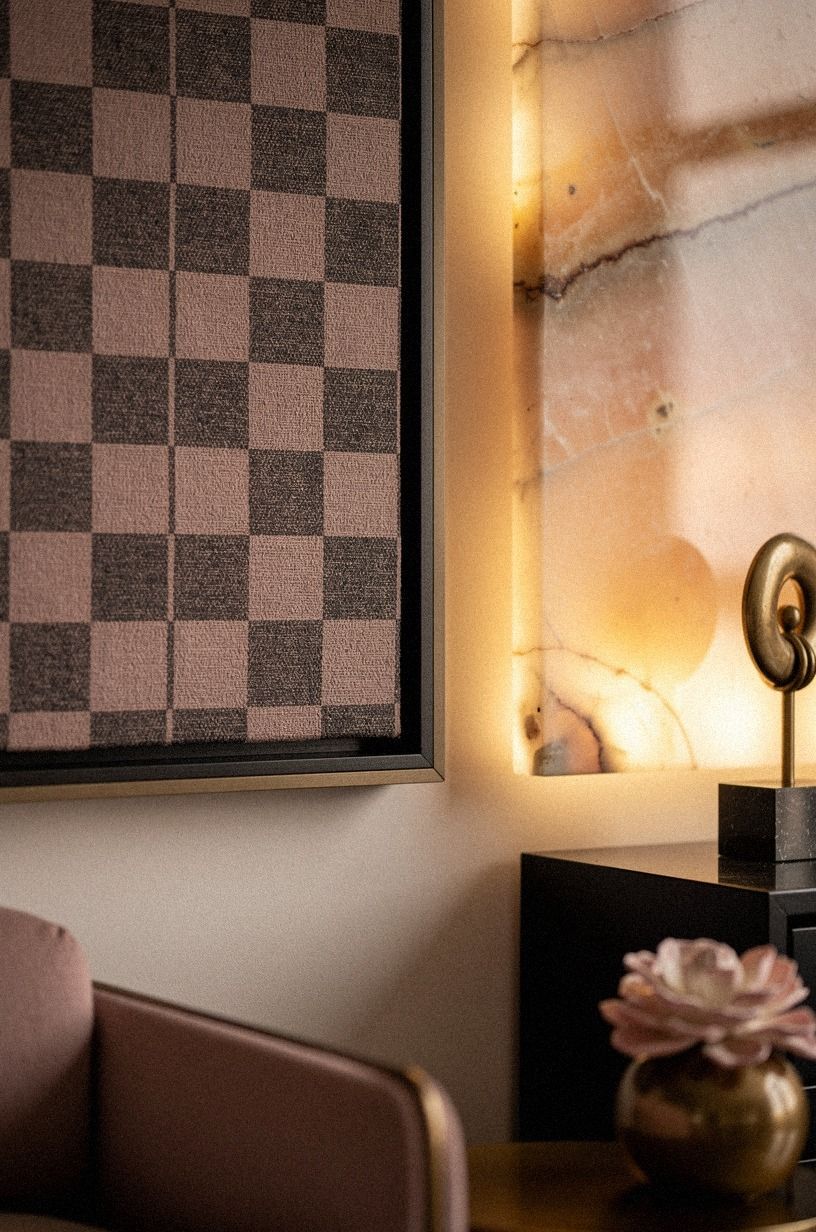
A framed fabric checkerboard in dusty rose and charcoal gives you the visual impact of a painted wall while keeping every part removable. Add a slim brass detail and a small piece of backlit translucent onyx for a warmer, more layered finish.
5Hang a Checkered Quilt for Warmth and Texture
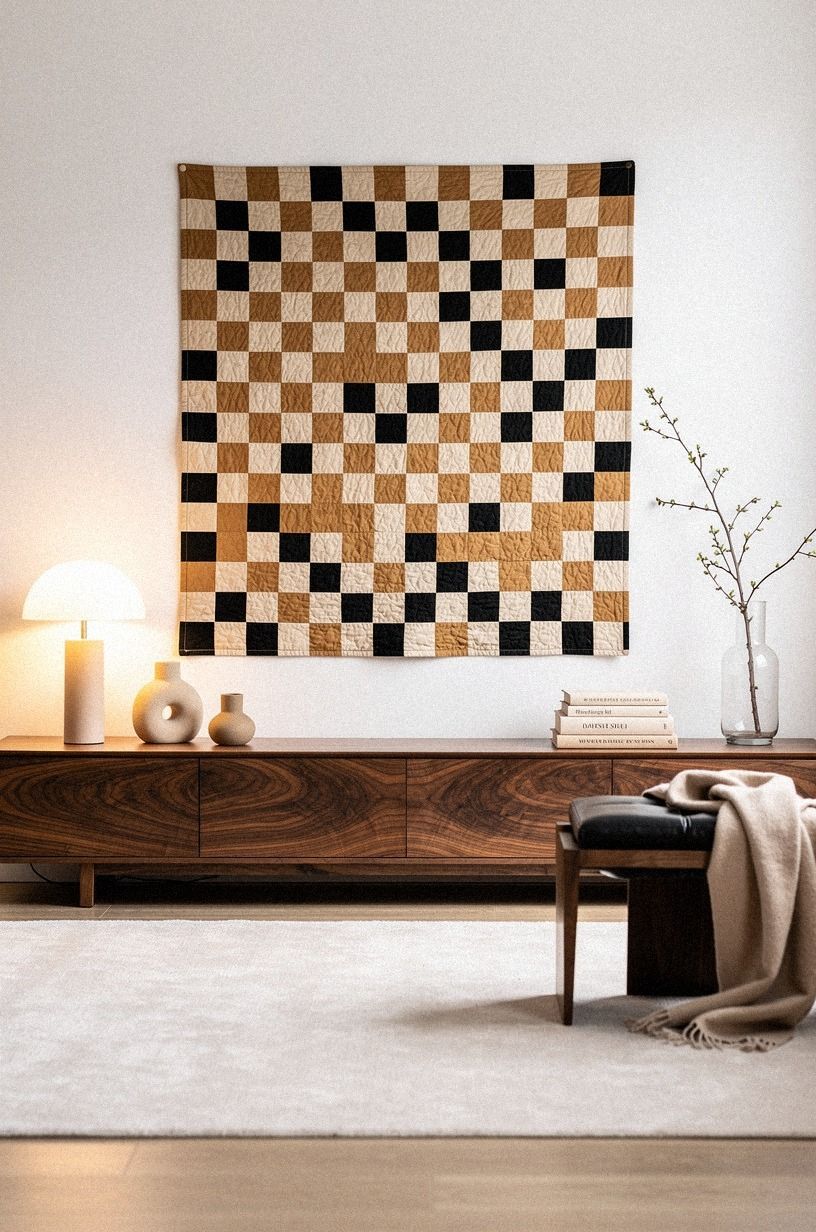
A vintage quilt can become a checkered wall hanging with almost no wall damage. Look for a cotton patchwork quilt with squares in warm white, camel, and black, then hang it from a curtain rod, quilt sleeve, or removable picture hooks rated for its weight. The fabric softens sound, which is useful if your rental bedroom has hard floors and echoing walls.
Your wall doesn’t need another sharp graphic if your bedding already has stripes or florals. Choose a quilt with irregular stitching and a few worn patches instead. That imperfection is what makes the room feel lived-in rather than staged.
Book-matched walnut on a console or bench can repeat the warmth without competing with the wall piece.
I’d skip hanging a heavy quilt from two tiny adhesive hooks. It may hold for a week, then slide down at midnight.
Use a broad wooden dowel and distribute the weight across several removable points. For a serene bedroom, pair the quilt with Sherwin-Williams Agreeable Gray SW 7029 on existing walls and warm bulbs from three sources: overhead, task, and ambient.
You can fold the bottom edge behind a console or bench if the textile is longer than the wall allows. That small adjustment keeps the composition tidy while making the quilt feel connected to the furniture. Your room will look warmer without needing another decorative layer.
If the quilt has bright colors, place it against quiet bedding and plain curtains. A restrained background lets the imperfect squares feel intentional rather than noisy. For more wall texture inspiration, you can also browse a Venetian plaster-inspired wall texture guide.
6Budget Before Beauty: Compare the Real Cost
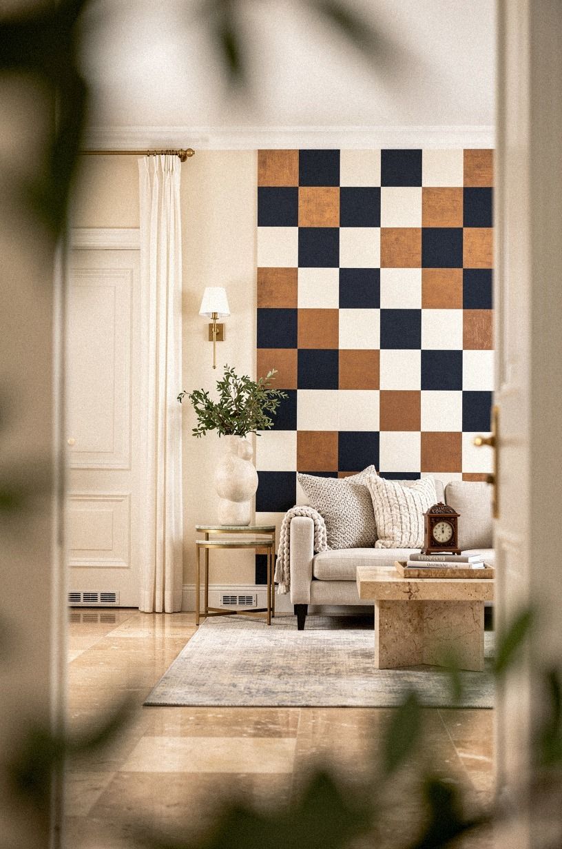
The cheapest checkered wall is usually the one you can remove in sections. Washi tape, felt, and fabric panels let you test your scale before you commit to a larger purchase. Your full room budget may be modest, but the surrounding furniture can push the total much higher, especially if you add a rug, lighting, and storage.
For this specific renter project, I’d start with the budget tier and spend on texture before furniture. A secondhand textile in midnight blue, copper, and ivory can look sophisticated beside warm travertine, even without expensive furniture. Your first test can cost less than dinner out, while a full-room refresh may move toward the $200 to $800 range once you add fabric, lighting, and organization.
Track the cost of the pattern separately from the cost of the room. That distinction helps you see whether you’re actually buying a wall treatment or quietly starting a full makeover. You’ll make calmer decisions when those numbers stay visible.
And if your wall needs a softer backdrop, you can study limewash wall ideas and matte mineral texture, then recreate the feeling with removable fabric rather than applying paint. That keeps your lease intact.
Start with a 24-inch sample panel before buying enough material for the whole wall. It’ll show you whether the colors work in morning light, lamp light, and the less flattering light you usually ignore.
7Swap Paint for a Tension-Rod Textile Grid
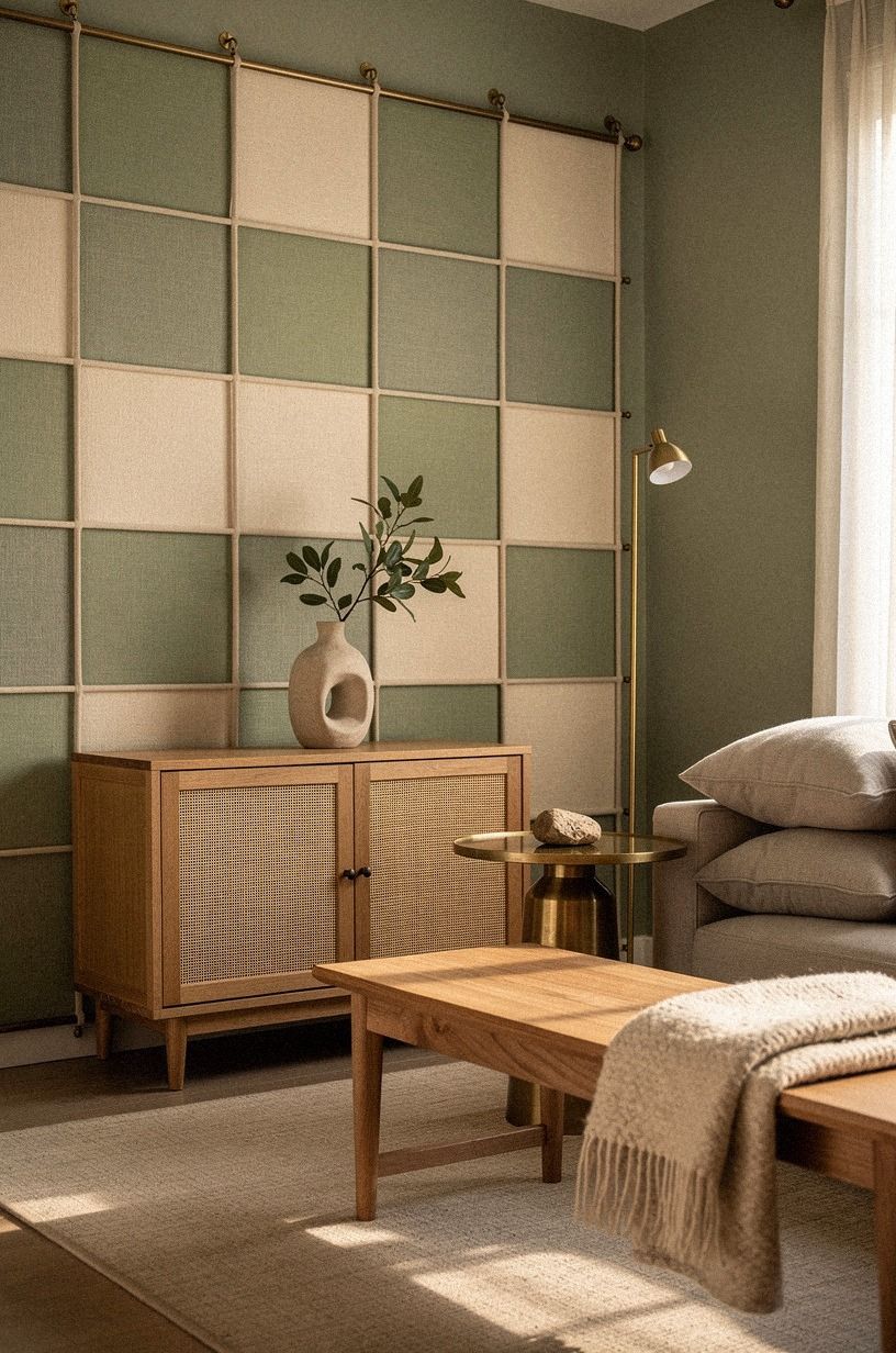
A tension rod turns a blank wall into a removable textile display. Install one rod several inches below the ceiling, then clip alternating fabric panels across it to create broad vertical checks. Add a second rod lower down if you want a more obvious grid, but leave enough space for the fabric to hang without bunching.
This works best with sage green and warm cream textiles, balanced by natural wood and unlacquered brass developing a gentle patina. Brass catches afternoon light differently from linen, so your pattern will shift through the day. I’d skip crisp black-and-white panels unless your room has plenty of natural wood to balance the contrast.
Your renter-friendly advantage is that the rods sit in the side walls or window recess, not the main wall surface. You can remove the entire installation in minutes.
If you’re styling behind a bed, keep the lower edge at least a few inches above the mattress so the fabric doesn’t gather dust. For more texture, place a Venetian plaster-inspired wall texture guide nearby for visual reference.
Choose fabrics with enough weight to hang straight but not so much weight that the rod slips. You’ll want to open the window, clean behind the panels, and adjust the folds occasionally. That everyday flexibility is part of the appeal.
A brass clip or dark wood clip can become part of the look, so don’t hide every fastening detail. The grid should feel like a textile installation, not a failed attempt to imitate painted squares.
8The Three-Height Light Stack Changes the Mood
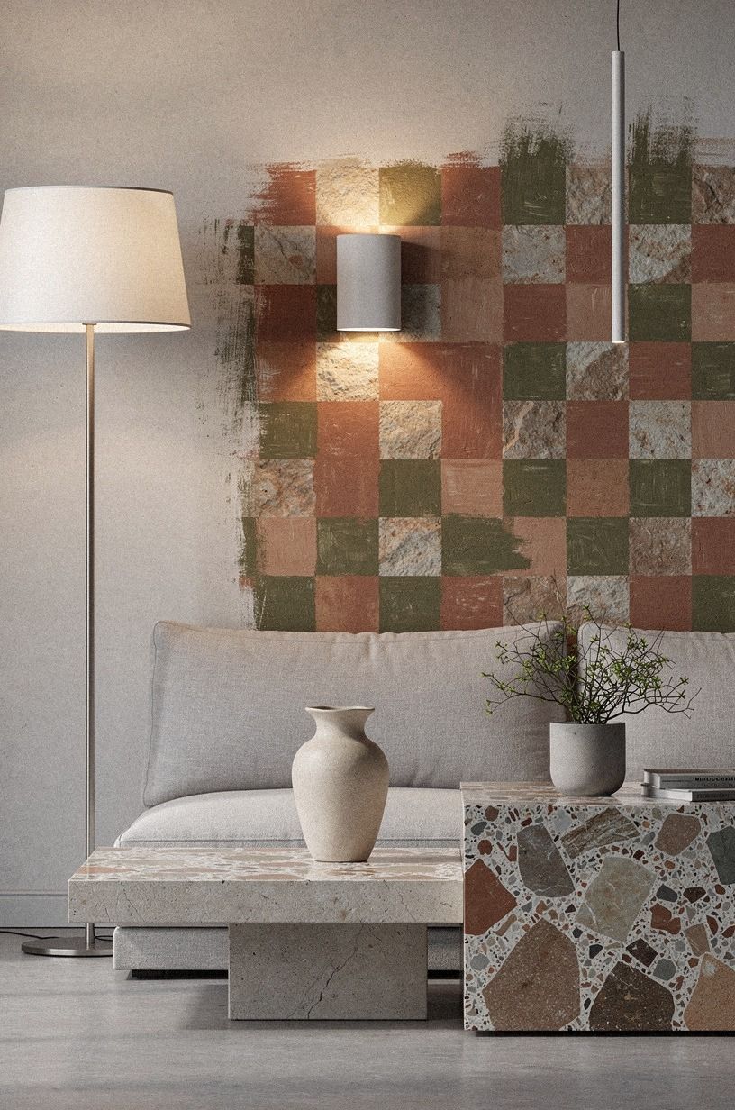
The Three-Height Light Stack makes a checkered wall feel atmospheric after dark. Place one light low, such as a small table lamp; one at seated eye level; and one higher through a picture light or clip-on fixture. Your pattern becomes part of the lighting rather than a flat graphic pasted behind the furniture.
Use terracotta, stone, and olive around a surface of oversized-chip terrazzo for warmth and variation. A soft 2700K bulb will make those tones feel welcoming, while a cool bulb can turn them gray and harsh. I’d skip a single ceiling fixture because it erases the texture you worked to create.
You’ll notice the difference at night immediately! The low lamp throws a pool of amber across the lower squares, while the higher light catches the material edges. But keep cords tidy with removable cable clips, and never place a lamp where your curtain or quilt can touch the bulb.
Your three-source plan should include overhead, task, and ambient light.
If you’re styling a bedroom, keep the brightest source away from your pillow. In a living room, let the lower lamp sit beside the pattern rather than directly in front of it. You’ll preserve the checkerboard’s depth and avoid turning the wall into a glare point.
For a calmer glow, use 2700K LED bulbs with frosted glass. Clear bulbs can create bright dots across glossy materials, while a diffused bulb lets terrazzo, fabric, and wood keep their texture.
9Anchor Small Checkered Panels Behind Functional Zones
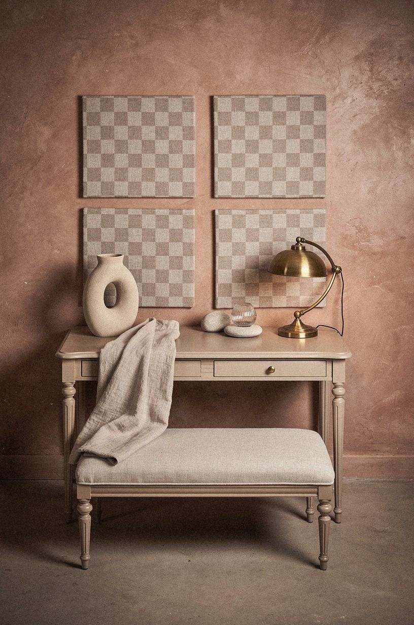
Small checkered panels work when your rental can’t handle a full statement wall. Try clay and linen panels with aged brass details, especially against hand-applied Venetian plaster.
10Wood Against Vinyl: Mix Soft Checks with Natural Grain
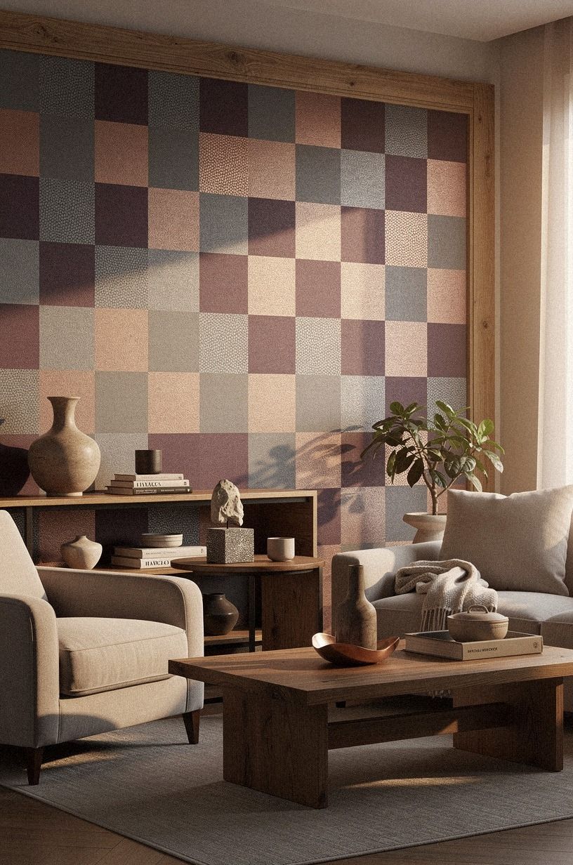
Wood makes a checkered wall feel grounded, especially when the pattern has a bright or playful color. Use lightweight squares in plum and grey, add rose-gold details, and bring in shagreen accents for a softer counterpoint. Mount each piece with removable strips rated for its weight, and leave a narrow gap between pieces so the grid can breathe.
Your finish should match the mood of the room. A muted plum-and-grey combination feels richer with rose gold than with bright chrome.
I’d skip very orange pine because it can fight with warm beige rental walls. A CB2 Primitivo bouclé chair nearby would add a soft counterpoint, but you don’t need premium furniture to make the idea work.
And don’t polish every square until it shines. A matte finish lets the material catch the light quietly, which is more calming than a reflective surface.
Test one panel near the window before ordering more. If it looks too yellow at noon, shift toward grey or pair it with Farrow & Ball Pigeon No.25 textiles.
You can also alternate wood and soft panels in vertical bands rather than a strict chessboard. That subtle change keeps the wall graphic while making the materials do more of the visual work. Your hand will notice the difference when you pass the panels, which gives the idea a surprisingly luxurious quality.
For a more mineral-looking combination, compare the wood with Venetian plaster-inspired wall texture ideas. You’re looking for contrast between grain and softness, not a wall full of competing finishes.
11The Removable Border Gives the Pattern a Finish
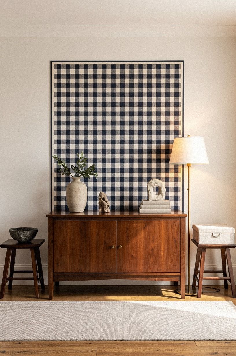
A removable border gives your DIY checkered wall ideas a finished edge. Try navy and white with a walnut accent, then soften the arrangement with washed Belgian linen.
Scale First: Choose the Right Size for Your Room
Scale is the decision that changes everything. Six-inch squares can feel lively and intimate above a small desk, while 12-inch squares create a quieter rhythm behind a sofa or bed. If you’re working in a narrow room, place a sample at eye level and view it from the doorway before buying supplies.
Your furniture should interrupt the pattern slightly. A sofa, console, or headboard covering the lower edge makes the wall feel integrated. Leaving the entire design exposed can make it look like a backdrop waiting for display.
For a tiny room, limit the palette to two colors and use larger squares. For a generous living room, you can introduce a third shade through wood, fabric, or a thin border. The pattern will feel richer without becoming chaotic.
A 12-inch paper mockup is more useful than a tiny color swatch. Tape it to the wall, walk through the room, and notice how it behaves beside doors and windows. You’ll catch proportion problems before they become shopping mistakes.
Can Your Adhesive Pass a 24-Hour Test?
Every rental wall has a different finish, even when two apartments share the same paint color. Test your adhesive, tape, or mounting strip behind a piece of furniture for at least 24 hours. You’ll learn whether it grips, slips, stains, or pulls at the surface.
Remove test pieces slowly. Warm the area with your hand, then pull the material back on itself rather than straight away from the wall. If the finish changes color or texture, stop and choose a hanging method that puts less pressure on the paint.
You should also document the test area before installation. It gives you a useful record when you’re comparing the original surface later. Your landlord may never see it, but the documentation can make moving day less stressful.
If strips fail, switch to a tension rod, freestanding frame, or leaning panel. A no-drill shelf system can also help move weight away from the patterned wall. Browse these no-drill shelf ideas for renters before adding anything heavy.
Why Checkered Walls Feel Fresh Again
Checkered walls are having a moment because they bring order without demanding a perfect room. The pattern gives your eye a path, but the materials decide whether the result feels rustic, modern, calming, or playful. I’ve seen the same two-color grid look stark in glossy vinyl and wonderfully soft in linen, felt, or faded cotton.
Your rental limitations can improve the design because you have to edit. You can’t hide a weak pattern under layers of paint, so you’ll notice scale, texture, and light sooner.
That’s useful. A 6-inch checker can feel busy above a small desk, while a 12-inch grid may look bold and balanced behind a sofa.
I’d choose fabric or felt before decals if you want the room to feel warm. I’d choose washi tape if you need a quick seasonal change.
And if you’re still unsure, make a 24-inch test panel first. Live with it through one morning and one evening.
If you don’t like it in both lights, the wall won’t rescue it.
The best versions have a little tension. The pattern is orderly, but the material is soft.
The colors are deliberate, but the edges don’t feel sterile. You can create that contrast with a handmade quilt, uneven felt, matte wood, or fabric that changes subtly as the light moves.
For a broader palette reference, look at limewash wall ideas and matte mineral texture. The useful lesson is variation. Flat color rarely feels as deep as a surface that changes gently across the day.
Your checkered wall should support the furniture you already own. If your sofa is bulky, use larger squares and a restrained palette. If your room has delicate furniture, a small felt grid can add depth without making the composition feel heavy.
Repeat one wall color in a cushion, lampshade, or vase. You don’t need matching accessories everywhere. One or two quiet echoes will make the pattern feel considered, while too many repetitions can make the room look overly coordinated.
If the furniture is mostly wood, introduce fabric or paper-based checks. If the room already has several textiles, use framed wood and cork instead. Your goal is contrast, not another version of the same texture.
A woven basket or ceramic lamp can soften a geometric wall without copying it. I’d rather see one rounded object nearby than six matching checkered accessories.
If the room feels too stark, add texture through a Venetian plaster-inspired wall texture guide and then choose only one material from that direction. You’re borrowing the mood, not layering every finish at once.
Removal Day: Keep a Renter-Friendly Plan
Before you start, decide how the wall will come down. Keep spare fabric for lifting adhesive edges, label each panel if you’re using a complex arrangement, and store the original packaging for removable products. These small steps will save you time later.
Take the pattern down in stages. Remove accessories first, then the border, then the central panels. You’ll see whether any section is creating pressure or pulling unevenly.
Don’t rush the final corners, where adhesive often has the most grip.
When you move, pack the materials flat if you want to reuse them. Felt squares can go between sheets of paper.
Fabric panels can be rolled around a clean tube. Your next rental may have a different wall, but the idea can travel with you.
Keep a small removal kit with dental floss, a clean cloth, spare paper, and the product instructions. Floss can help separate some adhesive edges without scraping the paint. Test every method first, because rental finishes vary.
For heavier pieces, return to a freestanding or tension-rod solution instead of forcing removable strips to carry too much weight. You’ll avoid damage and make the whole design easier to adapt.
The Questions Worth Answering First
What is the best DIY checkered wall idea for a small rental?
Removable felt squares are the best choice for a small rental because they add soft texture without visual glare. Try 6-by-6-inch squares behind a desk or 8-by-8-inch squares behind a nightstand. IKEA KALLAX storage can repeat the wood tone without competing with the pattern.
Where can I buy checkered wall materials on a budget?
Look at IKEA, Wayfair, Target, thrift stores, and Facebook Marketplace for low-cost fabric, frames, and storage. A vintage quilt or secondhand curtain can become a wall hanging. You’ll often find better texture in used textiles than in new glossy decal sheets.
How much does a checkered wall makeover cost?
A small renter-friendly makeover usually costs about $20 to $80 for tape, felt, fabric, or removable mounting supplies. A larger room refresh may fit within the $200 to $800 budget range when you add lighting, art, and organization. Existing furniture and textiles can cost nothing.
Can I create a checkered wall on a budget?
Yes, and you can start with three free choices: rearrange textiles you already own, make a paper grid before buying materials, and use existing frames. A budget-friendly version can combine thrifted fabric, cardboard panels, and removable strips for a warm pattern without permanent work.
Is a checkered wall worth it in a small space?
Yes, because a small wall gives the pattern a clear boundary and keeps it from overwhelming your room. Use larger squares, limit yourself to two or three colors, and keep furniture overlapping the lower edge. Your space will feel more intentional without needing a full renovation.
Is a checkered wall a good idea for a rental?
Yes, if you choose removable materials and test them first. Peel-and-stick fabric, washi tape, tension rods, and removable hooks can create low-damage decoration.
Don’t assume every adhesive is safe for every finish. Test behind furniture, remove slowly, and keep the original wall surface visible where possible.
The Choice I’d Make First
If I had to pick one, I’d start with removable felt squares. They soften sound, hide minor wall flaws, and won’t reflect harsh light like vinyl. Pin the felt-grid idea for later, then test six squares behind your desk before committing to the whole wall.
If you want more structure, frame the felt inside a natural wood border or place it beside a no-drill shelf. If you want more warmth, switch to a vintage quilt. The best choice is the one that suits your room’s existing texture and can come down without a repair bill.