
 by
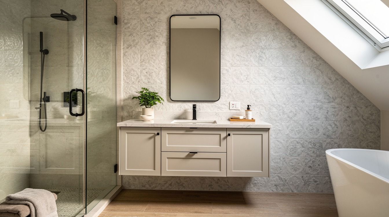
by A master bathroom remodel on a budget can look expensive for about $200 to $1,200 if you keep the layout, paint what you own, and spend on mirrors, light, and one remnant stone surface. I did exactly that after staring at a tired vanity for months. And the wild part? You don't need a full gut job to make your bathroom renos feel calm, welcoming, and finished.
Here's what it looked like before
Before this bath remodel, you walked in and saw the full builder-grade package: shiny mirror wall, yellowed vanity finish, flat lighting, and a counter that collected every bottle I owned. Nothing was broken, which almost made it worse, because I kept telling myself I should live with it a little longer. I had a 60x30 in tub, a standard double vanity, and enough square footage to do something good with it, but the room still felt cheap.
What changed was the order of decisions, while the footprint stayed put. I stopped shopping for dream bathrooms online and started measuring the room I had, right down to the 32-36 in vanity height and the narrow stretch in front of the toilet where you still need 21 in of clearance. If you're planning your own bathroom remodel master update, spend ten honest minutes with master bathroom before-and-after ideas first.
You need inspiration and a reality check.
- Clear the counter before choosing finishes
- Keep the old vanity box for now
- Tape the new walkway on the floor
- Swap builder mirrors for two framed ones
- Paint the vanity a soft mushroom tone
- Add brass pulls before changing cabinets
- Install picture lights above each mirror
- Choose a remnant stone vanity top
- Run peel and stick marble behind faucets
- Hang linen cafe curtains at the window
- Style one teak stool beside the tub
- Bring in a washable wool runner
- Hide daily bottles in a shallow tray drawer
- Would one antique frame warm up the room?
- Keep warm ivory walls against the mushroom vanity
- Why does Kohler polished nickel work with aged brass?
- Let CB2 add one sculptural storage note
1Clear the counter before choosing finishes
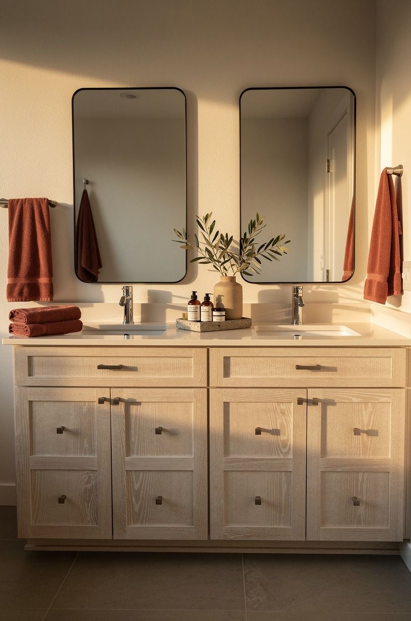
I didn't pick paint first. I picked emptiness first.
The day I cleared the vanity top completely, I could finally see the real color problem. The old finish was passable on its own, but next to my toothpaste tube, a pink hand soap, and a black blow dryer, it read muddy and random. Once the counter was empty, the golden grain in the drawers made sense, and I knew I wanted to stay in that lane with cerused white oak tones, cream, and aged brass instead of chasing bright white everything.
This is the part I want you to steal: clear every surface before you order a single sample. If your counter is busy, you'll overcorrect and buy finishes that scream for attention. Mine looked better the second I stripped it back to one aged brass tray and a folded towel.
And if you're still deciding whether your room wants plaster, tile, or paint, look at these luminous bathroom walls before you commit. You need to see what Venetian plaster does in a bathroom.
2Keep the old vanity box for now
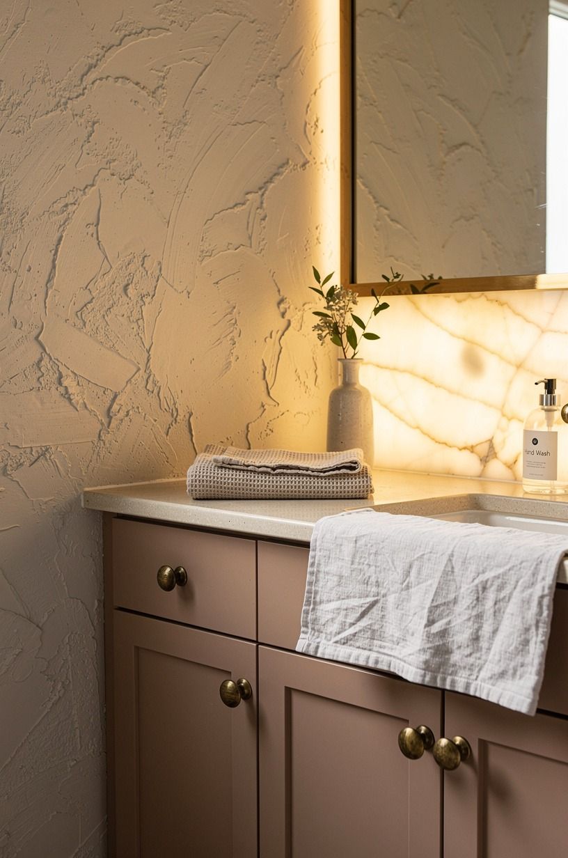
I almost ripped the vanity out in week one, and I'm glad I stopped.
3Tape the new walkway on the floor
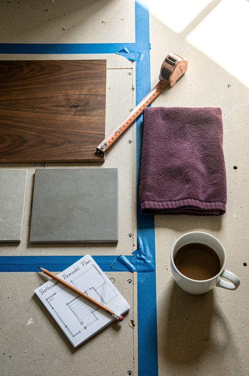
This layout tape test felt fussy. It saved me from a dumb purchase.
I used 3M ScotchBlue painter's tape to mark the path between the vanity, toilet, and tub before I bought a runner or moved a single thing. The taped lines showed me where the room pinched, where the door swing stole space, and how much visual weight the vanity wall could handle.
Once you map the route, you stop pretending a pretty object will float if the circulation is wrong. It will not.
You should do this even in a small bath remodel, especially if you're tempted by a chunky stool, a basket, or a deep rug. I learned that I needed a cleaner lane in front of the tub and a cushioned landing near the vanity.
A comfortable shower wants at least 36x36 in, and even outside the shower zone your eye reads openness as airy and luxurious. If you like rooms with fewer hard transitions, this microcement bathroom inspiration shows why uninterrupted surfaces feel so restful.
4Swap builder mirrors for two framed ones
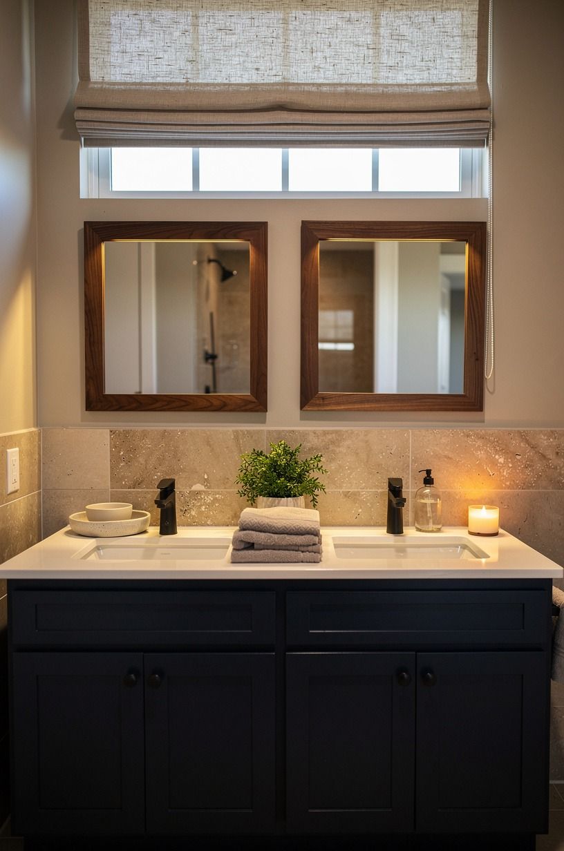
The old wall mirror made the room feel like a rental, even though we owned the house.
5Paint the vanity a soft mushroom tone
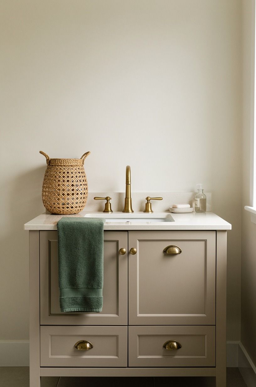
This mushroom paint sample was the turning point.
I tested white, then pale gray, then finally a mushroom tone that sat between taupe and clay. The winner was closest in feeling to Benjamin Moore Chestertown Buff HC-9, though I had it color matched a touch quieter so the cream walls could stay creamy. White would have been cleaner on paper, sure, but it would have made the floor look dingier and the room flatter.
The mushroom shade gave the vanity elegant weight without making it look heavy.
If your bathroom gets uneven light, this is where you need nerve. Morning sun can make a beige look peach, and a cool bulb can make the same paint go dead by night. I painted big boards and moved them around the room for two days before I touched the cabinet.
And yes, that felt annoying. It also kept me from wasting $60 cabinet paint and a weekend.
If you're debating wall texture too, compare the effect with these Venetian plaster bathroom walls. Smooth color with a little mineral depth always beats flat contractor beige.
6Add brass pulls before changing cabinets
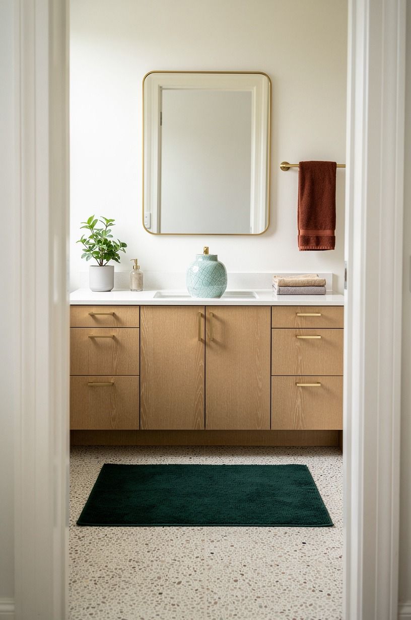
New Rejuvenation hardware is where the room started flirting with expensive.
I used unlacquered-style pulls in a length that felt substantial in your hand, rather than tiny jewelry stuck on the drawers as an afterthought. Against the calmer cabinet finish, the aged brass pulls looked collected rather than trendy.
This is one of those upgrades people skip because it seems too small to matter. But the hand feel matters.
The shadow the pull throws matters. The way metal warms up wood matters.
You can spend a fortune here and still miss. I would avoid the skinniest modern pull on earth for a broad vanity front because it makes the drawers look bigger and cheaper.
Go a little longer. Let the Rejuvenation Bowman pull hold its own.
Mine cost far less than new cabinetry and changed the read of the whole wall in an hour. But pair brass with something earthy, like oak, mushroom paint, or a creamy stone, or it can tip shiny fast.
I used these zellige bathroom ideas to keep the metal from feeling lonely beside all the matte surfaces.
7Install picture lights above each mirror
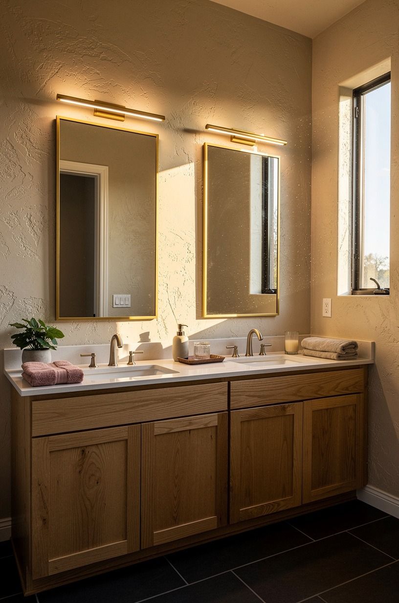
The builder vanity light was too flat, and I knew it every morning.
I added two small picture lights over the mirrors instead of another row of exposed vanity bulbs. That choice pulled the room toward furniture instead of fixture showroom.
The 2700K LED glow washed down the frames, mellowed the glass, and made the whole wall feel layered at night. You do not need dramatic lighting in a bathroom.
You need light that lands in more than one place. It made the wall feel finished at last!
If you are stuck between sconces and picture lights, ask what your mirror wall is missing. Mine needed a top line. The dimmable brass picture lights created one and made the ceiling feel taller at the same time.
I kept the finish golden so it tied back to the pulls, and I used dimmable bulbs because bright white is rude at 6 a.m. (you know that feeling). For more low-contrast, high-payoff surface ideas, I kept saving this microcement bathroom roundup.
The common thread is a soothing finish with very little clutter.
8Choose a remnant stone vanity top
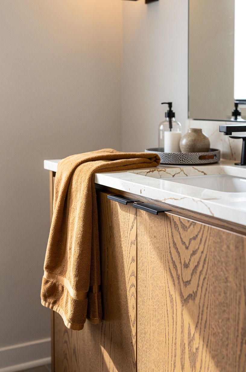
This quartzite remnant is where I let myself spend a little.
A full slab quote was out, but a remnant was possible. I found a white stone piece left over from a larger fabrication job, and because my vanity top was compact, the remnant covered it beautifully. The subtle movement looked far more luxurious than laminate, and the eased edge kept it from going fussy.
I paid for one visible honed quartzite surface that your eye reads instantly, which is a much smarter budget move than replacing three okay things at once.
You should always ask the yard about leftovers before you settle for a fake upgrade. Marble top pricing usually lands around $50-$100 per sq ft, but remnants can come in under that because the fabricator wants them gone.
Mine wasn't precious Calacatta drama. Good.
I didn't want drama. I wanted a creamy top that made the faucet and paint look better together.
And if you're weighing glossy handmade wall finishes against stone, these zellige bathroom examples show how one high-touch surface can carry a whole room.

9Run peel and stick marble behind faucets
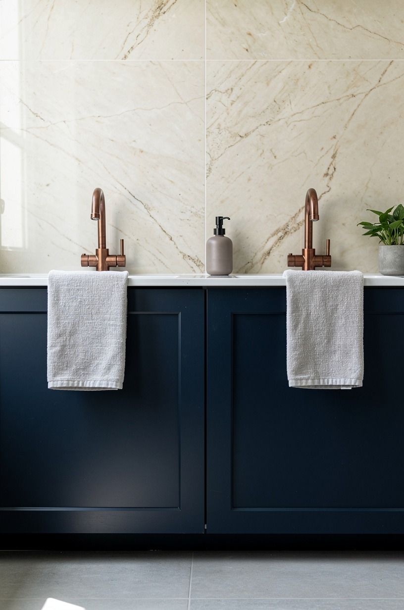
I needed the vanity backsplash to stop looking like an afterthought without turning it into a demolition project.
So I ran marble-look peel and stick panels just behind the faucets, enough to create a clean visual stop where the wall met the counter. From a standing view, that little strip read like intention.
From a low angle, it gave the vanity wall a polished break between paint and stone. I would avoid fake marble on every wall in a bathroom, because then you are asking too much from it.
But as a contained Smart Tiles backsplash move? It works.
This is also a rental-friendly idea if you keep the application tight and removable. Mine had soft ivory veining, with none of the loud gray lightning that makes faux stone look busy.
You want something that supports the faucet and keeps the wall calming. And if you love the idea of a more tactile wall finish later, compare it with these Venetian plaster bathroom ideas so you can decide whether your room wants movement, gloss, or almost none at all.
10Hang linen cafe curtains at the window
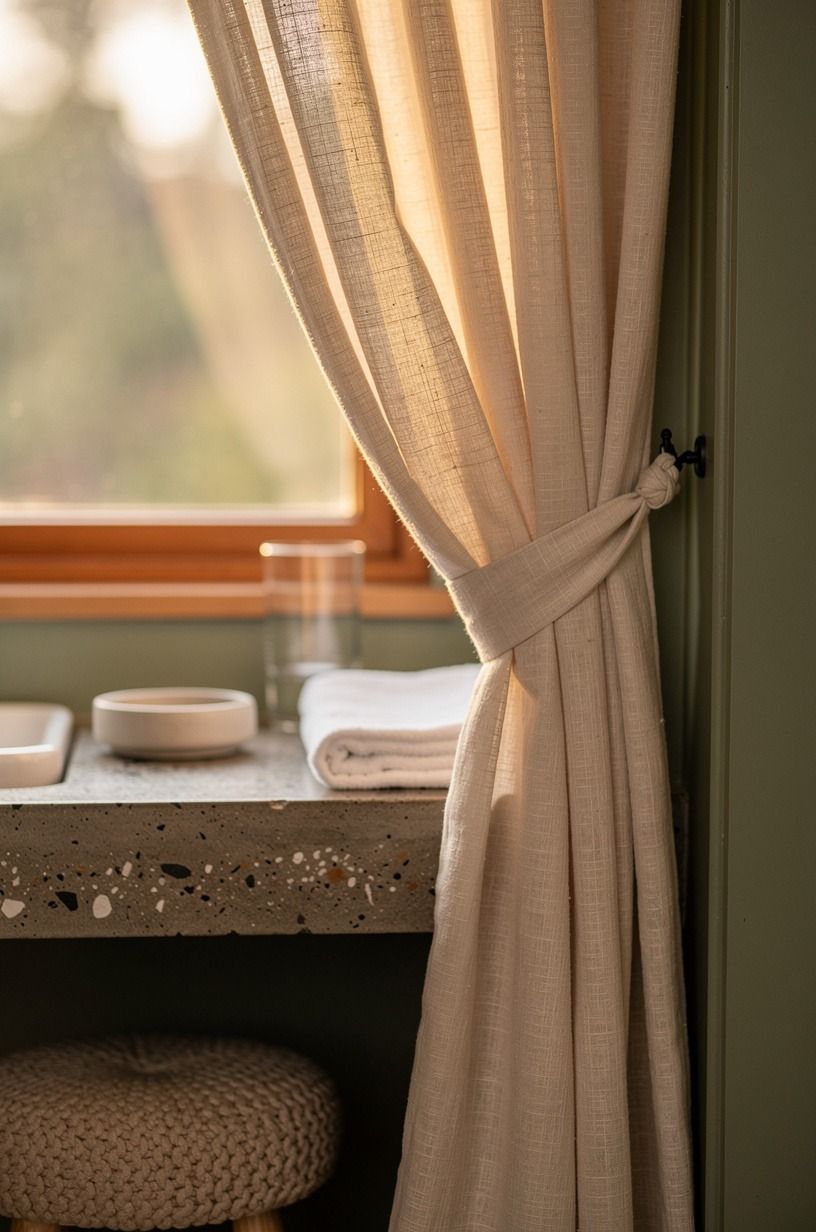
I didn't expect Belgian flax linen to matter this much. It did.
The window was small and awkward, and the blind that came with the house made it feel even smaller. I swapped it for cafe curtains in cream linen hung just to sill height, and suddenly the trim looked intentional.
The Belgian flax cloth filtered daylight instead of blocking it, which let the room stay private without going dark. I tied them back loosely while I was testing the shape, and the loose folds next to the painted trim sold me on it right away.
If you try this, pick a fabric with body. Flimsy polyester will collapse and tell on itself. I used linen with a simple header and kept the rod quiet so the fold was the feature.
The trim color nearby was close to Sherwin-Williams Sea Salt SW 6204, and that serene green made the cream fabric glow instead of yellowing out.
But the nicest surprise was how much milder the daylight felt once the blind was gone. Want more hand-finished surface inspiration around a bathroom window? I liked browsing these plaster wall finish ideas while choosing the cream linen tone.
11Style one teak stool beside the tub
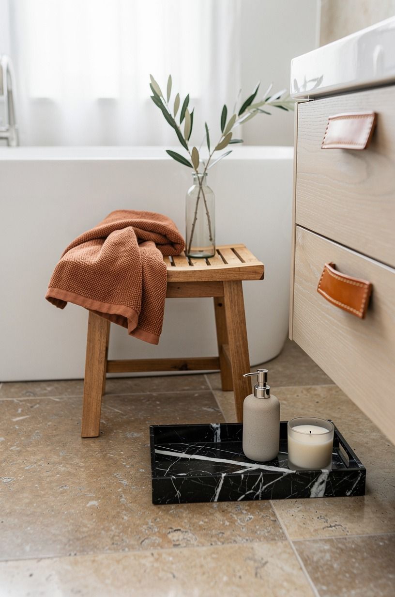
One solid teak stool. That's it. No pile of props, no tray circus.
I placed a single teak stool beside the tub and let it do the quiet work of grounding that corner. The marine-grade teak warmed up the cooler stone floor, echoed the vanity, and gave me a spot for a towel or book without turning the tub zone into a fake spa set. This is where so many bathroom renos go sideways.
People add too much. You don't need a basket, vase, candle trio, branch, bead garland, and folded blanket in a wet room.
If you're styling near a standard tub, keep the scale honest. My stool sat low enough to feel relaxed but didn't disappear beside the 60x30 in tub apron.
Teak also earns its keep because moisture doesn't scare it the way cheaper woods can. But I'd skip dark stained wood here.
It can read heavy against pale stone. One natural wood note is enough, especially if your vanity already carries oak or mushroom paint.
I kept comparing that restraint to these master bath remodel examples and came back to the same answer every time: less wins.
12Bring in a washable wool runner
The bare floor looked clean, but it felt cold before coffee. A low, washable runner gave the route from door to vanity a comfortable landing without swallowing the floor pattern. I chose a faded oat ground with a narrow rust border because handwoven wool has enough tooth to feel substantial and still dries quickly when the room is aired.
Measure with the doors and drawers open. Mine needed clear edges so a wet rug could not bunch under the vanity.
I would avoid a thick white shag here. It holds every footprint and turns a practical room into a laundry project.
You will want the Ruggable Verena runner to make the space feel welcoming while letting that taped circulation plan keep doing its job.
13Hide daily bottles in a shallow tray drawer
A pretty counter won't stay pretty if your routine has nowhere to go.
14Would one antique frame warm up the room?
Yes, if it has a job. I hung one small antique oak landscape frame on the short wall opposite the tub, where it caught your eye from the doorway without competing with the mirrors. Its warm brown edge echoed the stool and made the newer finishes feel gathered rather than installed all at once.
I would skip a gallery wall in a damp bathroom. Too many frames create fussy little gaps, and cheap backing can warp. One piece with quiet color is enough.
Mine added a charming, lived-in note to the ivory and mushroom palette, which is exactly what the room needed after all those crisp upgrades.
15Keep warm ivory walls against the mushroom vanity
This contrast is softer than white against gray, and that's why it works.
16Why does Kohler polished nickel work with aged brass?
Because matching every metal can make a remodeled bathroom feel bought in one afternoon. I kept the Kohler Purist polished nickel faucet and used aged brass on the mirrors, pulls, and lights.
The nickel reads quiet and functional near water. Brass brings warmth higher on the wall.
Repeating each finish at least twice made the mix feel intentional.
Would matte black have worked? Sure, but I would have lost the gentle shimmer that made the remnant top feel richer.
If you are mixing metals, keep the Waterworks metal profiles simple and the undertones friendly. Your eye accepts variation when the silhouettes speak the same clean language.
17Let CB2 add one sculptural storage note
The last gap was towel storage, and a bulky cabinet would've crowded the path. I used a slim CB2 Aster wall shelf with a curved profile on the wall near the shower.
Two rolled bath towels and one lidded container fit without pushing into the room. That single curve also broke up all the rectangles from the vanity, mirrors, and tile.
You do not need the exact shelf. You need one storage piece that looks deliberate from across the room and stays shallow enough for your shoulder to clear it. I skipped open ladder storage because it would have made the bath feel busy and less peaceful.
A powder-coated steel wall shelf was the refined finish the layout could handle.
How much it cost
This bathroom remodel master update stayed on the sane side because I kept the plumbing, layout, and plywood vanity box. The real spending went into the surfaces you notice first: paint, mirrors, light, fabric, hardware, and one stone top. If you are planning your own bath remodel, these typical US ranges are the numbers worth starting from.
My own spend landed around $1,140 all in, with the quartzite remnant top taking the biggest bite. That total included paint, hardware, mirrors, picture lights, peel and stick backsplash, linen curtains, and the stool.
It did not include ripping out walls, moving plumbing, or chasing a bigger shower footprint. That is why it worked.
I bought finish without buying chaos. If you are pricing more texture-heavy upgrades, compare with zellige bathroom costs and ideas and this microcement bathroom guide before you commit.
Why did the Counter-First Rule save me money?
Because expensive-looking rooms are usually edited harder, then purchased carefully. I learned that the budget did not blow up when I kept saying no to replacement and yes to sequence.
Counter first. Mirror second.
Light third. Then paint, stone, and fabric once the bones were speaking the same language.
That is my Counter-First Rule, and I trust it now more than any shopping list.
You can feel when a bathroom has been solved in the wrong order. The faucet is new, but the mirror is still flimsy.
The stone is pretty, but the lighting is flat. The rug is soft, but the walkway is cramped.
I made versions of those mistakes in mood board form before I made them in real life, thankfully. And that saved me more than any coupon ever could.
If you're torn between replacing a vanity and refining one, start with what your eye lands on in the first three seconds. That first read tells you where the money belongs.
But there was another savings I did not see coming: I stopped buying backup versions of the same thing. Once the room had a mushroom-and-brass direction, I quit second-guessing every small purchase.
But this is also why I do not worship the full renovation. Sometimes a full redo is right.
Yet when the room already has decent proportions, the expensive look comes from restraint, repetition, and one solid focal surface. Mine ended up richer, calmer, and much more personal because I stopped trying to make it look new and started trying to make it look kept.
That was the real shift for me, and it is the part I would repeat without hesitation!
What did the Three-Surface Rule keep me from replacing?
It kept me from replacing the porcelain floor and acrylic tub.
My Three-Surface Rule was simple: if the cabinet face, mirror line, and vanity top all improve at once, the whole room reads upgraded even if the tub, toilet, and floor stay put. That's why I didn't panic about the shower tile yet.
Those three surfaces carry the visual story from the doorway, and if they feel steady together, you stop noticing what didn't change. For more real-world examples of that kind of selective restraint, I still like these master bathroom remodel before-and-afters.
The Questions Worth Answering First
What is the best Master Bathroom Remodel on a Budget [Ideas That Look Expensive] for a small bathroom?
The best move is a painted vanity plus framed mirrors because framed mirrors change the architecture without stealing floor space. In a smaller room, I'd pair a slim mirror with a shallow storage piece like IKEA GODMORGON proportions and keep the walkway clean.
Where can I buy Master Bathroom Remodel on a Budget [Ideas That Look Expensive] pieces on a budget?
Start with Target Threshold bath storage, IKEA, and Wayfair because they cover mirrors, hardware, stools, and textiles fast. For the stone top, ask a local fabricator about remnants.
For the warmest finds, Facebook Marketplace. Old wood beats flimsy new almost every time.
How much does a Master Bathroom Remodel on a Budget [Ideas That Look Expensive] makeover cost?
About $200 to $1,200 is the usual budget range for paint, mirrors, faucet, and textiles if you're keeping the layout. My version went a little above that because of the remnant top.
Free helps too. Clearing counters, taping layout lines, and editing clutter cost nothing.
Can I create a Master Bathroom Remodel on a Budget [Ideas That Look Expensive] on a budget?
Yes, and you should start with the cheapest visual shifts first. Clear the counter. Paint the vanity.
Swap the mirror. Then add a removable backsplash or cafe curtain if you still need softness.
You don't need demolition to get a better read.
Is a Master Bathroom Remodel on a Budget [Ideas That Look Expensive] worth it in a small space?
Yes, because small bathrooms reward restraint faster. You notice every better choice right away, from a cleaner mirror line to a warmer light source. Keep at least 21 in clear in front of the toilet and don't crowd the tub corner with extra decor.
Is Master Bathroom Remodel on a Budget [Ideas That Look Expensive] a good idea for a rental?
Yes, especially if you focus on removable bathroom upgrades with strong visual payoff. Try peel and stick backsplash panels, cafe curtains on a tension rod, framed mirrors you can take with you, and better hardware if your lease allows a clean swap back later.
Where I'd Start First With the Mirror-Light Stack
If I had to pick one, I'd start with the framed mirrors. They fake custom millwork faster than decor ever will, and they force every other choice to rise to their level. Pin this idea for later and do that before you shop for anything small.