

 by
by My rug and sofa layouts for awkward rental living rooms cost $387 and one weekend to fix. The room had a narrow chimney bump-out, a 40-inch sofa swallowing the walkway, and an 8x10 rug stranded in the middle. I moved everything 14 times, then found a layout that felt warm, airy, and surprisingly grown-up. You can copy the process without painting a wall.
Here's what the room was fighting:
The living room was long, shallow, and full of awkward interruptions. A window occupied one wall, the chimney projection stole a corner, and the doorway needed a clear path. Every piece technically fit, but nothing felt connected.
The old arrangement pushed the sofa, chair, and media unit against the perimeter. That made the center look empty while the edges felt crowded.
I didn’t need new walls or expensive millwork. I needed a better relationship between the sofa, rug, coffee table, and walking path.
Your eye should move around the room without hitting a furniture dead end. That was the whole problem. The room needed to feel inviting, grounded, and a little more generous.
Before moving, measure these four clearances
I started with a tape measure instead of a shopping list. Measure the sofa depth, the distance from the doorway to the window, the width of the narrowest passage, and the space between the seat and coffee table.
A comfortable table gap is usually 16 to 18 inches. A main walkway should feel closer to 30 inches, although a quiet secondary path can work at 24 inches if nobody has to squeeze past a chair. I marked those boundaries with blue painter’s tape.
The tape looked ridiculous for about ten minutes. Then it made the problem obvious.
I could see that the old sofa technically fit, but it left only a skinny strip behind it. The new arrangement had to protect the walking route first.
I also measured the rug before shifting anything. A rug that’s too small can make a generous room feel choppy. A rug that’s too large can swallow every zone and leave the furniture looking randomly placed.
- Float the Sofa into a Two-Rug Layout
- The Two-Wall Rule Made the Room Feel Intentional
- A Shallow Modular Couch or a Deep Sofa?
- Let the Rug Lead Your Sofa Palette
- Build the Three-Height Light Stack
- Hang Art Above the Sofa Without Making Holes
- Benjamin Moore Revere Pewter, Tested Against the Lease
- Turn the Chimney Bump-Out into a Useful Table Zone
- Wool Versus Synthetic Pile: Which Felt Better?
- Lower the TV Line, Raise the Room’s Calm
- Rehearse the Layout Before Buying Anything
1Float the Sofa into a Two-Rug Layout
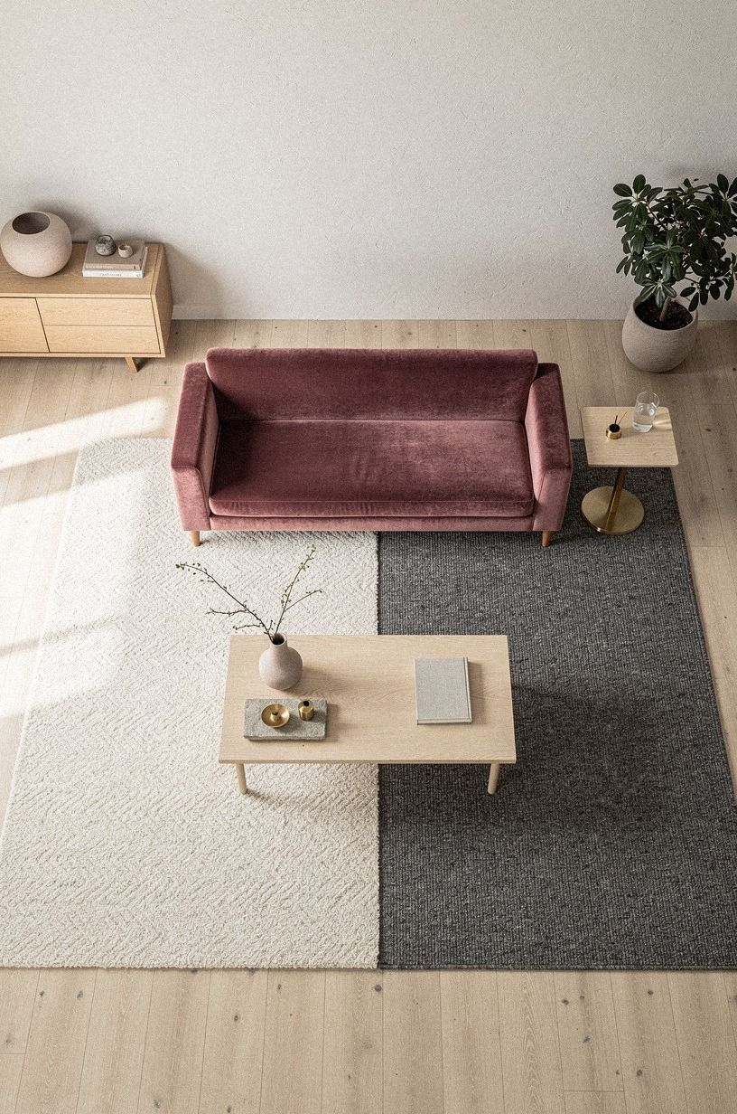
I pulled the sofa 8 inches away from the wall and let the rug sit beneath its front legs. That small shift opened a narrow path behind the sofa, which made the room feel less boxed in without changing its footprint. If you’re renting, you’ll want to measure the clearance first, because a beautiful layout is useless if your knees meet the wall every time you pass.
The main rug was a dusty rose and charcoal 8x10 rug with a deep-pile mohair velvet feel and subtle brass notes. I added a smaller flatweave runner near the reading chair instead of forcing one oversized rug to cover every zone. The room felt layered, tactile, and collected.
I’d skip two matching rugs. Repetition makes a rental look staged, while related textures make it feel collected. The second rug picked up the charcoal and dusty rose without copying the pattern.
That shift also gave the sofa a more confident position. It wasn’t hiding against the wall anymore. It was defining the room.
For more removable wall ideas, keep this rental picture-hanging guide nearby. It’s useful when your layout changes but your lease doesn’t.
2The Two-Wall Rule Made the Room Feel Intentional
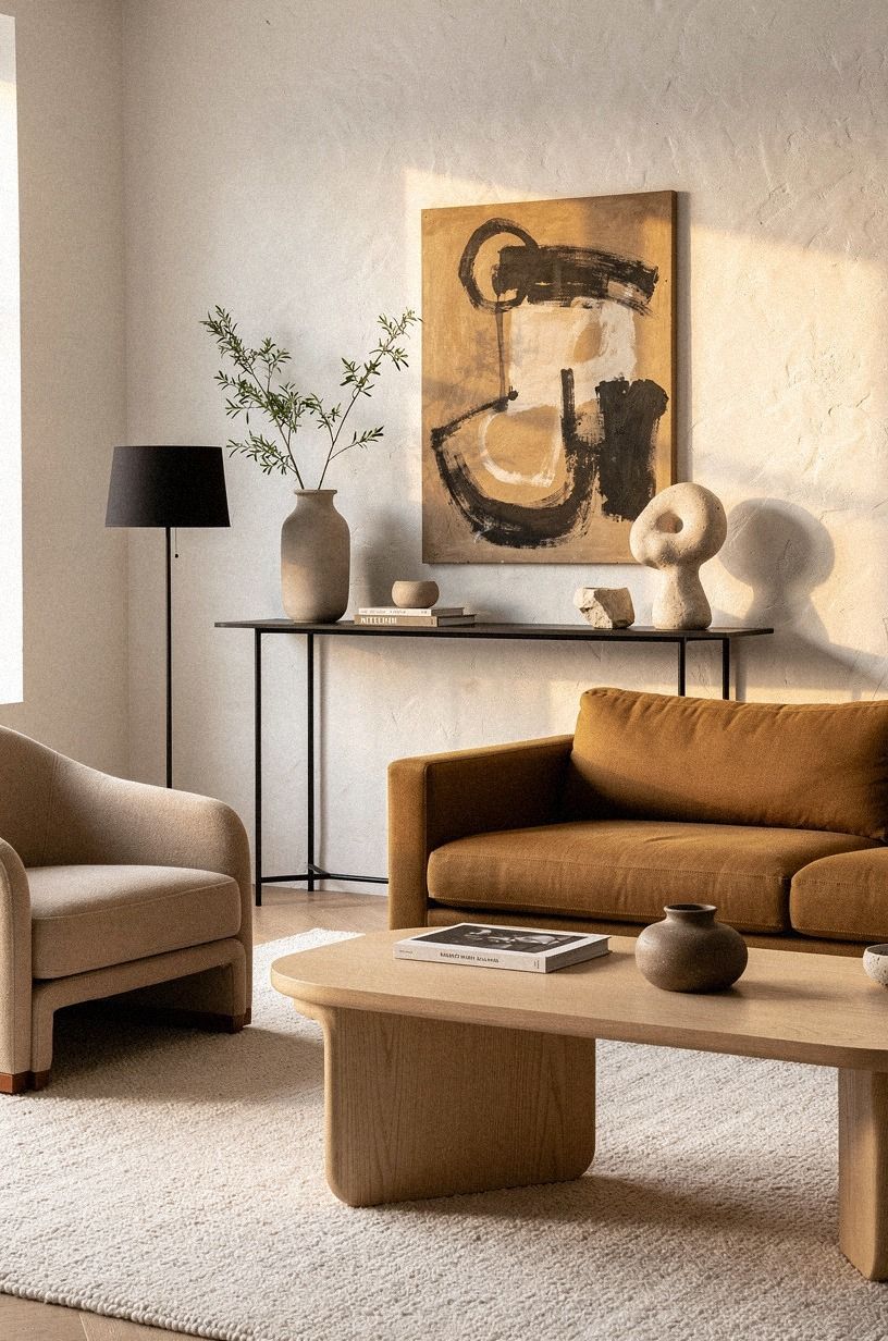
The Two-Wall Rule became my answer to the awkward corner. I placed the sofa on the longest wall and the media console on the shorter wall, creating a loose L-shaped plan instead of lining every piece along the perimeter.
You can still see the window, and the seating faces the center rather than a blank wall. That sounds minor, but it changed the mood immediately. The room became social, lively, and welcoming.
My IKEA KALLAX birch-effect unit became the low console, but I turned it sideways so its depth didn’t crowd the walkway. The open cubes hold oak baskets, books, and one lamp with a linen shade. The warm-white wall behind it kept the hand-applied Venetian-plaster finish from feeling too formal.
I’d avoid a tall bookcase here. It made the ceiling feel lower and emphasized the narrowness of the room. Low furniture gave the eye a longer horizon and made the whole space feel calmer.
The same principle works in a bedroom. This slow living bedroom approach helped me think about breathing space around the pieces that matter.
3A Shallow Modular Couch or a Deep Sofa?
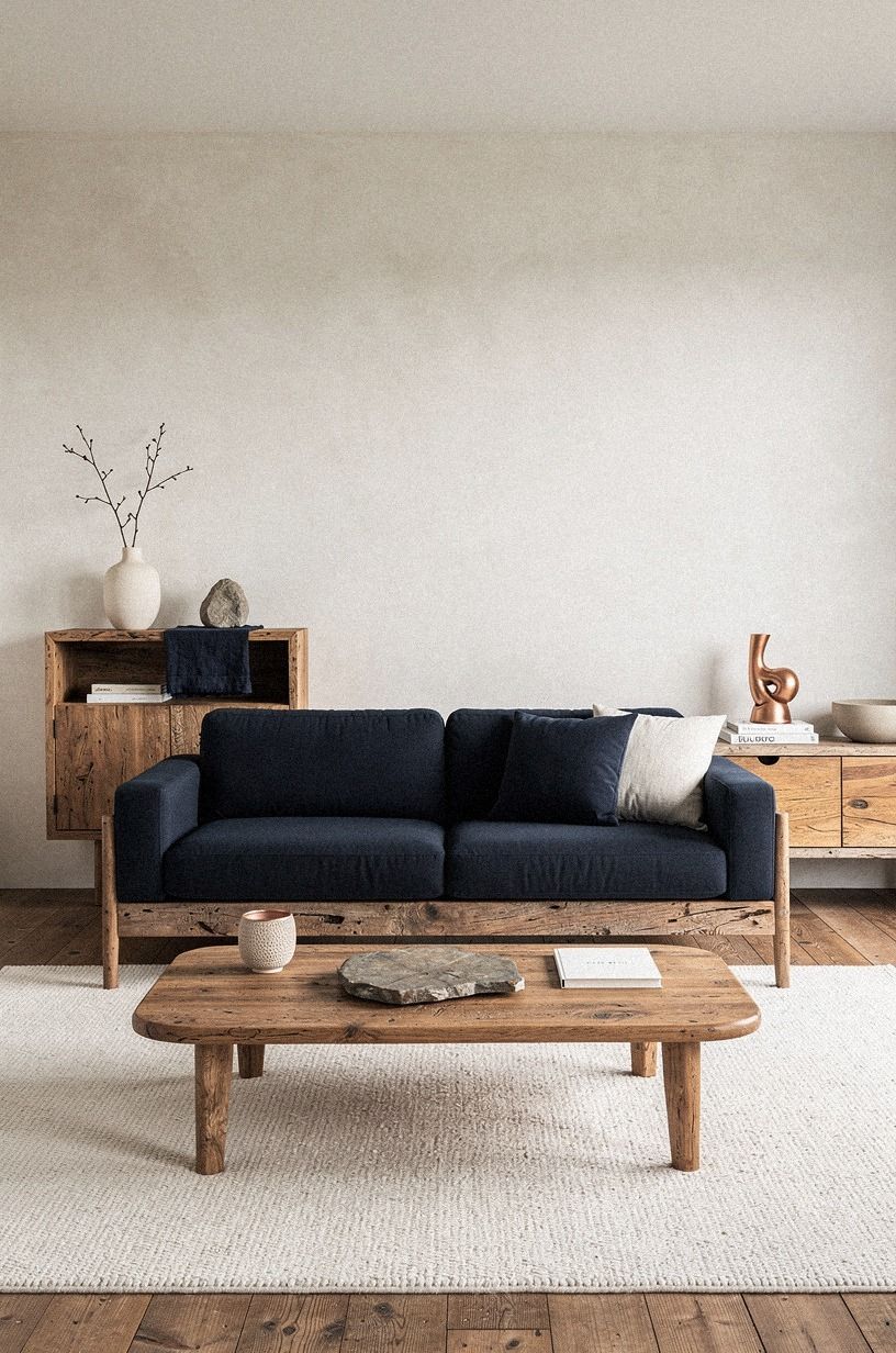
The original sofa was comfortable, but its 40-inch depth ate the room. I tested a 35-inch modular couch, and suddenly I could place the coffee table at the recommended 16 to 18 inches from the seat.
That gap made the room feel deliberate, not like someone had shoved the table away during a hurried cleaning session. It also left enough space to walk around the sofa without turning sideways.
I chose an Article Sven sofa in midnight blue because its arms are compact and its seat doesn’t visually overpower the rug. A reclaimed weathered-teak table brought copper and ivory notes into the arrangement without making the room feel heavy.
I went back and forth on a sectional. I’d skip one unless your room has a genuinely clear corner. A modular couch can flex later, while a fixed chaise traps your furniture when the landlord changes the floor plan or you move to a different apartment.
A shallow sofa isn’t automatically better. It needs to remain comfortable for your body. The point is to protect circulation while keeping the room handsome and usable.
If you’re also trying to make a rental bedroom calmer, the non-toxic bedroom plan follows the same low-commitment logic.
4Let the Rug Lead Your Sofa Palette
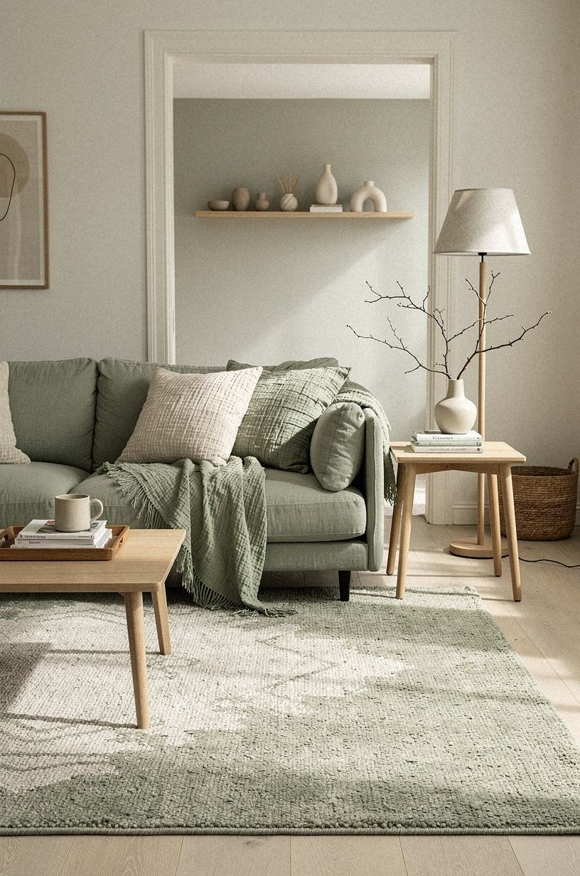
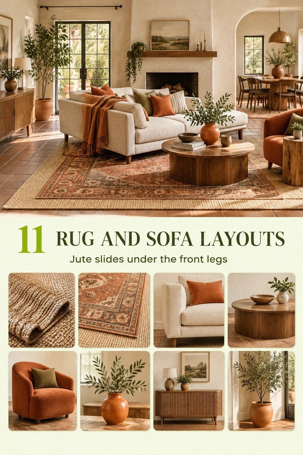
I placed the rug before making final decisions about pillows, art, or side tables. That sounds backward, but your rug controls the visual temperature of the room.
Mine had sage green, warm cream, and natural wood tones, so I pulled those colors into the sofa decoration instead of buying a matching set. The result felt warm, polished, and expressive without becoming theme-heavy.
A washed Belgian linen pillow added relaxed texture, while a natural-wood tray kept the seat practical. You can use three different textures without making the sofa look busy: one nubby, one smooth, and one woven.
I’d avoid five tiny pillows. They steal the usable seat and create visual fizz. One generous lumbar pillow looked more relaxed than a crowded row of cushions.
The rug also helped me reject colors that would have looked fine in a store but harsh in the room. That’s why I’d rather choose textiles in the actual space, beside the window, at different times of day.
For flexible art placement, pair this arrangement with ways to hang pictures without nails. Your artwork should be as movable as your furniture.
5Build the Three-Height Light Stack
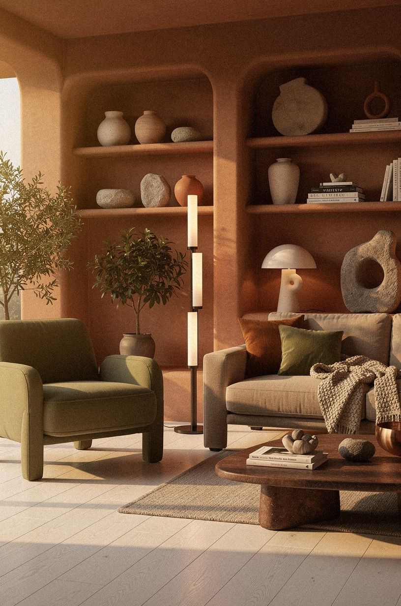
The room looked flat until I stopped relying on the ceiling fixture. A cerused white oak floor lamp added the tallest point, while a stone-toned table lamp and low olive accent created the other two heights.
The terracotta shade kept the lighting warm without making the room orange. I placed the lamps where they supported actual tasks, not just where they filled an empty corner.
6Hang Art Above the Sofa Without Making Holes
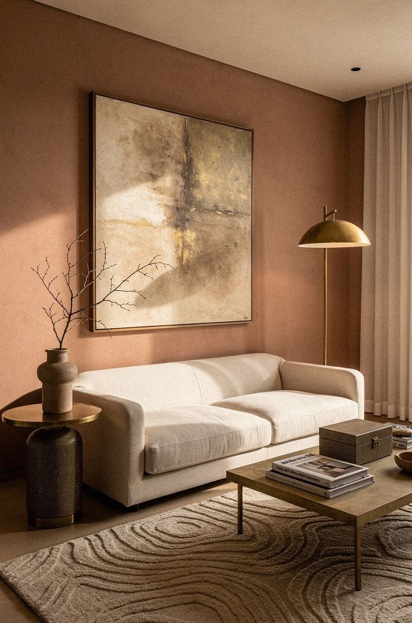
I wanted one large piece above the sofa, but the lease made nail holes a bad idea. Instead, I used removable picture strips rated for the artwork weight and left a slim gap above the sofa back.
Your art should feel connected to the furniture, not float near the ceiling. I measured twice because the first placement sat 3 inches too high and made the seating area look disconnected.
The piece was a framed abstract print in muted clay and linen, with an aged-brass border and small shagreen accents. I kept the border simple so the rug could remain the more expressive element.
If you’re hanging several pieces, establish one lower edge rather than spacing everything from the ceiling. A small gallery rail can also make future changes easier, provided your landlord allows the hardware.
I’d avoid filling every blank wall immediately. One strong piece gave the room a focal point, while the remaining walls kept the rental feeling light and airy.
This no-nail hanging guide is worth reading before you arrange a gallery wall. Check the strip rating, artwork weight, and wall finish first.
7Benjamin Moore Revere Pewter, Tested Against the Lease
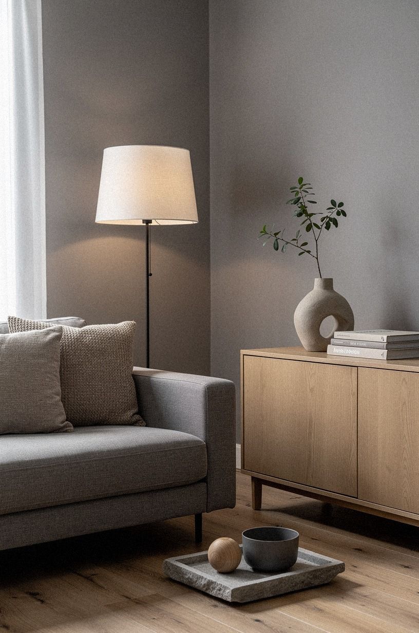
I couldn’t repaint the whole room, so I tested removable color on the shallow wall behind the sofa. A plum sample looked surprisingly good against the gray and rose-gold accents, though I kept the permanent wall warm white.
I used the deeper color as a small visual anchor rather than covering the entire rental. The room already had enough contrast once the walnut grain and soft textiles were in place.
8Turn the Chimney Bump-Out into a Useful Table Zone
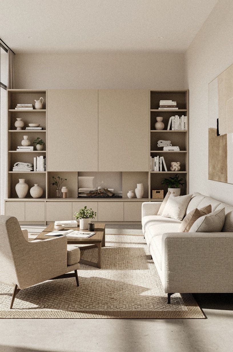
The chimney bump-out had been dead space, so I gave it a job. I placed a 12-inch-deep console near the projection and used it as a landing spot for keys, a book, and one small lamp.
If you’re working with a similar corner, keep the tabletop shallow enough for the walkway to remain clear. I stood in the passage and carried a laundry basket through it before deciding the depth was safe.
The table was a walnut console with a softly finished surface, and its grain warmed the navy-and-white palette. I added a shallow ceramic bowl and one organic bouclé cushion nearby for the first week.
You don’t need a crowded vignette to make a corner useful. The bowl catches small things, while the surface stays calm. A battery lamp would also work if outlets are awkward.
I’d skip a round pedestal table here. It looked charming but blocked the turning path. The narrow rectangle gave your eye a clean stopping point without interrupting circulation.
That corner became one of my favorite parts of the room because it had a clear purpose. Awkward space feels less awkward when it earns its footprint. The rental bathroom height trick follows a similar proportion-first idea.
9Wool Versus Synthetic Pile: Which Felt Better?
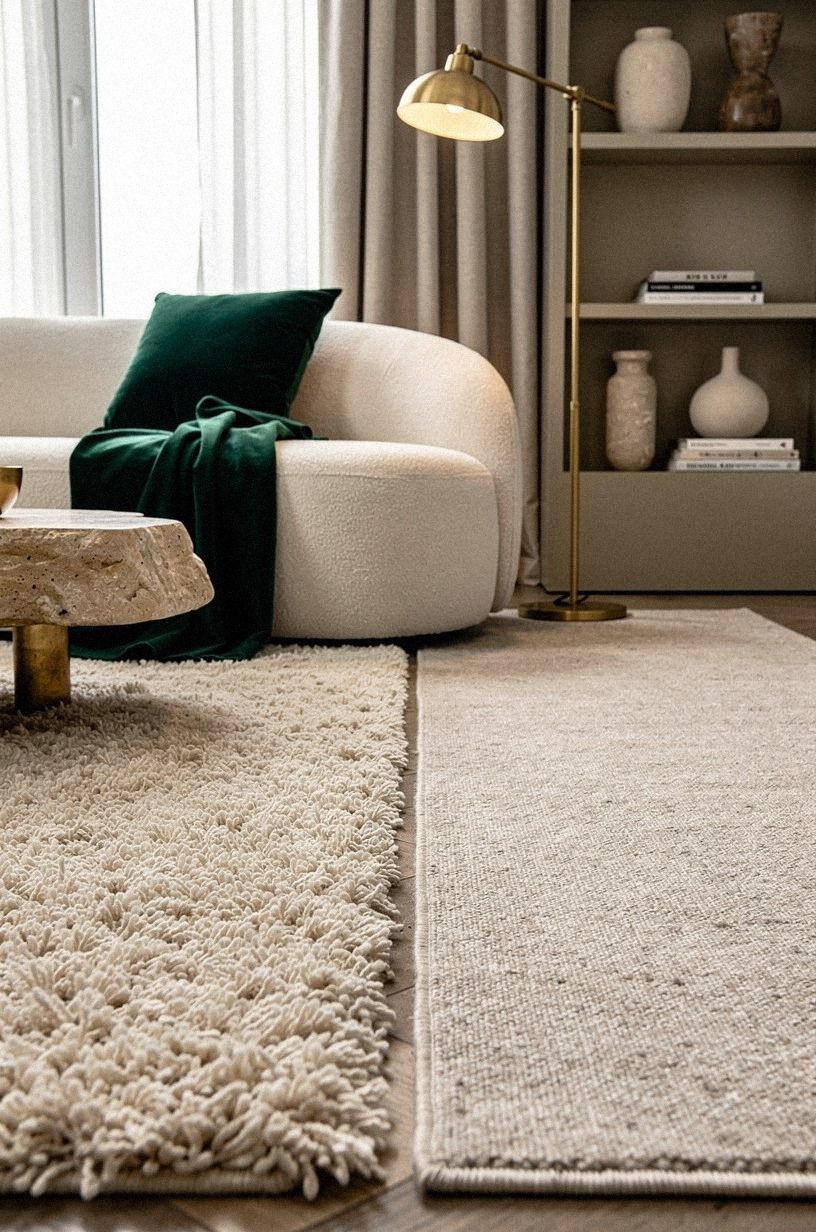
I tested a high-pile synthetic rug first, in emerald, gold, and cream, and it looked soft in the store. Beside it, an unlacquered brass lamp developed a gentle patina that made the palette feel warmer.
The synthetic pile was easier to clean than I expected, but it felt less substantial underfoot. I eventually preferred a lower wool option for the main walkway and kept the richer colors in the smaller reading zone.
10Lower the TV Line, Raise the Room’s Calm
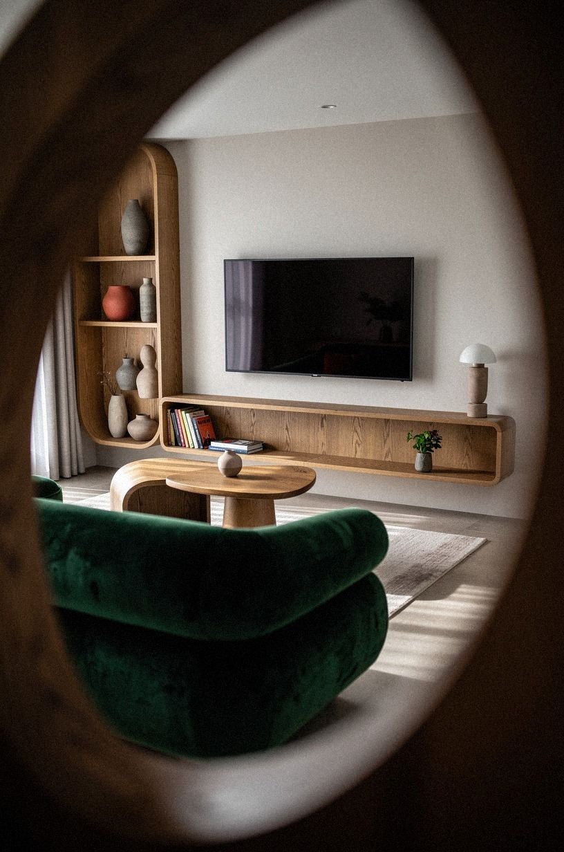
The television sat too high on a tall cabinet, so the first thing you noticed was a black rectangle. I lowered it onto a long console and placed two low objects beside it.
You’ll want the screen close to seated eye level, especially if your sofa is shallow and upright. Lowering the TV also brought the tall cabinet out of the main sightline and let the rug become part of the composition.
The replacement was a natural-oak media console, though a secondhand piece would do the same job. I kept the surface mostly clear and used a woven basket below for remotes. A rust-colored throw added warmth beside the forest-green upholstery.
A low-profile speaker fitted beneath the screen without creating another dark block. I hid the cables with a discreet cord sleeve, since loose wires can make even a beautiful arrangement look unfinished.
The room immediately felt calmer because the TV no longer competed with the window. I’d avoid a tall cabinet in a small rental, even if it offers more storage. A lower line gives the rug and sofa room to breathe.
If your electronics are the visual problem, solve the height and cable clutter before buying decorative objects. The tall-looking shower curtain approach taught me a similar lesson: proportion can change the whole room.
11Rehearse the Layout Before Buying Anything
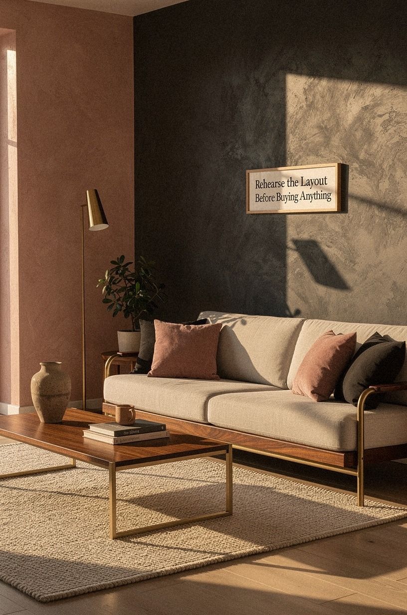
My final layout came from painter’s tape, not a shopping cart. The dusty-rose and charcoal textiles, brass details, and hand-applied Venetian-plaster wall gave me enough character to test the arrangement before adding anything else.
A five-minute test for circulation
After the main furniture was in place, I tested the room with three ordinary tasks: walking from the doorway to the window, sitting down with a mug, and reaching the lamp without leaning across the coffee table.
The first route should feel obvious. You shouldn’t have to navigate around a chair that’s technically decorative.
The second should leave enough table space for a drink and a book. The third should be possible without twisting your shoulder.
I also opened every drawer and cabinet. Storage doors need clearance, too. A layout can look wonderfully airy while making daily storage irritating.
My final test was visual. I stood at the doorway and checked whether the sofa, rug, and console read as one arrangement.
They didn’t need to match. They needed to belong together.
That simple test saved me from buying a larger coffee table. The table I wanted would have looked handsome but made the path worse. It worked!
The rental picture-hanging guide is useful here as well, because movable art should support a layout that can evolve.
How much it cost
I spent $387 on a secondhand rug, removable hanging supplies, two lamps, and fabric accents. The sofa and console were pieces I already owned, so your total could look very different.
A performance-fabric sofa often runs $1,200-$4,000. A wool rug in 9x12 can cost $600-$2,500. An oak coffee table may land between $300-$1,200, and linen drapes for a pair often cost $120-$400.
You can keep your own project near the budget tier by reusing the sofa and buying the rug secondhand. The free work matters most. Move the furniture, tape the rug outline, raise or lower the art, and take a phone photo from the doorway before spending money.
For a calmer approach to buying, this rental bedroom plan uses the same low-commitment mindset. Start with comfort and circulation, then add personality.
This no-nail hanging guide can also prevent a small decorating experiment from becoming an expensive lease problem.
Where secondhand money mattered most
I saved money on the console and spent more carefully on the rug. That balance made sense because the rug covered a large visual area and affected every other color in the room.
Secondhand oak furniture was especially worthwhile. Small scratches made the pieces feel established rather than precious, and the warmer wood kept the rental from looking flat.
I’d spend less on small decorative objects. A thrifted ceramic bowl, one good lamp, and a washable throw did more than a shelf full of inexpensive accessories.
For upholstery, inspect seams, underside fabric, odors, and frame movement. A low price isn’t a bargain if the sofa needs immediate repair. I’d also ask whether a rug has been stored somewhere damp before bringing it home.
The moody living room guide gave me ideas for using deeper accents without turning the whole room dark. One dramatic note is usually enough.
The slow living bedroom approach also helped me value fewer, more tactile pieces. A room feels richer when every object has a reason to stay.
The rental lesson I keep coming back to
I used to think a rental makeover had to look temporary because the walls, floors, and fixtures weren’t mine. That assumption made me buy small furniture and hide everything against the edges. The result was safe, but it wasn’t comfortable.
You’ll get more warmth from one confident layout than from ten little decorative purchases. The mistake I made was treating the rug as an accessory. It was the map.
Once the front legs sat on it, the sofa stopped floating, the coffee table had a clear job, and the chairs finally belonged to the same conversation. I also learned that a 35-inch sofa can feel more luxurious than a 40-inch one if your body has room to move around it.
I’d skip permanent changes unless your lease allows them. Removable panels, tension hardware, layered lamps, secondhand wood, and a properly sized rug can create a welcoming room without asking permission for every detail.
You’re not hiding the rental. You’re giving your furniture enough structure to feel intentional. The rental bathroom height trick works for the same reason: a small proportional change can make the whole space feel more considered.
The non-toxic bedroom guide follows that same flexible approach to choosing pieces that support daily comfort.
And yes, I still moved the sofa after taking the “final” photo. That’s normal. Your room changes when you live in it, and the best layout is the one that lets you put down a mug, stretch your legs, and walk to the window without apologizing to the furniture.
The Questions I Get Asked Most
What is the best rug and sofa layout for a small living room?
Start with the sofa’s front legs on an 8x10 rug, paired with a shallow coffee table. A low IKEA KALLAX console or compact Article Sven sofa can keep the sightline open. You’ll gain more usable floor space without pushing every piece against the wall.
Where can I buy living room pieces on a budget?
Look at IKEA, Wayfair, and Target first, then check Facebook Marketplace or a local thrift store. Your best savings usually come from secondhand rugs, oak tables, and lamps. I’d spend time finding the right proportions before chasing a specific style.
How much does a rental living room makeover cost?
A small makeover usually costs about $100 to $300 if you reuse the sofa and console. Moving furniture, taping the floor, and rearranging art are free. A new rug or lamp raises the total, while a replacement sofa can move the project into the thousands.
Can I improve the room without buying anything?
Yes, and you can begin tonight. Move the sofa 8 inches from the wall, place its front legs on an existing rug, and create three light levels with lamps you own.
Then remove one unnecessary piece instead of adding several small accents. Start with the furniture you have!
Is a rug and sofa layout change worth it in a small space?
Yes, because a small room rewards accurate proportions. A 35-inch sofa, 16 to 18 inch table gap, and correctly sized 8x10 rug can make circulation easier. You’ll notice the improvement every day, especially if your old furniture blocks the window or doorway.
Is this approach suitable for a rental?
Yes. Use removable picture strips, peel-and-stick panels where allowed, tension hardware, freestanding lamps, and secondhand furniture.
You can also keep storage flexible with baskets and modular pieces. This rental bedroom guide follows the same no-damage approach.
For more layout ideas, the slow living bedroom approach is helpful when you’re trying to make a compact room feel restful and purposeful.
Where I’d Start First
If I had to pick one change, I’d start with floating the sofa onto the rug. It fixes the room’s scale before you spend money, and every lamp, table, and pillow makes more sense afterward.
Clear the floor, tape the rug outline, and walk through the room with a mug in your hand. If the path feels natural, start there! The right layout won’t make the rental perfect, but it can make the room feel generous, calm, and genuinely yours.