
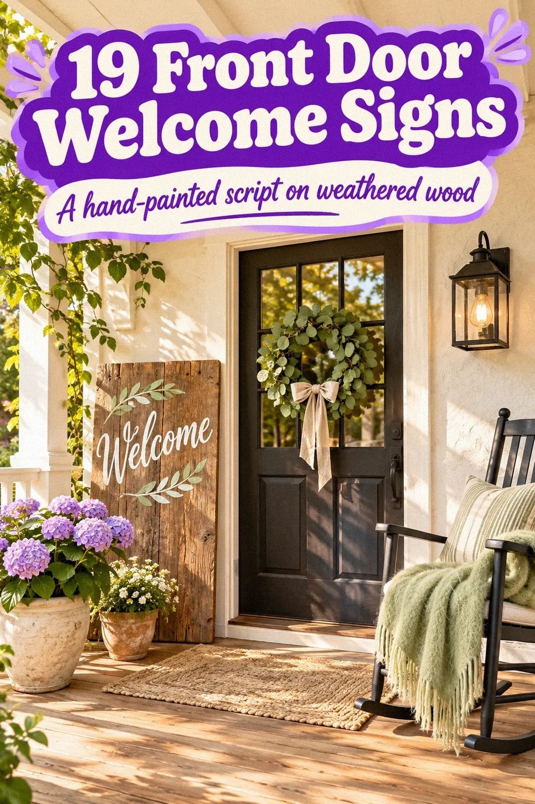
 by
A custom welcome sign can make your front door feel finished for about $100 to $300, depending on size, paint, and hardware. I've learned that the sign matters less than its scale and placement. A tiny plaque gets lost beside a wide entry. A tall cedar board can change the whole arrival. Here's how to choose yours.
- Layer a cedar board with painted lettering
- Paint a petite arch with the Cottage Arch Rule
- Hang a black-and-white plaque beside the door
- Frame a pressed-botanical sign
- Use one oversized round sign
- Follow the Two-Wood Rule
- Pair the sign with a front door welcome mat
- Build the Three-Height Light Stack
- Paint a color block behind the lettering
- Make the family-name sign feel less formal
- Swap a wreath for a hanging sign
- Price the porch plan before choosing the sign
- Paint the back of a glass panel
- Choose aged brass over bright chrome
- Create a rental-friendly removable sign
- Let the hardware do the talking
- Could a tiny sign work in a small entry?
- Frame the sign with side greens
- Mix modern lettering with old brick
1Layer a cedar board with painted lettering
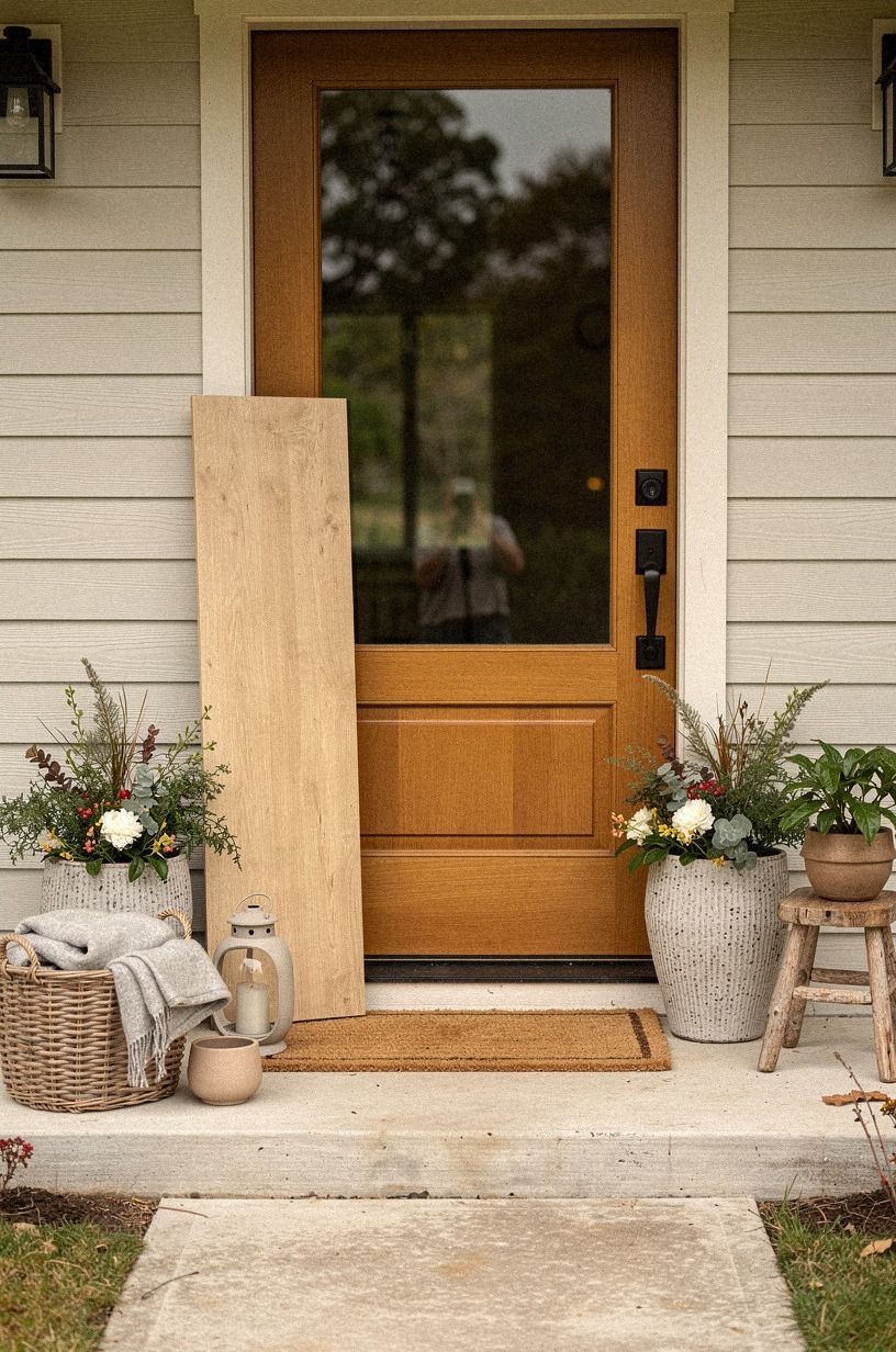
A vertical cedar welcome board gives your entry height without crowding the walkway. Choose one with visible knots and a lightly brushed finish, then paint the lettering in warm white or soft black. You’ll want the board tall enough to read from the sidewalk, but it shouldn’t block your doorbell, house numbers, or a 36-inch walkway clearance.
I made the mistake of hanging one too close to the hinge side once. Every grocery bag bumped it. Place yours on the opposite side of the door, where the grain catches afternoon light and the lettering stays easy to see.
A small unlacquered brass hook that develops a soft patina and a woven jute cord keep the look rustic without making your porch feel themed.
If your door is yellow, pair this idea with these yellow front door ideas for a sunny welcome. The cedar will soften the bright color, and you won’t need much else.
2Paint a petite arch with the Cottage Arch Rule
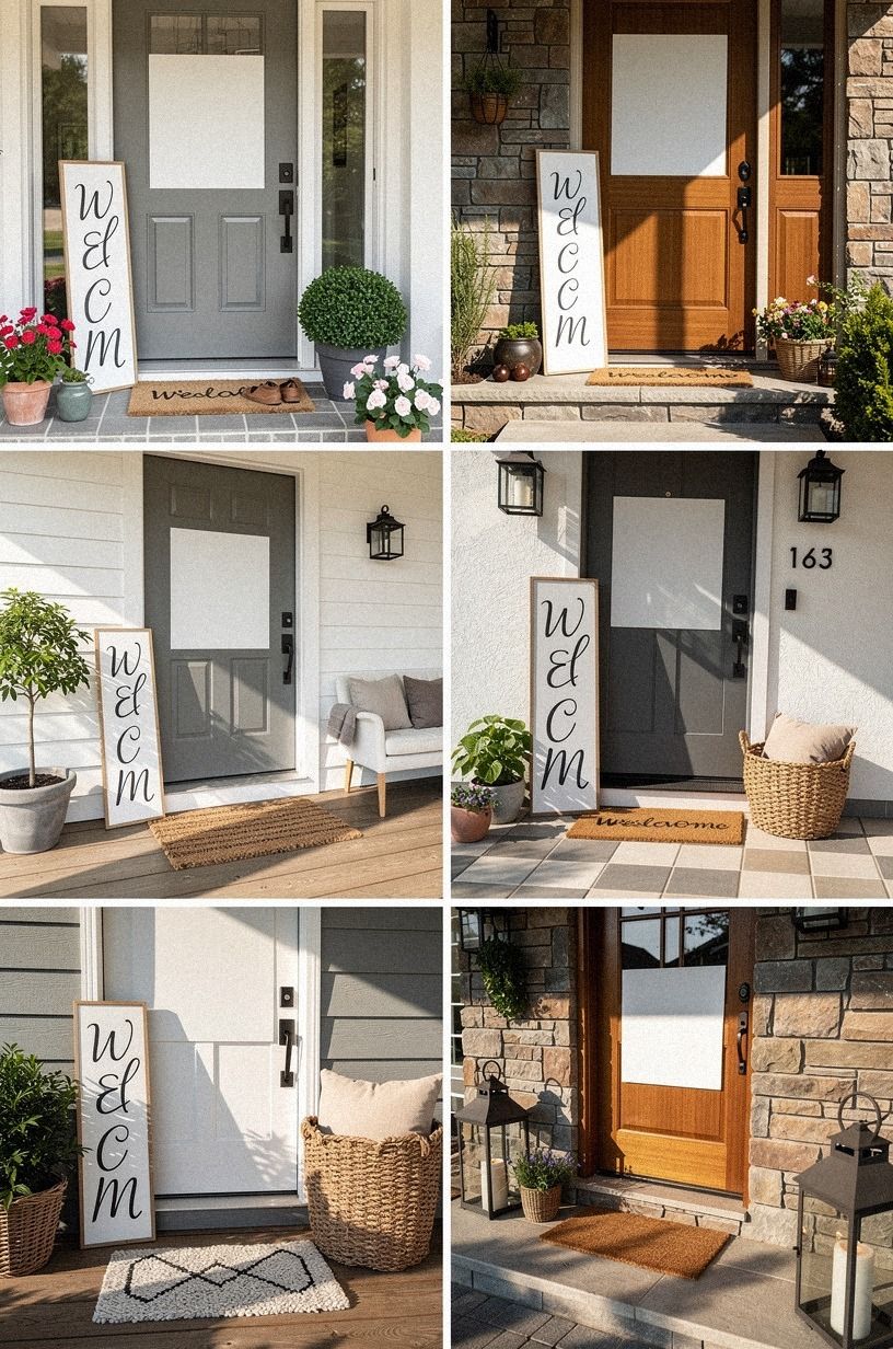
A rounded sign feels gentle and friendly, especially when your porch is narrow. The Cottage Arch Rule is simple: repeat one curve in the sign, a planter, or the door hardware so the shape feels intentional. You’ll get a charming entrance without filling every inch of wall.
Try Benjamin Moore White Dove OC-17 for the lettering against a forest-green background. The warm white won’t look blue beside brick or stone, and it works with both morning shade and late sun. I’d skip a glossy finish here.
It throws hard reflections across the words and makes the sign look newer than the rest of your porch.
And if you’re styling a small front door, let the sign carry the detail. One oversized-chip terrazzo pot, one trailing plant, and a soft cotton doormat are enough. Your eye needs a quiet place to land.
3Hang a black-and-white plaque beside the door
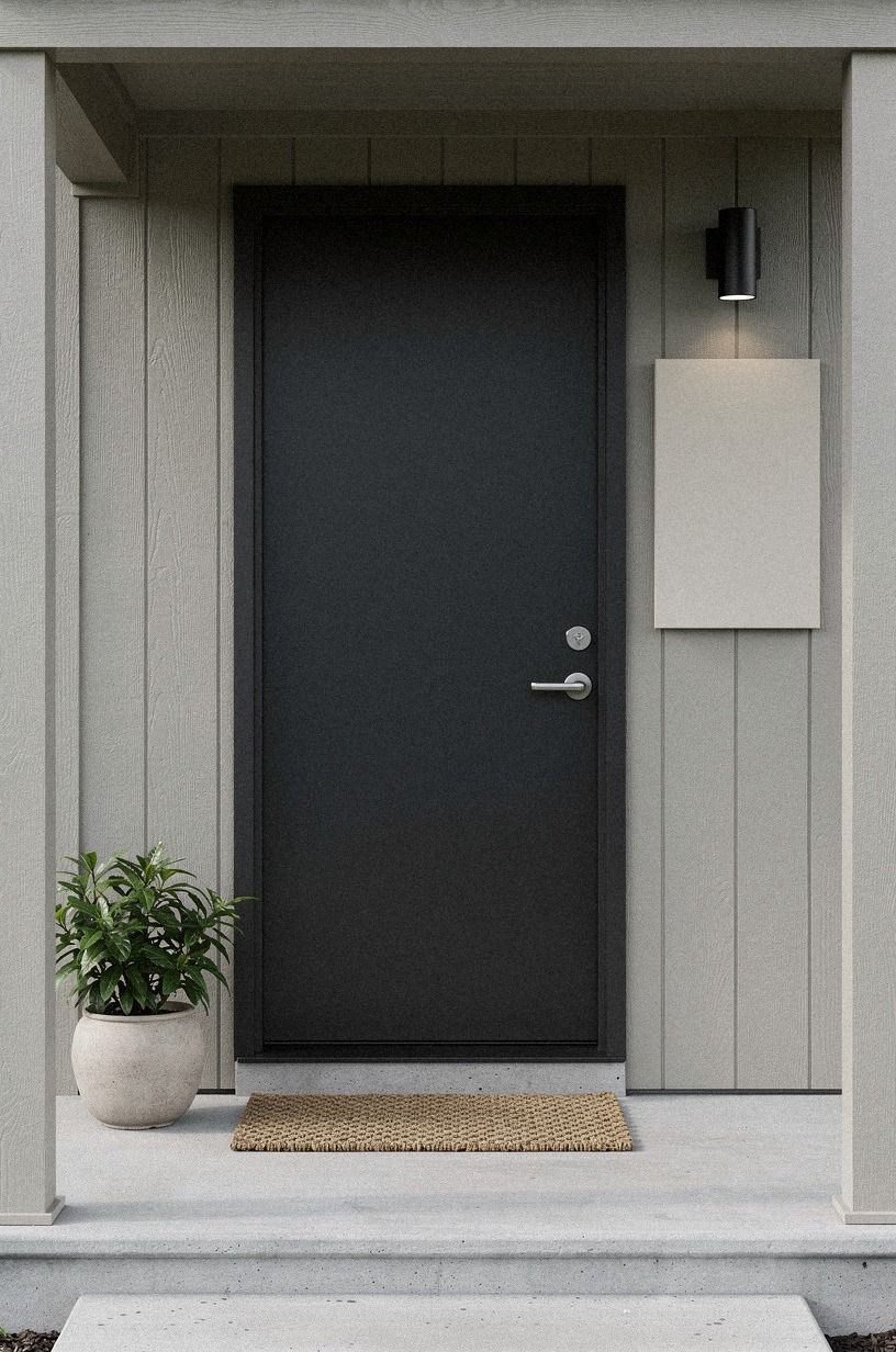
A plaque with charcoal lettering, a dusty-rose ground, and brass hardware has the crispest look of the group, but it needs breathing room.
4Frame a pressed-botanical sign
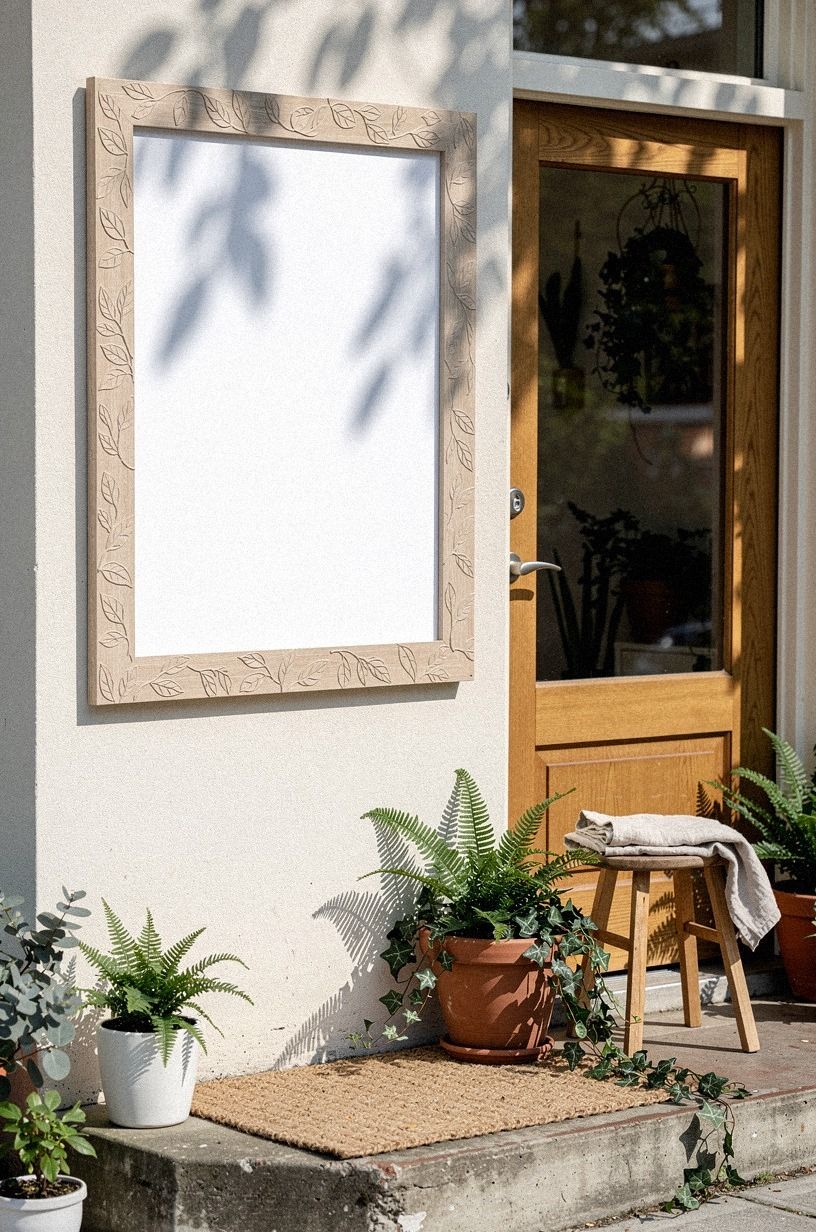
Pressed leaves behind glass turn a welcome sign into something closer to a small piece of art. Choose a pressed eucalyptus arrangement or flat fern fronds, then keep the lettering modest so you can still see the plant texture. You’ll want the frame sealed on the back, since outdoor humidity can curl paper and stain the mat.
A warm camel frame with shagreen accents works well against painted siding, while a thin bronze frame suits brick. I’d avoid loose dried flowers.
They shed, fade quickly, and make your porch look dusty before the rest of it does. A sealed botanical panel gives you the same organic note with less maintenance.
Your sign can sit on a narrow ledge, but hanging it is safer near the door. If you’re working with a wooden entry, these wooden front door ideas for warm natural character will help you repeat the grain without matching every finish. The result feels earthy, not overly rustic.
5Use one oversized round sign
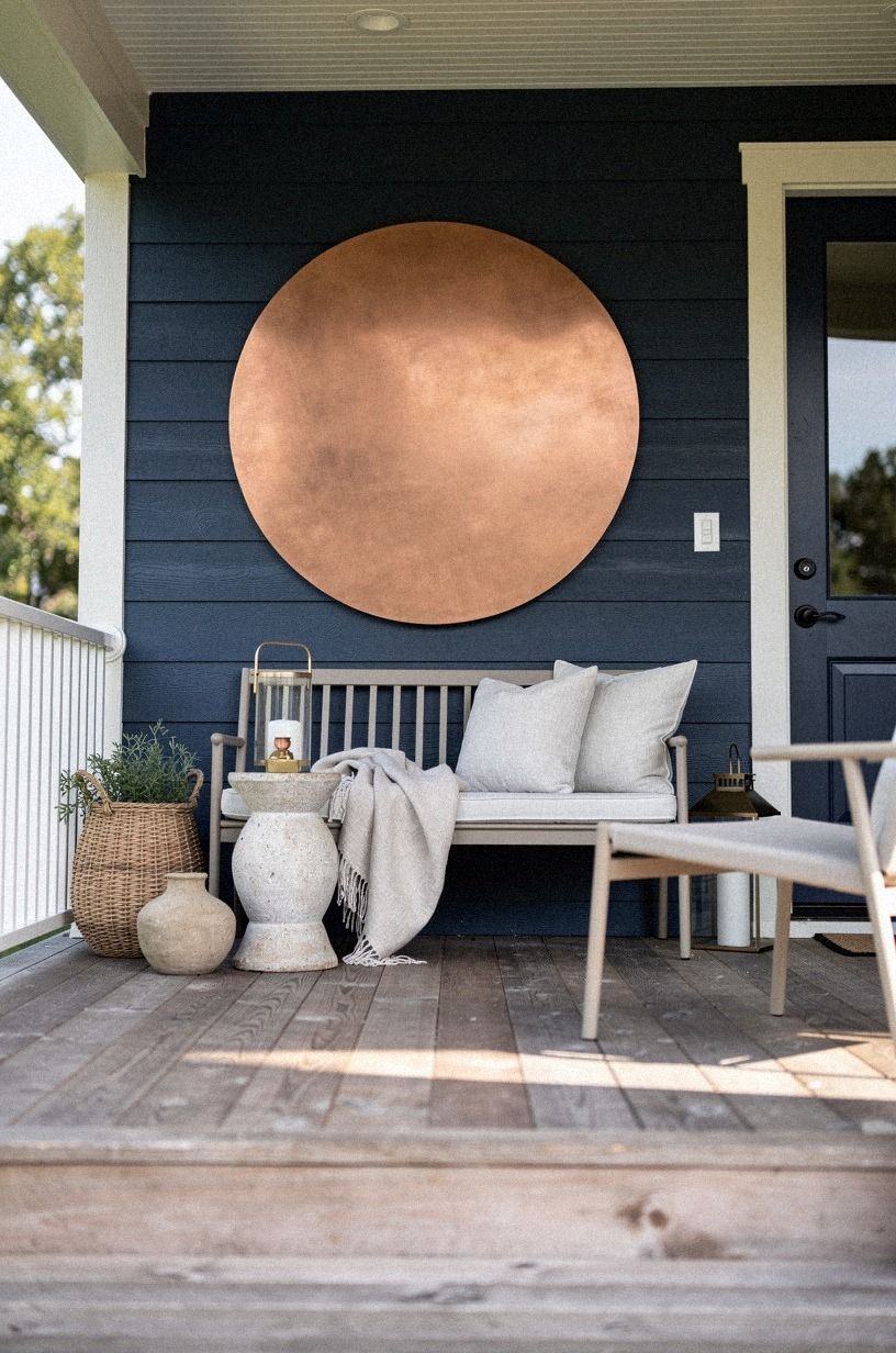
One oversized round sign can be more welcoming than a cluster of tiny plaques. Choose a diameter that fills the open wall without touching the trim, then use a washed Belgian linen face with a copper-toned edge so your eye finds the message immediately.
I’d skip a wreath around the sign unless your door is very plain. A wreath plus words plus a large planter becomes busy fast. Instead, add one low olive tree in a stone-look pot and let the circle stand alone.
The gray-green leaves will move in a breeze, while the sign stays visually steady.
Why should your welcome message compete with your door? It shouldn’t. A round sign is especially good with a modern entry, and these modern front door ideas for sleek curb appeal show how little decoration a strong shape needs.
6Follow the Two-Wood Rule
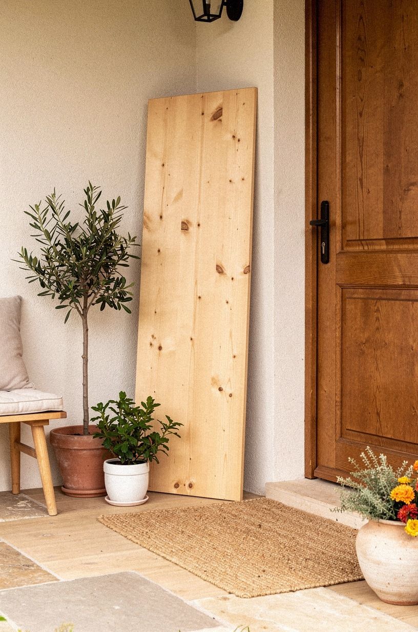
The Two-Wood Rule keeps a rustic welcome sign from looking like a craft fair display. Use one main wood, such as cerused white oak, and one supporting wood, such as a darker walnut stain. You’ll get contrast without collecting six unrelated brown tones around your entry.
Try a rectangular sign with a pale oak face and walnut lettering. The grain should run vertically if your door is tall, because the direction will echo the architecture.
I’d avoid a shiny polyurethane topcoat. It looks plastic in bright sun and shows every fingerprint you’ll leave while hanging it.
And you don’t need a matching wooden planter. Your sign can carry the warmth while an organic bouclé cushion on a nearby bench adds a softer note.
If your home has historic details, these Victorian and mid-century front door ideas for historic character can help you choose a period-friendly shape. Your entry will feel collected, not copied.
7Pair the sign with a front door welcome mat
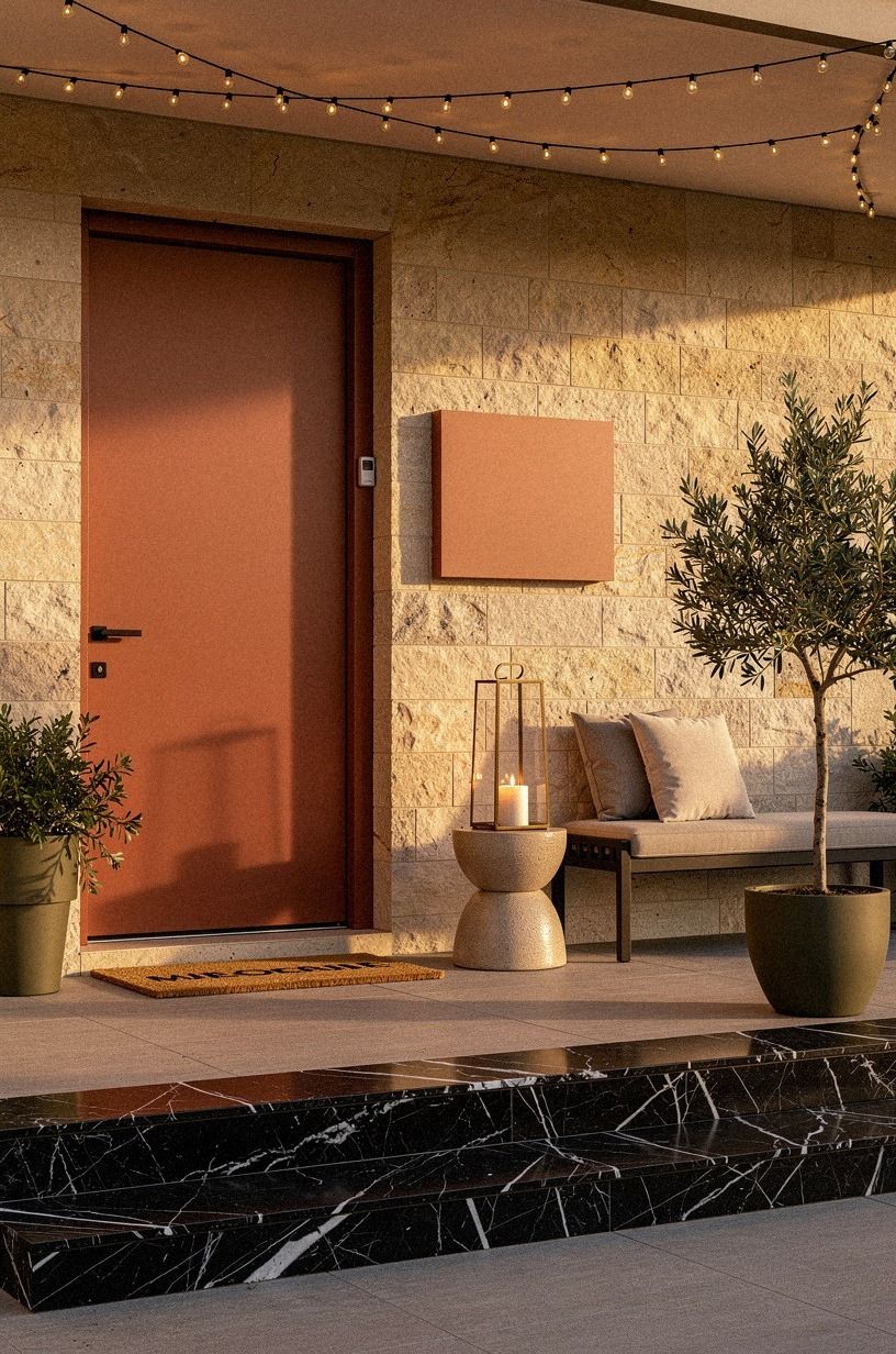
A sign looks more intentional when the floor answers it. Pair your lettering with a front door welcome mat that repeats one color or texture from above. A charcoal sign works with a natural coir mat, while a white sign looks better over a patterned polypropylene rug that can handle damp shoes.
You’ll want the rug’s front legs under the seating or planter when the porch has room. That small overlap makes the area feel anchored instead of scattered.
I’d skip a tiny mat under a large sign. The scale mismatch makes both pieces look accidental.
Choose nominal details rather than extra objects: coir fibers, a striped border, a low Nero Marquina black marble planter with white veins. But don’t let the mat cover the threshold or swing path.
Your door still needs to open easily, especially after rain. This is where front porch decorating ideas can guide the larger layout.
8Build the Three-Height Light Stack
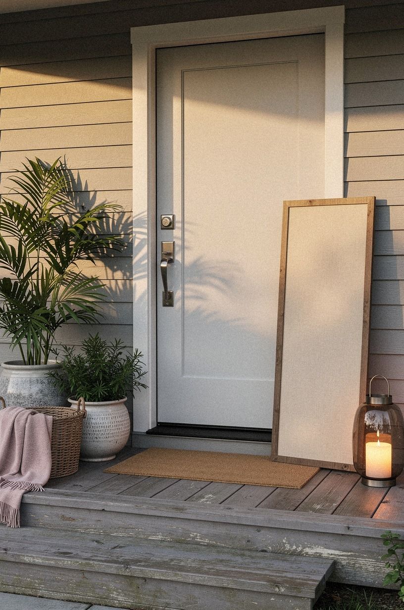
The Three-Height Light Stack uses a tall sign, a middle-height planter, and a low mat to give your entrance rhythm. You’ll want the sign to sit above the planter visually, while the mat keeps the bottom grounded. Nothing has to match exactly.
A slim clay-toned sign with linen texture can be the tall element. Add a West Elm ceramic planter at the middle height, then use a woven mat at floor level. I’d choose warm white lettering and a soft LED lantern rather than bright blue outdoor bulbs.
The lamp should throw a pool of amber across the sign after sunset.
But don’t place the planter directly in the door swing. Give your entry enough clearance for bags, packages, and two people passing. If you’re adding string lights to the porch, typical LED string lights run $30 to $120, so the glow can stay inviting without swallowing the sign.
9Paint a color block behind the lettering
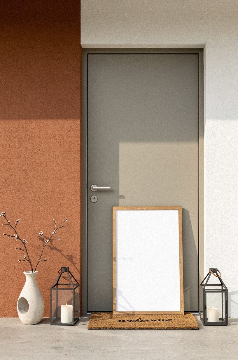
A painted color block makes a small sign read like a deliberate architectural detail. Paint a rectangle, arch, or circle on a backing board, then add the welcome message on top. You’ll get a bold focal point without repainting the entire door.
For a calm look, try a muted plum block with warm gray lettering and a subtle Carrara marble border with gray veining. It’s gentle beside brick and still has enough depth for the words to show.
I’d skip a bright red block unless your porch has another red detail. Otherwise, the sign becomes the only thing your eye sees.
Your color block can echo the door or contrast it. A pink door might work with a muted clay sign, while a dark blue door benefits from a warm ivory panel. These pink front door ideas for sweet standout charm show how a small color relationship can make an entry feel warm rather than loud.
10Make the family-name sign feel less formal
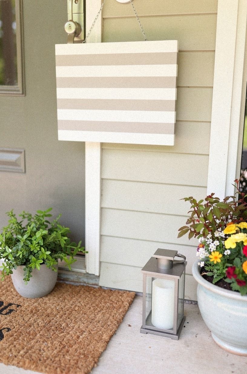
A family-name sign can feel personal without looking like a hotel lobby. Use a first name, initial, or simple “come in” message instead of fitting every surname and founding date onto one board. You’ll want the lettering to sound like your household, not like a real-estate listing.
Try a reclaimed weathered teak bench nearby, then echo its warm grain with a walnut-toned detail on the sign. The material contrast will make the entry feel lived-in. I’d skip ornate scrollwork unless your house already has curved trim or vintage ironwork.
And if you’re unsure about using your full name outdoors, your initial is enough. A painted cream enamel panel with one dark letter can look refined and still offer privacy. Add a small seasonal stem in a stoneware bud vase, but keep the message as the first thing visitors notice.
11Swap a wreath for a hanging sign
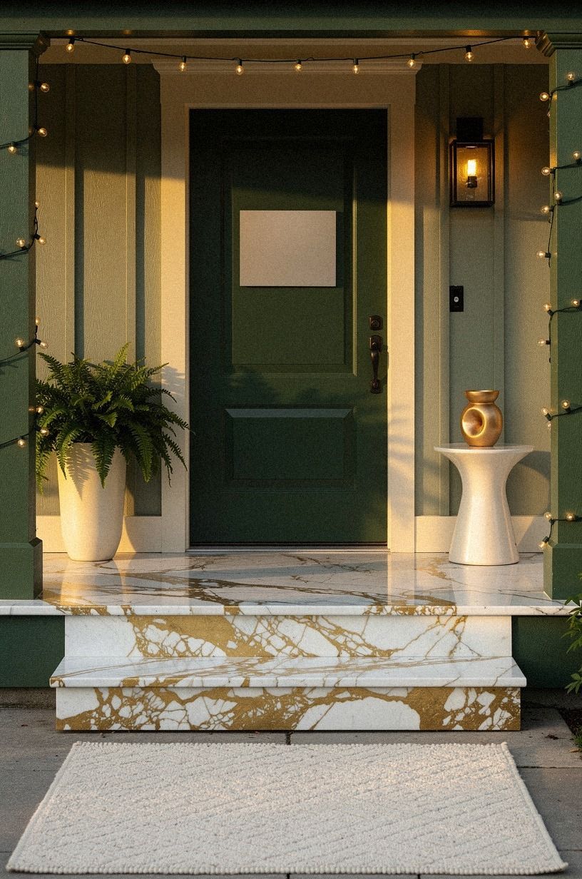
A hanging sign with a Calacatta marble face and gold veining gives you the softness of a wreath without repeating the usual circle.
12Price the porch plan before choosing the sign
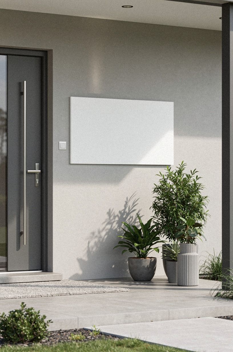
A welcome sign often works best as part of a small front porch decorating plan. Before you buy paint, a rug, and lighting, decide whether the sign is the star or one layer in a larger refresh. You’ll want your spending to follow the piece that changes the entry most.
For a typical US outdoor project, these ranges provide useful context:
A sign-only update can stay near the low end when you reuse a planter and paint a cerused white oak board yourself. I’d spend on weather-resistant lettering before decorative extras. Your sign will face sun, rain, and handprints, so durability matters more than a fancy silhouette.
13Paint the back of a glass panel
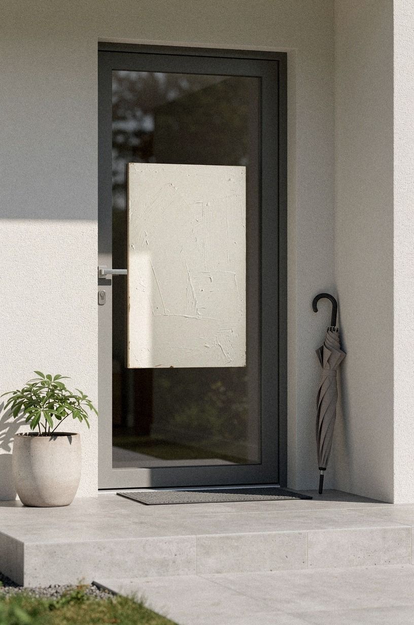
Painting the back of glass creates a smooth sign with a little depth. Use a glass panel with a backlit translucent onyx backing in a thin brass frame, paint the lettering on the reverse side, and let the transparent surface protect the message from weather. You’ll see a gentle reflection during the day, especially beside a dark door.
I’d keep the background simple. A soft gray or Benjamin Moore Pale Oak OC-20 will let the letters stay legible without feeling harsh.
Don’t use a thick backing that traps moisture against the glass. Your frame should have a sealed edge and a way for damp air to escape.
But this idea isn’t the place for tiny script. Visitors should read the sign without leaning toward the wall. Use broad lettering, generous spacing, and one clear phrase.
A warm unlacquered brass hook will echo the reflection and give the panel a finished detail.
14Choose aged brass over bright chrome
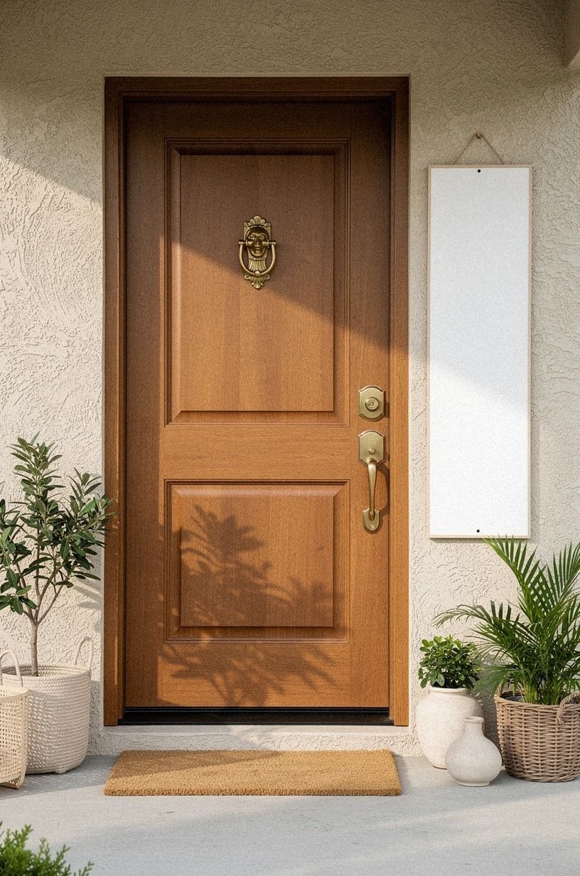
Aged brass brings warmth to a cool front door, especially when your sign has cream, olive, or tan lettering. Use unlacquered brass developing soft patina for the hanging hardware, and let it change naturally outdoors. You’ll get a surface that looks better with time instead of one that needs constant polishing.
I’d choose aged brass over chrome for a welcoming entry. Chrome reflects too much light and can make a handmade sign feel commercial. Your door may be modern, but a softer metal gives it a human note without pushing the style into farmhouse territory.
Pair the hardware with a book-matched walnut panel and warm-white lettering if you want a rich, welcoming background. The wood’s natural variation keeps the sign from looking flat. If your door is red, see these red front door ideas for a lucky, bold welcome before choosing the sign color.
15Create a rental-friendly removable sign
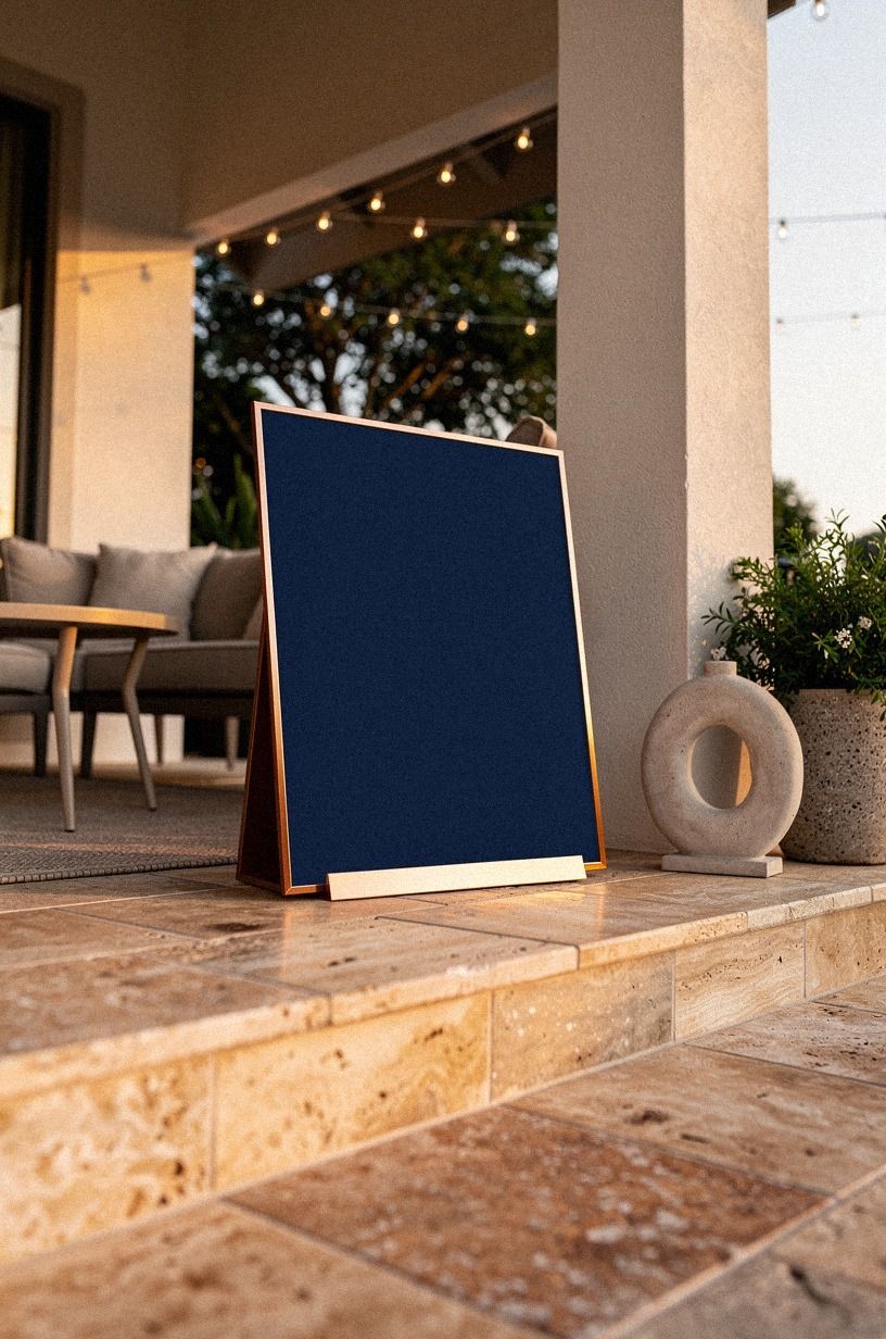
Renters can make a front door feel personal without drilling into the facade. A lightweight sign with a warm travertine finish, midnight-blue lettering, and a copper-toned hanging cord can add that custom feeling while staying easy to move.
16Let the hardware do the talking
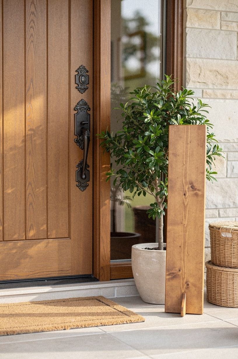
Sometimes the message can stay plain while the hardware carries the personality. Choose a simple “welcome” board, then frame it with unlacquered brass corner brackets that will develop a soft patina, visible screws, or a small forged-iron hanger. You’ll give the piece texture without adding more words.
I’d pair black lettering with a 18-ounce cotton canvas backing if your porch is covered. The weave catches side light and feels softer than a sealed board. If the entry is fully exposed, choose painted wood instead, because canvas can hold dampness longer than you’d expect.
Your hardware should be visible from the path, but it shouldn’t look oversized. A narrow bracket is enough for a small plaque.
For a larger sign, use two points of support so it doesn’t twist in the wind. You’ll notice the difference every time you open the door.
17Could a tiny sign work in a small entry?
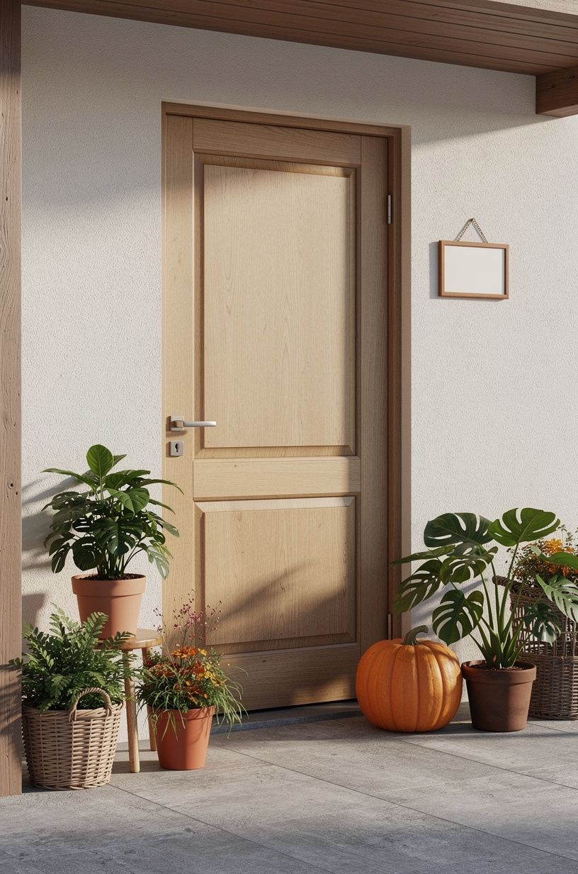
Yes, a tiny sign can work when your porch has limited wall space. Choose one strong shape, such as a small oval oversized-chip terrazzo plaque, and mount it where the door trim creates a natural frame. You’ll need less decoration, not more, because clutter makes a narrow entry feel even tighter.
Use a short phrase in wide lettering. “Welcome home” may fit better than a long family name.
I’d skip a tall plant beside the sign if it blocks your handle. Instead, use a low IKEA KALLAX birch-effect bench inside the entry or a slim pot outside the door.
But don’t let small mean faint. Your sign should still contrast with the wall, and your hardware should hold it firmly. A terracotta background with warm ivory letters can feel calming, while a black sign may add too much visual weight.
18Frame the sign with side greens
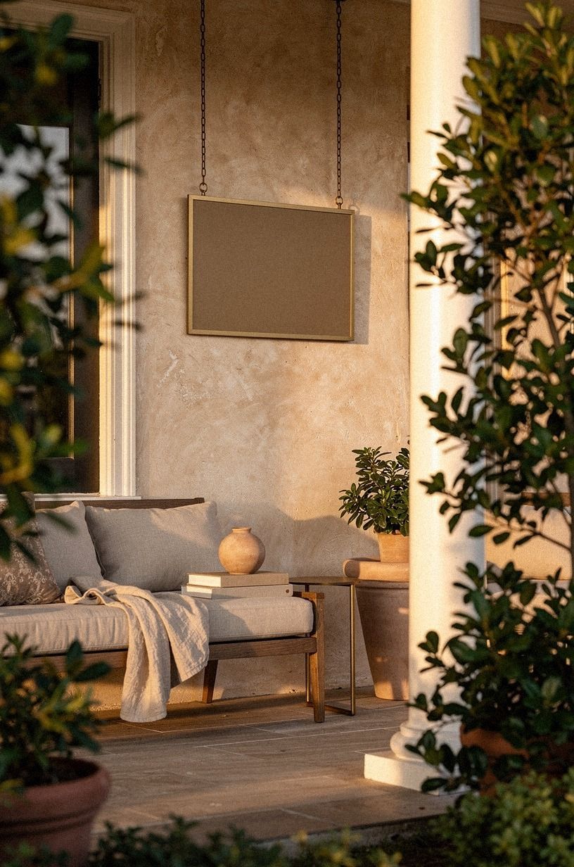
A framed sign with a hand-applied Venetian plaster surround looks especially inviting when two plants flank it without hiding the words.
19Mix modern lettering with old brick
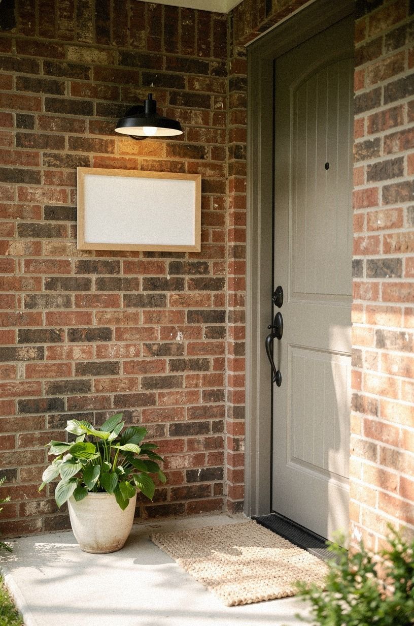
Modern lettering against old brick creates the most interesting contrast in this list. Choose a thin sign with clean sans-serif type and a small shagreen accent, then mount it beside the rough surface rather than covering the brick. You’ll see the mortar lines, chips, and color variation around the smooth board.
I’d avoid faux-distressed lettering here. The brick already carries age, so your sign can be crisp.
Use a matte mineral paint in muted plum with warm gray lettering and rose-gold screws that echo the window frames. Your porch will feel honest because each material gets to look like itself.
And if your house leans historic, keep the wording short. A single “welcome” or family initial will respect the architecture better than a crowded quote.
One final planter in 600gsm Turkish cotton? No, keep that material indoors.
Choose a weatherproof terracotta vessel instead, and let the sign stay the focal point.
The Sign Style I’d Choose for My Own Door
I’ve tried the oversized wreath, the tiny plaque, and the sign with far too many words. The tiny plaque disappeared, while the crowded version made the porch feel like it was explaining itself.
The one I kept was a vertical cedar board with warm white lettering, aged brass hardware, and one olive-green planter beside it. It looked settled, but not frozen.
That balance matters because a front door is a threshold, not a display shelf. You want visitors to feel expected, yet you don’t want the entrance to perform too hard. A good sign gives the eye a place to land, then lets the door, mat, and plants do their quieter work.
I’d spend more time on scale than on font. A plain message at the right height beats ornate lettering hidden beside the trim.
If you’re choosing between a painted panel and natural wood, I’d pick based on the house first. Wood warms brick and pale siding.
Paint adds needed contrast to a busy exterior. I’ve gone back and forth on this, but I wouldn’t force a rustic board onto a sleek metal door just because welcome signs are often shown that way.
Your entry should feel like your home, not a borrowed photo.
The best design is the one you’ll still enjoy seeing after the seasonal wreath comes down. Start with the wall, the door swing, and the light at night.
Then choose the sign that fits those facts. That’s where the custom feeling comes from.
The Questions I Get Asked Most
What is the best welcome sign for a small front porch?
A slim vertical cedar board or a petite round plaque usually works best because it uses wall height without taking floor space. Choose IKEA KALLAX birch-effect storage inside the entry if you need a landing spot, and keep the outside arrangement to one sign, one mat, and one plant.
Where can I buy welcome sign pieces on a budget?
Look at IKEA, Wayfair, and Target for simple plaques, planters, and outdoor mats. You can also find solid wood boards through Facebook Marketplace or a thrift store. Choose weather-resistant paint and reuse hardware when you can, because the frame often costs more than the lettering.
How much does a welcome sign makeover cost?
A small front-door refresh usually costs about $100 to $300. A reused board, existing planter, and free hand-lettering can keep your total low, while a custom frame and new lighting move the project upward. The sign itself doesn’t need to carry the whole budget.
Can I create a welcome sign on a budget?
Yes, and you can start with three low-cost moves: repaint a board you already own, reuse a planter, and cut lettering from removable vinyl. Add one matte exterior paint color instead of buying several accessories. You’ll get a warmer result by improving scale and contrast first.
Is a welcome sign worth it in a small space?
Yes, because a small entry benefits from one clear focal point. Mount the sign beside the casing, keep the walkway at least 36 inches clear, and choose a narrow shape. Your porch will feel more organized without needing extra furniture or decoration.
Is a welcome sign a good idea for a rental?
Yes. Use a lightweight plaque, removable outdoor-rated hooks, a freestanding planter, or a tension-mounted display rail where allowed.
Avoid heavy stone and deep anchors. A cane webbing panel can add texture while staying light enough to move when your lease changes.
Where I’d Start First
If I had to pick one, I’d start with the vertical cedar board. Its height fills empty wall space, while the grain keeps the entry from feeling flat.
Paint the letters warm white, add one aged brass hook, and leave the rest quiet. Pin this idea for later and let your front door lead the design.