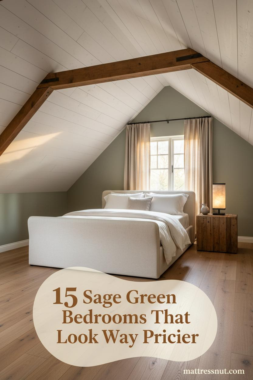
The best sage green farmhouse bedrooms don't announce themselves. They just feel right the moment you walk in.
I've spent a lot of time pinning attic rooms that almost work. These fifteen actually do.
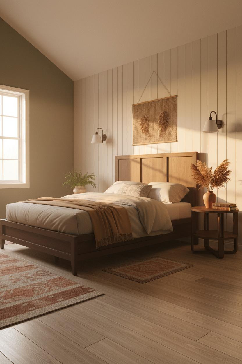
The Gallery Wall That Makes an Attic Feel Intentional


This is the kind of room that makes you want to slow down before you even sit.
Why it feels collected: Mismatched reclaimed frames running the full length of a sloped knee wall work because the raw plaster beneath gives them something real to rest against. Nothing matchy.
Steal this move: Treat the sloped knee wall like a horizontal gallery. Uneven spacing is fine. Honest, actually.
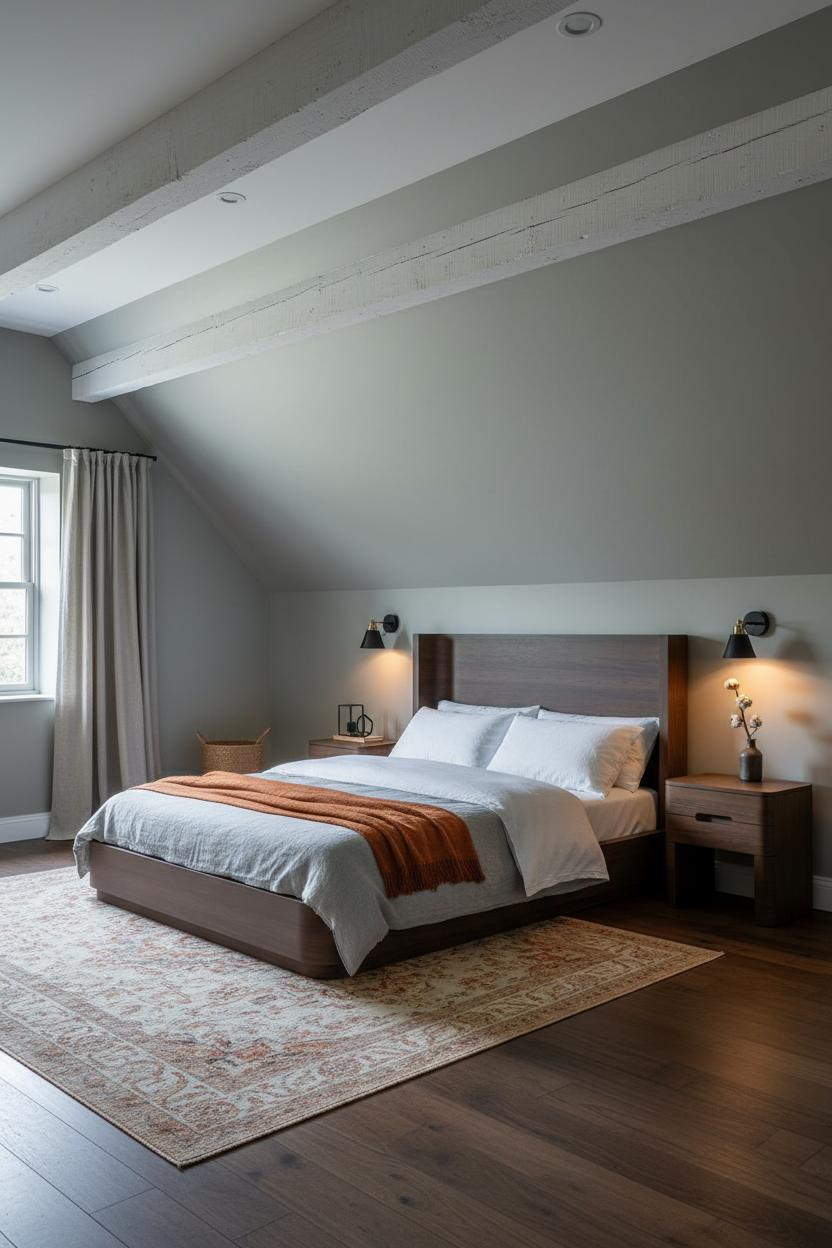
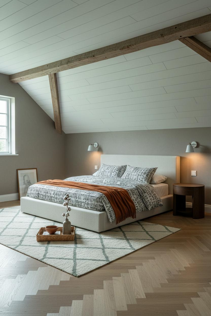
Shiplap Ceilings and Dormer Light Done Right


Honest opinion: exposed collar ties don't always photograph well. But here they do.
The reason is contrast. Dark raw timber against whitewashed horizontal shiplap creates a graphic rhythm that sage walls alone never could. It's two finishes doing the work of five.
If you have collar ties, leave them unpainted. That's the whole move. Don't overthink it.
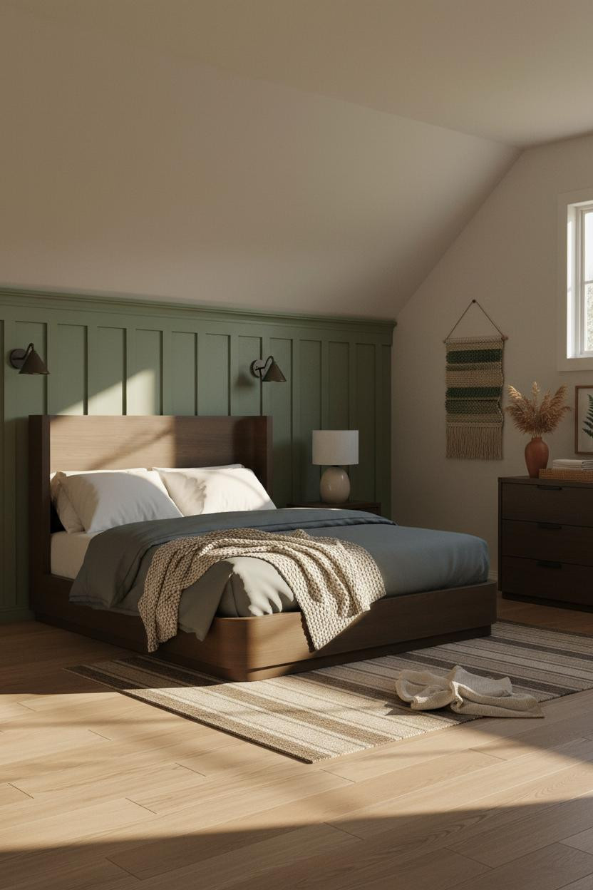
Wainscoting That Earns Its Keep in a Low-Ceilinged Room


I keep coming back to this one for attic bedrooms with low ceilings. It solves a real problem without drama.
What makes it work: Half-height tongue-and-groove paneling in chalky warm white gives the lower walls structure, which makes the muted sage-grey plaster above feel intentional rather than unfinished. The horizontal shadow lines from raking dormer light do the rest.
The smarter choice: In a tight attic room, paneling the lower half keeps the ceiling feeling higher while still adding texture.
Board-and-Batten With a Warm Ivory Finish
Floor-to-pitched-ceiling board-and-batten. That's a commitment. But it pays off.
The matte limewash finish on moss green walls does something flat paint can't replicate. Afternoon light rakes across the vertical boards and the whole room takes on a warm, dusty glow that feels genuinely old.
Avoid this mistake: Don't stop the paneling at chair-rail height here. The room's proportions need it to run the full pitch.
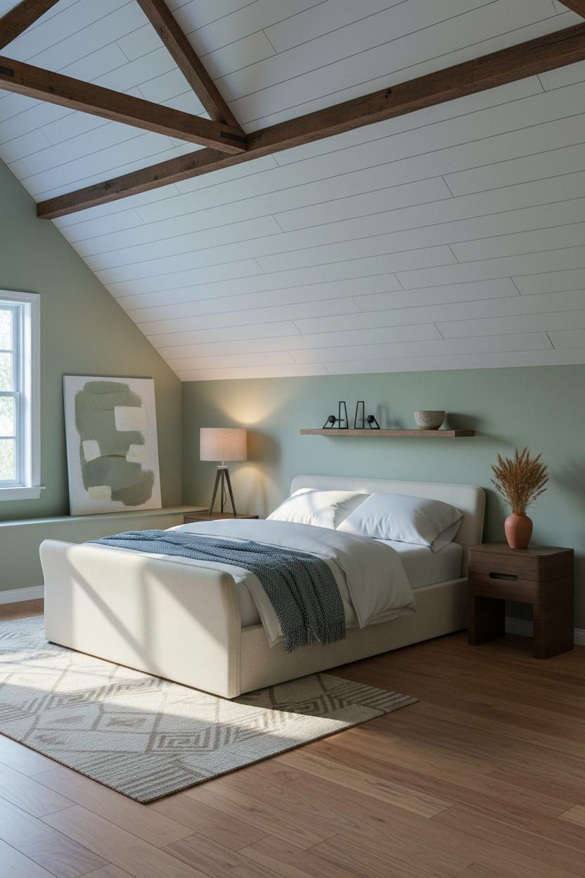
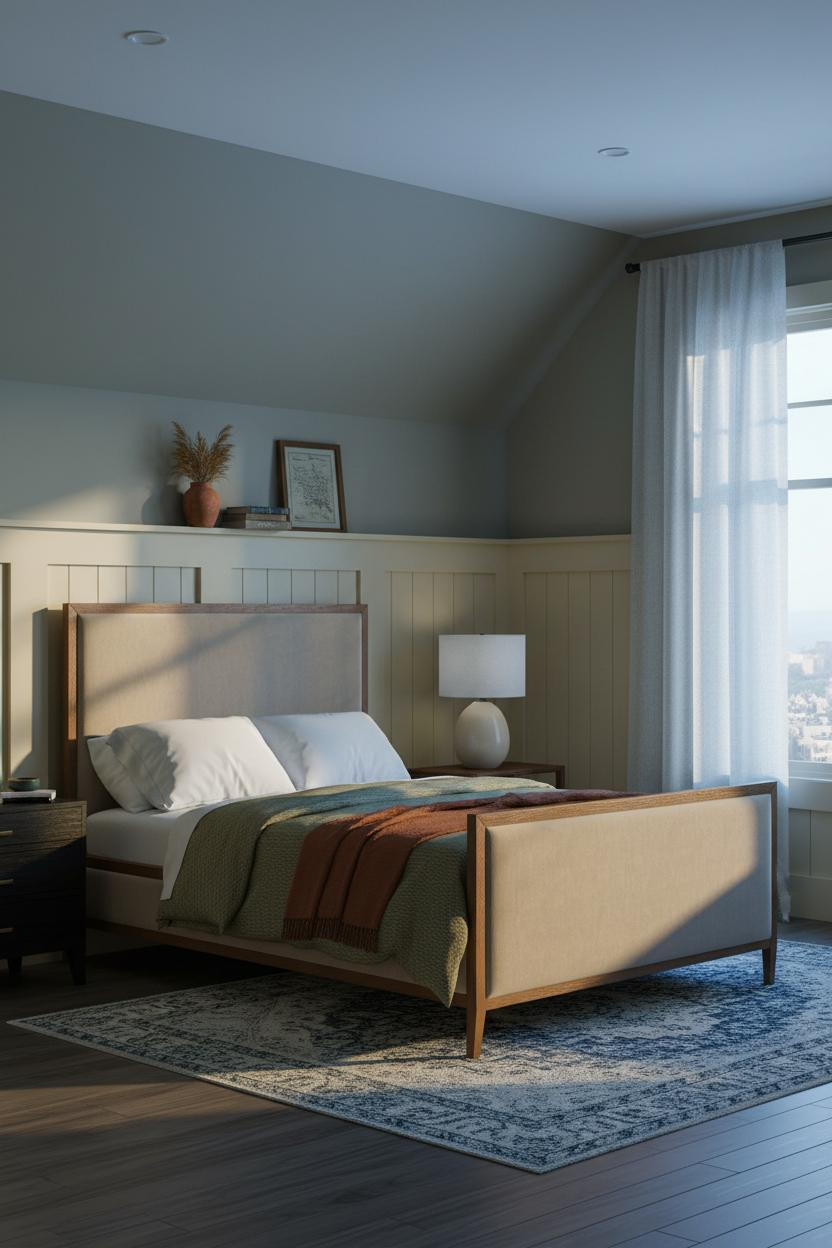
Greyed Sage and a Curtain That Drifts

Nothing fancy. That's the point.
Why the palette works: Greyed sage plaster above crisp ivory board-and-batten wainscoting keeps both surfaces from competing, while an undyed oatmeal linen curtain softens the dormer geometry in a way that feels genuinely loose rather than styled. The room feels hushed and rooted.
Try this: Hang the curtain at ceiling height even in a dormer. The extra length makes the room feel taller, not shorter.
Exposed Collar Ties Against Sage Grey Plaster

The room feels warm and cohesive without a single obvious decorating decision.
What gives it depth: Whitewashed rough-hewn collar ties running perpendicular across a sage-grey matte plaster ceiling cast fine horizontal shadow lines that add scale to a room that could otherwise feel cramped. It's a structural detail doing visual work.
Pro move: Pair floor-to-ceiling oatmeal linen curtains with the collar tie texture. The contrast between soft and raw is what makes it feel considered, not accidental.
A Dusty Rose Wall That Actually Works With Sage
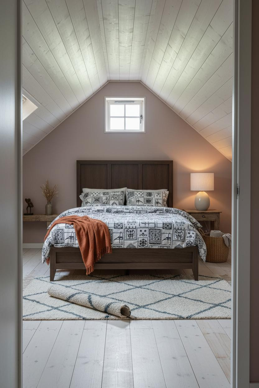
This one is divisive. But I'd do it.
The reclaimed ivory shiplap ceiling is carrying the whole combination. It pulls warmth from both the dusty rose walls and the chalky pine floor, which keeps the palette from tipping into twee. The room feels lived-in and intimate. Just enough tension to feel alive.
What not to do: Don't use a bright white shiplap here. The irregular grain and raw boards are what makes rose and sage coexist.
Whitewashed Shiplap and a Herringbone Floor


Two pattern-heavy surfaces, one calm result. It shouldn't hold together. But it does.
Why it holds together: The pale oak herringbone parquet and the whitewashed shiplap ceiling share the same bleached, low-contrast quality, so neither fights for attention. The warm grey-taupe walls sit between them and keep the room grounded.
A cream and dusty sage flat-weave rug in the bed zone ties floor to ceiling. One layer, big payoff.
The Arched Niche That Changes the Whole Wall
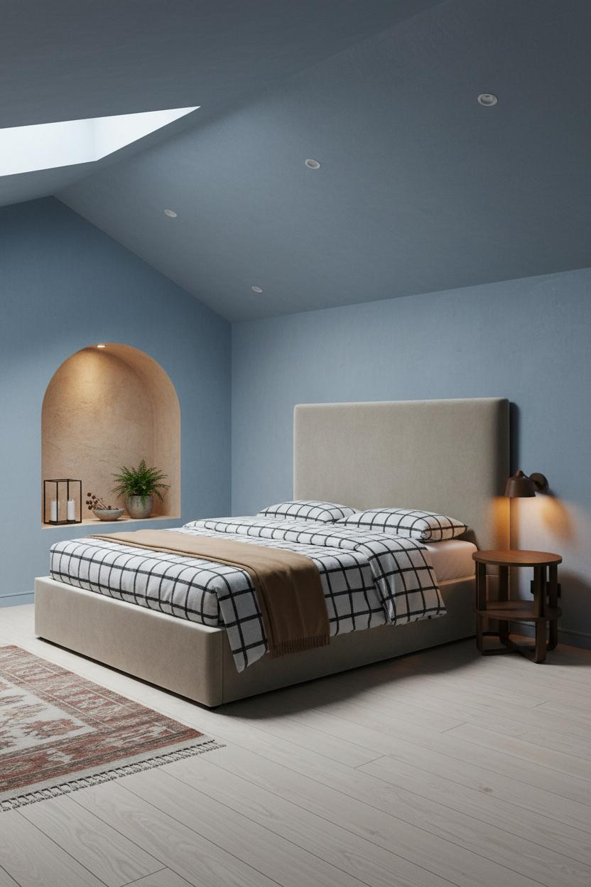
Having a built-in niche beside the bed changes how the whole room reads. Suddenly the nightstand isn't floating.
What carries the look: A curved recess lined in rough lime-washed plaster gives the faded denim blue walls an anchor point, so the wall feels architectural rather than plain. It's a small move, but it changes everything.
Worth copying: Even a shallow arched niche (8 inches deep) is enough. You don't need structural work to get the effect.
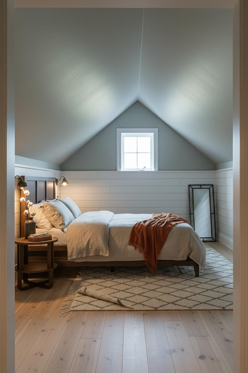
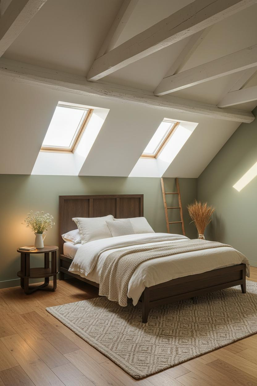
The Dormer With Divided-Light Panes and a Round Mirror
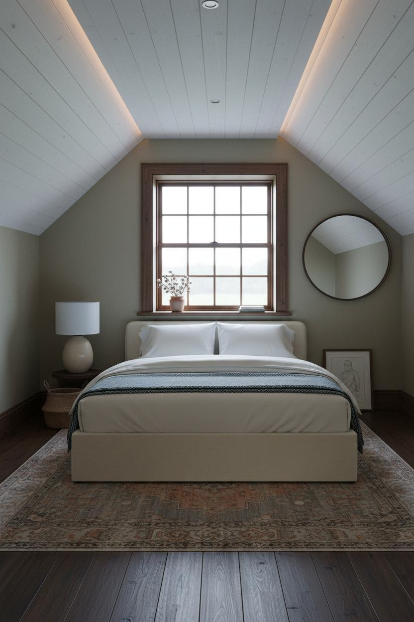
I've seen a lot of dormer rooms. This is one of the few where the window actually feels like a feature rather than an afterthought. The divided-light panes cast a faint grid shadow across the whitewashed shiplap ceiling, which makes the whole overhead plane feel intentional and alive.
A large round iron mirror beside the dormer reflects sky light back into the room. Simple. The room feels calm and polished without trying hard. One mirror, doubled light.
Built-In Shelving Packed With Plants and Linen Spines
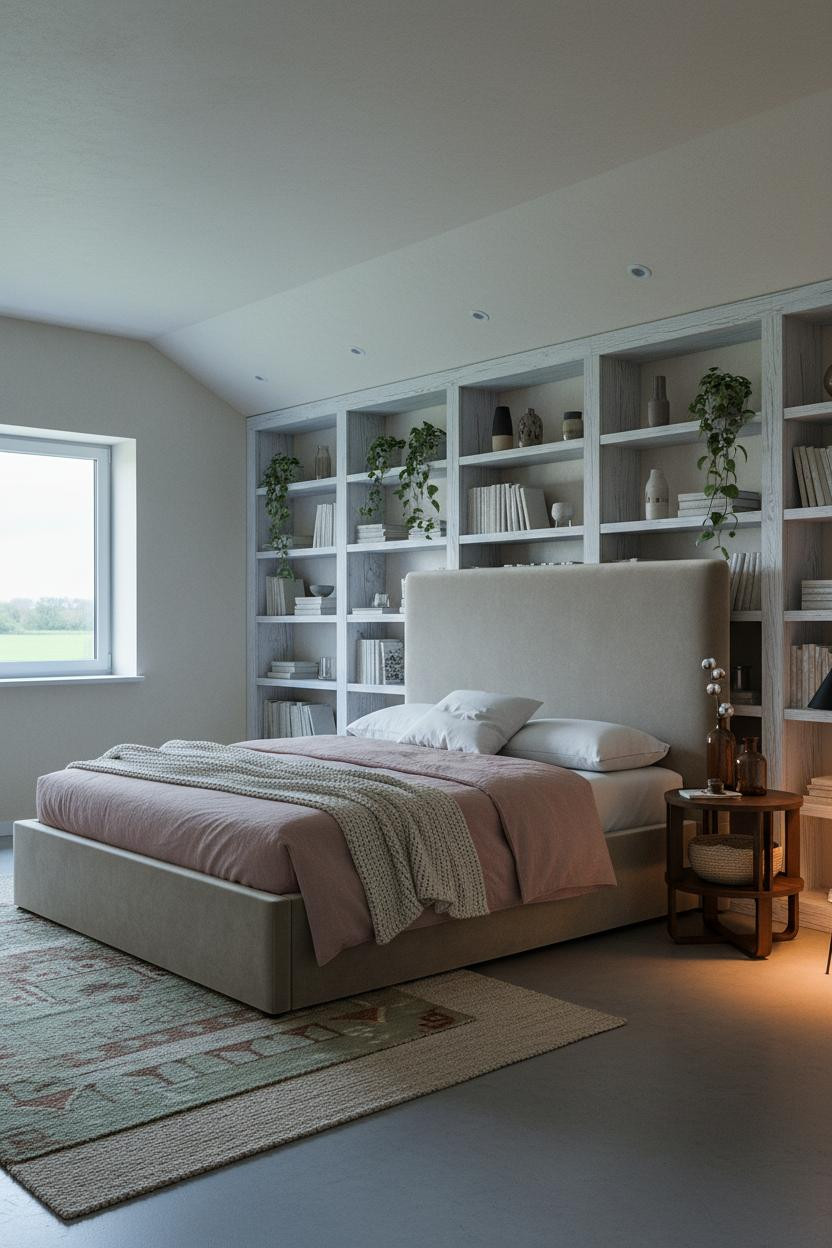
This is what separates an attic room that feels collected from one that just feels full. Scale matters more than quantity here.
The real strength: A full-width whitewashed pine shelving wall spanning the sloped ceiling creates a focal point that cream walls alone never would, while trailing plants and ceramic pieces keep it from reading as storage. It's a quiet nod to cottage character.
Where to start: Edit ruthlessly. Two trailing plants, a few linen-covered books, one ceramic bowl. Anything else is clutter.
A Rough Fieldstone Wall in an Attic Guest Room


Fair warning. This is moodier than the other rooms here. And I think that's why it works so well as a guest bedroom.
What creates the mood: Rough fieldstone mortared in cream catches the raking lamp light against deep olive walls, creating a warmth that feels centuries old rather than styled. The irregular texture does what flat paint simply cannot.
The easy win: Let the stone wall be the only statement. Navy sateen bedding and a cable-knit throw are all the contrast it needs.
Scandi Farmhouse With a Reclaimed Shiplap Ceiling
This one has a restraint that I find harder to pull off than it looks. The green and neutral palette stays interesting because the surfaces do the talking, not the accessories.
Why it looks custom: Reclaimed warm-white shiplap boards running horizontally across the pitched ceiling read differently from fresh painted planks. Each board slightly irregular in width, the grain visible through the wash. The dusty blue-grey plaster walls keep the warmth honest without dulling it.
One smart swap: Trade a standard overhead fixture for the kind of floor lamp that pools light low. The ceiling stays quiet and the warmth stays where you actually sit.
Moss Green Board-and-Batten Behind the Headboard
Decisive. Not subtle. But the rooms that read best at thumbnail scale usually aren't.
Afternoon light raking across vertical board-and-batten in muted moss creates shadow lines that anchor the sloped ceiling's geometry, while the bleached oak floor keeps the whole composition from going dark. The palette is essentially two earthy neutrals doing a slow negotiation.
What to copy first: Match the batten color to a deep version of your wall tone, not a contrast. The shadow lines will carry the detail work without the wall feeling like a separate room.
Whitewashed Timber Beams on a Sage Provençal Morning
This is the one I'd save if I were starting a bedroom from scratch. Honestly. It has all the right bones.
Why it feels intentional: Exposed whitewashed timber beams crossing a pitched sage plaster ceiling throw gentle shadow stripes down the walls below, giving morning light something to work with all day. Cream linen duvet and a honey-toned wide-plank floor complete the palette without adding a single competing element.
The finishing layer: A vintage wooden ladder leaned casually against the wall (not centered, not styled) is the kind of detail that makes a room feel like someone lives there rather than decorates there.

Our #1 Pick
Saatva Classic Mattress
America's best-selling online luxury innerspring. 365-night trial, lifetime warranty, free white glove delivery.
Shop Saatva Classic
The Foundation Of Every Beautiful Bedroom
Walls get repainted. Linen gets swapped out. The bed stays. And once you sleep on something that's actually built well, it's hard to go back to anything else.
The Saatva Classic is what I'd put in every room on this list. The dual-coil support system means the bed holds its shape through years of use, not just the first season. An organic cotton cover that breathes keeps the warmth from the sage walls from turning into heat at 2am. And the Euro pillow top is soft without losing structure, which is honestly the hardest thing to get right in a mattress.
Start with the bed. The rest figures itself out.

The rooms people save are the ones where nothing looks accidental. But underneath all the sage plaster and reclaimed timber, it always comes back to how the room actually feels to sleep in. Get that right first.