
 by
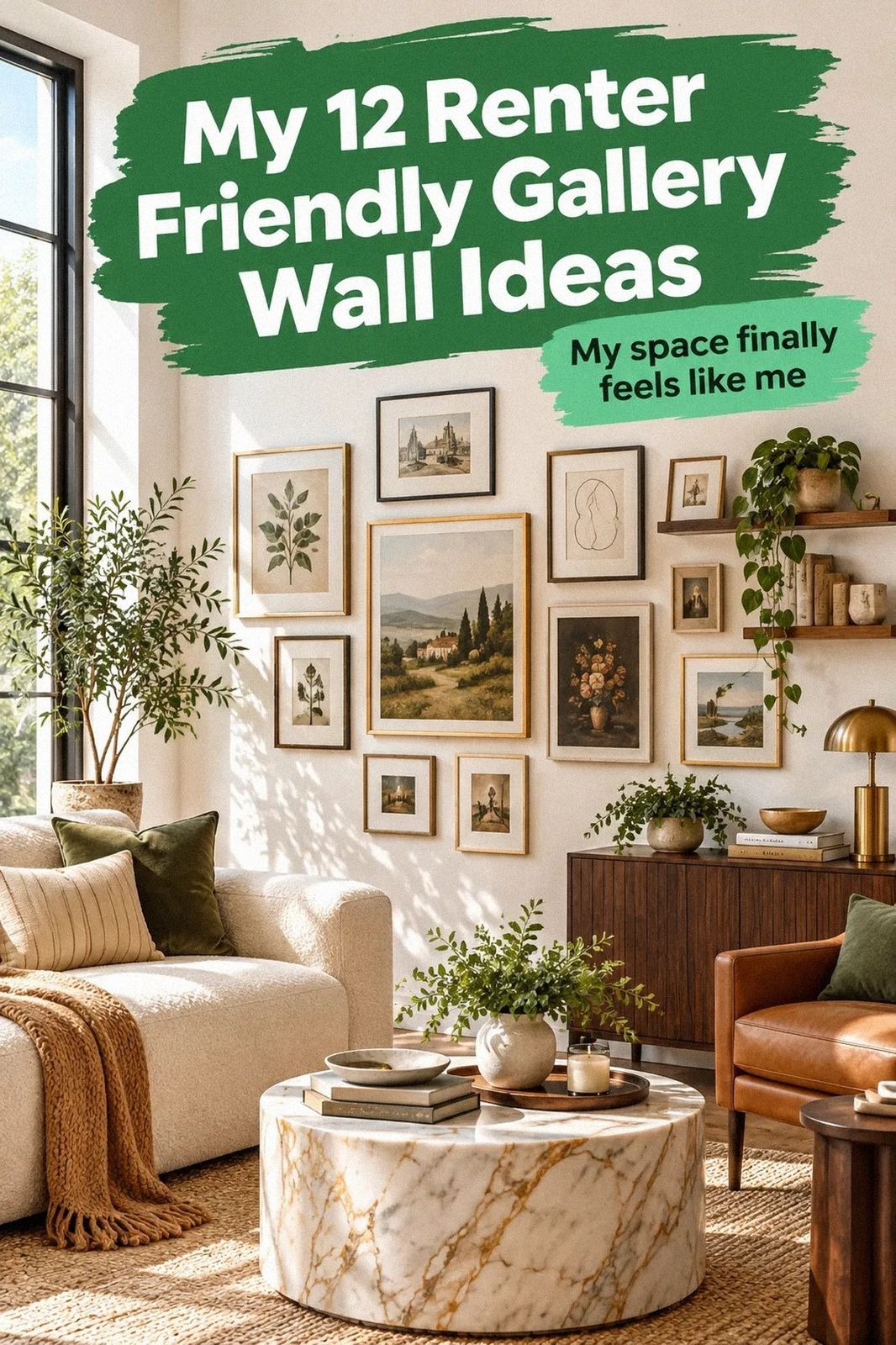
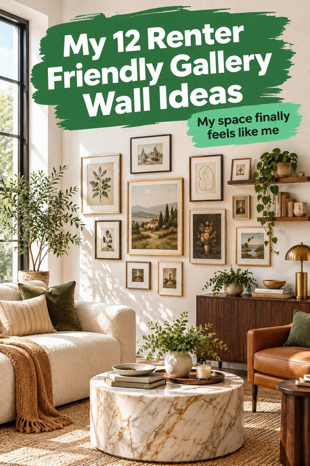
by Yes, you can create a renter friendly gallery wall for a big blank wall without damage, and I did it with removable strips, thrifted frames, and one careful paper layout. My lease was strict, the wall was painfully empty, and the finished collection made the room feel warm instead of temporary. I didn't expect that!
- ✓ Measure the wall before choosing the art
- ✓ Use The Three-Height Frame Stack
- ✓ Layer a warm paper palette
Here's what it looked like before:
The wall was wide, pale, and completely blank. The sofa sat below it, the ceiling felt taller than the furniture, and every small print I owned looked lost. I couldn't drill, repaint, or hide mistakes behind heavy millwork, so the first decision was accepting the wall's size instead of filling it with random little pieces.
The starting point told the story clearly. I kept the rental-white wall quiet and built the collection around midnight blue, copper, and ivory.
An organic bouclé texture softened the harder paper and glass surfaces, so the arrangement felt warm even before I added personal pieces. The result surprised me.
It felt settled, even though nothing permanent changed.
- Measure the wall before choosing the art
- Use The Three-Height Frame Stack
- Layer a warm paper palette
- Hang the anchor piece with removable hardware
- Mix thrifted frames over matching sets
- Let a corner art wall turn the layout
- Apply The Two-Wood Rule
- Paint the empty space around the collection
- Use a picture ledge instead of more holes
- Choose warm wood over another black frame
- Could a smaller cluster feel bigger?
- Finish with one personal object
1Measure the wall before choosing the art
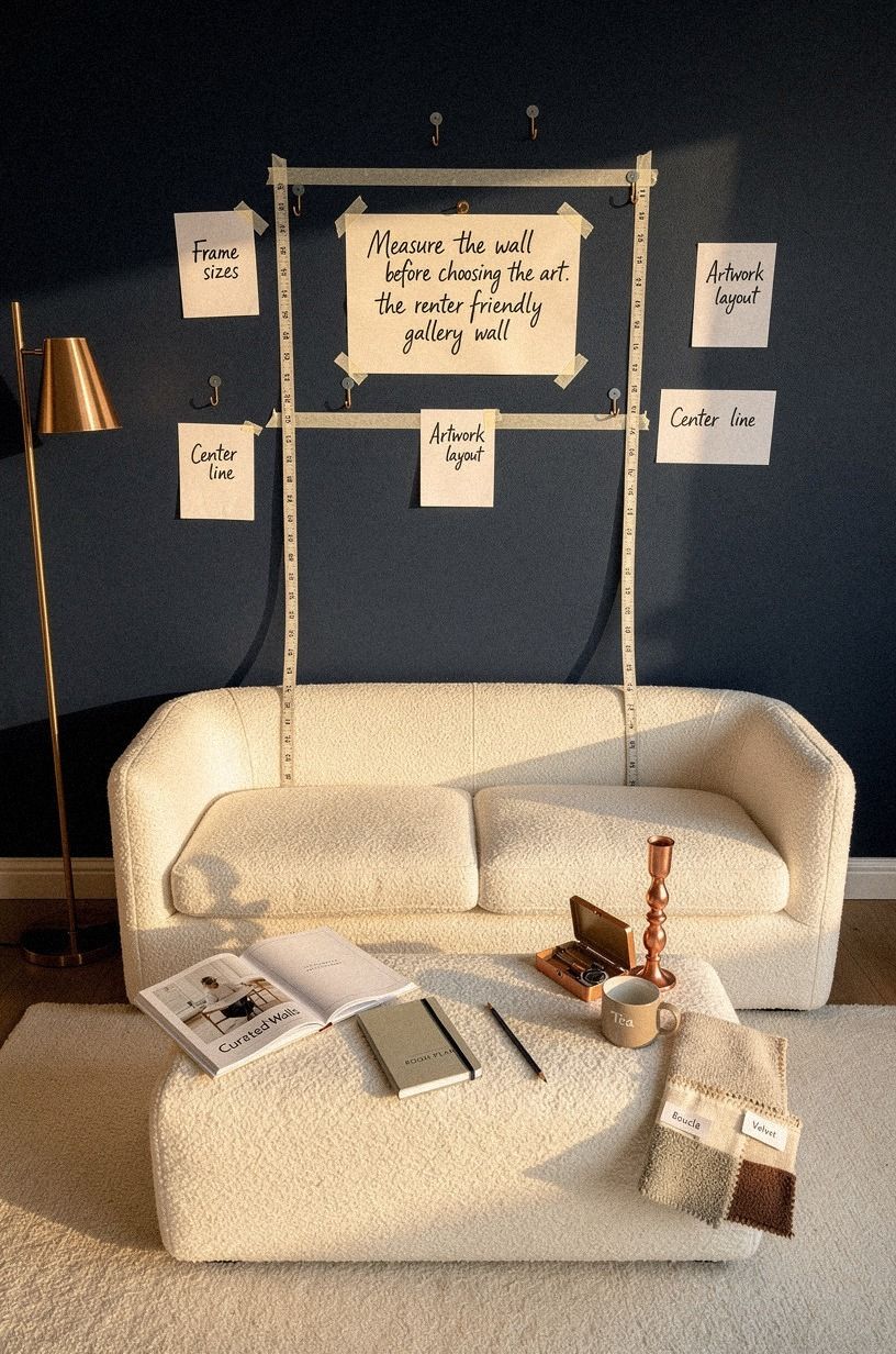
I started with painter's tape on the floor, not a shopping cart. The taped rectangle matched the area I wanted to fill above the sofa, and I left enough breathing room around the edges that your eye could read the whole group as one shape. A large wall needs an intentional boundary, or your collection will drift toward the ceiling.
For my layout, the center of the main pieces landed about 57 to 60 inches from the floor. That standard works because you can see the art comfortably while sitting or standing, and you won't have to crane your neck.
I used a soft measuring tape around the sofa and checked the spacing twice. You don't need perfect symmetry, but you do need a shared visual center.
The mistake I'd avoid is buying twelve frames before checking the wall width. Your art may be lovely, yet the arrangement can still feel pinched. If you're working with another empty wall, these renter friendly wall ideas for boring white bedroom walls helped me think about scale before color.
2Use The Three-Height Frame Stack
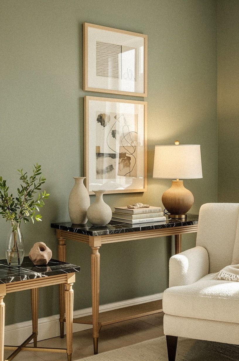
The first version had every frame at nearly the same height. I varied the stack with sage green, warm cream, and natural wood, then added a small Nero Marquina black marble accent for contrast. The three heights made the arrangement feel collected instead of mechanically aligned.
3Layer a warm paper palette
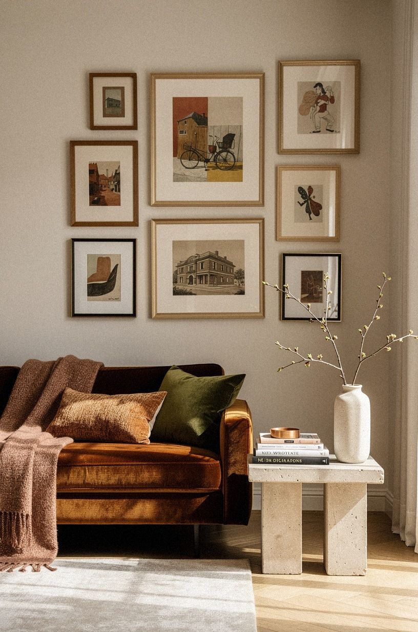
I wanted an artsy gallery wall, but I didn't want twelve loud colors competing over the sofa. My palette stayed close to terracotta, stone, and olive. The papers felt collected rather than matched, especially once I added a few botanical shapes and one old architectural drawing.
The strongest color was Farrow & Ball Red Earth No.64, used as a small painted detail inside one print rather than across the wall. That shade gave the stone and olive tones something earthy to answer. You can use a named paint color as a reference even if you aren't painting, since it makes thrift-store browsing much easier.
I also brought in a deep-pile mohair velvet texture through one small textile piece. It added softness without turning the wall into a collection of unrelated fabrics.
But I skipped bright primary red. It pulled attention away from the room and made the wall feel busier than it was. Your collection doesn't need one dramatic piece in every row.
A small warm accent, a faded photograph, and a little empty paper can create a more calming rhythm than a wall packed with bold graphics.
For another no-damage color direction, I borrowed ideas from these renter friendly wallpaper ideas that peel off clean. The point wasn't to add wallpaper. It was to notice how repeated tones can make a temporary room feel more settled.
4Hang the anchor piece with removable hardware
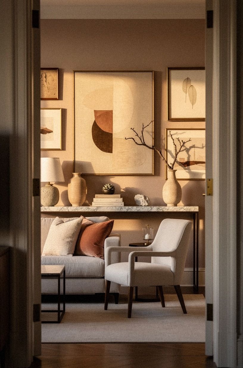
The central frame had to feel substantial without becoming dangerous. I used removable picture strips rated for the frame's actual weight, cleaned the wall first, and pressed each strip firmly before letting it sit. Read the package instructions for your hardware, because a large frame needs more support than a small postcard.
I let the adhesive settle before adding the art. That pause felt excessive, but your wall paint and the strip both need time to hold properly. Around the anchor, I kept the palette close to clay, linen, and aged brass, with a Carrara marble accent showing subtle grey veining.
The arrangement felt grounded without relying on a heavy wooden centerpiece.
Would I use adhesive strips for every possible frame? No.
I wouldn't trust them with a heavy glass piece or a valuable original. For a lightweight rental gallery, though, they gave me control without holes.
If you're nervous about the first placement, practice with a cardboard mockup and mark the top corners with tiny removable tabs.
A few extra notes from renter friendly headboard ideas to make in an afternoon helped me think about weight distribution before I committed to the anchor.
5Mix thrifted frames over matching sets
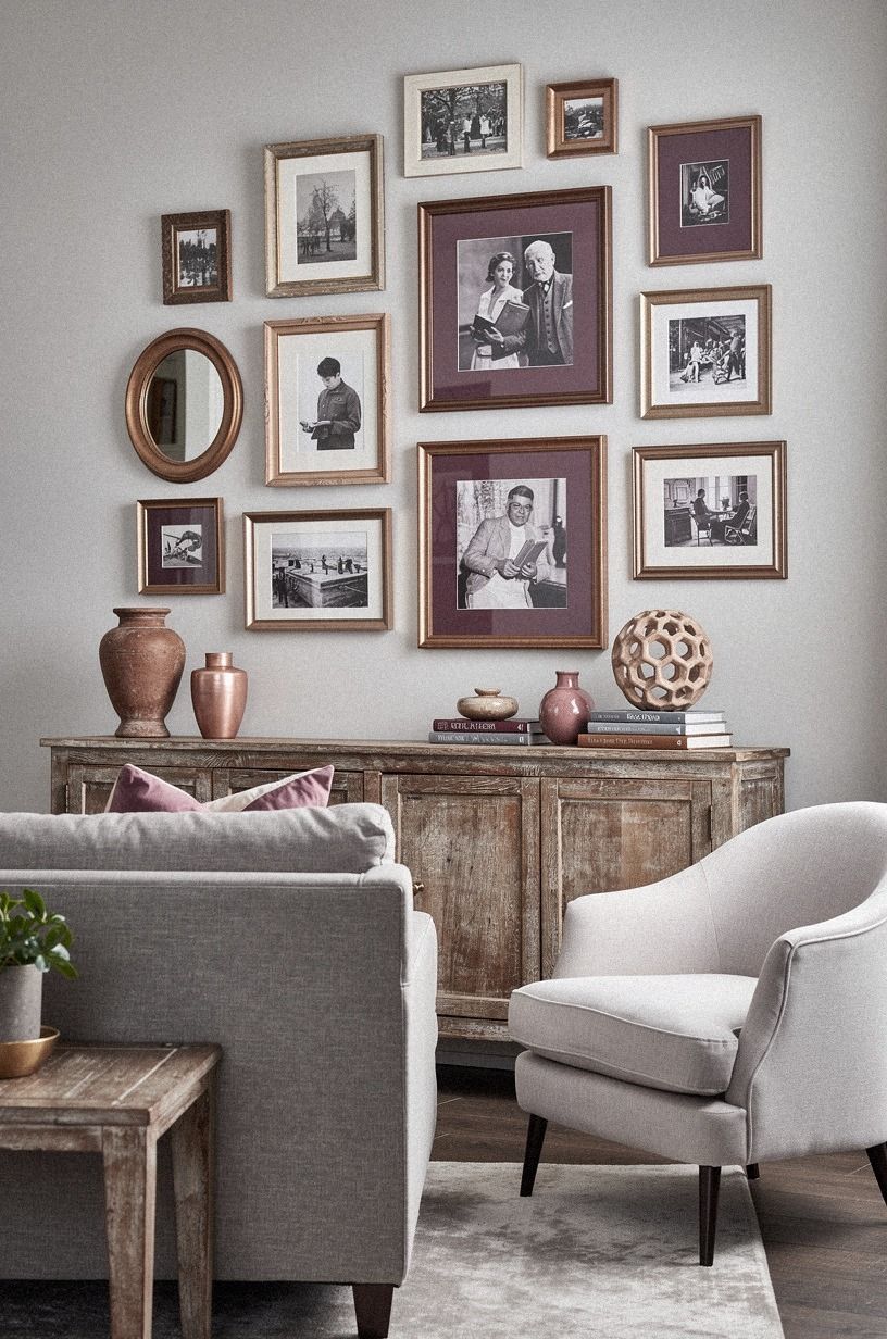
Matching frames sounded safe, but a tightly matched set in black made my wall look flat. I mixed plum, grey, and rose gold instead, then used reclaimed weathered teak for warmth. The variation made the gallery feel found over time rather than ordered in one afternoon.
6Let a corner art wall turn the layout
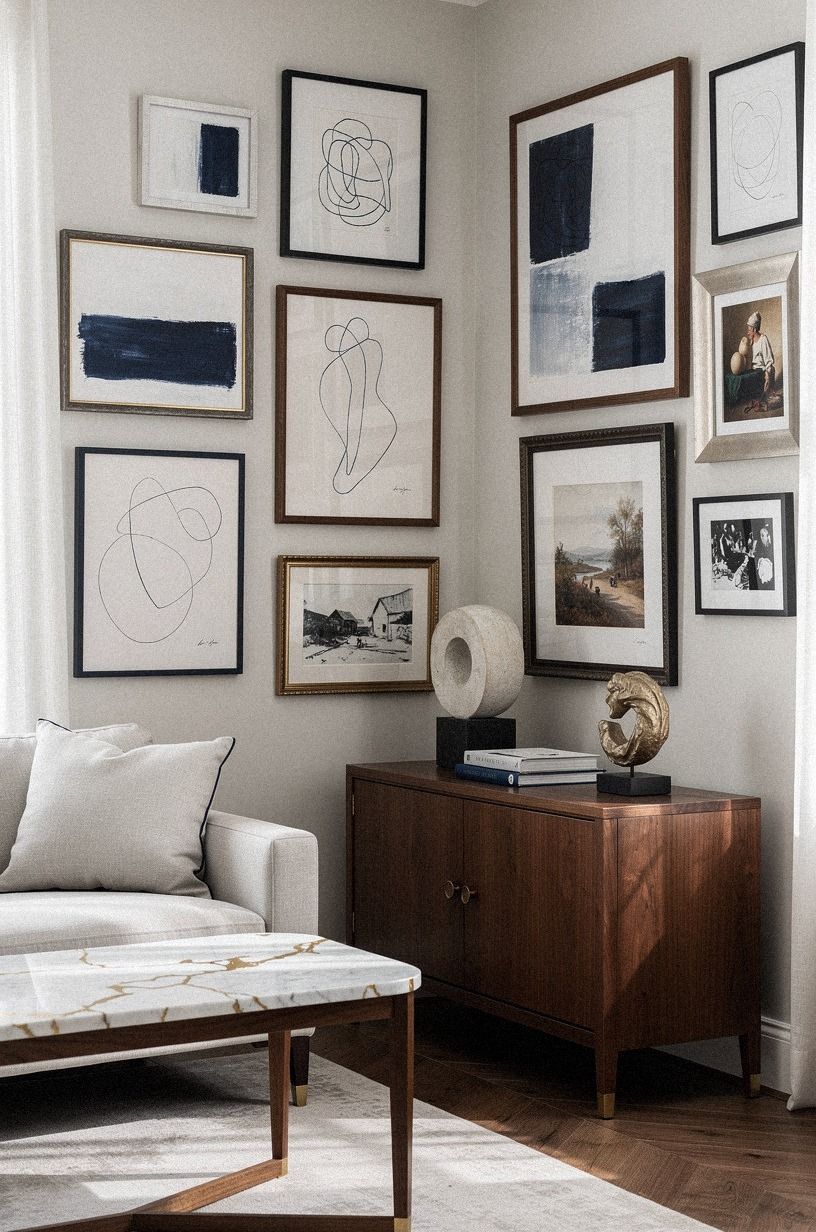
The wall continued around one short corner, so I considered stopping the gallery before it reached the edge. That would have left a strange dead zone. Instead, I carried three smaller frames around the corner and created a compact corner art wall that made the room feel wider.
I used navy, white, and walnut to connect the two surfaces. A small Calacatta marble detail with gold veining added polish without taking over the arrangement. If your wall turns a corner, keep the pieces there smaller than the central art so the main arrangement still has a clear front face.
And the corner didn't need another focal point. I avoided a large frame there because it would have made the sofa feel trapped between two competing centers.
You can repeat one paper color or wood finish instead. That little echo is enough to connect the planes, and it kept my tall wall ideas from becoming a wall-to-wall display.
I borrowed the same compact thinking from these renter friendly bedroom ideas that need no drilling. Small supporting moves can make a layout feel generous.
7Apply The Two-Wood Rule
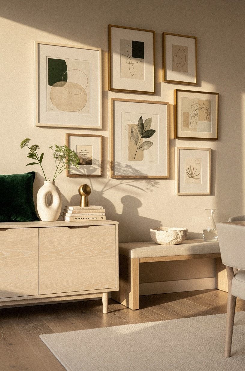
I wanted natural texture, but too many wood finishes made the wall look assembled from unrelated leftovers. The Two-Wood Rule solved it: I kept the wood family close to cerused white oak, then used emerald, gold, and cream to create variation elsewhere. Every frame didn't need wood, but the wood that appeared had to belong to the same warm family.
The main wooden choice was cerused white oak, visible in a substantial frame near the center. Its pale grain kept the emerald and gold accents from feeling too formal. Your eye moves between those tones, and the contrast helps the darker frames feel connected rather than random.
I rejected a red-toned cherry frame even though I liked it on its own. It made the rest of your palette look yellow, especially in evening lamp light.
You can make a gallery wall more harmonious by saying no to attractive pieces that don't support the whole group. For more renter-safe texture around the room, these renter friendly wallpaper ideas that peel off clean use the same principle of layering without permanent construction.
I also found useful proportion ideas in these renter friendly headboard ideas to make in an afternoon. Repeating related materials is often more elegant than collecting every finish you like.
8Paint the empty space around the collection
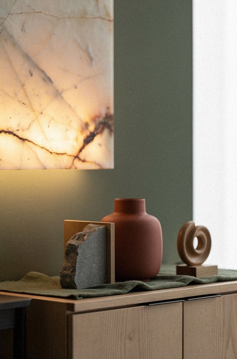
The wall stayed quiet, but I treated the empty space as part of the design. Instead of squeezing frames together, I left small pockets of breathing room around the outer edge. That margin made the collection feel larger and kept the sofa from looking buried under art.
The color story moved through forest green, rust, and natural oak. I also used a backlit translucent onyx detail in the lower grouping, which caught the warm light without demanding another large object. Sherwin-Williams Agreeable Gray SW 7029 remained a useful planning reference for checking whether any paper looked too cold against the rental wall.
The best moment came when I removed one frame. The arrangement breathed better immediately.
But I didn't assume more art meant more impact. If your wall is broad, give the collection a clear outside edge and let some blank paint remain visible. That restraint made the room feel peaceful instead of crowded, especially after sunset when the paper shadows became soft.
These renter friendly wall ideas for boring white bedroom walls reinforced the same lesson: a little negative space can feel surprisingly luxurious.
9Use a picture ledge instead of more holes
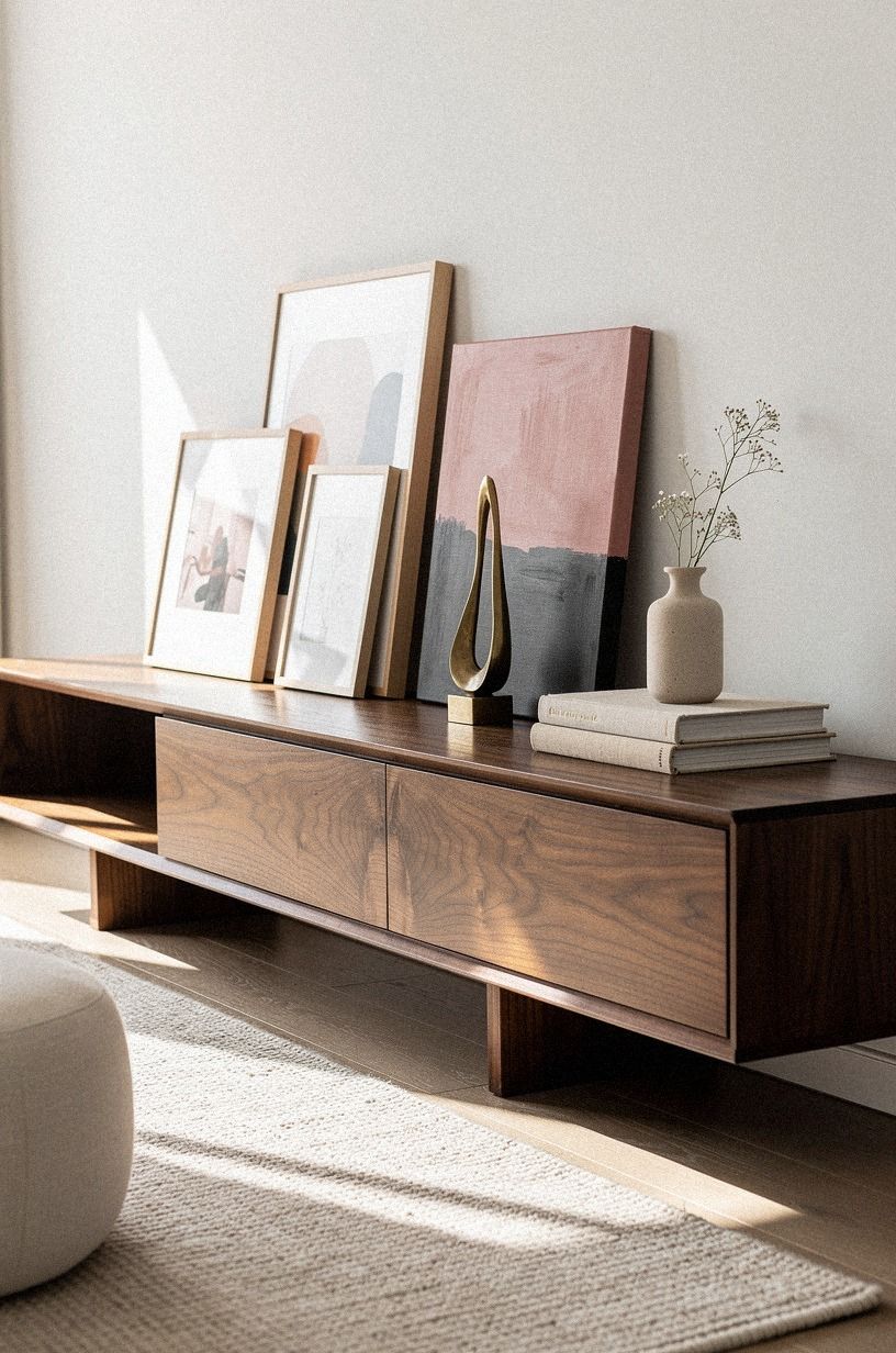
One lower section needed flexibility because I knew I'd change the prints seasonally. I added a narrow book-matched walnut picture ledge with removable support and leaned three lightweight frames against it. Dusty rose, charcoal, and brass gave the ledge enough contrast without asking the wall to hold another row of hardware.
A ledge also helps you correct scale. You can move the frames forward, overlap them slightly, or remove one when the arrangement feels heavy.
I kept the ledge below the main cluster, so it read as a base rather than a second gallery. Your eye needs one dominant arrangement, not two separate conversations.
I wouldn't use a deep shelf here. It would've pushed the sofa forward and collected dust along the top edge.
A slim profile kept the floor plan open. If you're planning a flexible rental display, these renter friendly bedroom ideas that need no drilling show how small changes can give you options without making the room feel temporary.
10Choose warm wood over another black frame
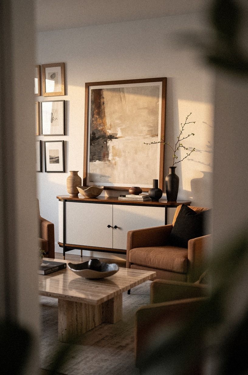
At one point, the lower row had too much black. The frames looked sharp, but the wall felt colder every time I added one. I swapped two of them for warm travertine accents, and the natural variation softened the arrangement without making it pale or bland.
This was the contrast I needed: warm travertine over another black frame. I kept the surrounding palette close to warm white and camel, with black used sparingly to define the gallery. The stone brought in a little natural variation, and afternoon light moved across its surface instead of stopping at a flat painted edge.
I also placed the warmest pieces below eye level, where they could support the group instead of competing with your strongest image. And I didn't add a woven basket or another decorative object nearby.
The wall already had enough texture. If you're working with a small room, let one material change do the work and keep the rest quiet.
These renter friendly headboard ideas to make in an afternoon use a similar warm-versus-dark balance.
11Could a smaller cluster feel bigger?
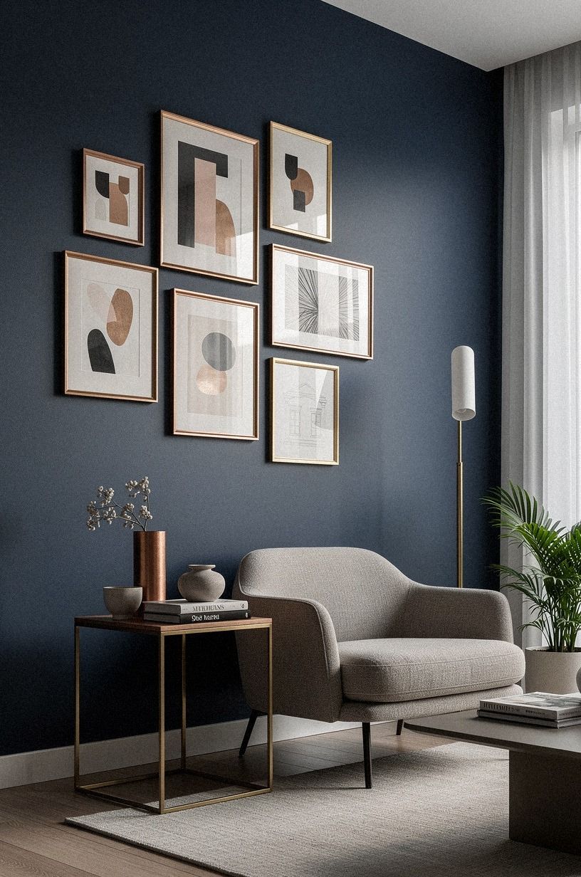
Yes, if the edges are deliberate. I removed four pieces from the first draft and spread the remaining frames across a wider rectangle. The collection felt larger because the group had room to breathe, even though it contained less art.
The key was a matte ivory mount board around several small prints, supported by midnight blue and copper accents. I added a touch of unlacquered brass that could develop patina over time. Those borders and warm details added visual acreage without making the artwork louder.
Why fill every inch when a little white space can make each piece clearer? I kept the lowest frames high enough to stay above the sofa back and aligned the visual center around 58 inches.
If you're building your own layout, step back to the doorway before deciding. That distance shows whether your arrangement supports the room or overwhelms it.
For another scale study, these renter friendly wall ideas for boring white bedroom walls helped me compare dense and airy arrangements.
12Finish with one personal object
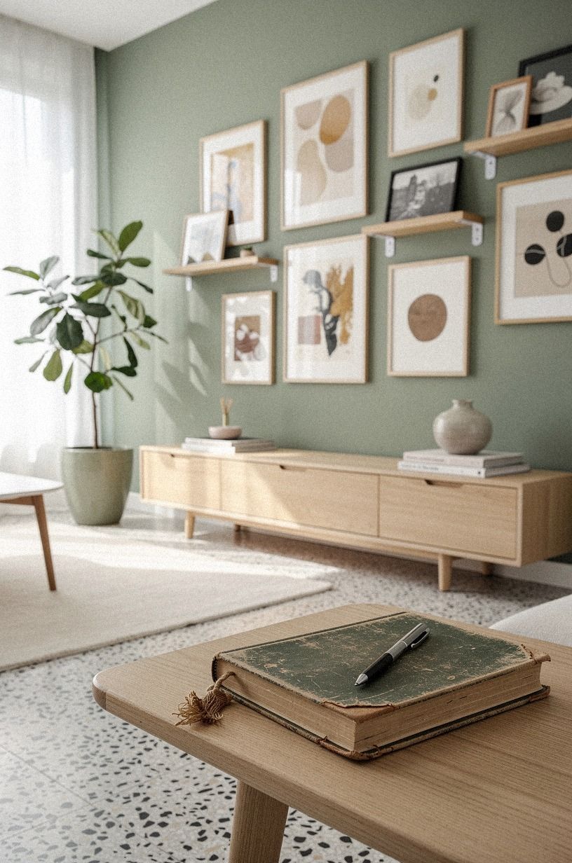
The last piece wasn't a print. It was a small family photograph beside an oversized-chip terrazzo object, and it changed the whole wall.
The terrazzo brought a little sage green, warm cream, and natural wood into the arrangement without feeling precious. That was the moment the arrangement stopped looking borrowed.
I placed it slightly off center, near the lower middle, so it would be found rather than announced. Your personal object doesn't need to be expensive or visually dramatic. It needs to mean something to you, because that private detail gives a gallery wall its lived-in quality.
The final test was simple. I stood across the room with the lights off except for one lamp.
The paper looked softer, the wood looked warmer, and the photograph pulled me closer. If you're styling your own blank wall, finish with one thing you wouldn't choose for a catalog.
That's the piece people will ask you about.
I also liked the restrained approach in these renter friendly wallpaper ideas that peel off clean. A personal corner doesn't need a dramatic backdrop to feel memorable.
How much it cost
I kept this makeover inside the budget tier instead of pretending every gallery wall has the same receipt. The typical US range for paint, textiles, art, and organization is $200-$800, while larger room changes can move far beyond that. My renter-friendly version stayed focused on lightweight art, existing furniture, thrifted frames, and removable hanging supplies.
The main savings came from using art I already owned and buying only the frames that solved a scale problem. A thrifted wooden frame can carry more personality than a new matching set, and you won't pay for a finish that makes the wall feel generic. I also avoided custom millwork, which would've changed the project completely.
For your own plan, start with the wall measurement, then decide which pieces need frames and which can use a ledge. If the budget is tight, use paper, postcards, textile scraps, and free photographs before buying anything. The removable hanging system matters more than an expensive print when your lease is the constraint.
These renter friendly bedroom ideas that need no drilling also show how much atmosphere can come from inexpensive, reversible details.
Why I kept the wall temporary
I used to think a rental had to look unfinished because I couldn't make permanent changes. This project changed that opinion. A temporary room can still have a point of view, but you have to spend your effort on proportion, texture, and the objects you can take with you.
My first mistake was treating renter-friendly as a visual style. It isn't. It's a set of limits, and those limits can make your choices sharper.
I couldn't hide weak art behind built-ins, so I had to remove pieces that didn't earn their space. I couldn't repaint the wall, so I paid attention to how paper and wood reacted to the existing light.
The most useful decision was leaving some work undone. I didn't cover the entire wall, buy a matching sofa, or add a shelf beneath every frame.
Your home doesn't need to look finished in the showroom sense. It needs a few details that feel unmistakably yours, including the slightly crooked photograph that makes you smile.
I also learned that damage-free design isn't about avoiding commitment. It is about committing to reversible choices.
You can select a palette, measure carefully, and build a strong composition without drilling into drywall. That matters if you're renting, moving soon, or simply want your room to change with you.
For more temporary decorating ideas, I kept returning to these renter friendly wallpaper ideas that peel off clean and these renter friendly headboard ideas to make in an afternoon. Both reinforced the same practical, inviting mindset.
The Questions I Get Asked Most
What is the best renter friendly gallery wall idea for a small wall?
A compact grid of lightweight frames works best because it gives your eye order without swallowing the room. IKEA RIBBA frames in two sizes can create a clean center with smaller pieces around it.
Keep the visual center around 57 to 60 inches from the floor, and save the largest image for the middle. These renter friendly wall ideas for boring white bedroom walls can help you judge the overall scale.
Where can I buy gallery wall pieces on a budget?
IKEA, Wayfair, Target, Facebook Marketplace, and thrift stores are useful places to look. Target Threshold frames often give you warm wood texture without requiring a matching set.
Search for old botanical prints, small photographs, and frames with minor wear. Those details can make your wall feel collected. You can also compare small-space sourcing ideas in these renter friendly wallpaper ideas that peel off clean.
How much does a renter friendly gallery wall makeover cost?
A typical US budget can fall between $200 and $800 when it includes paint, textiles, art, and organization. Thrifted frames and art you already own can lower the total.
Removable strips, paper mockups, and existing photographs may cost little or nothing, depending on what you have. These renter friendly bedroom ideas that need no drilling follow the same budget-conscious approach.
Can I create this gallery wall on a budget?
Yes, and you can start with free paper templates, secondhand frames, and photographs from your own phone. Paper mockups let you solve spacing before you buy anything.
Use one wood tone, one paper palette, and removable hardware. Those three choices will do more than buying twelve new prints. For another low-cost project, these renter friendly headboard ideas to make in an afternoon are useful inspiration.
Is a renter friendly gallery wall worth it in a small space?
Yes, because a small room benefits from vertical interest without losing floor space. A narrow picture ledge can also give you seasonal flexibility.
Keep the lower edge above the sofa, use fewer large pieces, and let the surrounding wall color remain visible. These renter friendly wall ideas for boring white bedroom walls show why restraint can make a room feel bigger.
Is a renter friendly gallery wall a good idea for a rental?
Yes, as long as your hardware matches the frame weight and your lease allows removable hanging products. Removable picture strips work well for lightweight frames when installed correctly.
You can also use a slim ledge, a tension-based display, or leaning art on furniture. Test one piece first before building the whole arrangement, and use these renter friendly bedroom ideas that need no drilling for more reversible solutions.
Where I'd Start First
If I had to pick one, I'd start with the paper layout. It costs nothing, exposes bad spacing before you damage the wall, and makes every frame choice easier. Pin your favorite arrangement for later, then live with the paper shapes overnight before hanging anything.