How to decide on white vs. wood kitchen cabinets comes down to light first, not taste. I learned that after staring at one bright kitchen for a week, sure I wanted painted doors, then watching the same room go flat by 4 pm while the oak sample still looked alive. If your kitchen feels cold, busy, or weirdly unfinished, this is the order I'd use so you don't waste money. And yes, you can figure it out before you order a single new door.
Before You Start: The Two-Finish Test
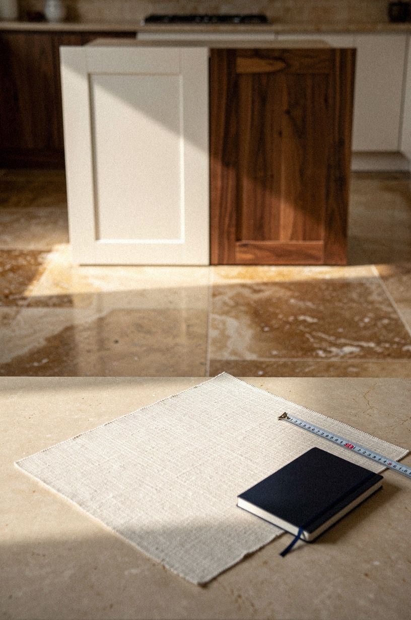
Before you compare doors, set up what I call the Two-Finish Test on one tray or island corner. You need a white sample, a wood sample, painter's tape, your floor photo, and ten minutes at breakfast time and again near dusk. If you can borrow a painted front from IKEA SEKTION or a loose oak panel from a local cabinet shop, even better.
Use real dimensions while you look. A standard counter sits at 36 in, uppers usually run 30-42 in tall, and the space from counter to uppers is about 18 in. Those numbers matter because a color chip floating in your hand will not tell you what a full wall of cabinetry will do.
If you want a fast cabinet refresher while you test, keep this painted versus stained kitchen cabinets guide open in another tab.
If budget is part of the call, keep the ranges in view from the start. The kitchen version of regret is falling for one finish, then learning the hardware, backsplash, and touch-ups change the whole math.
- Start with the kitchen’s natural light
- Match white cabinets to cool countertops
- Anchor wood cabinets with white walls
- Test cabinet samples beside the flooring
- Compare upper cabinets in white and wood
- Why run wood lowers under white uppers?
- Frame the range wall in warm oak
- Keep tall pantry cabinets bright white
- Layer brass hardware over both finishes
- Balance white doors with wood islands
- Soften glossy white with ribbed wood
- Build contrast around black appliances
- Choose white oak grain for open shelving
- Repeat cabinet tones in nearby trim
- Photograph both finishes at breakfast time
1Start with the kitchen’s natural light
Stand in the middle of the room and look at what the daylight is doing before you decide what you like. In a full kitchen where bright perimeter cabinets face cerused white oak, you will usually see the answer faster in the shadows than in the sun.
White bounces more. Wood holds more.
If your kitchen gets cool eastern light or weak afternoon light, wood often saves the room from looking chalky. I wouldn't force white in a dim space just because Pinterest made it feel safe. You need a finish that still reads warm when the overheads are off.
But if your room is flooded all day, white can keep the kitchen from tipping heavy. Tape both samples on opposite runs, step back to the doorway, and watch which one still feels calm at 8 am and 5 pm. For another side-by-side cabinet call, I like this guide on painted versus stained kitchen cabinets.
2Match white cabinets to cool countertops
A crisp white door needs the right counter under it or the whole run looks accidental. When you walk toward a bright cabinet line with a backlit onyx countertop, you can see why cool stone helps: the white reads intentional instead of flat. That's the pairing you want if your goal is clean, sharp, a little gallery-like.
Keep the undertones aligned. White doors with icy quartz, pale concrete, or translucent stone work because each surface stays on the same side of the temperature line. Pair that same white with very yellow granite and you will spend months wondering why the room never clicked.
I learned this the annoying way. A warm counter can make even Benjamin Moore White Dove OC-17 look dingy. If you're comparing painted fronts already, the thinking in this painted versus stained kitchen cabinets breakdown helps you spot where the undertone fight starts.
3Anchor wood cabinets with white walls
Wood cabinets need breathing room. In an overhead flatlay with book-matched walnut fronts, white paint swatches, and pale wall tile, the strongest part isn't the wood alone. It's the pause around it.
If you're leaning wood, keep the walls light first. A clean white wall lets the grain read as grain, not visual noise, and you won't lose the cabinet shape against the tile. I like wood more when the room gives it contrast instead of asking it to do every job at once.
And this is where people overdo it. They bring in warm wood, warm wall paint, warm tile, and warm brass, then wonder why the kitchen feels sleepy.
Start with white walls, then pull the softer tones back in through trim, stools, and dishes. If you're tempted to remove uppers while you test that mix, this piece on when to skip upper cabinets for open shelving is worth reading.
4Test cabinet samples beside the flooring
Set your door samples on the floor, not the counter. A classic travertine tile under white and walnut samples will tell you more in thirty seconds than a mood board will in an hour. Floors are the biggest uninterrupted surface in most kitchens, so they decide whether your finish reads warm, cool, pink, gray, or muddy.
You want the cabinet finish to either echo the floor on purpose or clearly contrast it. Half-matching is the part that goes wrong.
White can clean up a busy floor. Walnut can steady a pale floor that feels washed out.
If you want another comparison angle, this painted versus stained kitchen cabinets guide helps sort out where contrast beats matching.
I wouldn't judge any cabinet color without this step. Prop the sample at a 45-degree angle, look from standing height, then crouch so you see how the base cabinets will meet the grout lines.
But don't stop there. Carry the same sample near your stool legs and trim too, because the floor rarely fights alone.
5Compare upper cabinets in white and wood
Uppers change the room faster than lowers because they're right in your sightline. On a calm wall with one bank of bright white uppers and one bank of warm wood uppers, the white side usually feels taller and lighter. The wood side feels richer, but also more present.
Ask yourself one blunt question: do you want the eye to travel up, or settle down? In a small kitchen, I usually pick white uppers because you need the visual lift. Wood up high can be beautiful, but if the ceiling isn't generous, you'll feel the weight every time you walk in.
If you still love wood up top, keep the doors simple. Flat or narrow shaker fronts help.
Heavy mullions don't. For styling cues once the uppers are chosen, I still borrow ideas from this article on how to style the space above your kitchen cabinets, even when nothing goes above them.
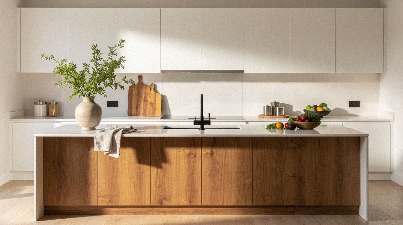
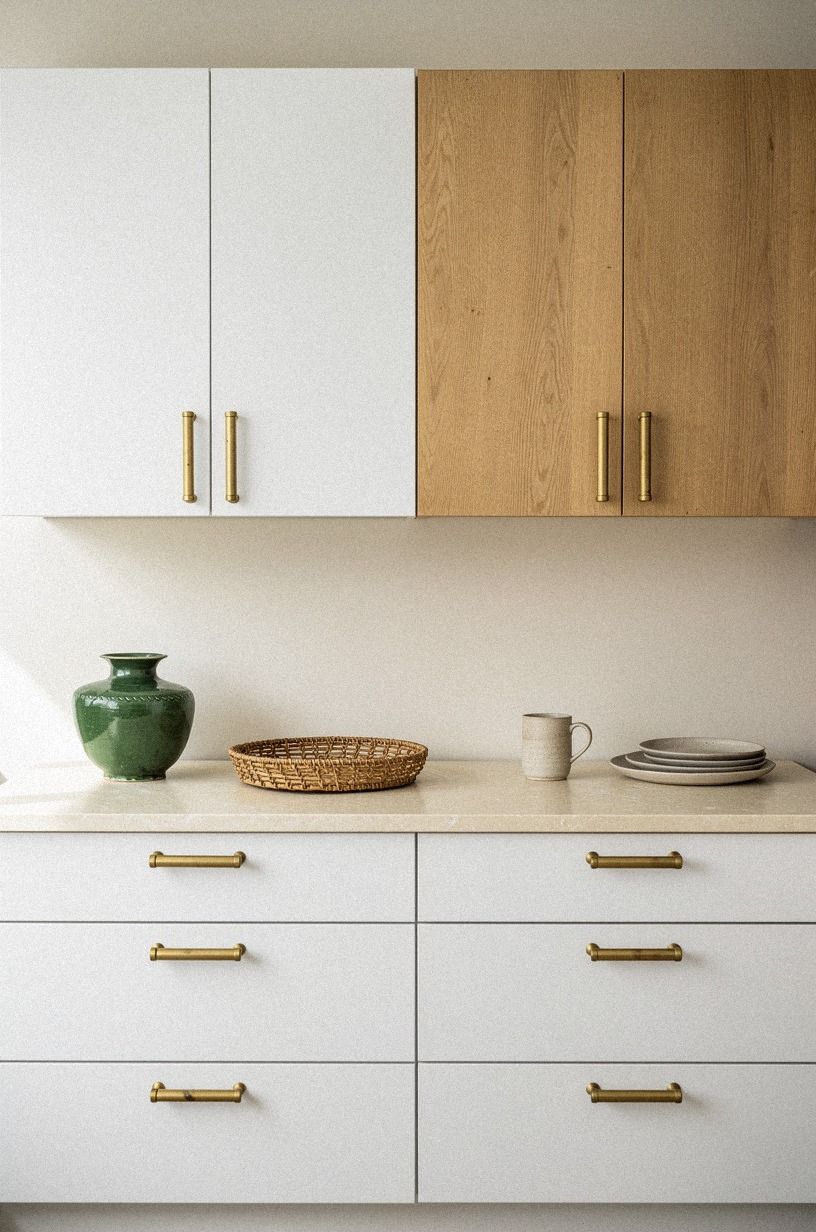
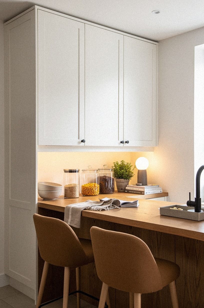
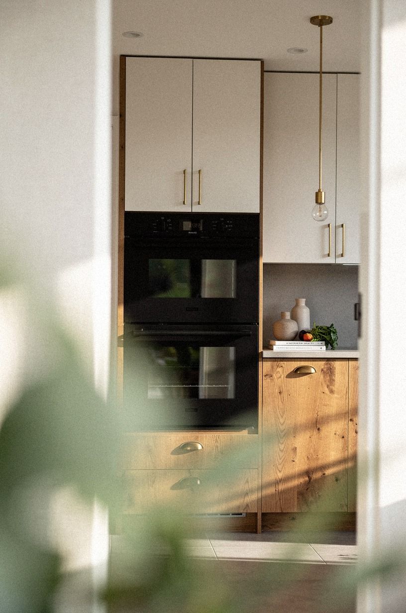
6Why run wood lowers under white uppers?
This is the mixed finish formula I trust most. White uppers keep the room bright and airy where your eye notices bulk first, while wood lowers bring the warm, grounded weight that stops the kitchen from feeling sterile.
If you want a kitchen that feels inviting instead of split in half, this is usually the safest place to start. I like a soft white above and a calming oak below because the contrast looks refined from the doorway and forgiving up close, especially when kids, shoes, and grocery bags keep banging into the base cabinets.
7Frame the range wall in warm oak
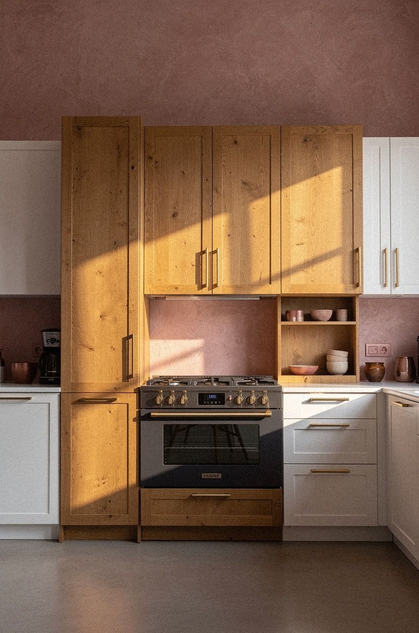
Use the range wall as the place where wood earns its moment. In a broad kitchen view with the cooker centered between warm oak towers, that zone feels grounded the second you see it. White runs on the adjacent walls keep the whole thing from turning dense.
This is my favorite move when you want wood but don't want a cabin kitchen. One strong wall of oak gives you depth, storage, and a focal point. Spreading wood everywhere can flatten the effect because nothing gets to feel special.
But keep the oak warm, not orange. A 3/4-inch white oak veneer with a soft matte finish looks expensive in the right way, while glossy red oak can pull you straight back to 2003. If your open storage will sit near that range wall, cross-check the tone with these open shelving kitchen ideas.
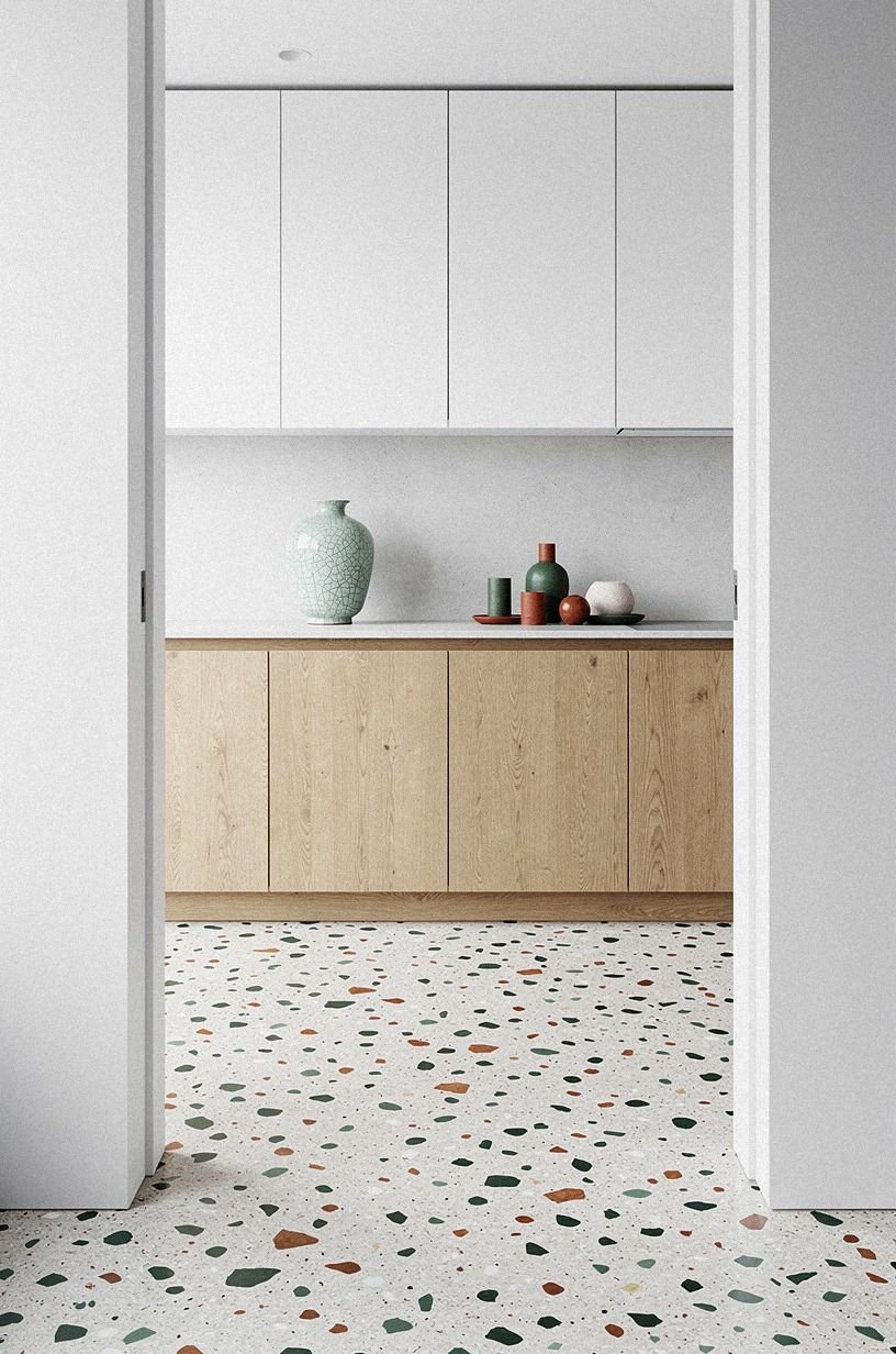
8Keep tall pantry cabinets bright white
Tall cabinets are where white quietly wins. In a pantry wall with bright warm-white cabinetry beside a wire-brushed oak section, the white towers step back while the oak reads as accent. That's useful, because pantry blocks are huge and can start to feel like furniture the size of a closet.
If your kitchen has one long storage wall, I'd keep that wall white first. You can bring wood to the island, the range wall, or the lowers and still get the richness you wanted. A full bank of tall wood doors can make even a nice room feel boxed in.
And here's the practical part: white on tall doors shows the architecture more clearly, which helps if your ceiling height is not perfect or the line of cabinets has to turn a corner. That clarity is why I still reference why hotels use white sheets when clients say white feels too plain.
You want those volumes to disappear a little. Let the pretty grain show somewhere lower where you can enjoy it up close.
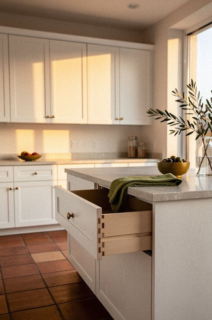
9Layer brass hardware over both finishes
Hardware is the peace treaty between white and wood. From a low view toward a symmetrical kitchen wall, a pull in unlacquered brass can warm a white door and sharpen a wood one at the same time. That's why mixed kitchens often feel unfinished until the metal goes on.
Pick one brass tone and stick with it. Soft aged brass over painted doors, oak drawers, and even a navy base reads deliberate because the repeat is steady. Mixing polished gold knobs with brushed nickel faucets is where the look starts to wobble.
I wouldn't overscale the pulls unless the doors are slab fronts. On narrow shaker doors, smaller brass hardware keeps the finish pairing from turning bossy.
If you want one low-cost update before repainting anything, this is it, and it's often inside that $300-$1,500 cosmetic range. Less than dinner out for a whole drawer pull set if you shop carefully!
10Balance white doors with wood islands
An island is where wood can feel generous without taking over the perimeter. In a close hero shot with a crisp white door edge beside a natural wood island panel and a poured concrete countertop, the contrast feels clean because each finish has a job.
The wall cabinets brighten. The island anchors.
If your kitchen is already lined with white doors, a wood island is usually the safest way to add depth. You get the grain at the center of the room, where people sit and lean and notice details, but you don't darken every wall.
And the island is the place where touch matters most. Ribbed oak, plain-sawn walnut, even a quiet ash all feel better under your hand than another painted panel.
For more ways to let one wood piece carry the room, this painted versus stained kitchen cabinets guide is useful. Keep 42-48 in of clearance around it, though, or the whole thing turns from beautiful to annoying fast.
11Soften glossy white with ribbed wood
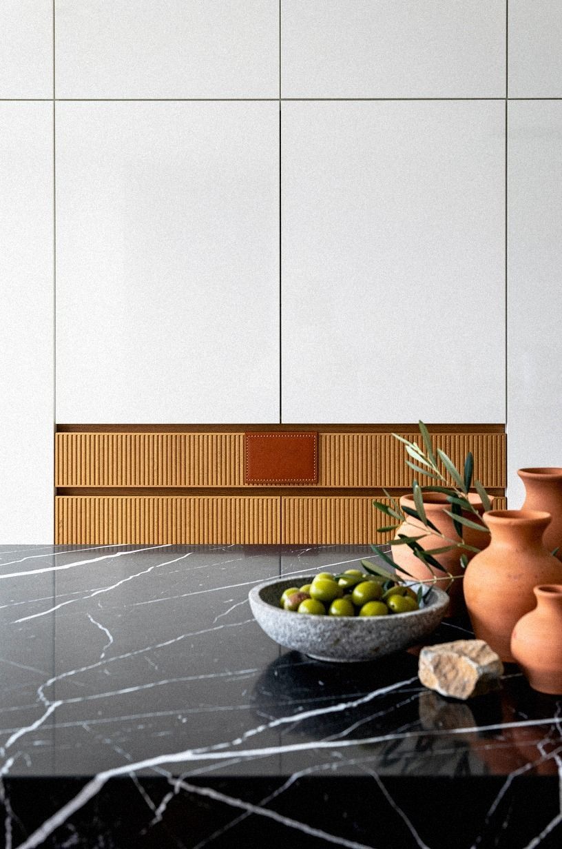
Glossy white can look slick in a way that gets old. Add ribbed wood drawer fronts nearby and the room calms down because the light breaks across the grooves instead of bouncing everywhere at once. That's especially useful if your kitchen gets hard afternoon sun.
I like ribbed wood best as a small counterpoint, not a full-room theme. One island face, one drawer bank, maybe a breakfast hutch. If you do every panel in texture, the kitchen starts feeling busy before you've even added bowls or bar stools.
But a little tactile contrast goes far. Pair glossy white with ribbed oak and a simple stone top, and you get a kitchen that feels softer without losing brightness.
If you want that same brightness logic in another room, why hotels use white sheets makes the case surprisingly well. The difference is visual, sure, but it's also physical.
Your eye gets somewhere to land.
12Build contrast around black appliances
Black appliances need a buffer or they can read like holes in the room. Seen through greenery and a doorway, matte black appliances look strongest when white and wood split the load around them.
White keeps the zone crisp. Wood keeps it from feeling harsh.
If your fridge, oven, or vent hood is black, don't put that whole wall in dark wood. I made that mistake on a mood board once, and the center of the kitchen vanished. White around the appliance edge gives you the outline back.
This is also where paint matters. Sherwin-Williams Evergreen Fog SW 9130 on a nearby trim piece can soften the jump between black metal and pale doors, while Farrow & Ball Studio Green No. 93 is moodier but easier to overdo. Want a related lesson in using white on purpose?
I still think this piece on why hotels use white sheets explains the psychology better than most decor posts do.
13Choose white oak grain for open shelving
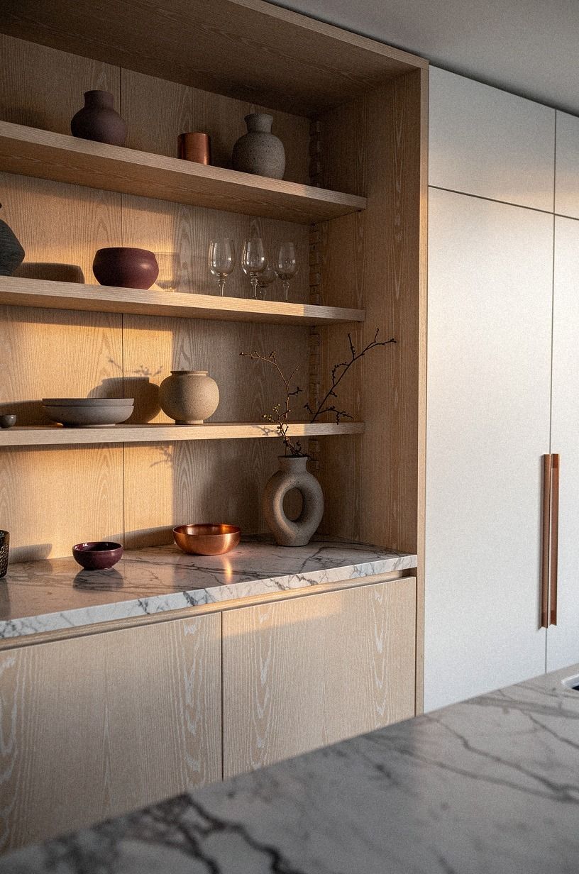
Open shelving is where fake wood gets exposed fast. If the shelf finish looks printed, flat, or overly glossy, the whole kitchen loses that easy, organic confidence people are usually chasing.
I would rather see one modest shelf in real white oak than three ambitious shelves in a plastic wrap that reads cold by noon. A natural grain brings warm movement, a more intimate feel near mugs and bowls, and a subtle depth that keeps white cabinets from looking too sharp.
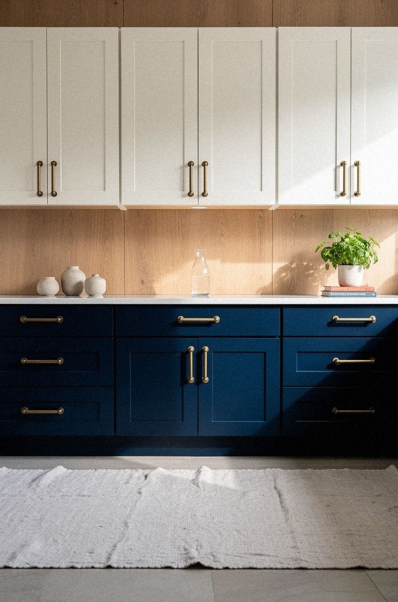
14Repeat cabinet tones in nearby trim
If the cabinets stop at the cabinet line, the finish mix can feel pasted in. When navy trim, white cabinets, and walnut fronts line up in one view, the room clicks because the tones repeat beyond the boxes. That's the part many kitchens skip.
Pull your chosen tone into one nearby detail. A window sash. A pantry door frame.
A stool leg. Even a picture rail.
You don't need a lot, but you do need an echo, or the wood island will feel lonely and the white run will feel detached.
But do not repeat everything. If the cabinets are white and walnut, I'd avoid adding a third stained trim color just because the flooring store had a sample on sale.
When I need examples of one clean repeat above the sightline, I look at how to style the space above your kitchen cabinets. Keep the repeats disciplined.
One wood family, one white, one dark accent if needed.
15Photograph both finishes at breakfast time
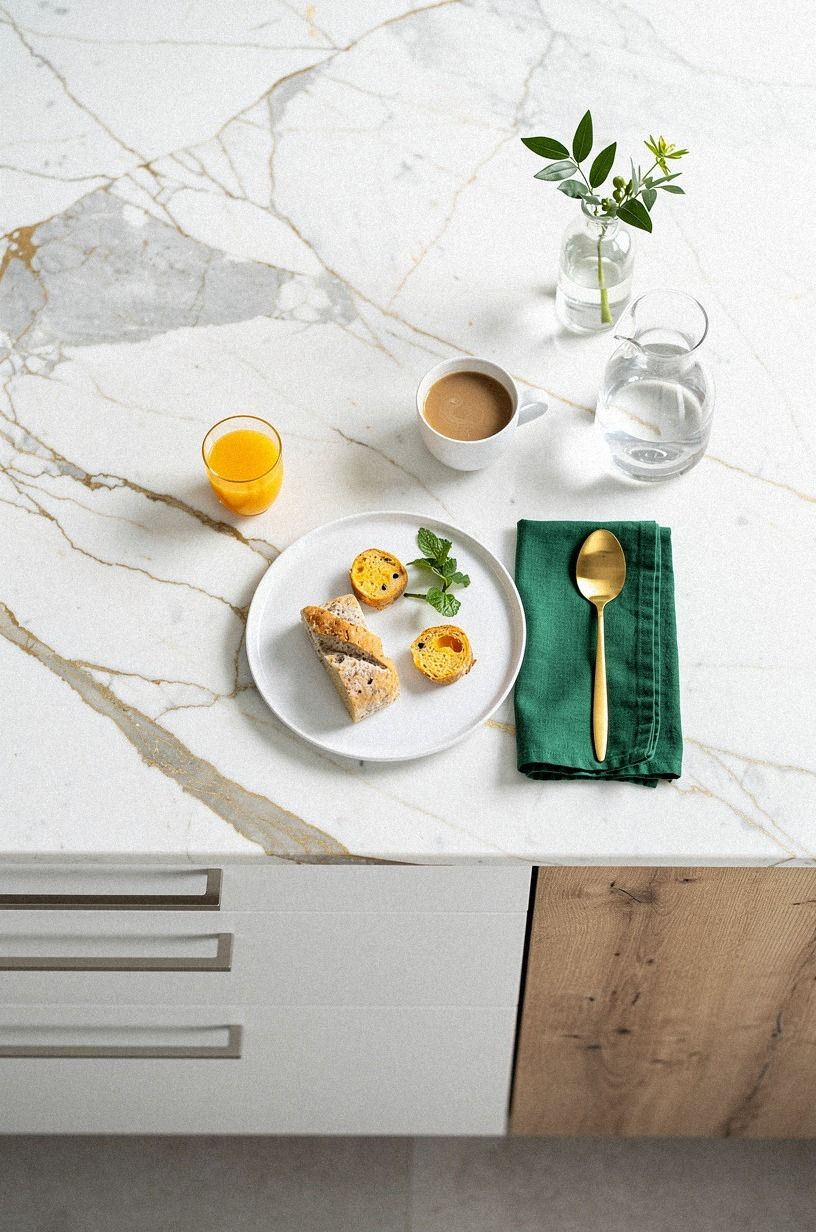
Breakfast light tells the truth. Breakfast light never lies!
In an overhead island shot with breakfast plates, a Calacatta marble surface, white doors, and wood panels catching early light, you can see warmth, glare, crumbs, and contrast all at once. That's more honest than a late-night lamp test.
Take two photos from the same angle, one with the white sample leading and one with the wood sample leading. Then look at them on your phone after you've left the room. Which one still feels like a kitchen you want to walk into every morning?
I trust this step because it removes the showroom fantasy. You see coffee, cereal, daylight, your real counters, your real mess.
And that is the life the cabinets have to survive. If one finish only looks good under perfect styling, skip it.
The Bounce-or-Body Rule I Use Before I Spend
When people ask me which cabinet finish is better, I think the question is a little off. Better for what? Better in a bright room with icy counters and black appliances is not the same as better in a dim galley with warm travertine and a low ceiling.
I went back and forth on this in my own notes because white is easier to recommend fast, but wood is often easier to live with once the room calms down.
Here's the rule I keep coming back to. White is the better choice when the kitchen already has enough warmth in the floor, the stools, the wall color, or the view out the window.
Wood is the better choice when the room feels cold, overlit, or a little too sharp. That's why I don't start with cabinet style anymore. I start with what the room is missing.
And cost changes the answer too. If you're in the cosmetic tier, paint can get you close to the white look for $300-$1,500, while adding wood convincingly may depend more on shelving, island cladding, or selective refacing than a full cabinet swap. In the mid range, where repainted fronts, new lighting, and a laminate or entry quartz top are in play, mixed finishes become much easier to pull off.
At the high end, you can do anything. That's also where expensive mistakes get very expensive.
I also think people underestimate maintenance psychology. White asks you to accept a little wipe-down routine. Wood asks you to accept variation, grain movement, and the fact that one panel may look deeper than the next.
Neither is wrong. But if perfection is your thing, bright painted doors may keep you calmer. If softness matters more, wood usually ages better in your mind.
So my framework is simple now. Let the room tell you whether it needs bounce or grounding.
Use white where you need space. Use wood where you need body. Repeat the finish somewhere nearby so it doesn't feel random.
And never decide before breakfast light, because that soft first hour tells you more than a whole afternoon on your laptop ever will.
The Questions Worth Answering First
What is the best White vs. Wood Kitchen Cabinets: How to Decide for a small kitchen?
White uppers with wood lowers is usually the best small-kitchen move because visual lift matters more than purity. You keep the wall light, hide wear near the floor, and still get warmth. If you want a ready-made starting point, look at IKEA SEKTION in white with an oak-look island panel.
Where can I buy White vs. Wood Kitchen Cabinets: How to Decide pieces on a budget?
Start with IKEA, Target Threshold, and Wayfair cabinet hardware or island stools, then check Facebook Marketplace for wood doors, stools, or a butcher block top. The biggest budget win is second-hand solid wood. You can paint the perimeter later and keep the real grain where hands touch it most.
How much does a White vs. Wood Kitchen Cabinets: How to Decide makeover cost?
A cosmetic pass usually runs about $300-$1,500, a more serious refresh lands around $3,000-$12,000, and a full remodel starts near $25,000 and climbs. Free first steps: sample testing, photographing the room, and moving styling pieces so you can read the finishes clearly.
Can I create a White vs. Wood Kitchen Cabinets: How to Decide on a budget?
Yes, and you don't need all new boxes. Keep the carcasses, paint selected doors, add brass hardware, and clad only the island or a shelf run in wood tone.
Cheap wins! Sample doors.
Peel-and-stick backsplash. One better light bulb temperature.
Is a White vs. Wood Kitchen Cabinets: How to Decide worth it in a small space?
Yes, because a small kitchen makes contrast easier to control and the result feels more intentional faster. Keep uppers white, stay disciplined with one wood family, and protect your walkways. That 42-48 in island clearance matters even more when the room is tight.
Is White vs. Wood Kitchen Cabinets: How to Decide a good idea for a rental?
Yes, if you keep it reversible. Use removable hardware, peel-and-stick backsplash, a wood-look island wrap, and open shelving added into existing anchor points when the lease allows it. For low-commitment styling above the cabinets, this guide on the space above kitchen cabinets gives you renter-safe cues.
Start With the Breakfast-Light Rule
If I had to pick one step, I'd start with the kitchen's natural light. Light lies least. Watch the room at 8 am and 5 pm before you buy anything, then save painted versus stained kitchen cabinets.