Black kitchen cabinet ideas for a bold, moody kitchen cost less than most people think if you stay cosmetic first. I did this makeover while trying to keep dinner moving in a kitchen that still had builder-grade fronts, and I did not expect black cabinets to make the room feel warmer instead of harsher. But they did. Fast!
Don’t overthink: I wrapped the island in matte black.
Here's what it looked like before
Before I touched a thing, my kitchen had the full safe-house package: off-white shaker doors, shiny nickel pulls, bright overhead cans, and a backsplash that read beige no matter what time of day it was. Nothing was broken.
That was the problem. It all worked, but none of it held your eye long enough to make the room feel grounded.
I kept trying little fixes first. A runner. A fruit bowl.
A new lamp on the counter. You know the move. None of it mattered because the cabinet finish still reflected light in that flat, chalky way that made every surface look temporary.
When I stood at the sink at 6:30 pm, the room felt washed out instead of calm.
The turning point came when I realized I didn't need a bigger kitchen, I needed stronger contrast. Once I stopped chasing bright and started chasing depth, every other decision got easier. If you're weighing color before storage, my favorite read on that balance is kitchen cabinet color ideas you'll still love in 10 years, because you can feel when a room got the order wrong.
- I chose flat black slab doors first
- I wrapped the island in matte black
- I paired black lowers with walnut uppers
- I ran black cabinets to the ceiling
- I added thin brass pulls everywhere
- I built a black pantry wall
- I framed the range with black towers
- I softened black cabinets with cream zellige
- I chose smoked glass upper cabinet doors
- I set black drawers under white quartz
- I added mid century tapered wood legs
- I left one oak shelf between cabinets
- I painted the hood to match
- I tucked lighting under every black upper
- I used ribbed black doors on the island
- I finished with a black coffee cabinet
1I chose flat black slab doors first
I started with flat fronts because raised panels would have made my small kitchen feel busier, not richer. A clean slab door in Sherwin-Williams Tricorn Black gave me the sharp, cabinet modern look I wanted, and the symmetrical wall finally felt intentional once every line ran straight from fridge panel to pantry return.
But here's the part nobody respects enough: black only looks expensive when the door shape stays quiet. If you already have too many seams, grooves, and decorative edges, your eye catches clutter before it catches mood. I measured every run twice and kept the reveal lines even, because crooked spacing on black shows up immediately.
I also learned that a flat front makes fingerprints easier to wipe than ornate profiles. You can run a microfiber cloth over the whole wall in under five minutes, and that matters when you're using the kitchen every day. If you're debating mixed finishes first, two tone kitchen cabinet ideas that add instant depth shows why the cleanest move often starts with the calmest door style.
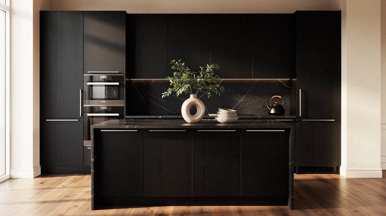
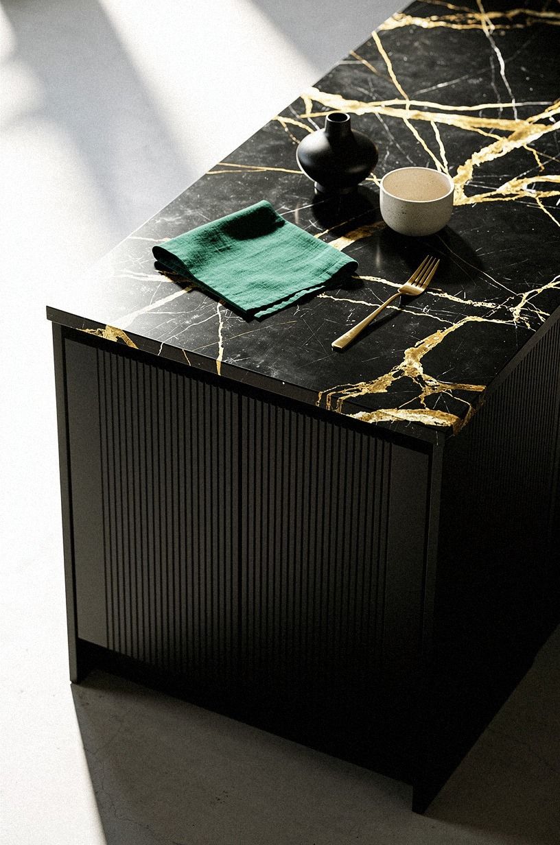
2I wrapped the island in matte black
The island changed the room the second I painted all four sides, not just the front face. I used a matte Benjamin Moore Advance finish so the black absorbed light instead of bouncing it, and from the first-person view as you step in, the island finally reads like furniture instead of a leftover box in the middle.
And yes, you need to think about clearance before you go dark. Mine sits with about 42 inches all around, which keeps the traffic path easy even when stools are pulled out. If your spacing is tighter than that, black can still work, but you had better keep the edges simple and the floor visible so your eye has room to move.
What surprised me was how much the matte finish warmed up the whole kitchen. Gloss would've looked slick.
Matte looked settled. If you're trying to make a compact room feel composed, small kitchen cabinet ideas that maximize storage has the same lesson: one strong central shape helps more than five little accents ever will.
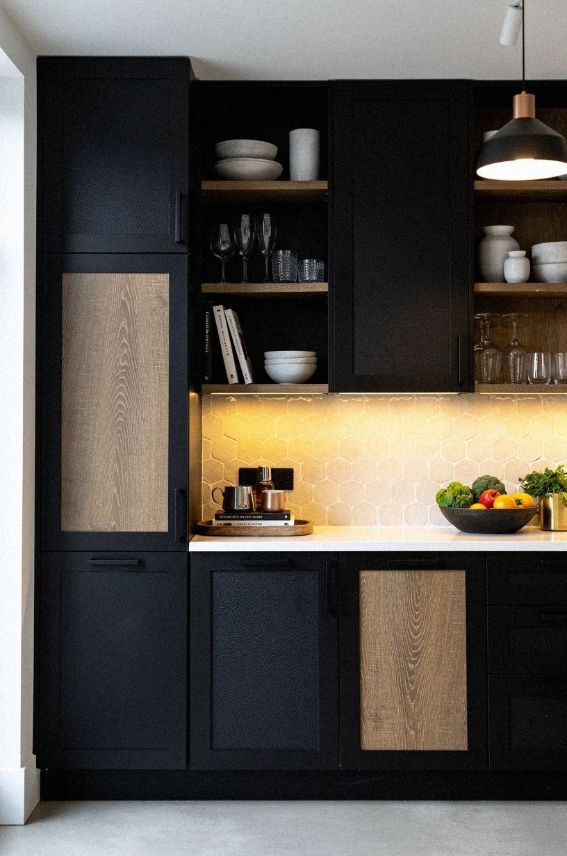
3I paired black lowers with walnut uppers
This was my version of the Two-Wood Rule, even though one of the woods was paint. The black lower cabinets grounded the room, while the book-matched walnut veneer uppers kept the sightline from turning too heavy. From above, the contrast looked clean and deliberate, almost like the kitchen had a built-in shadow line around the floor.
I would not do black on top and walnut below. The weight belongs low.
You feel it right away when you walk in, and your shoulders drop because the room stops shouting at you. That warm modern kitchen cabinets effect comes from visual balance, not from throwing in wood anywhere you can fit it.
Walnut also saved me from the all-black cave look I was worried about. If your kitchen doesn't get strong daylight, this pairing is safer than solid dark cabinetry wall to wall. For more on warm wood direction, I kept going back to oak kitchen cabinet ideas for a warm modern look while I was testing samples and trying not to over-darken the room.
4I ran black cabinets to the ceiling
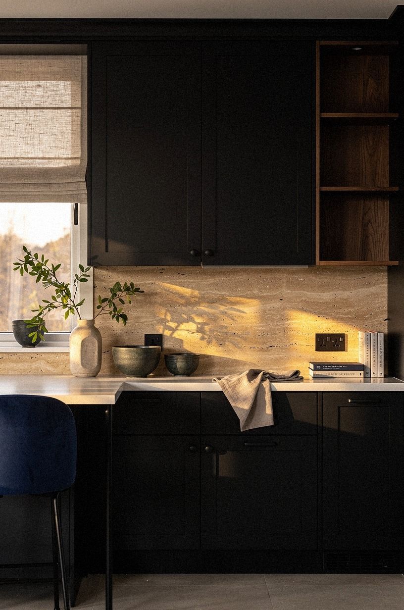
Going to the ceiling fixed the cheap gap above my old uppers in one shot.
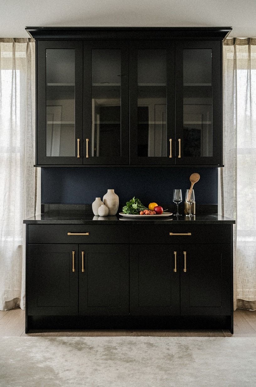
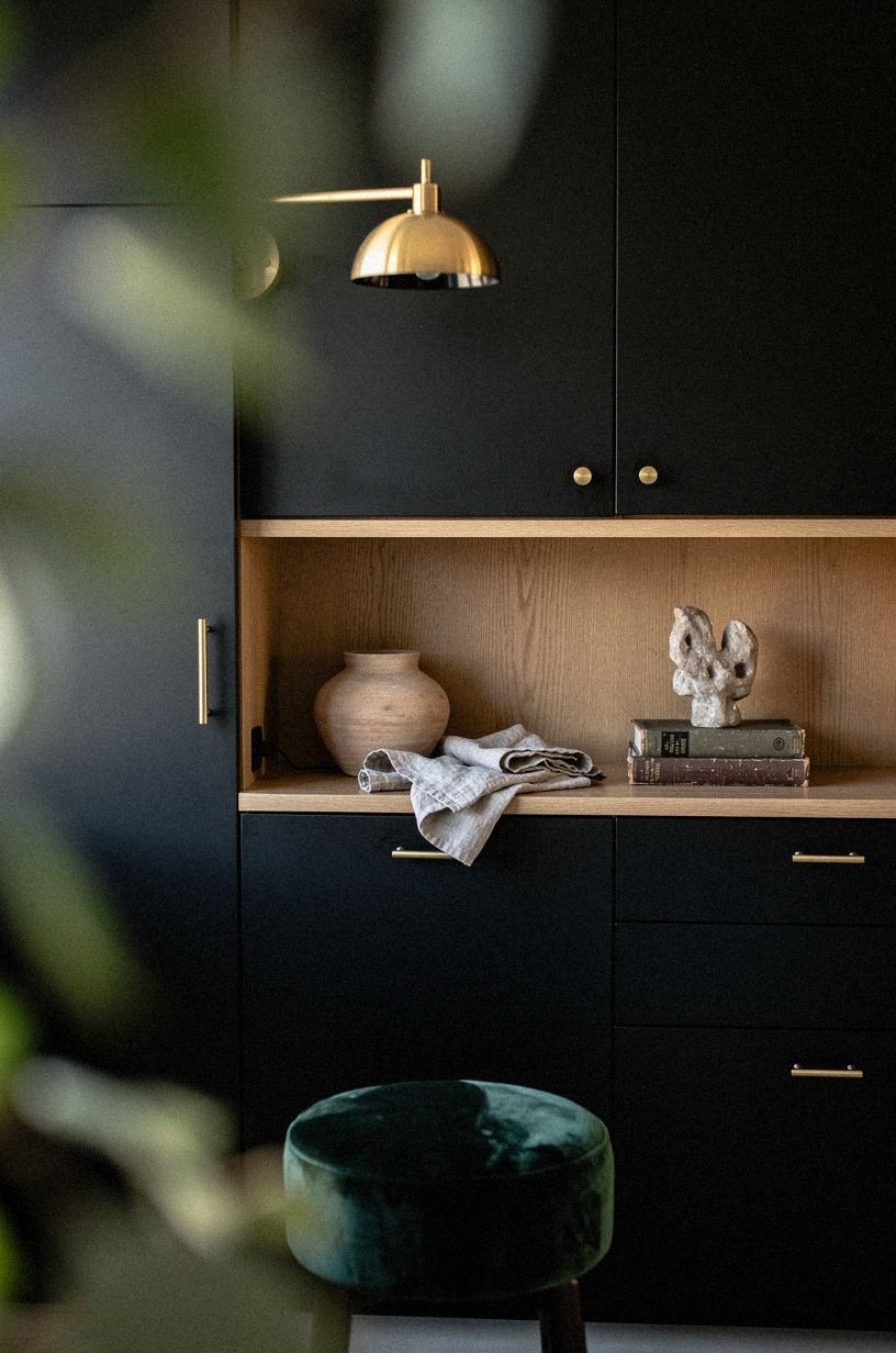
5I added thin brass pulls everywhere
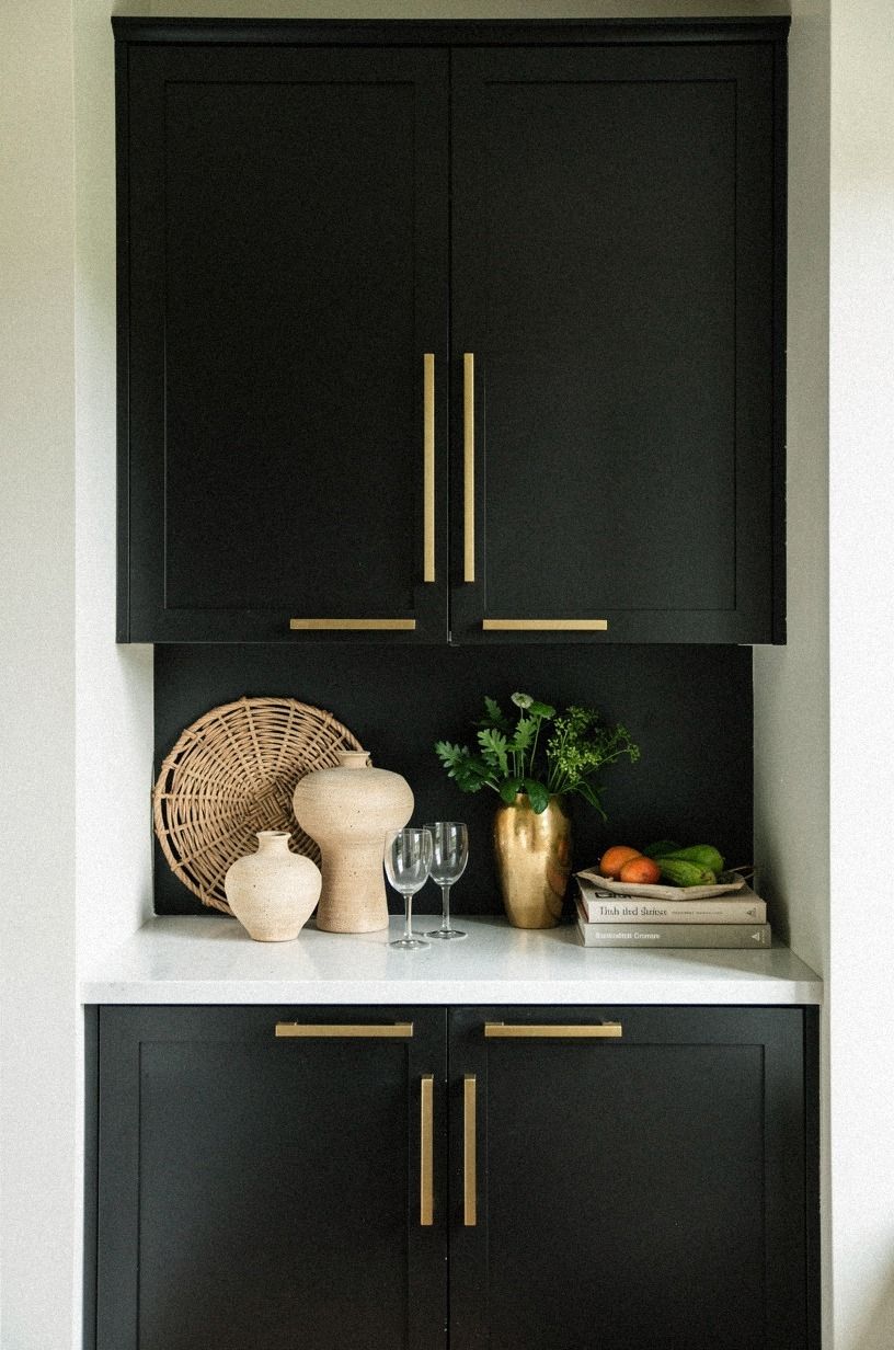
Thin hardware was the quickest way to stop the black fronts from feeling flat. I used slim unlacquered brass pulls with a soft, living finish, and the alignment across every drawer and door mattered more than the pull style itself. When the lines stack cleanly, the whole wall looks custom.
I made one bad sample-board choice first. I tried chunky bar pulls, and they pulled the kitchen toward restaurant instead of home. Thin brass gave me a quieter glint, especially at night, and that contrast against black felt older and more relaxed.
The cost stayed sane too. Hardware alone is one of those changes you notice every single time! If you're also refining the sink run, kitchen sink cabinet ideas to organize under the sink helped me think through where form matters and where function has to win.
6I built a black pantry wall
My pantry used to be an awkward collection of narrow doors that looked apologetic from the hallway.
7I framed the range with black towers
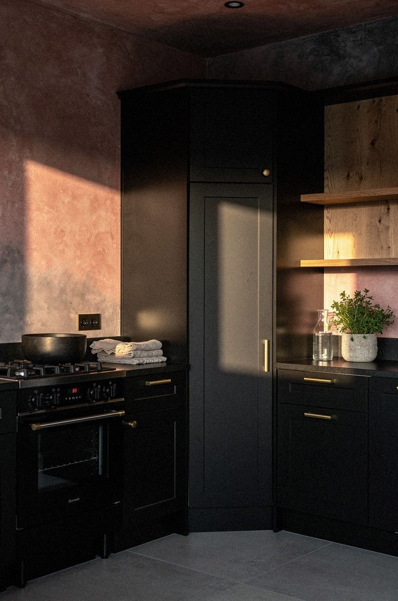
Framing the range gave the kitchen a center of gravity it had never had before. I built black towers on both sides so the cooker sat in a proper niche, and from the wide corner view, the whole wall finally felt like one thought. That symmetry matters more in a moody room because darkness amplifies whatever is off.
I skipped open spice shelves here on purpose. They look charming for about two days, then you spend the next six months staring at labels and half-empty jars. Closed towers let the range hood, splash area, and hardware do the talking instead.
If you're trying to make a regular kitchen feel a little grander, build weight around the appliance that already pulls your eye. And if your palette is still in flux, green kitchen cabinet ideas from sage to emerald is useful because it shows how dark color behaves when it frames the heat of the room.
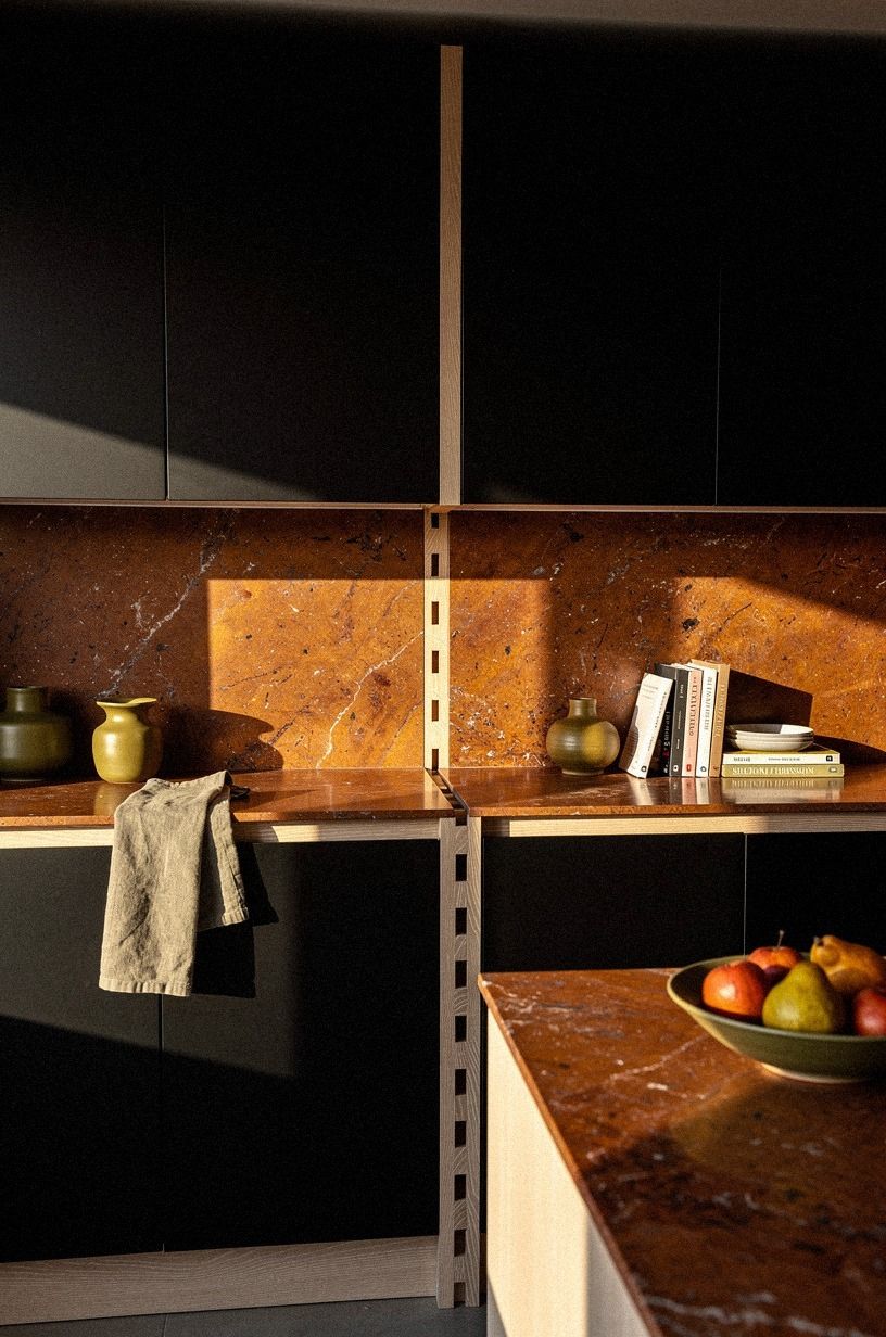
8I softened black cabinets with cream zellige
This section saved the kitchen from becoming severe. The cream zellige tile has that slight edge variation and soft sheen that keeps black cabinetry from looking flat, and the 18-inch space between counter and uppers suddenly felt layered instead of blank.
I would not use a cold gray backsplash with black fronts unless your room gets serious southern light. Mine does not. Cream zellige brought bounce without turning the palette sweet, and every uneven glaze mark made the black look more expensive by contrast.
The material cost can be worth it too. Typical zellige runs about $15 to $35 per square foot, which is not cheap, but you don't need a ballroom of it. Used in one clean band, it changes the room more than another accessory ever could.
Warm, yes. Fussy, no.
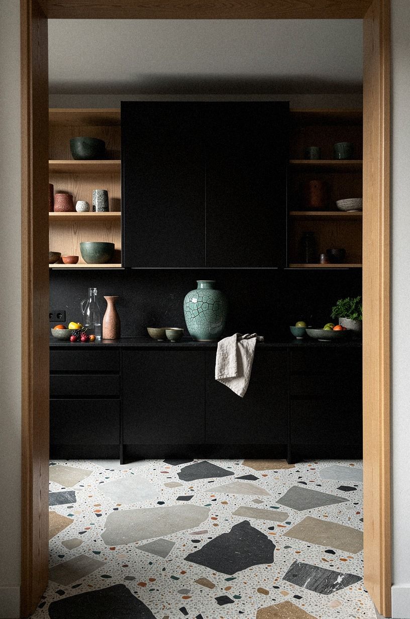
9I chose smoked glass upper cabinet doors
Smoked glass gave me breathing room without abandoning the dark palette. Above the black base cabinets, the bronze-tinted glass let the upper run feel lighter from the low angle, and that mattered because solid black boxes overhead can press down on you if your ceiling isn't generous.
You do have to edit what's behind the glass. I kept stacks of white plates, amber glasses, and two dark pottery pieces, nothing more. If you throw cereal boxes up there, the whole mood collapses in a week.
This is also where I started thinking less about hiding everything and more about staging just enough. If you want another take on balancing display and storage, small kitchen cabinet ideas that maximize storage handles that tension well without turning every shelf into décor theater.
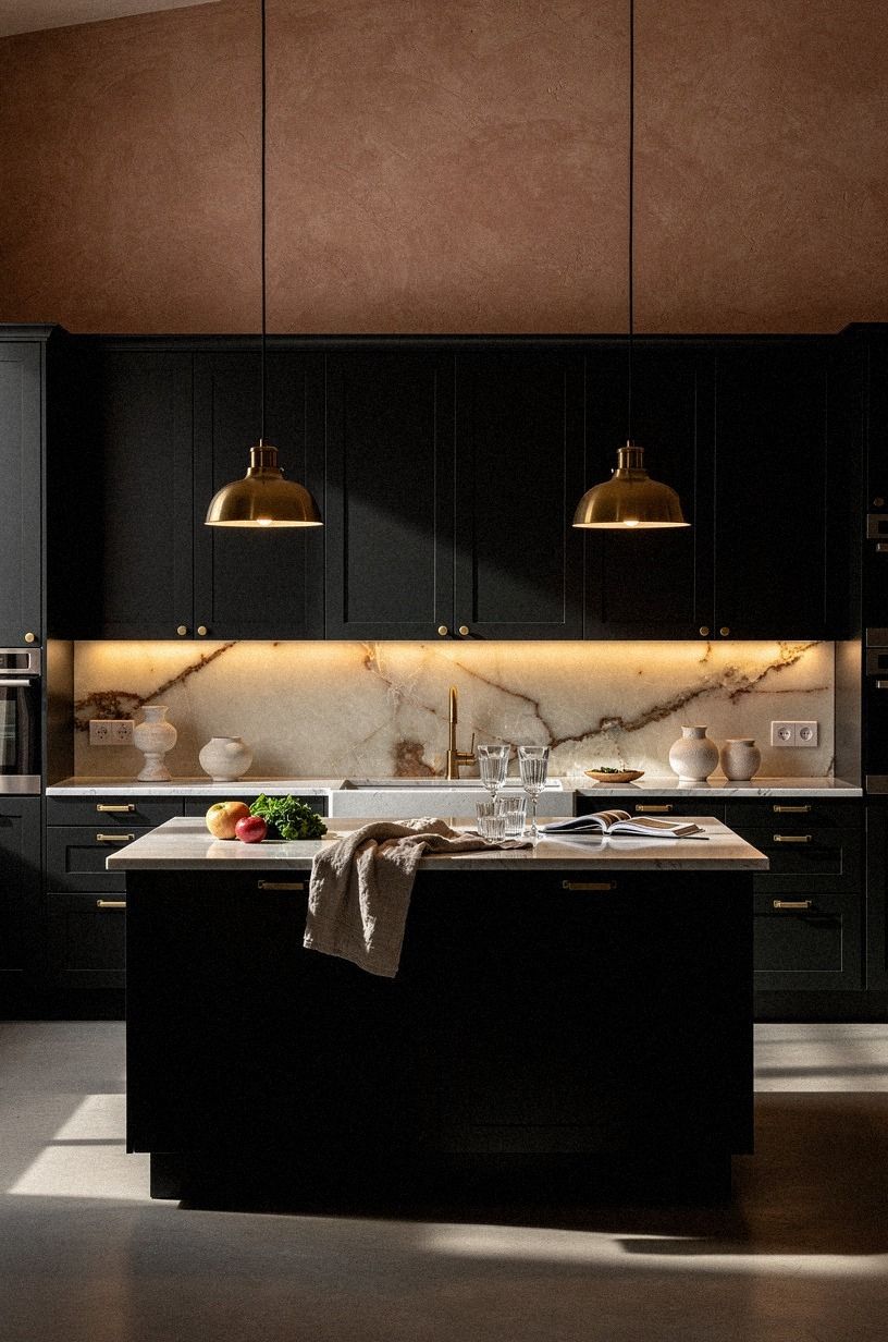
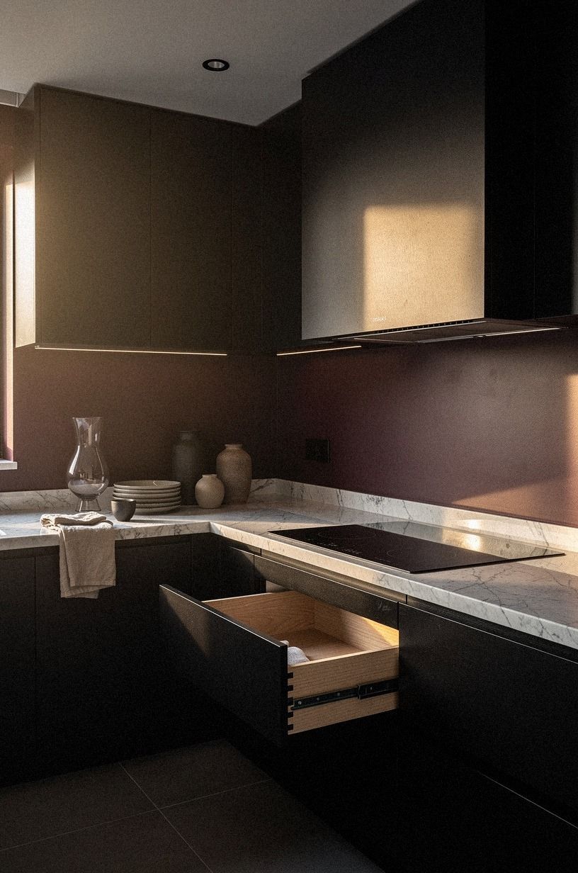
10I set black drawers under white quartz
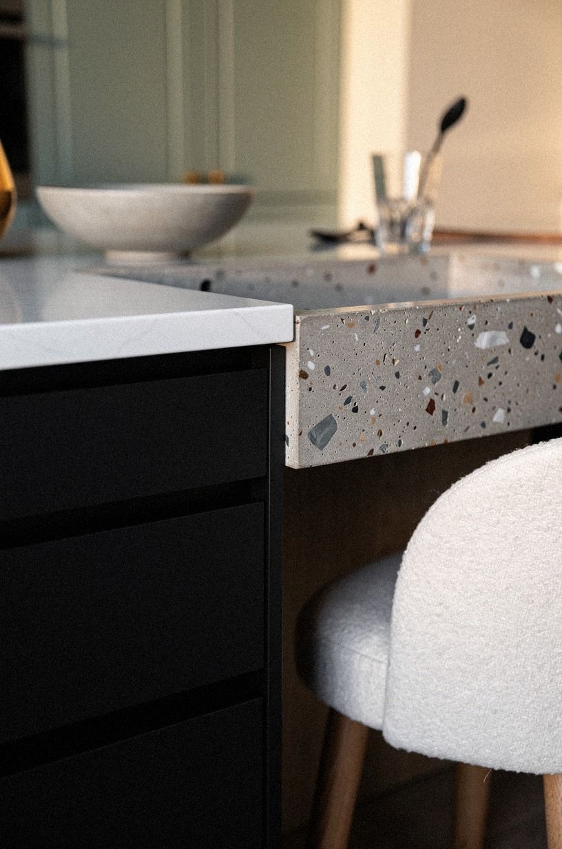
Black drawers under a bright counter gave me the crispest contrast in the room.
11I added mid century tapered wood legs
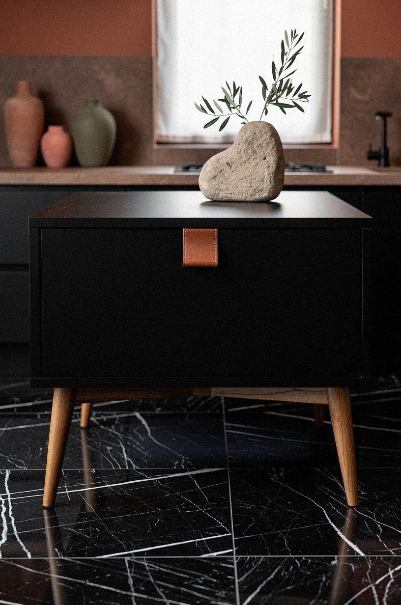
This was the little move that made the island feel custom instead of stock. Lifting the black base on tapered white oak legs exposed more of my Nero Marquina-style floor pattern and gave the island a lighter stance, almost like a furniture piece dropped into the room instead of millwork planted on it.
I used a 3/4-inch solid oak leg profile with a soft oil finish, not something skinny and flimsy. You want the leg to read intentional from ground level, especially against a dramatic floor. Too thin, and the whole thing looks borrowed from a vanity.
And honestly, this idea works best when the rest of the cabinetry stays strict. One furniture gesture is charming.
Five of them is noise. For more warm-wood restraint, oak kitchen cabinet ideas for a warm modern look helped me keep the wood notes connected instead of random.
12I left one oak shelf between cabinets
Leaving one open shelf between black cabinet runs kept the wall from turning into a dark monolith. Just one. The shelf is natural oak, and through a leafy edge view from the breakfast area, it acts like a pause in the composition rather than another storage demand.
I kept the styling spare because you don't need much here. A stack of cookbooks, one brown bowl, one little framed print, and a pepper mill.
That's it. If you force too many objects into the slot, you lose the relief the shelf was supposed to create.
Why not leave three shelves open? Because black kitchens need discipline more than they need display.
One break in the run feels intentional. A whole wall of open storage feels like you quit halfway through the plan.
13I painted the hood to match
Matching the hood to the cabinets pulled the whole cooking wall together. Once the hood disappeared into the same cabinet enamel, the room felt calmer from the diagonal view, and the brass accents around it had more presence because they weren't competing with a random painted shape.
This is one of those choices that sounds boring on paper and looks expensive in person. A contrasting hood can work, but in my kitchen it would've cut the wall in half. I needed one dark envelope around the range, not another focal point fighting for attention.
If you're still deciding whether your hood should stand out or blend in, go back to your storage shape first. My answer changed once I committed to the full-height runs and pantry wall. Then the matching hood was obvious.
14I tucked lighting under every black upper
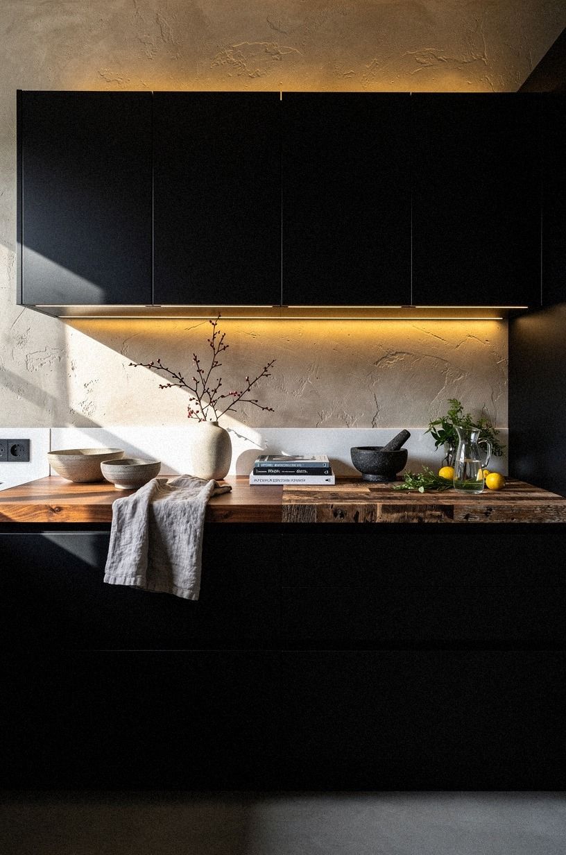
Under-cabinet lighting kept the black from swallowing the work surface at night.
15I used ribbed black doors on the island
Ribbed doors gave the island just enough movement to stand apart from the flat perimeter cabinets. From above, the vertical grooves in the reeded black fronts caught light in a softer way than I expected, and the island looked tailored instead of plain.
I would not rib every cabinet in the room. That would tip straight into costume. On one central volume, though, texture works because your hand and eye both register it as a special piece without turning the whole kitchen busy.
This is where the modern kitchen cabinets mood got more personal for me. I was not copying a showroom anymore. I was editing my own kitchen so the center island had a little swagger while the outer walls stayed quiet.
16I finished with a black coffee cabinet
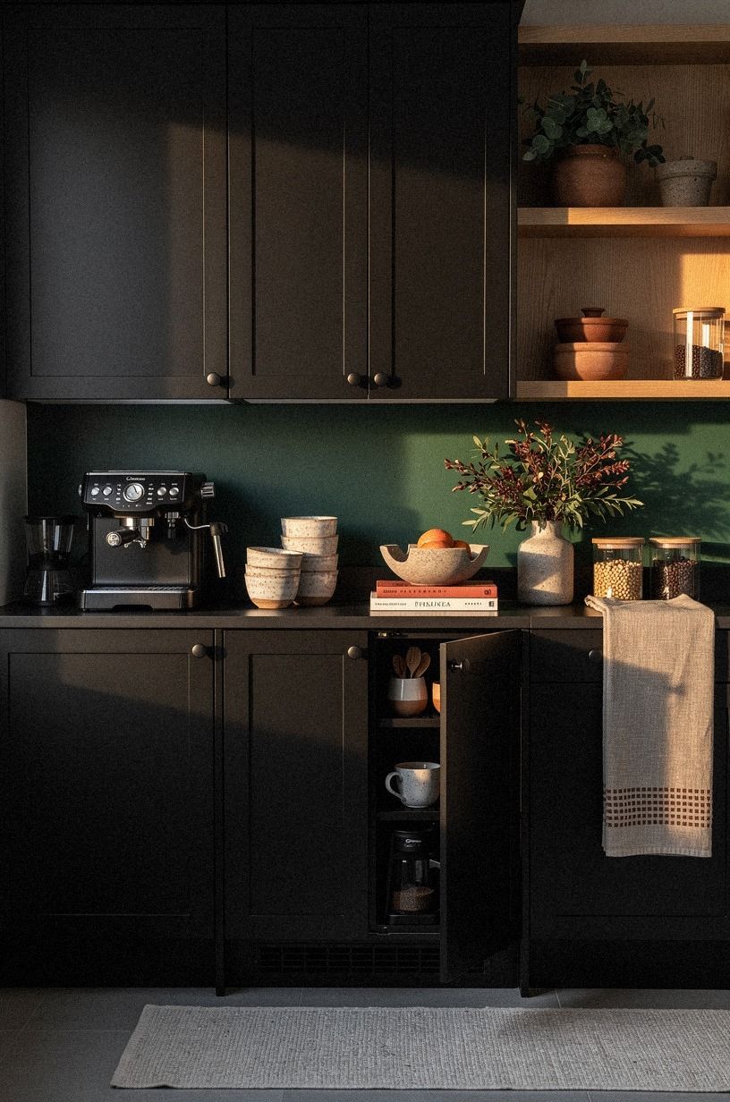
The coffee cabinet was the last thing I added, and it made the kitchen feel lived in instead of staged. Tucking that station into matching black cabinetry kept the mugs, beans, and grinder from colonizing the counters, while still making the morning ritual part of the room.
I fitted one drawer for pods and filters, one shelf for cups, and left the machine at standard 36-inch counter height so it stayed easy to use. That sounds obvious, but if the setup is awkward, you won't keep it clean, and then the whole niche starts looking tired.
You can do a version of this in a rental with a painted hutch or freestanding cabinet too. I love a moody kitchen, but I love a clear counter even more. The room finally felt like it knew what belonged where.
How much it cost: The Stay-Dark Ladder
I kept this makeover mostly cosmetic, so I could spend on the surfaces that changed the mood fastest and leave the expensive box replacements for another life stage. My own total landed around $2,180 because I reused cabinet boxes, hired out the spray finish, bought new hardware, added lighting, and splurged on a smaller run of zellige behind the range wall. If you're planning your own version, start with the range below and be honest about whether you need new cabinets or just a darker shell.
What would I cut if you gave me only one weekend and a tighter budget? New hardware, paint, and under-cabinet lights.
That's the cosmetic stack that shifts the room fastest. If storage is the bigger pain point than color, kitchen pantry cabinet ideas for smart storage, kitchen sink cabinet ideas to organize under the sink, and kitchen cabinet color ideas you'll still love in 10 years are worth reading before you spend on prettier surfaces.
The Shadow-Line Rule I Learned Too Late
What I got wrong at first was assuming black cabinets were the statement all by themselves. They aren't. Black is only the setup.
The real payoff comes from what you place against it, under it, and around it. If the lines are crooked, the pulls are clunky, the light is too cold, or the counter feels muddy, black won't save you.
It'll expose every weak choice faster.
I also used to think moody meant dark everywhere. That's not true in a real working kitchen.
You need one bright note, one warm note, and one surface that almost disappears. In my case, the bright note was the white quartz. The warm note was the walnut and oak.
The disappearing surface was the painted hood and pantry wall. Once I saw the room that way, I stopped shopping by object and started editing by role.
The other lesson was emotional, not technical. I kept resisting black because I thought it would make the room less friendly.
It did the opposite. White cabinets had made every crumb, every mail pile, and every unfinished thought feel visible. The darker palette lowered the visual noise, and that changed how I felt in the space at 7 am when the coffee was brewing and lunch boxes were still open on the counter.
You might know that feeling too: the room isn't messy, exactly, but it never lets you exhale.
And black finally gave me that exhale. Not because it was dramatic. Because it was decisive.
I did not need more décor once the cabinets carried more weight. I needed fewer interruptions. Fewer little color notes. Fewer shiny things calling for attention.
That's why I still think the safest version of this makeover isn't all-black everything. It's disciplined black, supported by warm woods, cream tile, brass that ages well, and lighting that understands nighttime.
If you're standing in your own kitchen trying to decide whether this palette is too much, ask a simpler question: what is the room doing right now that you want it to stop doing? Mine was scattering my eye.
Yours might be the same. When a room stops scattering you, it starts holding you.
That's what the dark cabinets really bought me.
What People Always Want to Know
What is the best Black Kitchen Cabinet Ideas for a Bold, Moody Kitchen for a small kitchen?
The best move for a small kitchen is black lowers with a lighter upper moment, because contrast keeps the room deep without making it feel boxed in. Flat fronts.
One warm wood note. An IKEA SEKTION layout works especially well when you keep the upper run spare.
Where can I buy Black Kitchen Cabinet Ideas for a Bold, Moody Kitchen pieces on a budget?
Start with IKEA, Target Threshold, and Wayfair for hardware, lighting, and freestanding storage. Facebook Marketplace is still great for solid wood hutches you can paint.
Brass pulls. Counter stools.
A small cabinet for coffee. That's usually where your cheap wins are hiding.
You can also compare forms and finishes in oak kitchen cabinet ideas for a warm modern look before you buy.
How much does a Black Kitchen Cabinet Ideas for a Bold, Moody Kitchen makeover cost?
A cosmetic version usually costs about $300 to $1,500, and a fuller refresh can run $3,000 to $12,000 depending on counters and lighting. Paint is the cheapest shift.
New cabinet boxes are the expensive jump. If you only need mood, you do not need a full remodel.
Can I create a Black Kitchen Cabinet Ideas for a Bold, Moody Kitchen on a budget?
Yes, and the budget path can still look intentional. Paint the lowers first.
Swap the hardware. Add peel-and-stick backsplash or warm lighting underneath the uppers. If you want more ideas before buying anything, two tone kitchen cabinet ideas that add instant depth is a smart place to compare cheaper paths.
Is a Black Kitchen Cabinet Ideas for a Bold, Moody Kitchen worth it in a small space?
Yes, black cabinets are worth it in a small space because depth can make a cramped room feel more anchored, not smaller. Keep your island clearance near 42 to 48 inches if you can.
One bright counter. One warm material.
That's usually enough to keep the room open.
Is Black Kitchen Cabinet Ideas for a Bold, Moody Kitchen a good idea for a rental?
Yes, if you keep the changes removable and low-risk. Peel-and-stick backsplash.
Plug-in or battery under-cabinet lights. A painted freestanding pantry or coffee hutch instead of built-ins.
And for renter-friendly storage logic, small kitchen cabinet ideas that maximize storage gives you moves you can undo later.
Where I'd Start First: The Two-Surface Rule
If I had to pick one, I'd start with the lower cabinet paint. Dark base cabinets do the heavy lifting, and everything else can build on top of them instead of fighting for attention. Pin this for later and start where the room needs weight, not where it wants another accessory.