
 by
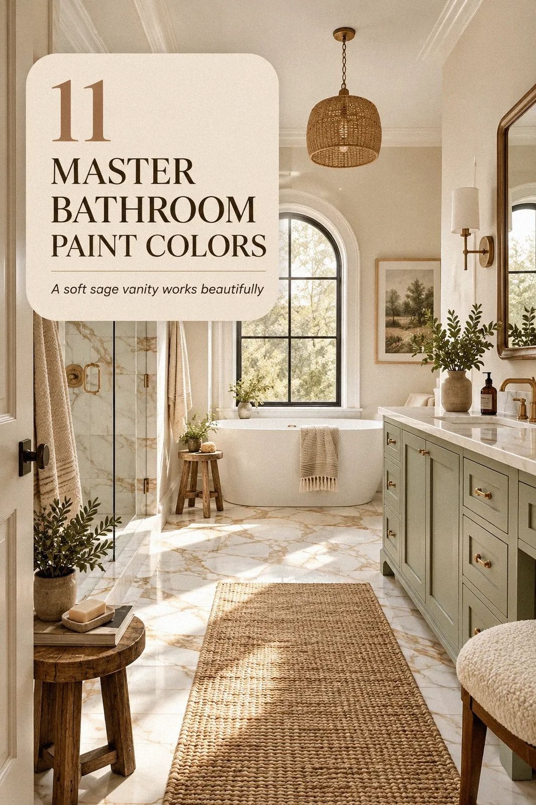
by Master bathroom paint colors can make the room feel warmer, calmer, or noticeably larger without moving a single fixture. I once chose a gray that turned lavender beside the vanity. It looked fine on the card and cold by morning. Your light matters more than the trend. These picks will help you choose with fewer regrets.
- Paint the Ceiling First for a Warm White Bathroom Design
- Layer The Light-Temperature Ladder in a Modern Greige Bathroom
- Test Benjamin Moore Chestertown Buff Against Natural Tones
- Choose Farrow & Ball Hague Blue Over Flat Gray
- Build The Three-Surface Pause Around Soft Minimalist Interior Design
- Swap Cool Gray for Sherwin-Williams Sea Salt
- Frame the Vanity With a Calm Contrast
- How Much Does a Neutral Bathroom Palette Cost?
- Anchor a Natural Tones Bathroom With Limestone
- Paint the Trim for a More Inviting Master Bath
- Mix Gray, Greige, and White Without a Muddy Finish
1Paint the Ceiling First for a Warm White Bathroom Design
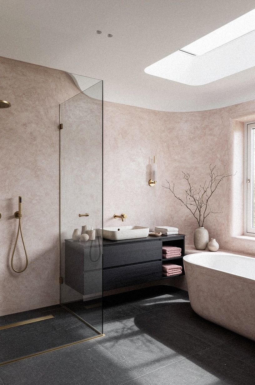
A warm white ceiling can make your bathroom feel taller without creating that sharp blue-white glare. I like Benjamin Moore White Dove OC-17 when the room has dusty rose walls, charcoal details, and soft brass. You’ll notice the difference beside hand-applied Venetian plaster, where subtle surface variation changes throughout the day.
Keep your walls slightly deeper than the ceiling so your eye can read the edges. A 32 to 36 inch vanity looks more grounded when the upper wall and ceiling don’t blur together. You don’t need dramatic contrast, but you do need a quiet shift in tone.
The room feels airy, not washed out.
Try a 600gsm Turkish cotton towel, a mirror with a slim charcoal surround, and one soft brass detail. The towel gives you texture without adding another color. If your bathroom has a low ceiling, I’d skip a dark top band because it’ll visually lower the room.
A ceiling sample is worth testing, too. Put a small painted board near the upper corner, then check it at breakfast, late afternoon, and after sunset.
You’ll see whether the white stays creamy or suddenly looks gray. That small test can save you from repainting the hardest surface in the room!
2Layer The Light-Temperature Ladder in a Modern Greige Bathroom
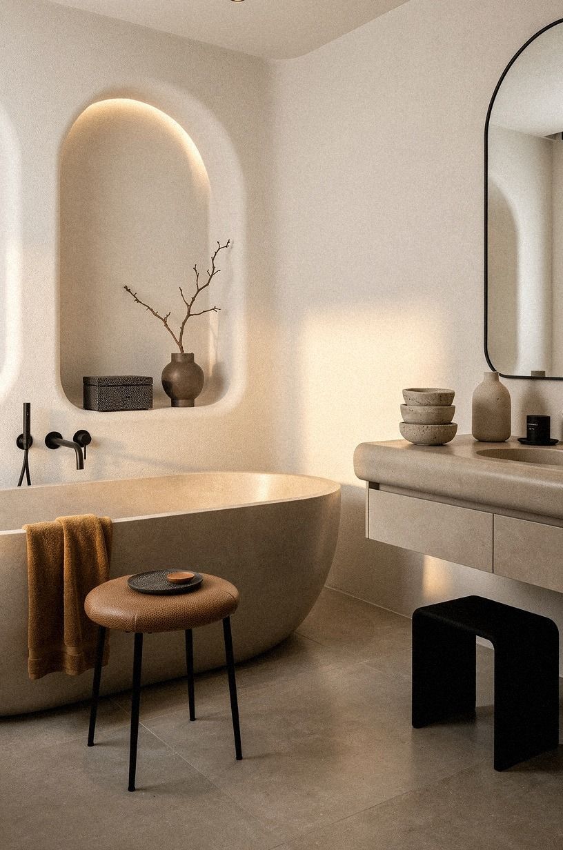
A warm white bathroom works best when you balance it with camel textiles and a few black accents.
3Test Benjamin Moore Chestertown Buff Against Natural Tones
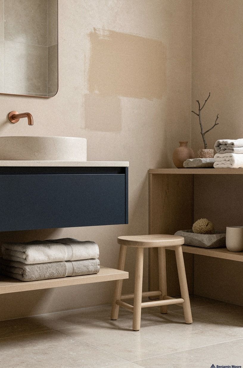
Benjamin Moore Chestertown Buff HC-9 brings a gentle tan note that looks especially inviting with midnight blue, copper, and ivory. It’s not a pale beige that disappears. Your bathroom will keep some color even when the mirror lights are on, which is useful if your fixtures are plain.
I’d sample it beside an ivory vanity with a midnight blue accent before committing. The paint’s ochre undertone can either flatter the deep blue or make the room look too yellow.
Paint two coats on a board and leave an ivory trim strip beside it. You’re checking the relationship, not judging the paint alone.
For a natural tones bathroom, use fewer competing finishes. A washed Belgian linen towel, a copper vessel, and one ivory stone tray are enough. Don’t pair this shade with too many orange finishes and bright yellow metal, or your bathroom may feel sleepy instead of warm.
These neutral limestone bathroom ideas show the same color logic with more texture. You’ll notice how a warm wall can feel composed when the stone has variation. I’d borrow that principle even if you’re working with a modest budget.
Chestertown Buff also rewards restraint. If you’ve got patterned floor tile, keep the towels plain.
If your vanity has visible grain, avoid adding several woven baskets. The color already gives the room a welcoming base, so you don’t need to decorate every empty surface.
4Choose Farrow & Ball Hague Blue Over Flat Gray
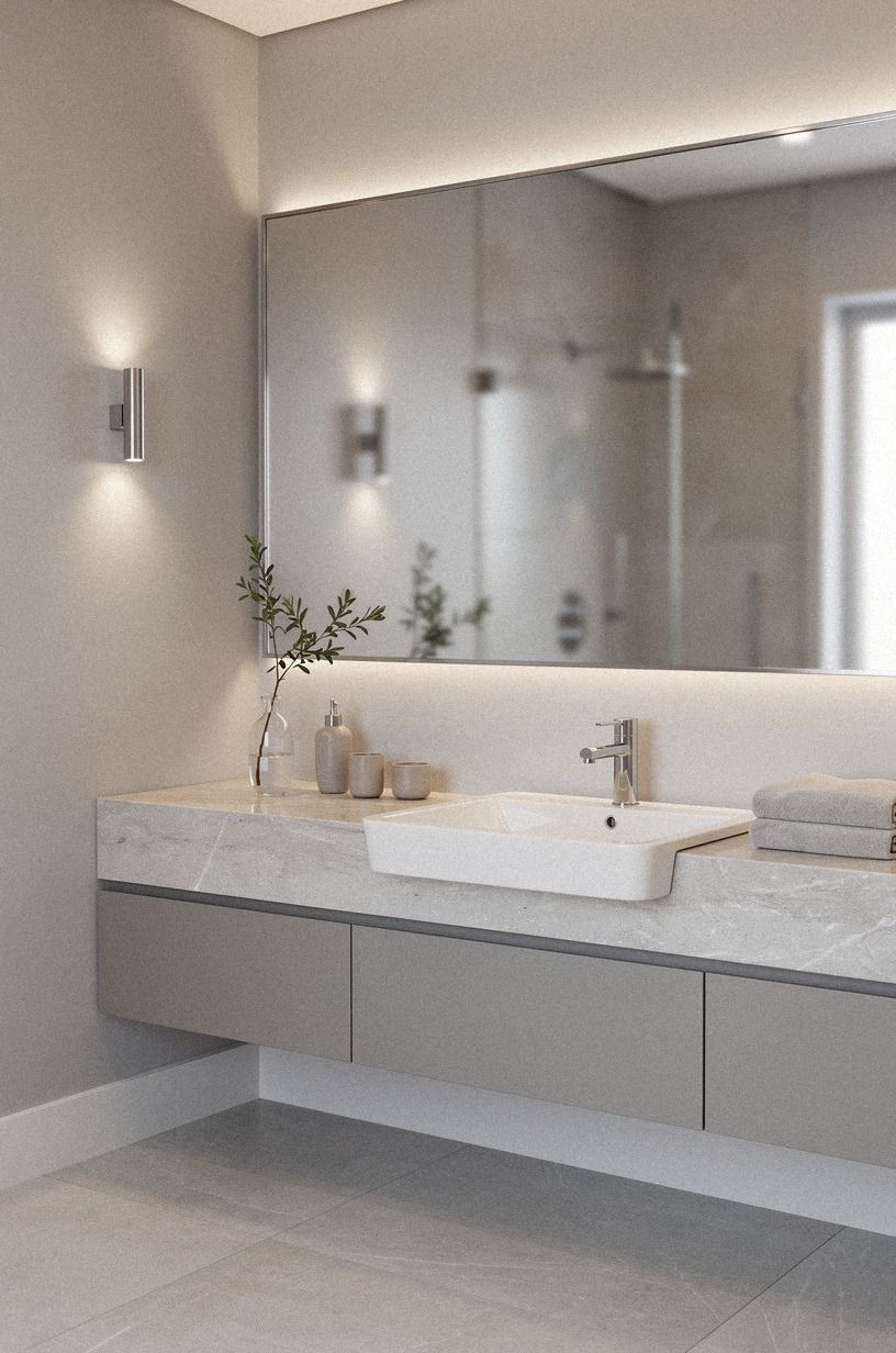
If your bathroom has warm cream tile and natural wood, Farrow & Ball Hague Blue No.30 can give the walls enough depth to make the fixtures look intentional. A sage green accent and organic bouclé can soften the contrast without making the room feel flat.
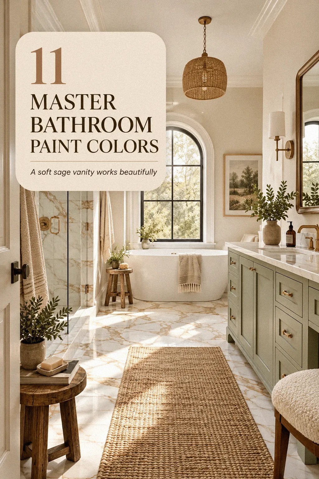
5Build The Three-Surface Pause Around Soft Minimalist Interior Design
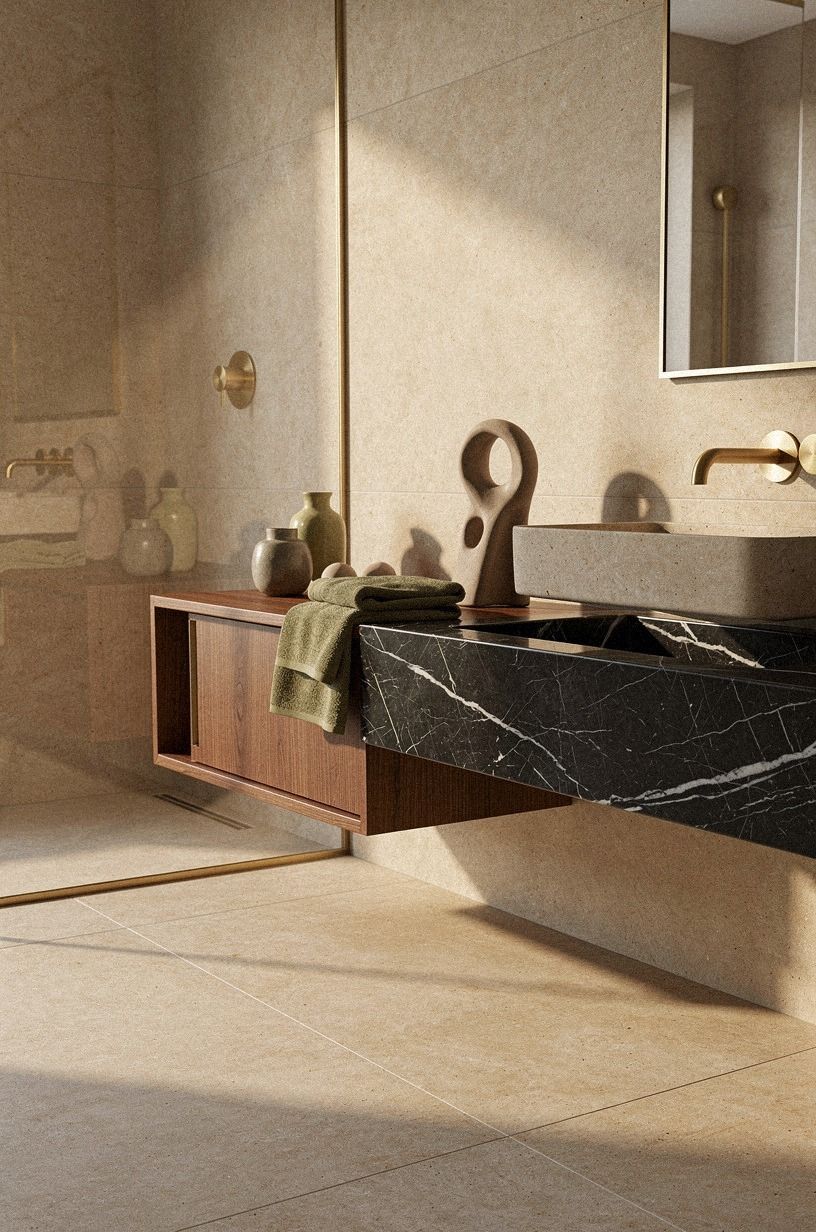
The Three-Surface Pause keeps a neutral bathroom from becoming a blur. Choose one wall color, one hard surface, and one textile shade, then let each one breathe. For example, terracotta walls, pale stone, and Nero Marquina black marble with white veins can feel warm without looking decorated.
You’ll want to pause before adding another beige object. Place your towels, rug, and vanity sample in the room for a full day.
Does the palette still look peaceful at 7 a.m.? Does it turn muddy beside the shower light?
Those answers matter more than the paint name.
I made the mistake of matching every neutral once, and the room looked flat despite the expensive materials. A 9 by 12 rug would overwhelm many bathrooms, so use a smaller washable runner where the door can clear it.
If you’re working around a freestanding tub, these master bathroom tub ideas can help you judge scale. You’ll see why a quiet wall color often needs one stronger material nearby. That might be a dark wood stool, a limestone ledge, or a mirror with a substantial surround.
The pause also helps you edit. If the room already has veined stone, wood grain, and a patterned floor, let the paint stay quieter.
If the fixed materials are plain, you can give the walls more personality. I’d rather see one intentional contrast than a collection of small accents competing for attention.
6Swap Cool Gray for Sherwin-Williams Sea Salt
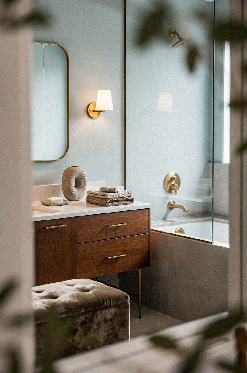
Sherwin-Williams Sea Salt SW 6204 is a smart choice when you want a pale color that can sit beside clay, linen, and aged brass. It can feel soothing with a deep-pile mohair velvet accent, but it won’t read the same in every room. Your daylight, floor, and bulbs will decide whether the green shows up.
I’d use Sea Salt with aged brass before pairing it with very cool metal. That contrast can work, but it needs a linen-toned or clay-colored element to connect the finishes. A simple vanity can keep the room practical while the wall color supplies the personality.
The Light-Temperature Ladder helps again: check the sample in daylight, under the vanity light, and with only the ceiling fixture on. If you’re hoping for a true blue-green, Sea Salt may feel too restrained. Still, it’s more forgiving than a cold gray, and it can make a small bathroom feel bright without turning stark!
You can also use Sea Salt as a bridge when your room has several fixed whites. It softens bright fixtures without making them look yellow. I’d keep the accessories simple and repeat the clay or linen tone only once in a towel or small ceramic piece.
7Frame the Vanity With a Calm Contrast

A vanity wall is the easiest place to make a paint decision feel deliberate. Paint the wall behind the mirror in a deeper neutral, then keep the side walls lighter. Your eye will land where you want it to, and the mirror won’t float against a blank field.
For a modern greige bathroom, try plum walls with rose gold hardware and a Carrara marble countertop with subtle gray veining. The softer metal gives the room a lived-in note. I’d avoid shiny gold on every surface because the reflection can become busy beside a large mirror.
Leave at least 21 inches of clear floor in front of the toilet, and don’t let a decorative stool steal that path. You’re designing for morning traffic, not a staged room. A slim gray leather stool can work if your layout has room, but a simple wood perch may be the better call.
See these modern luxury master bathroom ideas for more restrained contrast. You’ll notice that the strongest rooms usually repeat a finish instead of scattering five unrelated ones.
If you’re unsure about a dark vanity wall, begin with a board behind the mirror. Live with it for two days. I’m more comfortable recommending a full accent wall after you’ve seen the color beside your actual countertop and lighting.
8How Much Does a Neutral Bathroom Palette Cost?
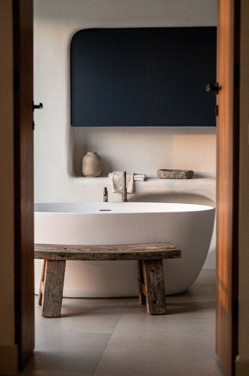
Paint is often the least expensive part of a bathroom refresh, but your full budget depends on whether you’re changing fixtures, tile, or plumbing. A paint-only update can stay close to the low end of your plans. If you’re replacing the vanity and lighting, the room moves into a different category quickly.
The table is a planning tool, not a promise. You’ll save more by keeping the plumbing where it is than by choosing cheaper paint. Reclaimed weathered teak can bring warmth beside navy walls, white fixtures, and walnut accents, but it needs the right bathroom-grade finish.
A neutral bathroom can be affordable, but it isn’t automatically inexpensive. If you’re comparing materials, look at the surface you touch every day first. A faucet listed at $120-$450 may matter more than a decorative tray.
This master bathroom remodel on a budget is a helpful companion. You’ll find that a $200-$800 cosmetic refresh can still feel substantial when your walls, mirror, textiles, and lighting work together.
I’d spend in this order: correct the lighting, buy enough quality paint for two coats, update the mirror or faucet, then add textiles. You don’t need to replace every fixture to make the room feel considered. A fresh wall color can expose worn hardware, so leave a little room in your budget for the detail that suddenly bothers you.
9Anchor a Natural Tones Bathroom With Limestone
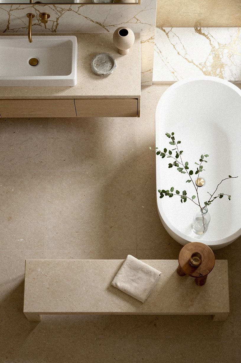
A warm stone surface gives a neutral bathroom a richer visual base than plain white tile. Use Calacatta marble with gold veining as a floor, shelf, or small wall accent if a full installation isn’t practical. Its cream ground and emerald or gold accents can keep your paint color from looking like it’s sitting on a blank box.
You’ll want to compare the marble sample with your paint at the same time. A yellow-beige wall can look too warm beside creamy stone, while a pale gray can make the gold veining appear too strong. I’d choose a quiet cream and let the surface variation carry the interest.
A comfortable shower needs at least 36 by 36 inches, so keep any ledge or stool from narrowing that footprint. If your shower is smaller, use the paint on the upper wall and keep the lower surface simple. That division can make the room feel less crowded.
This neutral zellige tile bathroom guide explains how irregular surfaces can support a calm palette. You’ll see why handmade-looking finishes don’t require a busy paint color. Let the marble or tile do the visual work.
Calacatta marble also needs practical consideration. Some varieties mark more easily than porcelain, and the finish may need sealing. I’d use it where you’ll appreciate the texture, then choose a durable, washable paint for the areas that receive the most condensation.
10Paint the Trim for a More Inviting Master Bath
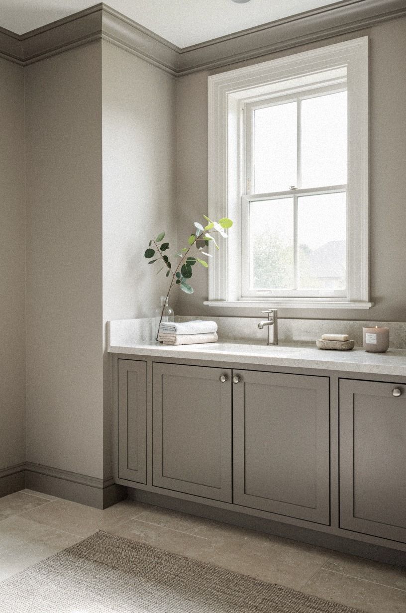
Trim color can change your paint choice more than people expect. Use a soft warm white on the baseboards and door casing when the walls are forest green. Your room will feel finished without the hard outline that bright white can create beside a deep color.
Try a forest green wall with warm white trim if you want a grounded combination. It’s bold, so the materials need to add interest. A cerused white oak vanity, a rust-colored textile, and a softly curved mirror can do that without crowding the room.
Don’t paint the trim darker just because the room feels plain. You’ll make every edge more noticeable, including uneven corners and tight transitions. Instead, repeat one finish at least twice.
A natural oak mirror surround and oak stool can give the warm bathroom design enough structure.
Less visual noise is calming, especially before coffee! If you’re repainting existing trim, clean it carefully first.
Dust, hairspray, and bathroom residue can make a beautiful color look patchy. I’d rather see one well-prepped coat system than several rushed layers.
When the wall and trim colors are close, the room can feel taller and quieter. That’s useful if you have a narrow layout or several doors. If your bathroom already has strong floor tile, keeping the trim soft prevents the edges from becoming another competing pattern.
11Mix Gray, Greige, and White Without a Muddy Finish
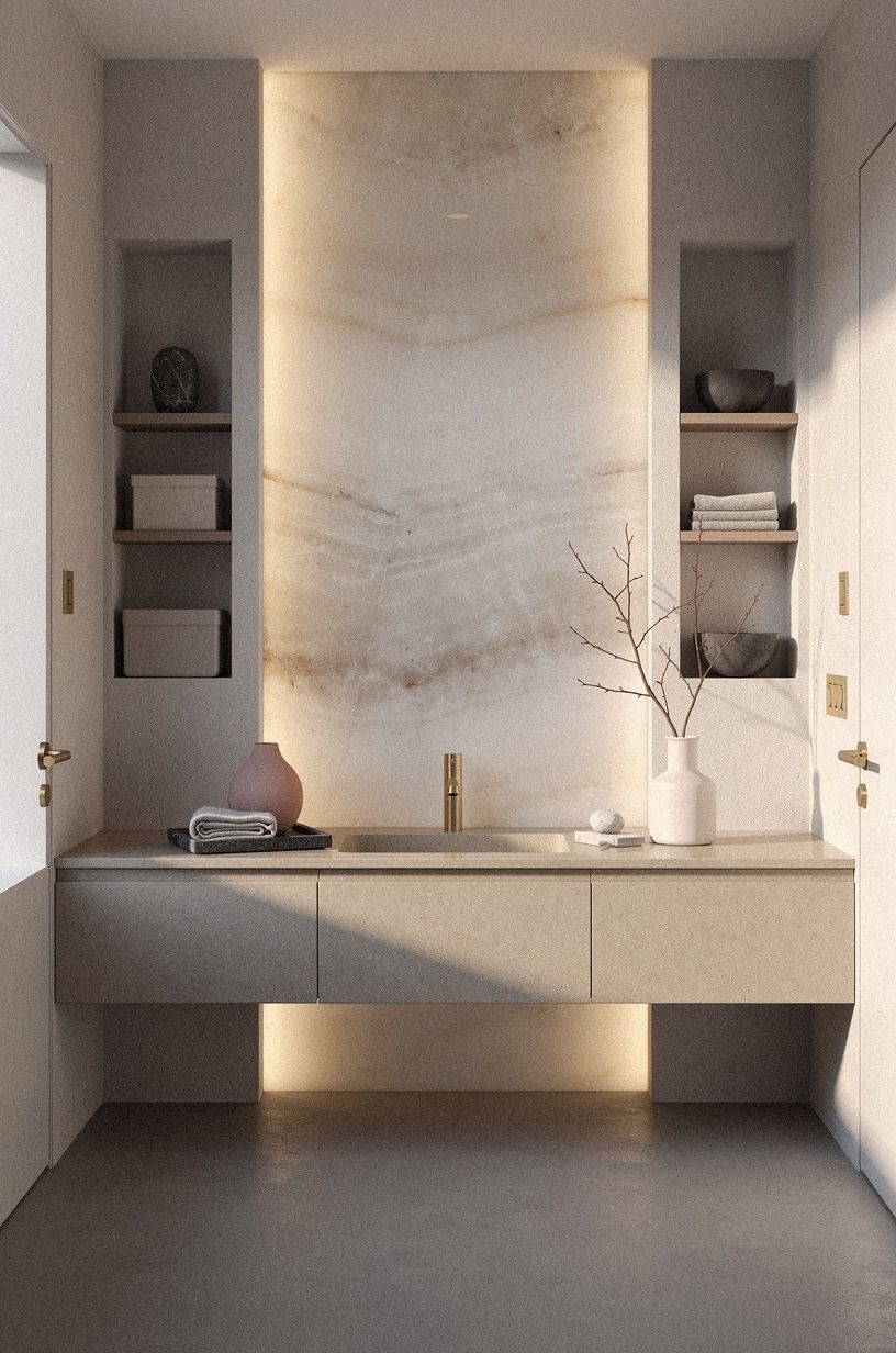
You can use gray, greige, and white together if each shade has a clear job. Let white belong to the fixtures, greige belong to the walls, and gray appear in a smaller material such as flooring or textiles. Your bathroom will feel layered rather than undecided.
The Three-Surface Pause applies here too. Backlit translucent onyx can bridge a dusty rose wall and charcoal tile, while a small charcoal stool and one brass fixture add weight. I’d skip three different gray paints because the undertones will compete around the mirror and shower.
Check the palette from the doorway first, then from the vanity. Does your eye settle somewhere?
If it doesn’t, remove one color before adding another object. A 60 by 30 inch standard tub already takes up visual space, so the room doesn’t need a crowded wall.
For a farmhouse direction, these modern farmhouse master bathroom ideas show how warm materials keep pale paint from feeling empty. You’ll notice that gray works better when it has a supporting stone or brass tone nearby.
I’d also keep the undertone families consistent. A blue-gray floor beside a yellow-beige wall can look accidental, even when both colors are attractive alone. Put your samples together in the actual room.
Your eye will catch the disagreement quickly.
A Simple Undertone Check Before You Buy
Take three large sample boards: one for the wall color, one for the trim, and one for the strongest fixed surface. Move them around the bathroom rather than leaving them in one convenient corner. You’ll see the color change near the window, beneath the vanity, and beside the shower.
Look for three things: does the paint turn pink, does it turn green, and does it become too dark after sunset? Your answer may change depending on the wall.
That’s normal. Bathrooms are small rooms with unusually reflective materials.
I’d avoid making a decision from a phone screen. Even a printed color card can mislead you when the room has glossy tile or tinted bulbs.
Give yourself at least one full day with the samples. If you’re still unsure, choose the color that behaves best with the fixed materials, not the one that looks most exciting alone.
What Your Fixed Materials Are Already Saying
Your countertop, floor, shower surround, and mirror surround have a color conversation happening before you add paint. A creamy countertop may need a warm white.
A blue-gray floor may need a cooler neutral. A wood vanity can tolerate more variation than a room filled with glossy white surfaces.
If you’ve inherited builder-grade tile, you don’t have to hide it with a complicated palette. I’d choose a paint that respects its undertone, then add one material with better texture. A linen shower curtain, oak stool, or stone tray can make ordinary tile feel more intentional.
Your goal isn’t to erase every undertone. You’re trying to give each finish a role. Once you see the room that way, choosing paint becomes less mysterious.
The Sample-Day Routine I Actually Use
On the first morning, look at the samples before turning on any lights. At midday, compare them near the vanity and shower. In the evening, switch on each fixture separately.
You’ll learn whether the color stays calm or starts shouting under artificial light.
I’d write a short note beside each sample: “too pink,” “good with oak,” “gray at night,” or “works with chrome.” Those notes are more useful than a vague feeling. If you’re testing several colors, label them clearly so you don’t accidentally fall in love with the wrong board.
On the second day, place your towels and accessories beside the samples. Your bathroom has to work with daily objects, not just an empty wall. If the color still feels right after that, you’ve probably found a reliable direction.
The Paint Choice I’d Defend
I’ve changed my mind about neutral bathrooms over the years. I used to think the safest answer was a pale gray with bright white trim, because it felt clean and seemed easy to coordinate. Then I lived with one.
In morning light, it looked blue. At night, the vanity bulbs made it look faintly violet.
Every towel choice felt wrong, even though the towels weren’t the problem.
Now I start with the room’s fixed materials. The floor, shower tile, countertop, and mirror surround already have undertones, whether you notice them or not.
Paint has to join that conversation. Farrow & Ball Hague Blue can make white tile feel crisp, while Benjamin Moore Chestertown Buff can make ivory, copper, and washed linen feel gathered.
Neither is universally better. The winner depends on what your bathroom is already saying.
I’m also less impressed by a perfectly matched palette. A bathroom needs a little friction.
Warm paint beside aged metal, pale walls beside a dark mirror, or soft green beside clean porcelain gives your eye somewhere to rest. That’s why I’d rather see one confident color and three quiet materials than six shades of beige competing for attention.
Your budget matters, too. If you have $200 to $1,200, spend first on paint, a mirror, a faucet, and textiles that touch your skin every day. If you’re already planning a $3,000 to $9,000 mid-range update, coordinate the vanity and lighting before choosing the final wall color.
If plumbing or re-tiled surfaces push the project toward $12,000 or more, take extra time with samples. A costly room deserves a color decision that survives changing light.
The practical lesson is simple: don’t pick a paint color from a screen and expect your bathroom to behave. Tape the sample beside the vanity, shower, and trim.
Leave it there. You’ll see the undertone before you buy the gallon, and that small pause can save an entire Saturday.
The Budget Decision That Changes the Result
If you’re working with a smaller budget, keep the plumbing and floor where they are. Paint, lighting, textiles, and a mirror can change the mood without turning the project into a demolition exercise. I’d rather see a carefully tested wall color with modest fixtures than expensive materials fighting under poor lighting.
If you’re already replacing tile or a vanity, choose those materials before you finalize paint. The fixed finishes will cover more visual area and will be harder to change later. You’ll get a better result when the paint supports them instead of trying to rescue them.
What People Always Want to Know
What are the best master bathroom paint colors for a small bathroom?
Sherwin-Williams Sea Salt SW 6204 and Benjamin Moore White Dove are strong small-bathroom choices because they keep the room light without feeling icy. You’ll get better results when the vanity and mirror stay visually simple, such as a white cabinet with a slim surround.
How much does a neutral master bathroom makeover cost?
A small cosmetic refresh can run about $100 to $300 when you keep the existing mirror, vanity, and fixtures. Free changes include removing clutter, rearranging textiles, and testing your paint against daylight before buying more supplies.
Can I create a calm master bathroom on a budget?
Yes, and you can start with three low-cost moves: paint one strong wall, replace tired textiles, and change the mirror or lighting. A focused update usually works better than buying many small accessories that don’t solve the room’s undertone problem.
Is a neutral paint palette worth it in a small space?
Yes, because a small room lets one confident color do more work. A controlled palette can make the space feel calmer and more intentional. Keep the floor path open, use a mirror that reflects light, and avoid placing bulky storage beside the vanity.
Is master bathroom paint a good idea for a rental?
Yes. Choose removable changes such as peel-and-stick accents, a tension rod, temporary mirror film, and washable textiles.
You can also style a freestanding cart or stool without drilling. Check your lease before painting, and keep the original hardware safely stored.
Where I’d Start First
If I had to pick one, I’d start with Sherwin-Williams Sea Salt. It’s forgiving beside white fixtures, softer than a cold gray, and flexible when your lighting changes. I’d sample it beside your vanity, floor, and trim before you buy the gallon.
If your room has warm oak and stone, Benjamin Moore Chestertown Buff would be my next test. If you have strong daylight and want more drama, Farrow & Ball Hague Blue deserves a board of its own. The right choice is the one that still feels good when you’re standing in the room at 7 a.m. and again when the vanity lights come on at night.