
 by
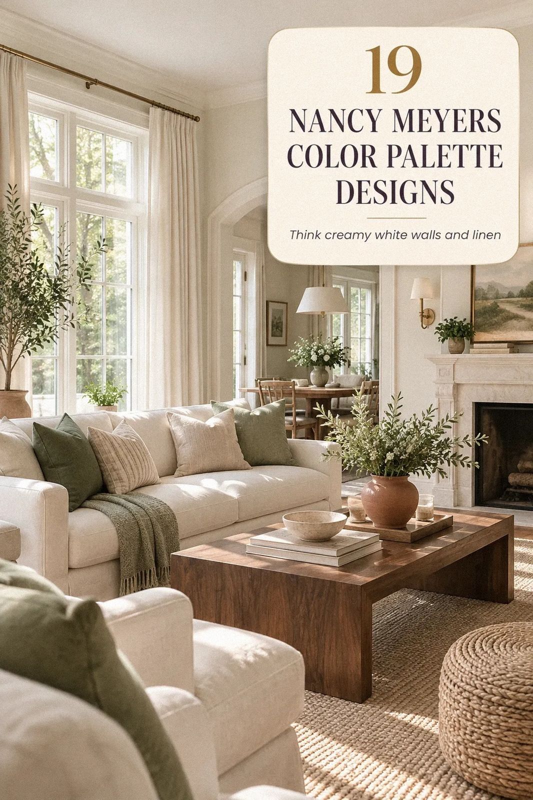
The Nancy Meyers color palette starts with warm whites, quiet taupes, and soft blue-grays that keep a room inviting without making it sugary. I once chose a cool white and spent weeks wondering why my oak floor looked orange. The fix was warmer paint, layered light, and fewer competing tones. Your room can feel collected without feeling staged.
- Paint Benjamin Moore White Dove for a shaded white living room
- Layer cream with the Two-Wood Rule
- Which warm neutral works best with oak floors?
- Use Sherwin-Williams Agreeable Gray in open rooms
- Frame a room with the Soft Trim Halo
- Paint a ceiling in warm ivory
- Mix taupe and blue in the Three-Undertone Stack
- Soften a white kitchen with warm greige
- Hang art at the Nancy Meyers eye line
- Ground off-white living room furniture with wool
- Float furniture with the Airy Perimeter
- Swap stark white for a creamy contrast
- Build the Three-Height Light Stack
- Repeat one color through the house
- Pair warm neutrals with unlacquered brass
- Warm a bedroom with painted trim
- Borrow the Contrast Instead of Adding More Color
- Frame a small room with pale walls
- Calculate what your warm neutral makeover costs
1Paint Benjamin Moore White Dove for a shaded white living room
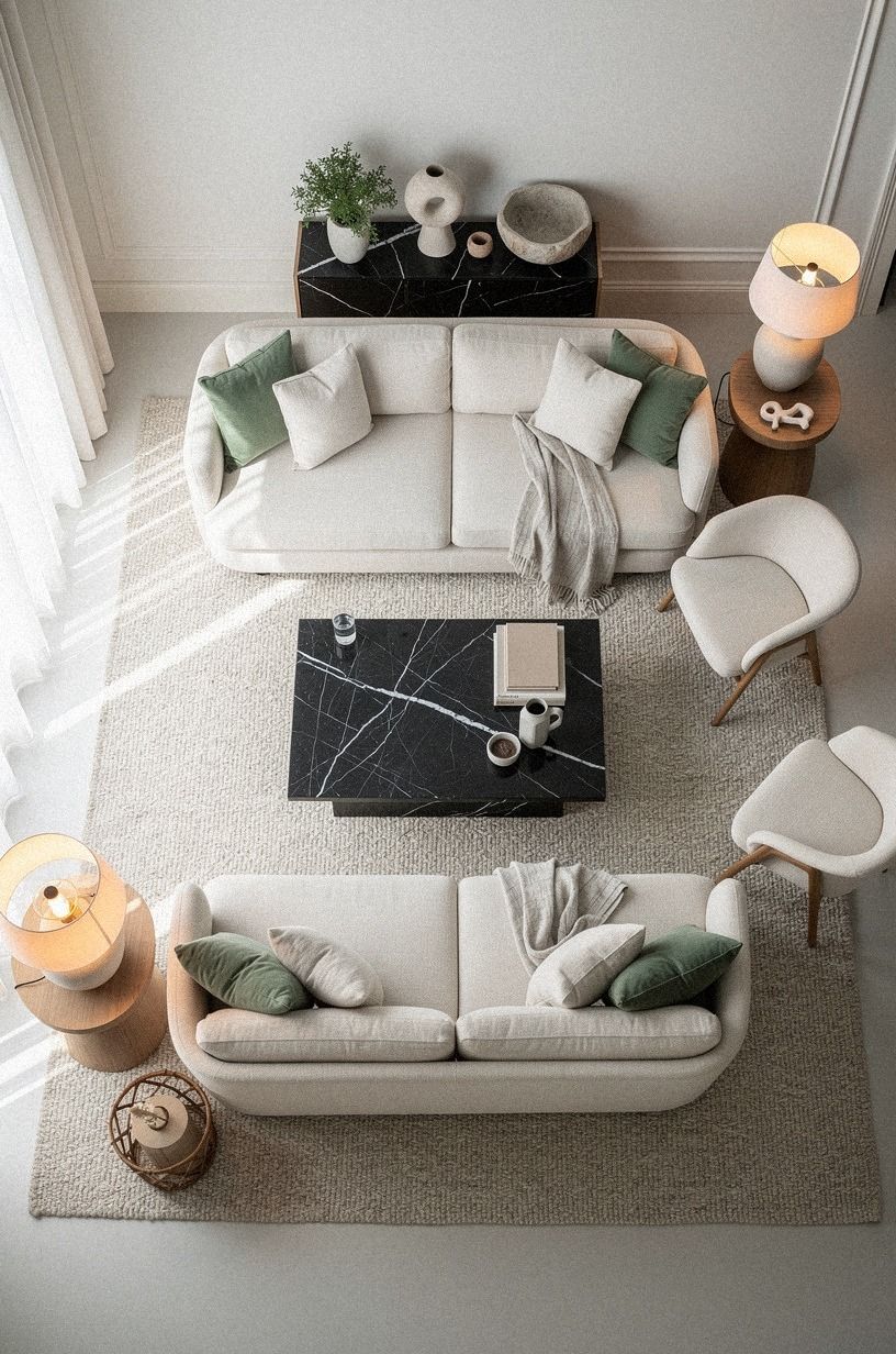
Benjamin Moore White Dove OC-17 is my safest starting point when you want warm walls that still look clean. It has enough cream to flatter sage green, natural wood, and Nero Marquina black marble, but it won't turn yellow beside a sunny window.
If you're working with a north-facing room, test it beside your trim before committing. I learned that a sample board tells you more than a tiny paint card ever will.
Use this shade on walls, ceiling, and trim when you want your room to feel calm and continuous. Your warm cream linen curtains will look softer against it, while a natural wood table keeps the palette from floating away.
A small Nero Marquina marble accent can add contrast without disturbing the softness. And if you're building the whole room around this color, my guide to Nancy Meyers living room ideas for cozy timeless comfort will help you balance the warm whites.
Try two coats over a properly primed wall. The finish matters, too. Eggshell gives your walls a gentle glow without making every uneven patch shout.
2Layer cream with the Two-Wood Rule
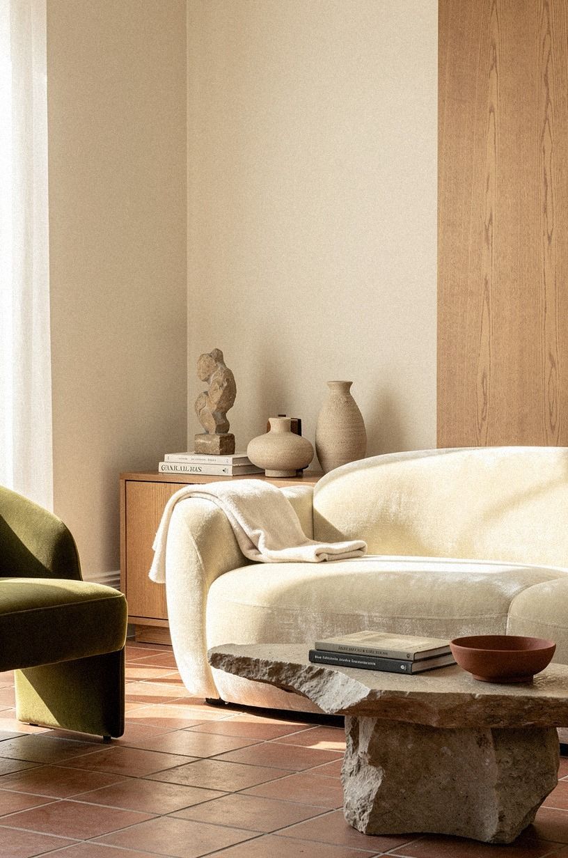
The Two-Wood Rule keeps a warm neutral room from looking like one beige blur. Choose one pale wood and one deeper wood, then let terracotta, stone, and olive bring the palette to life.
Your eye gets contrast, but the room still feels relaxed. I wouldn't add four wood tones, because the grain starts competing instead of settling the space.
Start with a lighter wood coffee table and bring in a deeper wood frame, stool, or cabinet. Add a deep-pile mohair velvet chair or cushion in a warm neutral so the room gains softness without becoming flat. If you're styling a small room, let the lighter wood occupy the larger surface so your floor doesn't feel heavy.
And if your furniture collection already leans pale, you don't need to replace everything. Your existing IKEA KALLAX birch-effect storage can work beside a darker wood tray or side table, especially with an olive textile nearby. See these Nancy Meyers home interiors with a warm timeless look for the layered effect I mean.
3Which warm neutral works best with oak floors?
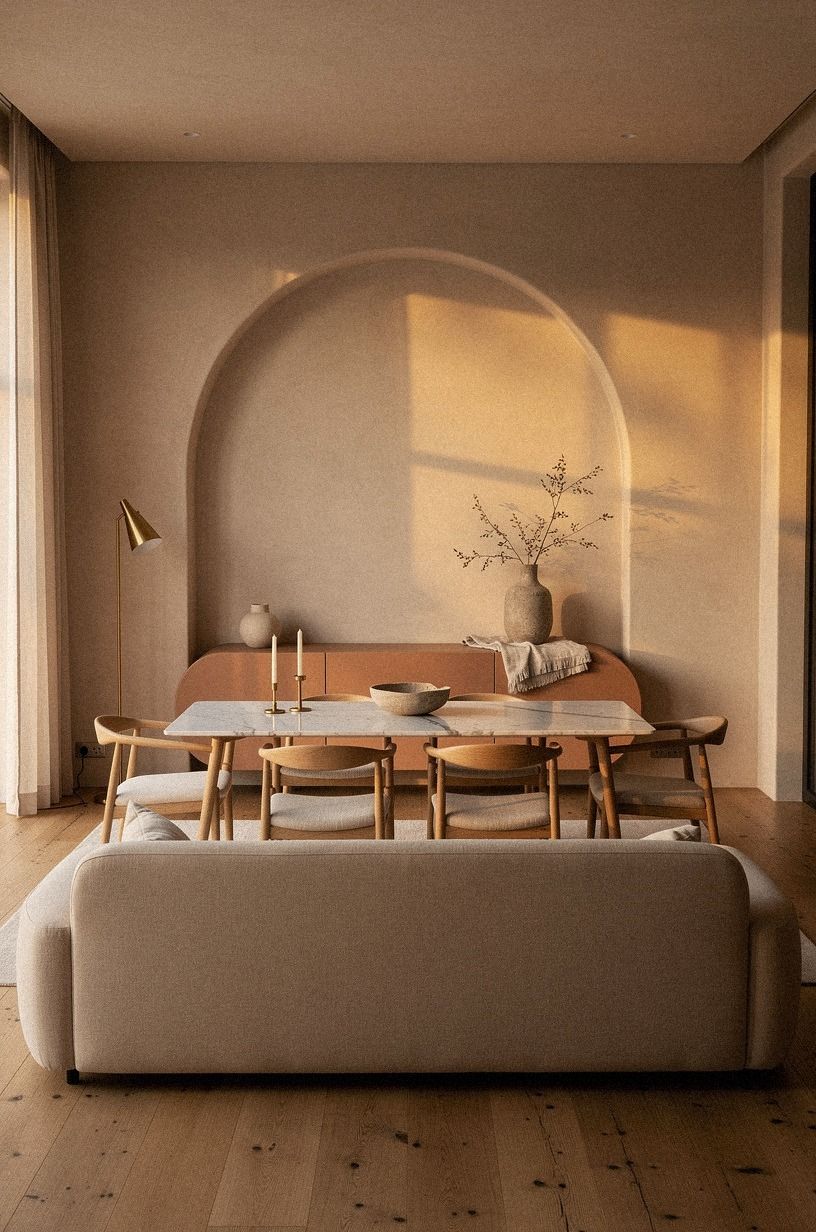
For orange oak floors, I prefer Farrow & Ball Pigeon No.25 over a bright cream. Balance it with clay, linen, and aged brass so the floor feels intentional rather than overly golden. A Carrara marble surface with subtle gray veining can cool the arrangement gently without making the room feel stark.
4Use Sherwin-Williams Agreeable Gray in open rooms
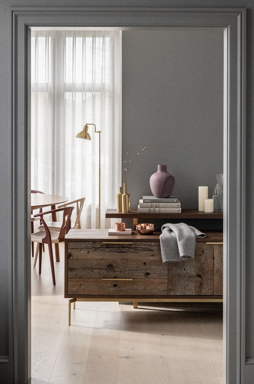
Sherwin-Williams Agreeable Gray SW 7029 earns its name because it shifts gently between beige and gray. I like it in open layouts where your kitchen, dining area, and living room need to speak to one another. You're getting warmth without a strong yellow cast, which makes it easier to pair with plum accents, soft gray upholstery, and rose-gold details.
Keep the trim lighter, but don't automatically choose stark white. A soft off-white will make your walls feel considered, while a brilliant white may look disconnected. If you're using Agreeable Gray in a hallway, repeat it in a nearby room so your sightline doesn't break.
The shade works with reclaimed weathered teak, rose gold, and gray textiles. Your room will feel more welcoming when the surfaces have small variations for light to catch. Read this Nancy Meyers entryway guide for a warm first impression if your open plan begins at a narrow entrance.
5Frame a room with the Soft Trim Halo
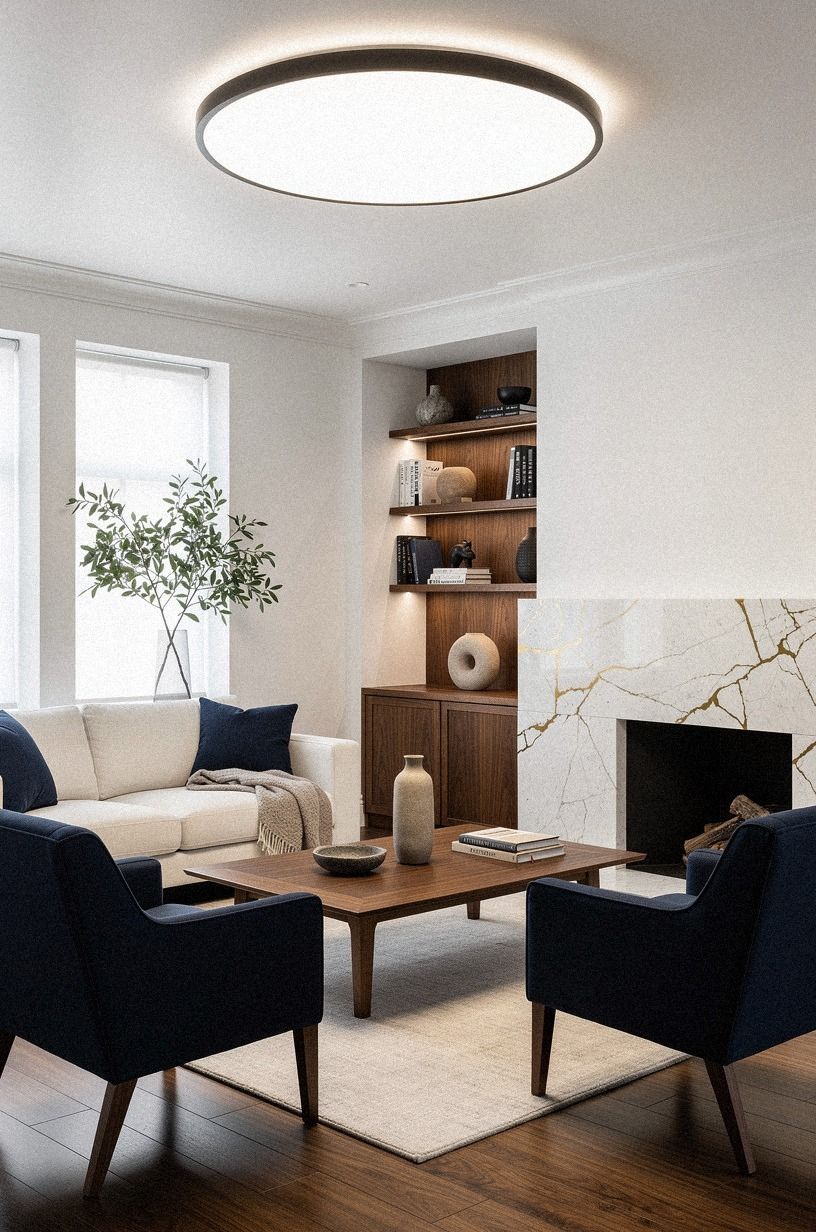
The Soft Trim Halo means choosing trim that supports your wall color instead of cutting across it. Use a warm white beside taupe, greige, or pale blue-gray, and keep the sheen consistent enough that your eye notices shape before contrast. I prefer this approach when you're working with older doors and uneven casing.
Paint your baseboards, door frames, and crown molding one shade lighter than the wall, or use the same color in a different sheen. Your Benjamin Moore White Dove walls can take White Dove trim without looking flat if the wall is matte and the trim is satin. A navy accent, walnut furniture, or Calacatta marble with gold veining can add structure without creating a hard edge.
Don't use high-gloss trim simply because it reflects more light. It can make dents and brush marks obvious, especially if your home has been lived in for years. If you want a stronger frame, repeat walnut or a restrained gold detail rather than adding a cold black stripe.
6Paint a ceiling in warm ivory
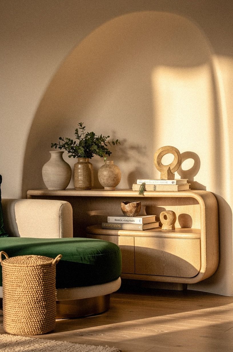
A warm ceiling can make your neutral walls feel taller and softer. Pair the ivory with emerald accents and restrained gold so the room gains depth without losing its cream foundation. Cerused white oak is a beautiful way to carry that warmth into the furniture.
7Mix taupe and blue in the Three-Undertone Stack
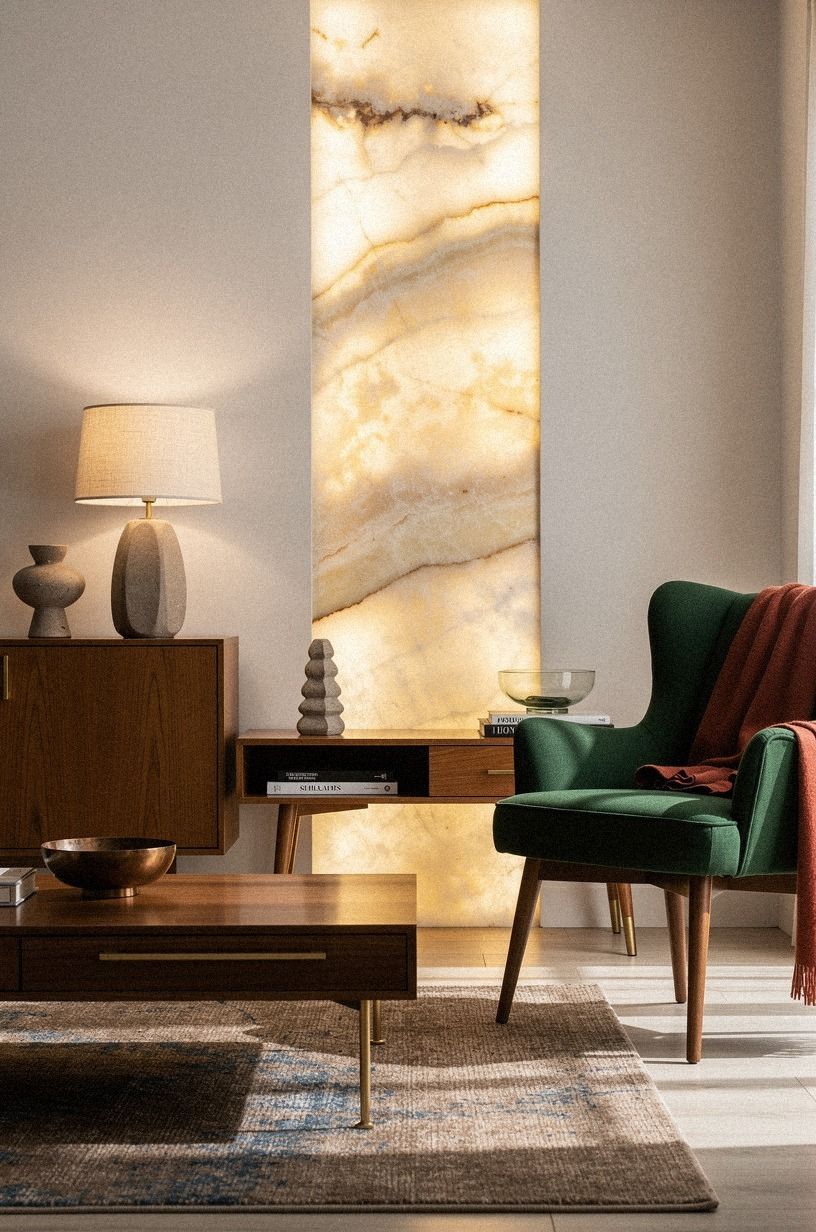
The Three-Undertone Stack uses one warm neutral, one softened blue, and one natural brown. Try Benjamin Moore Pale Oak OC-20 with Farrow & Ball Pigeon, then bring in forest green, rust, and natural oak. Your room gets depth without relying on high contrast, and the colors change pleasantly as the daylight moves.
I wouldn't add a fourth major undertone just because a fabric looks charming in a store. If you're styling a sofa, rug, and curtains, let two pieces stay quiet while one carries the green or rust note. Otherwise your palette will feel busy before you've added art.
Use a backlit translucent onyx accent for a little glow, then balance it with nubby linen or another quiet textile. Your eye needs both smooth and rough surfaces. The Nancy Meyers look isn't about beige alone, as this complete Nancy Meyers aesthetic style guide makes clear.
8Soften a white kitchen with warm greige
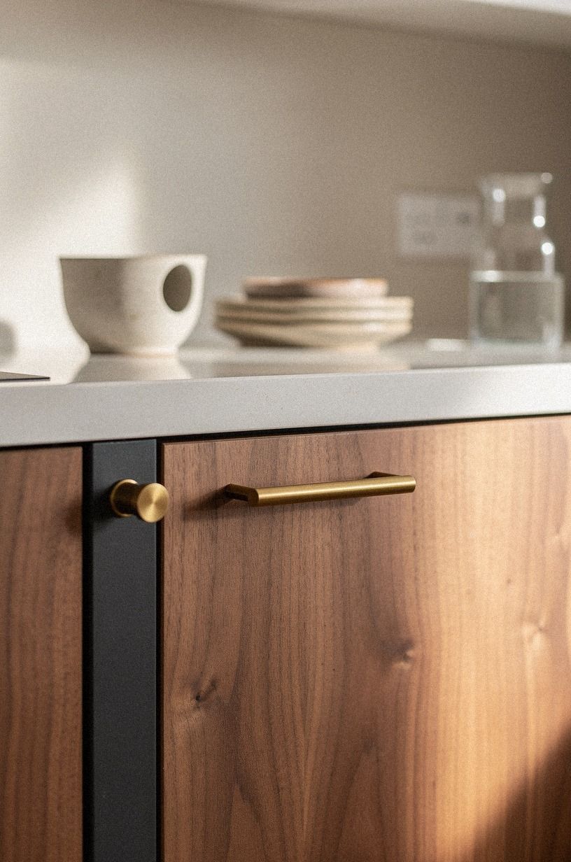
White kitchens can feel cold when every surface is bright and reflective. I prefer a warm greige on the walls or lower cabinets, especially beside dusty rose, charcoal, and brass. Sherwin-Williams Accessible Beige SW 7036 gives your kitchen enough warmth without turning the cabinets tan.
If you're painting cabinets, test the color beside your countertop, backsplash, and floor. Your materials won't stay visually separate once the room is lit at night. A small sample may look calm in daylight and muddy under a 2700K bulb, so move it around before you decide.
And don't forget the dining area. A book-matched walnut panel, linen runner, and brass pull can make the kitchen feel connected to the rest of your home.
Warm light wins! For more ideas, use these Nancy Meyers kitchen ideas for a warm and inviting look.
9Hang art at the Nancy Meyers eye line
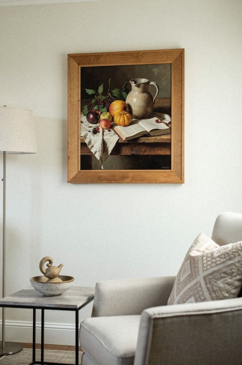
Art changes how your warm neutral walls read, so hang it with intention. The center should sit about 57-60 inches, or 145-152 cm, from the floor.
That height keeps your artwork connected to your eye rather than stranded above the sofa. I lower art more often than I raise it, and your room usually feels calmer for it.
Choose oil landscapes, muted still lifes, or artwork with a warm white, camel, and black palette. You don't need every piece to match, but your collection should share one quiet thread. Warm travertine can reinforce the palette on a console or side table without competing with the art.
A single oversized piece can be more convincing than six tiny prints. Your art should give the neutral paint something to hold onto, not create a second gallery wall. Start with one piece you would keep even if you repainted tomorrow.
10Ground off-white living room furniture with wool
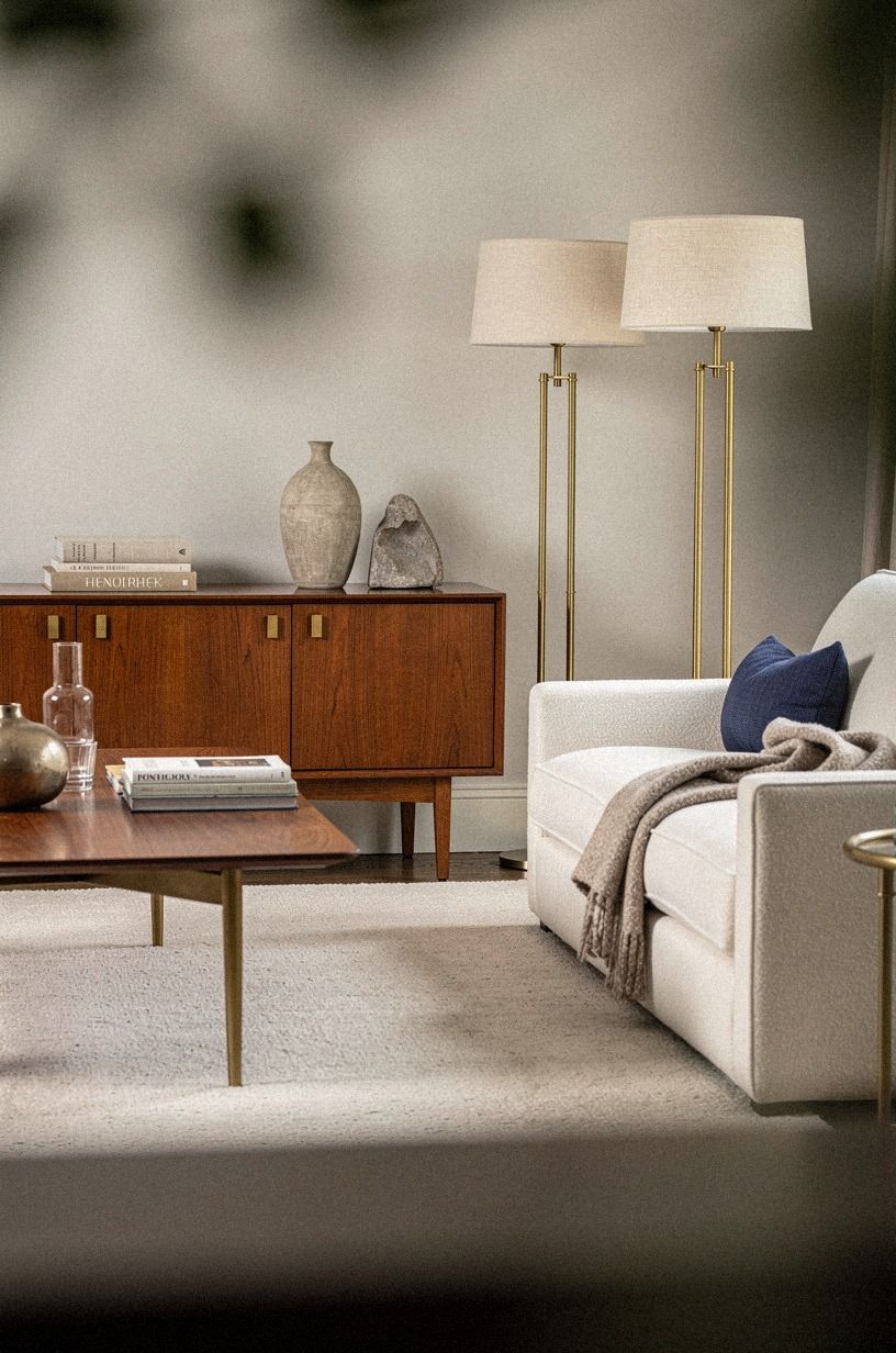
Off-white furniture needs a grounded base, or your room can begin to feel weightless. I like a hand-knotted wool rug with enough variation to hide daily crumbs and pet evidence. Make it large enough that the front legs of your major furniture overlap it, especially if you're arranging a sofa, chair, and coffee table.
Choose an ivory sofa beside warm walls, then introduce midnight blue and copper through a chair, cushion, or small table. Your neutral furniture won't look washed out when one surface has visible warmth. Unlacquered brass developing a gentle patina can add another layer without making the room feel polished or formal.
If you're starting with a rental, layer a smaller vintage rug over a flat woven base. Your floor stays protected, and you can take both pieces with you. This Nancy Meyers living room guide with cozy cream interiors has the right sense of scale.
11Float furniture with the Airy Perimeter
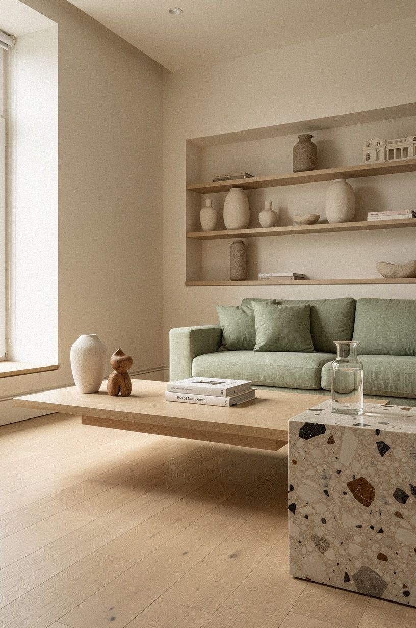
The Airy Perimeter leaves a little breathing space between your furniture and the walls. Keep the surrounding palette close to sage green, warm cream, and natural wood, then use oversized-chip terrazzo on a table or hearth for a grounded detail.
12Swap stark white for a creamy contrast
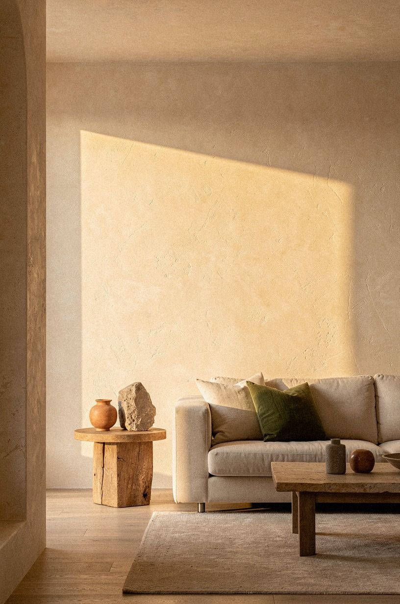
Stark white is useful, but it isn't automatically the warmest choice. Try a soft terracotta on a pantry door, reading nook, or built-in cabinet when your main walls are creamy white. The contrast is subtle, yet your cabinetry gains a little presence.
If you're choosing between creamy paint and pale gray, look at your fixed materials first. Stone, olive, and warm wood want a color with some body.
A hand-applied Venetian plaster surface can add the variation that flat paint sometimes lacks. Your room doesn't need one neutral everywhere, but each choice should answer something already present.
I wouldn't paint every surface cream without adding a deeper note. Use an olive textile or a stone-colored lamp base so your eye has somewhere to rest. Browse these Nancy Meyers nursery ideas for a soft timeless baby room for a gentle example of contrast.
13Build the Three-Height Light Stack
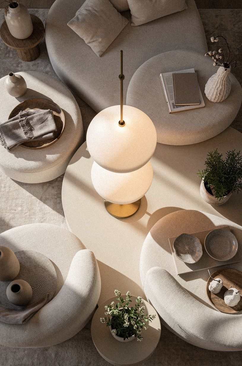
The Three-Height Light Stack combines overhead, task, and ambient light. The brief's useful standard is 3 sources per room, and I find that number enough to keep warm neutral paint from looking dull after sunset. Your ceiling fixture gives general light, a lamp handles work, and a low glow softens the edges.
Choose a linen drum shade for a diffused pool of light, then add a table lamp with a clay-toned base and a small aged-brass detail. Shagreen accents can add texture without making the room feel busy. If you're using only recessed lights, your walls may look flat and your furniture may cast harsh shadows.
Place the lowest light near the floor or on a console. Your eye will catch that gentle amber layer first, which makes the room feel inviting before you switch on every bulb.
But don't use blue-white bulbs with creamy paint. The colors will argue all evening.
14Repeat one color through the house
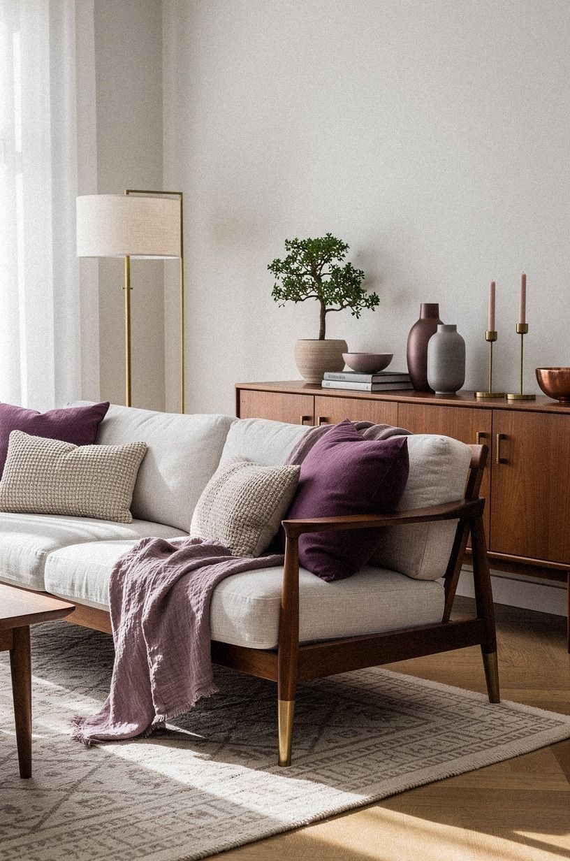
Repeating one muted color makes separate rooms feel related. Plum, soft gray, and rose gold can move from one room to another through small details, while washed Belgian linen keeps the palette relaxed.
15Pair warm neutrals with unlacquered brass
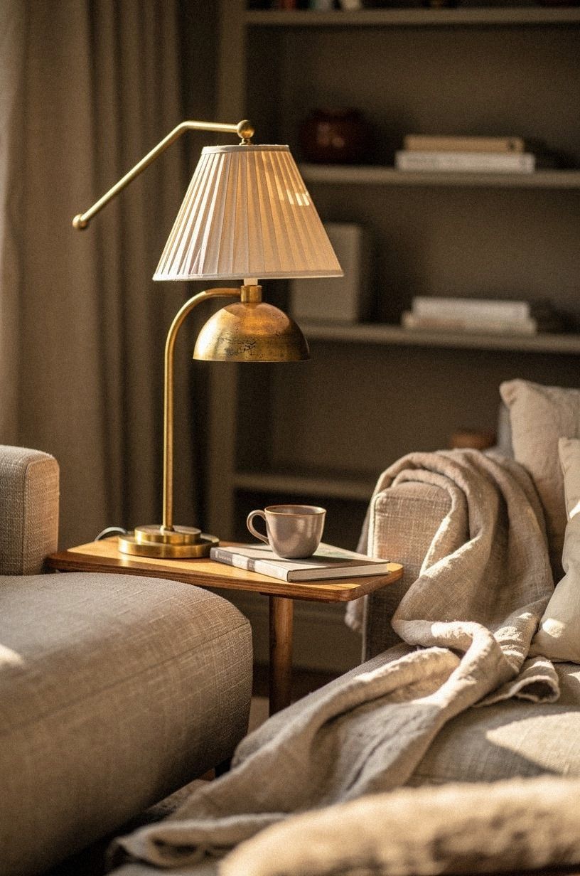
Unlacquered brass brings a soft golden note to warm neutral paint, especially as it develops a gentle patina. I prefer it to polished yellow brass when you're aiming for a relaxed, collected room. Your hardware should look better after years of touch, not demand constant polishing.
Use unlacquered brass on cabinet pulls, a mirror frame, or a small picture light. If you're updating a kitchen, repeat it on only two or three details so the finish doesn't become a theme park. One faucet, a few pulls, and a lamp are usually enough.
I wouldn't place brass beside every warm color in the room. Balance it with navy, white, walnut, and organic bouclé. Your eye needs a quieter surface between each glow.
This Nancy Meyers entryway inspiration shows how a small brass moment can welcome you without shouting.
16Warm a bedroom with painted trim
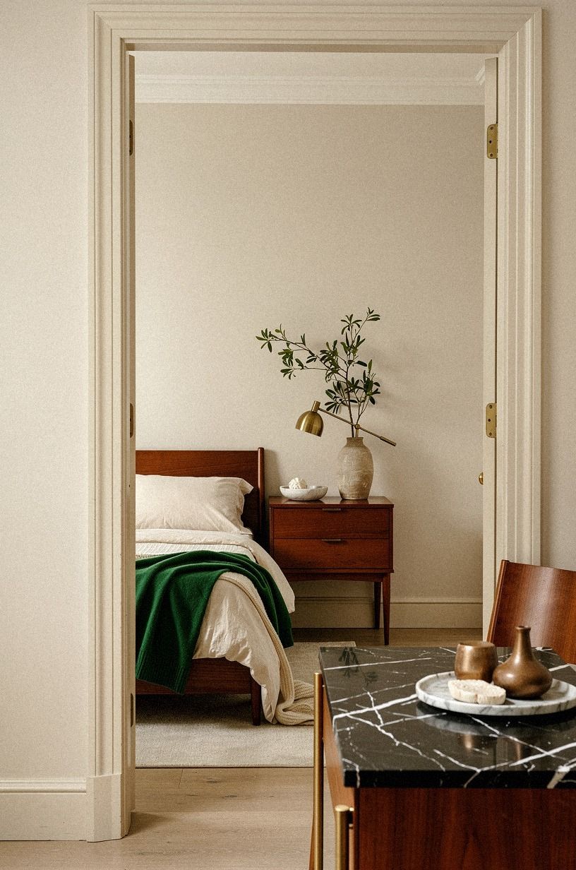
Painted trim can make a bedroom feel quieter than bright white casing. Use Farrow & Ball Bone on the trim with a slightly deeper beige on the walls, or reverse the pairing if you want the architecture to recede. Your bed will feel more enclosed, which is useful when you want a restful room.
Add emerald and cream through the headboard, bedding, or one lumbar pillow, then bring in a gold lamp for warmth. A small Nero Marquina black marble detail can ground the arrangement without requiring a dramatic dark wall.
I don't think every bedroom needs a strong color block. A gentle contrast can feel more generous.
Keep your window treatments full length. Hang the rod 4-6 inches, or 10-15 cm, above the frame and let the fabric fall to the floor. Your room will look taller, and the warm neutral palette will read as layered rather than plain.
17Borrow the Contrast Instead of Adding More Color
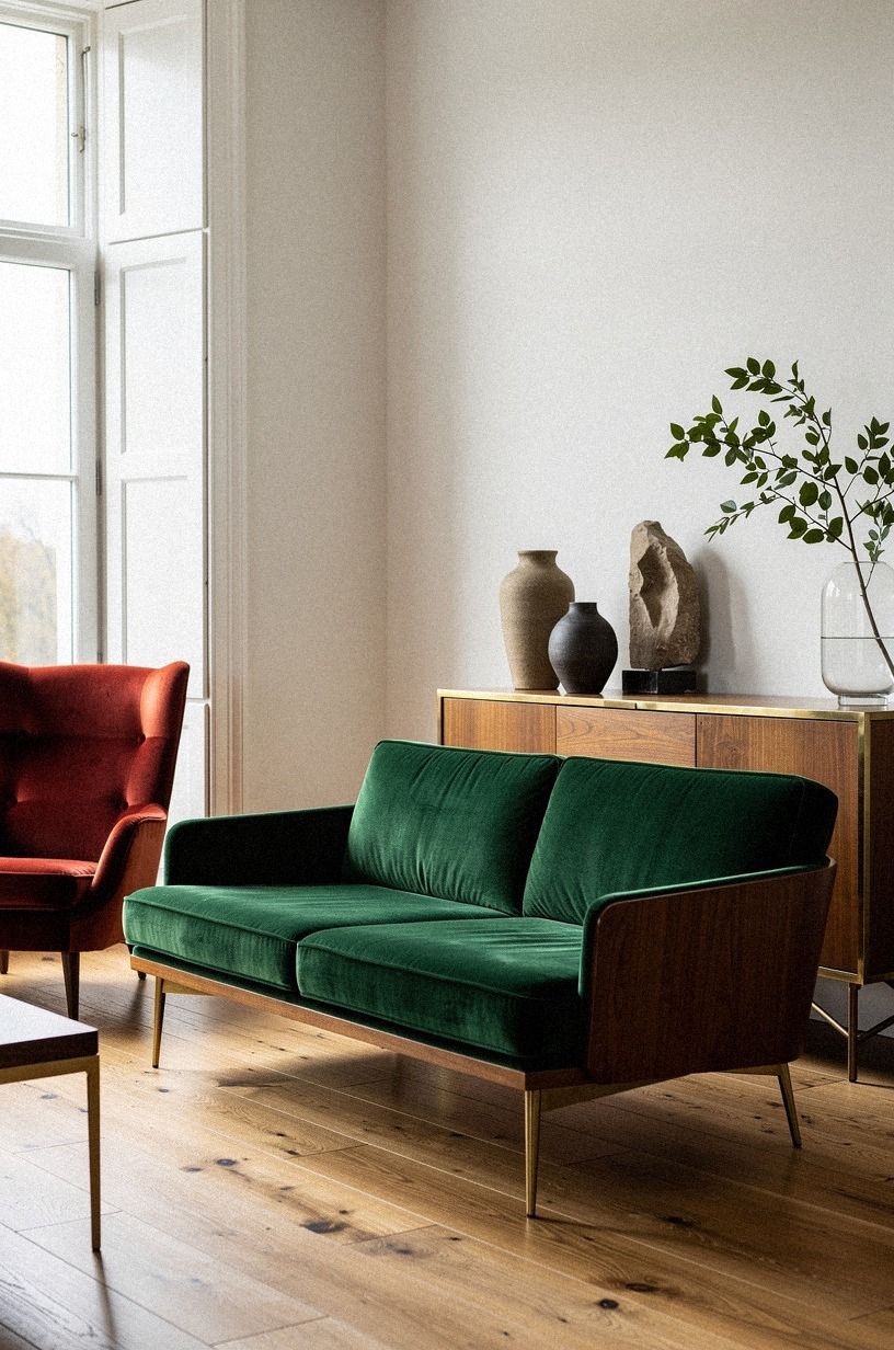
When your room feels flat, borrow contrast from texture before adding another paint color. A deep-pile mohair velvet chair, ribbed ceramic lamp, or woven basket can give your eye something to explore while the walls stay quiet. Forest green and rust add movement, while natural oak keeps the palette grounded.
If you're working with off-white living room furniture, add a natural oak side table and a rust-colored wool pillow before repainting. I often find that the missing ingredient is surface variation, not a new color. And if you're tempted to add bright blue, test a softer earthy color first.
Use one organic object, such as a branch in a stone vase, to soften the arrangement. Your room won't need a shelf full of accessories when the materials already carry interest. This Nancy Meyers home interiors reference has the restrained layering I would copy.
18Frame a small room with pale walls
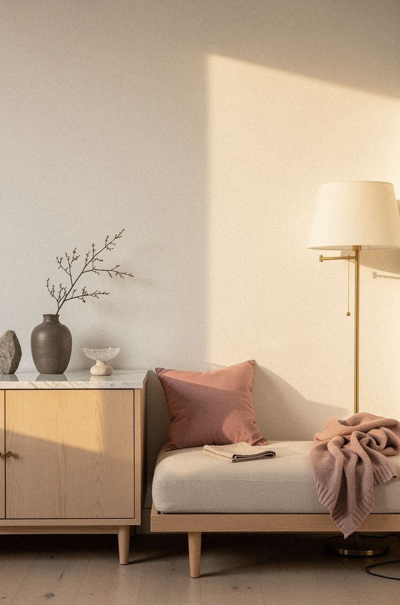
Small rooms benefit from pale warm walls because the color reflects light without making the room feel clinical. Dusty rose, charcoal, and brass can add definition, while Carrara marble with subtle gray veining keeps the space from feeling visually heavy.
19Calculate what your warm neutral makeover costs
Your palette can begin with paint and rearranging, but the full room cost depends on how much furniture and lighting you replace. I prefer spending first on the rug and the light sources, because your walls won't feel finished if the floor and evening glow are wrong. Use this table as a typical US planning guide.
For individual materials, a wool rug may run $400-$1,500, linen drapes for a pair $120-$400, a statement light fixture $150-$800, and DIY room paint $200-$600. You can spend less by keeping your sofa, shopping secondhand, and using your existing art. Your best first move is the one that fixes the room's biggest visual problem.
The Warm Neutral Choice I Stand Behind
I used to think the Nancy Meyers look depended on having a large kitchen, perfect windows, and expensive furniture. It doesn't. The real foundation is restraint: warm paint, useful lighting, wood that shows its grain, and enough empty space for the room to breathe.
Your budget matters, but your editing matters more.
I've also learned that the wrong neutral can make every later decision harder. I once chose a cool white beside honey oak, then tried to correct the chill with rugs, pillows, and lamps. None of it worked because the wall color was fighting the floor.
If you're stuck, test the paint beside your largest fixed material first.
My favorite rooms don't look assembled in one afternoon. They have a chair with worn arms, a bowl that isn't perfectly centered, and curtains that catch the last light.
That lived-in quality is worth protecting. You don't need to copy a movie set; you need to notice what makes your own home feel good when you're tired and the lamps are on.
And yes, the palette can be affordable. A painted cabinet, a secondhand frame, and one well-sized rug may do more for your room than a cart full of small decorations.
Your goal isn't to make every surface impressive. It's to make the whole room feel warm, useful, and settled. That matters!
What People Always Want to Know
What is the best Nancy Meyers color palette for a small room?
Benjamin Moore White Dove and Farrow & Ball Pigeon are strong choices because they stay soft without making your walls look yellow or gray. Your room will benefit from light furniture, a wool rug, and one darker wood piece. The IKEA KALLAX birch-effect line can add storage without visually closing in the space.
Where can I buy warm neutral pieces on a budget?
IKEA, Wayfair, and Target all carry useful neutral furniture and textiles, while Facebook Marketplace and thrift stores can provide older wood pieces with better character. Your best finds may need new paint or hardware. I wouldn't shop only one store, because mixed sources make your room feel less packaged.
How much does a warm neutral makeover cost?
A small refresh can cost about $100 to $300 when you keep your furniture and focus on paint, textiles, and rearranging. A broader US makeover may reach the $200-$800 budget tier. Your free changes include editing accessories, moving furniture, and using art you already own.
Can I create this look on a budget?
Yes, and you can begin without buying furniture. Test paint on cardboard, rearrange your room for better flow, and shop your own closets for linen, baskets, and lamps. Your next paid purchase should solve a visible problem, such as poor lighting or a rug that is too small.
Is a warm neutral palette worth it in a small space?
Yes, because a small room benefits from fewer visual interruptions and softer contrast. Keep your largest pieces close to the wall color, then add one darker wood or metal note. Your space will feel more open if the rug overlaps the furniture instead of stopping in the middle.
Is this palette a good idea for a rental?
Yes. Use removable wallpaper on one small surface, tension rods for full-length curtains, peel-and-stick art hooks, and washable textiles. Your walls can stay neutral while your accessories bring in Pigeon, terracotta, or olive.
For more renter-friendly ideas, browse the Nancy Meyers aesthetic style guide.
Where I'd Start First
If I had to pick one, I'd start with Benjamin Moore White Dove. It softens oak without turning yellow, so your rug, lamps, and artwork won't have to fight the walls. Pin White Dove for later and test it beside your floor before buying a full gallon.