Under-cabinet lighting ideas to brighten your kitchen can make a real difference for about $100 to $300, and my own kitchen proved it fast. I started this makeover because the room looked fine at noon and flat by dinner. One week later, the counters felt usable again. The whole space finally looked awake.
Here's what it looked like before
Before I touched a single wire, my kitchen had that frustrating half-finished glow you know the minute you walk in. The ceiling light blasted the middle of the room, but the counter edge stayed dim, the sink wall fell into shadow, and every evening task felt a little more annoying than it should have. I had olive lowers, decent stone counters, and upper cabinets that should have reflected light better, but they didn't.
The worst part was how uneven it felt. One corner looked yellow, another looked gray, and the pantry edge disappeared after 7 pm.
I kept adding lamps and pulling the roman shade higher, which told me the problem was never daylight. It was placement. My kitchen needed light down low, exactly where my hands were working.
- I started with one warm white test strip
- I mapped the shadows under every upper cabinet
- I chose slim bars for the sink wall
- I hid puck lights inside glass-front cabinets
- I ran tape lighting along the backsplash edge
- I added motion sensors by the coffee station
- I softened white cabinets with champagne light
- I tucked LEDs beneath the floating oak shelf
- I lit the marble prep zone extra bright
- I placed tiny spots over the stove niche
- I matched black fixtures to modern cabinet pulls
- I washed the tile backsplash with low glow
- I framed the pantry corner with vertical light
- I added toe-kick glow under base cabinets
- I kept the island side dark and moody
- I wired dimmers beside the cabinet switches
- I concealed every cord behind painted trim
- I finished with one evening-only warm scene
1I started with one warm white test strip
I began with a single warm white strip under the cerused white oak uppers, right over the stone counter and olive cabinetry, because I didn't trust my eye from showroom samples alone. If you're choosing between cool and warm, test the light in the exact spot where you chop, rinse, and set groceries down.
That one move will tell you more than any package claim. My strip cost $24, and within ten minutes I could see why the old overhead wasn't solving anything.
The warm cast picked up the terracotta accents and the exposed white wall instead of flattening them. But here's the part that mattered: the counter edge looked cleaner, not yellower.
In a white interior kitchen, that distinction is everything. I would have skipped daylight bulbs here, because stone and oak need softness to read expensive.
If your cabinets have warmth in them, let the lighting agree. If you love warm timber kitchens, oak kitchen cabinet ideas for a warm modern look is worth opening in another tab.
2I mapped the shadows under every upper cabinet
Next, I stood at the kitchen entry and marked every dark run under the uppers with painter's tape, almost like drawing a route for my future light.
3I chose slim bars for the sink wall
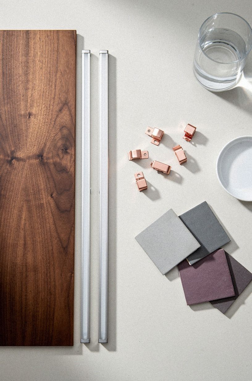
For the sink wall, I went with slim light bars instead of a wider fixture because the visible sink edge already pulled focus and I didn't want the hardware to look chunky. If your kitchen room design has a long wet zone, a low-profile bar keeps the task light steady without cluttering the line under the cabinets. I held one bar beside a book-matched walnut sample and knew right away that a cooler finish would have fought the grain.
The rose-gold mounting clips looked pretty in the box, but I didn't use them on the final install. Too jewelry-like for a working sink wall.
The gray-plum tile swatches read richer under the slimmer bars, and the water line finally looked intentional instead of gloomy. I linked this decision mentally to my kitchen sink cabinet ideas to organize under the sink notes, because once the sink zone is bright, you notice every storage issue under it too.
4I hid puck lights inside glass-front cabinets
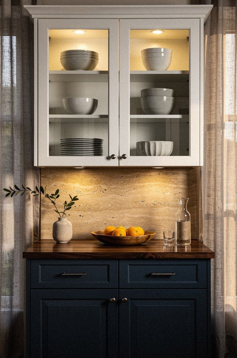
I didn't want the glass-front uppers to go dark at night while the counter glowed, so I tucked puck lights inside the cabinets and let them spill softly onto the travertine backsplash below. If you're working with glass fronts, hidden interior light gives you two jobs from one install: display and task support. My navy lowers and white uppers already had contrast, but the walnut counter line needed a bridge between them.
This is where I learned restraint matters. One puck per section was enough. Two looked busy and started throwing double highlights across the glass.
In a cabinet modern scheme, I'd rather see one warm pool than a row of little stage spots. You can borrow the same layered contrast from two tone kitchen cabinet ideas that add instant depth, especially if your uppers and lowers are already doing different visual work.
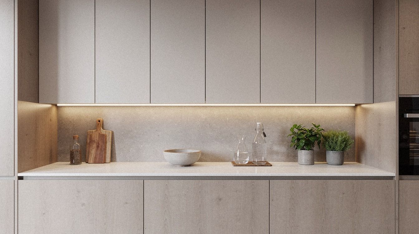
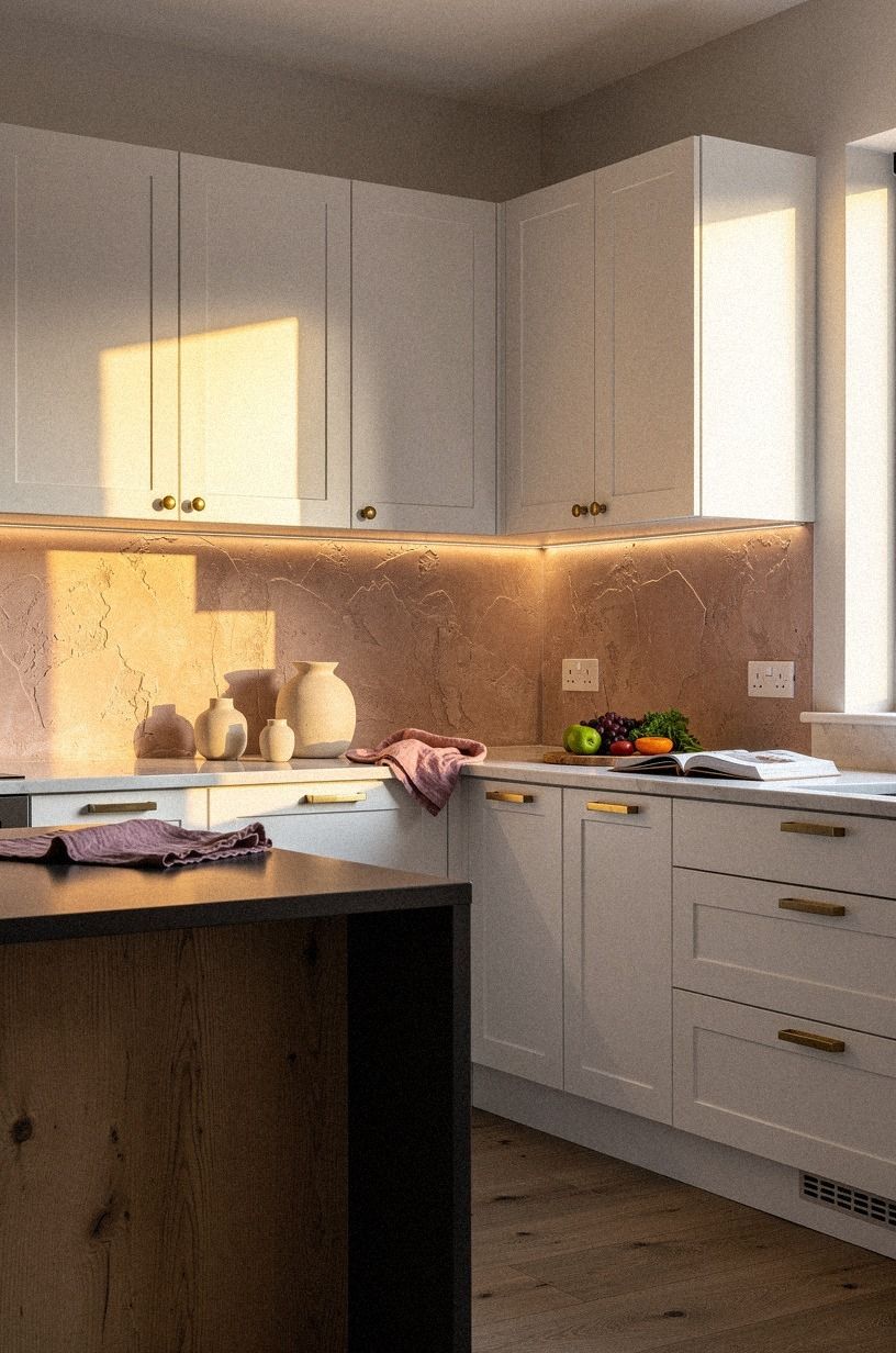
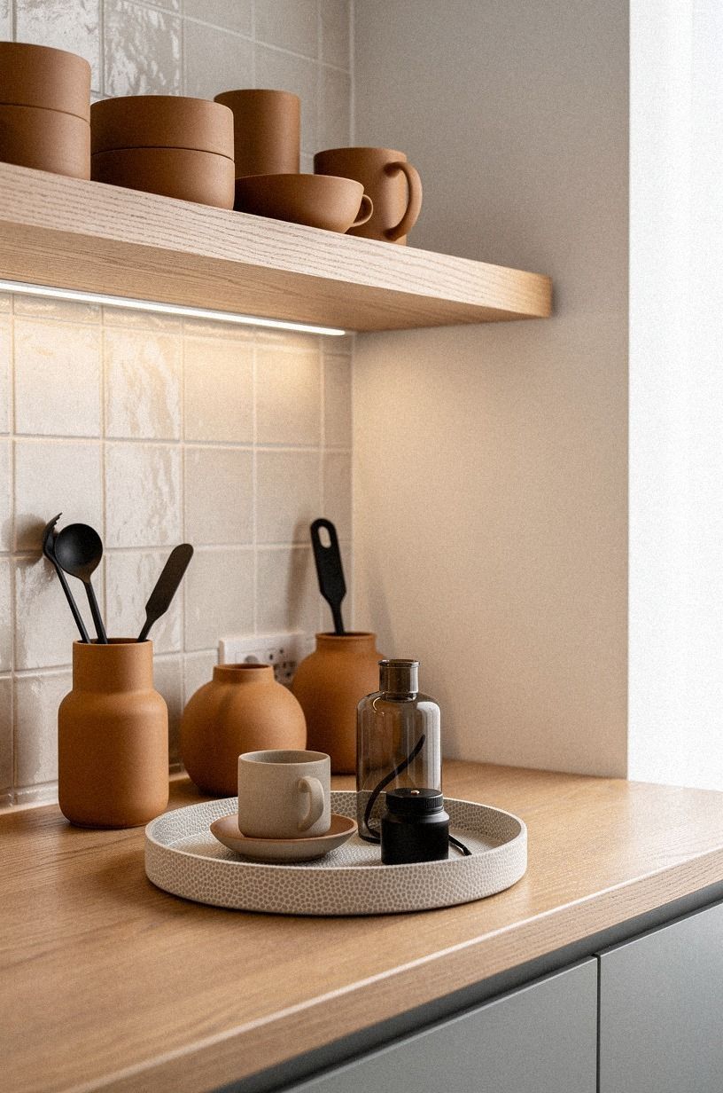
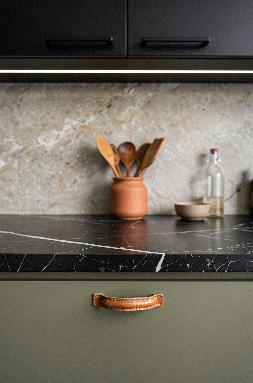
5I ran tape lighting along the backsplash edge
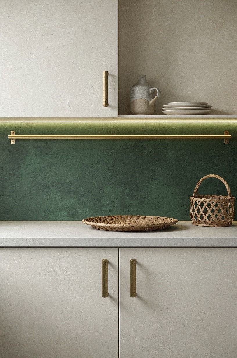
The prettiest result in the whole makeover came from running tape lighting right along the backsplash edge instead of centering it under the cabinet box. That placement made the wall finish do the work.
My emerald and cream backdrop, the unlacquered brass patina pulls, and the gold-toned shelf rail all picked up a soft wash that felt far more custom than the cost. If you have any texture in your wall, bring the light forward.
I used that move because the backsplash gap was a clean 18 in and the line could stay uninterrupted. A centered strip would have wasted the texture and left the lower half dim. And in a modern kitchen renovation, wasted texture is wasted money.
The wabi-sabi cups on the counter suddenly looked placed on purpose, which is what good light does. It edits the room without moving a single object!
I kept comparing that edge detail to two tone kitchen cabinet ideas that add instant depth because both moves rely on one sharp line doing a lot of quiet work.
6I added motion sensors by the coffee station
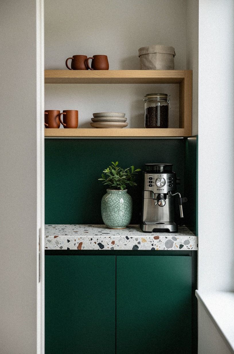
My coffee station was the one area I touched before sunrise, so motion sensors made sense there before anywhere else.
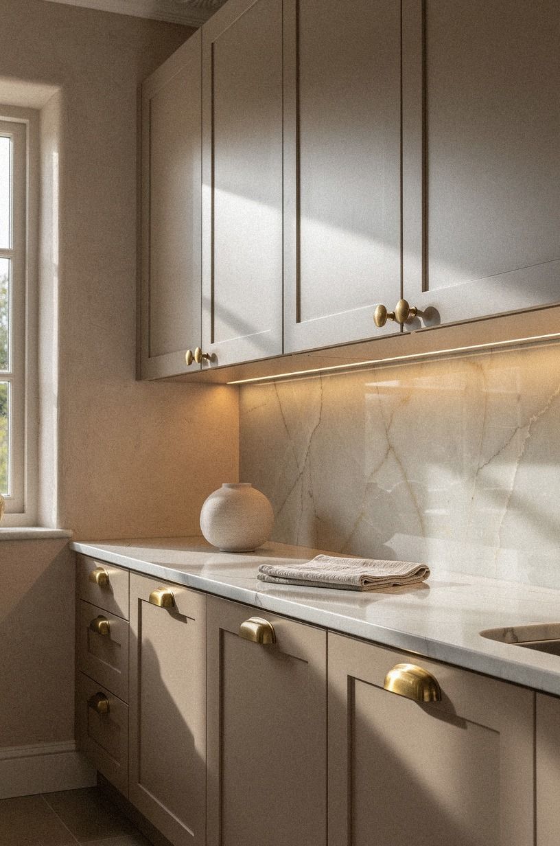
7I softened white cabinets with champagne light
White cabinets can turn hard under the wrong bulb, and mine were coming off sharper than I wanted by late afternoon. So I switched to a champagne-toned light under the uppers and let it wash across the Venetian plaster backsplash.
If your cabinets are painted Benjamin Moore White Dove OC-17, as mine were, neutral-warm light keeps them creamy instead of clinical. That shift was immediate.
The dusty rose accents stopped looking decorative and started looking grounded, especially against the charcoal island edge and brass hardware. I know some people chase the crispest white possible, but I would not in a family kitchen.
You need forgiveness in a room that lives hard. And the softer tone made the whole cabinet modern setup feel less showroom, more home.
Worth it. If you're juggling pale uppers with deeper lowers, two tone kitchen cabinet ideas that add instant depth helps you see why this warmth matters.
8I tucked LEDs beneath the floating oak shelf
There was one floating shelf near the side wall that always felt like it belonged to a different room. I fixed that by tucking LEDs beneath the wire-brushed oak shelf so the glow landed on the warm white backsplash instead of floating out into space. If you have open shelving mixed with upper cabinets, you need those two light sources to speak the same language.
Otherwise, the shelf reads like an afterthought.
My camel ceramics, black accents, and shagreen tray detail finally looked connected once that low line of light came on. I used 3/4-inch solid white oak for the shelf, and the grain held the glow beautifully. But I kept the strip hidden from standing height.
Seeing the diode line would have ruined the mood. For more on getting oak to feel current, I kept circling back to oak kitchen cabinet ideas for a warm modern look.
9I lit the marble prep zone extra bright
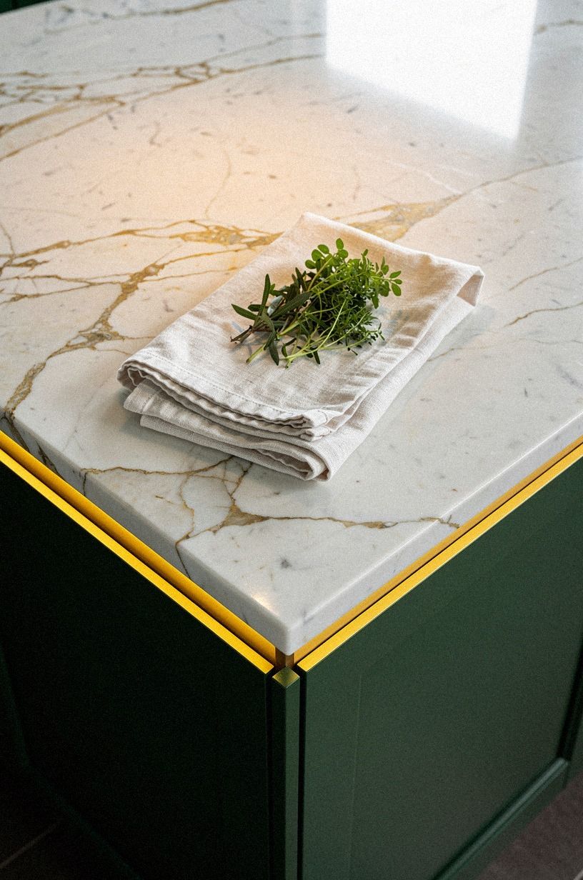
My prep zone needed the brightest setting in the room because that was the one place where pretty light alone wasn't enough. I set a stronger task bar over the ivory marble counter and tested it from a low angle toward the midnight-blue cabinets, just like I use the space when I'm trimming herbs or checking a knife edge. If you cook often, don't pretend every zone deserves the same output.
The copper details and washed Benjamin Moore White Dove OC-17 wall looked balanced only after I gave the prep strip more strength than the coffee side. Standard counter height is 36 in, and that working plane deserves proper visibility.
I wouldn't put a moody bulb here just to keep the room consistent. Who wants a bright sink and a gloomy cutting board?
For sleek inspiration, modern kitchen cabinet ideas for a sleek clean look helped me stay disciplined.
10I placed tiny spots over the stove niche
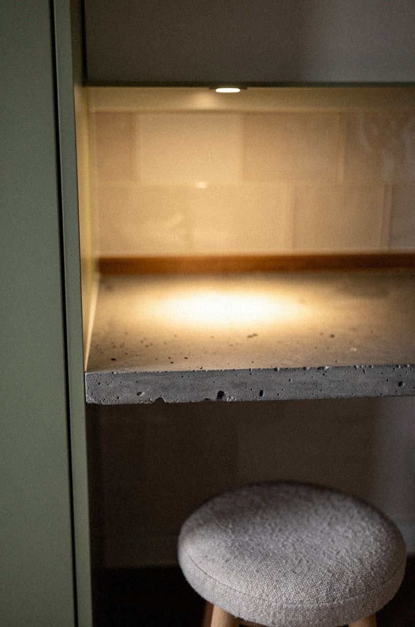
The stove niche needed a different kind of light, so I used tiny spots instead of another strip. That gave me a controlled cone on the poured concrete countertop without lighting the whole wall like a stage set.
If your range sits in a recessed niche, small directional spots can make the zone readable without flattening the sage green cabinet edge around it. I liked seeing the aggregate in the concrete for once.
This was the only place where a little drama helped. The warm cone caught the edge of the niche and made the cooking area feel deliberate, not improvised.
But I kept the beam tight. Too wide and the whole thing would have turned theatrical.
In kitchen room design, tight focus belongs where heat and motion already create energy. A niche should feel framed, not sprayed.
For more controlled lighting zones, outdoor kitchen lighting ideas for evening cookouts lands on the same principle.
11I matched black fixtures to modern cabinet pulls
On the darker run, I matched black fixtures to the modern cabinet pulls so the hardware line looked planned instead of pieced together over time. If your counter is already bold, like my Nero Marquina slab with white veining, extra metal colors can get messy fast. I had terracotta utensils on one side and a stone backsplash on the other, so a black fixture gave the eye one clear answer.
I almost chose brushed brass to echo the crock, but it would have split the palette right down the middle. Black let the marble stay the loudest thing in the frame.
And that is the right hierarchy when the counter has this much pattern. The move also tied back to modern kitchen cabinet ideas for a sleek clean look, where restraint does more work than one more pretty finish.
12I washed the tile backsplash with low glow
One stretch of tile didn't need brightness. It needed tenderness.
I set a lower glow under that cabinet run so the backsplash could read softly through the kitchen foliage, with the clay cabinets, linen roman shade, aged brass details, and deep mohair seat holding the scene together. If your tile already has variation, keep the output lower than you think. Too much light can make handmade surfaces look nervous.
That softer wash also helped the room read deeper at night. I wasn't trying to mimic daylight anymore.
I was trying to make dinner cleanup feel less abrupt. And this was the first section where I noticed the makeover giving something back emotionally, not just visually. You can see a similar sense of controlled warmth in outdoor kitchen lighting ideas for evening cookouts, even though the setting is different.
13I framed the pantry corner with vertical light
The pantry corner had always looked like a dead end, so I framed it with vertical light and let that edge do some architectural work.
14I added toe-kick glow under base cabinets
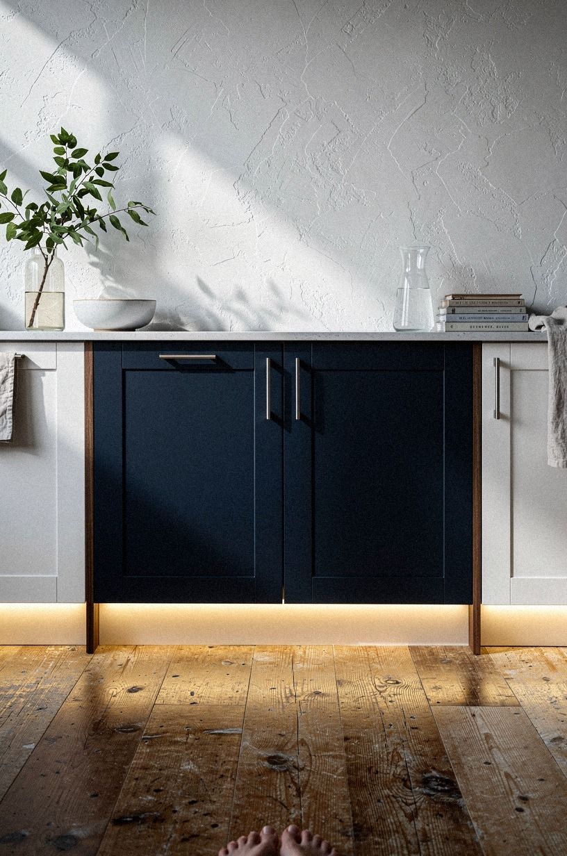
Toe-kick glow felt optional until I tried it, and then I couldn't believe I waited so long. I ran a low strip under the base cabinets and walked the room from a first-person angle toward the navy, white, and walnut mix just to see what changed.
The answer was depth. If you have reclaimed teak flooring or any other textured wood underfoot, that little shadow break helps the base cabinets stop looking heavy.
I kept the brightness subtle because this light isn't for tasks. It's for navigation and mood.
And in a small kitchen, that matters more than people admit. The weathered teak picked up the wash without looking glossy, which was exactly what I wanted.
I also think toe-kick light helps renters mimic a built-in look with fewer big changes, especially if your kitchen layout is tight and every sight line counts. That little floor wash changes the feel fast! For tight footprints, small kitchen cabinet ideas that maximize storage pairs nicely with the same thinking.
15I kept the island side dark and moody
Not every side of the kitchen needs to glow the same way, so I let the island side stay darker and moodier than the perimeter.
16I wired dimmers beside the cabinet switches
Adding dimmers beside the cabinet switches was the least glamorous change and maybe the most useful. If you have more than one under-cabinet circuit, you need control where your hand already goes, not buried in an app you forget to open. Mine sat near the cerused white oak uppers and forest green lowers, with rust pottery and natural oak shelves nearby, so I could test the whole color story as I adjusted the brightness.
This is where the room stopped feeling like a lighting project and started feeling livable. One dimmer gave me prep brightness.
Another gave me dinner softness. And I didn't have to choose a single personality for the whole space.
I kept thinking about kitchen pantry cabinet ideas for smart storage here, because good kitchens work best when the control points are obvious.
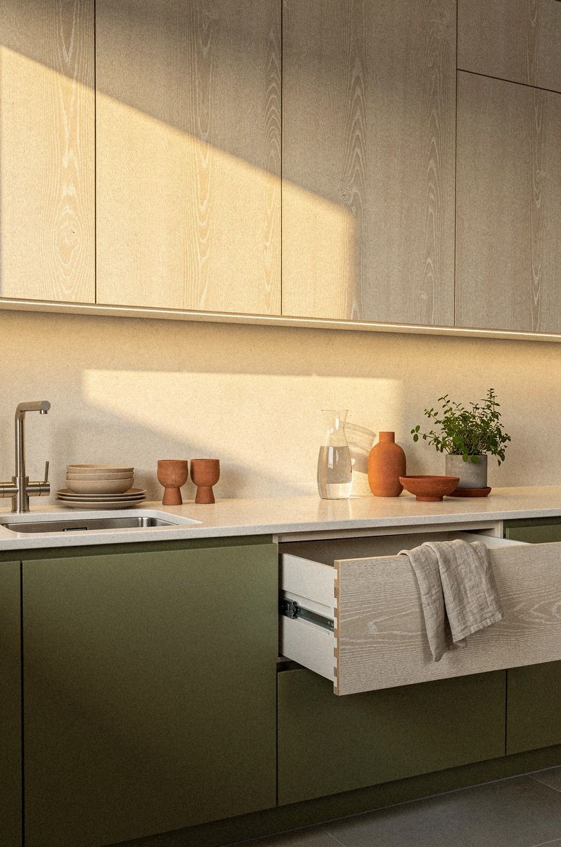
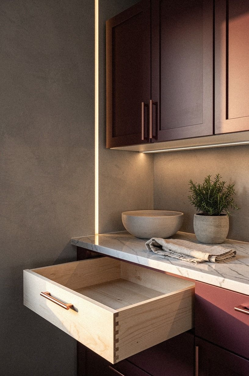
17I concealed every cord behind painted trim
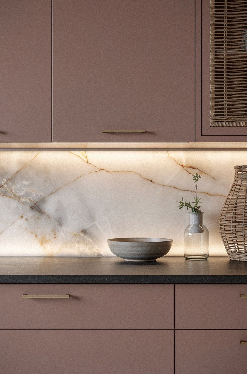
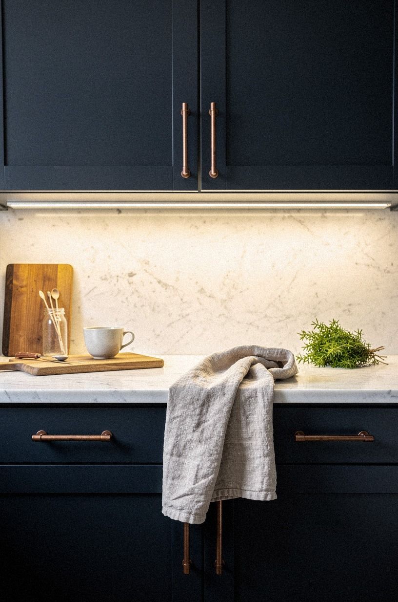
No upgrade looks finished if the cords are still shouting at you, so I concealed every run behind painted trim and matched it to the cabinet color line. My backsplash was a backlit translucent onyx panel under dusty rose uppers with a charcoal counter edge and brass pulls, and any visible cable would have broken the whole illusion. If your kitchen has one luxe surface, protect it from the cheap visual stuff around it.
I cut the trim shallow and ran it tight to the underside so you couldn't spot it from standing height. That made the onyx glow feel architectural instead of added later.
And it solved the renter-looking problem that plug-in lighting can create. I used removable clips first, then painted trim once I knew the path worked. You can do the same if you're testing before a full modern kitchen renovation.
It looked cleaner overnight! If cords are eating into your visual calm, kitchen tall cabinet ideas to use every vertical inch is another good lesson in hiding utility.
18I finished with one evening-only warm scene
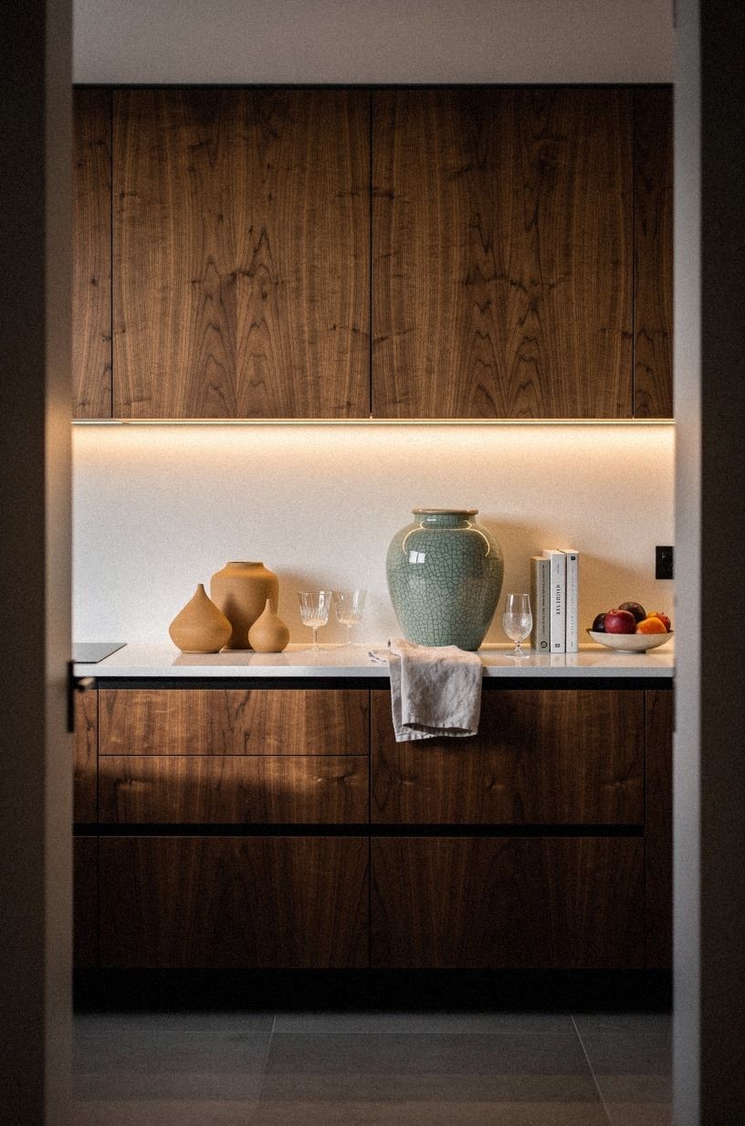
At the end, I saved one setting just for evening and gave it a job: make the kitchen feel calm after the work was done. The view through the doorway toward the book-matched walnut cabinets, warm white backsplash, camel ceramics, and black accents finally felt composed instead of restless.
If you're doing under-cabinet lighting ideas to brighten your kitchen, don't stop at utility. Build a closing scene too.
My final preset was the one I used after cleanup, when the counters were clear and the room didn't need to prove anything. That soft scene made the whole makeover feel more expensive than it was.
But it also made me want to stay in the kitchen longer, which was the point from the start. Bright isn't just about lumens.
It's about relief.
The One-Temperature Rule
The biggest mistake I almost made was mixing temperatures because each individual fixture looked nice on its own. That never works in a kitchen you see from multiple angles.
Once I committed to one warm family, the olive cabinetry, the navy accents, the walnut, and the white walls stopped arguing with each other. If you're wondering where to start, start there.
I settled on one warm white range and let brightness change by zone instead of color. That mattered more than fixture style.
You can have bars, spots, pucks, and toe-kick strips in the same room if the tone stays consistent. But once one corner turns blue, the whole kitchen feels cheaper. I learned that fast.
The Two-Switch Rule
I also learned that kitchens need at least two moods, not one. One setting for work.
One for living. If a single switch controls everything, you end up choosing between sharp counters and a room that feels pleasant after dinner, and that choice gets old fast. My prep wall needed more punch than the island and pantry ever would.
So I split the system. One circuit handles the brighter counter runs.
The other handles the social and evening zones. If you have a small kitchen, this matters even more because one overlit area can make the whole room feel tense.
And once you can lower one side without losing function, the room starts acting bigger.
The Three-Layer Light Stack
What changed the room most was not one fixture. It was finally understanding that kitchen light has layers, and each layer needs its own reason.
I used to think brightness alone would fix a dim kitchen. It didn't.
The ceiling light made the floor visible, sure, but it never made the counters feel inviting. The under-cabinet layer did the real work. Then the shelf, pantry, and toe-kick lights added shape around that task layer so the room could feel bright without looking flat.
If you're planning your own version, think in three parts. First, task light where your hands work: sink, prep zone, stove niche, coffee station. Second, surface light where the room needs texture support: the backsplash edge, the glass-front cabinets, the floating shelf.
Third, low ambient light where movement and mood matter: toe-kick glow, pantry framing, island dimmers, that final evening scene. Once I saw the room this way, every decision got easier because each light had a job.
Nothing was there just because the package said it was popular.
And this is the part I wish I'd known earlier. The expensive-looking kitchens are not always using more fixtures.
They're using better hierarchy. The brightest line belongs over the hardest work.
The softest line belongs where the eye wants to rest. The odd little in-between moments, like the pantry edge or the shelf underside, are what make the room feel finished.
If I had copied one identical bar across every upper cabinet, the kitchen would've looked brighter on paper and worse in person.
But once the layers were separated, the whole room relaxed. The oak looked warmer.
The stone looked cleaner. The brass had a reason to glow.
Even the clay and terracotta accents stopped reading as scattered and started reading as part of one calm picture. That's why I don't think of this as a gadget upgrade anymore.
It's a layout decision you happen to make with light.
How much it cost
I kept this makeover in the cosmetic tier, and that was the right call for my kitchen. My exact under-cabinet lighting spend came to $278: $24 for the test strip, $86 for slim bars, $32 for the coffee-station sensor, $44 for dimmers, $28 for puck lights, $36 for toe-kick tape, and $28 for clips, trim, and wire covers. I did the install over one weekend, and I didn't move any cabinets or replace the counters.
If you're budgeting the whole kitchen, these are the typical US ranges I used to keep myself realistic:
And if you're pricing surfaces while you plan, these ballpark numbers help too:
What People Always Want to Know
What is the best Under-Cabinet Lighting Ideas to Brighten Your Kitchen for a small kitchen?
Slim bars are the best place to start because they give you clean task light without visual bulk. In a small kitchen, I'd pair an IKEA MITTLED bar on the sink or prep wall with one low toe-kick strip. Tight footprint.
Better visibility. Less clutter.
Where can I buy Under-Cabinet Lighting Ideas to Brighten Your Kitchen pieces on a budget?
IKEA, Target, and Wayfair are still the easiest places to shop, especially when you want budget-friendly layers instead of one fancy fixture. Look for IKEA SKYDRAG, Target Threshold, and basic plug-in bars. Facebook Marketplace.
Habitat ReStore. Open-box bins.
Those are worth checking first.
How much does a Under-Cabinet Lighting Ideas to Brighten Your Kitchen makeover cost?
About $100 to $300 for a lighting-only update is a fair real-world range, and that's where the best value lives. Free wins.
Better bulb choice. Smarter placement.
Cleaner cord routing. Once you start repainting fronts or changing counters, the budget jumps much faster.
Can I create a Under-Cabinet Lighting Ideas to Brighten Your Kitchen on a budget?
Yes, and you can do more than most people think with small, cheap changes. One warm test strip.
One motion sensor by the coffee zone. Painted trim to hide cords.
If your cabinets are dark, even just adding toe-kick glow can shift the whole room.
Is a Under-Cabinet Lighting Ideas to Brighten Your Kitchen worth it in a small space?
Yes, it's even more worth it in a small kitchen because better light gives you usable depth. Small rooms show shadows faster.
Keep the brightest strip on the main work run, then use a lower setting near the pantry or island so the space doesn't feel overlit. For layout support, small kitchen cabinet ideas that maximize storage is a strong companion read.
Is Under-Cabinet Lighting Ideas to Brighten Your Kitchen a good idea for a rental?
Yes, as long as you stick with low-commitment upgrades. Plug-in bars.
Removable clips. Peel-and-stick wire channels.
Battery pucks inside glass fronts. I would skip hardwiring unless you're staying put, but renters can still get the warm layered look without damage.
The One I'd Do Tonight
If I had to pick one, I'd start with the backsplash-edge strip. It makes the wall finish, the counter edge, and the cabinet color work harder all at once. Pin this idea for later and copy it before you buy a second fixture.