
 by
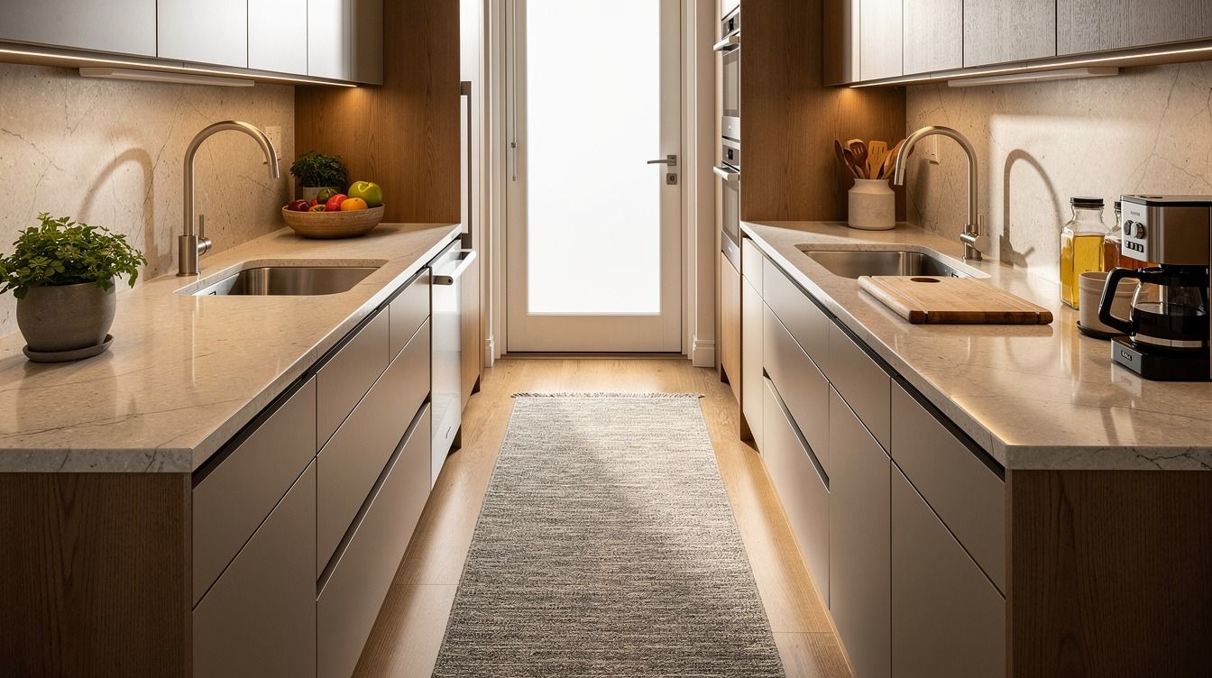
by A galley kitchen layout guide fixed my narrow kitchen because the flow came down to three things: a clear landing strip, centered work zones, and a brighter finish line. I learned that after months of shoulder-bumping cabinet pulls, stacking groceries on the floor, and turning sideways to pass the dishwasher. Then I stopped styling it like a pretty photo and started planning it like a room you cook in twice a day.
Here's what it looked like before
Before I changed anything, my kitchen had the full awkward layout feel. The fridge sat deep inside the aisle, the sink drifted off-center, and every counter task stole space from the next one. You could unload bags, sure, but only if you didn't also need the oven or the trash at the same time.
The finishes weren't the problem on their own. I had decent white oak fronts, a serviceable top, and enough storage.
But the layout kitchen design was off, so every good material read as cramped instead of calm. I kept thinking I needed a full remodel.
I didn't. I needed a better sequence.
- Mark the landing strip with a runner rug
- Keep the sink centered between both counters
- Move the fridge to the galley entrance
- Place prep space beside the range
- Tuck tall pantry cabinets at the end
- Run upper cabinets only on one wall
- Choose shallow drawers for the tight side
- Leave the walkway clear of handles
- Add glass uppers near the window
- Put the dishwasher beside the sink
- Shift the trash pullout under prep
- Use open shelves over the coffee zone
- Light both counters with continuous strips
- Break the cabinet run with warm wood
- Keep the range wall visually anchored
- Add a narrow island cart on casters
- Frame the far wall with storage
- Repeat one finish down both sides
- End the galley with a brighter view
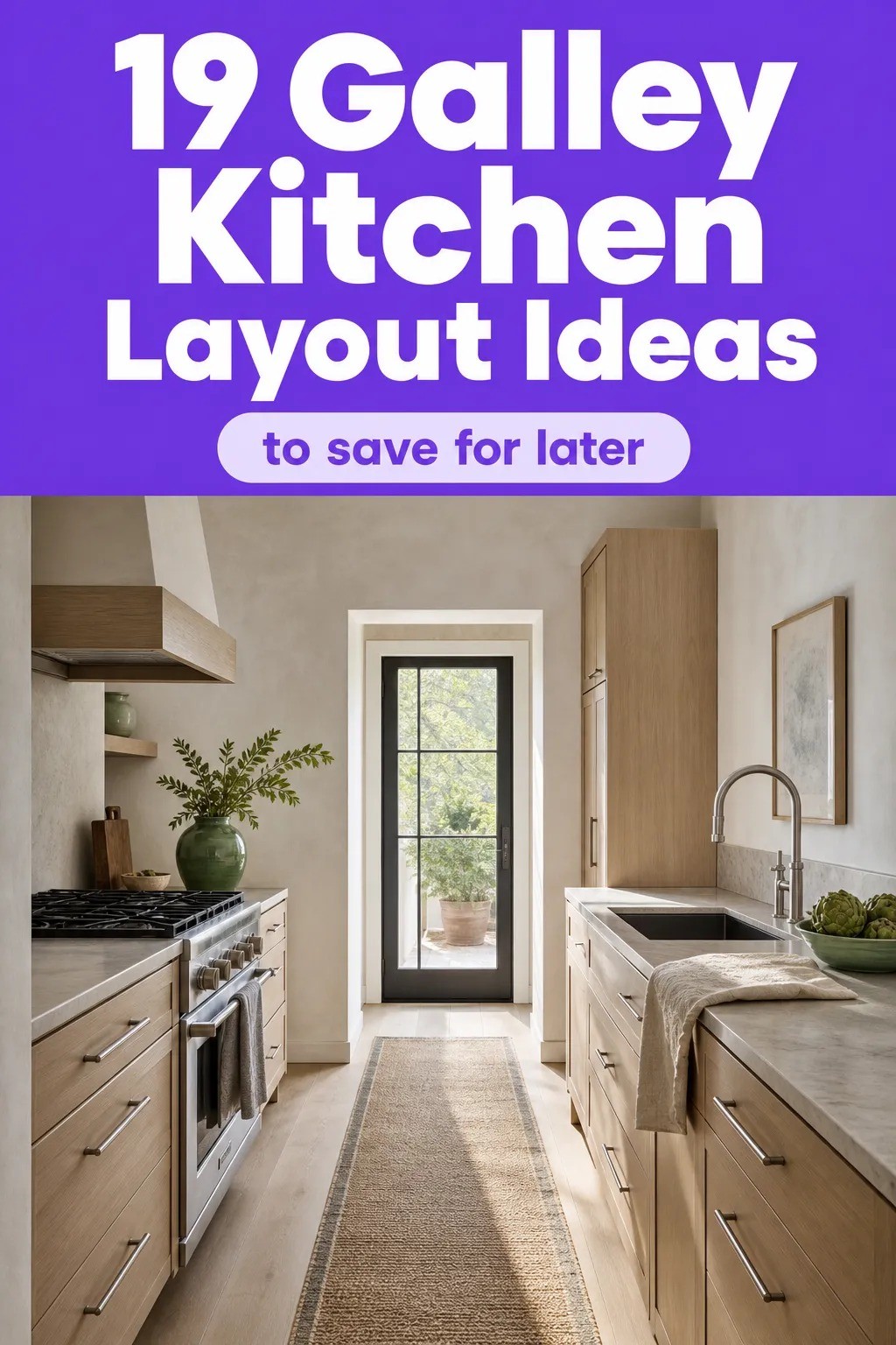
1Mark the landing strip with a runner rug
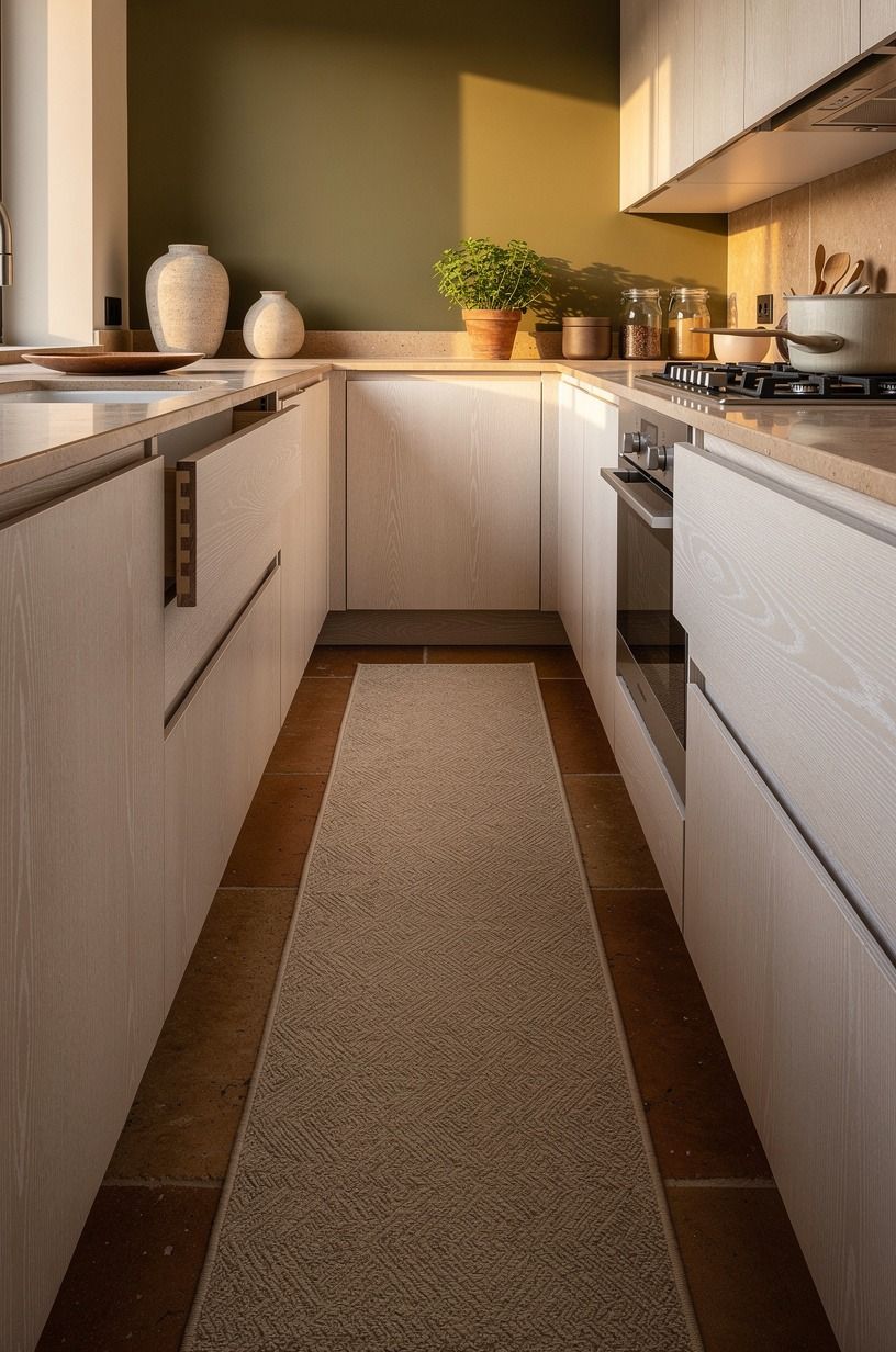
The first thing I fixed was the path under my feet. A long runner rug gave the aisle a clear landing strip, and the minute I laid it between the cerused white oak runs, you could feel where your body was supposed to move.
That sounds small. It wasn't.
I used the aisle rug like a line on a stage, not decoration. In a functional galley kitchen layout, you want your eye to travel straight down the aisle instead of bouncing into every toe-kick and chair leg.
A washable style around 2.5 by 8 feet worked for me, and if you're still deciding on finishes, my guide to the most popular kitchen cabinet colors right now helps you keep the floor from fighting the cabinets. I also borrowed scale cues from galley kitchen cabinet ideas for narrow layouts.
2Keep the sink centered between both counters
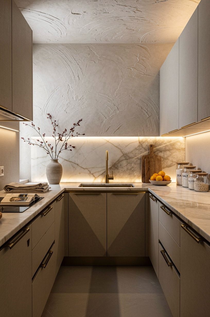
Centering the sink changed more than the sink. Once the basin sat between both counters, with that glowing onyx backsplash behind it, I had a true middle instead of a random stop. You can prep on one side, rinse on the other, and turn without feeling boxed in.
I wish I'd respected that sink placement earlier. In kitchen layouts galley plans, symmetry isn't about showing off.
It's about giving your hands somewhere to land on both sides of the mess. My sink wall finally felt balanced once I held to a standard 36 in counter height and kept the clear zones even. If you're mapping a renovation from scratch, kitchen cabinet layout ideas to plan before you renovate lays out that logic well, and galley kitchen ideas that make the most of a narrow space shows the same idea in tighter rooms.
3Move the fridge to the galley entrance
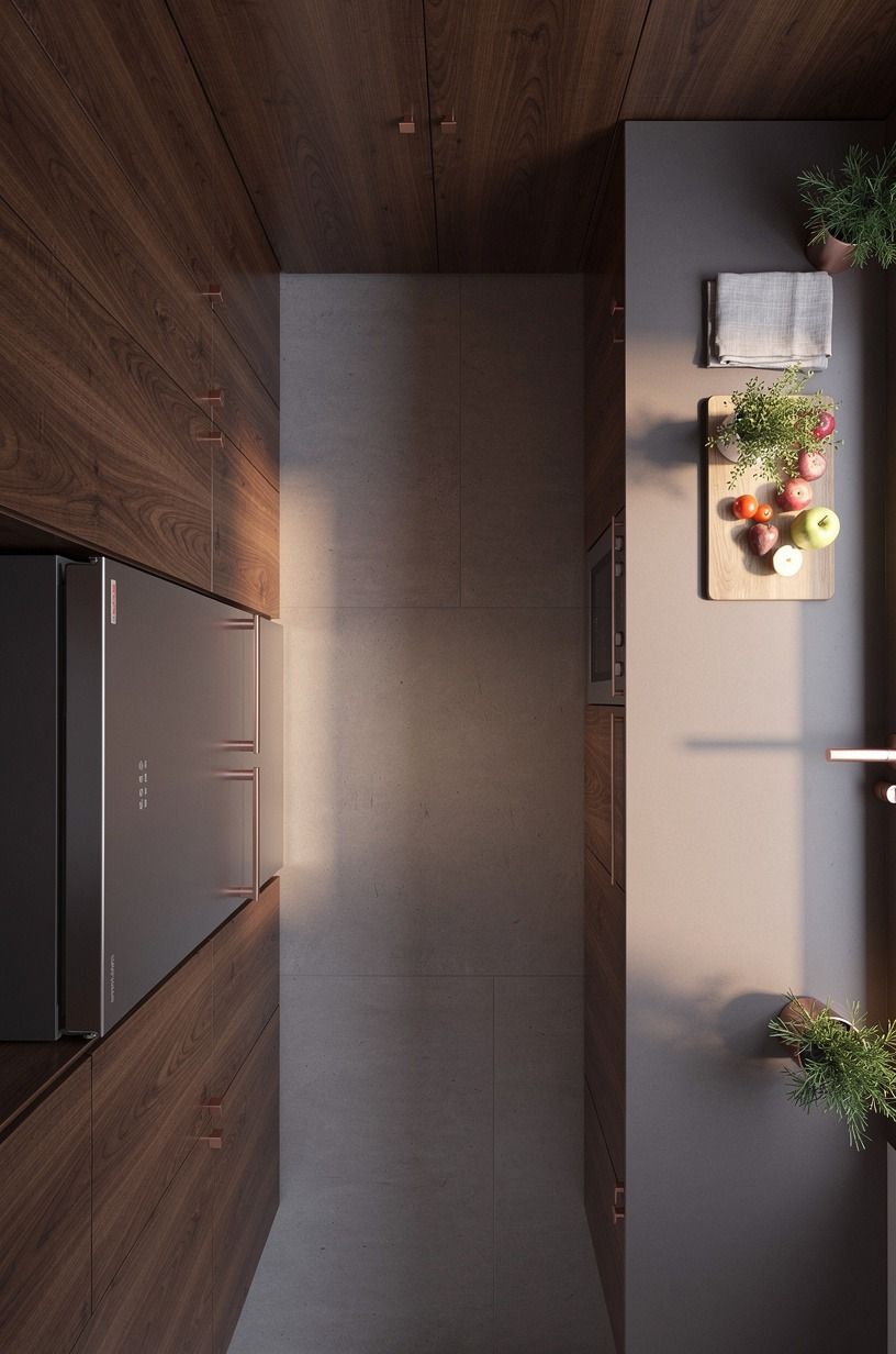
I fought this one for weeks because moving a fridge sounds dramatic. But putting the panel-ready fridge at the entrance stopped the worst traffic jam in the room. You grab milk, set down groceries, and back out without walking the full aisle every single time.
The overhead floor plan view made it obvious once I sketched it. In kitchen layout ideas galley spaces, the fridge is the first stop more often than the stove, so it should live near the threshold, not buried beside your prep zone.
I paired mine with book-matched walnut cabinetry so the entry wall still looked composed, and the whole room felt less bossy. Such a relief!
4Place prep space beside the range
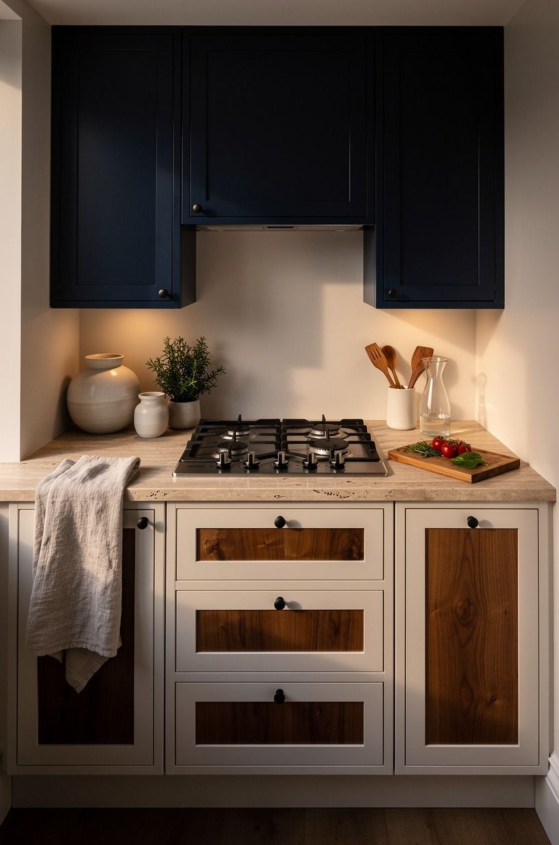
My range looked handsome before, but it worked hard with no landing space.
5Tuck tall pantry cabinets at the end
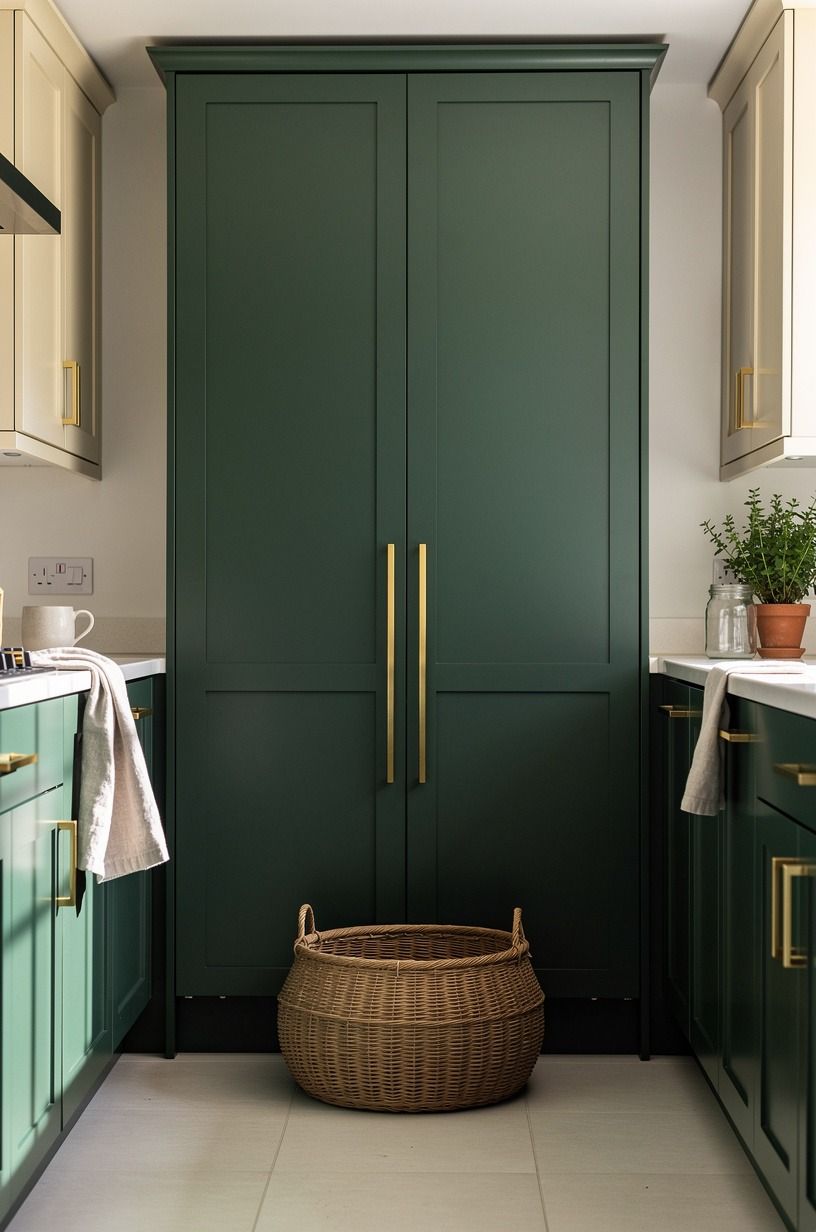
Tall storage can make a galley feel grand or suffocating. Mine felt suffocating when I had it mid-run. Once I pushed the pantry cabinets to the far end, the aisle opened up, and the eye finally had a destination instead of a wall looming at your shoulder.
I kept the palette soft there, with emerald, gold, cream, and just enough unlacquered brass to warm the height. That let the big volume read as built-in architecture instead of a block dropped in later.
In a kitchen layouts galley plan, tall mass belongs where it frames the end, not where it interrupts the middle. You feel that immediately, especially if you've looked through the most popular kitchen cabinet colors right now and noticed how calmer layouts let color read better.
6Run upper cabinets only on one wall
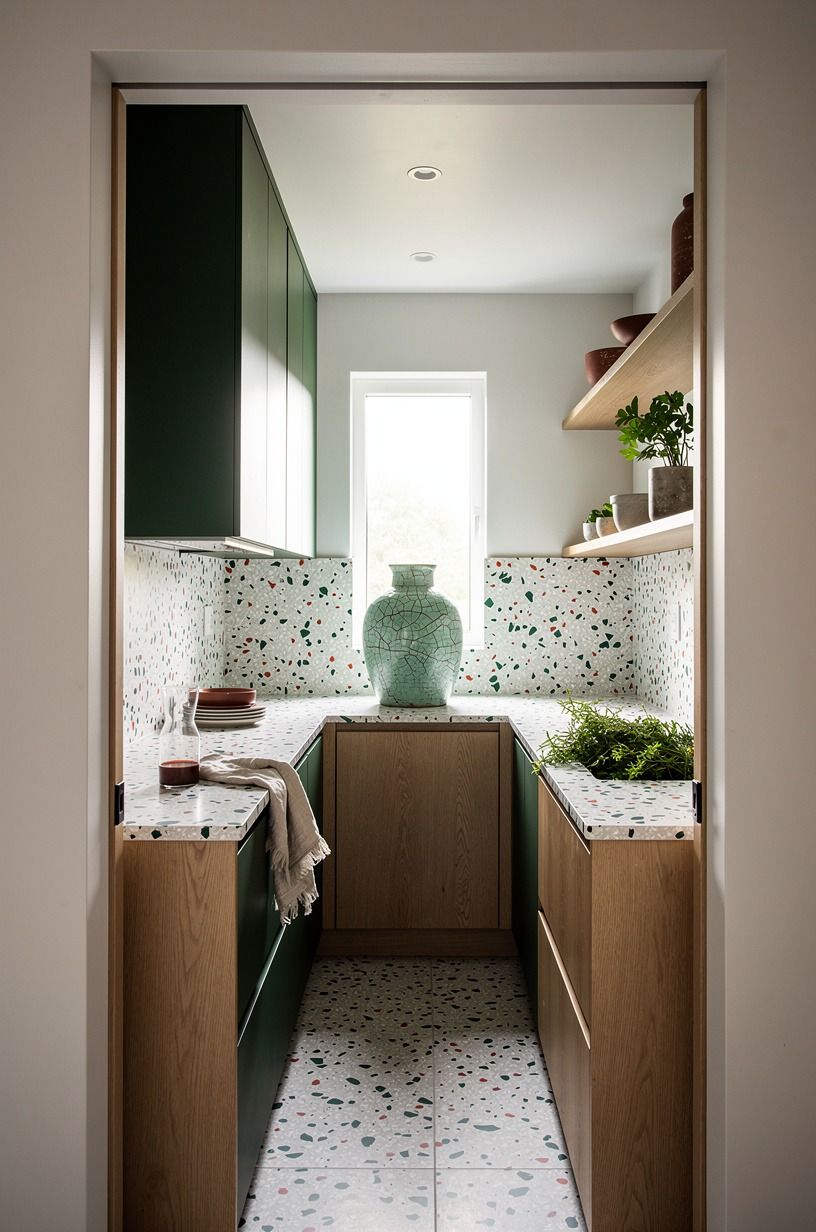
This was my version of backing away from an argument.
7Choose shallow drawers for the tight side
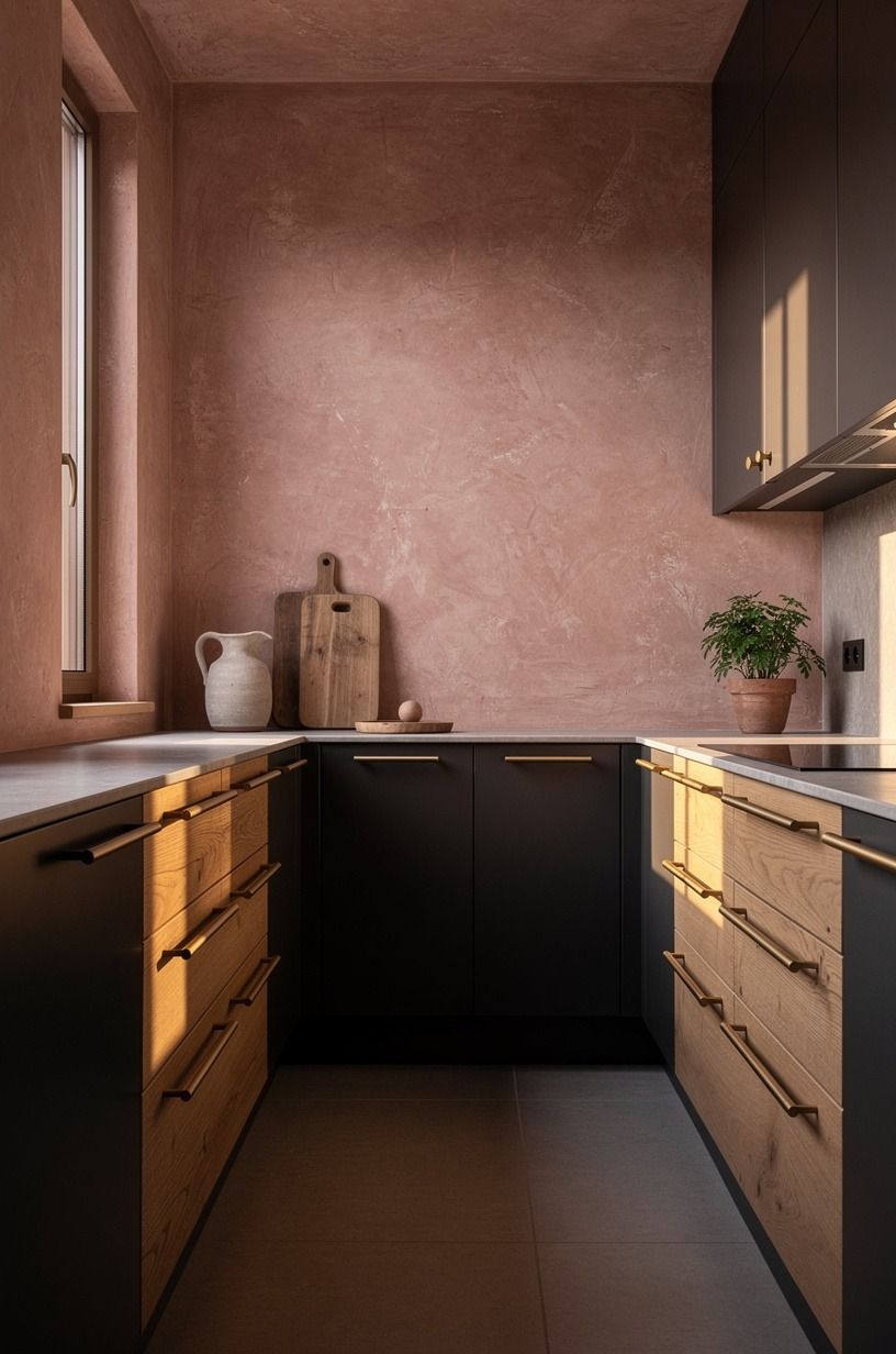
The tight side of my galley had no business pretending it could take deep storage. I swapped in shallow drawers there, and that one move stopped the hip-check dance I did every morning.
You lose a little volume on paper. You gain daily sanity.
Shallow storage drawers are better when the aisle is doing real traffic, especially if your cabinet fronts already have color and brass working hard for them. Mine sat under a dusty rose and charcoal palette, so the room still felt layered, not stripped down. I keep tools, towels, and wraps there, and nothing bangs into me when I pivot.
8Leave the walkway clear of handles
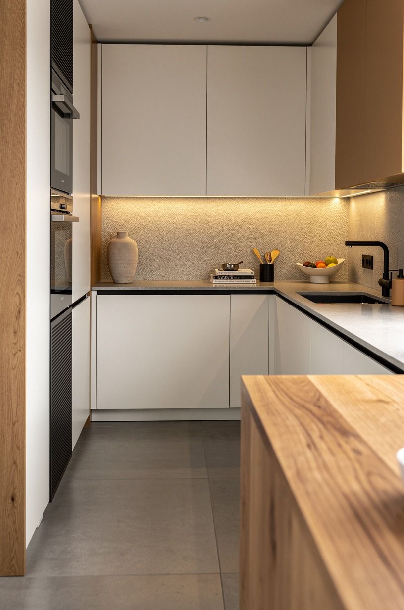
Flat-front cabinets saved my knees. I know hardware can look charming, but in a narrow aisle, protruding pulls turn your path into an obstacle course. I went handle-free on the walkway side, and the whole cabinet run felt calmer before I even opened a door.
You don't need a futuristic walkway plan to do this. A warm white, camel, and black palette keeps handle-free fronts from feeling cold, especially if you mix in tactile finishes. But the real win is physical.
When you carry a pasta pot or a trash bag, nothing catches your hip. That's the kind of design you notice because you stop noticing pain, and kitchen cabinet layout ideas to plan before you renovate reinforces that same no-bump logic.
9Add glass uppers near the window
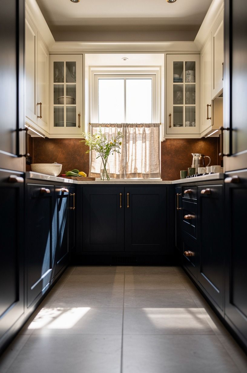
Glass near the bright end of the galley gave me depth without heaviness. I only used glass-front uppers near the window, and that small decision kept the midnight blue, copper, and ivory palette from turning moody in the wrong way.
You don't want glass uppers everywhere. I made that mistake in a rendering, and it looked fussy fast. But a short run near natural light reflects enough brightness to soften a tight aisle, especially with 30 to 42 in uppers kept simple.
If you're planning a breakfast corner nearby, galley kitchen breakfast nook ideas for narrow layouts helps you keep that end from feeling cut off.
10Put the dishwasher beside the sink
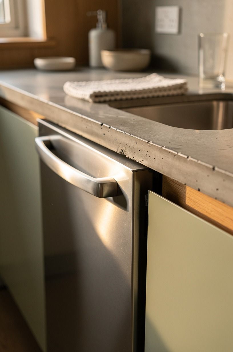
This is one of those moves that sounds so obvious you almost skip it. Don't. Putting the dishwasher directly beside the sink kept drips off the floor and gave me a cleaner unload path from rinse to rack.
I stopped twisting with wet plates in my hands.
The macro view of the dishwasher seam convinced me more than any plan drawing did. You want the seam to feel intentional, almost invisible, so the counter reads as one continuous work surface.
I paired mine with a poured concrete look top, and even the cleanup zone started to feel deliberate. Small move, big payoff!
I kept coming back to galley kitchen cabinet ideas for narrow layouts when I was checking seam alignment.
11Shift the trash pullout under prep
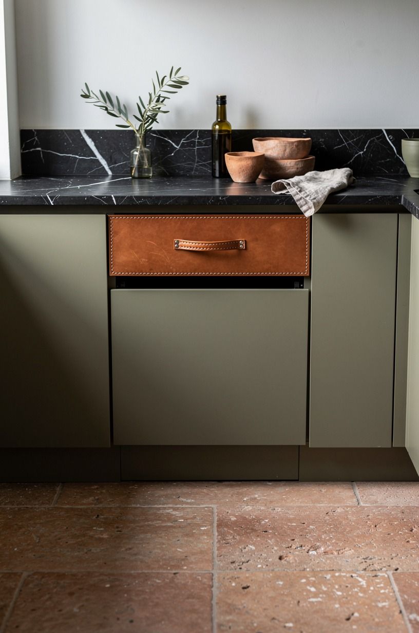
Trash belongs where scraps happen, not where the cabinet grid says it fits. I moved my trash pullout under the prep zone, and suddenly onion skins, wrappers, and coffee filters disappeared with one step instead of three. That changed the pace of cooking more than new lighting did.
The lower view across the Nero Marquina floor taught me something blunt: the ugliest workflow mistake is often at shin level. In layout kitchen design, you want the bin under the counter where your knife work happens, not tucked near the sink because that seems tidy. Tidy on a plan isn't always tidy in real life, which is why galley kitchen ideas that make the most of a narrow space stayed open on my phone during the whole reset.
12Use open shelves over the coffee zone
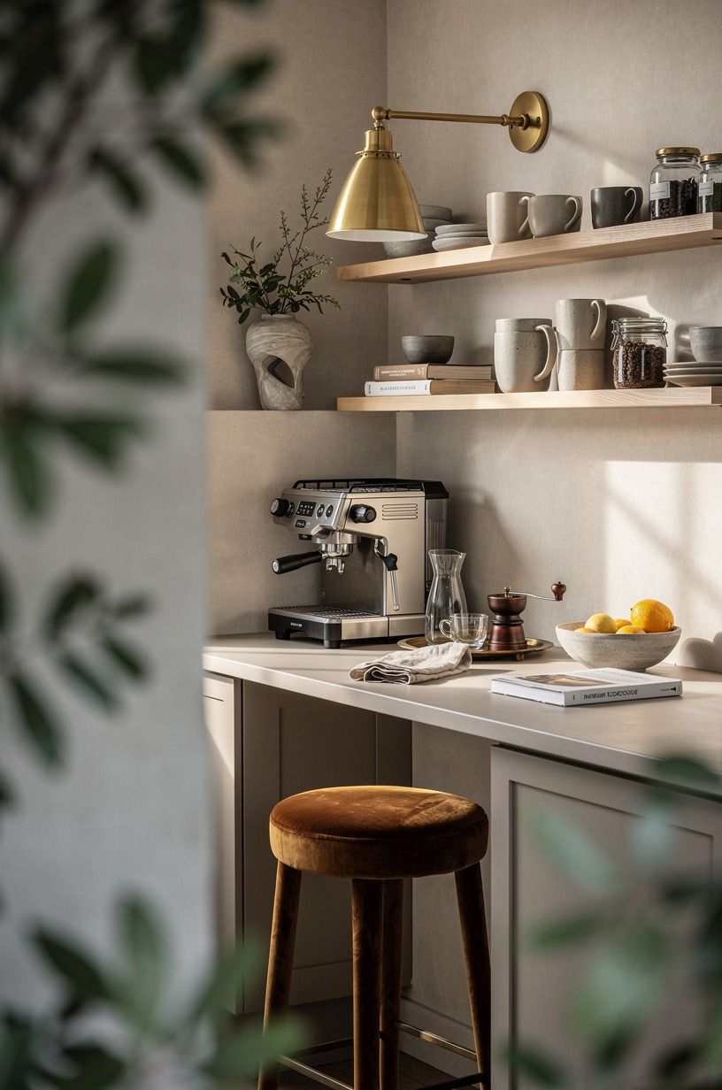
My coffee corner needed air, not another cabinet door.
13Light both counters with continuous strips
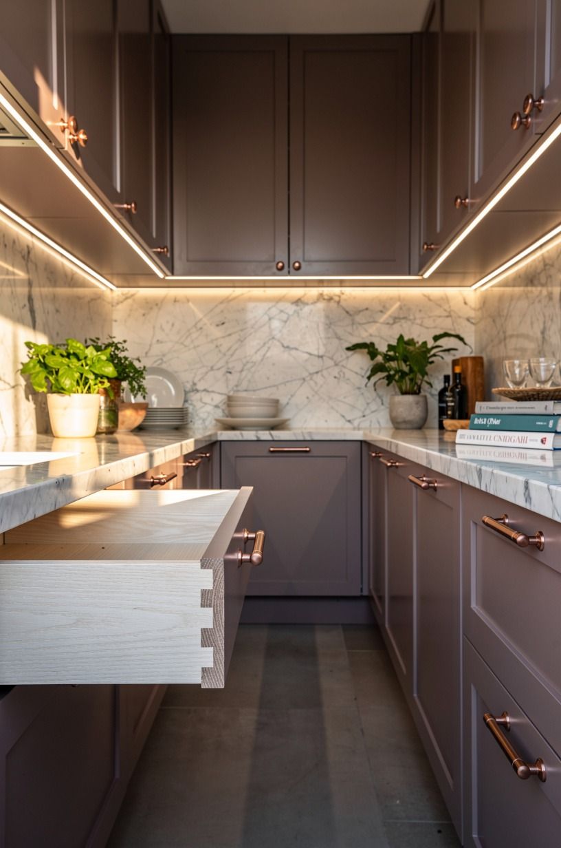
Under-cabinet lighting fixed the mood, but continuous lines fixed the flow. Once I ran warm LED strips under both sides, every counter task felt connected.
No more bright patch, dark patch, bright patch. Your eye reads one long workspace, and your hands stop chasing shadows.
This is one place where I wouldn't cheap out on color temperature. Warm, steady light makes Carrara marble, brass, and even plain laminate look calmer at night.
But if the strips dot or flicker, the whole effect falls apart. I wanted the room to feel like one sentence, not a string of interruptions.
And yes, you notice it every evening.
14Break the cabinet run with warm wood
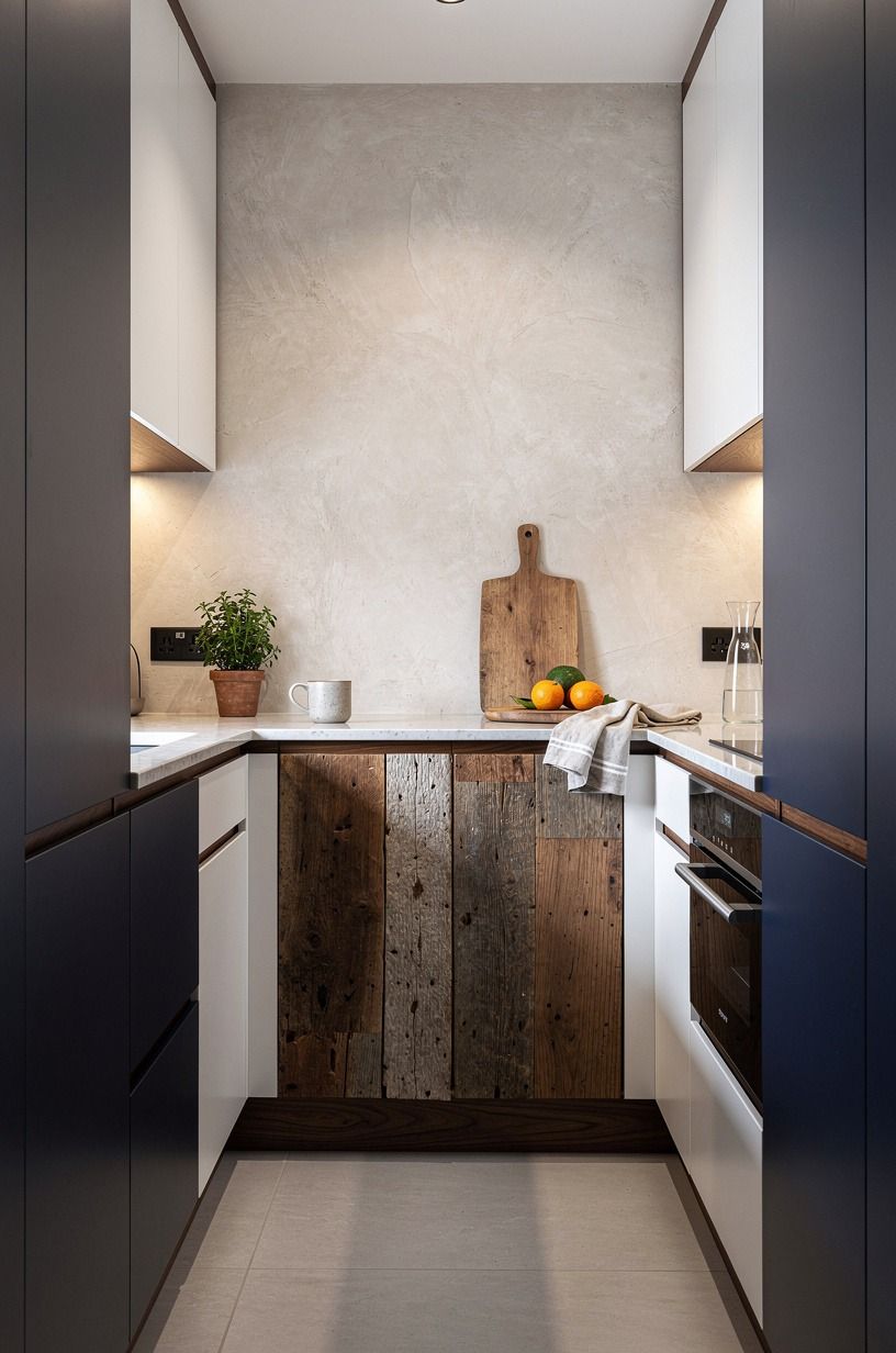
Too much cabinetry in one material can feel relentless, even when the cabinets are good. I interrupted my painted run with a section of reclaimed teak, and the aisle stopped looking like a tunnel. The wood worked like a pause in the middle of a long paragraph.
That pause mattered because the rest of the room already had navy, white, and walnut carrying plenty of structure. You don't need a dramatic contrast.
You need one section that says, breathe here. I stepped toward that weathered teak panel every morning and felt the kitchen soften.
That's when I knew the functional galley kitchen layout was finally starting to look human too.
15Keep the range wall visually anchored
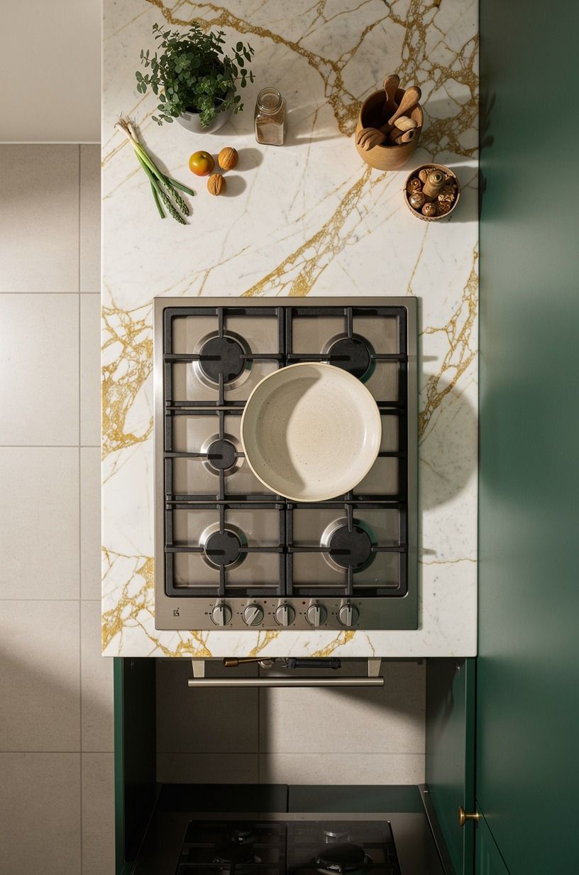
My cooking wall only started to make sense once I anchored it on purpose. I centered the range wall composition so the hood, counter spans, and upper rhythm all pulled toward one middle. Overhead, the compact plan looked quiet instead of scattered.
I used the stone balance and cabinet weights to do that work, not décor. A Calacatta-style surface, darker hardware, and even spacing kept the wall from floating off to one side. Why does that matter so much?
Because in a narrow kitchen, your range wall is the room's gravity. If it wobbles, everything around it feels temporary.
16Add a narrow island cart on casters
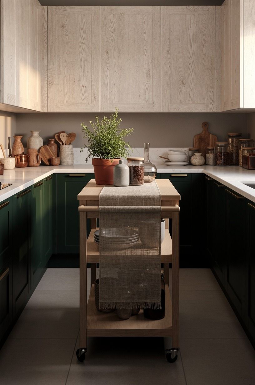
I resisted a cart because I thought any island would choke the aisle. The answer was a rolling island cart narrow enough to keep 42 to 48 in of clearance when parked, and mobile enough to move when I needed the room clear. That gave me flexibility without fake built-in drama.
I treated the rolling cart like bonus prep, not permanent furniture. A wood top, open lower shelf, and locking casters were enough. You can pull it into the center for baking, then push it away when two people need to pass.
If you're comparing galley footprints with outdoor setups, outdoor kitchen layout ideas l shape u shape more is oddly helpful because it makes circulation logic so obvious. I cross-checked it with l shaped vs u shaped outdoor kitchen best layout guide when I was deciding how much clearance to protect.
17Frame the far wall with storage
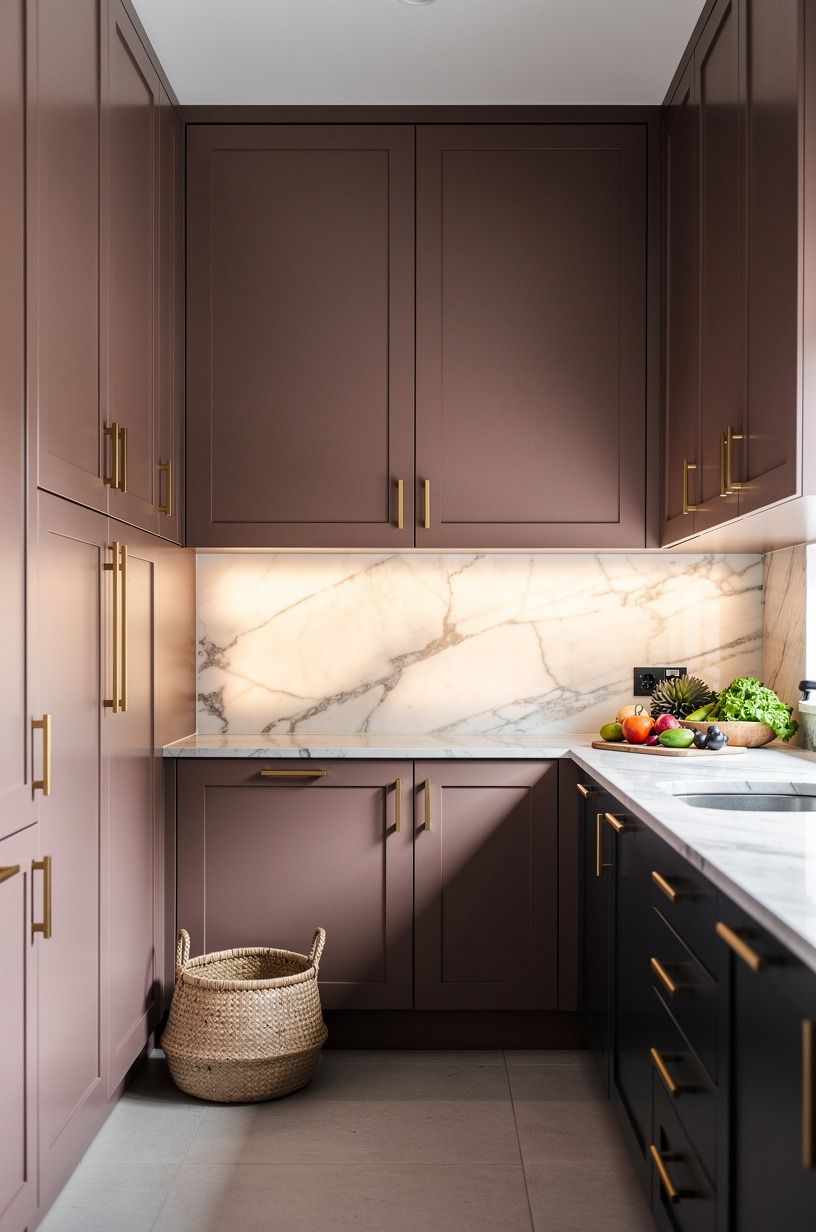
Once I gave the far wall real storage, the end of the room felt finished instead of accidental. Built-in end storage framed the view down the aisle, so your eye landed on purpose. That dusty rose, charcoal, and brass mix looked richer because it had a destination.
I like end storage best when it feels architectural, almost like a quiet furniture piece built into the wall. You don't need every inch closed up, though. A little display, a little utility, and a strong vertical outline are enough.
In kitchen layout ideas galley rooms, the far wall is where you can create closure without narrowing the middle.
18Repeat one finish down both sides
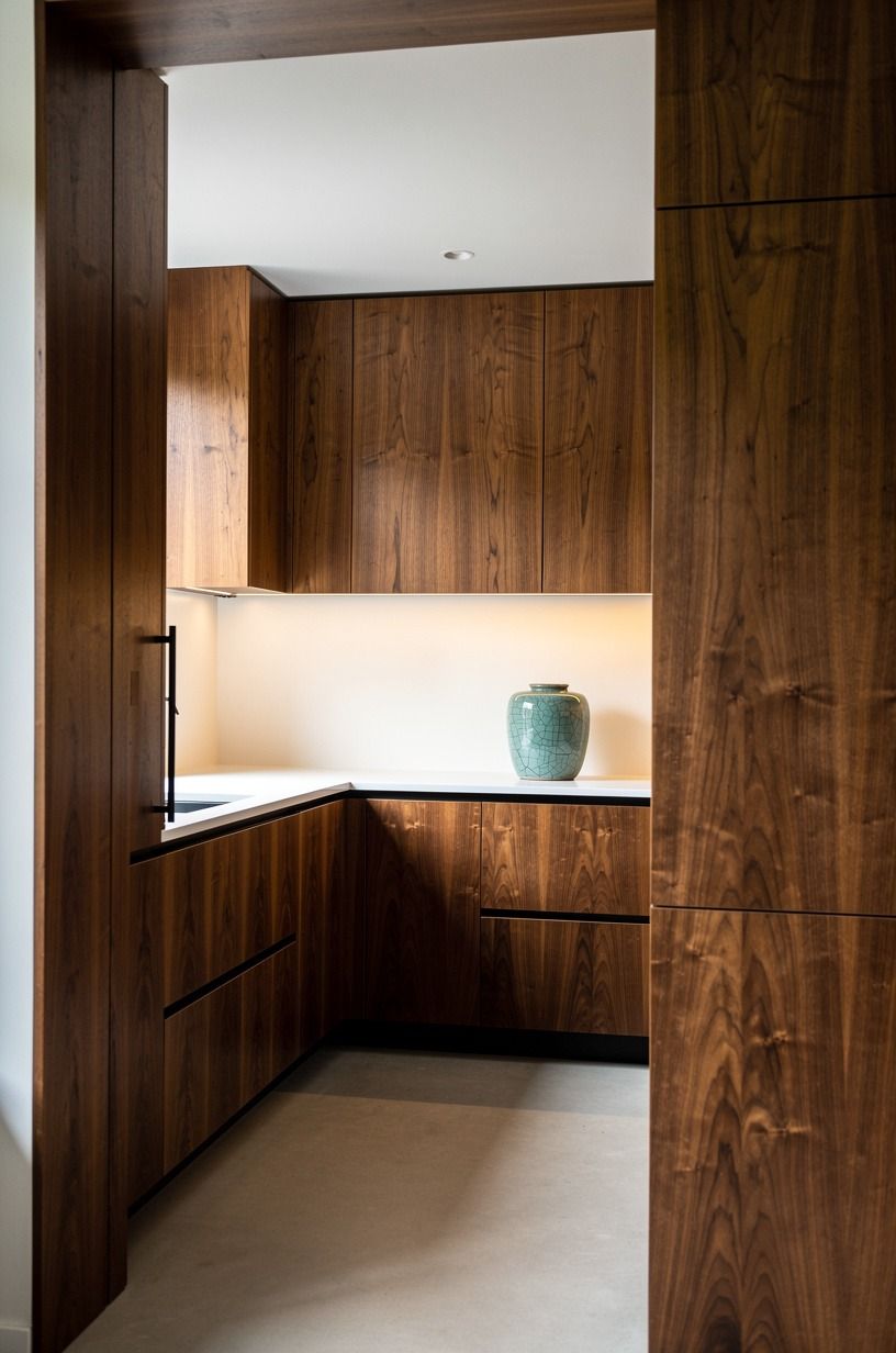
The room clicked when I stopped introducing new finishes and repeated one hero material down both sides. For me, that was book-matched walnut used in smaller touches along each run. The repetition calmed the eye faster than any paint sample ever did.
I still used warm white, camel, and black around it, but the repeated walnut finish acted like a chorus line you could follow through the whole aisle. If you're torn between two layout directions, l shaped vs u shaped outdoor kitchen best layout guide is a smart reminder that repeated finishes often do more for flow than extra square footage does. That same discipline shows up in the most popular kitchen cabinet colors right now too.
19End the galley with a brighter view
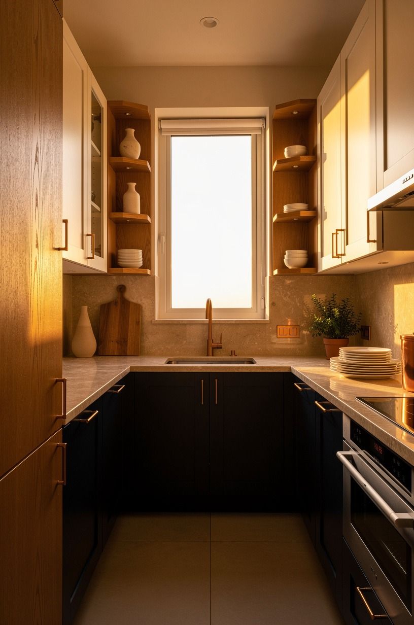
The last move was the simplest, and it may be the one you feel first. I made sure the galley ended on a bright window view, and that luminous finish line pulled you through the room every time. Warm travertine, midnight accents, and soft daylight finally worked together instead of competing.
I kept the far end clear enough for the window light to spread and resisted filling it with one more shelf or stool. But the emotional shift was the part I didn't expect.
When the end of a narrow kitchen looks brighter than the start, the whole space feels more generous. That's a better kind of luxury than adding one more cabinet.
But if you're still tempted, galley kitchen cabinet ideas for narrow layouts is the better place to compare storage tradeoffs.
The Two-Lane Rule That Finally Made Sense To Me
The real lesson here wasn't about one rug or one cabinet color. It was the two-lane rule I kept coming back to: one lane for movement, one lane for work.
Every time I ignored that, the kitchen looked fine in photos and drove me nuts in real life. Every time I respected it, the room got easier to use and, oddly enough, prettier too.
I think that's why so many galley kitchens go wrong. People treat them like a storage problem first, so they keep packing both sides until the room starts acting defensive.
More drawers, more uppers, more hardware, more things jutting into your body. But a galley isn't begging for more stuff. It's begging for sequence.
You need a clear landing spot, a clear prep spot, and a clear ending point your eye can trust.
I learned this through trial runs the slow way. I tried moving accessories before I moved functions.
I tested stools I didn't need. I even taped out a shelf run that looked smart on paper and felt ridiculous once I walked it for a week.
The difference was never the cute object. It was always the traffic pattern underneath the cute object.
Annoying, but true.
And once I admitted that, design choices got easier. Benjamin Moore White Dove OC-17 made sense because it bounced light where the aisle tightened.
Farrow & Ball Studio Green No.93 worked only where I had breathing room around it.
Sherwin-Williams Evergreen Fog SW 9130 looked best when warm wood broke up the run instead of covering every door. That's the part I wish more layout guides said out loud: color can't rescue a bad route. You have to fix the route first.
Would I do every one of these moves in every galley kitchen? No, and that's the point.
But some of you need the runner rug and the clear pulls more than the cart. Some of you need the fridge moved before you buy a single pretty thing.
If your kitchen feels cramped even after you've edited the styling, start with the traffic. Start where your body gets irritated. The room tells on itself fast!
How much it cost
I kept this makeover firmly in the cosmetic lane, which is why it felt doable instead of paralyzing. The typical budget ranges are below, and they match what you usually see in the US when you're improving flow rather than gutting the room.
For material costs, I kept comparing the dream finish to the practical finish so I wouldn't overspend in the wrong spot. That helped more than any mood board did. Worth it!
The Bright-End Rule I Wouldn't Ignore Again
If you only borrow one layout principle from my layout kitchen design reset, make it this one: end the aisle with light or visual reward. You can survive a plain counter. You can't enjoy a galley that dead-ends into clutter.
That single bright-end rule made every other decision easier to judge.
And that bright-end rule kept me from wasting money. If a purchase didn't support the route, the prep zone, or the brighter finish line, I cut it. That's how you keep a small makeover from drifting into expensive noise.
The Questions I Get Asked Most
What is the best Galley Kitchen Layout Guide: How to Get the Flow Right for a small kitchen?
The best version is one that protects movement first, then storage. A centered sink and a clear walkway do more for a small kitchen than one more upper cabinet. I like pairing that with simple IKEA drawer inserts so you gain order without crowding the aisle.
Where can I buy Galley Kitchen Layout Guide: How to Get the Flow Right pieces on a budget?
Start with IKEA for runners, carts, shelves, and basic lighting, then compare Target and Wayfair. You can save the most on pieces that don't need to be custom. For one-off finds, Facebook Marketplace is still great for a narrow wood cart or a solid stool you can refinish yourself.
How much does a Galley Kitchen Layout Guide: How to Get the Flow Right makeover cost?
For a cosmetic makeover, expect about $300 to $1,500 in many US kitchens, with paint and peel-and-stick changes doing the cheapest work. A refresh with lighting, a faucet, and repainted fronts lands higher. The free part is layout editing, which matters more than people think.
Can I create a Galley Kitchen Layout Guide: How to Get the Flow Right on a budget?
Yes, and you do not need a full remodel to feel the difference. A runner, better lighting, and a handle-free walkway side can shift the room fast.
Free moves count too. Fridge rethinking.
Shelf editing. Clearing the bright end so your eye has somewhere calm to go.
Is a Galley Kitchen Layout Guide: How to Get the Flow Right worth it in a small space?
Yes, especially in a small space, because tight rooms expose bad flow immediately. The smaller the kitchen, the more every inch matters. Keep prep beside the range, keep cleanup beside the sink, and protect that 42 to 48 in circulation if you bring in a cart.
Is Galley Kitchen Layout Guide: How to Get the Flow Right a good idea for a rental?
Yes, if you focus on reversible layout upgrades. Peel-and-stick backsplash, removable lighting, and open shelves over a coffee zone can shift the feel without damage. Add a washable runner, use tension-mounted organization inside cabinets, and skip anything that needs new hardwiring.
The Landing-Strip Rule I'd Start With First
If I had to pick one, I'd start with the runner rug. It forces the route into focus, and once the route is clear, every later decision gets easier. Pin this for later and fix the path before you buy one more pretty thing!